 Paint Review")
Benjamin Moore Gray Wisp (1570) is a soft, airy paint color that blends blue, green, and gray tones for a light and calming look.
It feels fresh and gentle without being too cool or too warm. If you want a soft color that adds interest while staying neutral, Gray Wisp might be the perfect fit.
This color is a beautiful option for bedrooms, bathrooms, and any room where you want a peaceful atmosphere.
It works well with natural light and soft materials. Gray Wisp brings just enough color to make a space feel finished, but it’s light enough to feel clean and open.
In this blog, I’ll explain how Benjamin Moore Gray Wisp looks in different rooms, how to pair it with other colors, and why this gentle hue continues to be a popular choice for both classic and modern homes.
What Kind of Color Is Benjamin Moore Gray Wisp (1570)?
Gray Wisp is a soft blue-gray with green undertones. It’s light and airy, with a subtle coolness that brings calm to a space.
This paint color changes depending on the light—sometimes it leans more blue, other times it shows more green or gray. That soft shifting quality makes it feel natural and relaxed.
Its Light Reflection Value (LRV) is 54.43%, so it reflects a good amount of light. That means it can help brighten a room, especially smaller spaces or areas with limited natural light.
It’s not stark or harsh, it has a soft, misty tone that gives walls a gentle wash of color.
Gray Wisp is great for people who want a hint of color without going bold. It’s easy to work with, blends well with many styles, and adds a soothing look to any space.
Gray Wisp: A Gentle and Airy Color for Every Room
Gray Wisp is soft and flexible, making it a great choice for a variety of rooms. It works in both small and large spaces and adds calm without feeling cold. Its subtle tone is easy on the eyes and easy to decorate around.
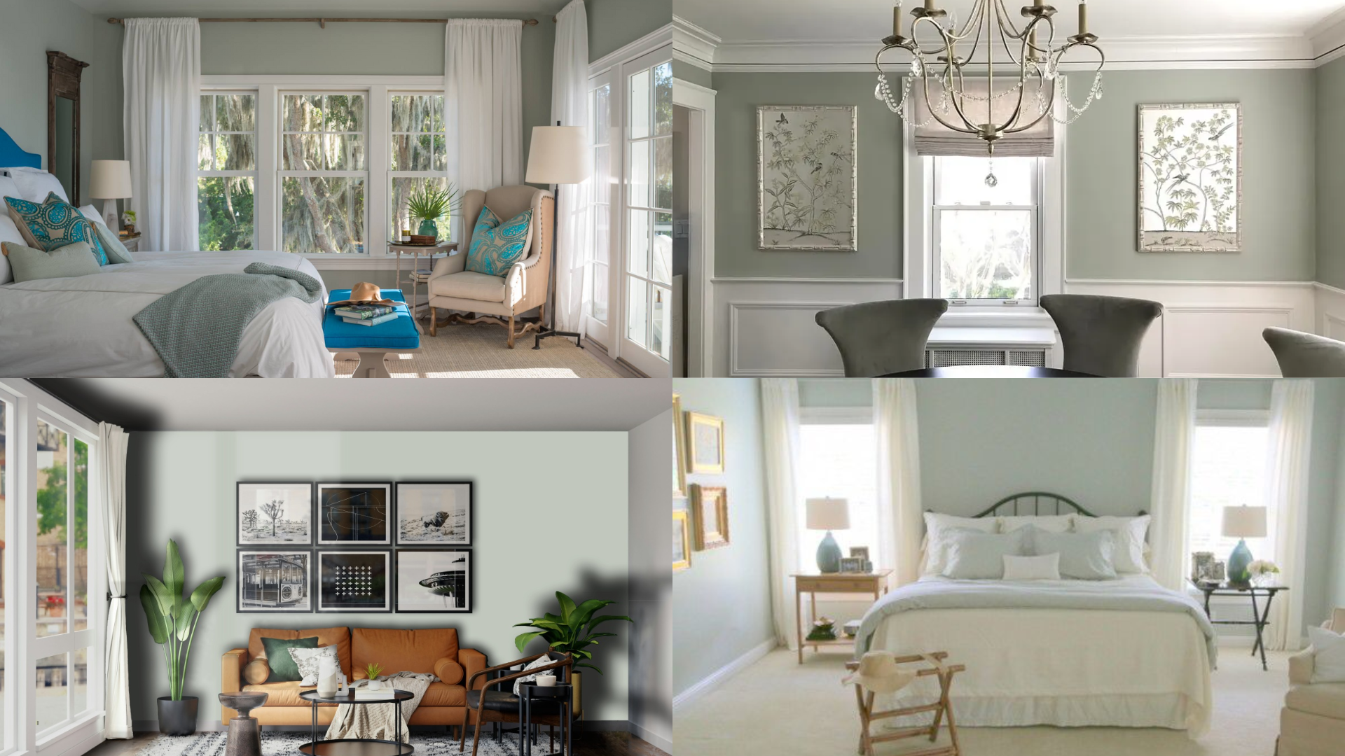
Living Room
In the living room, Gray Wisp creates a relaxed, welcoming mood.
It works especially well with light wood furniture and woven textures, such as seagrass baskets or jute rugs, which bring in natural warmth.
I’ve used it on all the walls for a soothing, unified look, but it also looks amazing on just one accent wall, keeping the space light and fresh.
I like to pair it with neutral sofas and soft, cozy throws. White trim around windows and doors offers a crisp contrast, making the whole room feel brighter.
Add in some plants or beachy art, and you’ve got a laid-back space perfect for lounging or entertaining.
Bedroom
Gray Wisp is ideal for the bedroom, especially if you’re trying to create a soft, sleepy retreat. I’ve used it to make the whole room feel like a gentle hug at the end of the day.
The calming hue promotes rest, making it easier to wind down at night.
I love pairing it with white or cream bedding, natural linens, and soft lighting, such as warm-glow bedside lamps.
Light wood or rattan furniture adds an earthy touch that balances out the cool tones in the paint.
You can even layer in soft blues, dusty greens, or pale blush tones to create a peaceful, layered palette.
Kitchen
For the kitchen, Gray Wisp offers a clean, refreshing look that’s both modern and comforting.
I’ve used it on walls, but I also love how it looks on cabinets; it brings just enough color to feel interesting without overpowering the space.
It’s perfect if you want a kitchen that feels calm but still has personality.
It looks fantastic with white quartz or marble countertops and pairs effortlessly with stainless steel or brushed nickel fixtures.
Warm-toned flooring, like honey oak or light maple, can balance out the coolness of the paint, making the whole space feel welcoming.
I also like to bring in open shelving or ceramic pottery for an extra touch of charm.
Bathroom
Gray Wisp really shines in bathrooms. Its soft green-blue tones bring a spa-like atmosphere that makes every shower or soak in the tub feel extra relaxing.
I’ve used it in small powder rooms and larger primary baths, and it works in both. It makes the space feel fresh and airy, without being stark.
I like to pair it with white subway tile, silver or chrome fixtures, and fluffy white towels for a crisp, clean look.
Adding candles, leafy green plants, and light wood accents like a bamboo bath mat or a teak stool helps create that peaceful, natural retreat I’m always aiming for.
Even a small bathroom can feel serene and pulled together with this shade.
How to Use Gray Wisp in Small Rooms or Low-Light Areas
Thanks to its high LRV, Gray Wisp works well in smaller spaces or rooms that don’t get much natural light. It can help make tight spaces feel more open while still giving them a bit of color.
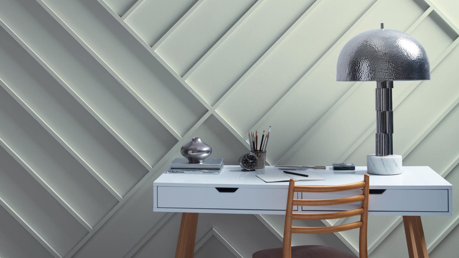
Accent Walls
Even in a small room, an accent wall in Gray Wisp adds softness and charm.
Use it behind a bed, a desk, or a sofa. It brings in color without taking over the room. Pair with soft whites and minimal decor to keep it from feeling busy.
Hallways and Entryways
These spaces often lack windows or strong lighting.
Gray Wisp is light enough to help reflect artificial light and make narrow spaces feel more open. Use mirrors or glass lighting fixtures to enhance the airy effect.
How to Pair Gray Wisp with Other Paint Colors and Accents
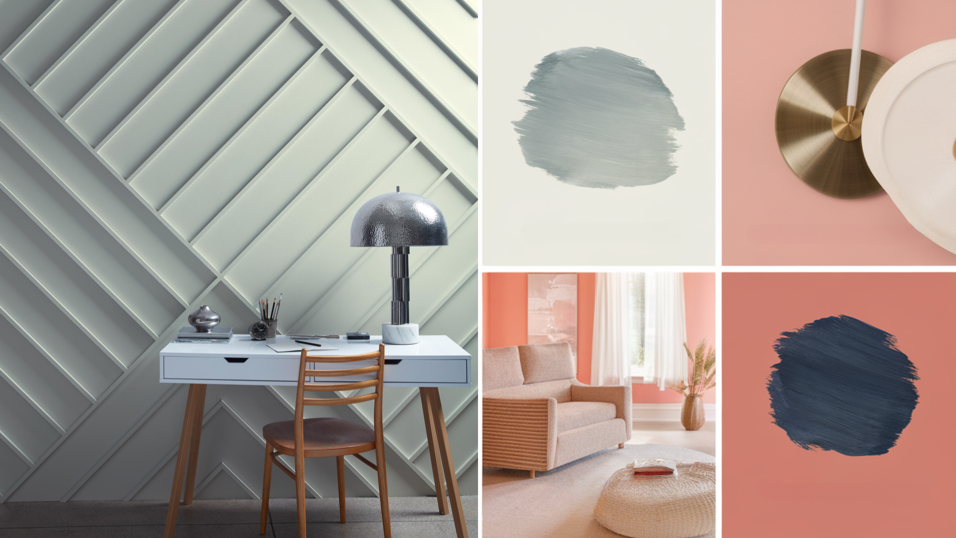
Gray Wisp’s soft blend of blue, green, and gray makes it easy to pair with many colors and finishes. It can go cool or warm depending on what you put next to it.
Neutral Colors
Gray Wisp works beautifully with soft whites, warm beiges, and greige tones. These neutrals keep the look clean and simple. Try creamy whites for trim, or warm tan upholstery for balance.
Warm Accents
To add warmth, pair Gray Wisp with brass, gold, or warm wood tones. Oak, walnut, or bamboo bring a cozy contrast to the cool paint color. You can also add soft blush, peach, or muted terracotta for subtle warmth.
Bold Colors
If you want to add contrast, try pairing Gray Wisp with navy blue, charcoal gray, or deep forest green. These bolder shades stand out against the softness of Gray Wisp while keeping a calm, earthy mood. Use them in small touches like artwork, pillows, or rugs.
What Style Works Best with Benjamin Moore Gray Wisp?
Gray Wisp fits into many different design styles thanks to its calm and soft nature. It can look coastal, modern, or traditional depending on how you style the room.
In modern homes, it adds lightness and a hint of color to clean lines and simple furniture. It pairs well with white walls, black accents, and light wood.
In farmhouse or cottage-style spaces, it adds charm and softness. Use it with vintage pieces, warm wood, and cozy fabrics like cotton or linen.
In coastal spaces, Gray Wisp shines. Its blue-green tones feel like the sky or sea and work perfectly with driftwood, woven textures, and breezy curtains.
It also works well in transitional homes that blend modern and classic pieces. It’s soft enough to flow from room to room without clashing.
Is Benjamin Moore Gray Wisp a Warm or Cool Color?

Benjamin Moore Gray Wisp is a cool color with hints of blue and green. While it has a little softness from the green, it mostly leans cool and fresh. That coolness makes it feel calm, peaceful, and airy.
Because of its cool undertones, it works best in rooms where you want to feel relaxed. It can help make warm spaces feel more balanced or give a fresh feel to rooms with lots of natural light.
Even though it’s cool, it’s not sharp or icy. Its muted tone keeps it soft and welcoming.
Color Characteristics Table
| Color Name | Gray Wisp |
|---|---|
| Hex Code | #CBD2CD |
| RGB | 203, 210, 205 |
| Undertones | Blue, Green, Gray |
| Mood/Effect | Soft, Calm, Airy |
| Best Rooms | Bedrooms, Bathrooms, Kitchens, Living Rooms |
| Style Compatibility | Modern, Coastal, Farmhouse, Transitional |
| Light Reflectance Value (LRV) | 54.43% |
How to Test This Color in Your Space Before Painting
Before painting a full room, it’s smart to test Gray Wisp on your walls. Lighting, flooring, and decor can all affect how the color looks.
1. Buy a Sample: Get a sample from your local Benjamin Moore store or order online.
2. Paint Large Swatches: Try it on more than one wall, especially where light hits differently.
3. Check Throughout the Day: Look at the color in morning and evening light to see how it shifts.
4. Compare With Furniture: Place rugs, pillows, or furniture nearby to make sure it all works together.
What Paint Finish Works Best for Gray Wisp?
Choosing the right finish helps the color shine and hold up well.
1. Matte or Flat Finish: Good for bedrooms or ceilings. Gives a soft look with no shine.
2. Eggshell or Satin Finish: Ideal for living rooms, kitchens, and bathrooms. These are easy to clean and offer a light sheen.
3. Semi-Gloss or Gloss Finish: Best for trim, cabinets, or doors. These finishes reflect light and are durable for high-use spots.
Pick a finish based on the room and how much traffic or cleaning it needs.
Common Mistakes to Avoid with Gray Wisp
Gray Wisp is a flexible color, but there are a few things to avoid:
-
Skipping the Sample: Always test first. The color can look more blue or more green depending on the lighting.
-
Using Cool White Trim: Cool whites may clash with Gray Wisp’s softness. Stick to warm or neutral whites.
-
Not Adding Texture: This light color needs layers—add texture with fabrics, wood, or natural materials to keep the room feeling cozy.
Why People Love Benjamin Moore Gray Wisp
People choose Gray Wisp again and again because:
-
It’s light and airy: Great for small or dim spaces.
-
It has a soft color: Just enough hue without going bold.
-
It’s easy to match: Works with warm or cool accents.
-
It feels peaceful: Ideal for bedrooms, baths, and cozy spots.
It’s a soft, stylish shade that feels good to live with.
Is Gray Wisp the Right Paint Color for Your Home?
Benjamin Moore Gray Wisp (1570) is a soft and peaceful paint color that brings a calm feel to any space.
It has a gentle mix of blue, green, and gray that makes rooms feel light, clean, and fresh.
Gray Wisp is easy to match with many styles. You can pair it with warm woods, soft whites, and even bold accents like navy or gold.
It also works well with natural textures like linen, rattan, and cotton. The soft tone makes the room feel comfortable without being plain.
If you want a light paint color that still adds personality, Gray Wisp is a great choice. It’s simple, pretty, and very flexible.
Try a sample in your space and see how this soft color can bring calm and beauty to your home.