 Is a Top Paint Pick?")
Benjamin Moore Barberry (1244) is a warm, earthy red that feels cozy and full of life. It’s bold but not too bright, making it a great color for many rooms in the home.
I like how it brings warmth and charm without feeling too loud or overwhelming. It has just the right mix of red and brown to feel rich and grounded.
This color works well with different styles and materials, like wood, metal, and soft fabrics. It looks great in living rooms, bedrooms, dining rooms, and even entryways.
In this blog, I’ll share why I think Barberry is such a great paint choice. I’ll go over where it works best, what it pairs with, and how to use it in your space.
If you’re looking for a color that’s both warm and stylish, Barberry might be just what you need. Let’s take a closer look.
What Kind of Color Is Benjamin Moore Barberry (1244)?
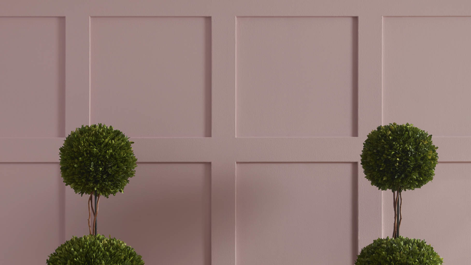
Benjamin Moore Barberry is a deep, warm red with earthy brown undertones. It’s bold without being too loud.
The color feels grounded and rich, like a fall leaf or soft red clay. It brings warmth and personality into a room while still feeling elegant and cozy.
Barberry is a medium-to-dark color, best used in rooms where you want to make a statement or create a warm, inviting feel. It pairs well with natural materials like wood, leather, and stone.
With an LRV of 27.66%, Barberry absorbs more light than it reflects. This gives the color a deeper, cozier feel. It’s great for adding warmth and richness, especially in rooms where you want a soft, welcoming mood.
Barberry’s warm and earthy tones make it a perfect choice for creating cozy, creative, and stylish spaces.
Barberry: A Versatile Color for Any Room
Benjamin Moore Barberry can be used in many parts of the home. Even though it’s a bold color, it still works well across different rooms and styles.
Living Room
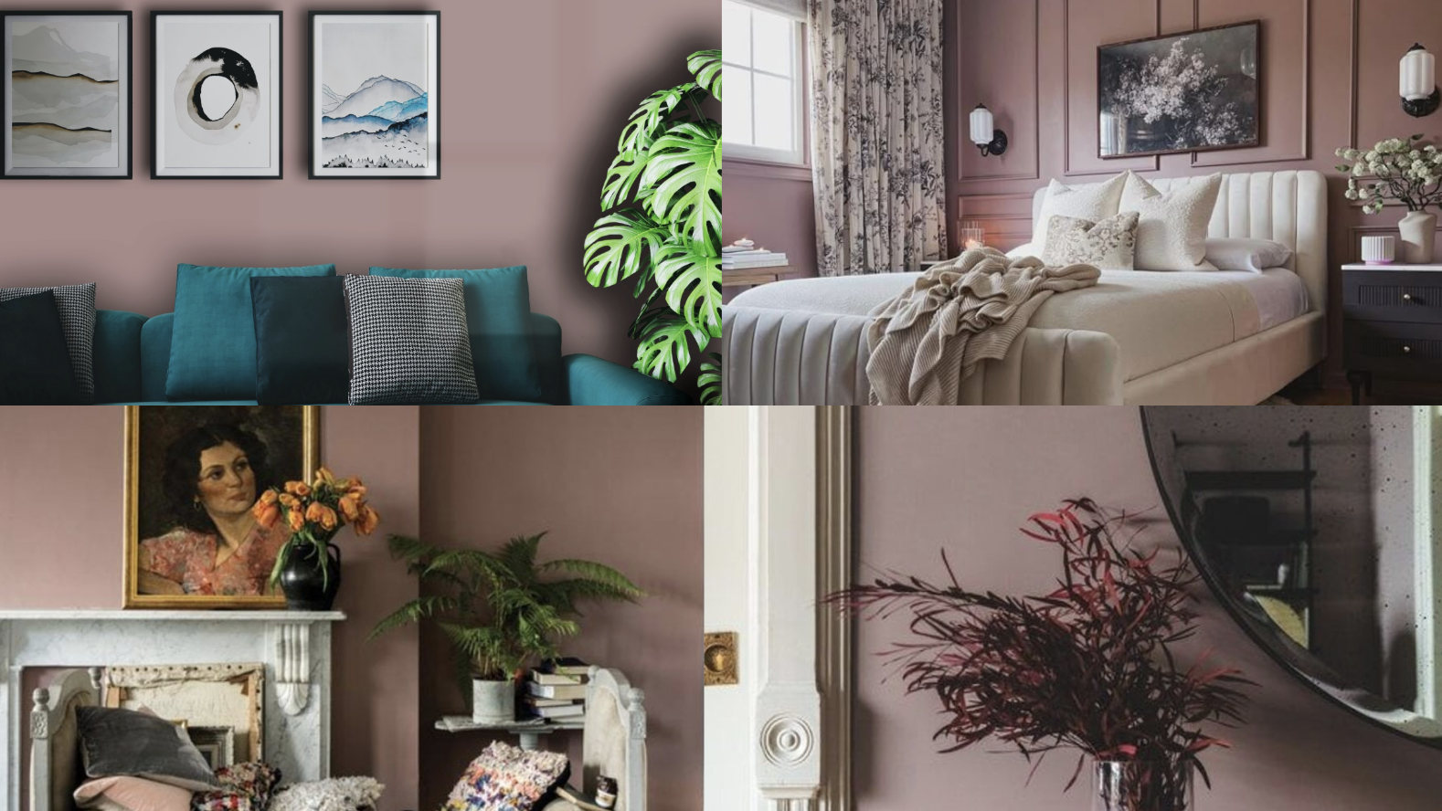
Barberry adds depth and warmth to a living room. It’s great for creating a cozy and welcoming space. You can use it on all four walls for a bold look or just on an accent wall.
Pair it with warm woods, neutral sofas, and soft lighting for a comfy, stylish vibe. Add a few textured throws or cushions to complete the inviting atmosphere.
Bedroom
In my bedroom, Barberry has created a restful and warm feeling. It makes the space feel snug, especially when paired with soft textures and neutral bedding.
It’s a great option for adding color without being too bright or flashy. The cozy hue wraps the room in comfort, turning it into a perfect retreat at the end of the day.
Kitchen
Barberry works surprisingly well in kitchens. Use it on lower cabinets, a feature wall, or even just the pantry door. It pairs nicely with cream, beige, and warm metal finishes like brass or copper.
Its earthy undertone adds depth and a sense of richness to modern or farmhouse-style spaces.
Dining Room
This is one of the best rooms for Barberry. Its deep, warm tone sets the perfect mood for dinner with family or guests. It brings elegance and charm, especially when paired with dim lighting and classic furniture
The color helps create an inviting space that encourages long, relaxed meals and conversation.
How to Use Barberry in Small Spaces
Even though Barberry is a deeper shade, it can still be used in small spaces with the right approach. It’s all about balance.
1. Accent Walls: Try using Barberry on just one wall. This creates a bold look without overwhelming the space. It adds interest and color while keeping things cozy.
2. Hallways and Entryways: Barberry can make narrow or small spaces feel warm and personal. It gives character to spaces that often get overlooked. Pair it with light trim and warm lighting for the best effect.
How to Pair Barberry with Other Colors
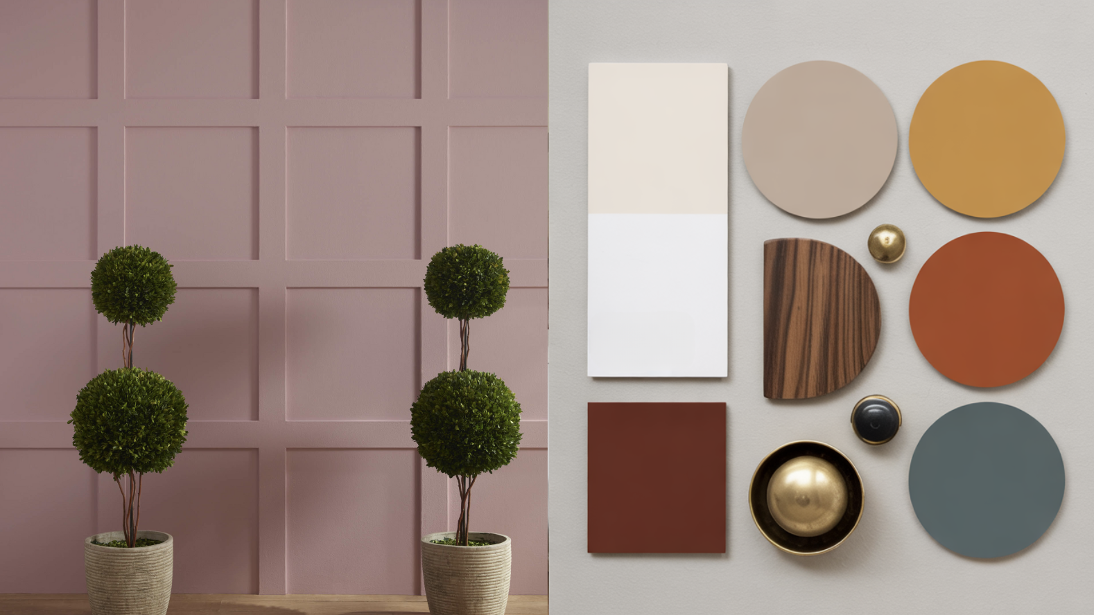
Barberry is a warm red with brown undertones, which makes it both bold and earthy. It pairs well with many colors, from soft neutrals to bold accents. Choosing the right colors to go with Barberry helps it feel balanced, stylish, and welcoming.
Neutral Colors
Pairing Barberry with neutrals is one of the easiest ways to let the color shine. Soft whites, warm creams, beiges, and light grays all help tone down the boldness while keeping the space light and airy.
These colors also create a clean backdrop, letting Barberry take center stage without feeling too heavy. Use neutral trim, furniture, or rugs to create balance in the room.
Warm Accents
Barberry looks beautiful with other warm tones like terracotta, mustard yellow, rust, and golden browns. These colors bring out its earthy side and make a space feel rich and layered.
You can use warm-toned throw pillows, blankets, artwork, or wooden furniture to add depth and texture.
Cool Contrast
Adding cool tones can help balance Barberry’s warmth. Soft blues, sage green, dusty teal, or cool grays can create a calming contrast.
These cooler shades work great in accessories like vases, wall art, or nearby rooms for flow. They help make the space feel more relaxed and less intense.
Black and Metallics
Barberry also pairs well with black, gold, brass, or copper accents. Black adds drama and makes Barberry feel more modern, while gold and brass bring warmth and a bit of shine.
Try using metal light fixtures, curtain rods, or picture frames to pull the look together.
Wood Tones
Natural wood looks amazing with Barberry. Lighter woods like oak or pine keep things airy, while darker woods like walnut or cherry bring richness.
Wood floors, furniture, or shelving add texture and warmth, making Barberry feel right at home.
What Style Works Well With This Color?
Barberry fits well into a variety of home styles. It’s warm and welcoming but also bold enough to stand out.
In traditional homes, Barberry adds elegance and charm. It works beautifully with classic wood furniture, antiques, and rich fabrics.
In boho or eclectic styles, it adds depth and a pop of personality. It mixes well with patterns, textures, and lots of plants.
In modern spaces, Barberry brings warmth and color to sleek lines and simple designs. It looks great paired with black, white, and gold.
In rustic or farmhouse homes, Barberry works well with raw wood, vintage decor, and cozy fabrics. It makes any room feel like a comfy retreat.
Is Barberry a Warm or Cool Color?

Benjamin Moore Barberry is a warm color. It has strong red tones with hints of brown, which gives it a cozy, earthy feel.
When you look at Barberry, it feels like the color of autumn leaves, rich clay, or a warm sunset. These warm undertones help make any room feel welcoming and comfortable.
Warm colors like Barberry are great for spaces where you want to feel relaxed, connected, or even a little energized. It’s a good choice for rooms where people gather, like the living room or dining room.
Because it’s a deeper, warm shade, Barberry works well in cooler seasons, too. It can help make a room feel snug in winter and cozy in fall, but it’s still fresh and bold all year long.
If you want a color that adds warmth and personality, Barberry is a great option.
Color Characteristics Table
| Color Name | Barberry |
|---|---|
| Hex Code | #A85F56 |
| RGB | 168, 95, 86 |
| Undertones | Red and Brown |
| Mood/Effect | Warm, Cozy, Inviting |
| Best Rooms | Bedrooms, Dining Rooms, Living Rooms, Entryways |
| Style Compatibility | Traditional, Boho, Modern, Rustic |
| Light Reflectance Value (LRV) | 27.66%, |
How to Test This Color in Your Space?
Before painting a full room, test Barberry to make sure it fits your space.
1. Get a Sample: Buy a sample pot from Benjamin Moore or your local store.
2. Paint Large Swatches: Try it on different walls, near windows, and in corners.
3. Check Lighting: Look at the swatches during the day and at night. The color may look warmer or darker depending on the light.
4. Compare with Decor: See how it looks with your floors, furniture, and trim colors.
What Paint Finish Should You Choose?
Picking the right finish helps Barberry look its best.
Matte or Flat Finish: Best for bedrooms and low-traffic spaces. It gives a soft, smooth look and hides small wall flaws.
Eggshell or Satin Finish: Good for living rooms and dining rooms. It has a slight shine and is easier to clean.
Semi-Gloss or Gloss Finish: Great for trim, doors, and kitchen cabinets. These finishes are shiny, durable, and easy to wipe down.
Common Mistakes to Avoid
Even with a beautiful color like Barberry, a few simple mistakes can change the final look:
1. Using It in a Dark Room Without Balance: Barberry can feel heavy in spaces with little light. Use lighter trim or accents to brighten things up.
2. Overusing it: This is a bold color. Using it on every wall can make the room feel too small or intense. Stick to feature walls if unsure.
3. Ignoring Other Elements: Check how it works with your furniture, flooring, and light fixtures. Make sure it fits your style and not just the paint chip.
Why Do People Like Benjamin Moore Barberry?
People love Barberry for its rich warmth and bold charm. It stands out without shouting. It’s colorful but still classy. Here’s why it’s a favorite:
- It Feels Cozy: Barberry creates a warm, snug space.
- It Adds Style: The color looks high-end and timeless.
- It Works in Many Rooms: You can use it in bedrooms, dining rooms, and beyond.
- It’s Easy to Pair: Barberry goes well with wood, neutrals, metals, and more.
Is Benjamin Moore Barberry Right For Your Home?
Benjamin Moore Barberry (1244) is a warm and rich color that adds life to any space. It’s bold but not too bright, making it easy to enjoy every day. The red and brown tones make a room feel cozy, grounded, and full of character.
This color pairs beautifully with soft neutrals, warm woods, gold accents, and even cooler tones for contrast. It’s flexible and easy to match with your current decor.
If your space feels plain or needs warmth, Barberry can really make a difference.
It’s strong but soft, warm but stylish. That’s what makes Barberry special. I recommend trying a sample on your wall, see how it looks in your light, and you may find it’s the perfect color to bring warmth and style to your home.