")
I’ve been living with Benjamin Moore’s Kensington Green on my walls for about a year now, and I’m excited to share what I’ve learned about this rich, calming color. This green shade has changed my home in unexpected ways.
In this blog, you’ll learn:
- What Kensington Green actually looks like in real homes
- Which rooms work best with this color
- Colors that pair perfectly with it
- How to test it properly before buying
I’ve used this paint in several rooms with different light exposures and noticed how it shifts throughout the day. I’ve made the mistakes, so you don’t have to.
Let’s see if this rich, calming green is the perfect choice for your home.
What Kind of Color Is Kensington Green?
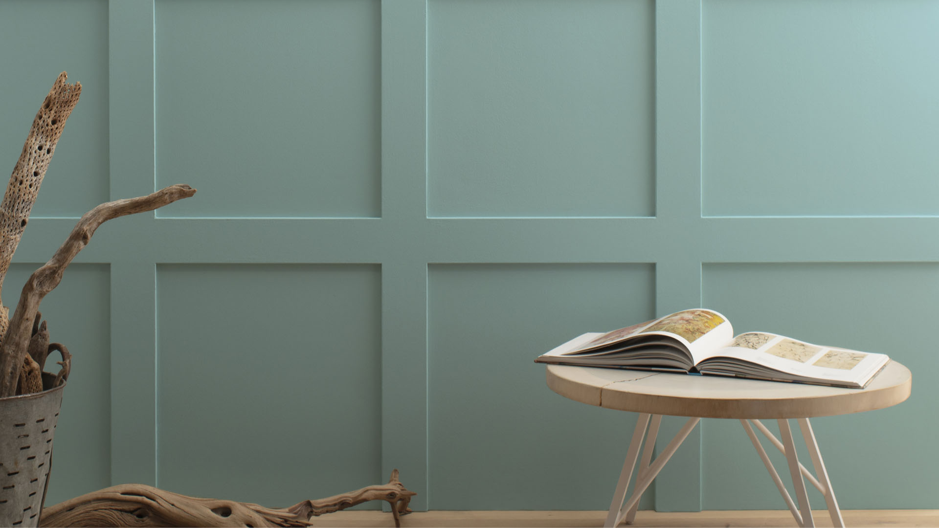
When I first painted a test patch of Kensington Green (Benjamin Moore 710) on my wall, I was immediately struck by its complexity. This isn’t just a green—it’s a sophisticated color that shifts throughout the day.
At its core, Kensington Green is a medium-depth green with noticeable blue influences and gray undertones that give it remarkable depth. In my experience, it reads as a cool, composed color that brings a sense of calm to any space it touches.
What fascinates me about this color is its changeability. In my morning light, it appears as a clear, crisp green with plenty of life. By midday, the gray notes become more prominent, giving it a soft, muted quality. Come evening with lamp light, it transforms again, deepening and becoming more mysterious.
Technically speaking, Kensington Green has an LRV (Light Reflectance Value) of 45.02. In practical terms, this middle-range value means the color isn’t so dark that it absorbs all light, making a room feel small, nor is it so light that it lacks character. It hits a sweet spot that adds richness while keeping spaces feeling open.
In my rooms, I’ve noticed Kensington Green creates a strong connection to natural elements without being obvious about it. It subtly brings the feeling of outdoors inside—like the understated green of sage plants or the soft color of eucalyptus leaves—but in a refined way that works in modern homes.
What Rooms Work Best with Kensington Green?
I’ve found that Kensington Green works wonderfully in spaces where you want a rich, natural look that will last for years to come. Based on my experience, here are the spaces where Kensington Green performs best:
Living Rooms
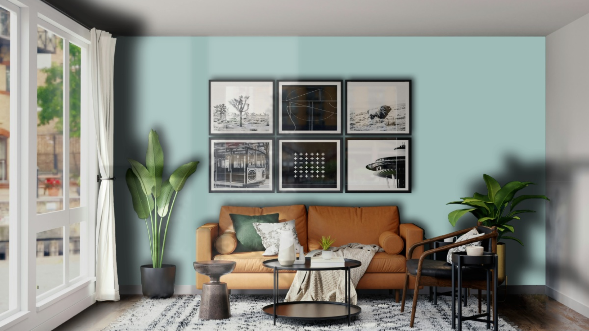
This color makes living spaces feel rich and welcoming. It creates a cozy background that allows furniture and art to stand out nicely. In my living room, Kensington Green walls make the space feel solid while highlighting my cream sofa and brass accent pieces.
The color works especially well in spaces that need to feel warm without being too dark. When paired with good lighting, it creates a room that feels both natural and comforting.
Dining Rooms
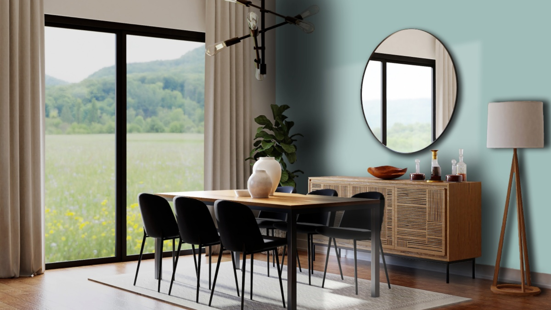
Kensington Green can transform dining rooms into elegant, luxurious spaces perfect for gatherings. I used it in my dining room, where it created a warm atmosphere for meals and conversations. The green tones help create a pleasant feeling while still being more interesting than plain neutrals.
What surprised me is how well it works with different wood tones. My oak dining table looks sharp against the Kensington Green walls, while crystal light fixtures bring sparkle that balances the richness of the walls. The room feels special yet comfortable.
Libraries and Studies
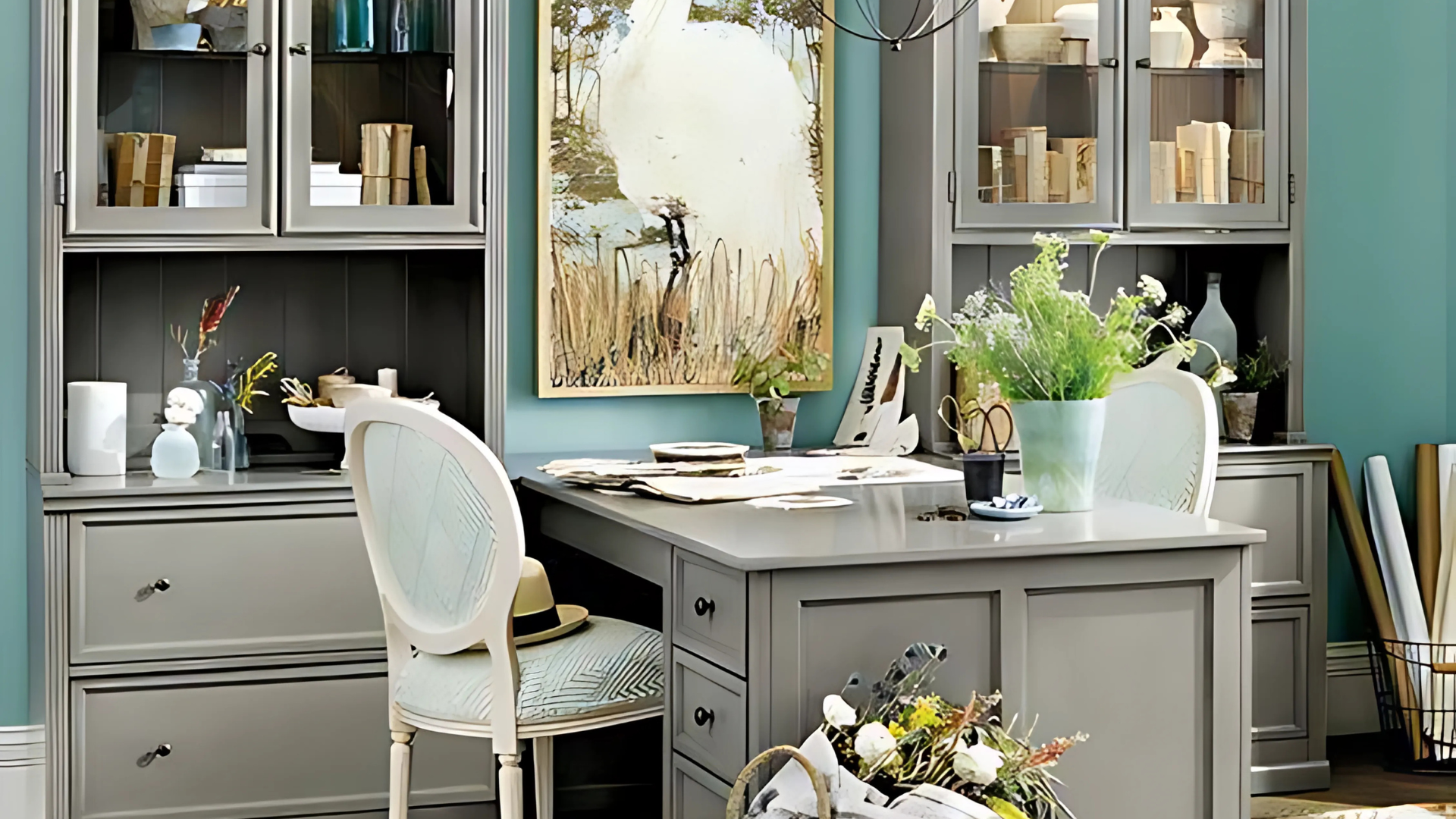
Kensington Green helps create a sense of focus and depth in reading areas. The balanced green feels classic yet comfortable during long reading hours. I painted my small home library in this shade and find it creates the perfect background for my books while keeping me relaxed and focused.
Kensington Green is particularly suitable for spaces that require a traditional yet comfortable atmosphere. The color appears to add depth while aiding concentration. I’ve noticed I feel more at ease reading in my Kensington Green study compared to my previous, plain beige workspace.
Bedrooms
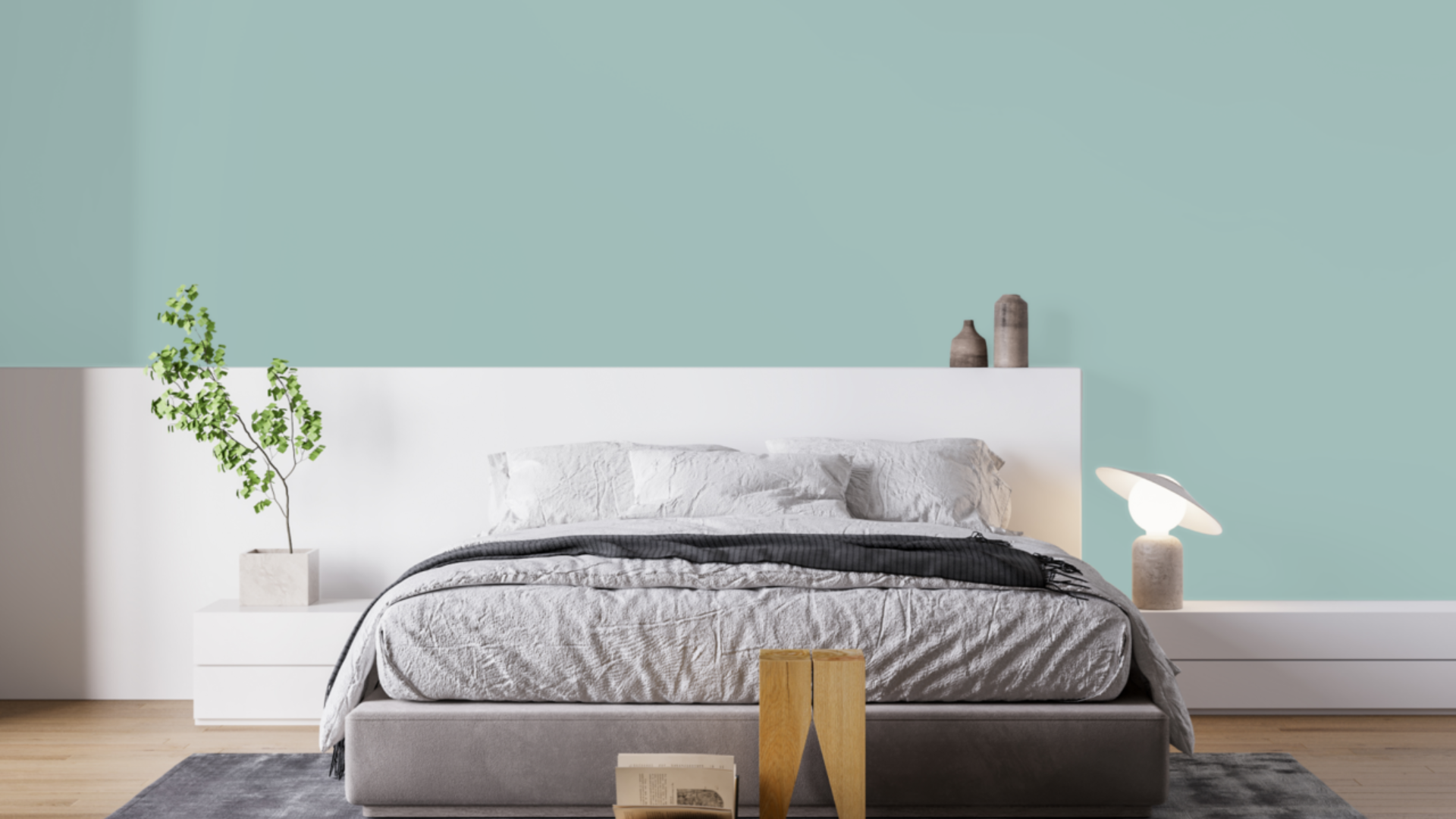
This balanced green can add a touch of nature-inspired serenity to these personal spaces. I painted my main bedroom Kensington Green, and it feels both rich and cozy. It works well for a space that needs to feel warm yet not overwhelming.
The color pairs beautifully with white bedding and gold or brass fixtures. It adds just the right amount of color without being too overpowering, making it a smart choice for a room that needs to encourage relaxation and comfort.
Kitchen Cabinets
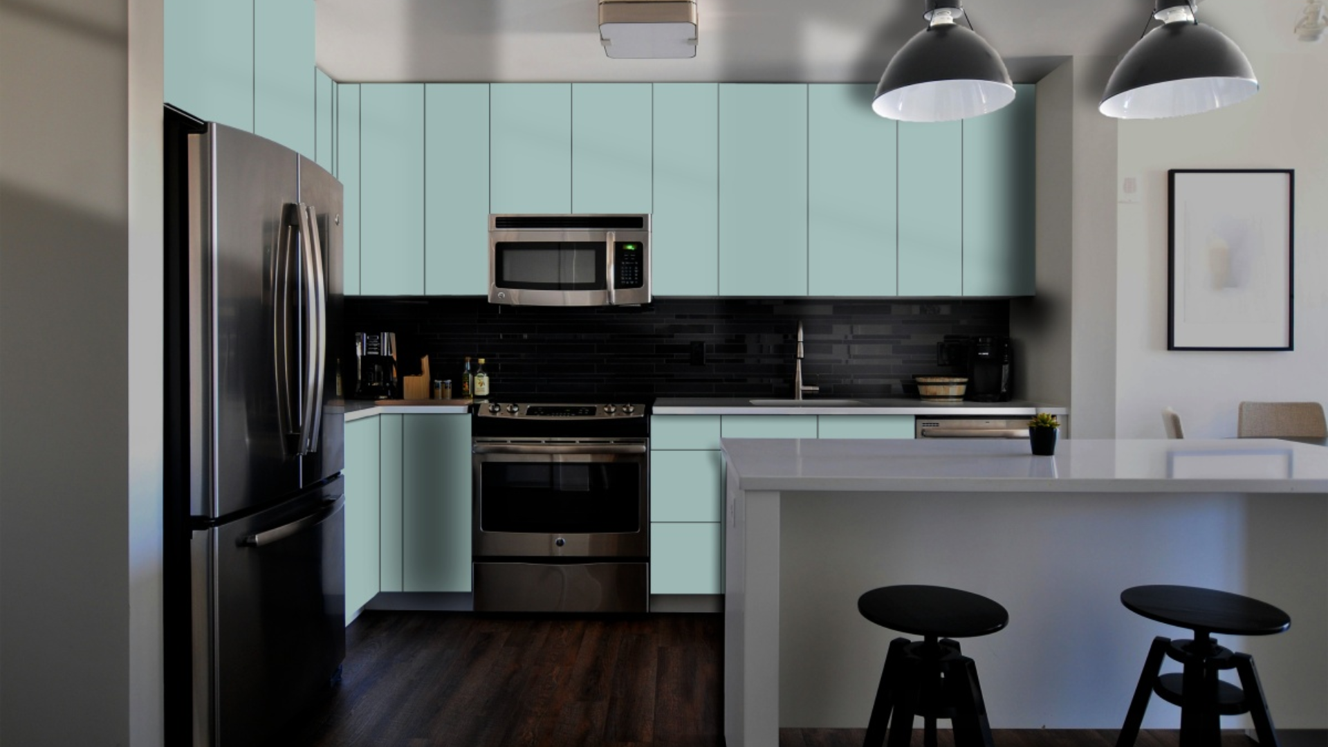
Kensington Green brings a rich yet sophisticated feel to kitchen spaces. I used it on my kitchen island, creating a focal point that anchors the room without overwhelming it. The green tone feels natural and fresh, perfect for a food preparation area.
What works especially well is how Kensington Green complements both light and dark countertops. With my white marble counters, the green creates a crisp, fresh contrast.
My neighbor used it with dark granite, and it added cohesion while still maintaining a natural feel. The color also pairs beautifully with brass hardware, creating a balanced, classic look that doesn’t feel too trendy.
What Colors Complement Kensington Green?
- Crisp whites: They create a fresh contrast that feels clean and timeless
- Soft creams: Offer a subtle contrast that feels cohesive and calming
- Medium to dark wood tones: Add organic texture and complementary warmth
- Navy blue accents: Create a deeper tone that enhances the blue undertones
- Gold and brass accents: Add a touch of warmth that balances the cool undertones
For my dining room, I combined Kensington Green walls with white trim and brass lighting fixtures. The combination feels both rich and balanced.
What Style Works Well with This Color?
Kensington Green accommodates various design styles. In traditional homes, it brings a classic element that feels timeless without being boring. For nature-inspired spaces, it creates the perfect background for plant-focused pieces. In library settings, it offers a rich quality that feels appropriate and grounded.
Most impressively, Kensington Green complements homes that mix different styles by adding a calm presence to spaces that combine various elements.
My own home mixes contemporary items with more traditional ones, and this color creates the perfect background for both. This flexibility makes it a smart choice if you like to change your decor or mix elements from different styles.
Is It a Warm or Cool Color?

Kensington Green is a cool color with complex undertones. The green base lends it a natural, rich feel, while the slight blue elements add sophistication.
I’d describe it as “softly cool” – the kind that makes a room feel grounded rather than cold or clinical. The gray aspects keep it from feeling too vivid. This balance makes it work well year-round in most homes.
When used well, it doesn’t feel too cold despite its cool base. The depth keeps it livable for everyday spaces. In rooms with ample natural light, the balance helps it reveal its true character throughout the day.
If you’re worried that a space feels too cool, I’ve found that adding warmer elements, such as wood tones, fabric textures, or brass fixtures, creates the perfect balance. In my dining room, the Kensington Green walls look beautiful with my oak table and brass chandelier.
Color Characteristics Table
| Characteristic | Kensington Green | What This Means For Your Space |
|---|---|---|
| Temperature | Cool | Creates a natural, grounded atmosphere |
| Undertones | Green with slight blue notes | Adds depth and sophistication |
| Light Reflectance Value | 45.02 | Balances light absorption and reflection to keep spaces bright yet grounded |
| Seasonal Feel | Year-round | Works well in both summer and winter settings |
| North vs. South Rooms | Adaptable | Appears richer in south-facing rooms, deeper in north-facing rooms |
How to Test This Color in Your Space?
- Buy a sample: Get a small container of Kensington Green
- Paint a board: Use a 2×2-foot piece of white poster board
- Move it around: See how it looks in different locations at different times of day
- Live with it for 3 days: Your first impression might change
When I tested Kensington Green, I was surprised by the significant changes it underwent from morning to evening. In my north-facing bedroom, it seemed deeper and more mysterious. In my south-facing dining room, it showed more of its green aspects throughout the day.
What Paint Finish Should You Choose?
- Flat: Good for ceilings and walls with texture issues
- Matte: My top choice for most walls – the color looks soft without glare
- Eggshell: This works in kitchens and bathrooms, where you need to clean walls
- Satin: Adds a slight sheen, could make the color look slightly brighter
- Semi-gloss: Too shiny for Kensington Green walls, but works for trim and doors
I used a matte finish in my bedroom and an eggshell finish in my kitchen island. The eggshell finish makes cleaning easier without adding too much shine that would alter the color’s appearance.
Real Home Ideas Using Kensington Green
- Accent wall: Kensington Green on one wall creates a focal point that makes a room feel more grounded
- With white trim: Used with white trim colors for a crisp contrast
- Cabinets: Kitchen island or bathroom vanity in this shade creates a custom look
- Furniture: A bookcase or dresser painted this shade adds a rich touch
- Exterior: Works beautifully as an accent color for doors or shutters
My friend painted just one wall in her office, Kensington Green, with white trim, creating a balanced look that feels both natural and grounded. It looks amazing and has inspired me to think about using it in more areas of my home.
Mistakes to Avoid
- Skipping the second coat – I learned this the hard way in my dining room. Kensington Green needs two full coats to show its true depth and color. A single coat can appear patchy and won’t provide the rich finish this color is known for.
- Pairing with orange-toned woods – I tried placing my cherry side table against my Kensington Green wall, and the clash was immediate. This green works much better with cooler-toned woods, such as walnut or oak. The orange undertones in cherry created an odd tension that never felt right.
- Using glossy finishes – When I painted my bathroom door in semi-gloss Kensington Green, it stood out completely against the matte walls. The shine brought out undertones that made it look almost like a different color. Stick with matte or eggshell finishes for this particular green.
- Ignoring the room’s natural light direction – In my west-facing office, Kensington Green looked perfect. When I tried the same color in my east-facing guest room, it appeared much cooler and less inviting. The direction of natural light significantly affects how this color appears.
- Choosing bright white fabrics – I bought pure white curtains for my Kensington Green bedroom and found they created too harsh a contrast. Soft cream or natural linen curtains create a much more cohesive look with this green. The slightly softened whites help the green feel more integrated into the space.
Why Do People Like Kensington Green?
Kensington Green has become popular among many homeowners, and I understand why. Its balanced quality creates spaces with depth while still feeling very livable. People like it because it’s not a basic green—it has personality without being hard to use.
The color creates rich spaces that still feel cozy and inviting. It works with many decorating styles and doesn’t date quickly, unlike more trendy colors. Whether in natural or artificial light, it shifts throughout the day, keeping spaces interesting.
Is Kensington Green Right For Your Home?
After a year with Kensington Green in my home, I can say it’s been one of my best paint choices. What began in my study has spread to several rooms, creating a wonderful atmosphere.
This color doesn’t demand attention—it forms a rich background that enhances everything else. My artwork stands out more, wooden furniture looks warmer, and rooms feel more complete than they did with my previous neutral walls.
The biggest surprise? How many guests ask about this color? Even friends who prefer white walls have noticed how “right” it feels in my space.
Suppose you want walls with genuine character that still complement almost any style. In that case, Kensington Green offers the perfect balance—enough color to feel intentional but enough softness to feel comfortable every day.
Frequently Asked Questions
How Does Kensington Green Look With White Trim?
I’ve paired it with white trim throughout my home and love the results. The contrast is clean and fresh without being stark. The green’s cool undertones work especially well with pure whites rather than creamy ones. In my living room, the white baseboards and crown molding create a crisp frame that makes the walls stand out beautifully.
Can I Use This Color in Small Spaces?
Absolutely! Its medium LRV (45.02) means it’s neither too dark nor too light. I painted my small home office with Kensington Green and was surprised how it actually made the space feel more defined and purposeful. It reflects just enough light to keep the room feeling open while adding character that plain white walls lack. The depth of color creates a cozy feeling that works wonderfully in smaller rooms.
What Makes It Different From Other Green Paints?
After testing several green paint samples, what stood out about Kensington Green was its balance and complexity. Many greens tend to lean too yellow, making them feel dated, or too blue, making them feel cold. This color strikes the perfect balance with its subtle blue undertones and gray undertones that lend it a sophisticated appeal. I find it has more depth and changes more throughout the day than similar colors I tested.
How Easy Is It to Keep Clean?
This has been a practical benefit I didn’t expect! The medium depth of Kensington Green hides small marks and smudges much better than the lighter colors I’ve used before. In busy areas like my hallway, it stays looking fresh longer between cleanings. With the eggshell finish in my kitchen, I can wipe the walls easily without affecting the color’s appearance.
Does It Work Well With Other Colors in Connected Spaces?
I’ve found it surprisingly adaptable in my open-concept home. In my main living area, I used Kensington Green on the dining room walls, which connects to a living room painted in a soft greige. The transition feels natural and intentional. The green adds interest without clashing with other colors. For best results in connected spaces, I recommend using it as a feature color in one area while keeping connected spaces in complementary neutrals.