")
Are you looking for a paint color that feels calm but still warm? Benjamin Moore’s Jute might be just what you need.
It’s a soft, earthy color that feels cozy. It also gives your room some quiet personality. It doesn’t scream for attention, but it also doesn’t fade into the background.
In this short read, I’ll explain why jute is a good choice for your next paint job. I’ll also show you where it works best and how you can match it with other colors and home items.
I’ve worked with paint colors for years. And I’ve learned how much the right one can change a room.
You don’t need a wild color to make a space feel special. Sometimes, a warm neutral like Jute is all it takes. Let’s look at how you can use it in your home.
Why Jute (AF-80) Is the Perfect Choice for Your Space?

Jute is a soft, warm color that works almost anywhere. It’s not just plain beige. It sits somewhere between tan and gray, which makes it feel calm but not boring.
What makes Jute stand out is how it changes with the light. In bright sunlight, it looks lighter and warmer. In darker spaces, it turns a bit deeper and cozier.
Jute fits in with many styles. You can use it in older homes or newer ones. It doesn’t follow short-term fads so that it won’t feel old after a few years. It’s simple and steady—easy to live with.
I’ve seen this color turn cold rooms into warm, homey ones. Its earthy feel makes people want to settle in and relax.
It also plays nicely with other things in the room. It won’t clash with your furniture or art. It looks great with wood and works with both cool and warm colors around it.
Where Is Jute (AF-80) Best Used in an Interior?
Jute’s versatility makes it suitable for many areas in your home. Before looking into specific rooms, it’s worth noting that this color works equally well in open floor plans and smaller, enclosed spaces.
Its neutral quality allows it to flow seamlessly from room to room while creating a cohesive feel throughout your home.
1. Living Room
The living room is where people come together. Jute makes it feel warm and easy to be in. It gives the room a soft, welcoming feel without being too much. Since it’s a neutral color, your furniture and other decorations can shine.
Jute looks great in rooms with lots of sunlight. The light brings out its warm side. At night, it feels cozy and calm. Try it with cream-colored couches or chairs.
This color helps your room feel relaxing without looking dull. That’s why jute works so well in living rooms, where comfort matters most.
2. Bedroom
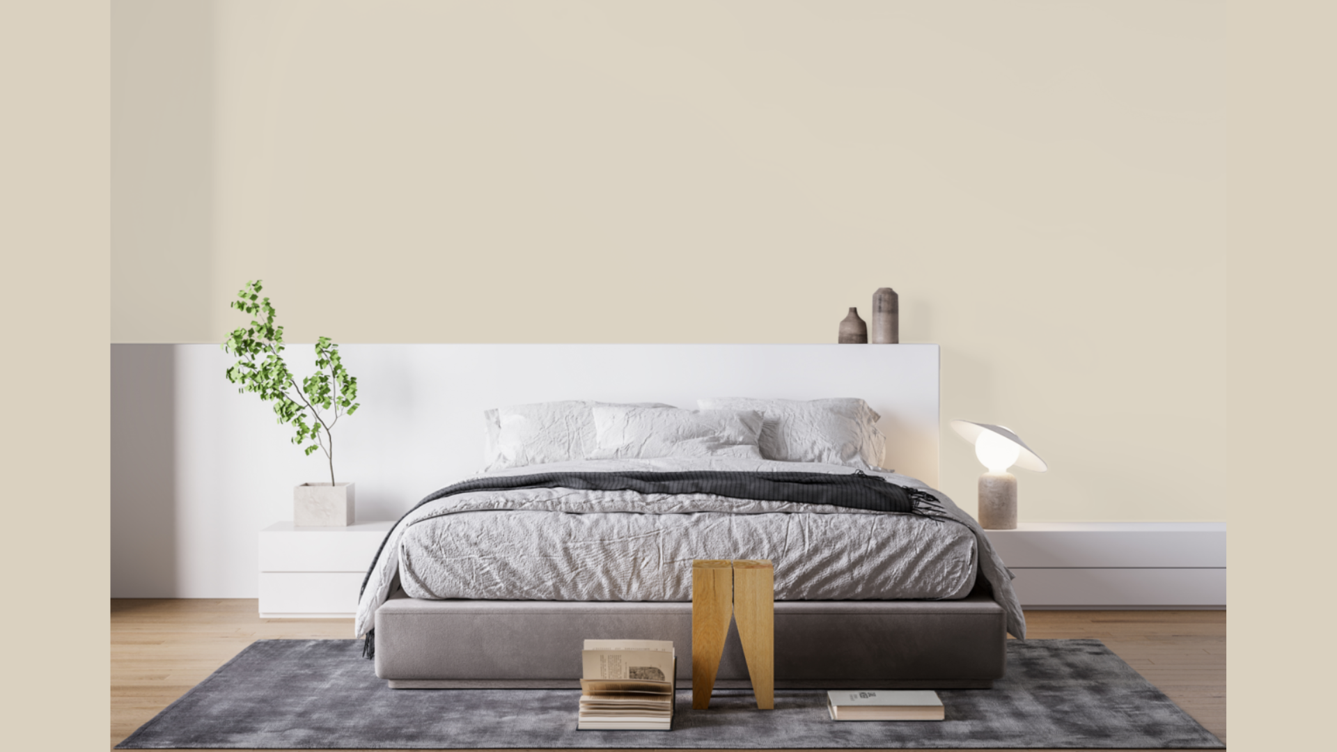
Jute is a great color for bedrooms. It’s calm and gentle, which helps you feel relaxed. It doesn’t grab attention, so your room feels quiet and peaceful, making it easier to wind down and sleep.
Jute has a natural, earthy look that feels grounding. It can be used with soft blankets and pillows. Choose bedding in shades like cream, gray, or light brown. Add soft blues or sage green for a bit of nature in your space.
The bedroom should feel like a break from the world. With jute on the walls, it becomes your cozy spot to rest and reset.
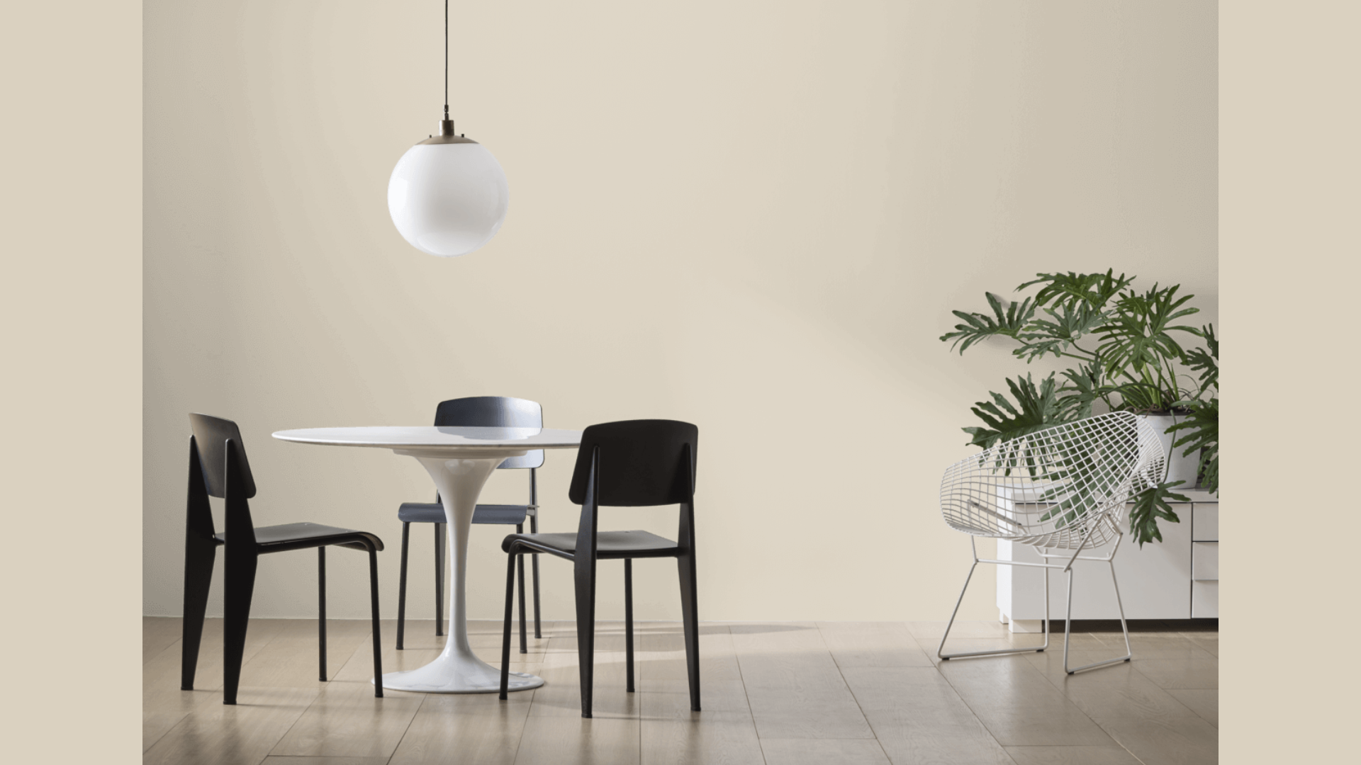
3. Dining Room
Jute makes dining rooms feel both nice and comfortable. It’s fancy enough for guests but still relaxed for everyday meals. The color doesn’t take over the room. Instead, it lets your table and chairs stand out.
If you have artwork or mirrors, jute gives them a soft background. This helps the room feel bigger and more open. It also looks great with lights that have gold or brass parts. That adds just the right bit of warmth.
If you’re having a family dinner or hosting friends, Jute sets the mood. It keeps things simple and cozy while still feeling put-together.
4. Bathroom Walls
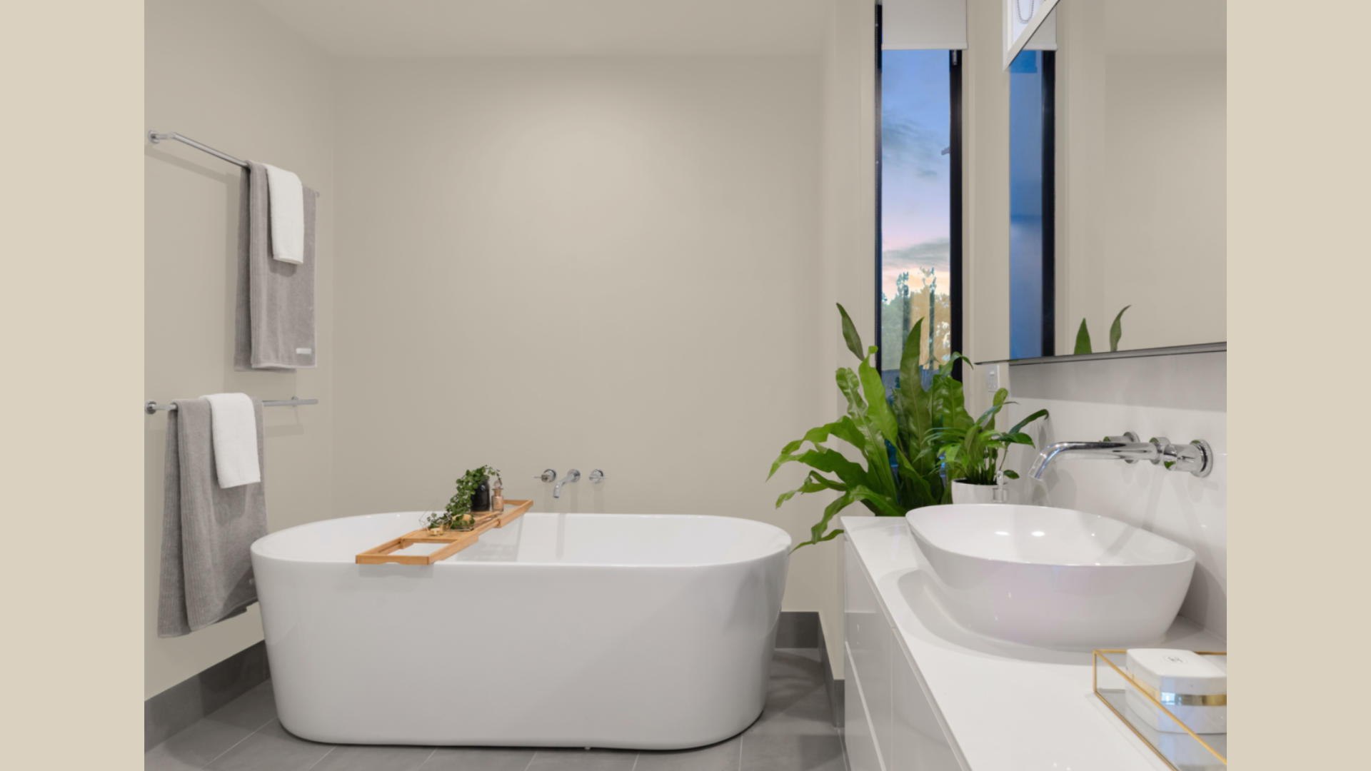
White or gray paint can make bathrooms feel cold. Jute changes that. It brings warmth without being too dark, making the space feel calm, like a little getaway at home.
It’s a good pick for small bathrooms or ones without much light. Jute helps reflect the light that’s there and keeps the room from feeling tight. It also matches well with both white and cream sinks, tubs, and tiles.
You can add wood shelves or green plants for a soft, earthy look. This is a simple way to transform your bathroom into a quiet, relaxing place.
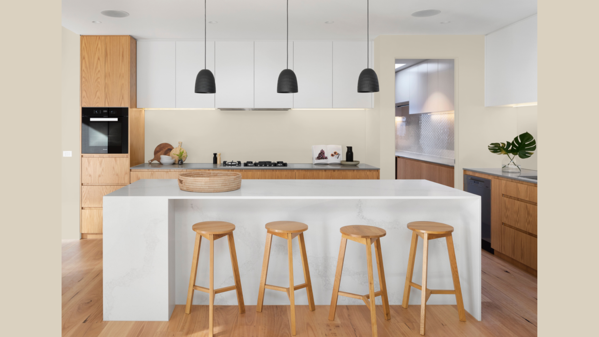
5. Kitchen Cabinets
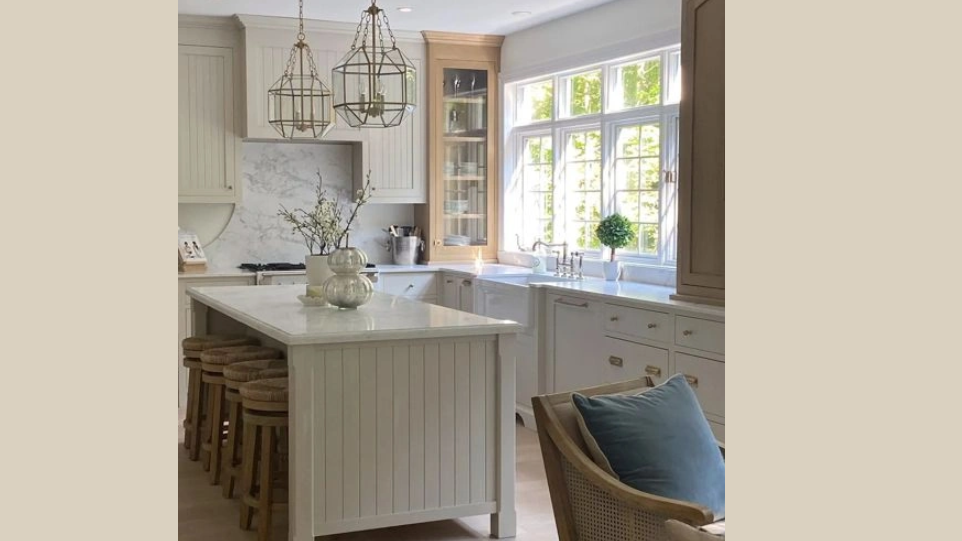
Jute isn’t just for walls. It works great on kitchen cabinets, too. It’s softer than white but still clean-looking. It adds warmth to the kitchen without being too bold.
Jute cabinets go well with many styles of countertops, like stone or wood.
If your kitchen gets lots of sunlight, the color will really shine. It helps the space feel bright and friendly.
Try white walls and backsplash to keep the look fresh. The mix of white and jute feels balanced and homey.
It’s a nice way to update your kitchen while keeping it easy to live with.
The Psychology of Jute
Colors can really change how we feel in a room. Jute gives off a warm, cozy feeling, making spaces feel calm and welcoming.
This color sits right in the middle. It’s not too warm and not too cool, which makes rooms feel steady and peaceful.
The earthy tones also give it a grounded feeling, like you’re connected to something real. It feels stable, not too busy or loud.
Jute also has a quiet kind of depth. It doesn’t stand out too much, but it’s not plain either. The soft changes in tone make it feel more grown-up and settled.
When people walk into a room painted in Jute, they often feel their body relax. The color reminds us of natural things, like sand, stone, or dirt.
That connection to nature helps people feel safe and at ease.
Cool gray paints can sometimes feel too sharp or cold. But jute feels warmer and more lived-in.
It makes the room feel like someone actually spends time there, like home.
How to Incorporate Jute Into Your Home Decor?
Jute isn’t just for walls. It’s a flexible color that works in many parts of your home. Before painting, check how it looks in your space. Jute changes with light.
It feels warmer in sunny rooms. In darker ones, it can look more gray. Try a sample first so there are no surprises.
If you’re using Jute in more than one room, mix in colors like Muslin or Kingsport Gray. This keeps things interesting but still balanced.
Jute also works well with soft blues, muted greens, deep reds, and clean whites. It gives you a lot of options.
Because it’s a smooth color, mix in textures. Use rugs, baskets, wood, or plants to add depth.
Jute makes a great background. It lets your photos, bold fabrics, or special furniture stand out without getting in the way.
Conclusion
Benjamin Moore’s Jute is a soft, warm color that fits well in today’s homes. It has just enough color to feel cozy but not so much that it takes over. It’s a great pick if you want something neutral that still has a little personality.
This color works in almost any room. I’ve seen it look great in living rooms, bedrooms, bathrooms, and even on kitchen cabinets. It’s one of those colors that blends in but still makes the space feel complete.
Jute works with many different styles, too, regardless of whether your home is more modern, classic, or somewhere in between.
Before painting, it’s smart to test a sample on your wall. Jute can look slightly different depending on the lighting in your room and the things around it. A small test patch will help you see how it fits with your furniture, floors, and light.
If you’re looking for a color that feels calm, natural, and easy to live with, Jute is a solid choice. It brings warmth and comfort without being too bold, making any space feel more like home.
Frequently Asked Questions
Is Jute (AF-80) More Beige or Gray?
Jute is a mix of beige and gray, often called “greige.” It leans a bit warmer than gray but doesn’t have the yellow tone that some beige colors do. It sits nicely in the middle, feeling soft and natural.
What Colors Go Well with Jute?
Jute works well with many colors. Soft blues, sage greens, and clean whites all look great next to it. You can also use deeper shades like navy or burgundy. Wood furniture and natural textures make it feel even warmer.
Does Jute Look Different in Various Lighting?
Yes, Jute changes with the light. In bright natural light, it looks warmer and softer. In dim or artificial lighting, it can lean more gray. That’s why it’s important to test a sample in your space before painting.