")
What if the gray you picked looks perfect on the swatch but totally off on your wall?
I’ve been there, and that’s how I found Sherwin-Williams Mindful Gray (SW 7016). I wanted a soft, balanced neutral that didn’t feel too cold or too beige, and after testing a dozen samples, this one just worked.
If you’re hunting for the color code, undertone details, or wondering how it plays in different light, I’ve got you. I’ve used it in real rooms and learned what the brochures don’t tell you.
In this blog, I’ll walk you through exactly what makes Mindful Gray tick, without fluff or confusion.
You’ll leave with a clear idea of whether this color fits your space or not.
Sherwin-Williams Mindful Gray: Color Details

Sherwin-Williams Mindful Gray is a versatile greige that sits right in the middle, not too warm, not too cool.
It’s a medium-light gray with soft beige and subtle blue-green undertones, giving it a steady, grounded look that doesn’t feel cold or harsh.
With an LRV of 48, it reflects a moderate amount of light, making it a solid pick for both bright and low-light spaces.
- HEX: #BCB7AD
- RGB: (188, 183, 173)
- CMYK: 0%, 3%, 8%, 26%
- LRV: 48
You’ll find Mindful Gray in the neutral gray section of the Sherwin-Williams color deck. It’s known for working well in many different rooms and lighting setups.
Mindful Gray works well in both interior and exterior settings. Indoors, it’s a favorite for living rooms, bedrooms, and hallways, anywhere you want a calm, balanced feel without going full-on cool or warm.
It adapts easily to different lighting and styles, acting as a quiet backdrop that lets other colors stand out. Outside, it offers curb appeal and stays consistent in sunlight, thanks to its moderate LRV and steady undertones.
Mindful Gray: Undertones and Lighting Behavior
Sherwin-Williams Mindful Gray is a warm greige with subtle green and occasional purple undertones.
In bright light, it leans warm and soft. In darker rooms, the green comes through more clearly, sometimes with a faint bluish or purplish cast. These shifts help it stay grounded and balanced, never feeling flat or overly beige.
Compared to true grays or warmer greiges, Mindful Gray sits in the middle, calm, adaptable, and full of character.
| Aspect | Mindful Gray (SW 7016) | True Gray | Warm Greige (e.g., SW 7029) |
|---|---|---|---|
| Undertones | Beige with green/purple hints | Cooler, often bluish | Stronger beige, less green |
| Hue | Warm greige | Cool or neutral gray | Warm beige-gray |
| LRV | 48 (moderate) | Varies | Usually higher (50–60+) |
| Light Behavior | Shifts with light and space | More steady, cooler overall | Stays warm and soft |
| Overall Look | Earthy, calm, slightly complex | Clean but can feel stark | Cozy, approachable, soft |
Mindful Gray offers balance, depth, and flexibility that simpler neutrals can’t always match.
Real-Life Applications of Mindful Grey
Mindful Grey is a go-to neutral that adapts well to real homes and real lighting. Its soft tone and subtle undertones make it a practical choice for spaces where comfort and balance matter most.
1. Bedroom
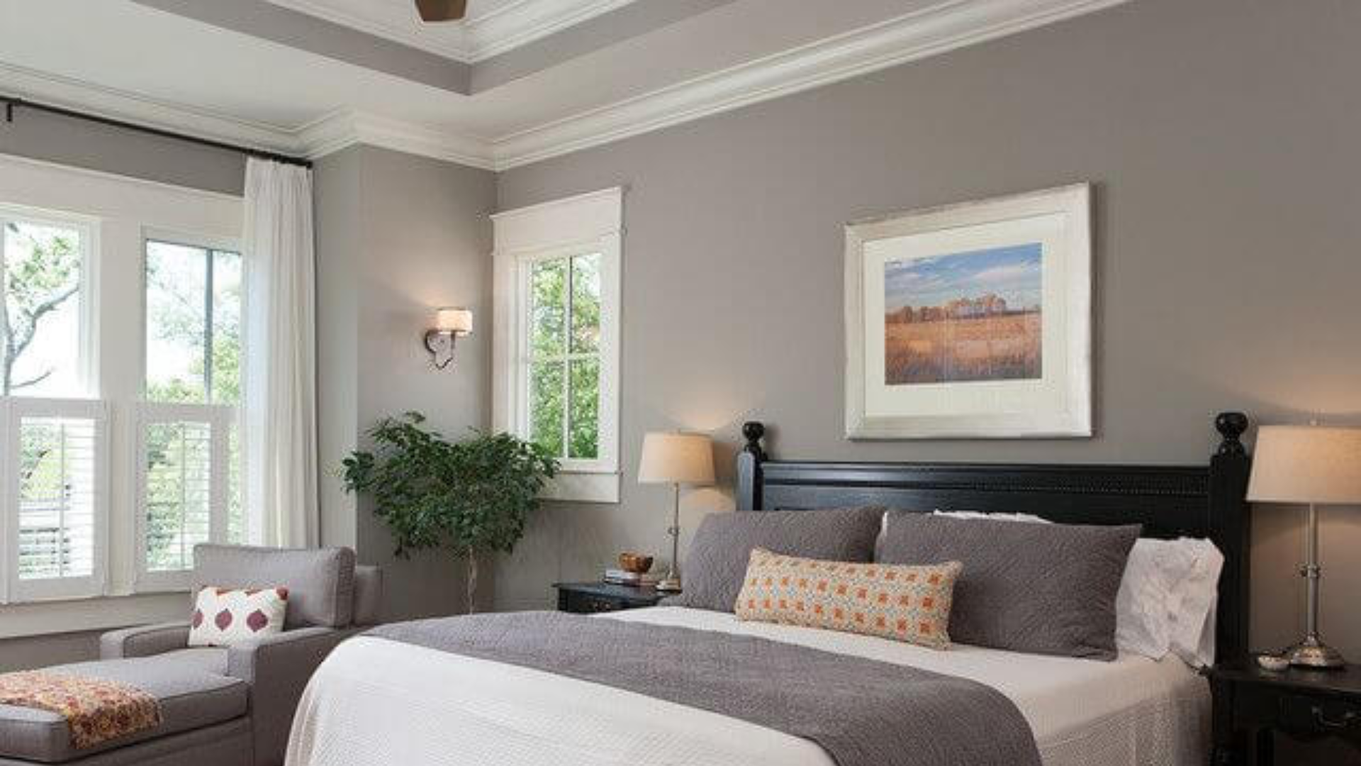
Mindful Gray works beautifully in bedrooms thanks to its calm, grounded tone. It softens the space without making it feel too cool or too warm.
Paired with crisp white trim, soft textures, and natural light, it creates a restful, balanced atmosphere. In the evening, it holds its color well under warm lighting, giving the room a cozy, tucked-in feel.
I’ve used it in a guest room with layered bedding and wood furniture, and it made everything feel relaxed and inviting.
2. Kitchen
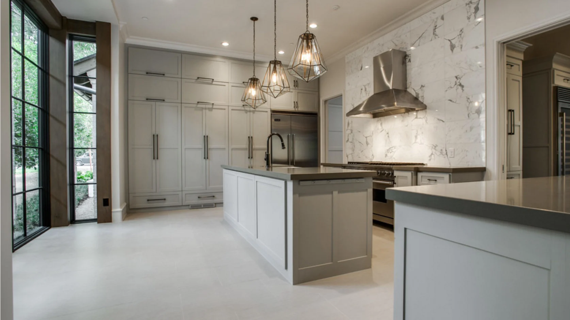
In kitchens, Mindful Gray adds quiet sophistication without overwhelming the space. It pairs well with white or cream cabinets, black hardware, and natural wood accents.
I’ve seen it used on walls behind open shelving and even on lower cabinets; it held up great under both natural and artificial light.
It’s a solid choice if you want something more grounded than stark white but lighter than charcoal. It plays nicely with stainless appliances and gives the kitchen a smooth, modern backdrop.
3. Living Room
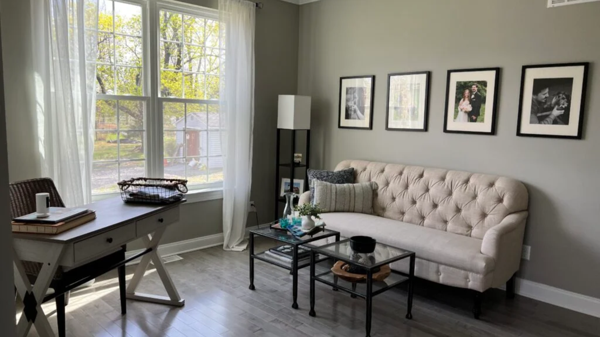
Mindful Grey is a solid choice for living rooms, especially if you want a color that feels warm without leaning too beige.
It sets a calm backdrop for layered decor, think wood tones, soft rugs, and neutral upholstery. I’ve seen it pair beautifully with both modern and classic furniture.
In natural light, it looks soft and welcoming, while in dimmer corners, it stays grounded without turning muddy. It’s versatile enough for open-concept layouts and cozy enough for smaller spaces.
When to Choose Mindful Gray
Mindful Gray is a steady, neutral choice that fits many homes and styles. It’s great for people who want calm, consistency, and flexibility without bold color swings.
- Soft, Authentic Neutral: Ideal if you want a paint color that doesn’t feel icy or beige-heavy. It avoids the strong blue or yellow tones that show up in other grays.
- Rooms with Varied Lighting: A smart pick for spaces that shift throughout the day. In natural or artificial light, it stays balanced without drastic changes.
- Flexible for Decor Changes: Easy to pair with whites, blacks, wood tones, and a variety of colors. Great if you like to change up rugs, pillows, or furniture over time.
- Modern but Timeless Taste: Works with farmhouse, modern, traditional, and transitional styles. It doesn’t chase trends but still feels fresh.
- Not for Bold or Bright Needs: If you want a high-contrast look, a crisp white, or a cooler true gray, this might feel too understated.
Conclusion
If you came here looking for a clear, no-nonsense guide to Sherwin-Williams Mindful Gray, I hope you found exactly what you needed.
I know how frustrating it is to pick a paint color that looks great on a swatch but shifts wildly on your walls. That’s why I broke down the undertones, lighting behavior, and real-life uses, so you can decide if Mindful Gray fits your space.
I’ve seen it work well in bedrooms, kitchens, and living rooms, thanks to its soft, balanced feel. It’s a dependable, grounded neutral that won’t throw you off with weird surprises.
If you need a paint that stays steady across changing light and pairs with nearly everything, Mindful Gray is worth considering.
I hope this helped make your decision easier and saved you from repainting regrets.