")
Dark gray paint can be tricky. Some shades feel too heavy, while others fade once they hit the wall.
Kendall Charcoal (HC-166) sits in a comfortable middle ground, which is why so many people keep coming back to it. It’s a trusted Benjamin Moore color that works in both modern and classic homes.
In this guide, I shared everything you need to know about Kendall Charcoal and why it’s such a popular choice.
I shared how the color looks in real homes, how lighting affects it, and which rooms work best for you.
You’ll also find details on undertones, finishes, and color pairings that work well with it. I’ll compare it to similar shades and share the pros and cons to help you decide with confidence.
By the end, you’ll know what to expect before picking up a sample.
Kendall Charcoal Color Overview and Its Characteristics
Kendall Charcoal by Benjamin Moore is a deep gray paint color that feels rich without looking flat or harsh.
On walls, it shows up as a bold neutral rather than a true black. The color adds depth to a space while still feeling easy to live with every day.
In low light, it can look darker and more dramatic. In brighter rooms, it softens and feels more relaxed.
The gray tone stays steady, which keeps the color from feeling heavy, dull, or muddy across different lighting conditions.
Key Specifications
- Color Code: HC-166
- Color Family: Dark neutral gray
- Finish Appearance: Smooth and even across large wall areas
- Best Use: Works well as a main wall color or an accent
- Light Sensitivity: Shifts slightly based on natural and artificial light
- Style Match: Fits both modern and traditional interiors
Key Features of Benjamin Moore’s Kendall Charcoal
Kendall Charcoal offers a steady, grounded look that works well in both large and small areas without making the space feel closed in.
1. Strong Depth without Feeling Overpowering
Kendall Charcoal has a deep gray tone that adds weight to a room without making it feel closed in.
It brings contrast and structure, especially in spaces that need a grounded look. The color feels rich on the wall but does not cross into black, which helps it stay practical for daily living.
This balance makes it easier to use on large wall areas, built-ins, or cabinets without the space feeling too dark or overwhelming.
2. Versatile Across Different Room Styles
One of the biggest strengths of Kendall Charcoal is how well it works with many design styles.
It fits just as easily in modern homes as it does in traditional or farmhouse spaces. The neutral gray base allows it to pair with light woods, white trim, warm metals, and even bold accent colors.
This flexibility makes it a safe choice if you plan to update furniture or décor later without repainting.
3. Reliable Performance in Various Lighting
Kendall Charcoal adapts well to different lighting conditions, which helps it feel dependable. In rooms with less light, it appears deeper and more dramatic.
In bright spaces, it softens and shows more of its gray side.
The color does not shift wildly throughout the day, so it stays consistent from morning to night. This steady performance helps prevent surprises once the paint is on the wall.
How Does Kendall Charcoal Compare to Similar Colors?
Seeing these colors side by side makes it easier to notice small differences that may affect how a room feels once the paint is on the walls.
| Paint Color | Tone | Depth Level | Overall Feel |
| Kendall Charcoal (HC-166) | Neutral gray | Dark | Balanced and grounded |
| Amherst Gray (HC-167) | Green-leaning gray | Dark | Heavier and moodier |
| Chelsea Gray (HC-168) | Warm gray | Medium-dark | Softer and more relaxed |
| Iron Mountain (2134-30) | Brown-gray | Dark | Warmer and earthier |
| Stormy Sky (1616) | Cool gray | Medium | Cooler and lighter |
Benjamin Moore Color Combinations for Kendall Charcoal
These pairings help create balance and flow, making it easier to build a clean, comfortable color scheme that works across different rooms.
- Simply White (OC-117): This soft white helps lighten dark spaces, adds clean contrast, and keeps Kendall Charcoal from feeling heavy on walls or trim.
- Chantilly Lace (OC-65): A bright white that sharpens contrast, reflects more light, and helps darker rooms feel open, fresh, and clearly defined.
- Edgecomb Gray (HC-173): This light gray-beige adds warmth, softens the depth of Kendall Charcoal, and works well in connected spaces or hallways.
- Hawthorne Yellow (HC-4): A gentle yellow accent that brings warmth and personality without overpowering Kendall Charcoal or shifting the balance of the room.
- Harbor Haze (2136-60): A soft blue-gray that adds calm contrast, works well in bedrooms or bathrooms, and pairs naturally with darker neutral walls.
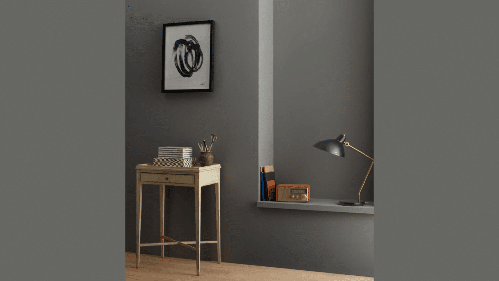
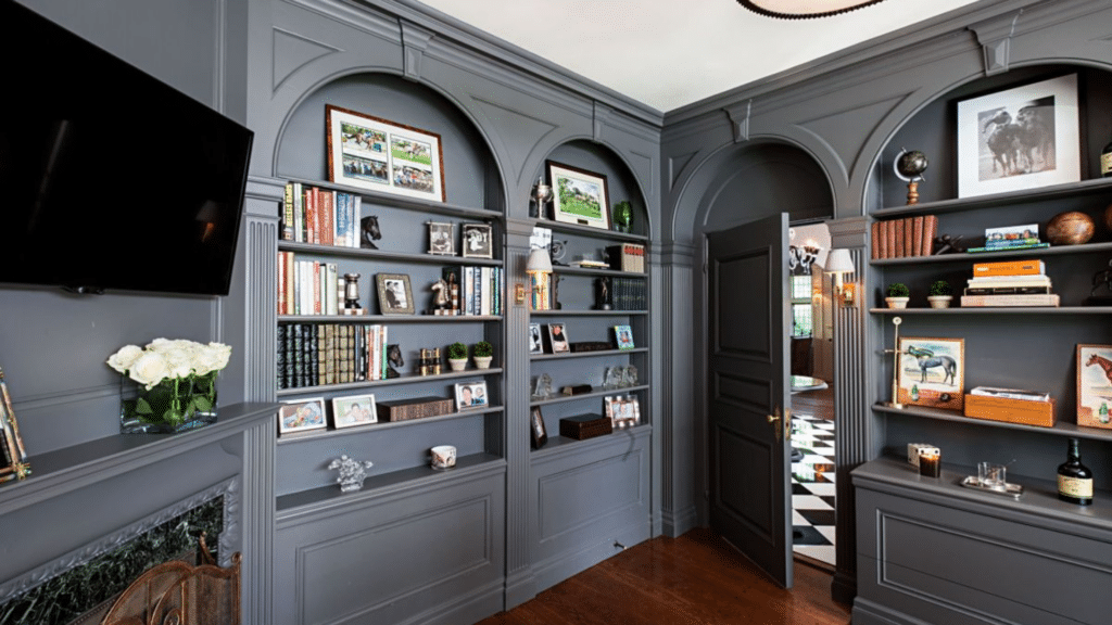
Best Rooms for Benjamin Moore’s Kendall Charcoal Paint
Kendall Charcoal adapts well across different spaces, offering a steady backdrop that supports both relaxed living areas and more focused rooms.
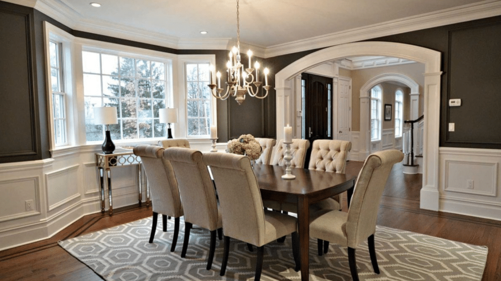
1. Living Rooms
Kendall Charcoal works well in living rooms where you want a strong but welcoming backdrop.
It adds depth to large wall areas and helps anchor furniture like sofas, shelving, or media units. In rooms with good natural light, the color stays balanced and does not feel too dark.
It pairs easily with white trim, warm wood floors, and neutral fabrics.
Many people use it on all walls for a cozy feel or as an accent to create a clear focal point.
2. Bedrooms
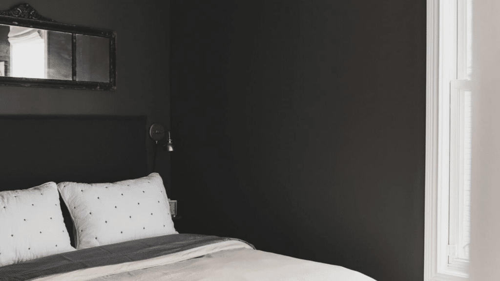
In bedrooms, Benjamin Moore’s Kendall Charcoal creates a calm and restful setting that feels comfortable at the end of the day.
The deep gray helps soften the space and reduces visual noise, which supports better sleep. It works well with light bedding, soft textures, and simple decor.
Rooms with some natural light help the color stay soft instead of heavy.
Using it behind the bed adds depth while keeping the room feeling balanced and relaxed.
3. Kitchens
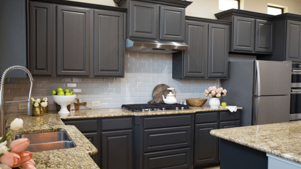
Kendall Charcoal is a popular choice in kitchens, especially for cabinets, islands, or lower sections of walls.
It adds contrast and structure when paired with white countertops, light backsplashes, and simple hardware. The color performs well under both natural and artificial light, which helps it stay consistent throughout the day.
In larger kitchens, it can also work on walls when balanced with bright lighting and light flooring.
Pros and Cons of Using Benjamin Moore’s Kendall Charcoal
Seeing both sides side by side helps you plan better, especially when room size, light levels, and finish choice can change how the color feels.
| Pros | Cons |
| Adds strong depth without reading as black | Can feel dark in rooms with little natural light |
| Works well with many design styles | Needs good lighting to avoid a heavy look |
| Pairs easily with whites and light grays | May show dust or marks on high-touch walls |
| Looks consistent under different lighting | Not ideal for very small or narrow spaces |
| Suitable for walls, cabinets, and accents | Requires testing before full application |
Recommended Finishes for Kendall Charcoal Paint
Choosing the right finish helps control how light reflects and how the color shows wear over time, especially with a darker gray like Kendall Charcoal.
- Eggshell: Works well for living rooms and bedrooms, offering a soft sheen that reflects light gently while hiding minor wall flaws and keeping the color balanced.
- Satin: A good option for high-traffic areas like hallways or kitchens, as it cleans easily and adds a slight sheen without making the color look shiny.
- Semi-Gloss: Best suited for cabinets and trim, providing durability and a clean look that highlights details while standing up to frequent use.
- Matte: Ideal for accent walls or low-traffic spaces, giving a smooth, flat finish that deepens the color and reduces glare from light sources.
Where to Buy Benjamin Moore’s Kendall Charcoal Paint Samples?
You can buy Kendall Charcoal paint samples directly from Benjamin Moore retail stores or through the official Benjamin Moore website.
Local stores are a good option if you want help choosing the right product or finish.
Online ordering works well if you already know what you need and want a quick option. Testing the color at home is important because light changes how it looks during the day.
Paint a small section on different walls and check it in morning, afternoon, and evening light.
This helps you see how the shade reacts in your space.
Samples also let you test the color next to trim, flooring, and furniture. Taking this step can save time and prevent mistakes before committing to a full gallon.
Conclusion
Kendall Charcoal is a solid choice if you want a deep gray that feels steady and easy to live with.
It brings depth without looking harsh and works well in many rooms when the lighting is right.
From walls and cabinets to home offices and living spaces, this color adapts better than many dark shades. Still, every home is different, and lighting plays a big role in how it will look for you.
Before making a final decision, try a sample in the room you plan to paint.
Watch how it changes throughout the day and how it looks next to your furniture and trim.
If you’ve already used Kendall Charcoal, share how it worked in your space. Your experience could help others feel more confident before picking up a brush.