
Choosing a neutral paint color can feel harder than picking a bold one. You want warmth, but not too much. You want softness, but not dullness or outdatedness.
Sashay Sand SW 6051 often comes up when homeowners search for a beige that feels current without drifting into gray territory. At first glance, it looks like a simple neutral. Once it’s on the wall, though, the undertones begin to show.
So, is Sashay Sand warm or cool? And how does it actually behave in real spaces?
Before you commit to gallons of paint, let’s break down everything that matters, from undertones and LRV to room placement and coordinating colors.
Understanding Sashay Sand and its Specifications
Sherwin-Williams Sashay Sand (SW 6051) is a warm mid-tone beige with muted peach and clay undertones. It carries more depth than a light neutral and provides noticeable warmth without turning yellow.
| Property | Details |
|---|---|
| Color Code | SW 6051 |
| Color Family | Beige / Neutral |
| LRV | 49 |
| RGB | 207 / 180 / 168 |
| HEX | #CFB4A8 |
| Undertones | Soft peach, muted clay, warm beige |
Note: Always confirm color details and availability through the official Sherwin-Williams website before purchasing.
What Does an LRV of 49 Mean?
LRV stands for Light Reflectance Value. It measures how much light a paint color reflects on a scale from 0 (pure black) to 100 (pure white).
With an LRV of 49, Sashay Sand sits in the true mid-tone range.
Here is what that means in practical terms:
- It reflects a moderate amount of light, but not enough to feel bright or airy.
- It has noticeable depth and body on the walls.
- It can feel richer in low-light spaces.
- It holds its color well in both natural and artificial lighting.
Because it is not a high-LRV color, Sashay Sand will not behave like an off-white. It brings warmth and substance to a space rather than brightness.
Is Sashay Sand SW 6051 Warm or Cool?
Sashay Sand is clearly warm. Its RGB values (207 / 180 / 168) show stronger red and green than blue, confirming its warm beige base. It does not contain enough gray or blue influence to read cool.
However, warmth does not mean golden or buttery. Sashay Sand avoids heavy yellow undertones. Instead, it leans toward soft peach and muted clay.
In most spaces, it feels:
- Warm
- Soft
- Balanced
- Slightly earthy
It does not shift toward gray in typical conditions. Even in cooler lighting, it remains warm, though slightly subdued.
What Sashay Sand Looks Like in Different Rooms
Sashay Sand brings warmth and depth to a space, and its mid-tone LRV of 49 gives it more presence than a light neutral. Because it carries soft peach and clay undertones, it responds noticeably to lighting, surrounding finishes, and furniture.
Living Rooms
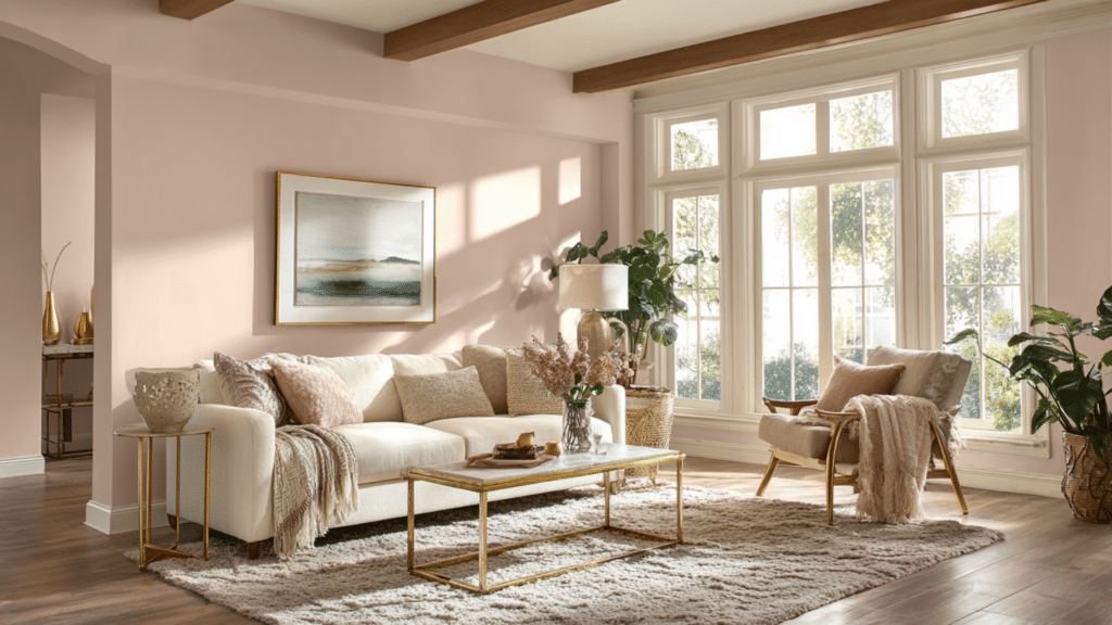
In living rooms, Sashay Sand creates a warm and welcoming foundation. It has enough depth to anchor the space without making it feel dark. The soft peach-beige undertones work especially well with wood flooring, leather seating, and textured fabrics.
In bright living rooms with large windows, the color looks balanced and natural. It does not wash out under sunlight.
In rooms with moderate lighting, it becomes slightly richer and more intimate. This makes it a strong choice for open-concept layouts where you want warmth without going too dark.
Bedrooms
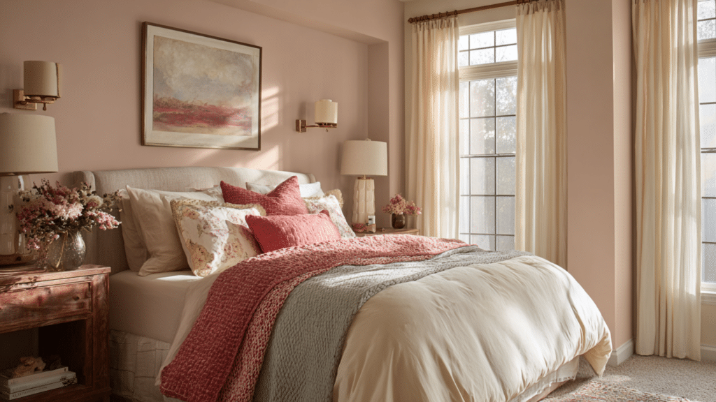
Sashay Sand works beautifully in bedrooms because of its calm, earthy character. The muted warmth softens harsh light and creates a comfortable backdrop for rest. It pairs well with layered bedding in cream, taupe, sage green, or dusty blue.
In rooms with plenty of natural light, it feels gently warm and balanced. In bedrooms with limited light, it becomes deeper and more enveloping, giving the space a cocoon-like quality.
Its mid-tone depth makes it more grounding than a pale beige, which many people prefer in sleep-focused spaces.
Kitchens and Cabinets
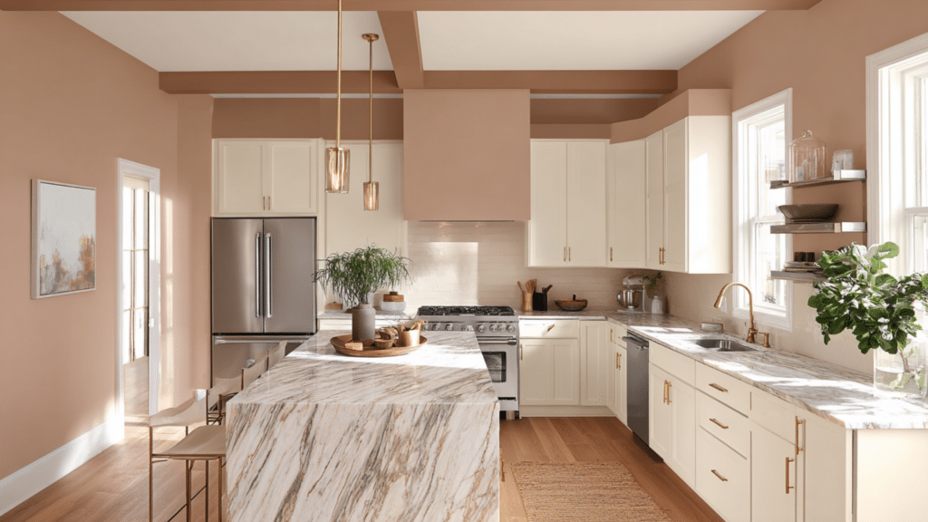
In kitchens, Sashay Sand adds warmth that offsets cool materials like stainless steel appliances and polished stone countertops. On walls, it keeps the space feeling welcoming without clashing with cabinetry.
When used on cabinets, it offers a soft alternative to white. It provides noticeable color while still maintaining a neutral appearance. It pairs especially well with:
- Warm marble or quartz surfaces
- Brushed brass or bronze hardware
- Natural wood islands
- Earth-toned backsplashes
Because it is a mid-tone neutral, proper lighting is important. Under warm under-cabinet lighting, its clay undertones become slightly more pronounced.
Dining Rooms
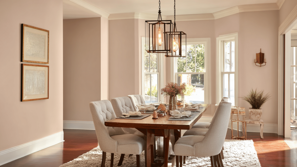
Dining rooms benefit from Sashay Sand’s warmth. Artificial lighting often dominates in these spaces, and this color responds well to warm bulbs. It enhances wood furniture and creates a comfortable setting for gatherings.
In formal dining areas, it feels classic and timeless. In casual dining spaces, it provides subtle richness without overpowering decor elements.
Hallways
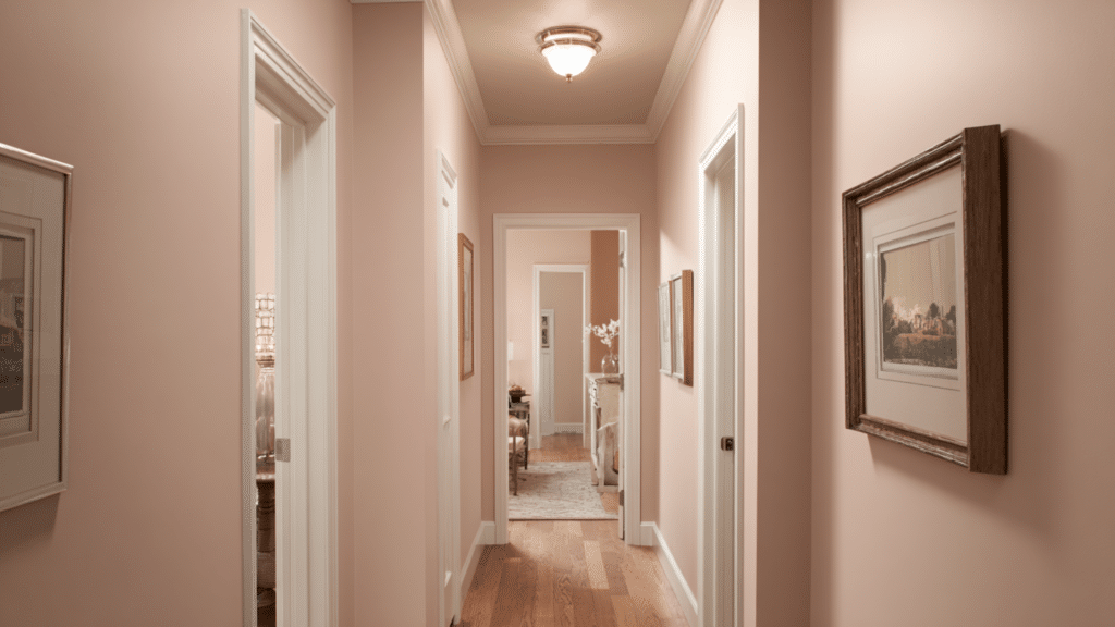
Hallways painted in Sashay Sand feel grounded and cohesive. Since many hallways lack direct sunlight, the color’s mid-range LRV prevents it from looking washed out. Instead, it adds warmth and visual continuity between rooms.
It transitions smoothly when adjoining rooms feature other warm neutrals. Against white trim, the warmth becomes more visible but remains balanced.
Best Paint Finishes for Sashay Sand
The sheen changes how the color reflects light and how durable it is.
- Matte/Flat: Softens the warmth and hides surface imperfections. Best for low-traffic rooms.
- Eggshell: Adds a slight sheen and is easy to maintain. Ideal for living rooms and bedrooms.
- Satin: More durable and moisture-resistant. Suitable for kitchens and bathrooms.
- Semi-Gloss: Great for trim and doors. Creates contrast and highlights architectural details.
Higher sheens may slightly intensify the warmth due to increased light reflection.
Best Coordinating Colors for Sashay Sand SW 6051
Sashay Sand pairs best with other warm or balanced tones.
| Color Name | SW Code | Best Use |
|---|---|---|
| Alabaster | SW 7008 | Trim and ceilings |
| Creamy | SW 7012 | Soft trim pairing |
| Naval | SW 6244 | Accent walls |
| Evergreen Fog | SW 9130 | Bedrooms or offices |
| Tricorn Black | SW 6258 | Doors and contrast |
| Accessible Beige | SW 7036 | Adjacent spaces |
Final Thoughts
Sashay Sand SW 6051 stands out for its character without being loud. It is not a bright white, nor is it a cool gray trying to pass as beige. It brings steady warmth and a sense of structure to a room.
In the right setting, it creates an inviting backdrop that supports furniture, textures, and architectural details without competing for attention.
Still, paint always reacts to its surroundings. Light direction, flooring, and trim color all influence the final result. Before committing, apply generous samples and observe them throughout the day.
Take your time, compare it with nearby finishes, and choose the option that feels right for your space.