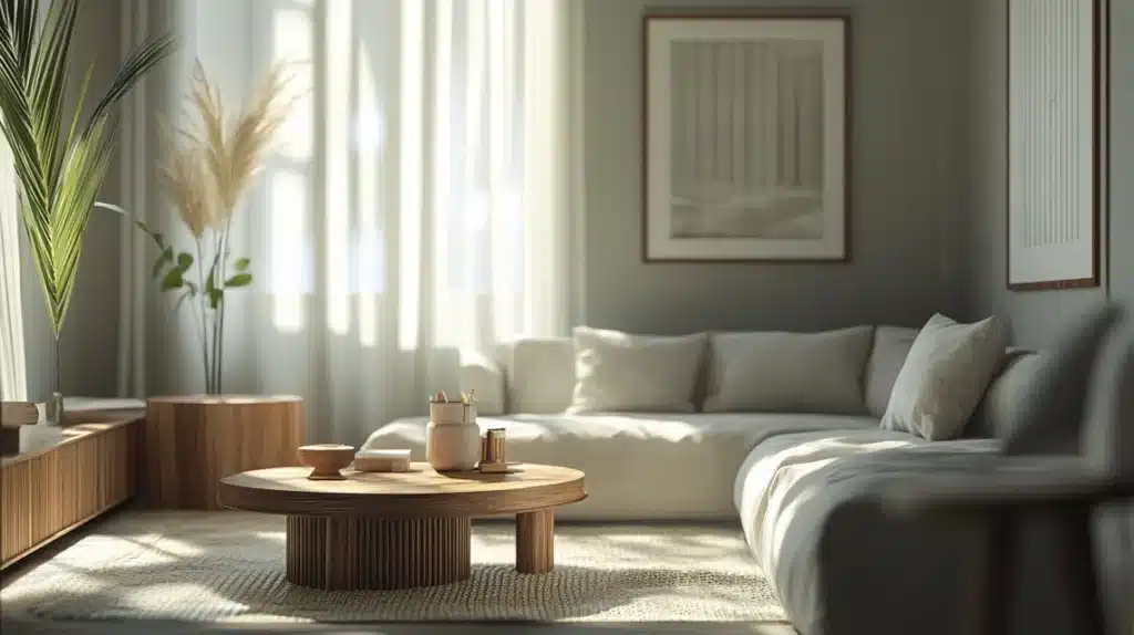
I first came across Moonshine while looking for a soft, balanced wall color for my home.
After testing several grays, this one stood out because of its gentle nature. It’s not too light or dark, perfect for creating a clean look without feeling cold.
I’ve seen it used in many modern homes, and it fits wonderfully in coastal settings, too.
What I love most about this color is how it changes subtly throughout the day while keeping its welcoming feel.
If you’re searching for a versatile gray that works with various styles, you might want to try this one.
Moonshine Benjamin Moore
Overview
Benjamin Moore Moonshine is a light gray paint color with subtle blue and green notes mixed into its base.
The color brings a gentle quality to walls, making it easy to work with in many settings.
Its makeup helps it stay neutral while offering enough character to make spaces feel complete.
This color belongs to Benjamin Moore’s Off-White Collection, marking it as a lighter shade that helps open up spaces.
It has enough depth to make a statement without taking over the room. The color stays balanced, letting other design elements shine while providing a solid base.
The color works well in main living areas, bedrooms, and kitchens.
Many homeowners choose it for spaces where they want a calm feeling without going too stark or plain.
It’s particularly good for rooms where you spend lots of time, as it creates a pleasant background for daily activities.
LRV (Light Reflectance Value)
Light Reflectance Value (LRV) measures how much light a color bounces back versus absorbs.
This number helps you understand how a color will look in your space and how it might affect the room’s brightness.
It’s measured on a scale from 0 to 100, with higher numbers meaning more light reflection.
With an LRV of 68.28, Moonshine sits in a sweet spot that makes rooms feel open. This mid-range number means it won’t make spaces feel too bright or too dark.
It gives walls enough color while still helping rooms feel spacious.
In bright rooms, Moonshine keeps its color while helping spread light around.
In darker spaces, it needs good lighting to show its true shade.
The color can look lighter in sunny rooms and slightly deeper in spaces with less natural light.
Undertone
Looking closely at Moonshine, you’ll notice three main undertones working together: muted blue, green, and gray.
None of these takes over, but they blend to create a balanced look.
The color stays true to its nature without leaning too heavily in any direction, making it work well in most spaces.
The color shifts slightly based on lighting conditions.
Morning light might bring out more of its blue notes, while evening light can highlight its green aspects.
Room direction also matters, northfacing rooms show its cooler side, while south-facing spaces bring out its softer qualities.
Testing The Paint Sample In Different Rooms
When checking how Moonshine looks in your space, paint samples on several walls and observe them throughout the day.
Start with a 12×12 inch sample area on walls facing different directions.
Notice how the color changes from morning to evening and under both natural and artificial light.
Test spots near windows and in shadowed corners to see the full range.
Pay attention to how the color interacts with your existing furniture, floors, and fixtures.
Keep in mind that things like nearby trees, buildings, or even your window treatments can affect how the color appears.
For the most accurate view, look at your samples over several days in different weather conditions.
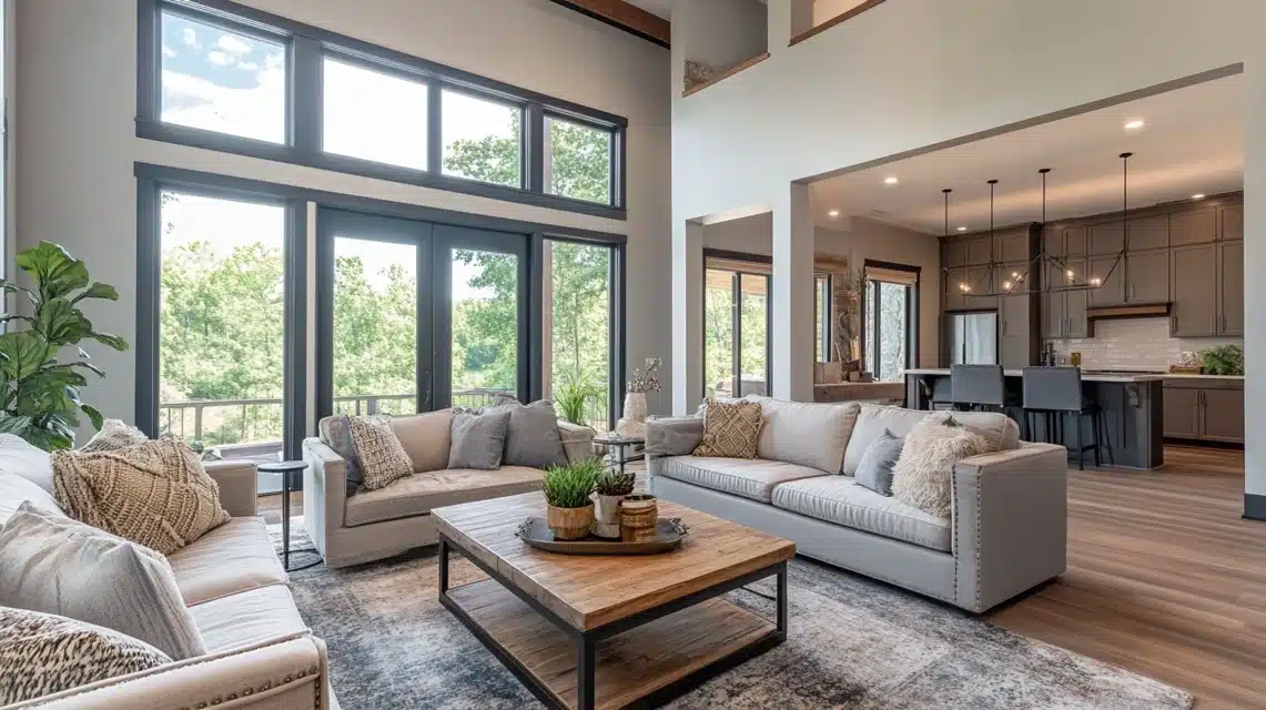
Living Room
Best Features
The light quality of Moonshine makes living rooms feel open and inviting.
Its gentle gray base creates a perfect backdrop for daily activities while maintaining a clean look.
The color stays consistent as lighting changes throughout the day, helping the space feel balanced from morning coffee to evening relaxation.
In larger living areas, it helps connect different zones while keeping the overall feel cohesive.
Design Tips
Light or medium gray sofas work well against Moonshine walls.
Add natural wood coffee tables or shelving to bring warmth to the space.
White trim keeps the look clean, while black or metal picture frames create nice contrast.
Textured throws and pillows in white, cream, or soft blue add depth without competing with the wall color.
Layer in glass and metal accessories to enhance the light, fresh feeling.
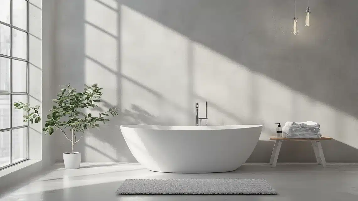
Bathroom
Best Features
Moonshine creates a clean, fresh feeling in bathrooms of any size.
The color’s light gray base helps bounce natural light around, making small bathrooms feel more open.
Master bathrooms provide a calm background that works well with various fixtures and materials. The color stays true even with steam and moisture, maintaining its soft appearance.
Under bathroom lighting, it keeps its gentle tone without turning too cool or stark.
Design Tips
White porcelain fixtures stand out nicely against Moonshine walls.
Consider white tiles for shower areas or backsplashes to create a seamless look.
Chrome or nickel hardware adds subtle shine without overwhelming the space.
Glass shower doors maintain the open feel, while frosted options still let light through.
Natural stone counters in light gray or white marble complement the wall color perfectly.
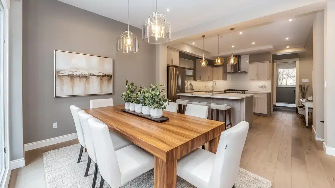
Dining Hall
Best Features
In dining spaces, Moonshine creates an ideal setting for meals and gatherings.
The color’s subtle depth provides enough interest without taking attention away from food and conversation.
It looks especially good under both natural daylight and evening lighting, making it suitable for all meals.
The color maintains its gentle presence even as shadows move across the room throughout the day.
Design Tips
Natural wood dining tables create a beautiful contrast against Moonshine walls.
Light fixtures in silver or glass add brightness without competing with the wall color.
Consider white chairs to keep the space feeling fresh or darker wood tones for more contrast.
Table linens in white or soft patterns work well, letting the room’s architecture stand out.
Window treatments in light and natural materials complement the wall color while managing light.
Kitchen
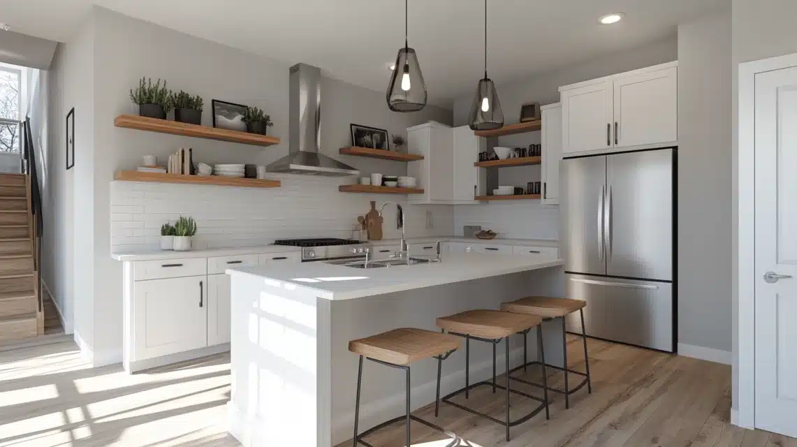
Best Features
Moonshine adds a fresh, clean quality to kitchens without making them feel cold.
The color works particularly well in spaces with lots of natural light, helping to maintain brightness without glare.
In kitchens with limited windows, it still keeps its light appearance, especially when paired with good lighting.
The color stands up well to kitchen activity, maintaining its clean look even in busy cooking spaces.
Its gentle gray tone creates a perfect background for food preparation and gatherings.
Design Tips
White cabinets maintain a bright, clean look against Moonshine walls.
Dark hardware creates a nice contrast without overwhelming the space. For countertops, light quartz or marble patterns complement the wall color while staying practical.
Light wood open shelving adds warmth and display space.
Under-cabinet lighting helps bring out the true color, even in shadowy areas.
Steel appliances blend smoothly with the color scheme.
Bedroom
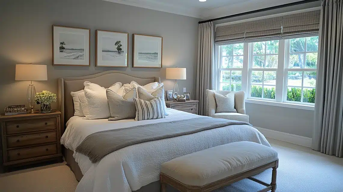
Best Features
In bedrooms, Moonshine creates a peaceful setting that promotes rest.
The color stays soft in the morning light, making wake-up time more pleasant.
Evening lighting brings out its calmer qualities, perfect for winding down.
The master bedroom provides enough presence to feel grounded without being heavy.
For guest rooms, it creates a welcoming atmosphere that suits various decor styles.
Design Tips
Light-colored bedding looks clean and fresh against Moonshine walls. Add texture through white or cream curtains to soften the light.
Natural wood nightstands or dressers bring warmth to the space. Soft table lamps provide gentle lighting that enhances the wall color.
Layer in light gray or white throw pillows to build depth without losing the calm feeling.
Simple artwork in light frames maintains a peaceful atmosphere.
Why Moonshine Over These Colors?
Moonshine vs. Gray Owl
| Feature | Moonshine | Gray Owl |
|---|---|---|
| LRV | 68.28 | 64.51 |
| Depth | Lighter | Slightly darker |
| Undertones | Blue-green | More neutral |
| Best Use | Bedrooms, smaller spaces | Larger living areas |
| Light Response | More reflective | Holds color better |
| Room Types | Best in bright rooms | Works in varied lighting |
Moonshine vs. Horizon
| Feature | Moonshine | Horizon |
|---|---|---|
| LRV | 68.28 | 72.82 |
| Depth | Medium-light | Very light |
| Undertones | Blue-green | Cleaner, cooler |
| Best Use | Main living spaces | Bright, open areas |
| Light Response | Maintains color | Can wash out |
| Room Types | Versatile | Best in dim spaces |
Moonshine vs. Crushed Ice
| Feature | Moonshine | Crushed Ice |
|---|---|---|
| Base Tone | Cool | Slightly warm |
| Undertones | Blue-green | Green-beige |
| Best Use | Modern spaces | Traditional rooms |
| Light Response | Stays consistent | Warms up more |
| Room Types | Any room | Better in warm-lit spaces |
| Style Match | Contemporary | Traditional to transitional |
These Colors Go Best In Pair With Moonshine Benjamin Moore
Accents
Blues with gray mixed in make perfect partners for Moonshine walls.
Mid-tone and darker shades like navy create a balanced look.
For warmth, consider medium wood tones or brushed metals like silver.
The key is picking colors with similar calm qualities – nothing too bold or bright.
Textures & Materials
Natural materials work wonderfully with Moonshine.
Light wood floors or cabinets add warmth without clashing.
Stone surfaces, whether light or dark, complement the color well.
Glass and metal items maintain the clean look while adding interest to the space.
Complementary Neutrals
Soft off-whites make good ceiling colors with Moonshine walls.
Light beige can work for trim if you want something besides white.
When using multiple neutrals, keep them in the same intensity range as Moonshine to maintain balance.
Moonshine Benjamin Moore And Lights
Natural Light
Morning sun shows Moonshine’s truest color.
As the day moves on, the color stays steady but might look slightly different.
South-facing rooms make it appear warmer, while north-facing spaces bring out its cooler side.
East and west exposures show the most change throughout the day.
Lighting Pairings
For the most natural look, use bulbs rated between 2700K and 3000K.
These create a clean light that doesn’t alter the color too much.
In spaces with less natural light, add plenty of light sources at different heights. This helps the color look its best all day long.
Conclusion
I’ve used Moonshine in several rooms of my home, and what stands out most is how well it adapts to each space.
After testing many grays, this one proved most flexible for my needs.
What I particularly value is its ability to stay true throughout the day – it never looks too dark or too light.
My best tip? Take time to test it in your space.
I put samples on every wall and lived with them for a few days.
The results made the extra effort worth it, and now I have a color that makes my home feel exactly how I wanted it to.
Frequently Asked Questions
What is the most popular Benjamin Moore grey color?
Gray Owl (OC-52) is Benjamin Moore’s most popular grey paint color. It’s a light, versatile shade that works well in most rooms and lighting conditions.
What shade of grey is calming?
A soft, cool-toned grey like “Repose Gray” or “Light French Gray” creates a calming atmosphere, especially when it’s a lighter shade with blue undertones.

