
The color on the outside of a house does more than look nice. It shapes the first impression and sets the mood before anyone steps inside.
The right shade can make a home feel warm, clean, modern, or calm, while the wrong one can make it look dated or out of place. That is why choosing exterior house colors deserves careful thought, not a last-minute decision.
In this article, you will find clear ideas that work for many home styles and settings.
I shared popular color choices, easy-to-match palettes, and helpful tips that make the decision less stressful.
You will also learn what to think about before picking a color, so you avoid common mistakes. If you feel stuck or unsure where to start, this guide is here to help.
By the end, you will have practical direction and fresh ideas you can actually use.
How to Choose the Right Exterior House Color?
Choosing the right exterior house color starts with your personal style. Think about colors you already like and feel comfortable seeing every day.
Next, look at your surroundings. Nearby homes, trees, and the overall setting can guide what will look natural and balanced.
A color that fits the area often feels right for longer. It also helps to think about long-term appeal.
Trendy colors may look nice now, but neutral or soft shades usually age better and are easier to live with.
Pay attention to how sunlight hits your home since light can change how a color looks during the day. Test small paint samples on different sides of the house before deciding.
This simple step can save time and money later.
By focusing on these basics, you can narrow your choices and feel confident about your final pick.
Top Inviting Home Exterior Paint Color Palettes
These color palettes are easy to live with and work well for many home styles. Each one focuses on balance, warmth, and a look that feels welcoming from the street.
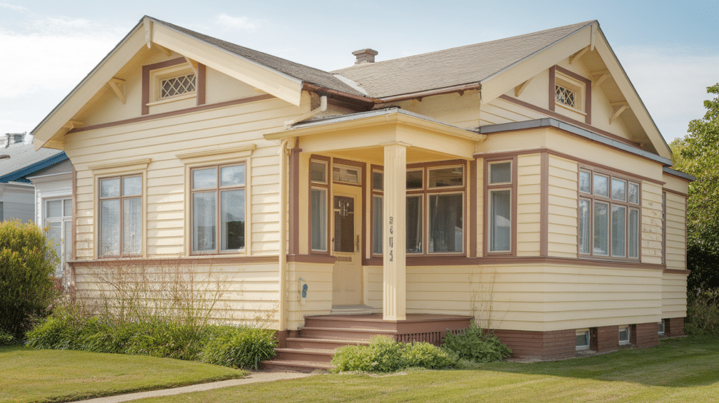
1. Warm White, Soft Gray with Charcoal Trim
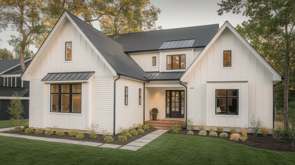
This palette creates a clean and inviting look that feels calm and balanced. Warm white works well as the main color because it reflects light without looking harsh.
Soft gray adds gentle contrast and keeps the exterior from feeling flat.
Charcoal trim brings depth and helps highlight windows, doors, and rooflines.
This combination suits both modern and traditional homes and looks good in most climates. It also pairs well with stone, brick, and neutral roofing materials, making it a safe and flexible choice.
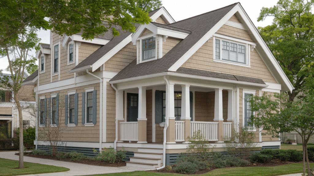
2. Cream, Taupe with Dark Brown Accents
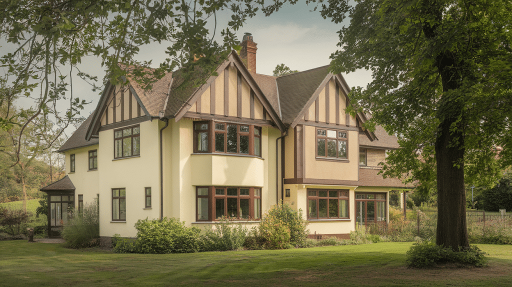
Cream gives the home a soft and welcoming base that feels warm rather than stark.
Taupe adds a grounded tone that goes well with natural surroundings like trees and landscaping. Dark brown accents help define trim and details without feeling too bold.
This palette works especially well for larger homes, as it adds warmth without overpowering the structure.
It also hides dirt better than pure white and tends to age well over time, making it a practical long-term option.
3. Light Gray, White Trim with Black Shutters
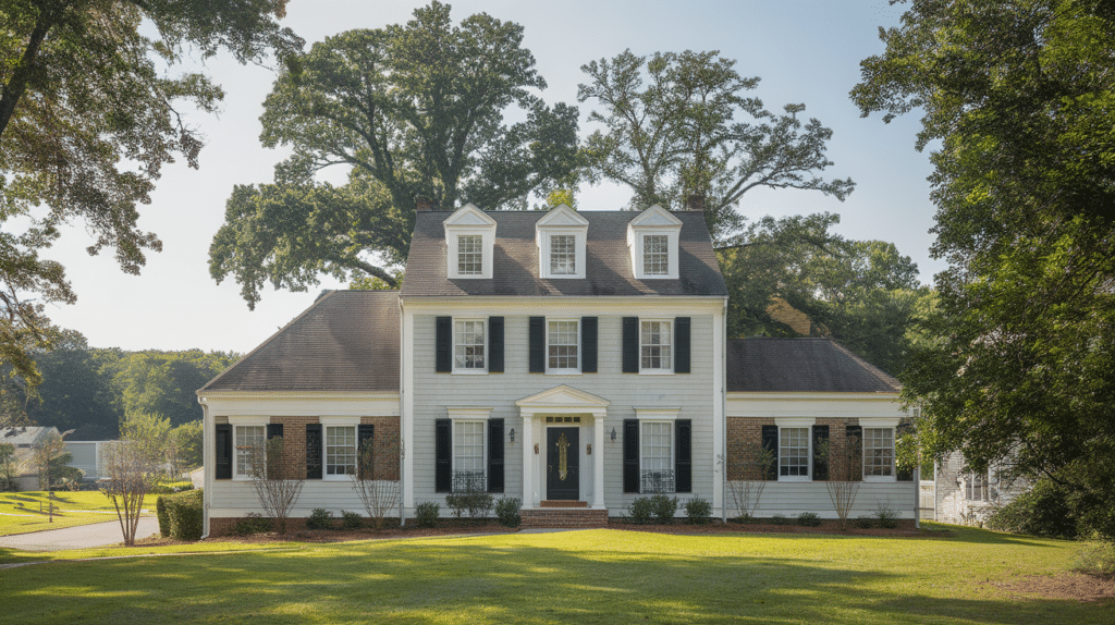
This palette offers a crisp and classic look that feels neat and well-balanced. Light gray serves as a soft main color that works in both sunny and shaded areas.
White trim keeps the exterior bright and clean, helping windows and edges stand out.
Black shutters add contrast and give the home a clear structure. This combination works well for colonial, traditional, and modern homes.
It also pairs nicely with brick details and darker roofs, creating a strong but simple exterior look.
4. Beige, Ivory with Soft Brown
Beige creates a warm and natural base that feels easy on the eyes. Ivory trim softens the overall look and keeps the exterior from appearing too heavy.
Soft brown accents add depth and help tie in wood features, stone, or darker roofing.
This palette works well in suburban and rural settings where natural tones combine better with the environment. It is a safe choice for homeowners who want a welcoming look that stays appealing year after year.
5. Greige, Crisp White, and Deep Gray
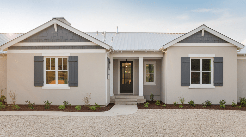
Greige blends gray and beige, making it a flexible base color that works in many settings.
It feels modern without looking cold and pairs well with both warm and cool accents. Crisp white trim adds brightness and keeps the exterior looking fresh.
Deep gray works well for doors, shutters, or trim details, adding contrast without being too harsh.
This palette suits modern, transitional, and classic homes and holds up well as trends change over time.
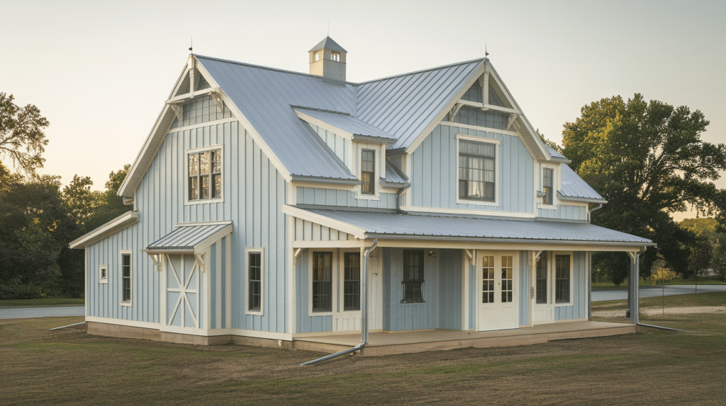
6. Soft Blue, White Trim with Light Gray
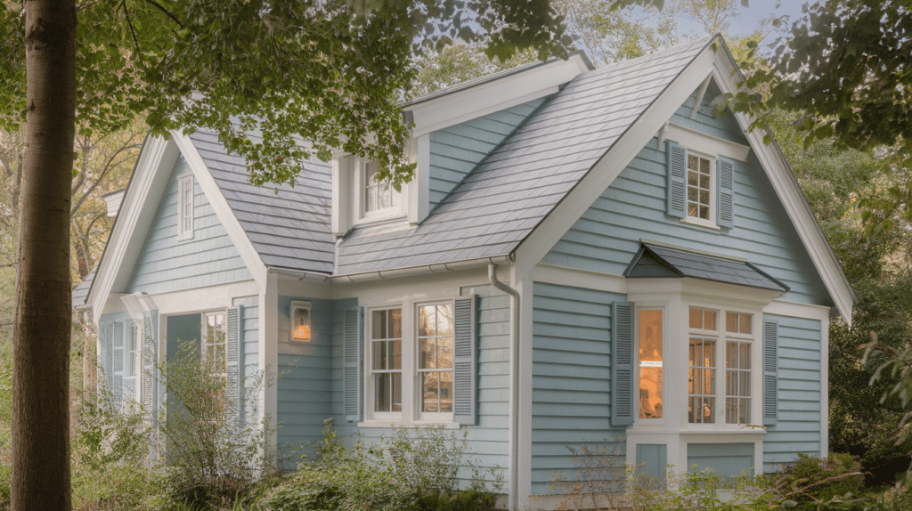
Soft blue gives the exterior a calm and welcoming feel without standing out too much.
It works especially well in sunny areas where the color stays light and fresh.
White trim keeps edges clean and helps highlight windows and doors. Light gray adds subtle contrast and prevents the palette from feeling flat.
This combination fits coastal, cottage, and traditional homes and works well with light roofing and natural landscaping.
7. Navy Blue, Bright White with Natural Wood
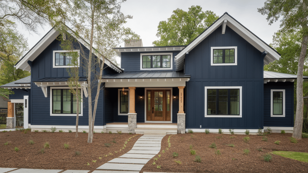
Navy blue adds depth and character while still feeling classic and reliable. Bright white trim keeps the look sharp and prevents the dark color from feeling heavy.
Natural wood accents bring warmth and help balance the contrast between light and dark tones.
This palette works well for modern and craftsman-style homes and looks especially good with metal or dark roofs. It creates a strong look without feeling too bold or overwhelming.
8. Slate Blue, Cream with Charcoal
Slate blue gives the home a calm and grounded feel that works well in many settings.
It feels richer than light blue but not too dark or heavy. Cream softens the look and keeps the exterior from feeling cold.
Charcoal adds contrast and helps frame doors, windows, and trim.
This palette suits traditional and modern homes and pairs well with stone accents and darker roofs. It also holds up well in changing light, making it a reliable choice.
9. Sage Green, Off-White, and Dark Bronze
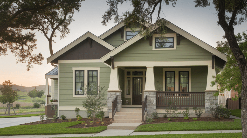
Sage green combines easily with natural surroundings like trees and gardens. It creates a relaxed and welcoming look that does not feel loud.
Off-white trim brightens the exterior and keeps lines clean and clear.
Dark bronze accents add depth and give the home a finished look without sharp contrast.
This palette works well for craftsman, cottage, and ranch-style homes. It is a good option for homeowners who want color without going too bold.
10. Olive Green, Beige with Black Trim
Olive green offers a warm and earthy base that feels stable and grounded. It works well in both urban and rural areas and goes well with landscaping.
Beige softens the main color and adds balance to the overall look.
Black trim creates strong definition and helps highlight architectural details. This palette suits homes with simple lines and natural materials.
It also works well with metal roofs and stone features, giving a clean and confident exterior finish.
11. Forest Green and Cream with Warm Brown
Forest green gives the home a deep and grounded look that feels calm and stable.
Cream lightens the exterior and keeps the darker color from feeling too heavy. Warm brown works well for trim, doors, or wood details, adding a natural touch.
This palette combines nicely with trees and outdoor spaces.
It suits traditional, craftsman, and cabin-style homes and holds up well across different seasons without looking dated.
12. Light Green with White and Soft Gray
Light green creates a fresh and friendly feel that works well in bright or shaded areas.
White trim keeps the exterior clean and helps highlight windows and edges. Soft gray adds balance and prevents the palette from feeling too simple.
This combination works well for smaller homes since it keeps the look open and airy.
It also pairs nicely with light roofs and simple landscaping for a relaxed finish.
13. Warm Tan and White with Mocha
Warm tan gives the home a cozy and welcoming base that feels easy to live with.
White trim adds contrast and keeps the exterior looking neat and finished. Mocha accents bring depth and help tie in darker roof tones or stone details.
This palette works well in many neighborhoods and blends nicely with natural surroundings.
It is a good choice for homeowners who want warmth without going too dark.
14. Sand with Cream and Soft Brown
Sand creates a light and natural base that feels relaxed and easy on the eyes.
Cream softens the overall look and keeps the exterior from feeling too sharp. Soft brown accents add warmth and help tie in wood features, stone, or darker roofing.
This palette works well in sunny areas where lighter colors reflect heat.
It suits coastal, suburban, and desert-style homes and stays appealing over time.
15. Taupe and White with Charcoal
Taupe offers a balanced mix of warmth and gray tones, making it easy to match with many materials.
White trim keeps the exterior clean and highlights architectural details. Charcoal accents add depth and give the home a defined look without feeling too bold.
This palette works well for both modern and traditional homes.
It also pairs nicely with dark roofs and metal finishes for a polished result.
16. Charcoal Gray with White and Wood Tones
Charcoal gray creates a strong and modern base that feels clean and confident.
White trim adds brightness and prevents the dark color from feeling heavy. Wood tones bring warmth and help soften the contrast between light and dark elements.
This palette works especially well for modern and craftsman-style homes.
It looks best when used with simple lines, natural textures, and minimal exterior details.
17. Medium Gray and Black with White Accents
Medium gray creates a steady and neutral base that works well in many settings.
Black adds contrast and helps define doors, shutters, or trim areas. White accents keep the exterior from looking too dark and help balance the overall look.
This palette suits modern and traditional homes and pairs well with darker roofs.
It also holds up well in different lighting, making it a reliable long-term option.
18. Soft Black with Warm White and Wood
Soft black gives the home a bold yet controlled look that feels modern and clean.
Warm white trim lightens the exterior and keeps details visible. Wood accents add warmth and prevent the palette from feeling too stark.
This combination works well for contemporary and farmhouse-style homes.
It creates a strong contrast while still feeling welcoming and well-balanced.
19. Brick Red and Cream with Dark Brown
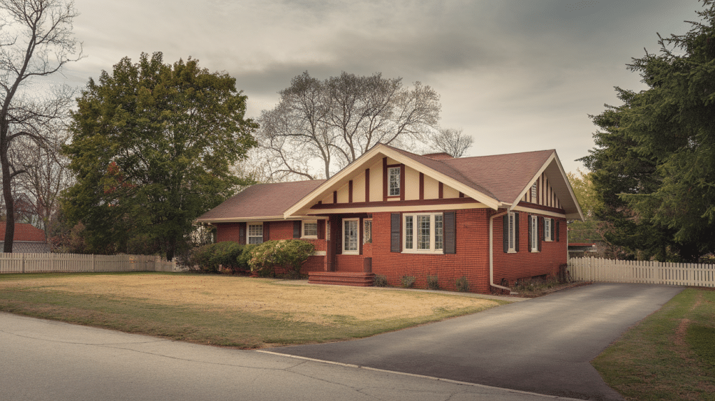
Brick red brings warmth and character to the exterior without feeling too bright. Cream softens the look and keeps the color from overpowering the home.
Dark brown accents add depth and tie in roofing or wood details.
This palette works well for traditional and ranch-style homes. It also combines nicely with stone features and mature landscaping for a settled, lived-in feel.
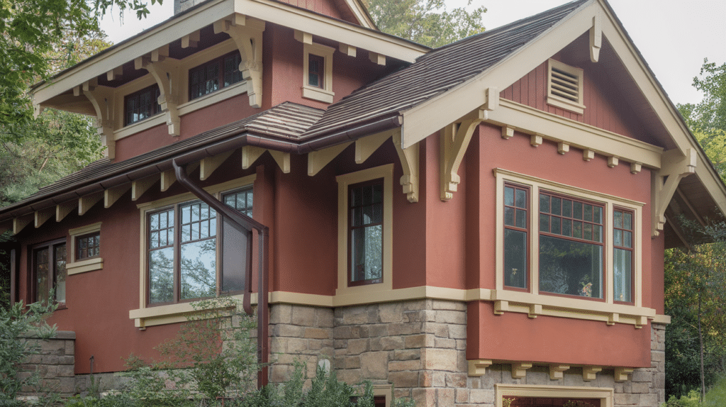
20. Muted Red with Beige and Charcoal
Muted red adds warmth and character without feeling too bright or overpowering.
It works well as a main color for homes that want a bit of depth while staying grounded. Beige helps soften the overall look and balances the stronger red tone.
Charcoal accents add contrast and help define trim, doors, and edges.
This palette suits traditional and country-style homes and pairs well with darker roofs. It also ages well and does not feel overly trendy.
21. Terracotta and Sand with Warm White
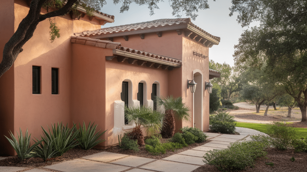
Terracotta brings an earthy and welcoming feel that works well in warm or dry climates. It adds color without feeling loud and goes nicely with natural surroundings.
Sand keeps the palette light and prevents the exterior from looking too heavy.
Warm white trim brightens the look and highlights architectural details.
This combination works well for stucco, adobe, and Mediterranean-style homes. It also pairs nicely with tile roofs and simple landscaping.
22. Clay with Cream and Bronze
Clay offers a soft, natural base that feels warm and grounded. It works well for homeowners who want color without going too bold.
Cream trim keeps the exterior light and helps balance the deeper clay tone.
Bronze accents add a subtle richness and work well for hardware, doors, or small details.
This palette suits craftsman and traditional homes and goes well with stone, brick, and wood features. It creates a finished look that feels calm and steady.
23. Light Yellow and White with Gray
Light yellow adds a cheerful and friendly feel without being too bright.
It works well in sunny areas and helps homes feel open and welcoming.
White trim keeps the exterior clean and prevents the yellow from looking heavy. Gray accents add balance and tone down the warmth, giving the home a more grounded look.
This palette suits cottages and traditional homes and pairs nicely with light roofs and simple landscaping.
24. Butter Yellow with Cream and Soft Brown
Butter yellow offers warmth while staying soft and easy on the eyes. Cream trim goes well with the main color and keeps the exterior looking calm.
Soft brown accents help tie in wood features and darker roof tones.
This palette works well for older homes and classic designs. It brings color without feeling bold and stays pleasant over time.
25. Soft Peach and White with Taupe
Soft peach gives the home a gentle and warm appearance that feels welcoming. White trim keeps the exterior bright and highlights clean lines.
Taupe accents add depth and help ground the lighter tones.
This palette works well in warm climates and suits stucco or smooth siding. It creates a relaxed look that feels friendly without drawing too much attention.
26. Dusty Blue and White with Charcoal
Dusty blue offers a calm and settled look that feels soft but still noticeable.
It works well as a main color for homes that want a hint of color without standing out too much. White trim keeps the exterior clean and helps edges look sharp.
Charcoal accents add contrast and give structure to doors, shutters, and trim.
This palette fits coastal, traditional, and modern homes. It also looks balanced in both bright sunlight and shaded areas.
27. Steel Blue with Light Gray and White
Steel blue brings a cool and steady tone that feels modern and neat. It works well on larger homes where darker colors can help add definition.
Light gray softens the look and keeps the exterior from feeling too heavy.
White trim adds clarity and highlights key details.
This palette pairs well with metal roofs and stone features. It is a good option for homeowners who want a clean look that still feels welcoming.
28. Pale Blue and Cream with Warm Gray
Pale blue creates a light and airy feel that works well in many settings. It reflects light nicely and helps the home feel open.
Cream trim adds warmth and keeps the blue from feeling cold.
Warm gray accents bring balance and help tie in roofing or stone elements. This palette suits cottages, farmhouses, and suburban homes.
It feels relaxed and easy to live with while still looking polished and thoughtful.
29. Warm White and Black with Wood Accents
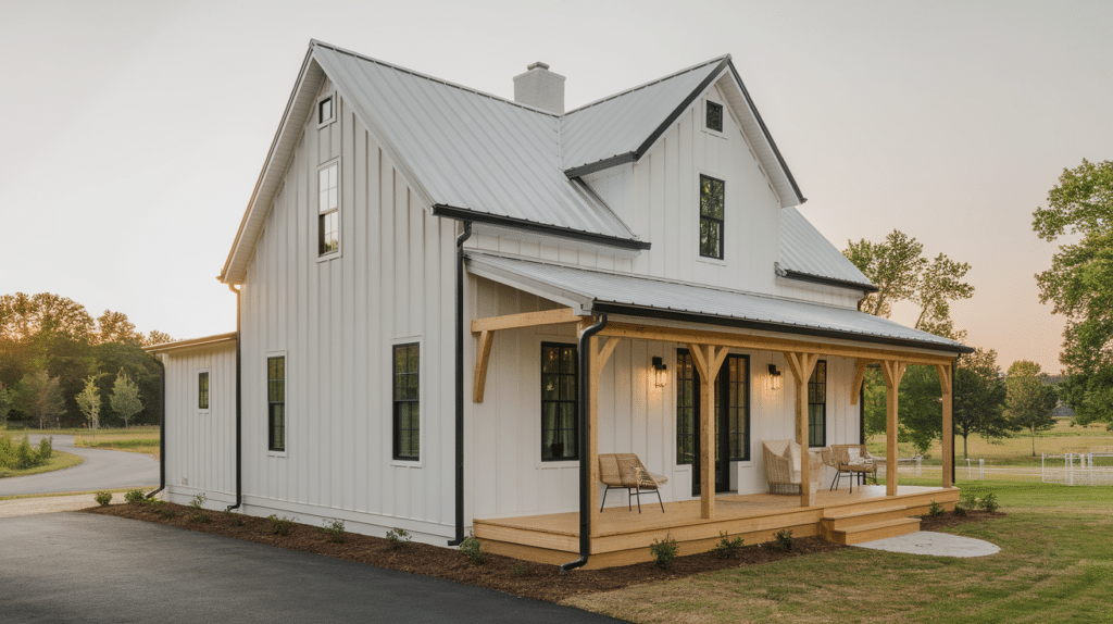
Warm white creates a clean and inviting base that feels bright without looking harsh.
It reflects light well and helps the home look fresh from the street. Black accents add contrast and help define windows, doors, and trim.
Wood accents bring warmth and prevent the palette from feeling too sharp or modern.
This combination works well for farmhouse, modern, and traditional homes. It also pairs nicely with metal roofs, stone paths, and natural landscaping.
30. Off-White with Soft Gray and Natural Stone
Off-white gives the exterior a soft and relaxed look that feels easy to live with.
It works well in both sunny and shaded areas without looking too bright. Soft gray adds balance and helps define trim or siding details.
Natural stone elements combine smoothly with these tones and add texture.
This palette suits larger homes and combines well with outdoor features like walkways and retaining walls. It creates a calm and finished look.
31. Cream and Sage Green with Dark Trim
Cream provides a warm and welcoming base that feels classic and familiar.
Sage green adds a gentle touch of color that goes well with trees and gardens. Dark trim helps frame the home and adds depth without feeling too bold.
This palette works well for craftsman, cottage, and ranch-style homes.
It feels balanced and natural, making it a good choice for homeowners who want color without taking risks.
32. Beige and Blue-Gray with White
Beige creates a warm and steady base that feels comfortable and familiar.
Blue-gray adds a cooler tone that keeps the exterior from looking flat or dated. White trim brings everything together by highlighting windows, doors, and edges.
This palette works well for suburban homes and combines nicely with brick or stone details.
It also pairs well with both light and dark roofs, making it a flexible option for many home styles.
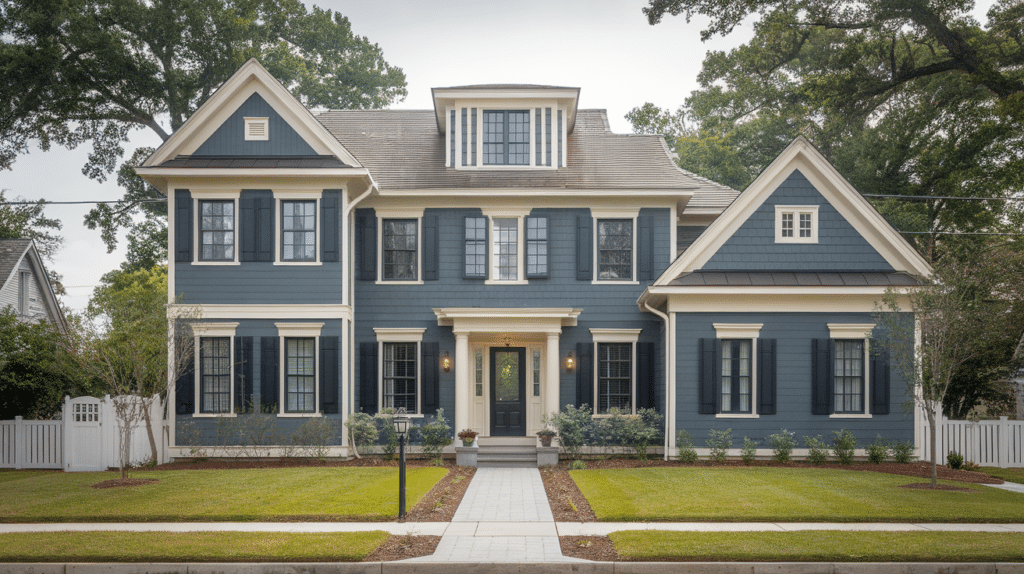
33. Light Gray with Navy Accents and White
Light gray offers a clean and modern base that feels calm and balanced. Navy accents add depth and give the exterior a strong but controlled contrast.
White trim keeps the look crisp and helps define architectural features.
This palette works well for both traditional and modern homes. It also holds up well in different lighting conditions and looks polished without feeling too bold or trendy.
Factors to Consider Before Picking Exterior Colors
Small details can affect how a color looks and lasts over time. Thinking through these points early can help you avoid costly mistakes later.
- Lighting: Sunlight changes how paint appears. Bright light can wash out colors, while shade can make them look darker.
- Climate: Hot sun, rain, and snow can fade or wear paint faster. Choose colors and finishes made for your local weather.
- House Size: Light colors can make a small home look bigger. Dark shades may make large homes feel heavier.
- Exterior Materials: Brick, siding, and stone all reflect color differently. Match shades that work well with existing materials.
- Neighborhood Rules: Some areas have HOA or local guidelines. Always check the rules before picking a final color.
- Roof and Trim Colors: Exterior colors should work well with fixed elements you cannot change easily.
Conclusion
Choosing the right exterior color is not just about looks. It is about feeling good every time you pull into your driveway.
With the ideas and tips shared in this guide, you now have a clearer way to narrow down choices that fit your home, setting, and long-term plans.
Taking time to test samples on different sides of your house can make a big difference.
Colors change with light, weather, and time, so seeing them in real conditions helps you avoid regret.
Trust what feels right to you, not just what looks good online. When you feel confident in your choice, the result is always more satisfying.
If you have repainted your home before or are planning to do it soon, I would love to hear about it.
Share your experience, tips, or lessons in the comments below.