 by Benjamin Moore")
If you’re like me and looking for a color that feels both contemporary and calming, Metropolitan by Benjamin Moore is a fantastic choice.
I love how this soft, muted grayish-blue hue creates a sophisticated and serene environment; it instantly brings a sense of peace to any space.
With its balanced tone, Metropolitan works beautifully in just about any room. Whether I’m designing a living room, bedroom, kitchen, or bathroom, it always adds a touch of quiet elegance.
What I really appreciate about Metropolitan is its sleek, modern look. It’s the neutral that goes with everything.
I’ve paired it with cool tones, warm accents, and even bold furniture pieces, and it never fails to impress. It’s such a versatile color that fits many design styles.
If you’re thinking about using Metropolitan in your next home project, keep reading. I’ll explain everything you need to know!
Why Benjamin Moore Metropolitan (AF-690) is So Popular
Metropolitan has quickly become a favorite among homeowners and designers, and I can definitely see why. Its cool and calming qualities are what first drew me to it.
The color’s subtle gray-blue tones give it a modern, sophisticated vibe while still feeling soft and inviting.
It’s the neutral that doesn’t feel too cold or too warm, which makes it incredibly versatile and easy to love.
One of the things I really appreciate about Metropolitan is how well it fits a wide range of interior design styles.
It blends effortlessly into any space, whether I’m decorating a minimalist space, a traditional home, or a modern apartment.
Its muted tone offers just the right balance for creating a classic yet welcoming atmosphere.
Plus, Metropolitan is part of Benjamin Moore’s Affinity Color Collection, which is known for offering beautifully balanced and harmonious colors.
This collection is full of shades that suit modern living, and Metropolitan is a perfect example. With its timeless appeal, it’s a reliable and stylish choice for any design project.
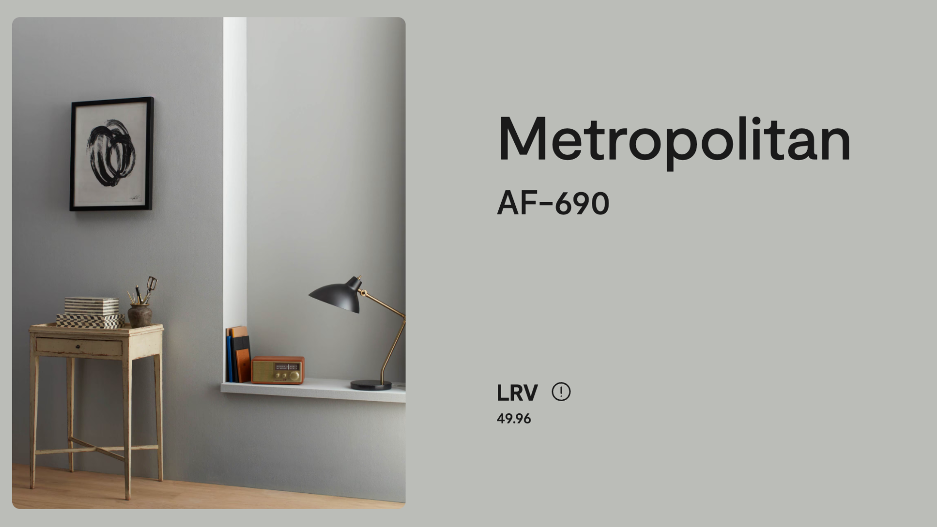
Specifications of Metropolitan (AF-690) by Benjamin Moore
Before you decide if Metropolitan is the right color for your space, it’s important to understand a few key details about the color.
Knowing the specifications will help you visualize how it will look in your home.
- Color Code: AF-690
- Collection: Affinity Color Collection
- Finish Options: Available in flat, eggshell, satin, semigloss, and more
- RGB: Red 188, Green 188, Blue 190
- HEX Code: #B8B8BE
- Light Reflectance Value (LRV): 49.96 – This indicates that Metropolitan reflects a moderate amount of light, helping to brighten a space without feeling too bright or harsh.
- Undertones: A soft mix of gray and blue with a cool, muted feel.
- Sheen Tip: An eggshell or satin finish works best for most walls, as it highlights the beauty of the color while adding a subtle shine.
These details provide a better idea of how Metropolitan will perform in your space.
Its moderate reflectance and cool undertones make it an ideal choice for creating a peaceful and sophisticated environment.
Using Metropolitan (AF-690) by Benjamin Moore
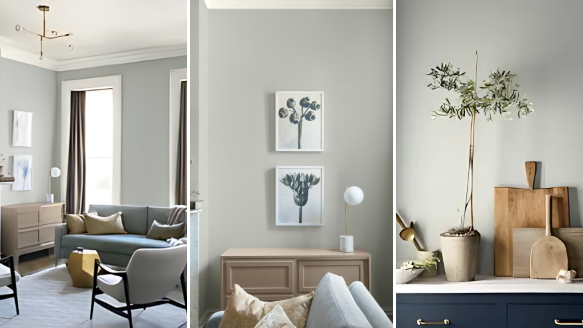
Metropolitan is a versatile color that can be used throughout your home. Some ideas on how to use Metropolitan in different areas are:
1. Living Rooms
Metropolitan is an excellent choice for the living room, where you want to create a calm and welcoming atmosphere.
I love how the soft gray-blue hue provides a neutral backdrop that works well with so many furniture styles.
Whether you have a modern sectional, vintage armchairs, or contemporary decor, Metropolitan will complement them all.
Pair it with natural wood furniture, white or neutral-colored rugs, and plenty of soft throw pillows for a cozy, stylish space.
You can also use it as an accent color on one feature wall to create depth and interest in the room.
2. Bedrooms
In the bedroom, Metropolitan helps create a serene and restful environment. The cool undertones of the color promote relaxation, making it ideal for your sleeping space.
I like how you can use it on all four walls to create a soft, soothing feel, or apply it to just one accent wall behind the bed for a subtle focal point.
Combine Metropolitan with light-colored bedding, natural wood furniture, and soft textures like linen or cotton to complete the peaceful vibe.
This color works well with white, soft gray, and muted pastels, giving the room a calm, inviting atmosphere.
3. Kitchens
In the kitchen, Metropolitan offers a sleek, modern look that’s perfect for creating a stylish yet practical space.
I recommend using it as the main wall color or on your kitchen cabinets. Its cool, neutral tone pairs beautifully with stainless steel appliances, white countertops, and marble backsplashes.
If you prefer a more classic look, pair Metropolitan with natural wood finishes for a balanced and warm feel.
Whether you have a modern or traditional kitchen, this color will fit right in and elevate the entire room.
4. Bathrooms
Metropolitan is ideal for bathrooms, where its soft, muted tone can help create a spa-like atmosphere.
Whether you’re designing a modern bathroom with clean lines or a more traditional one with vintage fixtures, Metropolitan will complement any style.
I like how you can use it on the walls or vanity, and pair it with white tiles, soft towels, and light wood or stone accents.
If you want to add a little contrast, pair Metropolitan with darker accents like charcoal or navy for a more modern look.
5. Hallways and Entryways
Hallways and entryways often lack natural light, but Metropolitan’s light-reflecting properties will help make these spaces feel brighter and more open.
I suggest using it on the walls or as an accent color to create a welcoming atmosphere as guests enter your home.
Pair it with mirrors, soft lighting, and simple decor to enhance the light and airy feel.
Metropolitan will make these smaller spaces feel more spacious and inviting, giving your home a good first impression.
6. Accent Walls
If you’re not ready to paint an entire room with Metropolitan, consider using it for an accent wall.
This color makes a stylish statement without overpowering the rest of the room. It works beautifully behind a sofa, bed, or dining table, creating a subtle focal point that adds depth to the space.
Metropolitan pairs well with bold furniture or vibrant artwork, helping to highlight other design elements in the room while maintaining a balanced and sophisticated look.
7. Furniture Makeovers
For a simple but impactful update, consider using Metropolitan to give old furniture a fresh look.
Whether it’s a dresser, side table, or bookshelf, this color can transform it into a modern and stylish piece.
It works well on wood or metal furniture and pairs beautifully with silver or brass hardware.
Coordinating Colors with Metropolitan (AF-690) by Benjamin Moore
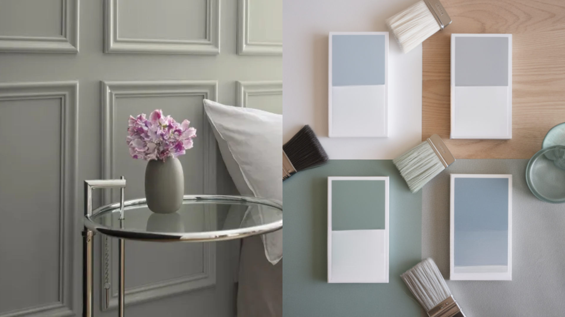
Metropolitan is a versatile neutral that pairs well with a wide range of other colors.
In living rooms, bedrooms, or kitchens, it easily combines with different shades to create a balanced and stylish look. Some great color pairings for Metropolitan include:
-
Whites and Creams: Pair Metropolitan with whites and creams to create a bright and fresh look. These light tones will complement the soft gray-blue undertones of Metropolitan, helping to create a clean and airy space.
-
Soft Grays: Since Metropolitan already has a soft gray undertone, it pairs beautifully with other shades of gray. Whether it’s light gray, charcoal, or even deep slate, this combination creates a balanced and sophisticated feel.
-
Warm Neutrals: For a cozy and inviting atmosphere, combine Metropolitan with warm neutrals like beige, taupe, or light brown. This adds warmth and depth to the space while still keeping the modern, cool vibe intact.
-
Wood Tones: Natural wood finishes, such as oak or walnut, look stunning with Metropolitan. The contrast between the cool tones of the color and the warmth of the wood creates a sophisticated and grounded feel.
-
Bold Accents: If you want to add some drama to your space, pair Metropolitan with bold accent colors like deep navy, forest green, or rich burgundy. These contrasting colors work well with the neutral base of Metropolitan, creating a stylish look.
Metropolitan (AF-690) by Benjamin Moore vs Similar Shades
When selecting a neutral color, it’s helpful to compare similar shades to see which one works best for your space.
| Color | Description | Key Differences |
|---|---|---|
| Metropolitan (AF-690) | A cool, muted grayish-blue with a sophisticated vibe. | Balanced and soft, creating a calming, modern atmosphere. |
| Gray Owl (2137-60) | A light gray with subtle green undertones, offering a cooler, more neutral look. | Lighter and with more of a neutral gray tone. |
| Revere Pewter (HC-172) | A soft, warm gray with slight beige undertones, giving it a traditional feel. | Warmer and more beige compared to the cool tones of Metropolitan. |
| Silver Chain (1472) | A cool, light gray with a slight blue undertone, creating a more modern look. | More blue in tone and slightly lighter than Metropolitan. |
By comparing these shades, you can confidently choose the one that best fits your home’s style and atmosphere.
Reviews of Metropolitan (AF-690) by Benjamin Moore
Homeowners and designers alike rave about Metropolitan for its cool, modern vibe. Many reviews mention how the color creates a serene, sophisticated atmosphere that isn’t too cold or stark.
People appreciate its ability to work with a variety of design styles, from minimalist to traditional to modern.
Metropolitan is also praised for its versatility. Paint an entire room, create an accent wall, or update a piece of furniture, Metropolitan works beautifully and adds a personal touch to any space.
Its ability to complement other colors and furniture styles makes it a popular choice for both homeowners and designers.
Conclusion
Metropolitan by Benjamin Moore is a soft, cool gray that brings calm and style to any room. It’s a great choice if you want a clean and modern look without feeling cold or plain.
This color works well in bedrooms, living rooms, kitchens, and even bathrooms. It pairs nicely with whites, grays, wood tones, and bold colors, so it’s easy to match with your decor.
Whether you use it on all the walls, one accent wall, or even furniture, Metropolitan adds a touch of class and comfort.
If you’re looking for a beautiful neutral that feels both fresh and timeless, consider Metropolitan. It might just be the perfect fit for your next home project.