
Color is one of the most influential elements in interior design. It sets the mood, enhances the style, and can even influence how you feel in a space. Whether you’re designing a living room, a bedroom, or an entire home, understanding how to use color effectively is key to creating a harmonious environment.
A well-thought-out color palette can transform a room from ordinary to extraordinary, making it feel balanced, inviting, and comfortable.
In this article, we’ll explore the art of creating harmonious color palettes and provide helpful tips on choosing the right colors for your home’s interior.
Understanding the Power of Color in Interior Design
Before diving into specific palettes, it’s essential to understand the psychological effects of color. Different colors evoke different feelings and associations, and these emotions can have a significant impact on how a room feels. Here’s a quick rundown of common color associations:
- Red: Passion, energy, warmth
- Blue: Calm, tranquility, trust
- Yellow: Happiness, positivity, energy
- Green: Balance, growth, relaxation
- Purple: Luxury, creativity, calm
- White: Purity, simplicity, spaciousness
- Gray: Neutrality, sophistication, calm
When selecting a color palette, think about the emotions you want to evoke in each room and choose accordingly. For instance, a living room may benefit from calming blues or greens, while a kitchen might be better suited for lively yellows or oranges.
How to Choose a Color Palette for Your Home
Creating a harmonious color palette isn’t just about picking a few colors that look good together. It’s about creating balance, contrast, and flow between the various elements in a room. Here are some tips on how to select a cohesive and harmonious color scheme for your home:
1. Start with a Base Color
The first step in creating a color palette is to select a base color. This will serve as the foundation for the rest of your design. The base color should cover a significant portion of the room, such as the walls, large furniture pieces, or flooring.
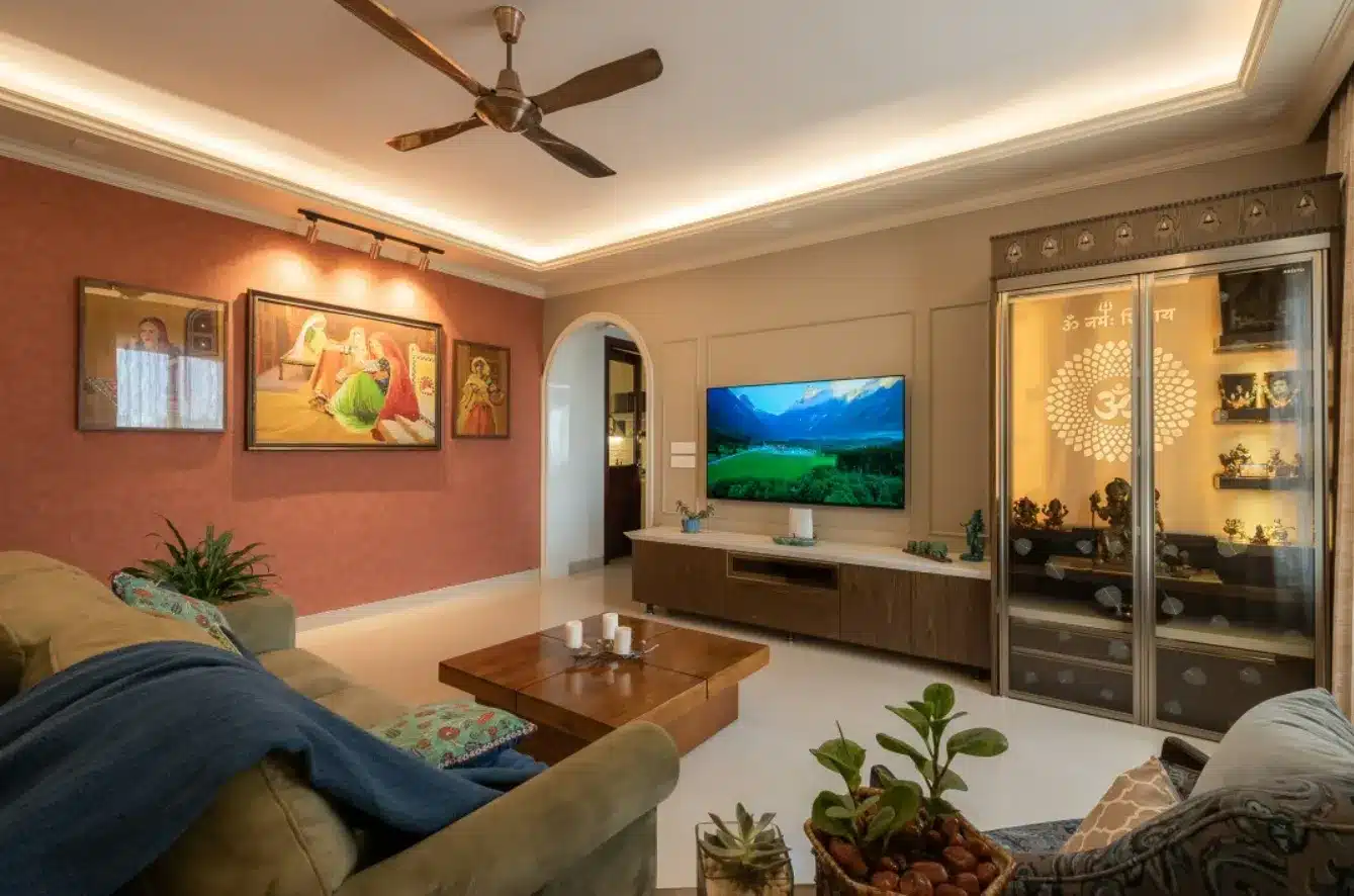
- Neutral Base Colors: Neutral tones like white, beige, gray, or taupe are timeless and versatile. They provide a calming backdrop for other colors and can make the space feel more open.
- Bold Base Colors: If you’re feeling adventurous, you can choose a bold or dramatic base color, like navy blue or charcoal gray, for a more striking look.
Starting with a base color gives you a clear direction for the rest of your design, making it easier to build the rest of your palette.
2. Add Complementary Accent Colors
Once you’ve chosen a base color, the next step is to add complementary accent colors. These should be colors that contrast or complement your base color. Accent colors are typically used for smaller elements, like throw pillows, rugs, curtains, and decorative accessories.
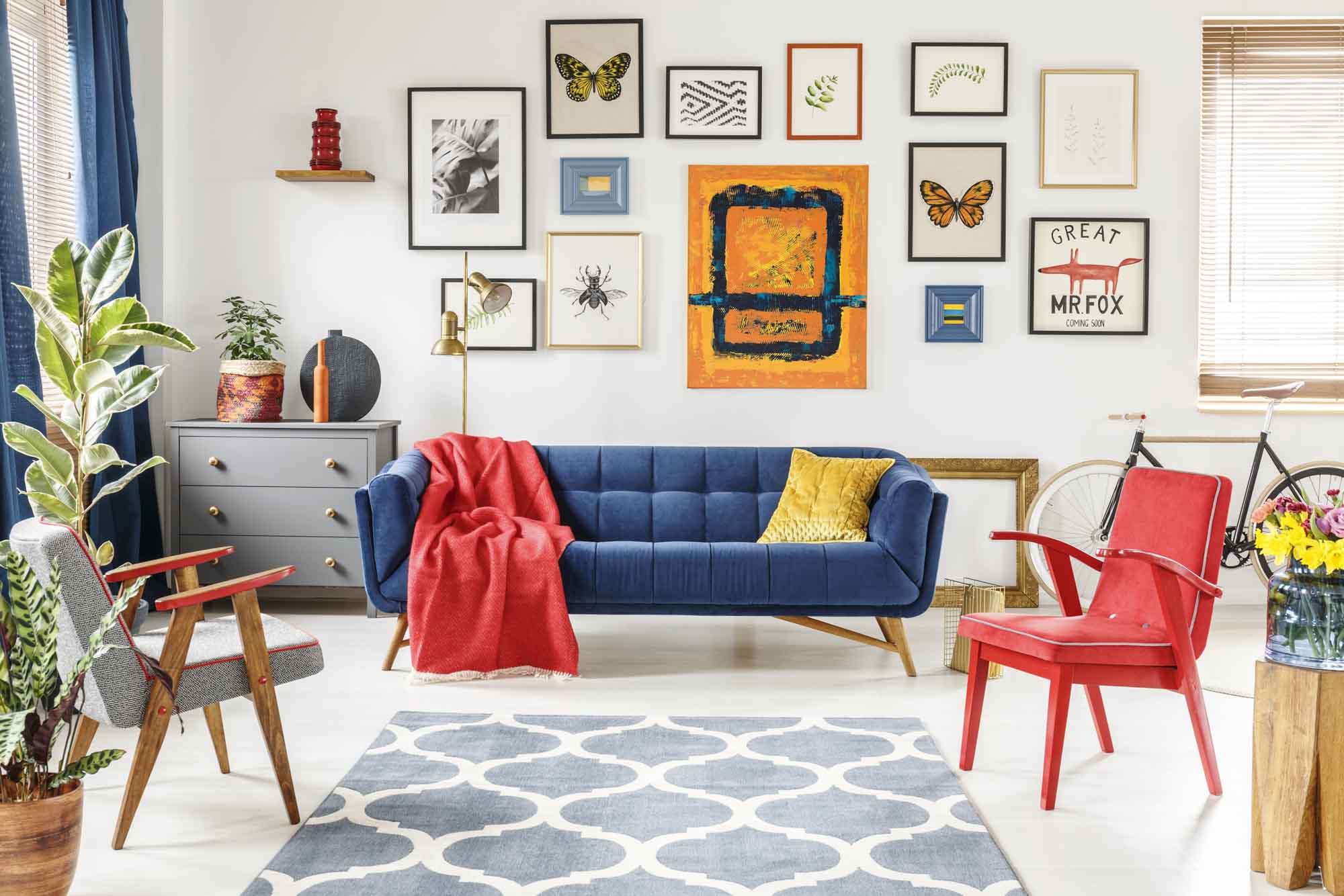
- Complementary Colors: These are colors that are opposite each other on the color wheel (e.g., blue and orange, red and green). Using complementary colors creates visual interest and can make your space feel dynamic and energetic.
- Analogous Colors: These are colors next to each other on the color wheel (e.g., blue, blue-green, and green). Analogous colors work well together because they create a seamless and harmonious flow.
For instance, if your base color is a soft beige, you can add accent colors like navy blue, mustard yellow, or emerald green to create balance and contrast.
3. Use the 60-30-10 Rule
A helpful guideline in interior design is the 60-30-10 rule, which is a simple formula for balancing colors within a room.
- 60%: The dominant color (typically the walls or larger furniture pieces).
- 30%: The secondary color (usually for upholstery or curtains).
- 10%: The accent color (for accessories like throw pillows, artwork, or small décor pieces).
This rule helps you create a balanced and well-organized color scheme, preventing any one color from overpowering the others.
4. Consider Natural Lighting
The amount and type of natural light a room receives can significantly affect how colors appear. Rooms with abundant natural light will make colors appear brighter and more vibrant, while rooms with less natural light can benefit from lighter and warmer tones to prevent the space from feeling too dark and cold.
- Light-Colored Walls: If a room doesn’t receive much natural light, use light colors like whites, pastels, or soft neutrals to make the space feel brighter and more open.
- Dark-Colored Walls: If you have a well-lit room, darker colors like deep blues or rich grays can add depth and warmth without making the room feel too closed off.
Consider the natural light available when selecting your palette to ensure the colors complement the room’s atmosphere.
5. Incorporate Texture and Patterns
Once you’ve selected your primary colors, it’s time to add texture and pattern to the space. Mixing and layering different textures (e.g., velvet, leather, wood) and patterns (e.g., stripes, florals, geometric shapes) adds richness to the room and enhances the overall aesthetic.
- Wallpaper: Adding textured wallpaper can give a room a stylish and sophisticated look. There are various wallpaper designs available, from subtle textures to bold patterns, which can complement the chosen color palette. If you’re looking for inspiration or ready-made designs, check out Wallism, where you can explore a range of wallpapers tailored to suit any room’s theme and color palette.
- Soft Furnishings: Throw blankets, cushions, and rugs in complementary colors and textures can elevate the visual appeal of the space and help pull together the color scheme.
For example, a flower mural wall can add both texture and color to a living room or bedroom, creating a dynamic feature that ties together the rest of your design.
6. Maintain Consistency Across Rooms
While each room in your home can have its own color palette, maintaining some level of consistency throughout your home creates a cohesive flow. You don’t have to use the same colors in every room, but you can carry similar tones or accent colors throughout the home to unify the space.
- Matching Accent Colors: You can incorporate the same accent colors in different rooms to create a sense of unity. For example, if you have navy blue accent pillows in the living room, consider using navy blue curtains in the bedroom.
- Transitioning Colors: For rooms that are adjacent to each other, try to use transitional colors that complement one another. This way, the colors in each room won’t clash when viewed from a hallway or doorway.
Conclusion
Creating a harmonious home is all about balance, flow, and personal expression. By understanding the psychological effects of color, using complementary and contrasting tones, and layering in texture and patterns, you can design a space that feels welcoming, comfortable, and visually appealing.
Don’t forget, when designing a space, every detail matters—whether it’s the choice of a subtle color palette or a bold feature like a flower mural wall, which adds a unique, vibrant element to any room. Start with a clear color plan, and your home will come together in a way that reflects your style and personality.