
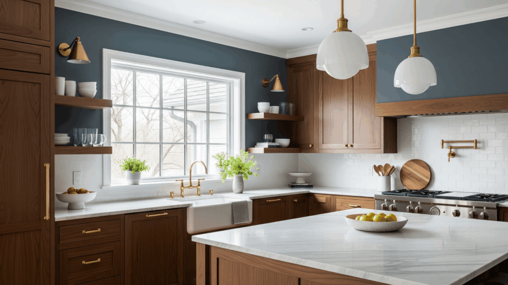
Dark cabinets bring depth, grace, and bold style to any kitchen. But I’ve learned that finding the right paint color to match them isn’t always easy.
Some colors make the room feel too dark, while others clash with the richness of the cabinets. I’ve stood in that spot, surrounded by swatches, feeling completely unsure. That’s why I created this guide.
It’s full of carefully picked paint color ideas that work with dark cabinetry.
Each one includes simple tips on what it pairs with, how it looks in different lighting conditions, and which kind of kitchen style it suits best.
I wanted this to be easy and helpful, especially if you’ve been second-guessing your choices. Let’s find a color that brings balance, warmth, and life into your kitchen.
Why Color Choice Matters with Dark Cabinets?
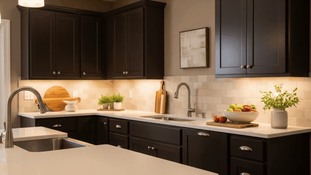
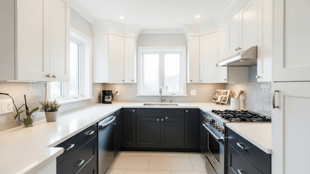
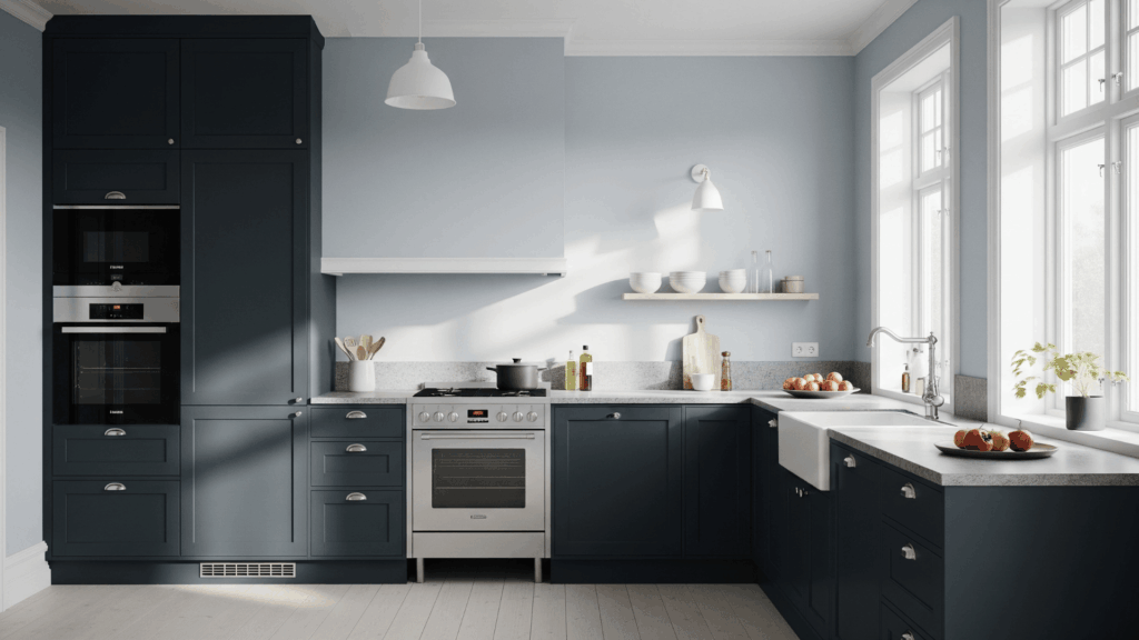
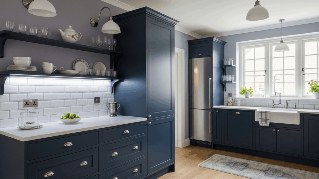
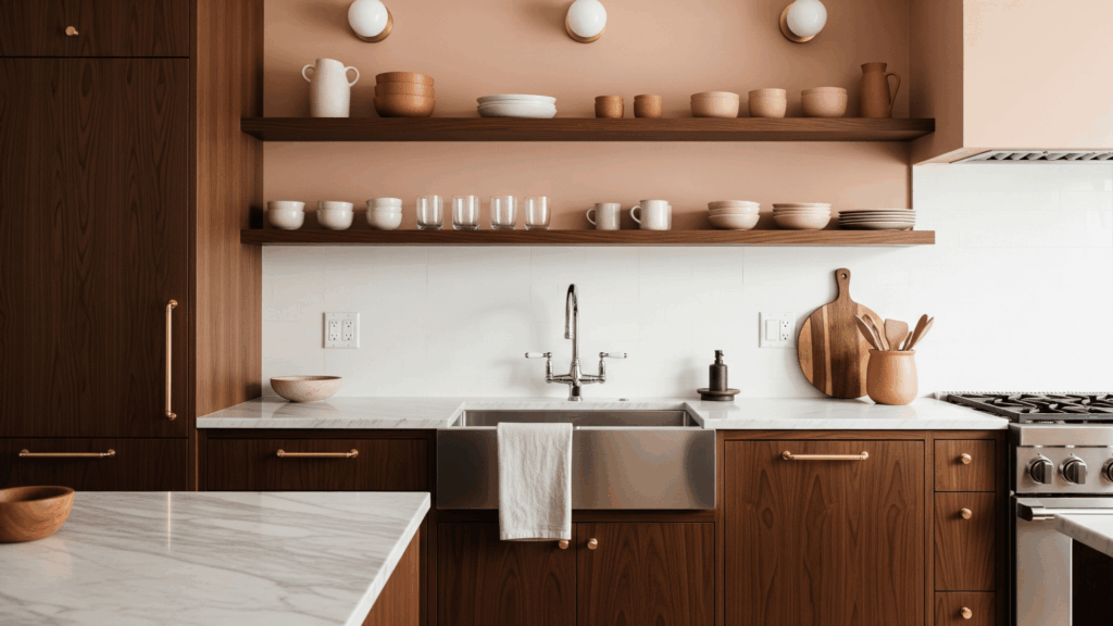
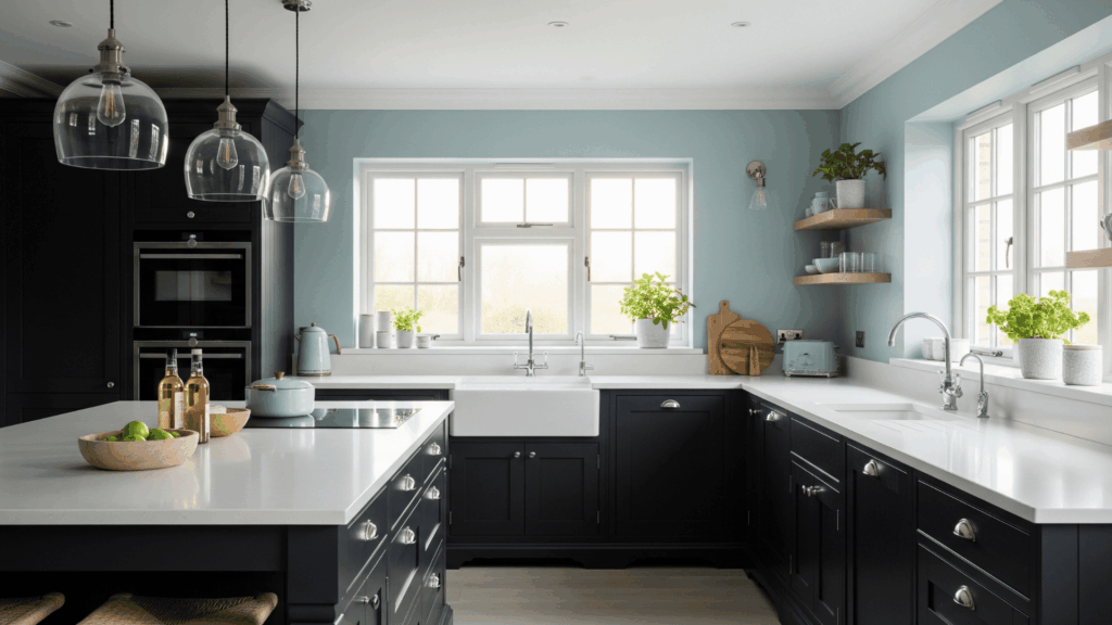
Dark cabinets, such as espresso, navy, charcoal, or black, add richness and style to a kitchen. They make a bold statement and bring a sense of depth.
However, without the right wall color, the space can start to feel too heavy or claustrophobic.
The paint color you choose plays a big role in setting the tone. Light colors can open up the room and reflect natural light, while deeper shades can add cozy contrast when used smartly.
It’s all about balance. The right color pairing helps highlight the cabinets instead of letting them dominate the space. A well-chosen wall color can change the kitchen into something that feels both grounded and inviting.
Top Color Ideas that Work Beautifully with Dark Cabinets
Dark cabinets stand out, and the right wall color makes them shine. I’ve gathered paint ideas beyond plain white or beige.
1. Soft Sage Green
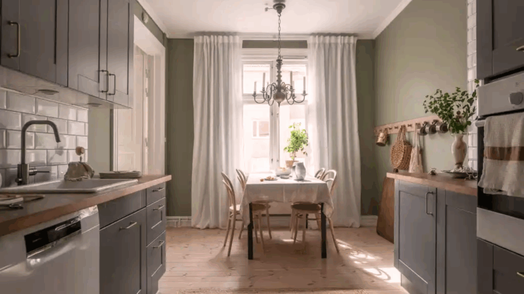
Soft sage green adds a peaceful, earthy feel that pairs perfectly with dark cabinets. It softens the heaviness of the cabinetry and introduces a calm, refreshing tone.
It’s a great pick for kitchens with natural light and wood accents, adding a cozy, natural feel while keeping contrast and style.
- Pairs with: Matte black or brass fixtures
- Great for: Farmhouse or organic styles
- Lighting note: Looks freshest in morning light
2. Warm Taupe
Warm taupe is a welcoming, balanced neutral that adds gentle warmth to spaces adjacent to dark cabinets. It works like a cozy backdrop, softer than gray but less yellow than beige.
This paint color helps tie in wood tones and natural textures beautifully. It won’t compete with dark cabinetry but complements it subtly.
- Pairs with: Cream countertops or tile
- Great for: Transitional or classic designs
- Lighting note: Holds up well in artificial lighting
3. Crisp White
A crisp white palette makes any kitchen feel clean, open, and bright. When paired with dark cabinets, it creates a beautiful contrast that looks fresh and modern.
It’s the go-to option for small or low-light kitchens since it helps bounce light around. Just make sure to pick the right undertone; some whites are cooler, others are warmer.
- Pairs with: Any hardware or backsplash
- Great for: Modern, small, or narrow kitchens
- Lighting note: Maximizes brightness
4. Dusty Rose
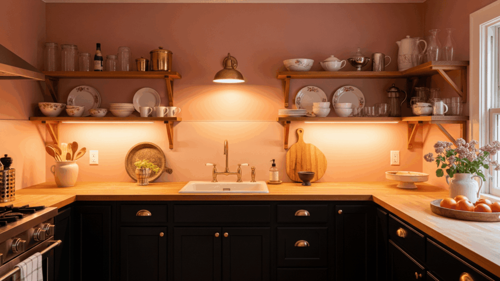
Dusty rose brings a subtle pop of color without being loud. It has a vintage softness that works beautifully against rich espresso or black cabinets.
This soft pink has a gray base, giving it a more mature feel. It brings warmth, depth, and character to the room.
- Pairs with: Gold or natural wood
- Great for: Retro, vintage, or eclectic styles
- Lighting note: Glows warmly under soft lighting
5. Buttery Yellow
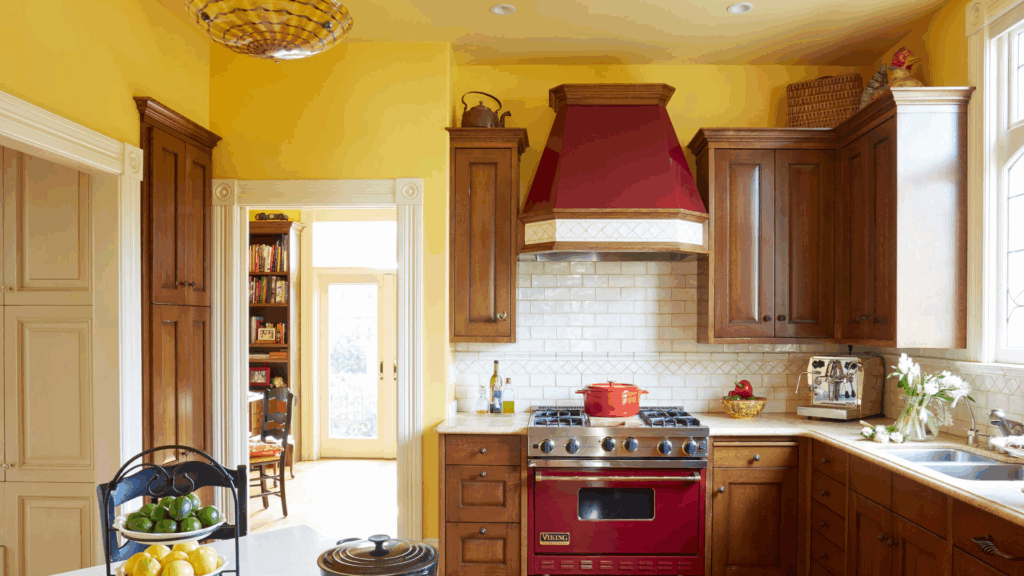
Buttery yellow brings sunny warmth to a kitchen with dark cabinets. It instantly brightens up the space and creates a cheerful, welcoming mood.
This color works well in kitchens that don’t get much natural light or need a little uplifting energy. It’s also a nostalgic hue that pairs well with older houses or beautiful cottages.
- Pairs with: Dark bronze or copper hardware
- Great for: Cottage, country, or vintage kitchens
- Lighting note: Ideal for low-light areas
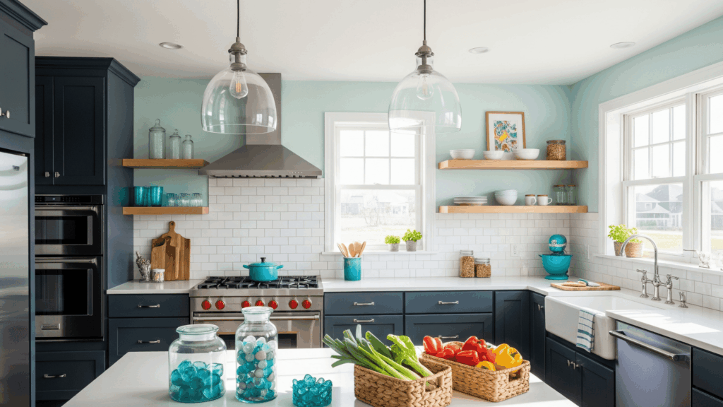
6. Icy Blue
Icy blue feels crisp and clean. It adds a soft contrast to dark cabinetry without making the room feel cold. This shade is light, slightly grayish, and works well in both small and large kitchens.
Icy blue calms the richness of dark cabinets and adds a touch of softness. It also pairs beautifully with stainless steel appliances and white or gray countertops for a balanced look.
- Pairs with: Chrome, white, or glass
- Great for: Coastal, modern, or minimalist kitchens
- Lighting note: Feels airy in natural light
7. Greige (Grey and Beige)
Greige is one of the most versatile colors for pairing with dark cabinets. It’s a neutral that feels cozy but not too warm, and clean but not too stark.
The gray and beige mix helps pull in both cool and warm elements, making it a versatile choice that complements a variety of countertops, floors, and finishes.
- Pairs with: Warm wood or cool tile
- Great for: Open-concept or mixed-material spaces
- Lighting note: Shifts slightly depending on light
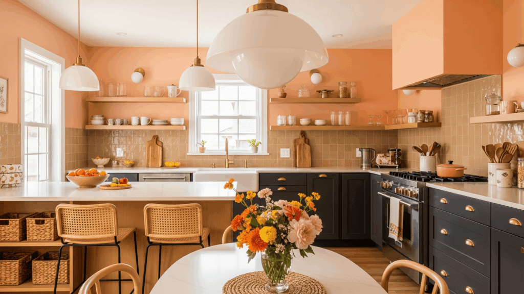
8. Pale Peach
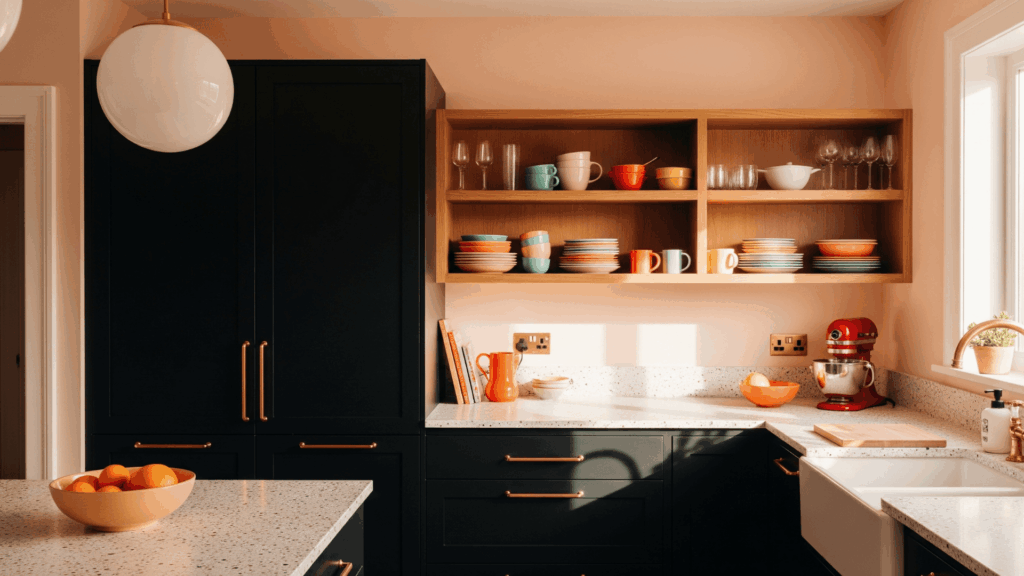
Pale peach adds soft energy to the kitchen while still feeling neutral. This warm, pink-orange blend pairs beautifully with charcoal, navy, or black cabinets.
It doesn’t shout for attention but gently brightens the space with a fresh twist. Pale peach adds warmth without heaviness, and it works well with both modern and retro design elements.
- Pairs with: Brass or rose gold accents
- Great for: Mid-century or boho kitchens
- Lighting note: Reflects soft golden tones
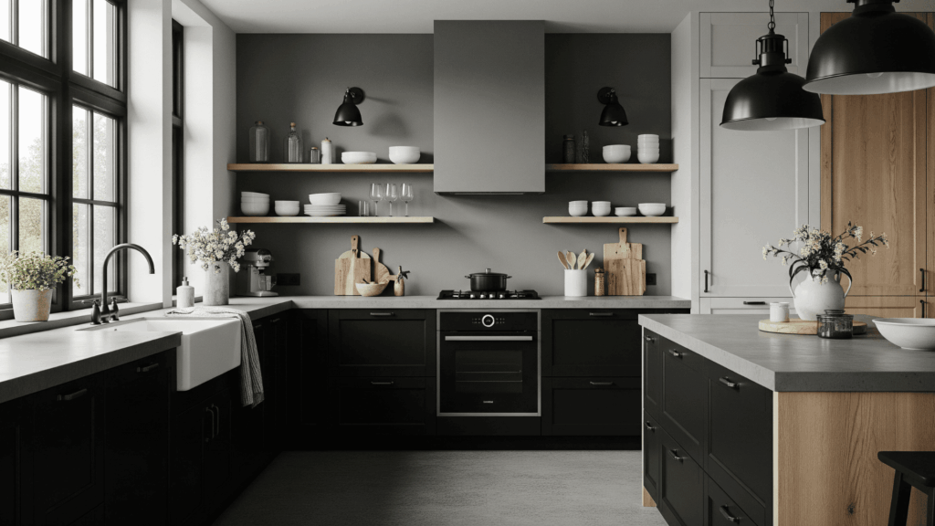
9. Sky Gray
Sky gray is a light, cool-toned color that helps lighten up kitchens with dark cabinets. It’s a clean, subtle backdrop that feels modern and airy.
Sky gray keeps things fresh while letting darker cabinetry remain the star of the show. It also combines easily with stainless steel appliances and stone surfaces.
- Pairs with: White trim and nickel finishes
- Great for: Minimalist or Scandinavian kitchens
- Lighting note: Reduces glare in well-lit spaces
10. Creamy Beige
Creamy beige offers a gentle, warm tone that softens dark cabinets and makes spaces feel more open. Slightly richer than off-white, it’s warmer than gray, creating an inviting, versatile atmosphere.
Creamy beige works well in homes with classic or transitional design styles and complements natural textures, such as wood or woven baskets.
It’s great for layering in warmth without adding too much color.
- Pairs with: Light wood, off-white counters
- Great for: Traditional or rustic spaces
- Lighting note: Flatters both natural and artificial light
11. Teal Green
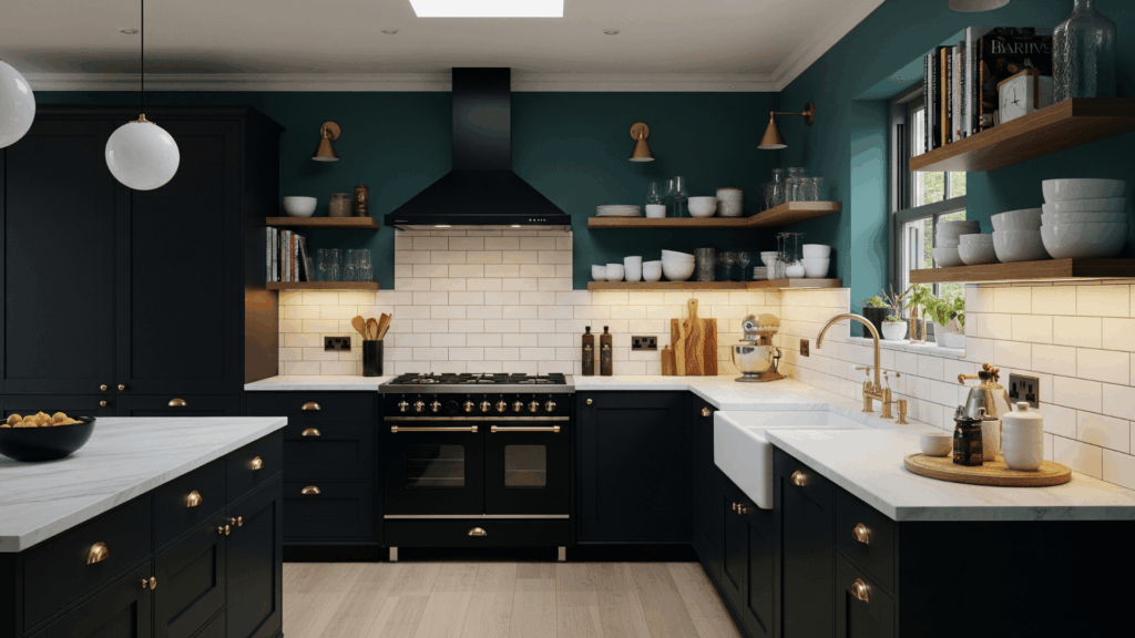
Teal green is bold but grounded. It offers a vibrant contrast to dark cabinets without clashing. This jewel-toned shade adds depth and personality, especially if you’re aiming for a rich, layered look.
It’s dramatic but not overpowering when used on just the walls. Pair it with lighter countertops and metallic touches to keep things fresh.
- Pairs with: White tile or gold accents
- Great for: Moody, modern kitchens
- Lighting note: Can darken in low light
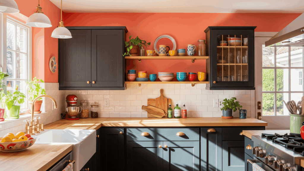
12. Terracotta
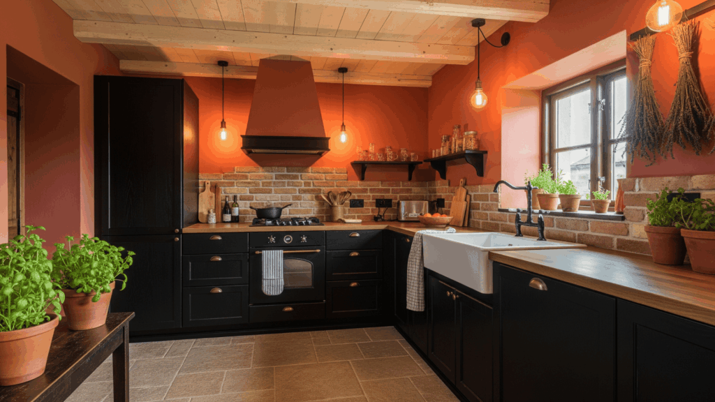
Terracotta adds a warm, earthy tone that beautifully complements espresso or black cabinets. It brings in natural, sunbaked vibes and pairs well with rustic textures.
This clay-like shade adds comfort and coziness to any kitchen. It’s especially fitting if you’re using stone floors or wood beams.
- Pairs with: Brick, stone, or copper
- Great for: Rustic or Mediterranean kitchens
- Lighting note: Glows under warm bulbs
13. Lavender Gray
Lavender gray is unexpected but lovely. It combines a soft purple undertone with gray for a subtle yet creative wall color. It gives dark cabinets a unique backdrop while keeping the room calm and airy.
This shade is perfect for adding a hint of playfulness without overwhelming the space. It also works well with brushed metals and white tile.
- Pairs with: Nickel or white ceramic
- Great for: Romantic or vintage spaces
- Lighting note: Feels cooler in LED light
14. Slate Blue
Slate blue offers a smoky, gray-blue tone that mixes beautifully with dark cabinetry. It adds depth without competing for attention and feels welcoming.
The color works well in both small and large kitchens, adding a classic or modern touch to your decor, depending on your style.
It pairs especially well with marble, white countertops, or wood accents.
- Pairs with: Brass or marble
- Great for: Farmhouse or transitional styles
- Lighting note: Maintains richness in dim spaces
15. Olive Green
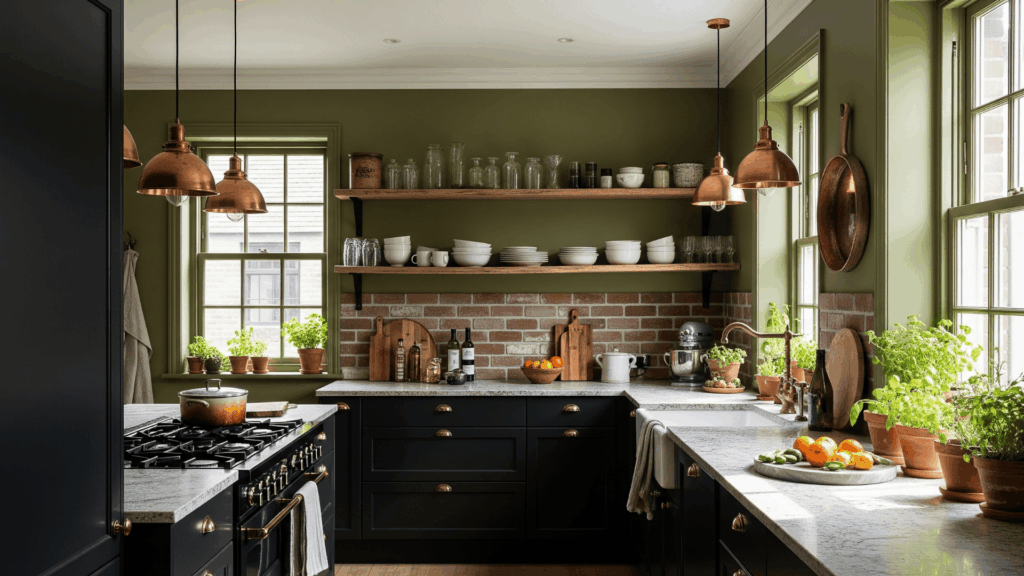
Olive green brings a cozy, earthy vibe to a kitchen with dark cabinets. It feels rich and inviting, especially when used alongside natural materials like wood or stone.
This muted green adds personality without shouting and fits beautifully into kitchens aiming for a grounded, organic feel. It looks pretty against matte black or deep wood cabinetry.
- Pairs with: Raw wood, brick, or copper
- Great for: Organic, earthy styles
- Lighting note: Needs sunlight to stay lively
16. Pale Aqua
Pale aqua is light, airy, and instantly softens the intensity of dark cabinets. It adds a cool touch while still feeling cheerful and inviting.
This pastel tone works particularly well in coastal-themed or vintage-style kitchens. It’s ideal if your kitchen already has lots of natural light and you want a calming contrast to dark cabinetry.
- Pairs with: Glass, white, or stainless steel
- Great for: Coastal or breezy kitchens
- Lighting note: Feels vibrant in sunlit rooms
17. Soft Apricot
Soft apricot introduces a gentle warmth without leaning too orange or peachy. It adds a cheerful glow to the kitchen and complements navy, walnut, or espresso cabinets beautifully.
The color is playful and welcoming without becoming too bold. Apricot can also help older kitchens feel more updated and stylish without a total remodel.
- Pairs with: Brass, tan tile, or rattan
- Great for: Retro or cheerful kitchens
- Lighting note: Glows warmly in soft lighting
18. Mushroom Gray
Mushroom gray is an earthy, mushroom-inspired neutral that mixes gray and beige with soft brown undertones. It adds a quiet class and warmth to any kitchen, especially when paired with espresso or black cabinets.
The color complements natural stone, butcher block, or concrete countertops well. It doesn’t overpower, but helps the space feel grounded and cohesive.
- Pairs with: Stone or matte black hardware
- Great for: Modern or industrial spaces
- Lighting note: Very adaptive across light sources
19. Warm Coral
Warm coral brings playful warmth and brightness to a kitchen with dark cabinetry. It’s not too red, not too orange, just the right cheerful middle.
This color makes the space feel lively and creative, especially in homes with a lot of personality. Coral pairs nicely with natural textures and light-colored countertops.
- Pairs with: Light wood, ivory, gold
- Great for: Tropical, eclectic, or family kitchens
- Lighting note: Feels vibrant in natural or soft white bulbs
20. Soft Mocha
Soft mocha brings a warm, coffee-like tone that adds comfort and richness. It pairs effortlessly with dark cabinets, especially espresso or walnut, and creates a smooth visual transition.
Mocha isn’t flashy, but it makes a room feel polished and cohesive. It works well with warm tile floors, bronze fixtures, and natural materials. It’s a practical color if you want warmth without overwhelming your space.
- Pairs with: Tan, stone, or bronze
- Great for: Cozy, welcoming kitchens
- Lighting note: Enhances shadows and warmth
21. Pale Buttercream

Pale buttercream is a soft, yellow-tinged neutral that makes kitchens feel bright and homey. It brings in warmth without the intensity of pure yellow and contrasts nicely with black or deep brown cabinets.
This color adds a sunny, comforting tone that works well in traditional or country-style kitchens.
It’s especially useful in kitchens with limited natural light where you want to boost the brightness without going full white.
- Pairs with: Espresso cabinets, warm wood floors
- Great for: Vintage or country kitchens
- Lighting note: Keeps the room light and inviting
22. Light Clay
Light clay is a subtle blend of tan, pink, and brown that creates a natural, earthy ambiance. It works beautifully with dark wood cabinets by softening their intensity.
This color is classy but approachable and feels more modern than traditional beige. It complements natural materials and open shelving perfectly.
- Pairs with: Marble, brass, or white tile
- Great for: Urban, boho, or natural kitchens
- Lighting note: Reflects ambient light gently
23. Ocean Mist
Ocean mist is a soft, blue-green tone that evokes a refreshing and balanced feel. It cools down the heaviness of dark cabinets while still adding color and depth.
This hue is perfect for calm, spa-like kitchens or open layouts with lots of light. Ocean mist also works well with white trim, light countertops, and natural accents.
- Pairs with: White, glass, or chrome
- Great for: Coastal or peaceful kitchens
- Lighting note: Changes gently with natural light
Quick Tips Before You Paint
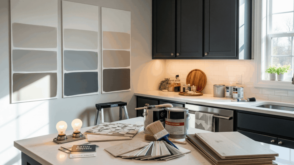
What looks perfect on a swatch can feel different when applied to walls. These small steps can save you a lot of frustration and help you feel more confident in your choice.
- Sample before committing: Paint large swatches directly on multiple walls, not just on white paper. Observe them during the morning, afternoon, and under your kitchen lights to see how their tone and mood shift.
- Test with your cabinet finish: Hold your swatch or sample near both matte and glossy cabinet doors. Some paint colors pick up reflections, while others look dull against flat finishes.
- Pair with countertops and backsplashes: Lay the sample next to your countertop, backsplash, and even flooring. The undertones can either clash or mix beautifully, depending on the materials.
- Watch the lighting: North-facing kitchens need warmer tones, while south-facing ones suit brighter shades. Light bulbs also affect how paint looks.
- Use an eggshell or satin finish: These finishes reflect just enough light to keep the space bright while still hiding minor wall flaws. They also clean more easily, perfect for kitchen splatters.
Conclusion
Picking the right paint color isn’t just about making things look nice; it’s about creating a space that feels right every time you walk in. I’ve made rushed decisions before and ended up regretting them.
Colors that looked great online didn’t feel the same in real life. That’s why I always suggest slowing down, testing a few options, and trusting your gut.
Your kitchen should feel like it fits you, not a trend. It’s where life happens: meals, conversations, memories.
A well-chosen paint color can completely change the mood, brighten your mornings, and highlight the beauty of your cabinets.
If this post gave you clarity, a favorite idea, or even just helped you feel less stuck, share it with someone else who’s choosing paint. You never know whose kitchen you’ll help fix next, with just a link.