
Looking at colors from the past can tell us a lot about how people lived and what they liked. One group of colors that’s gaining new attention is the set used during the Regency era. These tones stood out in homes, clothing, and art in England during the early 1800s.
Many people today are drawn to Regency colors because of period shows, Jane Austen stories, and old-world homes being brought back to life. These colors feel soft but are still strong. They reflect the beauty of natural dyes and hand-mixed paints from that time.
In this post, you’ll learn what “Regency color” really means. We’ll walk through some of the most used shades, what they represented, and where they’re still being used today.
If you’ve ever wanted to bring a calm but rich feeling to a space, these historic colors may be just what you’re looking for.
What Is Regency Color?
Regency color refers to the paint shades used during the British Regency era, which lasted from the late 1700s to the mid-1800s.
Social trends, historical events, and artistic taste of the time shaped these colors. Because of their soft, balanced feel, they are still used today in both historic and modern interiors.
During the Regency period, color played a strong role in how people designed their homes. It wasn’t just about personal taste—it was also about showing wealth, status, and cultural knowledge. Families with more money used deeper, stable colors made from better pigments.
The shades were often calm, but they still had depth. Common choices include soft blues, earthy greens, warm browns, and creamy neutrals.
The paints were usually matte, not glossy, which added to their grounded look. These colors were inspired by nature, ancient art, and the clean lines found in classical design.
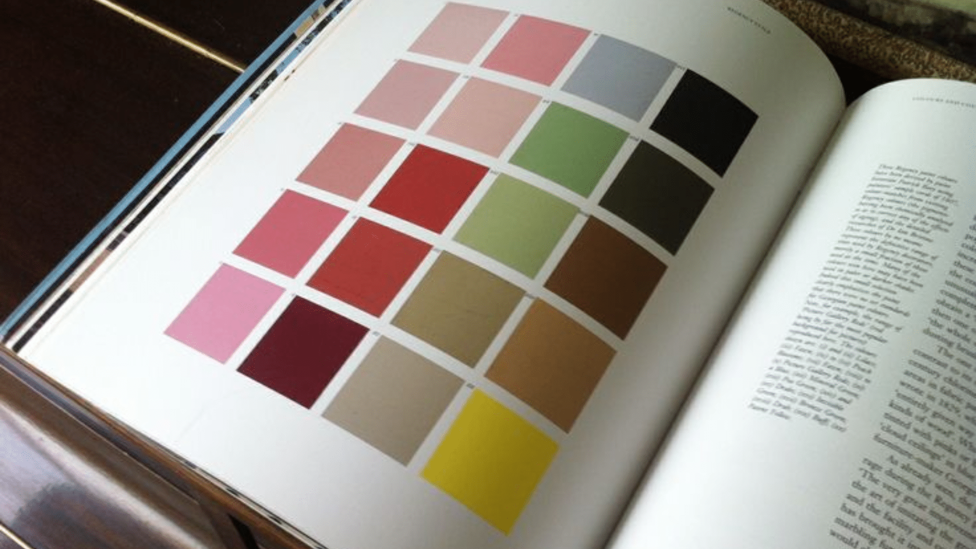
Common Regency Colors and Their Meaning
Regency homes used soft, calm, and easy-to-live-with colors. These shades were chosen for rooms where people gathered, read, or rested. Each color had a job to do and helped make the space feel just right.
1. Peach Blossom – HEX #FFD1DC

Peach Blossom is a soft pink that feels warm and gentle. It helped drawing rooms feel calm and peaceful. The shade worked well with the white trim and gold details.
It looked best in rooms with natural light. The pink stayed light without looking washed out, making rooms feel friendly without being too bright.
2. Yellow Pink – HEX #F6C289

Yellow Pink is a mix of light pink and soft gold. It brings warmth without feeling bold. People often use it in rooms with wood floors and light walls.
This shade gave the room a soft glow. It matched well with brass, cream, and tan, making homes feel cozy and neat.
3. Celestial Blue – HEX #A3C6E6

Celestial Blue is a pale blue that feels cool and light. It reminds people of clear skies and soft daylight, so it was often used in fancy sitting rooms or halls.
It looked best with white trim or silver accents. The tone stayed calm without feeling flat, helping open up the space and making it feel fresh.
4. Green Verditer – HEX #B2D3C2

Green Verditer is a light mint green made from copper salts. It was used on walls and trim in quiet rooms, making spaces feel balanced and calm.
It paired well with ivory, tan, and stone. The color stayed soft under daylight and candles, giving a fresh look without standing out too much.
5. Blue Verditer – HEX #B5D7E0

Blue Verditer is a soft, powdery blue. It was used in open areas like halls and stairways. The shade brought lightness without making the room feel cold.
It worked well with white or pale gray. The color helped brighten tall walls and large spaces, making homes feel calm and put together.
6. Stone – HEX #D0C8BA

Stone is a gentle gray-beige used as a trim or base color. It gives rooms a quiet and clean base and works well with pastels and deep tones.
People used Stone to balance bright colors. It helped tie the whole room together. It never felt too dark or too plain.
7. Mushroom – HEX #D1C8B7

Mushroom is a soft brown-gray that feels grounded and warm. It was often used on doors, trim, and lower walls. The shade worked well with wood and brass.
Mushrooms added a touch of color without taking over the room. They gave depth to spaces with light walls, and the tone made rooms feel stable and calm.
8. Buff – HEX #F0DC82

Buff is a pale tan with a soft yellow touch. It was used in trim, ceilings, and woodwork. Buff helped warm up rooms without using bright colors.
This shade worked with both dark and light paints. It made spaces feel smooth and blended. Buff was a safe pick in most rooms.
9. Deep Olive – HEX #556B2F

Deep Olive is a strong green that feels steady and grounded. It was often used in libraries or studies. The shade made quiet rooms feel rich and calm.
Olive worked well with dark woods and warm metals. It gave the space a thoughtful look and helped people feel settled and focused.
10. Indigo – HEX #4B0082

Indigo is a rich purple-blue that feels deep and strong. It was used in curtains, borders, and rugs, helping frame and shape rooms.
Indigo added weight to light spaces. It worked well with gold, red, and cream. The tone gave rooms a quiet but bold edge.
Where You Might See Regency Colors Today
Regency colors aren’t just stuck in the past. They still appear in home design, film, and even commercial paint lines. Their calm feel and deep roots in history make them a favorite for those who love soft, lived-in color.
1. Historic Homes and Restorations
In older homes, Regency colors are often brought back through careful paint restoration. People match shades found beneath old layers of paint to stay close to the home’s original style, keeping the building’s story alive while making it feel fresh.
Rooms like parlors or studies use colors such as sage green or peach blossom to bring warmth and history. Trim and molding often get painted in soft neutrals like buff or stone. These details help give old spaces a gentle but rich look.
2. Paint Brands Inspired by Historic Palettes
Paint companies like Little Greene and Farrow & Ball offer colors taken straight from the Regency period. These shades are based on real historic pigments and room colors, making it easy for anyone to add a bit of the past to modern homes.
These brands group shades into collections tied to specific time periods. This helps homeowners and designers build accurate palettes and gives people a simple way to pick colors that feel steady and tested over time.
3. Films and Period Series
Period dramas often use Regency colors to show history without using words. Shows like Bridgerton or Pride & Prejudice are full of light blues, soft pinks, and calm creams. These shades help set the mood and reflect the time period.
The colors add feeling to a scene—peach for romance, sage for quiet strength, or red for drama. This isn’t just about looks—it’s also about what the colors suggest. It shows how powerful these quiet tones still are in telling a story.
How to Use Regency Colors in Modern Spaces
You can bring Regency colors into modern homes without needing a full historic look. These shades work best when used with care, often as accents or feature walls. The key is to balance soft backgrounds with one or two richer tones.
- Start with a gentle neutral like stone, cream, or mushroom as your base.
- Add contrast with deeper shades like sage green, oxford blue, or burnt sienna.
- Stick with matte finishes to reflect the muted feel of the original palette.
- Choose softer metals like aged brass or gold for hardware and lighting.
- Bedrooms, sitting rooms, and libraries are perfect for these colors.
- Use lighter shades in bedrooms for a calm space and darker tones in libraries to feel grounded.
- Powder rooms can handle bolder colors without making the space feel too intense.
- These tones also blend nicely in classic or cottage-inspired English styles.
Regency colors bring comfort and depth when used with care. Start small, pair wisely, and let the space feel calm and grounded. Even one well-placed shade can bring a quiet, lasting effect.
Regency Color in Fashion and Art
Regency colors were not just for walls—they shaped clothing, fabrics, and fine art, too. Many outfits and artworks from the time followed a soft, balanced color palette. These shades helped create a feeling of ease, calm, and quiet beauty in daily life.
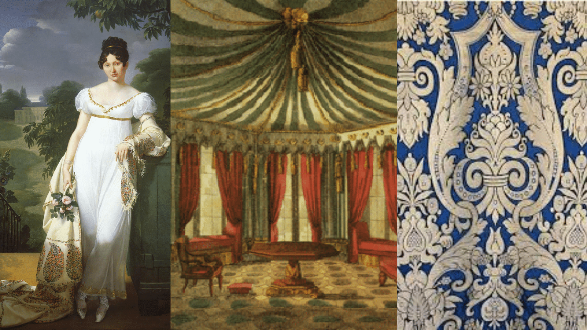
1. Dress Colors of the Era
Clothing during the Regency period often came in gentle shades like pale pink, cream, and soft green. These tones were seen as clean, polite, and proper for social events. They also showed a person’s taste without being loud.
Lighter colors worked well with the fine fabrics of the time, such as muslin and silk. Thanks to these colors, dresses worn during the day were simple but had a soft, elegant finish. In the evening, deeper shades like plum or blue appeared for a more refined look.
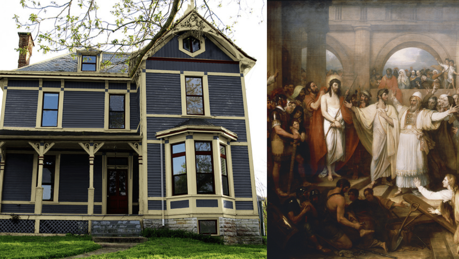
2. Botanical and Mythological Themes
Regency art and design were full of plant and myth themes. Pomona, the Roman goddess of fruit, inspired many gentle floral patterns and natural greens. These nature-inspired colors felt peaceful and tied to classical stories.
Greens, earthy reds, and soft sky blues brought those ideas to life in both fashion and paintings. Artists and decorators used these colors to hint at calm scenes or old myths, adding meaning and depth without needing bold designs.
3. Use in Wallpaper and Textiles
Fabrics from the Regency period used patterns with quiet detail and soft color. Popular prints included small florals, light vines, and repeated shapes in coral, pale yellow, or blue. These prints were often used in curtains, chair covers, and gowns.
Greek-style borders and simple repeats were also common in wallpaper. They used natural tones that felt steady but rich, like olive green or soft terracotta. These patterns helped tie whole rooms together in a gentle and thoughtful way.
Tips Before You Paint
Regency colors can look very different depending on light and space. A color that feels soft in one room may feel much deeper in another. Sampling helps you understand the color before committing to a full wall.
- Use sample boards or paint large swatches on different walls in your room.
- Check the color at different times of day to see how it changes.
- Natural and artificial light can shift the tone more than you expect.
- Look closely for hidden undertones—some may lean slightly warm or cool.
- Try the color next to your furniture, flooring, and trim.
- Avoid choosing straight from a paint chip—real light is key.
- If possible, leave the sample up for a full day or two before deciding.
- Always test more than one option to find the right fit.
Sampling saves time, money, and frustration later. Take a little extra time upfront, and you’ll get a result you’re happy to live with. It’s the best way to see how a Regency tone truly works in your space.
Conclusion
Regency colors have stayed popular for a good reason. They bring a gentle, grounded look that still feels rich. These colors were chosen carefully in the past, and they still feel right in many homes today.
They show up well in both old-style rooms and clean, modern spaces. If you’re designing a room, these shades can support deeper tones or softer ones, depending on what you pair with them. They’re also easy to use across walls, trim, and even furniture.
The best way to begin is to test one color and see how it feels during the day and night. Once you see how it fits your home, you can add more colors that blend with it. That small step may be all you need to bring the quiet strength of the Regency palette into your space.