

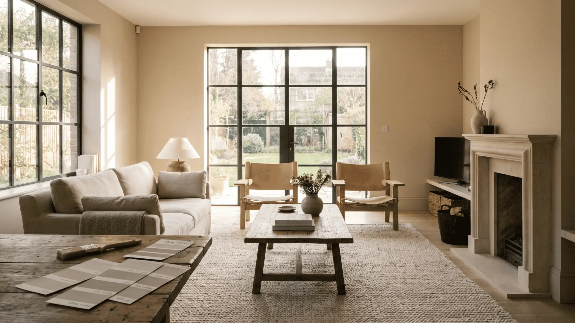
Choosing paint sounds simple until the color dries on the wall and looks completely different from the sample.
I’ve seen how lighting, flooring, and even nearby furniture can change the way a beige appears. That’s why picking the right warm beige paint colors takes more than choosing a shade that looks nice on a paint chip.
A small difference in undertone can make a room feel cozy, balanced, or slightly off.
Taking a little extra time before buying paint can save money and frustration later. The colors below are selected to help you compare undertones, lighting, and real-world performance with greater confidence.
The Best Warm Beige Paint Colors, Organized by Undertone
Warm beige paint colors aren’t all the same. They generally fall into four undertone families: yellow, pink/peach, earthy taupe, and tan.
These undertones have the biggest influence on how a beige looks once it’s on your walls, often more than the paint chip itself suggests.
Lighting also plays a major role. A color that feels warm in a south-facing room may appear cooler or reveal subtle gray or pink undertones in a north-facing space.
That’s why every color below includes its undertone, Light Reflectance Value (LRV), ideal lighting conditions, and a common pairing to avoid, helping you narrow down your options before testing samples.
Best Warm Beige Paint Colors for Every Room
Each of these warm beige shades has a different undertone and reacts differently to light, so the best choice depends on your room, finishes, and overall style.
1. Sherwin-Williams Accessible Beige (SW 7036): Best Overall
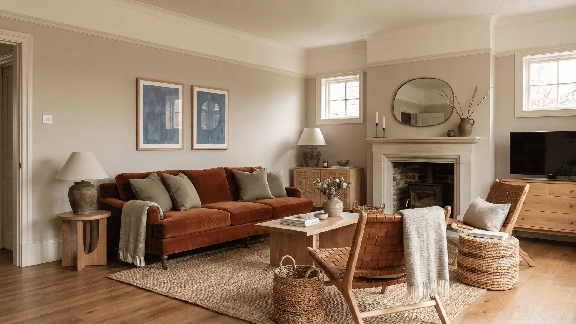
Accessible Beige is a true modern beige with a subtle greige undertone that keeps it from reading yellow, making it one of the most forgiving warm beiges across different light conditions.
Undertone: Yellow-beige with a gray lean | LRV: ~58
It performs best in south- and west-facing rooms, where afternoon light brings out the warmth. In north-facing rooms, it pulls slightly cooler, but it doesn’t go gray. That’s rarer than you’d think at this LRV.
The One Pairing to Avoid: Bright white trim. It pulls the gray component forward and strips out the warmth. Go with off-white or cream instead.
2. Benjamin Moore Edgecomb Gray (HC-173): Best Greige Bridge
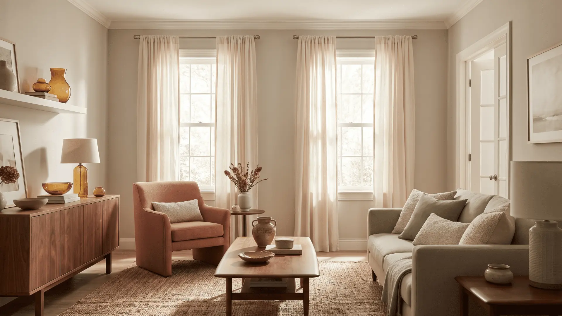
Despite its name, Edgecomb Gray reads as a warm beige in most conditions, and bridges warm and cool palettes better than almost any other color on this list.
Undertone: Mushroom/greige warm gray with beige depth | LRV: ~63.09
What pulls the beige is what’s around it. Warm wood tones, natural textiles, and amber-toned furnishings do the work. In a cool, sparse room with little warmth to reflect, it shifts toward gray.
The Pairing to Avoid: Cool white trim in a north-facing room. The beige quality disappears entirely. It just reads gray.
3. Sherwin-Williams Natural Linen (SW 9109): Best Cozy Tan-Beige
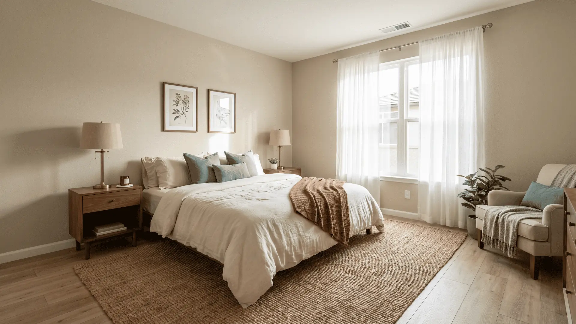
Natural Linen is a tan-beige with a light, cocooning quality, warm without being heavy, that works especially well in rooms with afternoon light.
Undertone: Tan-yellow | LRV: ~66
That high LRV means it reads lighter on the wall than the chip suggests. In south- or west-facing rooms, it stays soft and warm without ever feeling dense.
The Pairing to Watch: Honey oak + yellow pine floors. They amplify the yellow component, and the whole room tips toward butter-yellow. If your floors run warm, sample this one carefully before committing.
4. Benjamin Moore Grant Beige (HC-83): Most Balanced Across Light Directions
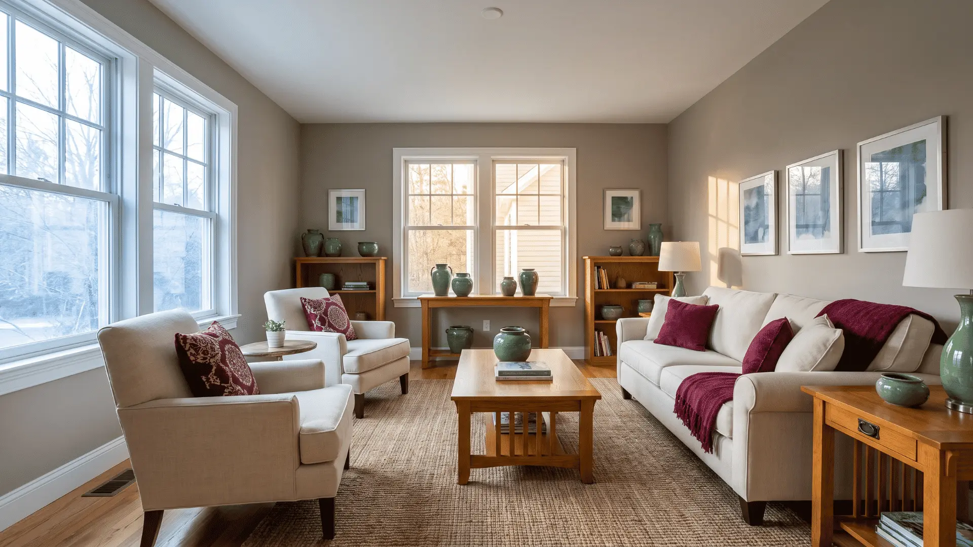
Grant Beige is one of the few warm beiges that reads consistently across north-, south-, east-, and west-facing rooms, thanks to a warm gray undertone that resists both yellow amplification and pink shift.
Undertone: Warm gray-beige | LRV: ~55.81
Most warm beiges shift because lighting amplifies their undertones. Grant Beige stays more balanced because its gray component softens yellow in afternoon light and reduces pink tones in cooler exposures.
The One Pairing that Breaks It: Very dark wood floors or cabinetry. They pull the gray forward, and it reads cooler than it should.
5. Benjamin Moore Bleeker Beige (HC-80): Best for Classic and Traditional Spaces
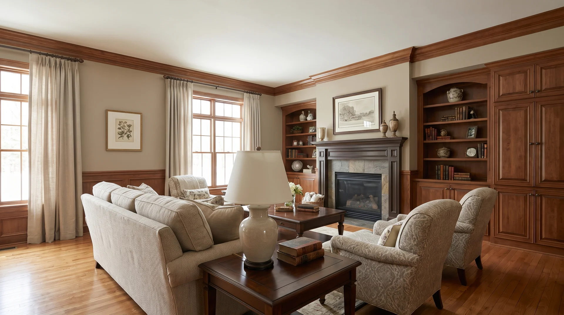
Bleeker Beige sits between beige and taupe, with enough earthy depth to feel grounded in traditional and classic interiors without reading as brown.
Undertone: Taupe-beige with earthy depth | LRV: ~51.66
That earthiness is an asset in the right room. Classic millwork, warm wood trim, and traditional furnishings give it context; the depth reads as richness rather than age.
Take it out of that context, and it struggles. Gray or cool-toned furnishings pull out the earthy component, making it look dingy. This one needs warmth around it to work.
6. Sherwin-Williams Warm Beige (SW 0035): Best for Rich, Traditional Warmth
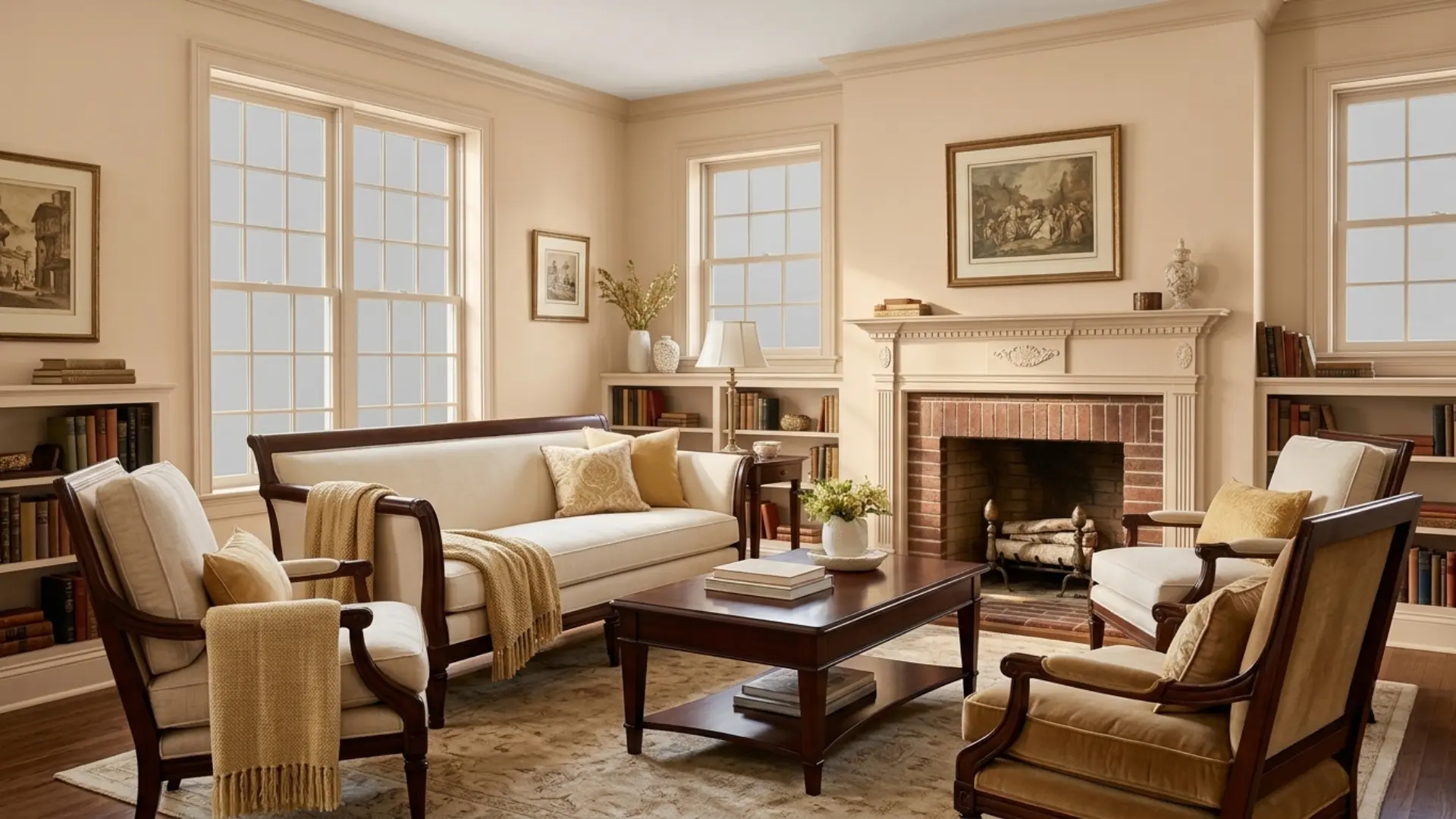
Warm Beige is a richer, more saturated yellow-beige than most modern neutrals; it reads as traditional and inviting in warm light, but can feel heavy in dim or north-facing rooms.
Undertone: Yellow-beige, higher saturation | LRV: ~73
That saturation is the point. In a room with strong natural light or warm artificial lighting, it delivers genuine richness, not just a hint of warmth.
The problem comes in minimal or contemporary spaces. Paired with bright white and gray, the saturation reads as out of place. This color belongs in a warm palette, not a cool-neutral one.
7. Benjamin Moore Shaker Beige (HC-45): Deepest Color on This List
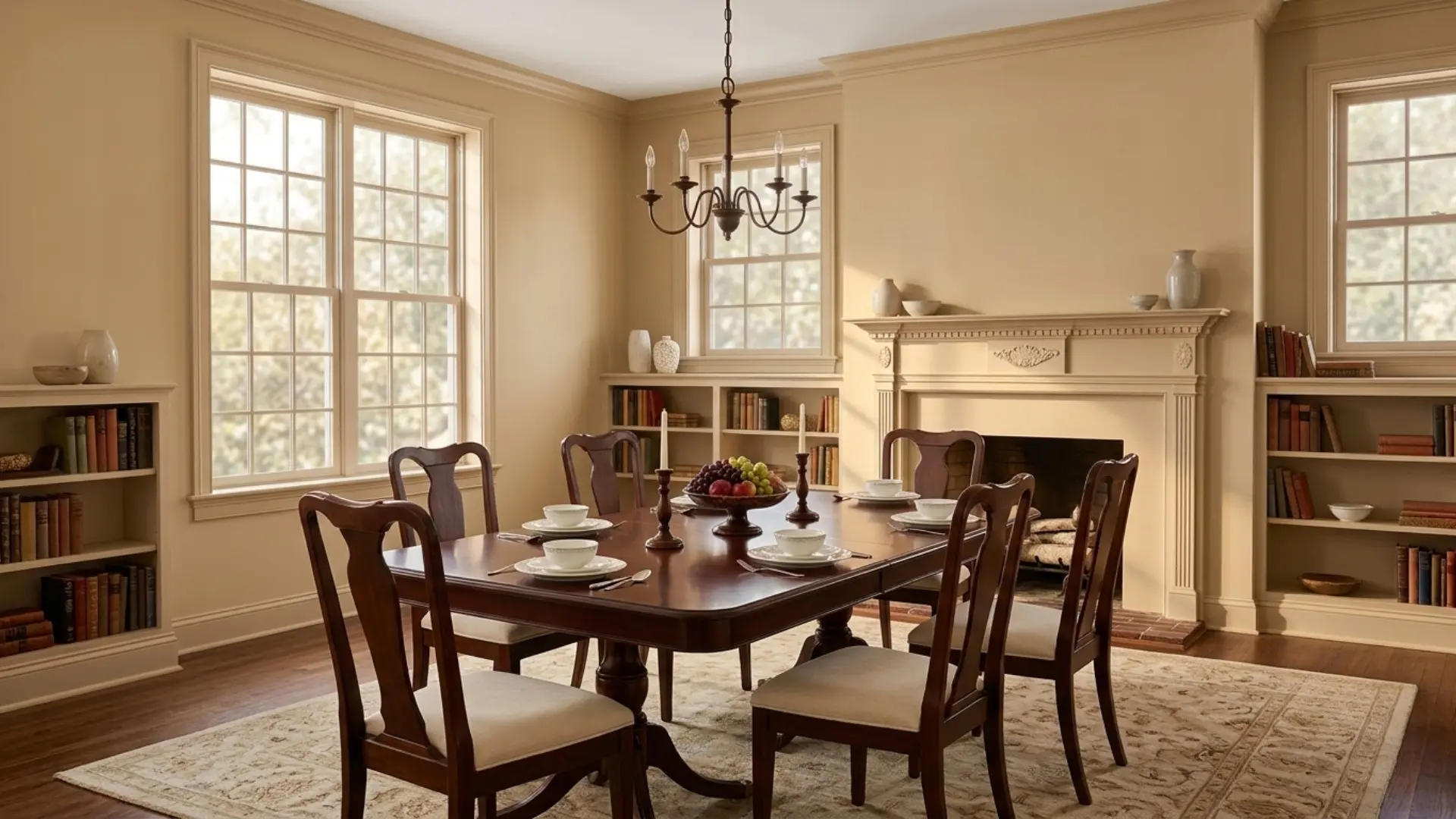
Shaker Beige is the most saturated color on this list, with an LRV near 48; it reads as a rich, warm honey-beige at scale rather than a neutral and works best where depth is the goal.
Undertone: Yellow with earthy depth | LRV: ~53.53
That low LRV means what’s on the chip is understating what lands on the wall. In a room with strong natural light or high ceilings, it’s beautiful. In a small or dimly lit room, it reads as dark.
Very light or minimal furnishings don’t give it enough to work with. The depth looks heavy rather than intentional.
8. PPG Whiskers (PPG1025-3): Best Under-the-Radar Option
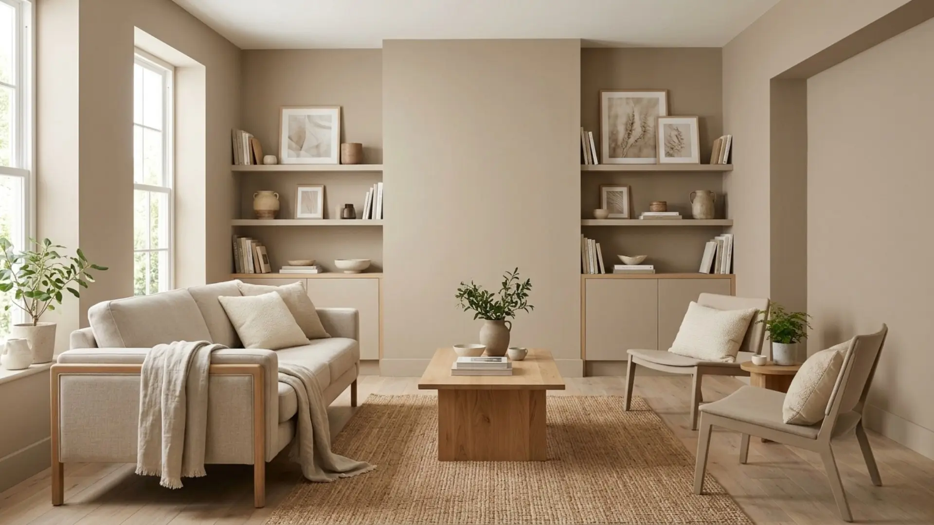
Whiskers by PPG is a warm taupe-beige that performs comparably to Benjamin Moore’s greige options and is worth considering for anyone shopping at PPG or Home Depot paint counters.
Undertone: Warm taupe-beige | LRV: ~60
It sits in the same family as Edgecomb Gray and Grant Beige, balanced, neither too warm nor too cool, without the premium brand markup.
One Condition to Watch: rooms with strong cool-blue light. The taupe component can shift slightly purple-gray under those conditions. Sample it the same way you would any other neutral on this list.
9. Sherwin-Williams Kilim Beige (SW 6106): Best Pink-Undertone Beige
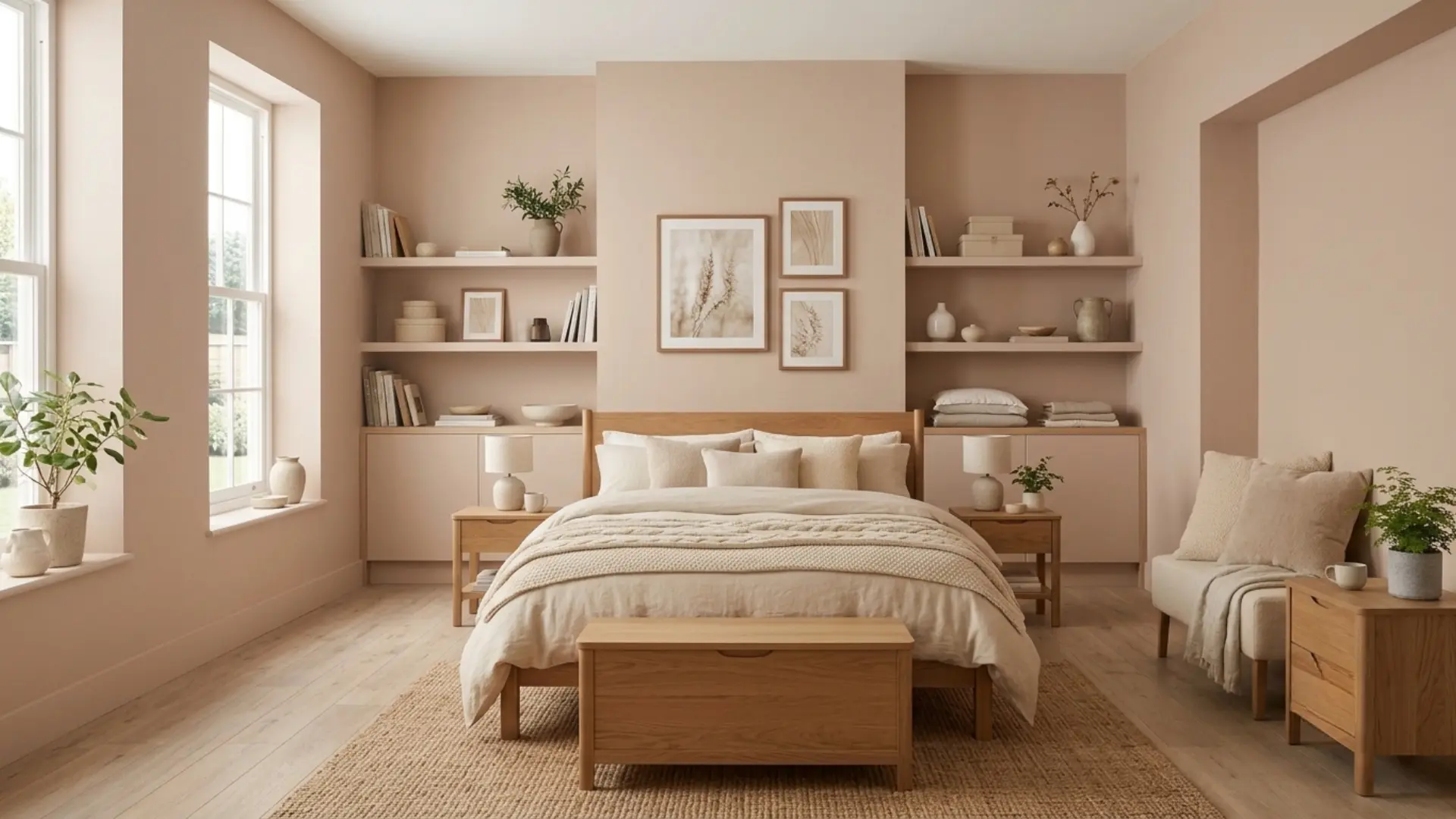
Kilim Beige is the warmest, most personal-feeling color on this list and the one most likely to surprise you if you don’t sample it in your specific room first.
Undertone: Pink/peach-beige | LRV: ~57
That pink undertone is what makes it feel soft and enveloping in the right light. South- and west-facing rooms with warm afternoon sun bring out the richness. It reads genuinely warm, never rosy.
North-or-east-facing rooms are different. Cool light can bring out pink undertones and make it feel peachy, which is harder to balance with decor. Sample this color more carefully than any other on this list.
10. Sherwin-Williams Universal Khaki (SW 6150): Best Earthy Statement Beige
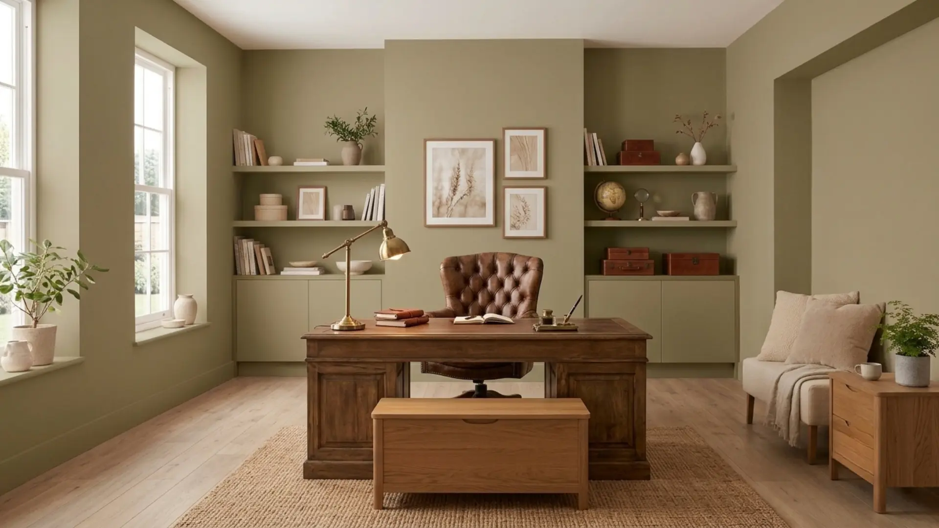
Universal Khaki brings a deeper, earthy feel to spaces that need more warmth and character than a typical beige.
Undertone: Green-brown earthy | LRV: ~40
That LRV makes it the deepest color on this list. It looks warm and golden in bright south-facing rooms, while north-facing rooms bring out a more noticeable, earthier green undertone.
This isn’t a whole-house neutral. It’s a commitment color, best in living rooms, dining rooms, or home offices where depth is part of the design intention. In small or low-light rooms, it will feel heavy.
How to Choose the Right Warm Beige Paint Color
Choosing the right warm beige paint color is about more than picking a shade you like. The amount of natural light, your flooring, and your home’s style all affect how the color looks once it’s on the wall.
| If Your Room Has… | Best Warm Beige Paint Colors |
|---|---|
| North-facing light | Grant Beige, Accessible Beige |
| South-facing light | Natural Linen, Kilim Beige |
| East- or west-facing light | Edgecomb Gray, Accessible Beige |
| Warm wood floors | Grant Beige, Edgecomb Gray |
| Modern interiors | Accessible Beige, Edgecomb Gray |
| Traditional interiors | Bleeker Beige, Warm Beige |
| Small rooms | Natural Linen, Edgecomb Gray |
| Large rooms or feature walls | Shaker Beige, Universal Khaki |
No paint color looks exactly the same in every home, so use this table as a starting point. Once you’ve shortlisted a few warm beige paint colors, test them on your walls at different times of the day before making your final choice.
Before You Buy Any of These, Sample It on the Wall
The only reliable way to know how a warm beige paint will look is to test it on your actual wall and check it at different times of the day. I’ve made the mistake of judging a paint color from a small paper sample and thinking it would look the same on the wall.
Once the paint was up, the room’s lighting and existing wall color changed the whole look. Paper samples can be misleading because the color underneath affects what you see.
Start by painting a white or primed patch at least 12″ × 12″, then apply your sample over it. This gives you a much closer idea of the true color.
Check the paint three times:
- In the morning light
- Around midday
- In the evening, with your usual artificial lighting.
A beige that looks good through all three is usually a safer choice. If the color changes more than you’re comfortable with, it may not be the best choice for that room.
Tip: Peel-and-stick samples like Samplize make testing easier by moving around the room and skipping priming. But they still need the same three-time check to show the true color.
Conclusion
The right warm beige paint colors don’t just look good in the store; it hold up across seasons, furniture changes, and different times of day.
What separates a color that works from one that doesn’t is rarely the brand or the price. It’s whether the undertone fits the light in your specific room.
Get that right, and almost any color on this list will serve you well. Get it wrong, and no amount of styling fixes it.
Sample on the wall. Observe across three lighting conditions and then decide. That one habit saves more paint regret than any list ever could, including this one.
Frequently Asked Questions
What is the most popular warm beige paint color?
Sherwin-Williams Accessible Beige (SW 7036) is consistently the most recommended warm beige on designer lists, retailer data, and online communities. Its greige undertone keeps it from reading yellow, and its LRV of approximately 58 makes it forgiving across a wide range of light conditions and room orientations.
What warm beige paint won’t turn pink on the wall?
Colors in the yellow-beige or taupe-beige sub-families, such as Accessible Beige, Grant Beige, and Natural Linen, are least likely to pull pink. Pink shift happens with peach-undertone beiges in north- or east-facing rooms under cool diffuse light. Sampling in your actual room under both natural and artificial light is the most reliable test.
What is the difference between warm beige and beige greige?
Warm beige anchored by yellow, peach, or earthy undertones. Greige blends beige with gray, producing a cooler, more neutral result. Some colors, like Edgecomb Gray and Accessible Beige,e sit on the boundary and read as one or the other depending on the surrounding finishes and the direction of the light.
Does warm beige work in small rooms?
Yes, but LRV matters more in a small space than anywhere else. Colors with an LRV above 55, like Natural Linen or Edgecomb Gray, keep the walls from closing in. Deeper options like Shaker Beige or Universal Khaki can work in small rooms with strong natural light, but they need it. In a dim, enclosed space, they’ll read heavily.