

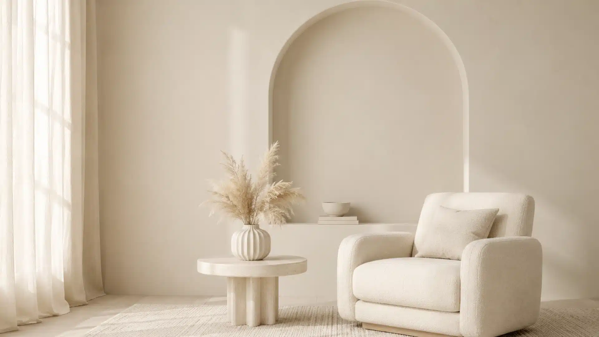
I once stood in a paint aisle comparing two swatches that looked almost identical. One said ivory, while the other said white, and under bright store lighting, I could barely tell them apart.
That small difference matters more than it seems. The wrong neutral, whether it leans toward a soft warm-toned white selection or something closer to cream, can change how a wall, fabric, outfit, or digital design looks once the lighting changes.
Ivory color sits close to white but carries a softer warmth that becomes easier to notice beside other neutrals. I personally find it easier on the eyes than bright white in many settings. Its color code, undertones, lighting, and surrounding shades all affect how it appears.
What Color Is Ivory, Exactly?
Ivory is a warm off-white with a faint yellow undertone that makes it softer than pure white. It stays light and neutral enough for many uses but has enough warmth to look noticeably different when the two colors sit side by side.
Pure white has no visible warm tint, while ivory can appear slightly creamy depending on lighting and nearby colors. Warm artificial light may bring out more yellow, whereas natural daylight often makes ivory look closer to white. Cool gray surroundings can also make its warmth more noticeable.
For digital applications, ivory has a recognized set of color values:
| Color Format | Ivory Value |
|---|---|
| Hex | #FFFFF0 |
| RGB | 255, 255, 240 |
| HSL | 60°, 100%, 97% |
| CMYK | 0%, 0%, 6%, 0% |
These codes provide a consistent digital reference, but physical versions are less standardized. Paint, fabric, furniture, and other products labeled ivory may lean slightly more yellow, toward one of the many cozy beige shade picks, or even gray, depending on the manufacturer and material.
How Is Ivory Different From White, Cream, and Beige?
Ivory belongs to the off-white family, but it is not the same as white, cream, or beige. Brightness and undertones make each one look different.
1. Ivory vs White

White is brighter and more neutral. Pure white, including many designer-favorite white shades, does not have the faint yellow warmth found in standard ivory.
Place the two side by side, and ivory generally appears softer. The difference may seem minor on a small swatch, but it becomes much easier to notice across a wall, curtain, dress, or large digital background.
2. Ivory vs Cream

Cream usually contains a stronger yellow undertone than ivory, closer to what you would find in a warm cream paint.
Both are warm off-whites, but cream tends to look richer and more yellow. Ivory remains closer to white, making it useful when a soft neutral is needed without moving into a noticeably creamy shade.
3. Ivory vs Beige

Beige contains more brown or tan and usually looks darker than ivory, similar to what you would notice with a soft neutral beige pick.
Ivory still reads mainly as an off-white, while beige falls further into the brown-neutral range. When placed together, ivory tends to appear brighter while beige looks deeper and earthier.
What Colors Go Best With Ivory?
Ivory works with dark colors, warm neutrals, and selected cooler tones. The right pairing depends on how much contrast or softness the final palette needs.
Here are several useful ivory color combinations:
| Color | How It Works With Ivory | Good Uses |
|---|---|---|
| Navy Blue | Creates strong contrast and makes ivory’s warmth easier to notice. | Living rooms, formal clothing, branding |
| Emerald Green | Adds a deep, saturated tone beside ivory’s lighter base. | Accent pieces, clothing, interiors |
| Taupe | Keeps the palette neutral while adding enough depth for separation. | Bedrooms, furniture, textiles |
| Soft Gray | Adds a cooler note that can balance ivory’s warm undertone. | Kitchens, offices, modern spaces |
| Brown | Supports ivory’s warmth and works naturally beside wood and leather. | Furniture, accessories, living spaces |
| Black | Gives ivory clear definition through strong light-dark contrast. | Graphic design, fashion, interiors |
Using at least one deeper shade, the way a bold black trim look pairs with lighter walls, can stop a mostly ivory palette from looking too pale or washed out. The surrounding colors also affect how warm the ivory itself appears.
How Is Ivory Used Across Interiors, Fashion, and Digital Design?
Ivory is used across many applications because it keeps much of white’s brightness while giving the overall look a warmer, softer finish. Its appearance can change depending on the material and lighting.
1. Ivory in Interior Design

Ivory works on walls, cabinets, furniture, curtains, bedding, and upholstery when bright white feels too sharp.
Paint brands often create their own ivory formulas, so one version may lean yellow while another looks closer to beige or soft white. Room lighting can shift the result further.
Warm artificial bulbs generally bring out more yellow, while cooler daylight may make ivory appear closer to a neutral off-white. Flooring, countertops, wood tones, and nearby fabrics can also affect how the paint reads.
2. Ivory in Fashion and Textiles
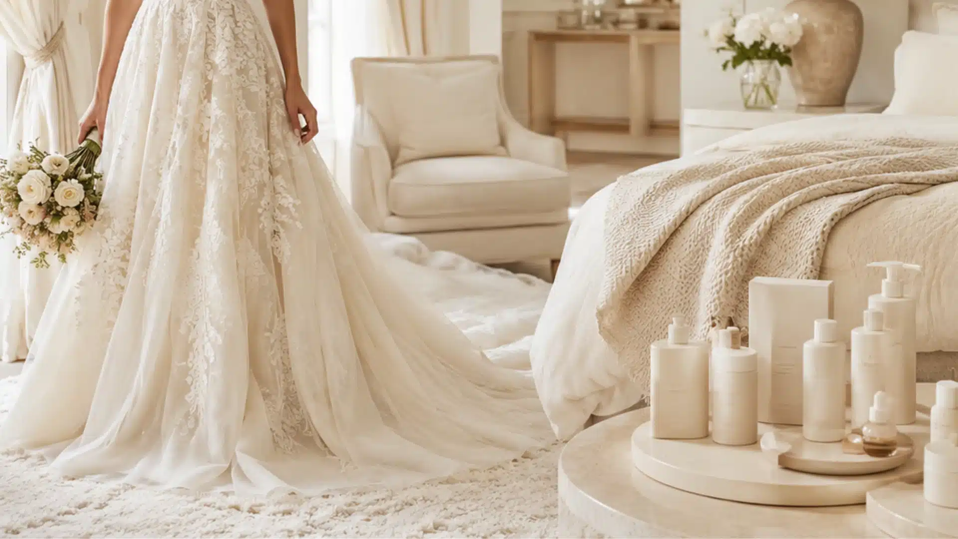
Ivory is common in dresses, bridal wear, shirts, knitwear, curtains, rugs, bedding, and upholstery.
Fabric texture has a noticeable effect on the color. Silk and satin reflect more light, which can make ivory look brighter. Linen, wool, and matte materials may make a similar shade appear deeper or warmer.
This difference is especially important when matching several ivory fabrics. Two pieces may carry the same color name but look different because of their weave, finish, or lighting.
3. Ivory in Digital and Product Design

Standard digital ivory uses the hex code , giving designers a consistent starting point for websites, graphics, and packaging.
It can provide a softer background than pure white while still allowing dark text, icons, and stronger accent colors to remain clear. Packaging may also use ivory when a light neutral base is needed without the sharpness of bright white.
Screen brightness, display settings, and surrounding colors can affect the final appearance, so testing the full palette together usually gives a better result than judging ivory on its own.
Across interiors, textiles, and digital work, ivory performs best when its material, lighting, and nearby colors are considered together.
How to Choose the Right Ivory Shade
A color name alone does not tell you exactly how a paint, fabric, or finish will look once it is placed in its final setting.
A few practical checks can help:
- Check Undertones: Look for yellow, beige, peach, or gray notes instead of relying only on the word ivory.
- Compare With White: Place the sample beside true white to make its warm undertone easier to see.
- Test the Lighting: Check the shade in daylight and under the artificial lights used in the space.
- Check Nearby Materials: Flooring, furniture, countertops, fabrics, and trim can influence how ivory appears.
- Use Larger Samples: Small swatches can hide undertones that become more noticeable across a bigger surface.
I prefer checking samples at different times of day before settling on a shade. A color that looks balanced in morning daylight may appear much warmer under evening lighting.
Conclusion
Choosing the right ivory becomes much easier once you know what separates it from nearby neutrals. Its slight yellow undertone makes it warmer than pure white, while its lighter appearance keeps it distinct from cream and beige.
For me, the simplest way to recognize ivory color is to place it beside true white. The difference in warmth becomes much easier to see.
The standard value works as a clear reference for digital projects, but paint, fabrics, and finishes deserve a real-world test. Checking a larger sample under the actual lighting can help prevent mismatched colors and make the final choice much more reliable.
Frequently Asked Questions
Can ivory and white be used together?
Yes. Pairing ivory with bright white creates subtle contrast instead of making both colors compete. White trim beside ivory walls, for example, can make architectural details look clearer while bringing out the warmer tone of the ivory.
What wood tones work well with ivory?
Ivory works with both light and dark woods. Oak and maple keep the palette light, while walnut and darker stained woods create stronger contrast. Warm natural wood tones generally sit comfortably beside ivory’s slight yellow undertone.
Does ivory make a room look yellow?
Ivory should still read mainly as off-white, but warm bulbs, yellow-toned wood, or beige furnishings can make its yellow undertone more visible. Testing a larger sample under the room’s actual lighting helps prevent an unexpectedly yellow result.
What metal finishes pair well with ivory?
Brass, bronze, black metal, chrome, and brushed nickel can all work with ivory. Warmer metals support its creamy undertone, while black or cooler silver finishes create stronger contrast and give the lighter shade more definition.
Can ivory work in a small room?
Yes. Its light value can keep a small room feeling bright while adding more warmth than pure white. The effect depends on natural light, flooring, furniture, and the other colors used in the space.