

| Color Detail | Taupe |
| Color Family | Gray-brown neutral |
| Common Hex Codes | #483C32 and #54463A |
| Common Undertones | Brown, pink, violet, gray, subtle green |
| Can Lean | Warm or cool |
| Common Uses | Paint, furniture, textiles, clothing, digital palettes |
| Works Well With | Cream, black, sage, blue, rust, burgundy, brown |
| Main Concern | Undertones and lighting can change how it appears |
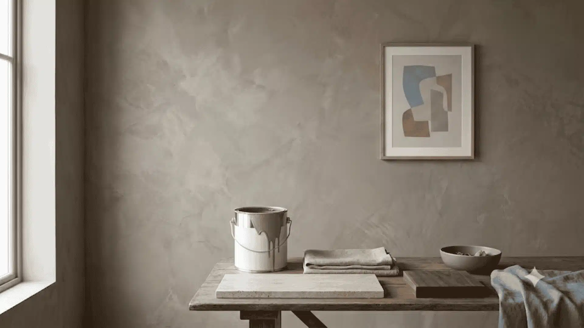
Taupe color looks simple until it sits beside another neutral. One sample can read brown, another can look gray, and a third can carry a faint pink or violet cast.
I have seen the same taupe shift noticeably between morning and evening light, and I have learned that choosing by the color name alone can lead to a very different result once paint, fabric, or furniture enters the room.
Taupe sits between gray and brown, but its undertones create many variations. Understanding those shifts makes it easier to build a taupe color palette, choose useful taupe color combinations, and decide where this neutral makes sense in a room.
Taupe Color: Undertones and Shade Family
Taupe’s base sits between gray and brown. Depending on the shade, it may carry pink, violet, beige, or subtle green undertones, which explains why one taupe can look warm while another appears noticeably cooler.
Brown-heavy taupes feel softer and warmer, while gray or violet influence gives the color a quieter, cooler cast.
That undertone profile places taupe close to beige, greige, mushroom, gray, and other muted neutrals. The differences can look minor on a small swatch, but they become clearer once the colors sit beside each other.
| Shade | How It Differs From Taupe |
| Beige | Warmer overall with stronger yellow or cream undertones |
| Gray | Cooler and more neutral with little noticeable brown |
| Greige | Mixes gray and beige, usually with a lighter appearance |
| Mushroom | Softer and paler with more beige or earthy influence |
| Rose Taupe | Adds a muted pink or mauve cast to the gray-brown base |
| Cool Taupe | Carries more gray, violet, or subtle green underneath |
| Warm Taupe | Shows more brown, beige, pink, or soft red warmth |
The table gives a useful reference, but the undertone becomes much easier to judge beside flooring, furniture, trim, and other fixed colors. A taupe that seems neutral on its own may suddenly look pinker, grayer, or browner once another neutral sits next to it.
If you want to see how a close cousin of taupe behaves on its own, this mushroom neutral paint colors roundup shows where that softer, paler shade sits next to greige and taupe.
One thing worth remembering is that taupe is not one exact shade. The name describes a broad gray-brown family, so paint brands, fabrics, and digital palettes can all use noticeably different versions.
That is also why there is no single taupe hex code that represents every variation. Codes such as #483C32 and #54463A are common reference points, but the final shade still depends on the specific taupe being used.
How Taupe Changes in Different Light
Taupe reacts strongly to its surroundings because neither gray nor brown fully dominates the color. Room direction, time of day, and artificial bulbs can all shift its appearance.
- South-Facing Rooms: Strong daylight often pulls out brown, beige, pink, or red notes, making taupe appear warmer.
- North-Facing Rooms: Cooler indirect light can emphasize gray, violet, or green undertones.
- East-Facing Rooms: Morning sun can make taupe feel softer and warmer before it becomes more muted later.
- West-Facing Rooms: Afternoon and evening light often increases the brown side of the color.
- Artificial Light: Soft bulbs usually support brown undertones, while cooler bulbs may make taupe look grayer.
A single paint chip viewed in-store provides only limited insight. To make a well-informed decision, place a sample in the actual room and observe it at different times: morning, afternoon, and evening. The same approach applies to lighter neutrals and best white paint options: test them in the same north-versus-south orientation before choosing your shade.
That simple test can reveal undertones that were barely noticeable at first.
What Colors Pair Well With Taupe
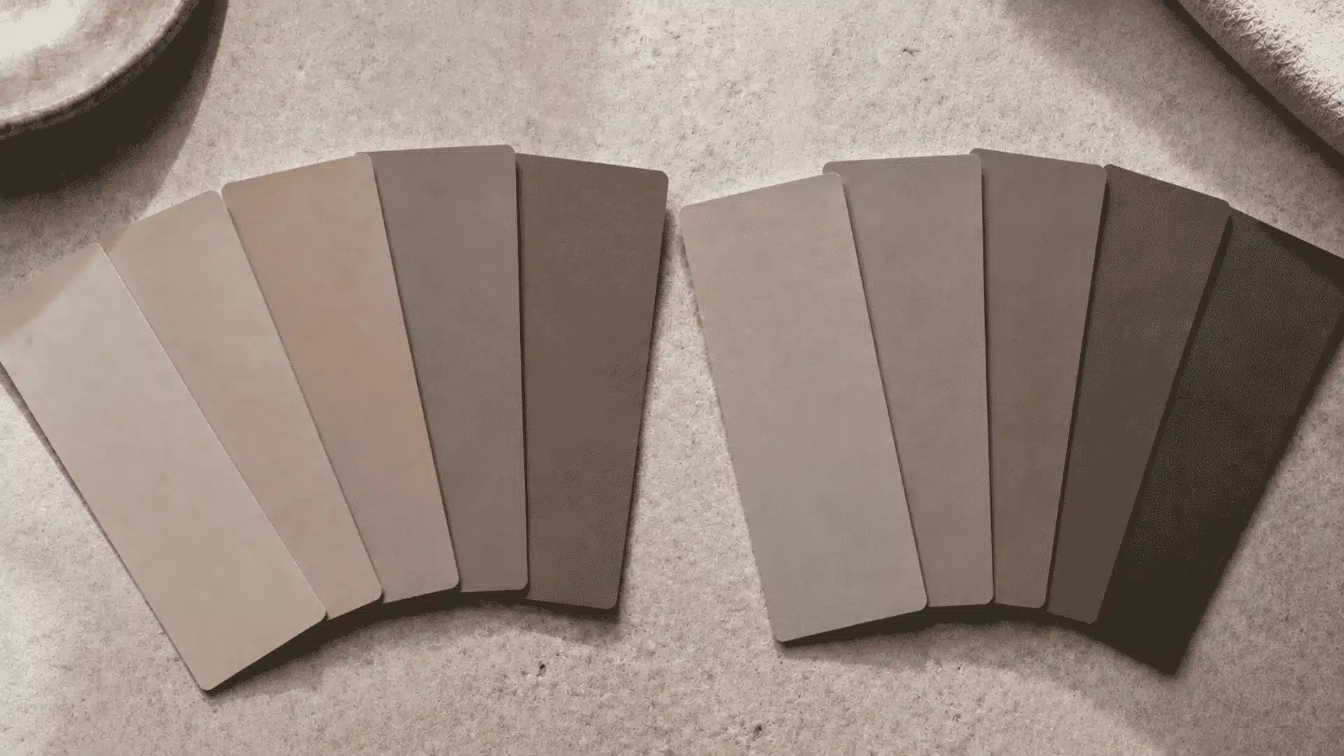
Taupe works with many colors because it already contains both warm and cool qualities. The best pairing depends on which side is stronger in the particular shade.
Colors for Warm Taupe
Brown-leaning taupe works naturally beside colors with similar warmth. Cream keeps the combination soft without creating a sharp jump in contrast.
Rust repeats the reddish side found in many warm taupes and works well through cushions, throws, art, or clothing. This kind of earthy pairing overlaps with the terracotta-leaning tones covered in this warm rust color review, which lists taupe as one of the neutrals that tones down a bold rust or clay wall.
Burgundy brings deeper contrast while keeping a related red-brown base. Black gives taupe clearer definition, especially through hardware, frames, furniture legs, shoes, or bags.
Gold and brass work well as smaller details because their yellow warmth sits comfortably beside brown-based taupe.
Colors for Cool Taupe
Gray-leaning taupe usually benefits from quieter colors with less yellow. Sage green works especially well because its muted quality supports taupe without competing with it.
Soft blue creates gentle temperature contrast and can make a gray-brown room feel lighter. Plum works with taupes carrying violet undertones and adds darker contrast without introducing a completely unrelated color. Charcoal gives cool taupe more structure and works well in furniture, textiles, or smaller architectural details.
Taupe Color Palette Ideas
Instead of matching one color at a time, these combinations can form a complete taupe color palette.
| Palette | Colors | Good For |
| Soft Neutral | Taupe, cream, warm white, medium brown | Living rooms, bedrooms |
| Earthy | Taupe, sage, terracotta, sand | Relaxed interiors |
| Deep Contrast | Taupe, burgundy, charcoal, off-white | Dining rooms, fashion |
| Cool Neutral | Taupe, slate blue, soft gray, muted white | Bedrooms, offices |
Each palette keeps taupe as the main neutral while giving the surrounding colors different roles.
How to Use Taupe in Interior Design
Taupe can work across large surfaces, furniture, cabinetry, and textiles. The main consideration is how its depth and undertone relate to permanent room finishes.
1. Walls and Paint
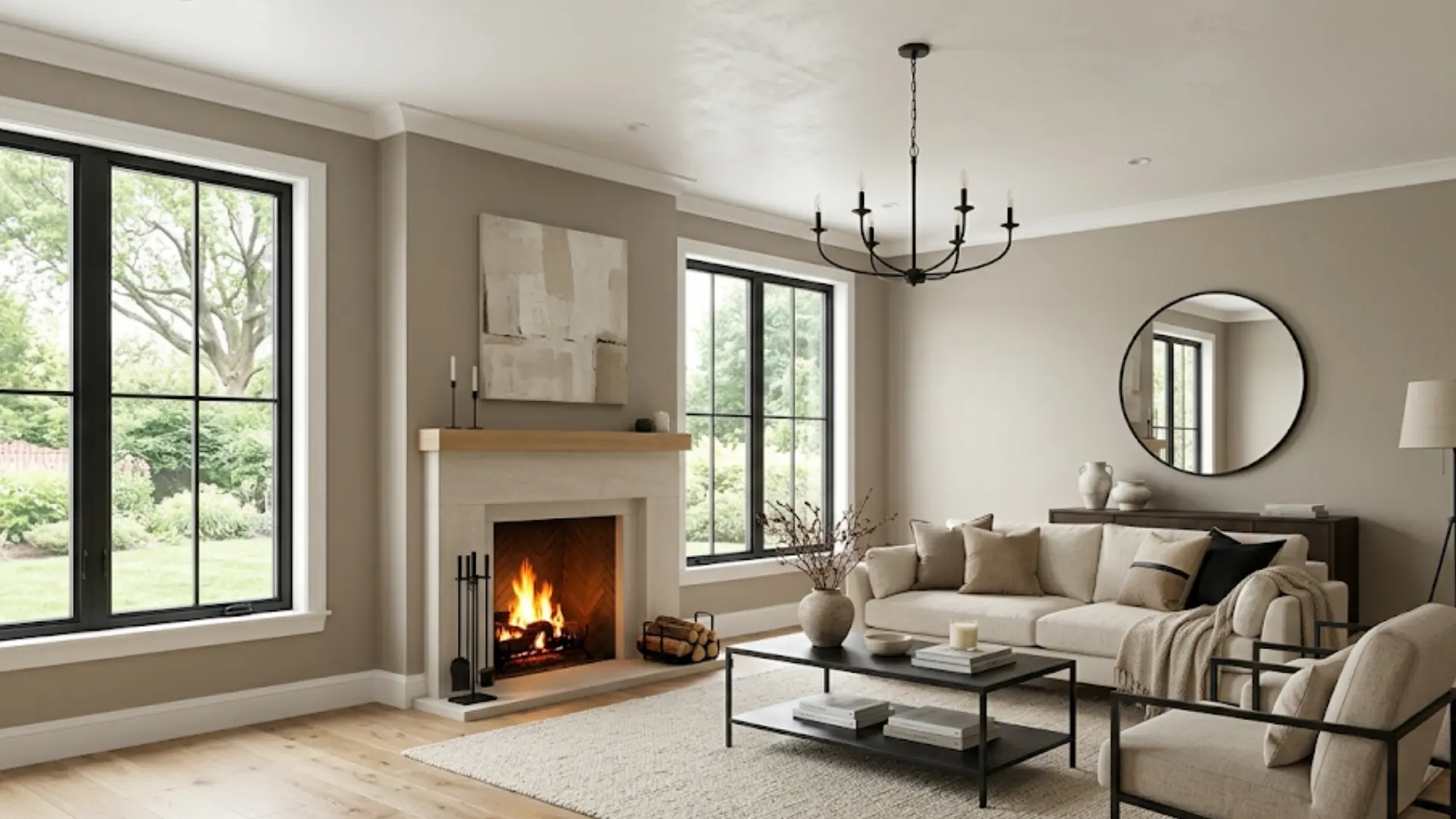
Taupe can provide more warmth than standard gray without carrying as much yellow as many beige shades.
Pale and mid-tone taupes can work across several walls in living rooms, bedrooms, and hallways. Deeper shades may suit smaller areas behind a bed, sofa, fireplace, or dining zone.
Trim and ceilings should usually remain clearly lighter so the room has enough visual separation.
Testing becomes especially important across a large wall. Flooring, countertops, tile, furniture, trim, and natural wood can all make the same paint appear warmer or cooler.
Compare several samples beside those fixed elements before choosing a final color. A small chip that looks balanced by itself can appear much pinker, grayer, or browner once placed beside existing finishes.
Paint sheen matters too. Flat finishes absorb more light, while satin and semi-gloss surfaces reflect more of the room around them.
Tip: Test taupe beside the largest fixed surface first. Flooring or a stone countertop can reveal an unwanted pink, gray, or brown lean faster than an empty wall.
2. Cabinets and Furniture
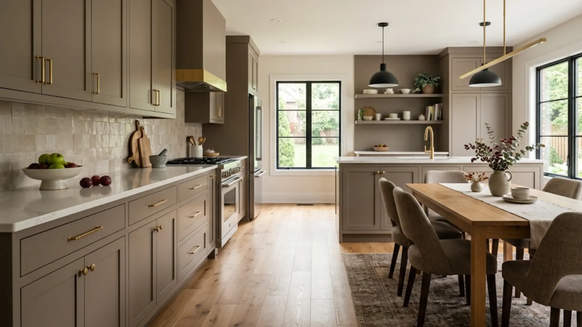
Taupe cabinets can sit between white counters, stone surfaces, wood flooring, and metal hardware without creating a strong color break.
Brown-leaning taupe tends to work naturally with warm wood, while grayer versions can sit comfortably beside cooler stone and muted tile.
Taupe is also useful for sofas, upholstered chairs, benches, headboards, and painted furniture.
A taupe sofa, for example, can support sage, rust, blue, burgundy, cream, or black accents without forcing the rest of the room into one strong color family.
3. Textiles and Soft Furnishings
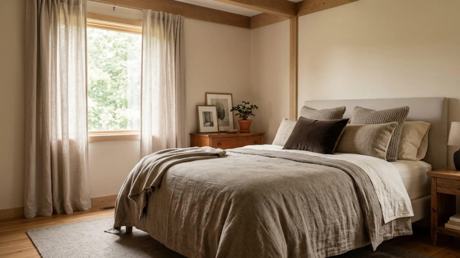
Rugs, bedding, curtains, cushions, and throws provide an easier way to add taupe without covering a full wall.
Fabric texture often softens the color, particularly on woven materials.
Several taupe textiles can work together when their depth changes from one piece to another. A pale taupe curtain beside a medium taupe rug and dark brown cushion creates clearer separation than three nearly identical gray-brown items.
Texture adds another layer of contrast when the colors themselves sit close together.
How to Style Taupe in Fashion
Taupe works as a clothing neutral because it can sit beside both light and dark shades.
A taupe coat can pair with cream knitwear, black trousers, denim, or olive. Taupe shoes also work with beige, brown, navy, black, and muted green clothing.
Fabric plays an important role here too. Suede often makes taupe look deeper and browner, while smooth synthetic fabric may appear cooler under the same lighting.
Burgundy creates stronger contrast beside a lighter taupe bag, coat, or jacket.
Problems can appear when several similar brown neutrals are worn together. Taupe, camel, beige, and medium brown may lose definition when their depth is almost identical.
Keeping one piece noticeably lighter or darker usually creates a cleaner result. A medium taupe coat with cream knitwear and dark brown boots, for example, creates clearer separation than three similar mid-tone browns.
Product photos can also distort the shade, so compare actual pieces when close color matching matters.
| Tip: Always test a taupe sample against your room’s largest fixed surface first, whether that’s flooring or a stone counter. That single comparison usually reveals a pink, gray, or brown lean faster than testing the chip against a wall alone. |
Popular Taupe Paint Options
Taupe varies noticeably between paint brands, so comparing each shade’s undertone and depth can help narrow down which option suits your room and existing finishes.
| Brand | Taupe Paint Color | How It Reads | Best Suited For |
| Benjamin Moore | Driftwood | Muted brown-gray with gentle warmth | Living rooms, bedrooms, relaxed neutral schemes |
| Benjamin Moore | Pashmina | Medium-depth taupe with balanced gray and brown | Cabinets, walls, rooms with natural wood |
| Sherwin-Williams | Poised Taupe | Warm taupe with noticeable brown and muted red notes | Bedrooms, dining rooms, accent walls |
| Sherwin-Williams | Tony Taupe | Earthy medium taupe with stronger brown influence | Living rooms, exteriors, warm interiors |
| Behr | Perfect Taupe | Soft gray-brown that can sit close to greige | Bedrooms, offices, lighter neutral spaces |
| Behr | Classic Taupe | Warmer brown-based taupe with more depth | Furniture, walls, warm-toned rooms |
| Farrow & Ball | Oxford Stone | Earthy neutral with a stronger brown base | Cabinets, walls, rooms with wood finishes |
Paint names alone cannot show exactly how a taupe will behave. Compare physical samples beside your flooring, trim, furniture, and natural light before deciding.
Final Thoughts
Taupe works best when you treat it as a flexible gray-brown family rather than one exact shade. I find that checking undertones, lighting, nearby finishes, and material gives you a much clearer idea of how it may look in real life.
Warm taupes pair well with cream, rust, burgundy, brown, and brass, while cooler versions sit comfortably with sage, blue, plum, and charcoal.
Taupe color can also work across walls, cabinets, furniture, textiles, clothing, and paint when there is enough contrast around it.
Use physical samples where possible, compare them beside fixed surfaces, and check them through changing light. Try these tips in your own space, then share which taupe pairing worked best for you.
Frequently Asked Questions
Does taupe go with white?
Yes, but the type of white matters. Soft white, ivory, and cream usually work easily with taupe. Very bright white can exaggerate pink, violet, or gray undertones in muted taupe shades.
Is taupe darker than beige?
Taupe is often darker and grayer than beige, but not always. Both colors cover a broad range. Beige usually carries more yellow, while taupe leans on a stronger gray-brown base.
What is the difference between mushroom and taupe?
Mushroom usually refers to a lighter, softer gray-brown with beige influence. Taupe covers a wider range and can be considerably darker, browner, grayer, pinker, or more violet.
Does taupe go with brown furniture?
Yes. The combination works best when the taupe and brown are clearly different in depth. A light taupe wall beside medium or dark brown furniture creates more definition than two nearly identical shades.
Is taupe a good whole-room paint color?
Light and mid-tone taupes can work across an entire room when their undertones suit the flooring, trim, and natural light. Darker taupes often need more pale surfaces to keep the room balanced.
What trim color works with taupe walls?
Soft white, cream, and muted off-white are useful starting points. Brown-leaning taupes often suit creamy trim, while cooler shades pair better with quieter neutral whites.