
Picking the right blue paint can be tough. I know because I’ve stared at those paint chips for hours, too. In this article, I’ll share popular blue paints that actually work well in real homes.
I’ve used these colors in my own house and seen them in friends’ homes. They’re not just pretty in photos—they look good on actual walls.
You’ll find:
- Which blues work in bright vs. dark rooms
- Exactly which rooms each color works best in
- How to avoid common blue paint mistakes
- Simple tips for matching blue with your furniture and trim
Blue is popular for good reasons. It feels clean, calm, and timeless, and it goes with almost everything. I’ve tested dozens of blues over the years, but these are the ones I’d use again. Trust me—the right blue can make your room feel exactly how you want it to.
What to Think About Before Picking a Blue?
Not all blues are the same. Before you grab a can, think about:
- Room light: Does your room get lots of sun or very little? Blues look different in bright vs. dim spaces.
- Room size: Darker blues can make small rooms feel cozy. Lighter blues can make them feel bigger.
- What time you use the room: Blues can look very different in morning vs. evening light.
- Your existing stuff: Consider your furniture, floors, and other items that need to be coordinated with the blue.
The paint chip at the store is much smaller than your wall at home. Colors look more intense on large surfaces. When in doubt, go a shade lighter than what you think you want.
Tried-and-True Blue Paints Worth Your Money
These blue paints aren’t just pretty in photos—they really work in homes. I’ve seen them in action or heard from others who’ve used them and still love them.
1. Dew Drop – Sherwin-Williams
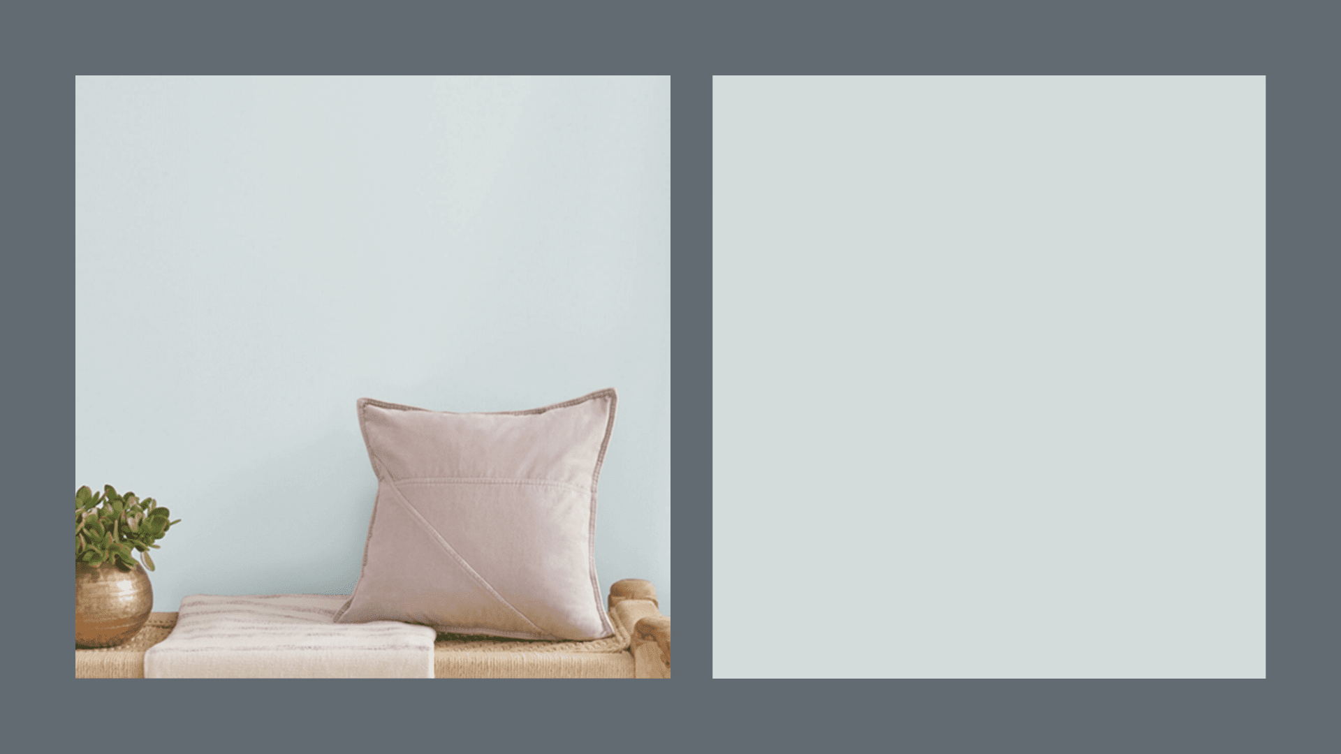
A very gentle blue with a tiny hint of green. Not too bright, just soft and clean. This color feels like fresh air. It stays true even in bright sunlight and doesn’t turn too pale or washed out.
It pairs beautifully with white trim and light wood furniture. The color doesn’t change much from day to night, making it reliable in any light.
Best for:
- Light-filled bedrooms
- Teen rooms
- Mudrooms
2. Sleepy Blue – Sherwin-Williams
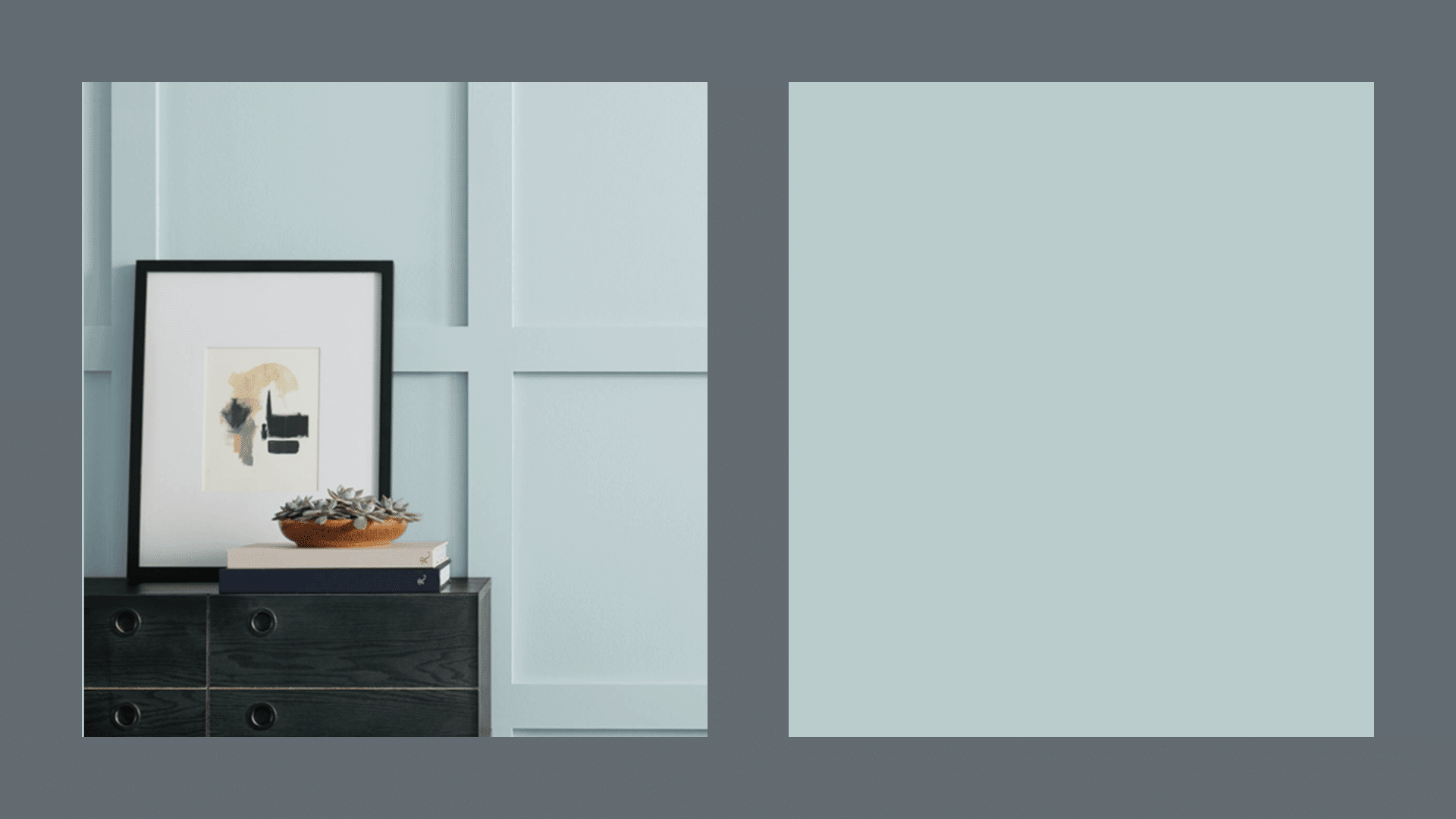
A cheerful blue that feels bright without being too loud, this shade has a clean look that doesn’t feel childish. I used this in my guest bathroom.
It looks great, even with the old beige tile I couldn’t replace yet. It reflects light well, making small spaces feel larger. This shade works with both modern and traditional styles.
Best for:
- Laundry rooms
- Hallways
- Small bathrooms
3. Good Jeans – Clare Paint
A mid-tone blue that looks like worn denim. Not too dark, not too light, this one feels both modern and classic. It works well with both white and wood trim.
It has enough gray to keep it from feeling too bright. The slightly muted quality makes it easy to live with for years.
Best for:
- Bathrooms
- Dens
- Basement offices
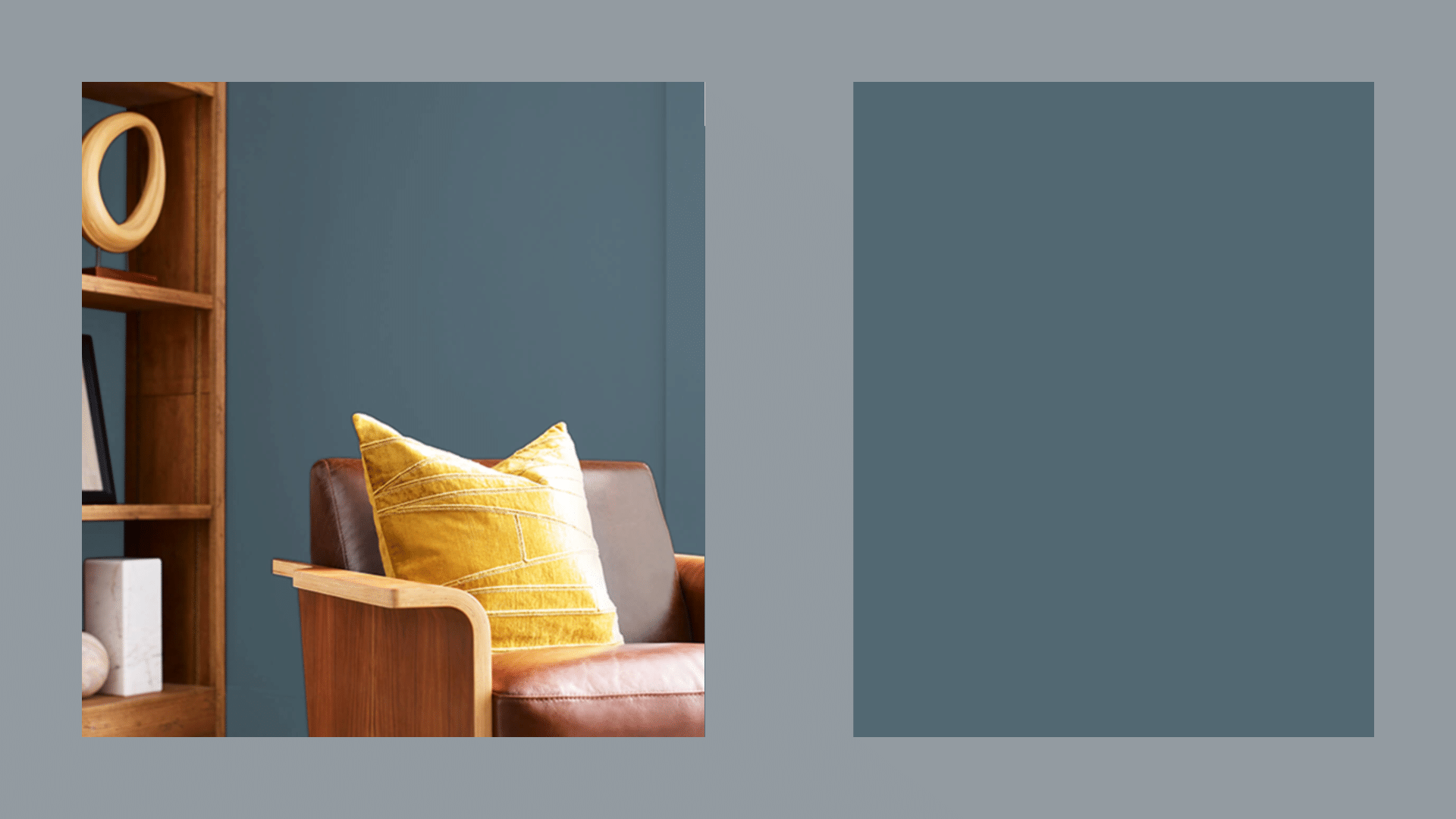
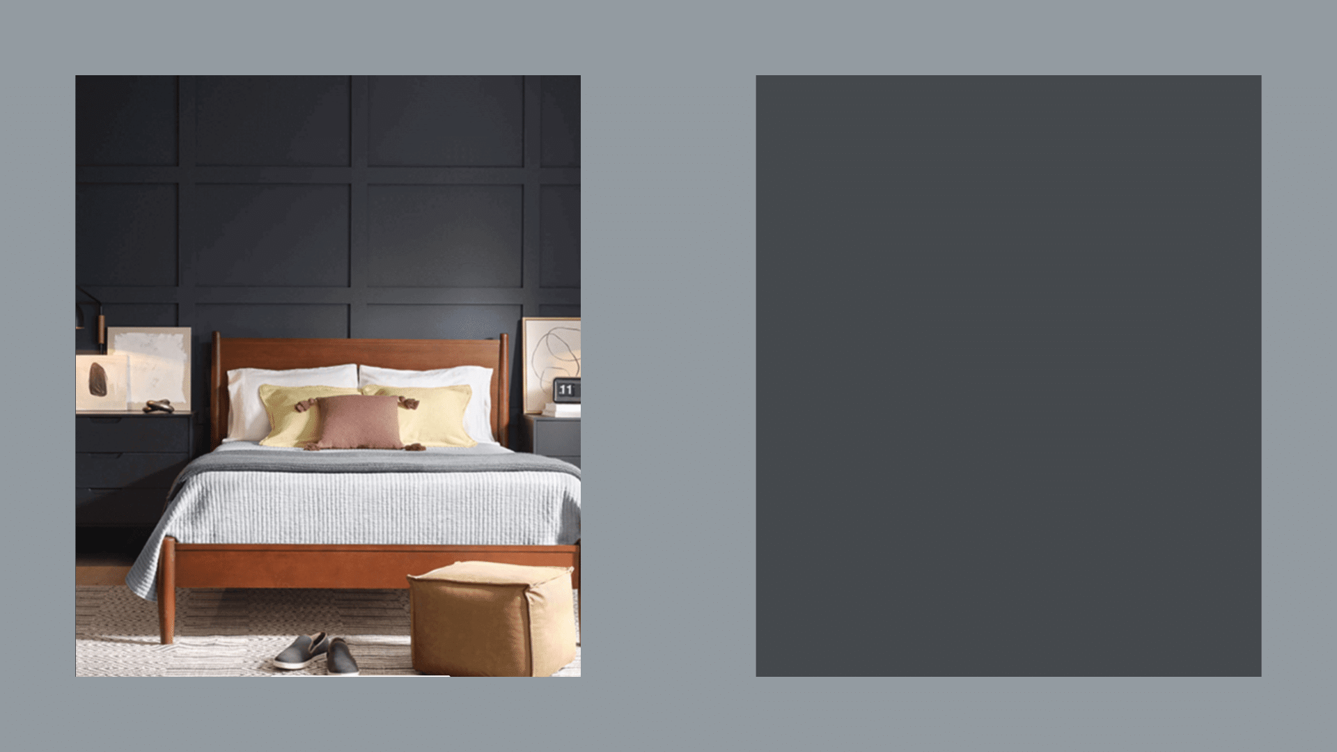
4. Debonair – Sherwin-Williams
A soft, complex blue that shifts a bit in different lights. It has depth without being too dark. This looks totally different from morning to night, in a good way.
It feels cozy but not heavy. A hint of purple shows up in the evening light, making it feel more grown-up than a typical blue.
Best for:
- Bedrooms
- Dining rooms
- Reading corners
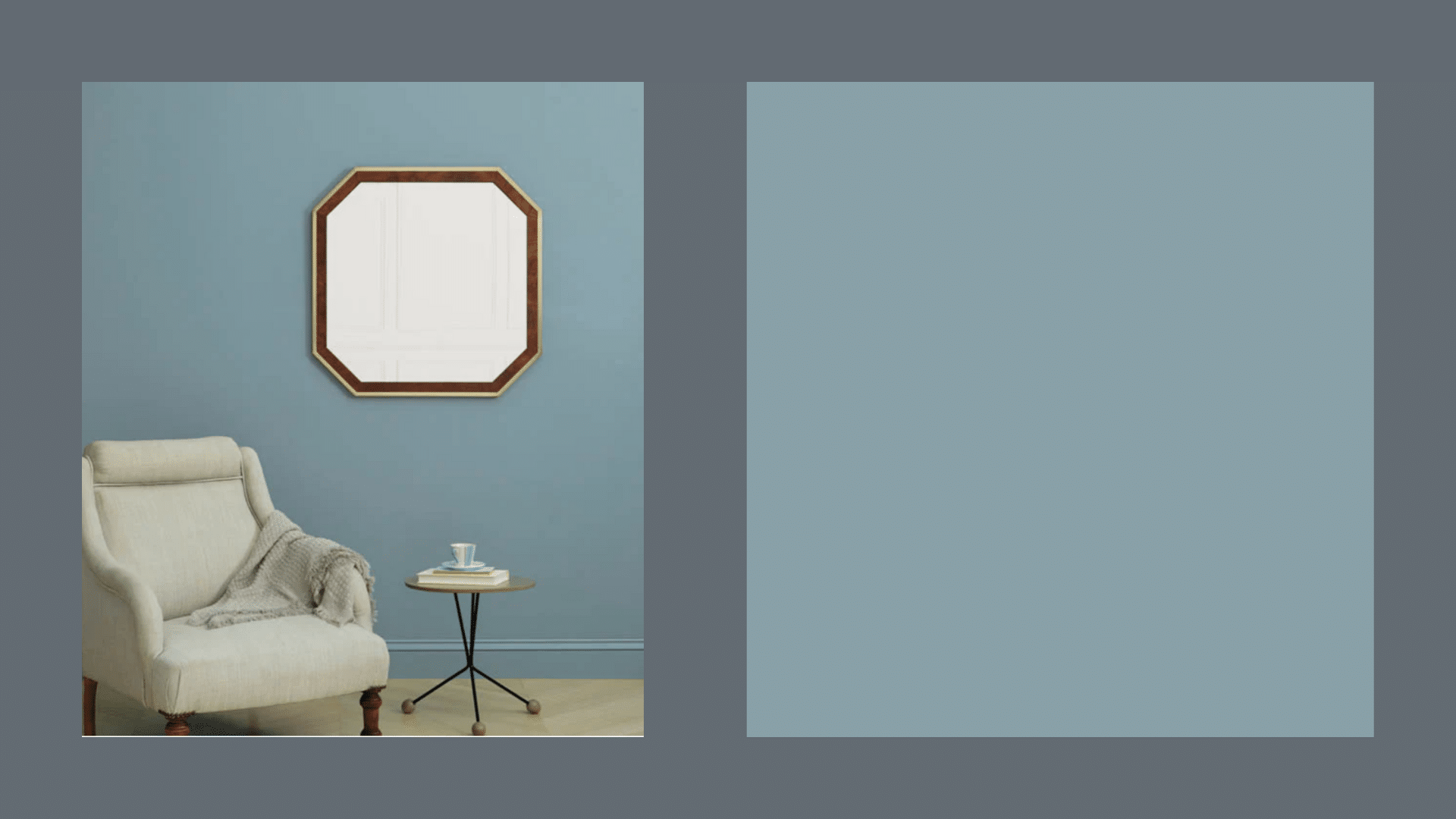
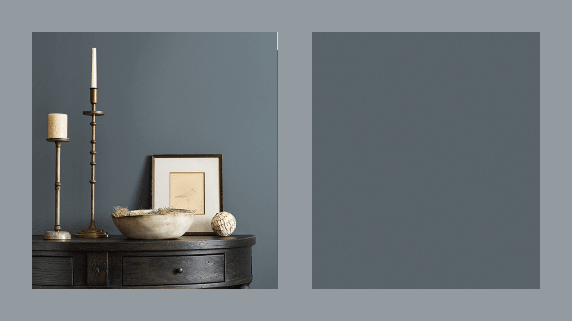
5. Slate Tile – Sherwin-Williams
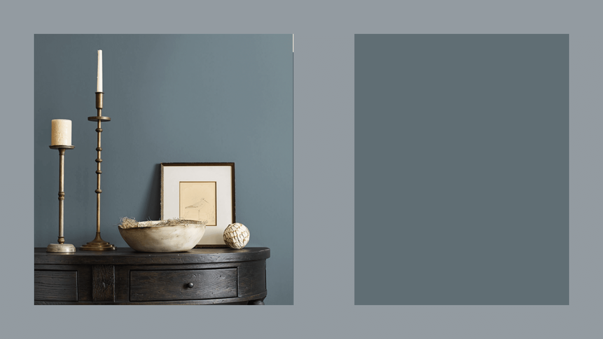
A mid-tone blue with some gray mixed in. It’s not bright or flashy, just steady and clear. This is my go-to when someone wants “blue but not too blue.”
It works with almost any style, from modern to traditional. The gray helps it blend with other colors easily. Even color-shy people tend to like this shade.
Best for:
- Kitchens
- Pantries
- Family rooms
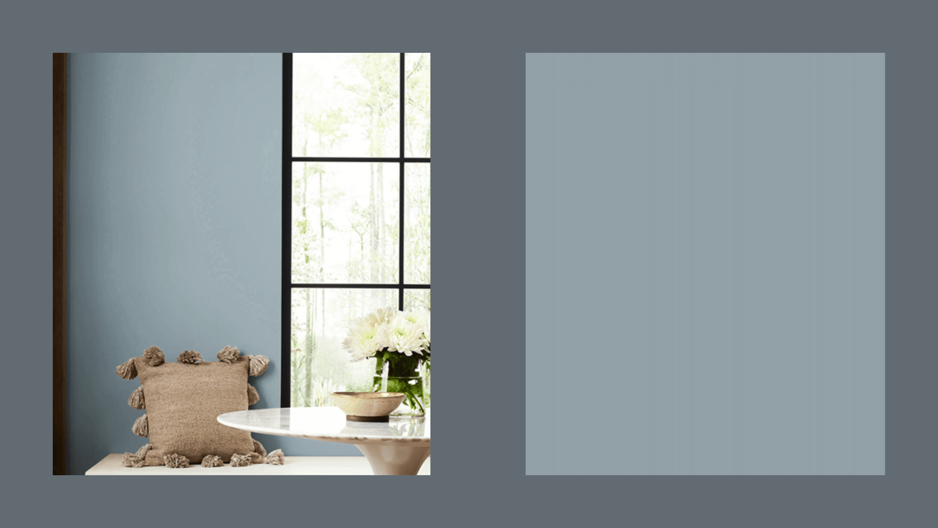
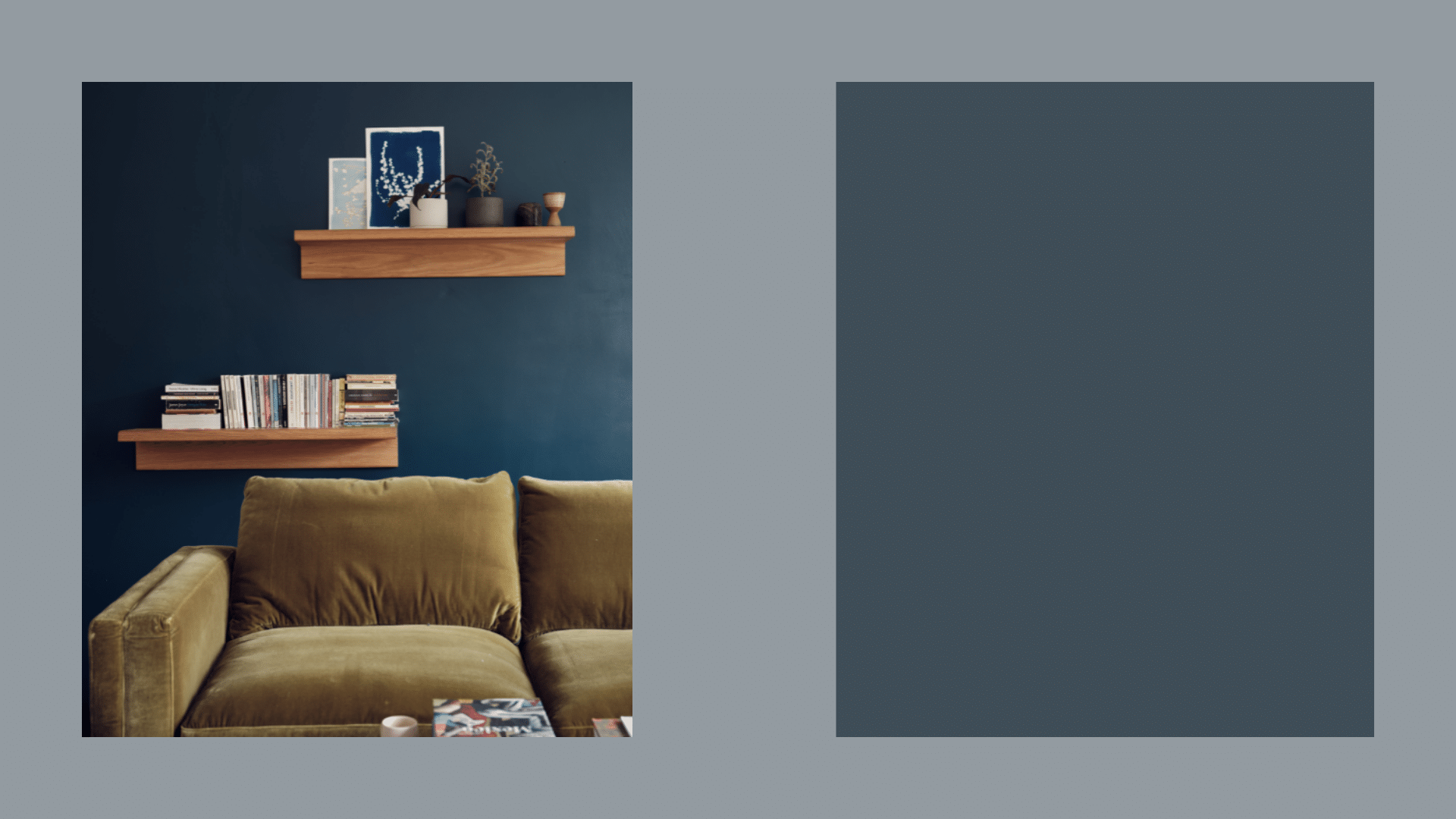
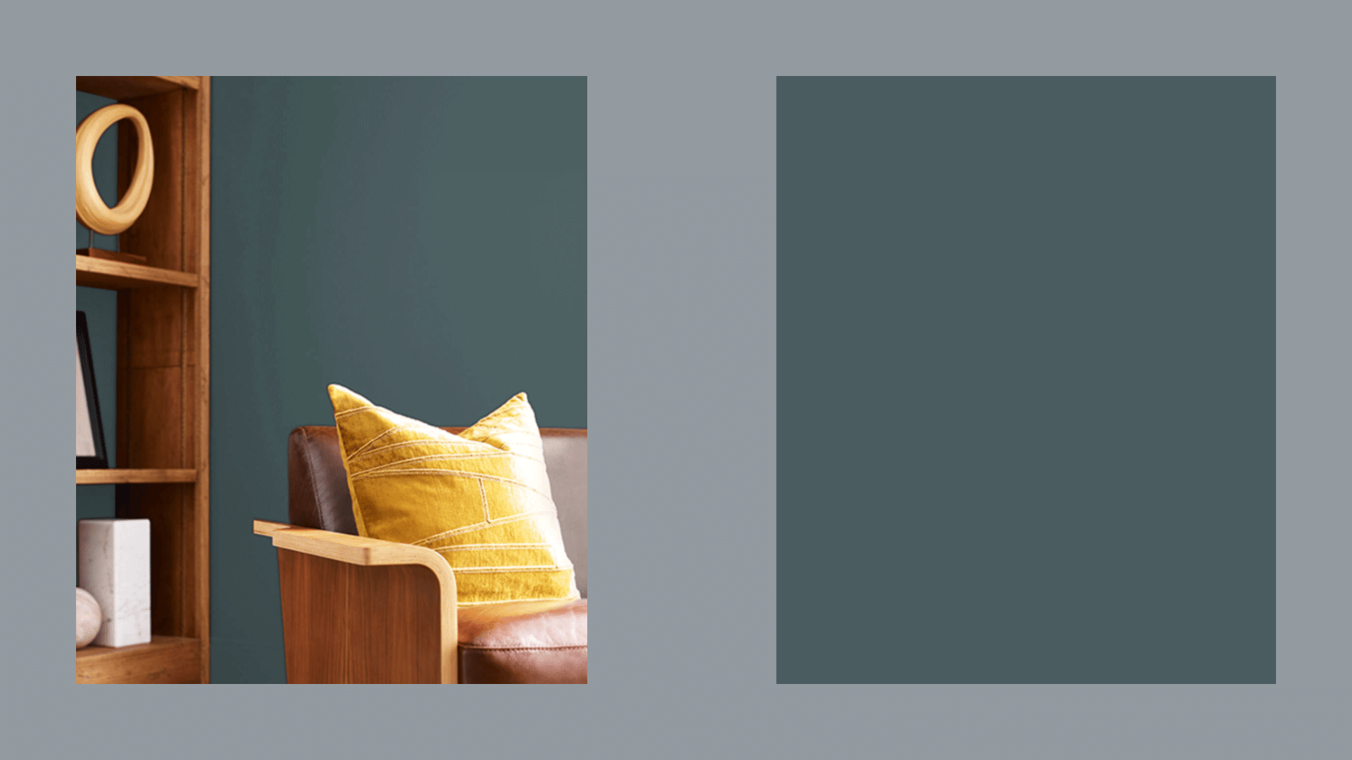
6. Waterloo – Sherwin-Williams
It’s blue with some green in it, but it still reads as blue. It’s deep but not dark. This color has a calming effect that still keeps you awake.
I’ve used it in spaces where people gather. It feels rich without being too serious. The green undertone gives it a unique look that sets it apart from standard blues.
Best for:
- Living rooms
- Basements
- Media rooms
7. Grays Harbor – Sherwin-Williams
A rich, darker blue that still feels warm, not cold or harsh like some dark colors. This color works great on kitchen islands when you want them to stand out from white cabinets.
It has a classic feel that doesn’t go out of style. This color looks amazing with brass hardware and natural stone counters.
Best for:
- Cabinets
- Home offices
- Entryways
8. Blue Note – Benjamin Moore
A very dark blue that’s almost black in some lights, it is deep and strong. It needs at least some natural light to show its true color. With good lighting, it’s amazing.
Without it, it just looks black. It creates a dramatic contrast with white trim or light furniture. In the right setting, it feels luxurious rather than gloomy.
Best for:
- Offices
- TV walls
- Moody bedrooms
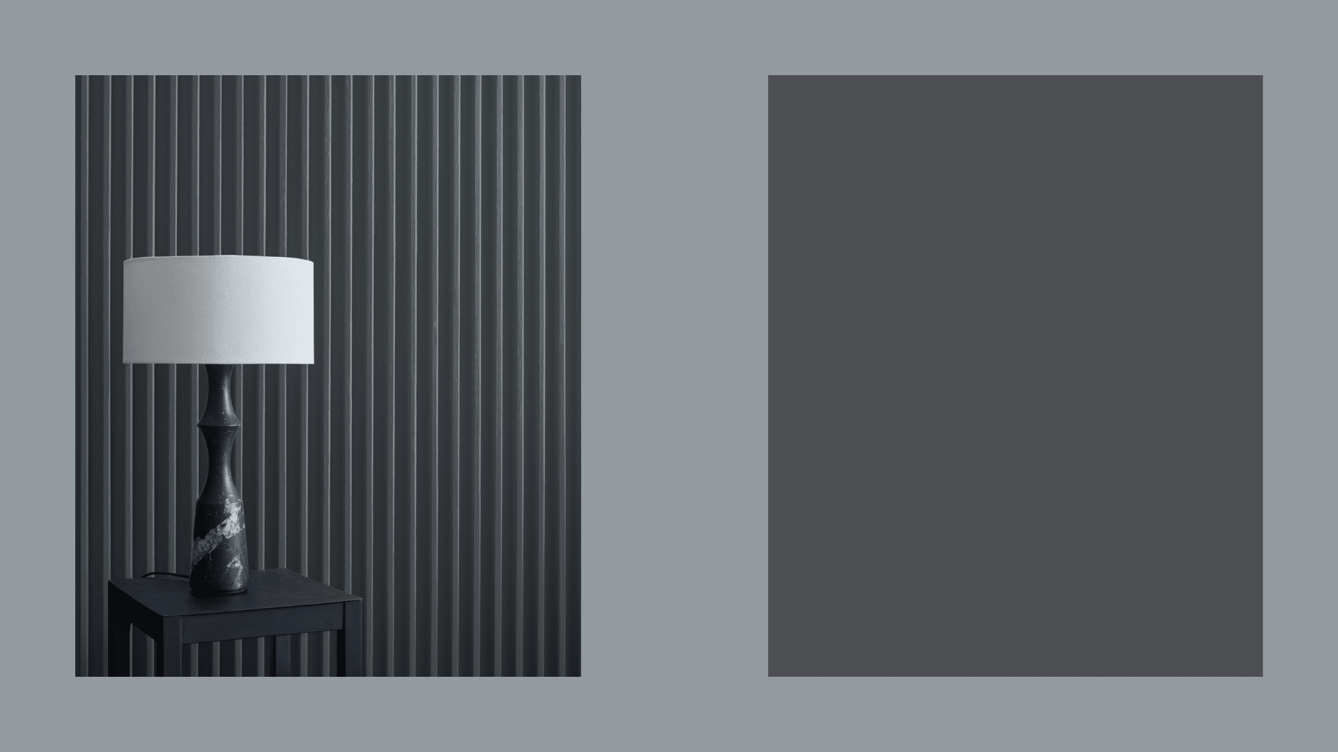
9. Cyberspace – Sherwin-Williams
A very dark blue-black that still looks clean and crisp, not muddy. I painted my front door this color and get more compliments on it than anything else in my house.
It has a modern edge but still works with traditional homes. It looks especially good with silver or brushed nickel hardware.
Best for:
- Bathrooms
- Front doors
- Bold hallways
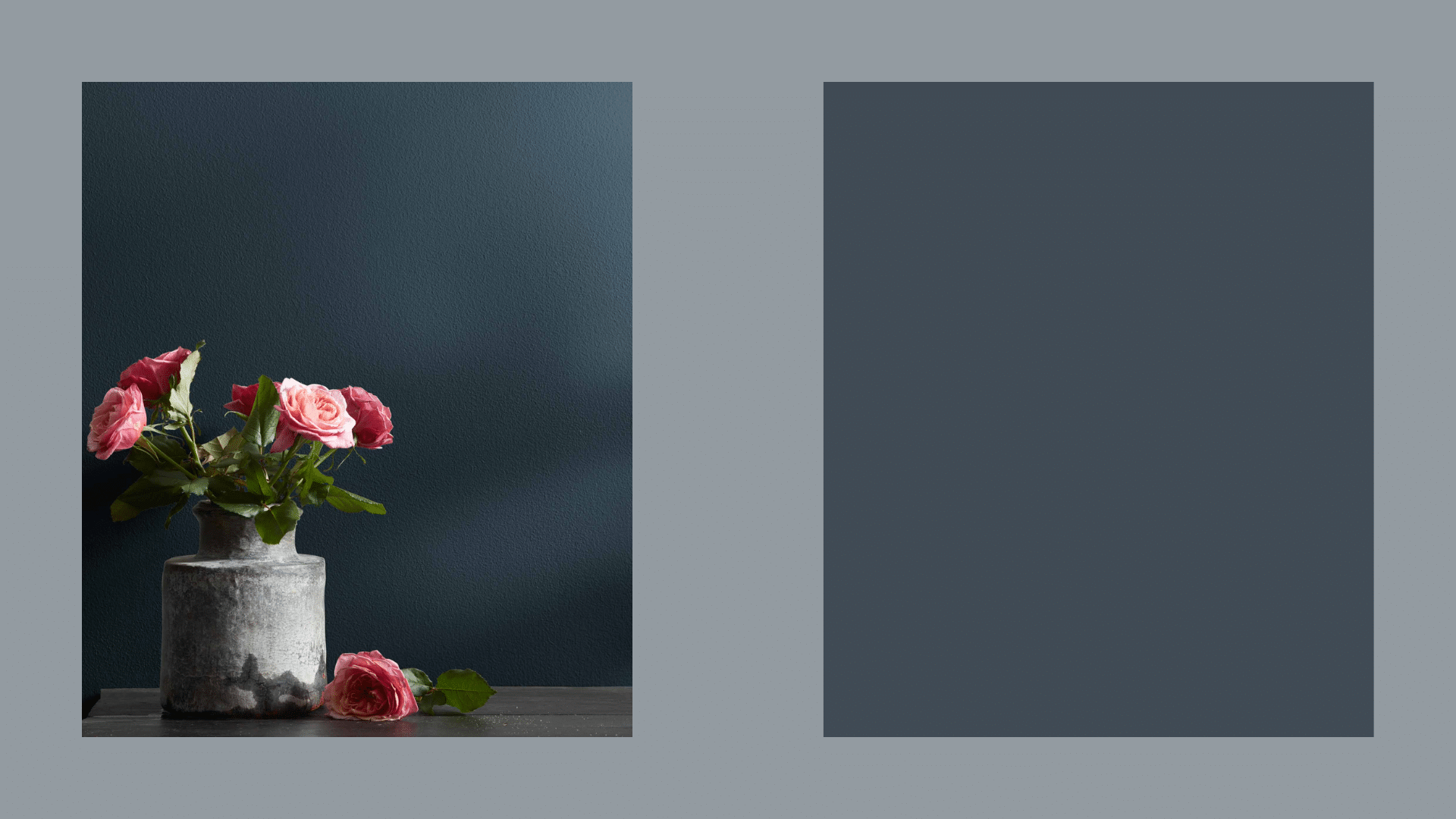
10. Hague Blue – Farrow & Ball
A dark blue with green tones, this paint is rich and smooth-looking on walls. Yes, it costs more, but this paint has a depth that’s hard to match.
It looks good in both old and new houses. The color seems to change throughout the day in interesting ways. It feels historic yet somehow still fresh and current.
Best for:
- Dining rooms
- Living rooms
- Accent walls
11. Stiffkey Blue – Farrow & Ball
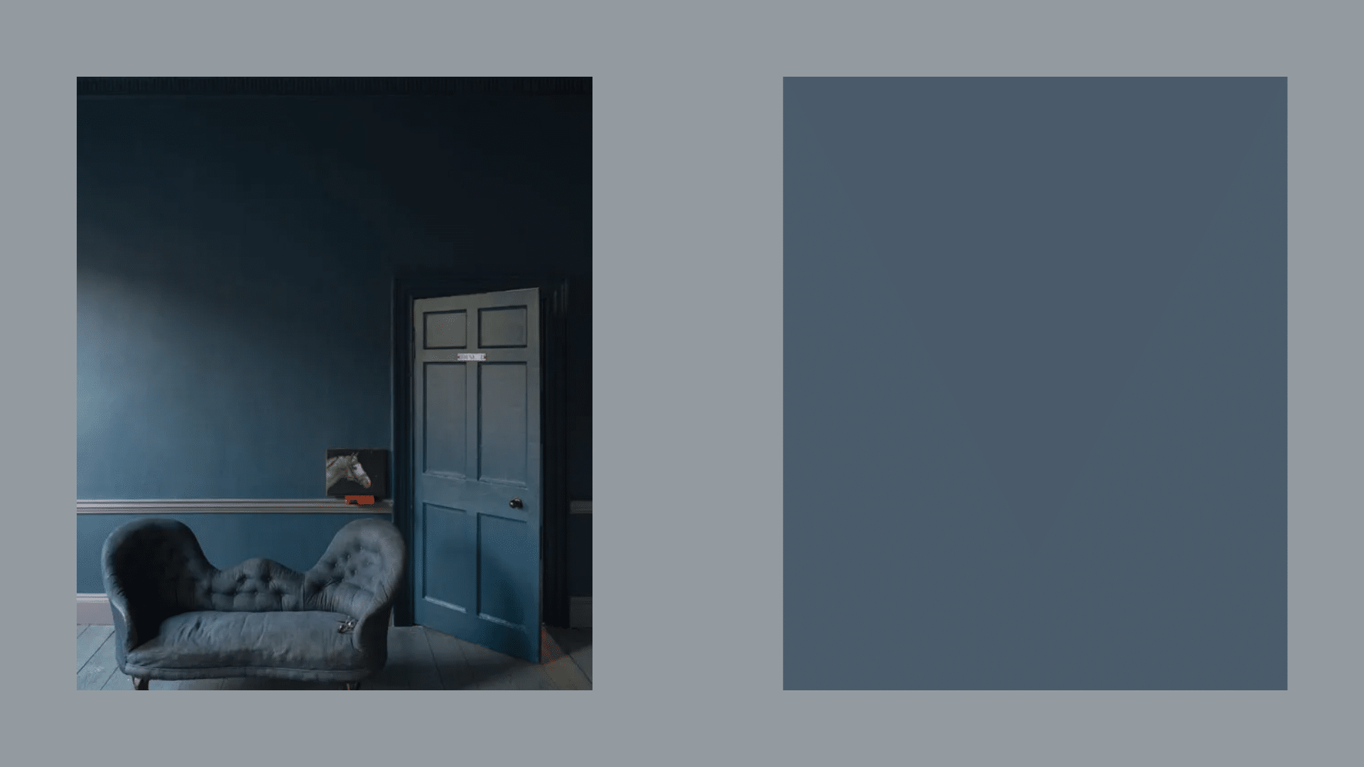
A clear, strong blue that doesn’t fade into the background, it holds its color well. This makes small rooms feel special instead of cramped.
It’s got personality without being loud. It creates a statement without trying too hard. The color has a slight maritime feel that works well with natural textures.
Best for:
- Bathrooms
- Bold kitchens
- Small rooms
12. Inchyra Blue – Farrow & Ball
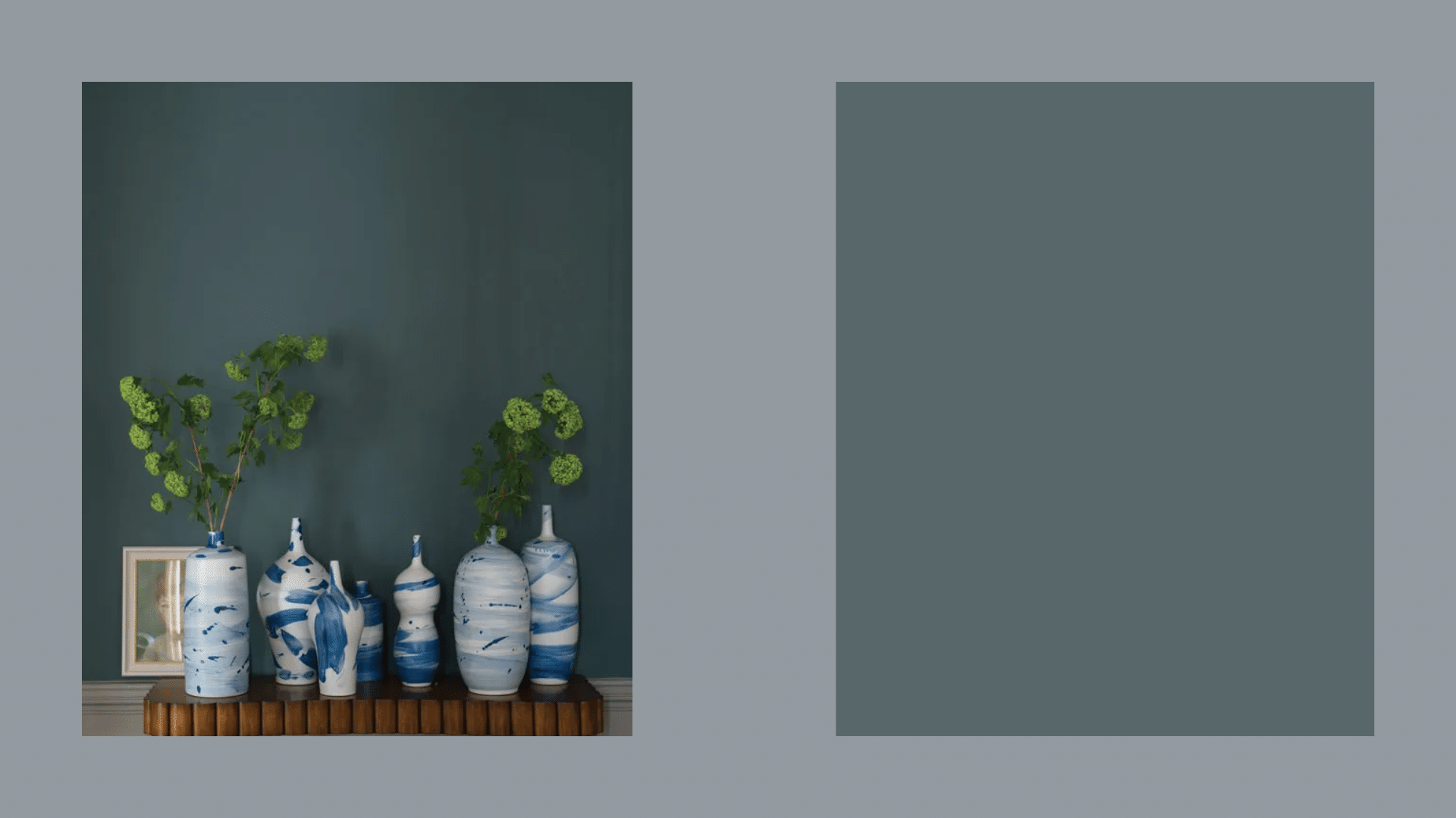
A blue that shifts between green and gray depending on the light. Always interesting. This is never boring.
It looks different every time you look at it, which makes a room feel alive. It has an old-world quality that feels connected to nature. Works especially well in homes with garden views.
Best for:
- Dining rooms
- Ceiling accents
- Cozy spaces
13. Still Water – Sherwin-Williams
A mix of blue and green that feels rich without being too dark or bright. This looks amazing with brass or gold accents.
It has a slight vintage feel that works well in older homes. It feels both fresh and classic at the same time. The color has depth that makes even simple rooms feel more finished.
Best for:
- Living rooms with lamps
- Bedrooms with soft light
- Home offices
14. French Beret – Benjamin Moore
A dark gray-blue that’s serious but not dull, it changes from blue to charcoal in different lights. This is perfect when you want a room to feel grown-up and put-together.
It works with both modern and classic furniture. It has a masculine edge that balances well with softer textures. It looks great with cream or off-white trim.
Best for:
- Bedrooms
- Closets
- Home libraries
15. Hale Navy – Benjamin Moore
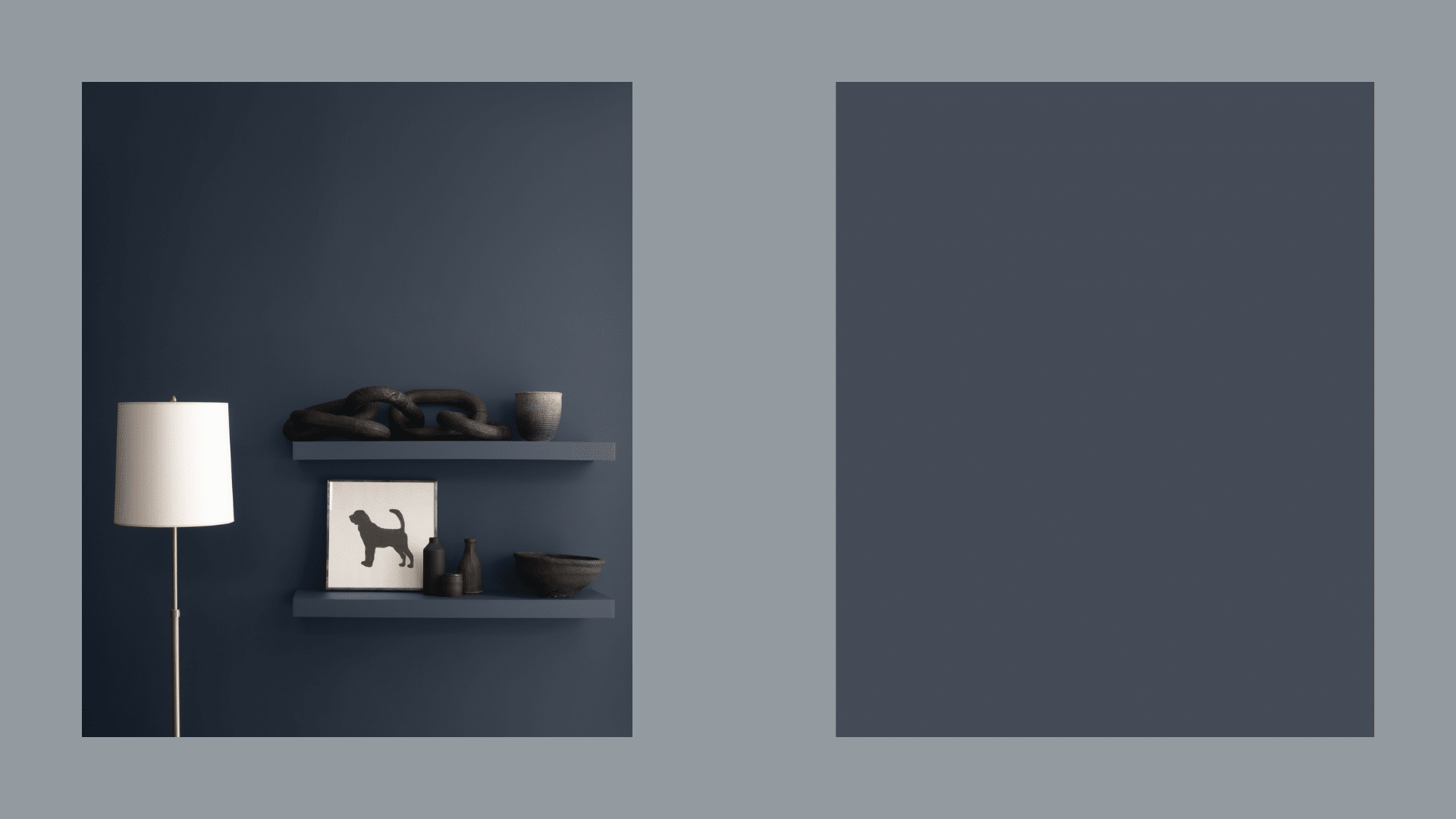
A true navy blue that’s deep without being too dark. Classic and clean. If you’re scared of going too bold, this is your safe bet.
It’s like blue jeans—it goes with everything and never looks wrong. It makes white trim and moldings pop. This color works in every room type and never feels dated or trendy.
Best for:
- Front doors
- Dining rooms
- Bathrooms
Light Room vs. Dark Room?
Blue paints look different depending on how much natural light a room gets. This is a simple guide to help you choose the right blue for your space:
| Room Type | How Blues Look | Good Blue Choices | Tips |
|---|---|---|---|
| Bright, South-Facing Rooms | Blues look more intense and vibrant | Dew Drop, Slate Tile, French Beret | Colors with gray mixed in stay truer in bright light |
| Medium-Light Rooms | Blues look most true to their color | Good Jeans, Waterloo, Hale Navy | Most blues work well in balanced light |
| Dark, North-Facing Rooms | Blues can look darker and sometimes more gray | Sleepy Blue, Still Water, Cyberspace | Mid-tone blues hold their color better in dim light |
| Rooms with Artificial Light | Blues can look different depending on bulb type | Debonair, Grays Harbor, Stiffkey Blue | Warm lighting softens cool blues |
My tip: Check your paint colors at different times of day in the actual room. Morning light vs. evening light can make a huge difference in how blue looks.
Matching Blue with Other Things
Blues are team players. They work with many colors, but some matches are better than others: Good matches with blue:
- Woods: Most wood tones work with blue. Medium to dark woods look great with navy, and light woods pair well with light to mid-blues.
- Whites: Crisp whites make blues pop. Warm whites soften the cool feel of blue.
- Metals: Brass and gold warm up cooler blues. Silver and chrome add to the cool vibe.
- Other colors: Greens, grays, and some pinks work well with blue.
I painted my office Slate Tile and added walnut shelves. The combo feels both classic and fresh. In my bathroom, I used Sleepy Blue with white tile and brass fixtures. The mix is clean but not cold.
Common Blue Paint Mistakes
- Going too bright: Blues can look much more intense on walls than on small samples. When in doubt, step back one shade.
- Not testing in your actual space: Light changes everything. A blue that looks perfect in the store might look totally different in your home.
- Ignoring the room’s use: A calm blue for a bedroom might feel too quiet for a living room where you want energy.
- Forget about trim color: The white you use on trim matters. Some whites have yellow undertones that clash with cool blues.
- Not thinking about flow: If you can see other rooms from your blue room, make sure the colors work together.
My biggest fail? I once painted a small bathroom a bright blue without testing it first. It felt like being inside a swimming pool and not relaxing at all!
Final Tips for Making a Good Choice
After trying many blues (and repainting more than once), here’s what I’ve learned:
- Always, always get samples. Paint large pieces of poster board and move them around the room.
- Look at the samples in morning, afternoon, and evening light.
- Consider the mood you want. Lighter blues feel fresh and airy. Darker blues feel cozy and mature.
- Start with one room. See how you like living with the blue before doing more rooms.
- Remember that paint is not permanent. If you don’t love it, you can always change it.
I keep a notebook of paint colors I’ve used or liked in other people’s homes. It helps me remember what works and what doesn’t.
Conclusion
After trying many blues in my own home and seeing them in clients’ spaces, I’ve found some clear winners. If you’re stuck, start with Sleepy Blue for bright rooms that need to feel fresh.
Try Slate Tile for living areas where you want color that won’t overwhelm. Use Hale Navy when you need something strong but classic.
Blue works because it’s both calm and interesting. It changes with the light throughout the day, giving your room depth.
If you’re nervous, start small— try one wall or a bathroom first. Get samples and live with them for a few days. Trust your gut feeling about which blue makes you happy when you look at it.
Remember, paint is the cheapest way to transform a room. If you don’t love it, you can always change it. The right blue is out there waiting for you.
Frequently Asked Questions
Will Blue Paint Make My Small Room Look Even Smaller?
Not if you choose wisely. Light to mid-tone blues can actually make small rooms feel bigger. Dark blues can work too if you have good lighting and keep trim white.
How Do I Test Blue Paint Properly Before Committing?
Paint large poster boards (at least 2×2 feet) and move them around the room. Check them in morning, afternoon, and evening light for at least two days.
Can I Use Blue in Rooms without Windows?
Yes! Choose mid-tone blues like Good Jeans or Slate Tile. Add warm lighting with lamps at different heights to create depth and prevent the blue from looking flat.
Do Blue Walls Work with Brown Furniture?
Absolutely. Blue and brown make a great pair. Navy blues like Hale Navy look fantastic with dark woods, while lighter blues like Sleepy Blue complement tan or medium brown furniture beautifully.
How Can I Make a Blue Room Feel Warmer?
Add warm metals like brass or gold in lighting and hardware. Use warm white (not cool white) for trim—layer in natural textures like wood, jute, or linen to balance the coolness of blue.