
Looking at paint colors can feel like staring at a hundred shades of the same thing. Benjamin Moore Cinnamon Slate sits somewhere between warm and cool, between bold and subtle.
It’s not quite brown, not exactly gray, and definitely not your standard beige.
Cinnamon Slate promises that balance, but does it actually deliver? Can it work in different rooms, with various lighting conditions, and with different decor styles?
Before committing to gallons of paint, it helps to know what this color truly brings to a space. That’s exactly what this review covers.
What Color is Benjamin Moore Cinnamon Slate?
Benjamin Moore Cinnamon Slate is a refined greige with warm undertones. It leans slightly toward taupe, blending gray’s coolness with cinnamon’s earthy warmth for a balanced, versatile neutral.
| Property | Details |
|---|---|
| Color Name | Cinnamon Slate (2113-40) |
| Color Family | Purple/Taupe |
| LRV (Light Reflectance Value) | 19.71 |
| RGB Values | R:137, G:116, B:117 |
| HEX Code | #897475 |
| Undertones | Warm brown, subtle gray |
| Color Depth | Medium |
Is Cinnamon Slate Warm or Cool?
Cinnamon Slate sits firmly in warm territory, though it’s not aggressively so.
The cinnamon influence brings earthy, cozy notes that create inviting spaces rather than stark ones. But it has just enough gray to keep it from feeling too honey-toned or orange.
This warmth works differently depending on the light. Natural sunlight amplifies those brown undertones, making rooms feel snug.
In north-facing spaces with cooler light, the gray becomes more apparent, and the color reads slightly more neutral. It won’t ever feel cold, but it can tone down its warmth when needed. That flexibility makes it interesting.
What Rooms Look Best in Cinnamon Slate?
Benjamin Moore Cinnamon Slate creates cozy, grounded interiors with rich depth and versatile warmth across multiple home settings.
Living Rooms
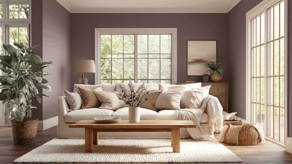
Cinnamon Slate adds refined warmth and character to living rooms, making the space feel inviting yet refined.
Its muted depth works beautifully with wood tones, leather furniture, and soft textiles. In natural light, it feels warm and enveloping; in the evening, it creates a cozy atmosphere perfect for entertaining or relaxing.
Bedrooms
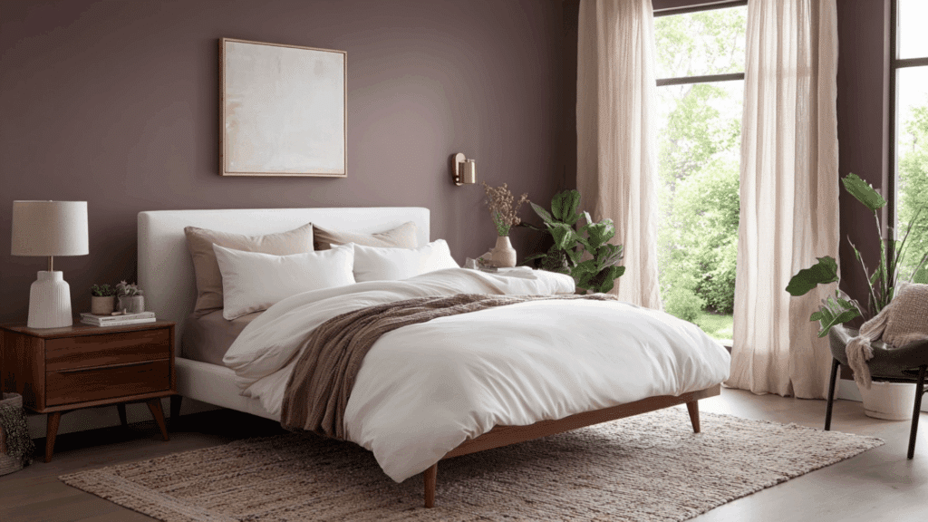
In bedrooms, Cinnamon Slate delivers a calming, cocoon-like effect without feeling overly dark.
The balanced undertones help it feel restful rather than heavy, especially when paired with crisp white bedding or warm neutral accents.
It works particularly well in primary bedrooms where a moody, serene environment enhances comfort and relaxation.
Accent Walls
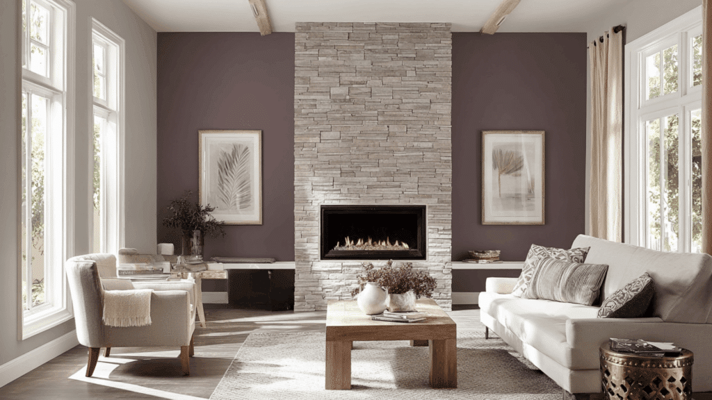
As an accent wall color, Cinnamon Slate provides dramatic contrast without overpowering a space. It pairs beautifully with light greige or creamy white walls, creating depth and architectural interest.
Behind a fireplace, bed, or built-in shelving, it highlights focal points while maintaining a refined, designer-inspired aesthetic.
Dining Rooms
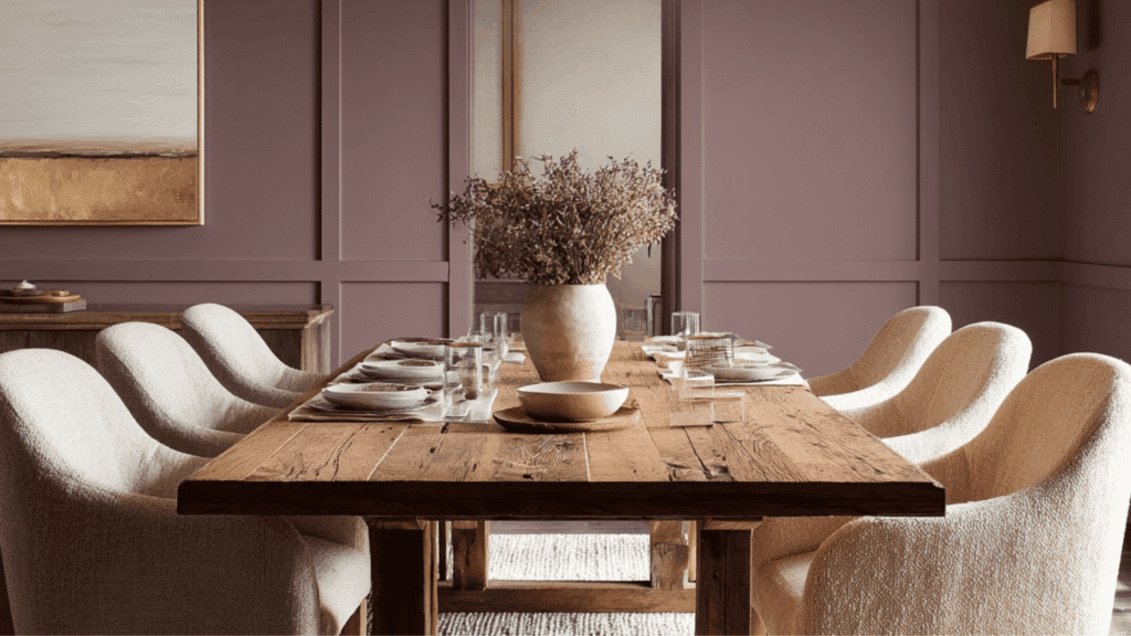
In dining rooms, Cinnamon Slate creates an intimate and inviting backdrop that enhances both casual meals and formal gatherings.
Its rich, earthy depth pairs beautifully with wooden dining tables, upholstered chairs, and warm metallic accents like brass or bronze lighting fixtures.
It works especially well in modern, rustic, or contemporary dining spaces, where warmth and depth add character.
Exterior Applications
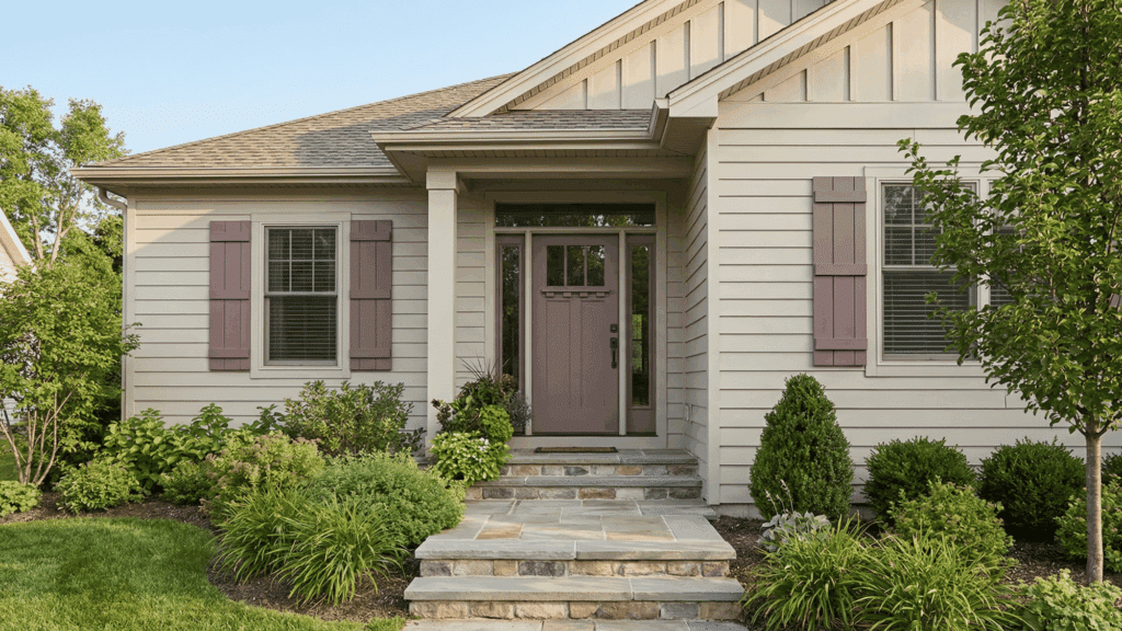
Cinnamon Slate can also perform beautifully on exteriors, especially for front doors, shutters, or siding in shaded settings.
Its earthy undertones complement stone, brick, and natural landscaping. When used outside, it offers a distinctive yet ageless curb appeal that feels rich and grounded rather than overly bold.
Best Trim Colors to Pair with Cinnamon Slate
Benjamin Moore Cinnamon Slate pairs best with crisp whites, warm creams, and soft neutrals that highlight its rich, earthy depth beautifully.
- Chantilly Lace (OC-65): A clean, bright white that creates sharp, modern contrast with Cinnamon Slate.
- Simply White (OC-117): A warm white that softens the look and enhances the cozy undertones.
- White Dove (OC-17): A balanced creamy white that feels timeless and elegant alongside deeper walls.
- Swiss Coffee (OC-45): A gentle off-white that adds warmth without looking too stark.
- Cloud White (OC-130): A subtle creamy trim choice that keeps spaces feeling inviting and classic.
- Pale Oak (OC-20): A light greige trim option that complements Cinnamon Slate’s earthy sophistication.
- Edgecomb Gray (HC-173): A warm neutral trim that creates a seamless, designer-style pairing.
- Classic Gray (OC-23): A soft, airy neutral that keeps the overall look light and balanced.
Is Benjamin Moore Cinnamon Slate Worth It?
Cinnamon Slate earns its keep in spaces that need warmth without going full plum or brown.
It’s a paint color that doesn’t demand attention but still makes a statement. The depth here is real; this isn’t some wishy-washy neutral that disappears on the wall.
For the price point, Benjamin Moore delivers quality coverage and color accuracy. Two coats usually do the job, and the finish holds up well over time. It pairs easily with both warm woods and cooler metals, which saves headaches when decorating.
The real value shows up in versatility. One color that works in multiple rooms means fewer paint cans cluttering the garage.
It transitions well from room to room without feeling repetitive. For homeowners wanting a cohesive look without boring sameness, that’s worth something.
To Conclude
Benjamin Moore Cinnamon Slate handles the tricky job of adding character without overwhelming a space.
It brings genuine warmth, not forced, and adapts better to different lighting conditions than many neutrals in its category.
The investment makes sense for anyone tired of cold grays or builder-grade beiges. It’s refined enough for formal spaces yet relaxed enough for everyday living areas. The color’s depth means it won’t fade into the background or feel flat on the walls.
For those ready to move beyond basic neutrals, Cinnamon Slate offers a smart middle ground. It’s a color that grows more appealing over time, not less.