")
Looking for an honest review of Ballet White (OC-9)? You’ve come to the right place. In this blog, I’ll give you the complete rundown of this popular Benjamin Moore shade.
Ballet White is a warm, soft neutral that sits perfectly between beige and white. It’s become a favorite among homeowners and designers for its versatility and calming effect.
I know that choosing the right paint color can feel overwhelming. There are thousands of options, and what looks good in someone else’s home might not work in yours.
That’s why I’m sharing my real-world experience with Ballet White, including:
- How it looks in different lighting conditions
- What rooms it works best in
- Common pitfalls to avoid
By the end, you’ll know exactly whether Ballet White is right for your space or if you should consider alternatives.
Why Ballet White Is an Ideal Paint Color for Any Room?
Ballet White shines in almost any space. I’ve used it in countless projects, from snug bedrooms to spacious living areas.
What makes it special? This color changes with the light. In the morning sun, it appears warm and creamy. By evening, it shifts to a softer, more neutral tone. Yet, it never goes yellow like many other off-whites can.
This adaptability is rare in the paint world.
I painted my home office Ballet White last year. The north-facing room had always felt cold and unwelcoming. Not anymore! The color adds just enough warmth without being overpowering.
The beauty of Ballet White is its balance. It’s not too white. Not too beige. Not too anything—except just right.
Have you ever noticed how some colors feel “loud” after a while? Ballet White never does. It stays in the background, making your furniture and art the stars of the show.
Understanding the Subtle Undertones of Ballet White
Ballet White isn’t just a simple cream color. It’s what paint experts call a “dirty cream” – and that’s actually a good thing!
What makes it dirty? Ballet White starts with a creamy base but has neutral elements mixed in. These neutrals tone down the yellow and create a balanced, sophisticated look.
Think of it as cream with a touch of earthiness.
In my experience, this color changes throughout the day. Here’s what I’ve noticed:
- Morning light: The warmth comes forward, showing more of its cream side
- Afternoon sun: It appears lighter and more neutral
- Evening with lamps on: The color deepens slightly, feeling cozy without turning yellow
Sometimes, you might catch a tiny hint of a green undertone, especially in north-facing rooms. Don’t worry – it’s subtle and rarely takes center stage.
The lighting in your home will change everything. I’ve seen Ballet White look almost like an off-white in bright spaces and more like a light beige in darker corners.
Want to test it properly? Don’t just slap a paint swatch on the wall and decide in five minutes.
Buy a peel-and-stick sample or paint a large poster board. Move it around different walls during the day. Look at it in the morning, afternoon, and with your lamps on at night.
What works in your friend’s sunny kitchen might look completely different in your shadowy hallway. Give yourself time to see all sides of Ballet White before committing.
Flooring Options That Pair Beautifully with Ballet White
Benjamin Moore’s Ballet White (OC-9) is a warm, soft off-white with subtle beige undertones that creates an elegant, airy atmosphere in any space.
When choosing flooring to complement this versatile neutral wall color, you have numerous options that can enhance its gentle warmth.
1. Warm Hardwoods
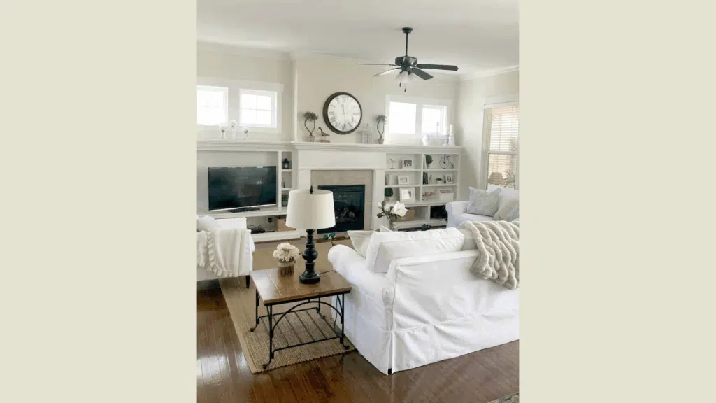
I’ve worked with Ballet White in dozens of homes, and warm hardwoods are my favorite pairing. Natural oak floors bring out the subtle warmth in Ballet White without making it look yellow.
Your walnut floors will create a gorgeous contrast that feels sophisticated rather than stark. The rich brown tones anchor the space, while Ballet White keeps things airy above.
Pine flooring with its honey tones complements Ballet White perfectly.
When these warm woods and Ballet White come together, the result feels timeless and inviting. The depth of the natural wood grain adds character, while the walls provide a clean backdrop.
2. Light Neutral Flooring
The beige carpet creates a seamless, monochromatic look with Ballet White walls. I recently designed a bedroom with this combination, and it felt like being wrapped in a cloud.
Your space will appear larger when floor and wall colors blend gently together. This approach works especially well in smaller rooms where contrast might feel choppy.
Natural fiber rugs—like jute, sisal, or seagrass—bring wonderful texture to rooms with Ballet White walls. The organic elements keep the neutral palette from feeling flat or boring.
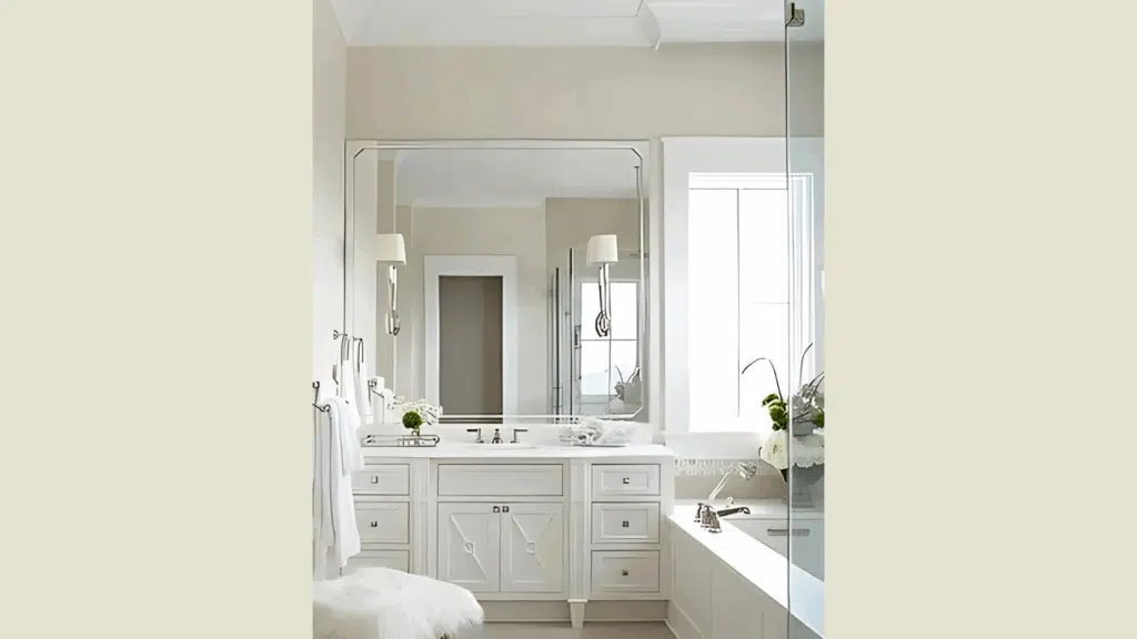
Light limestone or travertine tile floors continue this soft, cohesive feeling in bathrooms or kitchens. The subtle variation in natural stone adds just enough visual interest.
3. Cool-Toned Contrasts
Gray-toned hardwood is surprisingly effective with Ballet White. I was hesitant the first time a client suggested this combination, but the result was stunning.
Your greige, luxury vinyl planks will create a modern foundation that Ballet White softens just enough. This pairing feels current without chasing trends that will quickly date your home.
Slate floors in bathrooms or entries introduce a dramatic contrast that Ballet White can handle beautifully. The color stays warm and welcoming even against these cooler surfaces.
4. How Flooring Affects Undertones
The floor color you choose will dramatically change how Ballet White looks on your walls. This isn’t magic—it’s simply how colors interact.
Your dark floors will make Ballet White appear lighter and sometimes bring out more of its cream qualities. I’ve watched the same paint color look completely different in two rooms simply because of the flooring beneath it.
Light floors tend to reflect more light overall, making Ballet White look brighter and sometimes more neutral. If your floors have a strong undertone (like red-toned cherrywood), that color will visually “bounce” onto your walls.
Make sure to test your paint sample directly against your actual flooring material. Hold your Ballet White swatch against your floor to see how they’ll interact before committing to painting an entire room.
Creative Ways to Decorate with Ballet White
1. Soft Backdrop for Bold Decor
Ballet White creates the perfect canvas for statement pieces. I’ve used it countless times when clients want to showcase colorful art or unique furniture.
Your bold blue sofa will pop beautifully against these walls without fighting for attention. The neutral backdrop lets special pieces shine while keeping the overall feel balanced.
Think of Ballet White as the supporting actor that makes the star look good.
Earthy decor items—clay pottery, woven baskets, or natural wood sculptures—feel right at home against this color. The subtle warmth of Ballet White enhances these organic elements rather than making them look out of place.
2. Layering with Textures
I love how Ballet White responds to different textures in a room. It seems to enhance everything from rough to smooth surfaces.
Your wooden furniture will look rich and inviting. The gentle warmth of Ballet White complements both light oak and darker walnut tones equally well.
When paired with these walls, linen curtains create a gorgeous softness. The natural slight variation in linen fabric plays beautifully off the subtle depth of Ballet White.
Add metals for interest and contrast. I find that both warm metals (brass, copper) and cool ones (nickel, chrome) work well with this versatile color. The walls adapt to either choice without clashing.
3. Complementary Accent Colors
Ballet White plays nicely with many accent colors. My top recommendations include:
- Sage green for a fresh, natural feel
- Navy blue for classic contrast
- Rust or terracotta for warmth and depth
- Charcoal gray for modern sophistication
Your accent pillows, throws, and smaller decor items can introduce these colors without overwhelming the space.
I recently designed a living room with Ballet White walls and sage green accents. The combination felt both calming and current, with neither color dominating the conversation.
4. Trim Color Pairings
Choosing the right trim color makes a big difference with Ballet White. I typically recommend Benjamin Moore White Dove for a soft, cohesive look. The colors share similar undertones, creating harmony.
If you choose Benjamin Moore Super White instead, your trim will stand out more distinctly. This creates a cleaner, more modern contrast while still respecting the warmth of Ballet White.
For traditional spaces, consider using Ballet White on both walls and trim, just in different sheens. The walls in matte walls and the trim in semi-gloss create subtle dimension without any risk of clashing undertones.
Remember that lighting affects the amount of contrast between your wall and trim colors. Test your combinations in the actual room before making your final decision.
Ballet White Compared to Other Warm-Neutral Paints
I’ve used all these colors in different homes, and your specific lighting will dramatically impact how each appears. Ballet White sits perfectly between cream and grey – not as yellow as traditional creams but not as grey as true greiges.
| Paint Color | Undertones | LRV | When to Choose It | How It Differs from Ballet White |
|---|---|---|---|---|
| Ballet White | Soft cream with subtle neutral base | 71.97 | When you want warmth without obvious yellow | Our baseline for comparison |
| Edgecomb Gray | Greige, with a slight green undertone | 63 | When you need more depth but still want neutrality | Darker and more gray than Ballet White; less creamy |
| Swiss Coffee | Cream with yellow-green undertone | 84 | When you want a brighter, more reflective warm white | Much lighter than Ballet White; shows more yellow |
| Navajo White | Warm cream with an orange undertone | 73 | When you wish definite warmth that reads as “cream” | Similar lightness to Ballet White but with a stronger yellow/orange tone |
| White Dove | Soft white with slight yellow undertone | 85 | When you want a cleaner look while staying warm | Significantly lighter than Ballet White; reads more as “white” |
| Shoji White | Greige with slight green undertone | 74 | When you want a touch of gray in your warm neutral | More muted than Ballet White; less cream, more gray |
When testing these colors, place the swatches side by side on a white background. You’ll immediately see how Ballet White offers warmth without committing to a strong yellow tone.
Conclusion
Ballet White delivers what so many paint colors promise but fail to provide: true versatility without sacrificing personality.
I’ve used this color in dozens of homes over the years, from traditional colonials to modern farmhouses. It never disappoints.
The secret is in its balance—not too yellow, not too gray, just warm enough to feel welcoming without locking you into a specific style direction.
Remember that paint colors transform dramatically based on your specific lighting, flooring, and furnishings. What looks perfect in my north-facing office might appear completely different in your sun-drenched living room.
Before you commit, get a sample and live with it for a few days. Watch how it changes from morning to evening. See how it looks next to your furniture and trim.
Is Ballet White perfect for every space? No paint color is. But it’s hard to beat for a warm, adaptable neutral that plays well with others.