")
Pure White OC-64 by Benjamin Moore has quietly become one of the most sought-after white paint colors in recent years.
This soft, clean white has won the hearts of home decorators and professionals alike for its warm undertones and versatility in different lighting situations.
What sets Pure White apart in Benjamin Moore’s white collection is its perfect balance – not too stark, not too creamy. It offers a clean look without feeling cold or clinical in your space.
In this blog, we’ll look at:
- The exact color makeup of Pure White OC-64
- How it appears in different rooms and lighting conditions
- The best trim and accent colors to pair with it
- Common mistakes to avoid when using this paint
I’ll help you decide if Pure White is right for your home and show you how to use it effectively in your next project.
The Rich Undertones of Pure White by Benjamin Moore
Pure White isn’t just plain white paint. It has gentle undertones that give it character.
I’ve noticed it has a soft warmth to it, there’s a hint of cream that keeps it from feeling too stark. But don’t worry, it doesn’t turn yellow.
The Light Reflectance Value (LRV) of Pure White is 78.94. This high number means it reflects a lot of light, making spaces feel bigger and brighter.
Lighting changes everything with this paint. Here’s what I’ve seen:
- Morning sunlight: It looks bright and clean
- Evening light: The warm undertones become more visible
- LED lights: It can appear slightly cooler
- Incandescent bulbs: The creamy quality gets stronger
Unlike stark whites with blue undertones, Pure White will not make your room feel like a hospital. It stays soft and welcoming.
Why should you care about undertones? They’re the secret ingredient in how a room feels. You might not notice them right away, but they affect how all your furniture and decor look against your walls.
When you pick the wrong white, everything else in the room can look “off” without you knowing why. I learned that the hard way!
Pure White strikes a balance that works with most styles. This makes it easier to change your decor without needing to repaint.
The Psychology of Pure White by Benjamin Moore
White walls do more than look good. They change how we feel in a room.
I’ve painted several rooms with Pure White and noticed it creates a sense of calm that’s hard to get with other colors.
This shade of white feels clean without being cold. When you walk into a room painted with Pure White, you’ll likely feel:
- A sense of order and peace
- An open, airy quality
- A welcome feeling that’s not too formal
Pure White finds the sweet spot between cozy and clean. Many whites can feel too stark, like you’re in a doctor’s office rather than a home.
Others can be so warm they almost look yellow. Pure White sits right in the middle.
Why does this matter? I’ve found that the whites that lean too cool can make a room feel empty and lifeless. You might think all whites are the same, but they’re not.
The beauty of Pure White is that it gives you a blank canvas that still feels alive.
When I’m helping friends choose a white, I often suggest Pure White for people who want their furniture and art to stand out.
Your decor becomes the star while the walls support without competing.
Not all blank canvases are created equal. Some feel flat and boring. Pure White has just enough depth to make a room interesting even before you add anything else.
What would you put in a room painted Pure White? Almost anything works—that’s its strength.
Why Pure White Is an Ideal Paint Color for Any Room?
1. Works in Every Room Type
I’ve used Pure White in nearly every type of room. It shines in bedrooms where it creates a peaceful feeling.
In kitchens, it makes the space feel clean and fresh. Living rooms painted with Pure White feel open and welcoming.
What makes it so useful? It’s the paint color that fits almost anywhere. You can put it on your bathroom walls or in a home office. It won’t feel out of place.
2. Plays Well with Other Colors
Pure White is like a good friend who gets along with everyone. I’ve seen it paired with navy blue furniture, green plants, and wooden tables. It makes each of these elements look better.
If you love bright, bold colors for your rugs or pillows, Pure White gives them space to stand out. If you prefer soft, neutral tones, Pure White helps create a calm, put-together look.
3. Suits Rooms of All Sizes
In small rooms, some whites can feel too bright and harsh. Others might make the space feel dull. Pure White finds the middle ground.
I painted my tiny home office with Pure White, and it made the room feel bigger. When I used it in my large living room, it didn’t disappear or feel empty like some whites can.
You won’t have to worry about a room being too small or too big for this color.
4. The Safe Choice That Isn’t Boring
When you can’t decide on a color, Pure White is a smart pick. I’ve recommended it to friends who were stuck between different options.
It’s not a choice you’ll regret. Some “safe” colors end up feeling flat or dull over time. Pure White keeps its appeal year after year.
You can change your furniture, your style, or even the purpose of a room, and Pure White will still work for you.
Best Places to Use Pure White in Your Home
Pure White brings a clean, fresh look to any space in your home. This simple color choice offers more flexibility than you might think.
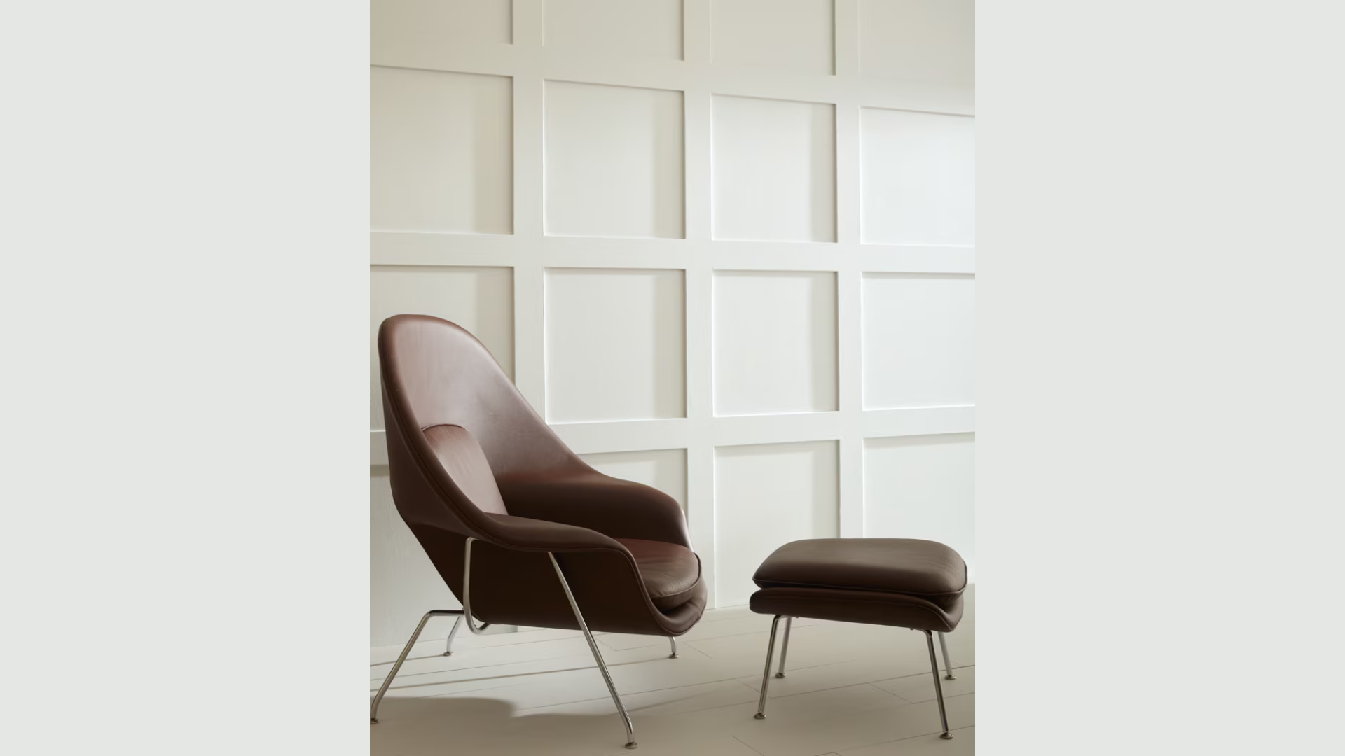
1. Bedroom
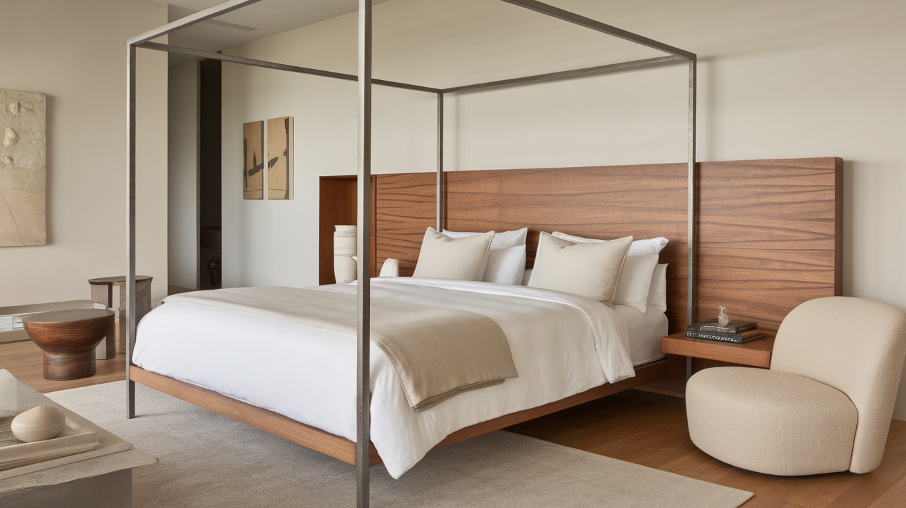
I find Pure White perfect for bedrooms because it creates a calm feeling without being boring. Your bedroom should help you relax, and this color sets the right mood.
It works well with any bedding colors you might choose.
Pure White walls in a bedroom also make the room feel bigger and more open. This is especially helpful in smaller bedrooms.
If you have windows that let in natural light, Pure White will help bounce that light around the room.
You can add pops of color with pillows, art, or a colorful rug, and they’ll all look good against this background.
2. Kitchen
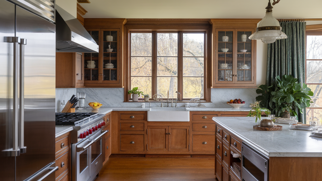
Kitchens can get messy and busy. Pure White cabinets or walls help create a clean, fresh look. I painted my kitchen cabinets with Pure White, and they still look good years later.
The color works well with stainless steel, black, or colored appliances. It doesn’t clash with food colors either, which is something to think about in a kitchen.
Pure White also makes a kitchen feel more open and airy. If you have a small kitchen, this color can help it feel less cramped.
3. Bathrooms
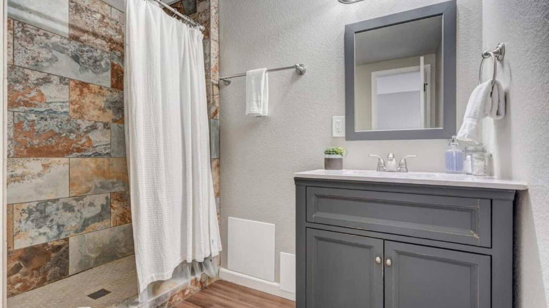
Bathrooms need to feel clean, and Pure White helps create that feeling. I’ve used it in both large and small bathrooms with great results.
Water spots and steam don’t show up as much on Pure White as they might on darker colors. This means your bathroom walls will look cleaner for longer.
Pure White also makes a bathroom feel more spa-like. You can pair it with green plants or colored towels to add some life to the space.
4. Home Office
Focus is key in a home office, and Pure White helps create a clean, distraction-free space. I painted my home office with Pure White, and it helps me stay on task.
The color reflects light well, which is good for a workspace. You’ll have fewer shadows and better overall lighting with white walls.
Your office supplies and equipment will stand out against Pure White. This makes things easier to find and creates a more organized feeling.
Flooring Options That Pair Beautifully with Pure White
Pure White walls create a blank canvas that works with almost any flooring type. Your floor choice can steer the room’s overall look while the white walls maintain a clean, open feeling.
1. Light Oak and Blonde Wood
I love how light oak floors look with Pure White walls. This combo creates a bright, open feel that never goes out of style.
The soft tones of blonde wood bring warmth without taking away from the clean look of the white walls.
This pairing works so well for getting that simple, clean Scandinavian style in your home. Your space will feel bigger and more open when these light colors work together.
Light wood floors also hide dust better than dark floors. This means less cleaning for you while still keeping that fresh look.
2. Medium-Toned Hardwoods
Medium brown floors offer just the right amount of contrast with Pure White. I’ve seen this combo in many homes, and it always looks balanced and welcoming.
The middle ground of medium wood tones creates a cozy feeling without making the space feel dark. Your furniture will also stand out nicely against this pairing.
Medium woods like walnut or cherry bring a classic feel that works in both old and new homes. You won’t tire of this combo even after many years.
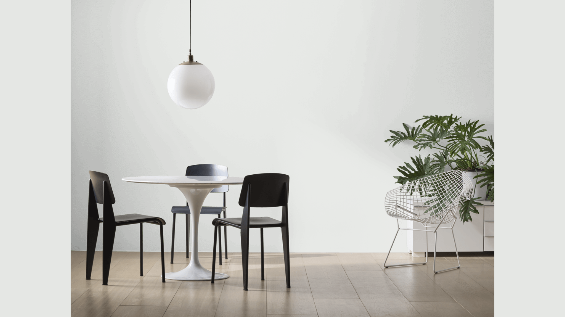
3. Dark Floors
Want to make a statement? Dark floors with Pure White walls create a bold look. I tried this in my dining room, and the contrast is striking but not overwhelming.
Dark hardwood or deep ebony floors can make your white walls look even crisper and cleaner.
This strong contrast works well in spaces where you want to create a more formal or modern feel.
Just keep in mind that dark floors show dust and pet hair more easily. They’re worth the extra cleaning if you love that bold, modern look.
4. Natural Stone
Stone floors in soft gray or beige tones match perfectly with Pure White walls. I find this combo brings a touch of nature inside while keeping things clean and simple.
Limestone, travertine, or slate all work well. The natural patterns in stone add interest to a room without clashing with the pure white walls.
This pairing feels timeless and works well in bathrooms, kitchens, or entryways. Your stone floors will last for decades and never go out of style when paired with these walls.
Pure White Compared to Other Warm-Neutral Paints of Benjamin Moore
I’ve used many Benjamin Moore whites over the years, and I find that comparing them side by side helps show their unique qualities.
| Comparison | What I’ve Noticed | When To Choose Each |
|---|---|---|
| Pure White vs. Simply White | Simply White is brighter and has more yellow undertones than Pure White. Pure White looks more balanced and less sunny. | Choose Pure White when you want a clean look without yellow. Pick Simply White when you want a space to feel sunny and bright. |
| Pure White vs. White Dove | White Dove has more gray and feels softer than Pure White. Pure White appears cleaner and crisper on walls. | Choose Pure White for a more modern, clean look. Pick White Dove for a softer, cozier feel that works well in traditional homes. |
| Pure White vs. Swiss Coffee | Swiss Coffee is much warmer with definite beige undertones. Pure White stays true white but still feels soft. | Choose Pure White when you want white walls that don’t lean beige. Pick Swiss Coffee when you want warmth that borders on being an off-white. |
What this means for you: If you’re stuck between these options, Pure White offers the most flexibility and the least risk of looking too yellow, too beige, or too dull. It’s my go-to recommendation for most homes.
Conclusion
After using Pure White in many homes, I can say it’s one of the most dependable paint colors out there. It works because it doesn’t try too hard – it’s a clean white that feels fresh without being cold.
What makes it special is how it fits anywhere. Your grandma’s colonial house? Perfect. Your sleek downtown apartment? Just as good. It bridges old and new without fuss.
Always get a sample before you commit. Paint a poster board and move it around your room at different times of day. What looks right in the store might look different at home.
Sometimes the plainest option is the smartest choice. Pure White doesn’t need fancy words or special features to be great.
It just quietly does its job, making your home look better while letting you and your style be the star.