")
Some paint colors feel too bright, and others feel too dull. River Blue by Benjamin Moore feels calm and balanced. It has a strong blue tone with just enough gray to keep it soft.
River Blue is the kind of shade that adds color without taking over the room. It brings depth but still keeps the space feeling relaxed, making it a great choice for people who want something grounded and easy to live with.
In this blog, we’ll look at what makes River Blue special. You’ll learn about its undertones, how it looks in different lighting, and where it works best. We’ll also cover color pairings, furniture ideas, and how to use it across different spaces.
If you want a blue that feels smooth and steady, this color might be the one to try.
Why River Blue (2057-10) Is the Perfect Choice for Your Space?
River Blue stands out because it offers depth without feeling too bold or too soft. Its calm gray base helps balance the richness of the blue, making it easier to use in everyday spaces. It brings color without making the room feel closed in.
- Deep, balanced tone that feels calm and steady
- Works in bold spaces or soft, simple rooms
- Adds color without making the space feel too dark
This paint color is a great fit when you want something with more mood but still easy to live with every day. It feels relaxed and grounded and is easy to pair with many styles.
The Rich Undertones of River Blue
River Blue is more than just a standard blue. It has a deep navy base mixed with gray and a soft touch of teal. These undertones give it a quiet, smooth look that works well in many homes.
The teal shows up more when there’s warm light, while the gray makes the color feel steady. In natural daylight, it may feel cooler, but in warmer light, it feels deeper and softer. That’s why it’s important to see how it looks in your space throughout the day.
Undertones play a big role when matching paint with other colors. Knowing that River Blue has a cool-gray base with a touch of green-blue helps you pick the right trim, fabric, and flooring.
River Blue’s Light Reflectance Value Explained
River Blue has an LRV of 7.27, which means it reflects very little light. On a scale from 0 (black) to 100 (white), this is on the darker end. It’s a rich shade that brings strong color but does not bounce light around the room.
In rooms with lots of sunlight, River Blue will look full and smooth. In low-light spaces, it can feel darker and cozier. Because of its low LRV, pairing it with light trim or floors can help balance the space.
If you’re using River Blue in a small or dark room, test a sample first to make sure it doesn’t feel too heavy. It works best when you want a deeper tone that adds color without feeling too cold.
River Blue in Different Lighting Conditions
River Blue reacts to light in a way that makes each space feel a little different. Its gray base helps it stay calm, but lighting can still shift the overall look. Testing it in your room is the best way to know how it will feel throughout the day.
- Natural light: softens the blue and brings out gray tones
- Artificial light: may make the color feel deeper or slightly cooler
- North-facing rooms: give it a cooler and more shadowed look
- South-facing rooms: bring out more warmth and depth
- Sample testing: helps you see how the color changes at different times
Trying a small patch first can help you avoid surprises. It’s the easiest way to know if River Blue fits the mood of your space.
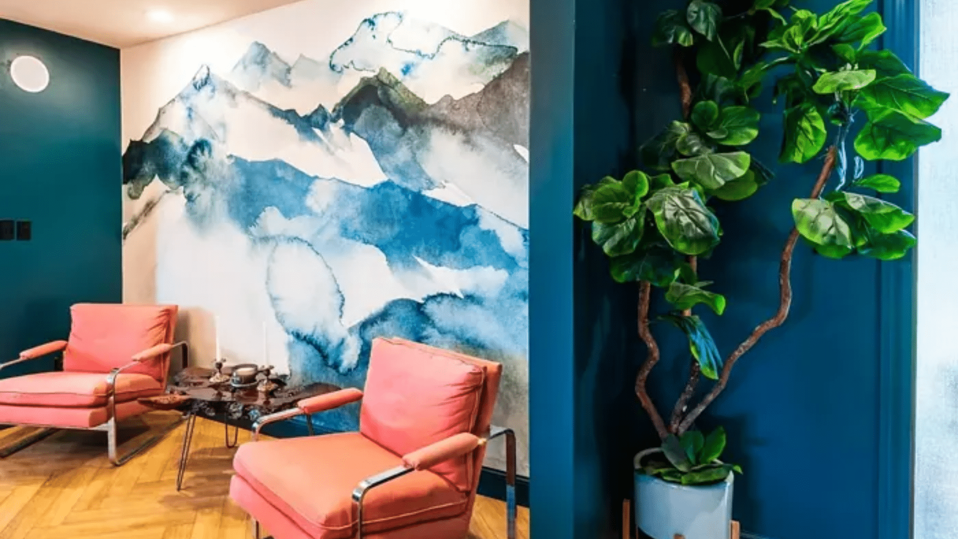
The Psychology of River Blue: How It Affects Your Mood
Colors can shape how a space feels, and River Blue is no exception. This deep, soft blue creates a quiet mood that helps people feel more at ease. It brings a sense of calm that works well in both relaxing and focused areas.
The gray base in River Blue helps reduce visual noise, making it easier to settle in during rest, reading, or work time. The shade helps a room stay quiet without feeling dull or flat.
Because it’s steady and cool-toned, River Blue is a smart choice for spaces that need balance. It supports a clear mind, softens stress, and helps the room feel more pulled together.
This paint color isn’t loud or busy—it simply gives the room a calm, steady feeling that lasts.
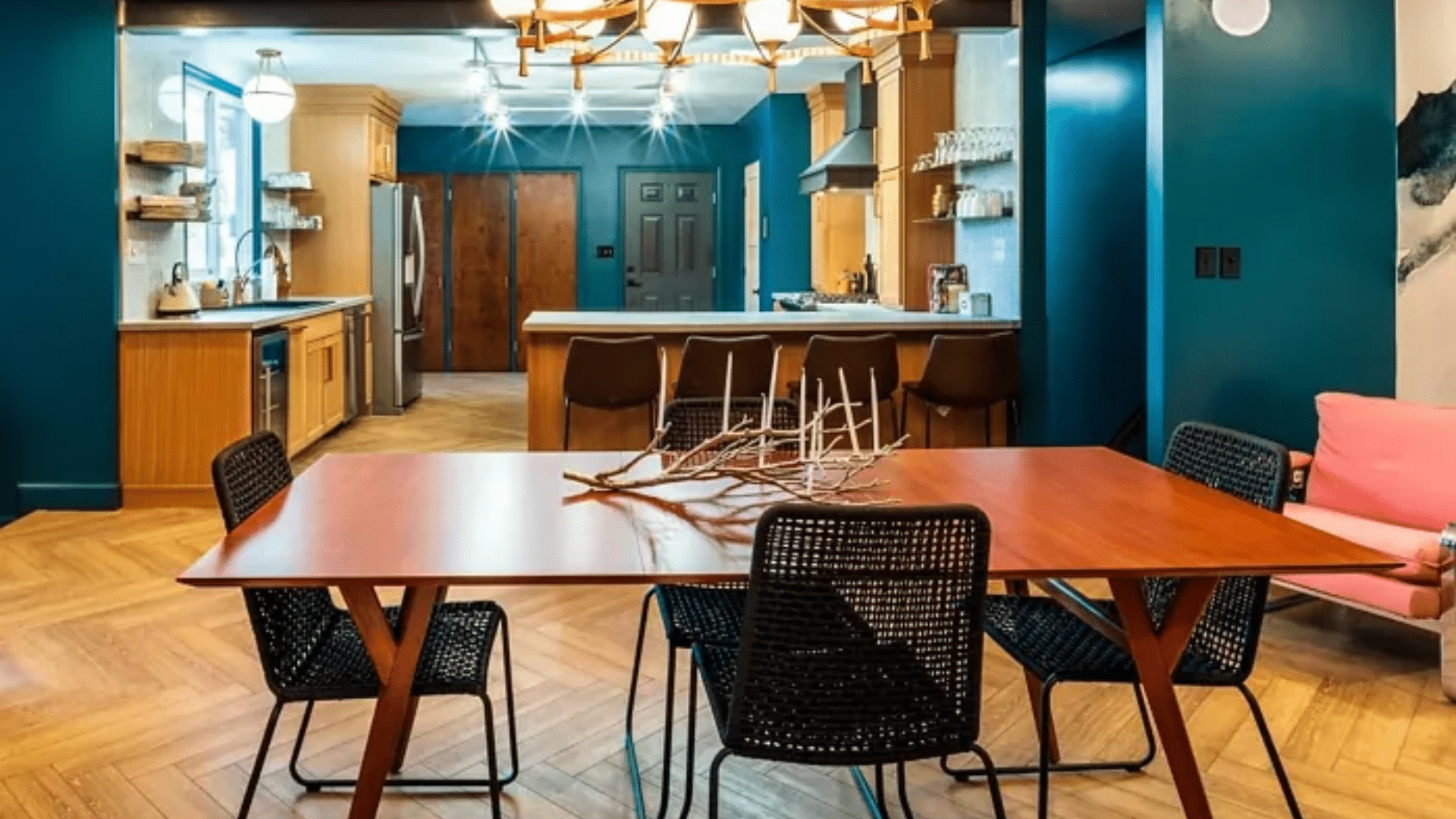
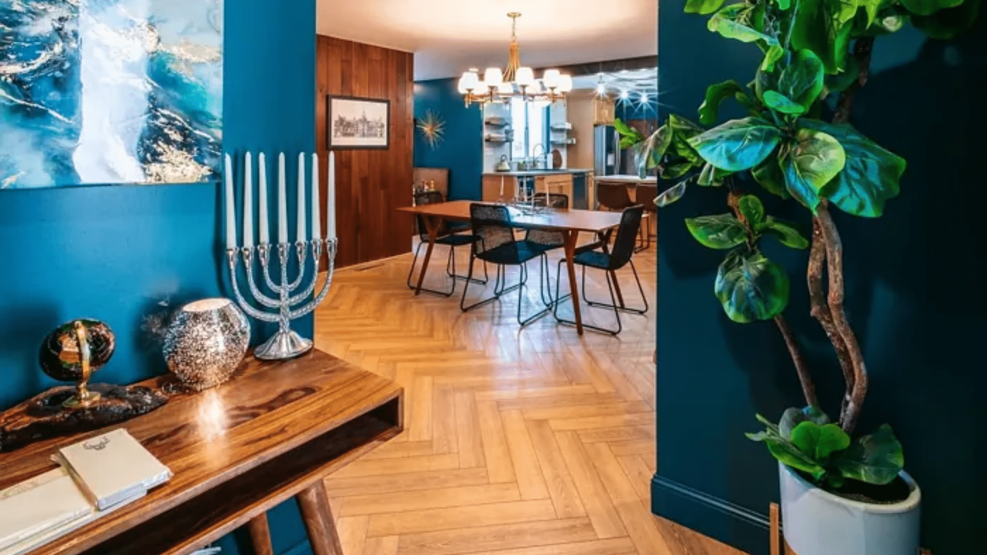
Where Is River Blue Best Used in An Interior?
River Blue fits into many parts of the home. Its steady, grounded look works in both quiet and active spaces. For a softer effect, you can use it across an entire room or just on one wall.
- Bedrooms: adds calm and depth without feeling too heavy
- Dining areas: bring a rich, welcoming look to gathering spaces
- Offices: help support focus and quiet
- Accent walls: make one wall stand out without being too bold
- Full-room use: works in spaces that need warmth and balance
- Small or large rooms: adapts to both with the right lighting
No matter the size or style of your space, River Blue can help shape the mood. Its deep tone feels steady and peaceful in many different settings.
What Kind of Floors Would Look Best with River Blue?
Flooring plays a big role in how River Blue looks in your space. This color works well with both warm and cool floor tones. Picking the right floor helps keep the room balanced and clear.
- Light oak flooring keeps the space open and clean
- Pale gray wood adds a cooler, modern feel
- Medium brown tones bring out warmth and depth in the blue
- Natural stone or warm tile works well in kitchens or entryways
- Soft neutral rugs help soften the color and tie everything together
With the right flooring, River Blue can feel settled and complete, making the whole room come together with ease.
How to Incorporate River Blue Into Your Home Decor?
River Blue can bring calm and richness into a space when used with the right mix of furniture and finishes. Its deep tone works best when balanced with soft textures and light touches. You don’t need much to make the color feel complete—just the right details.
Light wood or white-painted furniture works well with River Blue. Rounded edges, soft lines, or simple shapes help the room feel more open. Stick to pieces that feel clean and relaxed.
Wall art in soft creams, muted golds, or earthy greens adds warmth. To layer texture, try light pillows, neutral curtains, or woven baskets. These small changes help break up the depth of the wall color.
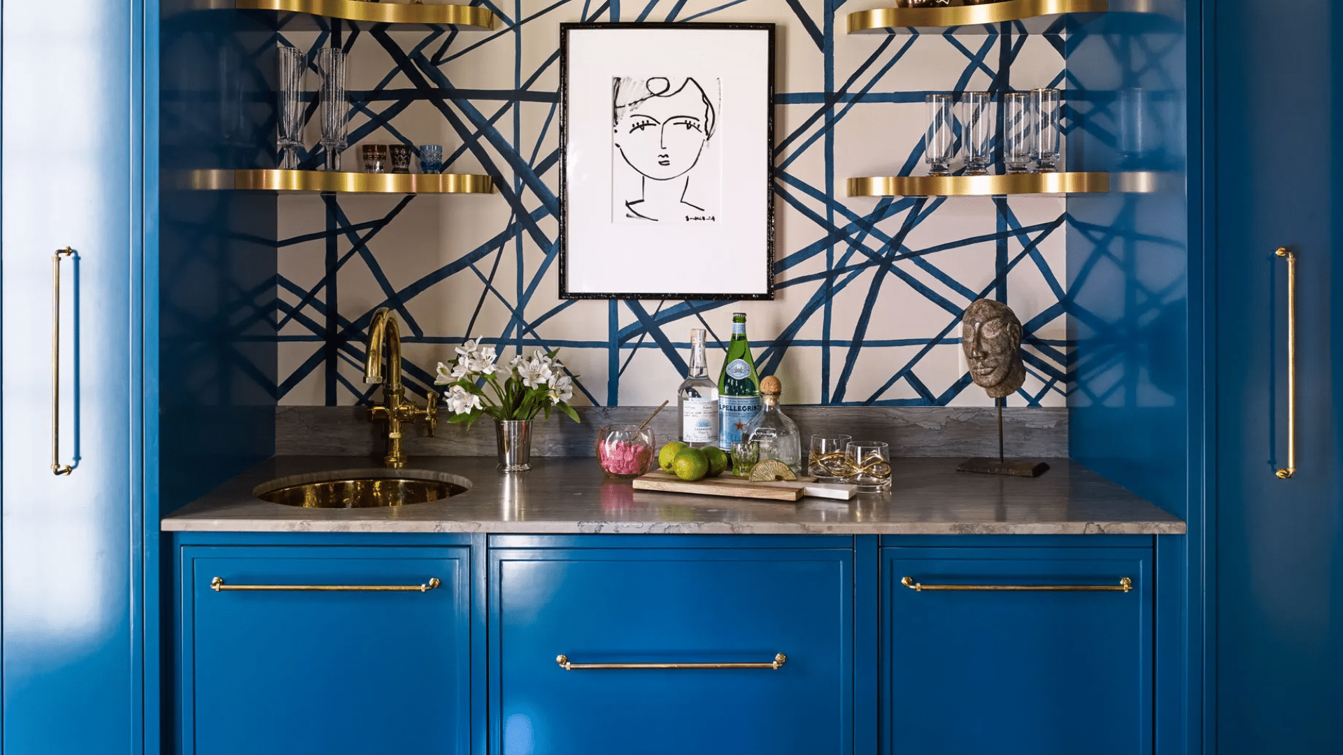
For metal finishes, brushed brass, matte black, or soft gold can all work. They add a gentle shine that doesn’t compete with the blue. Keep the look simple and balanced to let River Blue shine.
River Blue vs. Other Bold Blues
Bold blue paints can change the feel of a room in different ways. Some are darker and stronger, while others are soft and smooth. River Blue stands out for its calm tone and flexible use across many spaces.
| Paint Color | Tone & Depth | Mood in a Room |
|---|---|---|
| River Blue | Deep blue with soft gray base | Calm, grounded, balanced |
| Hale Navy | Very dark navy with cool undertones | Bold, dramatic, more traditional |
| Polo Blue | Deep, slightly brighter navy | Rich, strong, formal |
| Blue Note | Dark blue with green and gray hints | Moody, creative, modern |
River Blue is a great choice when you want depth without too much weight. It adds strong color but still lets the rest of the room breathe.
Is River Blue Suitable for Exteriors?
River Blue isn’t just for indoor walls—it also works well on the outside of a home. Its rich tone gives a house a steady, grounded look. On siding, shutters, or doors, it brings depth without feeling too bold.
In direct sunlight, River Blue can appear slightly lighter, with the gray tones softening the strong blue. In shaded areas, it may look deeper and cooler. This shift makes the color feel alive but still steady.
For trim, soft white or warm beige helps balance the richness of River Blue. Natural stone, light brick, or wood accents can also pair well with it, keeping the look balanced and smooth.
Using River Blue outside gives your home a strong yet calm feel. It’s a color that stands out just enough, while still blending well with natural materials.
Conclusion
River Blue is a soft but rich blue that adds calm to any room. It doesn’t feel too dark, but still brings enough color to make a space feel full. It’s steady, deep, and easy to pair with many styles.
This paint works well in bedrooms, offices, or dining spaces. It blends with warm wood, light floors, and soft fabrics. You can use it on walls, trim, or cabinets to get a grounded, finished look.
Always try a sample before using it in a full space. Paint can change a lot with light, and testing helps you know how it will feel in your room.
A small patch on the wall can save time and help you feel more sure. If you’re looking for a quiet, deep paint color, River Blue is a smart and flexible choice.