
Are you struggling to pick the perfect paint color? This article covers everything about Benjamin Moore’s Sea Pearl – from its unique qualities to the best ways to use it.
I’ll solve your color dilemma by showing exactly how Sea Pearl works with different floors, furnishings, and lighting conditions.
Why trust me? During my 15 years as a painter and designer, I’ve used Sea Pearl in over 30 homes. I’ve seen it in north—and south-facing rooms, in small apartments, and in large houses.
If you’re searching for a versatile neutral that won’t feel boring or dated, keep reading. I’ll share:
- How Sea Pearl changes throughout the day
- Which rooms it works best in
- What colors pair perfectly with it
By the end, you’ll know if Sea Pearl is the answer to your painting questions.
Why Sea Pearl Works so Well in Many Rooms?
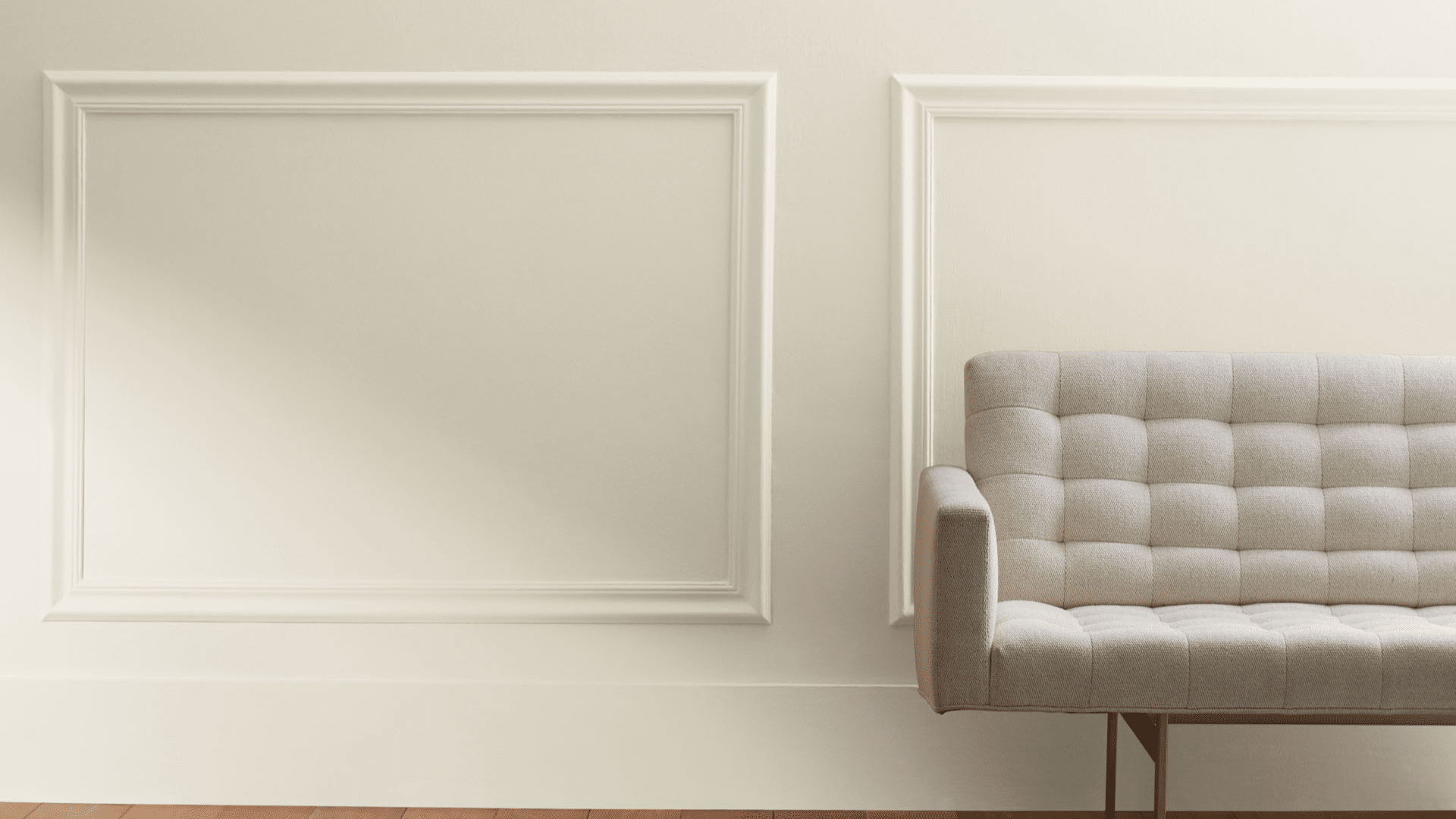
Sea Pearl (OC-19) works in so many rooms because it’s balanced and flexible. It’s not too light or too dark – it sits right in the middle at a light-medium depth.
What makes it special is how it changes slightly with its surroundings but stays true to itself. When placed next to other colors, it doesn’t turn too pink, too yellow, or too gray.
I’ve used Sea Pearl in small bathrooms and large living rooms. It also fits in modern and older houses. This adaptability is why it’s on my go-to list for clients who want a color that works.
The Subtle Colors in Sea Pearl
Sea Pearl isn’t just one color – it has layers. Looking closely, you’ll see:
- A gray base that keeps it grounded
- Soft green hints that add freshness
- Tiny touches of beige for warmth
These elements blend together to create a hard-to-pin-down color. It’s not simply gray, green, or beige—it’s all of them in perfect balance.
This mix is why Sea Pearl feels natural. It mimics the subtle color shifts you see in nature, making rooms feel relaxed and easy to live in.
The Mood of Sea Pearl
Sea Pearl creates a calm, peaceful mood in any room. It’s not loud or attention-seeking – instead, it sets a quiet background that helps you relax.
When I painted my office with Sea Pearl, I noticed I felt less stressed while working. The color doesn’t demand anything from you. It just sits back and lets you be.
This is a color that breathes. It gives your eyes a rest and your mind space to think. If you’re looking for a color that promotes tranquility without being boring, Sea Pearl delivers exactly that balance.
Best Rooms to Use Sea Pearl
I’ve found that Sea Pearl works best in these rooms:
- Living rooms: Create a welcoming, neutral backdrop
- Bedrooms: Promote rest with its calm vibe
- Home offices: Helps focus without being distracted
- Bathrooms: Makes small spaces feel larger and cleaner
- Hallways: Brighten typically dark areas
It’s particularly good in north-facing rooms that need a bit of warmth without going yellow. However, I wouldn’t use it in rooms where you want energy and excitement—it’s too subtle for that purpose.
What Floors Go Best with Sea Pearl?
The right floor can make Sea Pearl shine even more. From my experience:
- Medium wood tones create harmony with Sea Pearl’s subtle warmth
- White oak floors highlight the green undertones beautifully
- Dark walnut creates a striking contrast that feels classic
- The gray tile enhances the modern aspect of Sea Pearl
- Marble with gray veining looks absolutely stunning with these walls
I avoid very yellow-toned woods like pine with Sea Pearl, as they can clash with its gray-green elements.
Colors that Match with Sea Pearl
After trying countless combinations, these are my top 10 shades that effortlessly match with Sea Pearl:
1. White Dove (OC-17)

A soft white with warm undertones, White Dove perfectly complements Sea Pearl. I often use it for trim and ceilings when Sea Pearl is on the walls.
Its LRV is 83.16, making it bright but not stark. This pairing creates a clean, cohesive look that feels fresh rather than clinical.
2. Revere Pewter (HC-172)

This deeper greige adds welcome contrast when paired with Sea Pearl. With an LRV of 55.05, Revere Pewter works beautifully in adjacent rooms or on an accent wall.
The colors share similar undertones, but Revere Pewter has more depth, creating a natural flow between spaces.
3. Woodlawn Blue (HC 147)

A gentle blue-gray with a hint of green that adds a subtle water-inspired accent to any room with Sea Pearl. Its LRV of 60.65 puts it in the same light-medium family. This combination feels particularly coastal without being themed or obvious.
4. Gray Owl (2137-60)

This true gray creates a cool, cohesive look when used with Sea Pearl. Gray Owl has an LRV of 64.51 and fewer green undertones than Sea Pearl. I often use this pair in modern spaces where a clean, minimal palette is desired.
5. Pale Oak (OC-20)

A warm greige that adds just a touch more warmth to a Sea Pearl palette. With an LRV of 68.64, it’s almost identical in depth to Sea Pearl but leans more toward beige than green. This subtle difference creates interest without contrast.
6. Balboa Mist (1549)

Balboa Mist is a lighter alternative to Sea Pearl with an LRV of 65.53. It has similar gray undertones but less green, making it feel slightly cooler. These two colors can be used in the same space to create subtle dimensions on different walls.
7. Stonington Gray (HC-170)

This classic gray adds depth without darkness to a Sea Pearl scheme. Its LRV of 59.36 provides noticeable contrast while still feeling connected. The cooler undertones of Stonington Gray beautifully balance the warmth in Sea Pearl.
8. Classic Gray (1548)

Classic Gray is a light, warm gray with an LRV of 73.67 that creates a soft, tonal palette when paired with Sea Pearl.
This combination works especially well in spaces that need to feel light and airy but still grounded. I often use Classic Gray in bedrooms adjacent to Sea Pearl living spaces.
9. Chelsea Gray (HC-168)

For bold contrast moments, Chelsea Gray delivers with its deep, rich charcoal presence. The LRV of 23.33 makes it dramatically darker than Sea Pearl. I use this as an accent color for furniture, doors, or kitchen islands paired with Sea Pearl walls.
10. Chantilly Lace (OC-65)

A bright, clean white with an LRV of 90.04 makes Sea Pearl’s subtle coloration pop. Unlike White Dove, Chantilly Lace has no yellow undertones, creating a crisper contrast. This pairing works wonderfully in modern and transitional spaces.
I use these in trim, adjacent rooms, or as accent colors to create flow throughout a home.
Easy Ways to Use Sea Pearl in Your Home
- Start small with a powder room or hallway
- Paint just one wall as an accent to test how you like it
- Try it on kitchen cabinets for a fresh, updated look
- Pair it with white trim for a clean, defined edge
- Use it on ceilings and walls for a cocoon-like effect in bedrooms
I always tell clients to test paint in their actual space. Buy a sample and paint a 2×2 foot square on different walls. Check it morning, noon, and night before deciding.
Sea Pearl Compared to Other Soft Off-Whites
| Paint Color | Undertones | LRV | Best For |
|---|---|---|---|
| Sea Pearl | Gray-green-beige | 69.3 | Versatile, most rooms |
| Gray Owl | True gray | 65.77 | Modern spaces |
| Classic Gray | Warm gray | 74.78 | Brightest spaces |
| Pale Oak | Beige-pink | 69.89 | Warmer spaces |
| Edgecomb Gray | Beige-gray | 63.88 | Traditional homes |
Sea Pearl sits right in the middle – not too light, not too dark, not too warm, not too cool. This makes it more adaptable than these other options.
Sea Pearl in A Different Light
Light changes everything with this paint. Here’s what I’ve noticed:
- North-facing rooms: Sea Pearl shows more of its gray side
- South-facing rooms: The warmth comes forward more
- East-facing rooms: Clear and bright in the mornings, cooler in afternoons
- West-facing rooms: Cool in the mornings, warm and glowing in the afternoons
- Artificial light: Warm bulbs bring out the beige; cool LEDs enhance the gray
The time of day matters too. Sea Pearl can shift from feeling almost white in bright daylight to a definite light gray as evening falls.
Is Sea Pearl Warm or Cool?
Sea Pearl walks the line between warm and cool. It’s what paint experts call “temperature neutral.”The green undertones add coolness, while the beige notes add warmth. This balance is what makes it work in so many settings.
In rooms with lots of wood and warm elements, Sea Pearl will seem cooler. In spaces with chrome, glass, and cool colors, it will appear warmer.
This chameleon quality is its strength – it can tip slightly warmer or cooler based on what you need it to do in your space.
Conclusion
Sea Pearl stands out among hundreds of neutrals because it actually delivers on versatility after using it in dozens of spaces over the years.
I can confirm it works in most lighting conditions and with most decor styles. Its unique balance of gray, green, and beige creates a color that feels intentional rather than boring.
Is it worth trying? Absolutely. While it won’t create drama or make a bold statement, it provides something more valuable – a reliable backdrop that makes your furniture, art, and life look better.
Before committing, test a sample on different walls in your space and watch how it changes throughout the day. If you’re seeking a color that’s both interesting and calming and that works in multiple rooms, Sea Pearl might be exactly what you need.
Frequently Asked Questions
Does Sea Pearl Look Good with A White Trim?
Yes! Sea Pearl looks excellent with a white trim. I particularly like it with White Dove or Chantilly Lace for a clean, fresh look.
Will Sea Pearl Make My Small Room Look Bigger?
Yes, Sea Pearl can make a small room feel more spacious because of its light value and neutral character. It reflects light well without drawing attention to itself.
How Does Sea Pearl Compare to Revere Pewter?
Sea Pearl is lighter and has more green undertones than Revere Pewter. Revere Pewter is darker (LRV of 55.51) and has stronger beige-gray undertones.