")
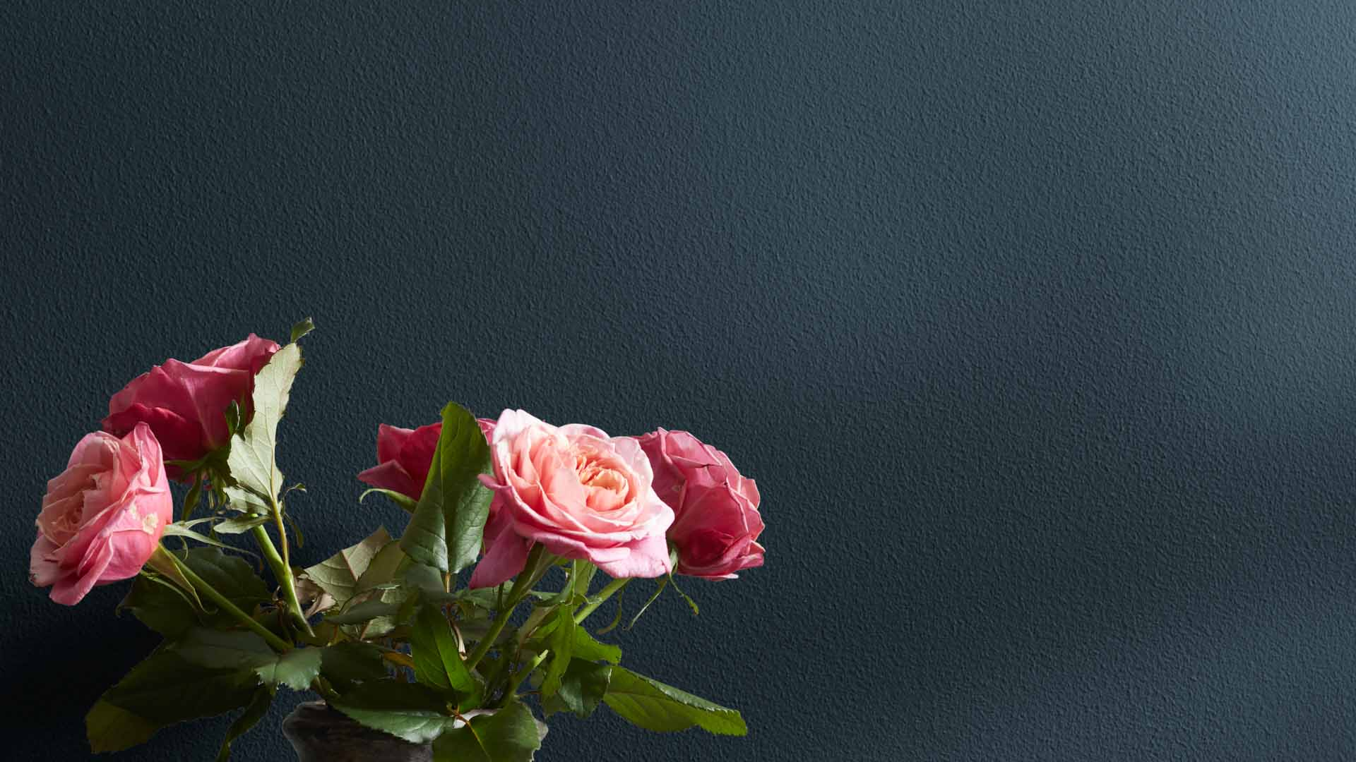
Benjamin Moore Blue Note (2129-30) is a deep, bold paint color that adds richness and style to any space. It’s a strong navy blue with subtle gray undertones that give it a smooth and balanced feel.
If you want a dramatic color that still feels calm and elegant, Blue Note might be just right.
Blue Note is versatile, working well in both modern and traditional homes. I love how it adds depth without being too overpowering and how easily it pairs with other colors.
It is a great choice for living rooms, bedrooms, kitchens, and even bathrooms.
In this blog, I’ll show you why Benjamin Moore Blue Note is a fantastic paint color for your next home project. From its bold tone to its ability to match many styles, you’ll see why it’s becoming a favorite for homeowners.
What Kind of Color Is Benjamin Moore Blue Note (2129-30)?
Benjamin Moore Blue Note is a dark navy color with cool gray undertones. It’s bold and rich and adds a lot of personality to a space.
The gray softens the blue, making it feel more relaxed and less harsh. This gives Blue Note a classy and grounded appearance.
It’s a darker paint, so it works best in rooms with good lighting or paired with lighter accents. Blue Note has an LRV (Light Reflectance Value) of 9.02%, meaning it absorbs most light. That helps it create a cozy and dramatic mood in a room.
This color’s clean and smooth look makes it feel both modern and timeless. It’s bold enough to stand out but calm enough to be used in more than one small area. It works well as a main wall color or as an accent.
If you’re painting one wall or an entire room, Blue Note brings a deep, stylish feel that can elevate your home.
Blue Note: A Bold and Flexible Color for Every Room
One of the best things about Benjamin Moore Blue Note is how it can be used in different rooms and styles. It’s a rich color that looks great in many spaces.
You can use it in modern homes, traditional spaces, or even coastal rooms. Let’s take a closer look at how Blue Note can shine in each part of your home.
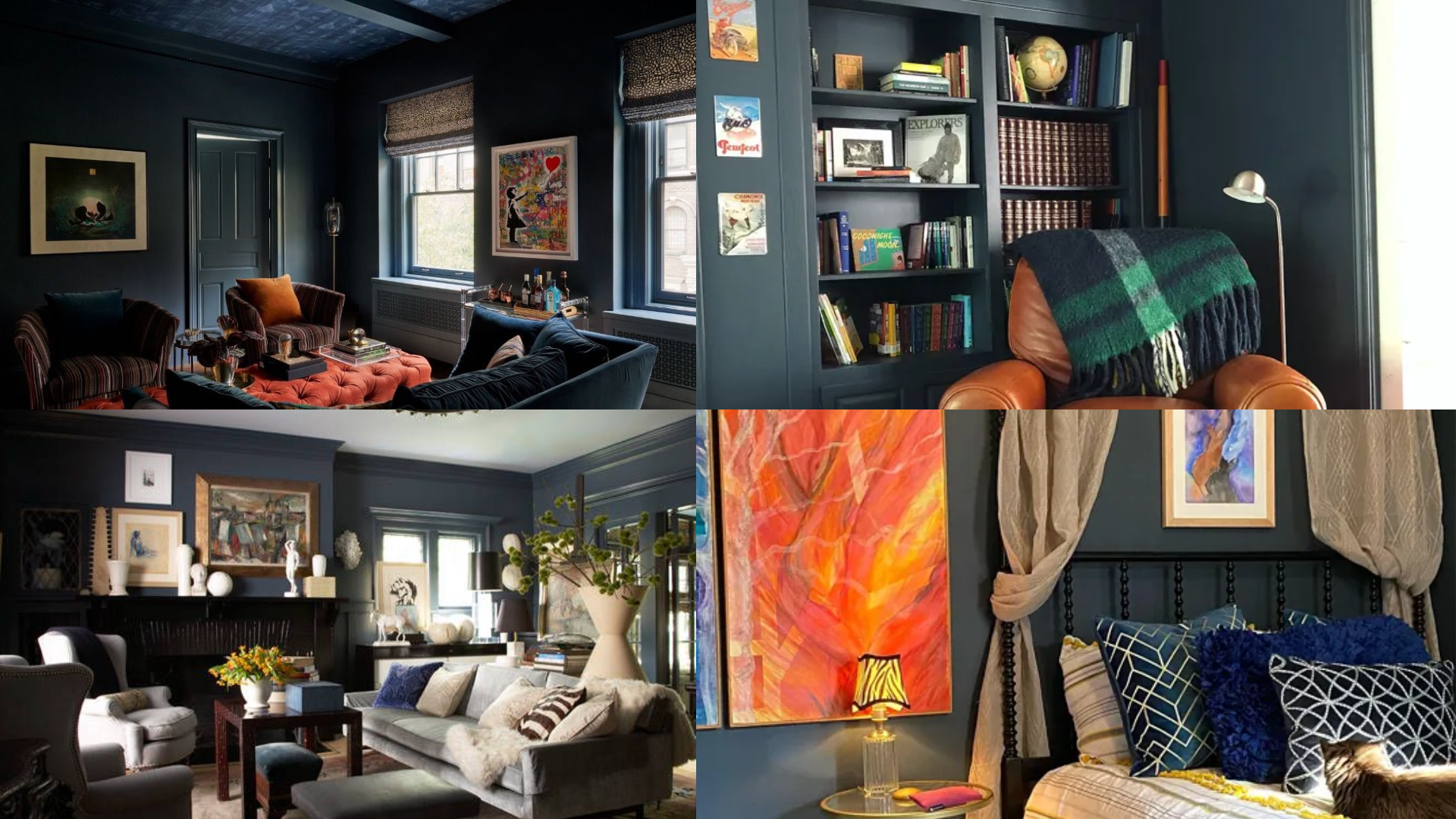
Living Room
In the living room, Blue Note makes a strong and cozy statement. It adds depth and works beautifully with both light and dark furniture.
Try it with a white couch, warm wood tables, or gold accents for a stylish look. It creates a peaceful, welcoming space for relaxing or entertaining.
Bedroom
For the bedroom, I think Blue Note is a great pick when I want something bold yet restful. The deep navy gives the room a private, calming feel, like a cozy retreat at the end of the day.
I’ve used it as a feature wall behind the bed, but it also looks amazing when you paint the whole room. I like to pair it with soft bedding and light wood furniture to keep things balanced and inviting.
Kitchen
Blue Note is a stylish option for kitchens, especially on lower cabinets or islands. It gives the space a fresh, modern look without being too loud.
This color works great with white countertops, subway tile, or brass hardware. It can help make your kitchen feel both bold and elegant.
Bathroom
In the bathroom, I love how Blue Note adds a clean, spa-like feel. It looks amazing next to white tile, marble, or chrome finishes. I’ve used it on both walls and vanities for a sleek, polished look.
With the right lighting, it can even make a small bathroom feel rich, calming, and inviting.
How to Use Blue Note in Small Rooms or Low-Light Spaces
Blue Note is a dark color, but that doesn’t mean you can’t use it in small spaces. In fact, it can make those rooms feel extra cozy and stylish. With the right balance, Blue Note can work even in rooms with less natural light.
Use Blue Note as an accent wall to add drama without making the whole room feel too dark. It works especially well when paired with white or cream on the other walls. Add light-colored decor and mirrors to reflect light and open up the space.
Blue Note looks great in hallways and entryways too. These are often overlooked spaces that can really benefit from a bold color. Add warm lighting and light trim to keep it from feeling closed in. It creates a welcoming feel right as you walk in the door.
How to Pair Blue Note with Other Paint Colors and Finishes
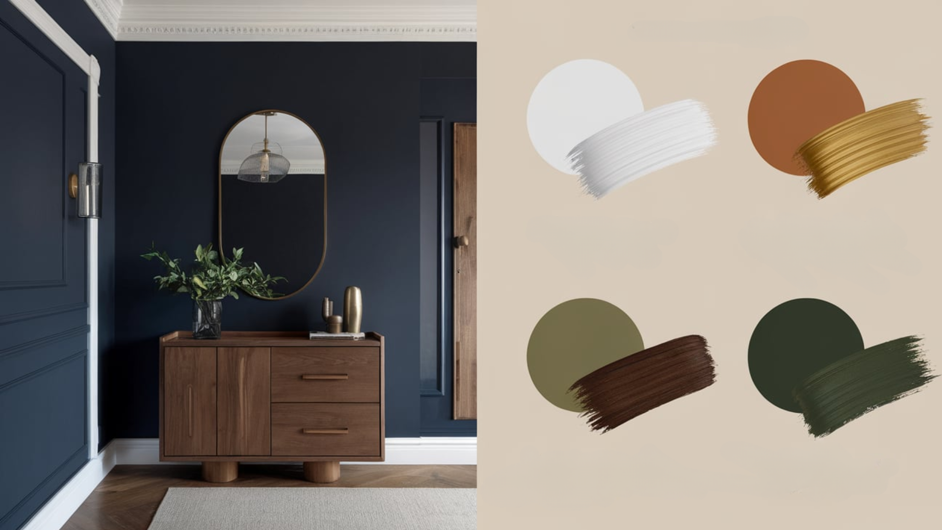
Pairing Blue Note with the right colors will make your space feel complete. This color is dark and bold, so it needs the right accents to really shine.
You can pair Blue Note with both warm and cool colors. Here are some ideas for matching this color with other shades in your home.
Neutral Colors: Blue Note goes perfectly with soft neutrals like white, beige, and light gray. These lighter tones help balance out the deep navy color. Use white trim or ceilings for a fresh, clean contrast.
Warm Accents: If you want to warm up your space, try pairing Blue Note with gold, brass, or warm wood tones. These accents bring in a cozy feel and help soften the cool tones of the blue. You can also try warm beige or tan.
Bold Colors: Blue Note also looks great with bold colors. Try pairing it with deep green, mustard yellow, or even coral for a fun and dramatic look. Use these stronger shades in small touches like pillows, art, or rugs to keep it balanced.
What Home Styles Work Best with Benjamin Moore Blue Note?
Benjamin Moore Blue Note is well-suited to a variety of home styles. Its deep tone and cool base make it a favorite for modern, coastal, and even traditional homes.
In modern homes, Blue Note looks sleek and clean. It pairs well with black fixtures, smooth surfaces, and minimal decor. It adds a cool, bold edge without feeling too heavy.
In coastal homes, Blue Note nods to the ocean and sky. Pair it with white shiplap, driftwood accents, and soft fabrics for a relaxing feel. It brings depth while keeping that breezy coastal look.
This color adds richness and class to traditional homes. Use it with crown molding, antique furniture, and warm wood tones for a timeless look. It’s a bold yet safe way to update a classic style.
Its ability to adapt to many styles is what makes Blue Note such a solid choice for homeowners.
Is Benjamin Moore Blue Note a Warm or Cool Paint Color?

Blue Note is a cool paint color. It has blue and gray undertones that give it a calming and quiet feeling. Cool colors like this are great for creating peaceful, relaxing spaces.
This color works well in rooms that get natural light, but it can also feel cozy in low-light spaces. Its deep tone gives rooms a soothing and grounded atmosphere.
Blue Note does not feel icy or cold, though. The soft gray in it keeps it from being too sharp. That balance makes it feel calm and stylish at the same time.
If you’re looking for a cool color that still feels cozy, Blue Note is a great pick.
Color Characteristics Table
| Color Name | Blue Note |
|---|---|
| Hex Code | #3F4C56 |
| RGB | 63, 76, 86 |
| Undertones | Blue and Gray |
| Mood/Effect | Bold, Calm, Sophisticated |
| Best Rooms | Bedrooms, Living Rooms, Kitchens, Bathrooms |
| Style Compatibility | Modern, Traditional, Coastal |
| Light Reflectance Value (LRV) | 9.02% |
How to Test Benjamin Moore Blue Note in Your Home
Testing paint colors is important, especially with darker shades like Blue Note.
- Get a Sample: Buy a small sample pot from your local Benjamin Moore store or online. This gives you a chance to see the color in your space before making a big commitment.
- Paint Sample Swatches: Use a brush or roller to paint large sample areas on different walls in the room. Be sure to include spots with both natural and artificial light.
- Watch the Color at Different Times: Blue Note may look different in the morning, afternoon, and evening. Check the samples throughout the day to see how it changes.
- Look at Your Decor: Hold your furniture, rugs, or tile up next to the sample. Make sure the color fits with what you already have in the room.
What Is the Best Finish for Blue Note Paint?
The paint finish you choose can change how Blue Note looks and feels in a space. Here’s a simple guide to help you pick the right one:
1. Matte or Flat Finish: Good for bedrooms or ceilings. This finish gives a soft, smooth look with no shine.
2. Eggshell or Satin Finish: Great for living rooms, kitchens, and bathrooms. These finishes are slightly shiny and easier to clean.
3. Semi-Gloss or Gloss Finish: Best for trim, cabinets, and doors. These finishes are very durable and make the color look more bold and polished.
You should pick your finish based on the amount of traffic the area gets and how easy you want it to be to clean.
Common Mistakes to Avoid When Using Blue Note
Even though Blue Note is a beautiful and flexible color, here are a few things to avoid when using it:
Skipping the Sample: Don’t paint a whole room without testing it first. Lighting can really change how this deep color looks.
Using It in a Very Dark Room Without Contrast: Blue Note is dark, so you’ll want to add lighter accents or good lighting to keep the space from feeling too closed in.
Overdoing It: This bold color is best used in balance. Use it on one or two walls, or combine it with neutrals to avoid making the room feel too heavy.
Why Homeowners Love Benjamin Moore Blue Note
People are drawn to Blue Note for many great reasons:
- Bold and Rich Look: It adds drama without being too loud.
- Flexible Style: It fits well with both modern and classic designs.
- Soothing Cool Tone: Even though it’s dark, it feels calm and balanced.
- High-End Feel: It makes any space look more finished and stylish.
Is Benjamin Moore Blue Note Right for Your Home?
Benjamin Moore Blue Note (2129-30) is a deep and bold color that brings style and calm into any room. Its navy tone, mixed with soft gray, makes it feel strong but not too dark.
Blue Note pairs easily with many other colors. Light neutrals, warm woods, and gold accents all look great next to it.
It also complements many home styles, including modern, coastal, and traditional. Even though it’s bold, it still feels calm and peaceful.
This paint color is a good choice for people who want a room that feels stylish but also relaxing. It stands out peacefully. Try a sample, test it in your space, and see how it can bring new life to your home.