")
Rock Bottom by Sherwin-Williams is a rich, dark paint color with a cool, calm feel. It’s not too bright and not too dull.
The name sounds bold, and the shade has the same vibe. Many people are using it in homes today, from bedrooms to front doors.
I noticed it showing up more often and wanted to learn what makes it stand out. This color works in both modern and classic spaces, but it depends on how and where you use it.
In this blog, you’ll find clear details that help you decide whether Rock Bottom is the right pick for your space.
Rock Bottom SW 7062: Color Facts and Stats
Rock Bottom (SW 7062) is a dark, earthy green-gray paint color from Sherwin-Williams. It gives a room a bold but calming look.
Many people like it because it’s not a flat black or bright color. It sits right in between, rich, grounded, and natural.
It is part of the neutral paint family, but it has more depth than your standard gray. The green tones give it a moody, thoughtful feeling. Sherwin-Williams includes it in both its interior and exterior collections, demonstrating its flexibility.
If you’re looking for a color that makes a space feel calm, stylish, and a bit dramatic, Rock Bottom Sherwin-Williams might be the right fit.
Here are the most important specs and traits of this paint color:
| Feature | Details |
|---|---|
| Color Name | Rock Bottom |
| Color Code | SW 7062 |
| Color Family | Green-Gray / Neutral |
| Finish Options | Flat, Satin, Semi-Gloss, Gloss |
| LRV (Light Reflectance) | 7 |
| RGB Value | 72 / 76 / 73 |
| Hex Code | #484C49 |
| Complements | Whites, warm woods, brass, soft greens |
| Paint Types Available | Interior and Exterior |
Understanding the LRV of Rock Bottom
LRV stands for Light Reflectance Value. It shows how much light a color reflects. The scale goes from 0 (black) to 100 (white).
Rock Bottom has an LRV of 7, which means it reflects very little light.
This makes it a very dark color, almost close to black in some lighting. In well-lit rooms, the green undertones are more apparent. In dim rooms, it feels cooler and closer to charcoal gray.
Because it absorbs so much light, it works best in rooms with plenty of lighting, natural or artificial.
Where to Use Rock Bottom SW 7062?
This color works in many types of rooms. It can look cozy, bold, or even elegant, depending on how you use it.
1. Living Room Walls or Built-Ins
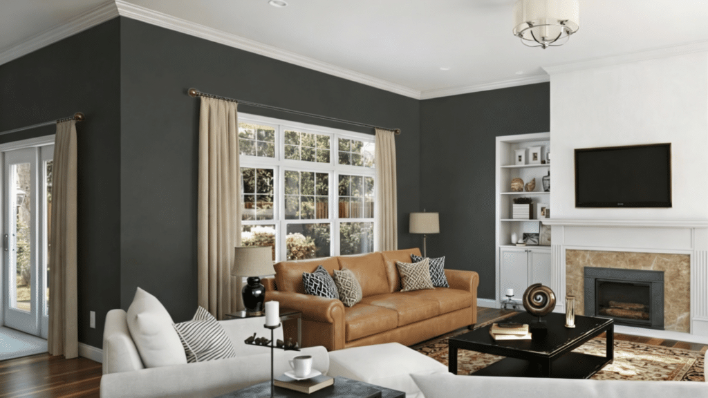
Rock Bottom makes a great choice for an accent wall in your living room. Try it behind a couch, a fireplace, or even around a TV wall. It adds depth and draws the eye without making the room feel closed in.
You can also use it to paint built-in shelves or cabinets for a designer look. The dark tone looks sharp next to white or light gray walls, and it helps show off books, art, or decor.
Add throw pillows or rugs in warm tones like beige, cream, or gold to soften the space.
2. Bedroom Accent Walls
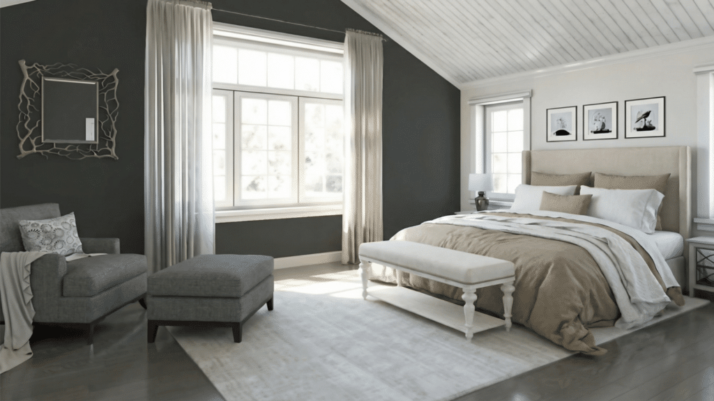
In bedrooms, Rock Bottom helps create a calm and restful mood. It’s a smart choice for a feature wall behind the bed, acting like a backdrop that adds warmth without being too loud.
Pair it with soft linens, beige or white bedding, and wood nightstands for a balanced look.
If you want to paint the whole room in Rock Bottom, use lighter curtains and lamps to keep things from feeling too dark. This color can help turn any bedroom into a cozy retreat.
3. Bathroom Vanities or Walls
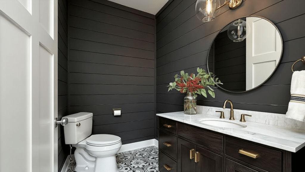
Dark paint in bathrooms is a big trend right now, and Rock Bottom fits right in. It works especially well in powder rooms, where you can make a bold style statement.
Use it on the walls for a rich, dramatic feel, or just paint the vanity cabinets for a touch of depth. Add contrast with white sinks, mirrors, and light fixtures.
Brass or gold hardware also looks great with this shade. Even in small bathrooms, Rock Bottom can make the space feel clean, fresh, and upscale.
4. Kitchen Cabinets or Islands
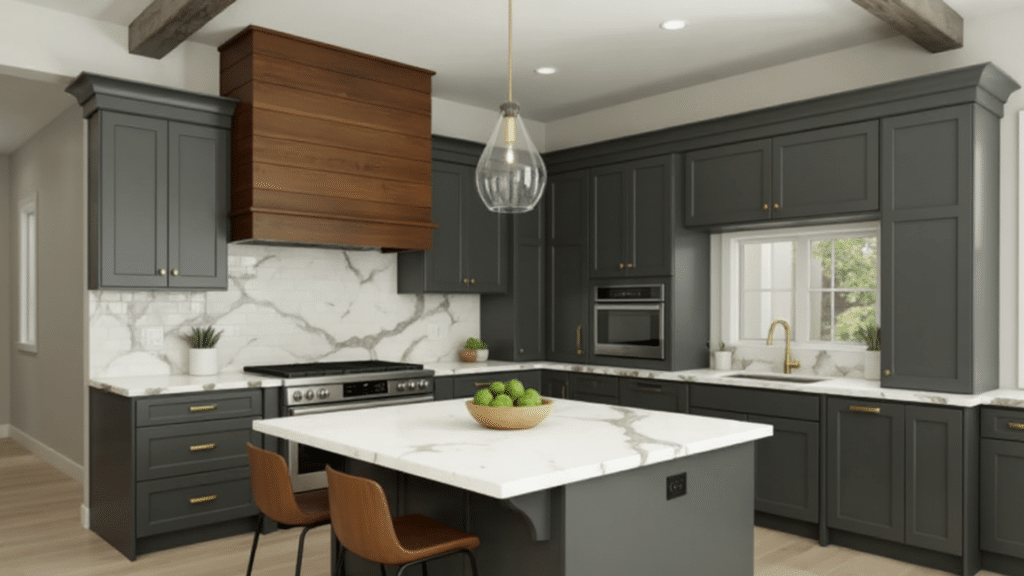
Rock Bottom is a great color for lower cabinets, kitchen islands, or even full cabinet sets if you want a bold, modern kitchen.
The color adds richness and pairs well with white quartz counters, subway tile backsplashes, and warm metals like gold or copper.
You can also mix it with white or light upper cabinets to keep the space bright and open. If your kitchen gets natural light, this color will shine without overpowering the room. It brings a sleek, high-end look that still feels cozy and grounded.
5. Front Doors and Home Exteriors
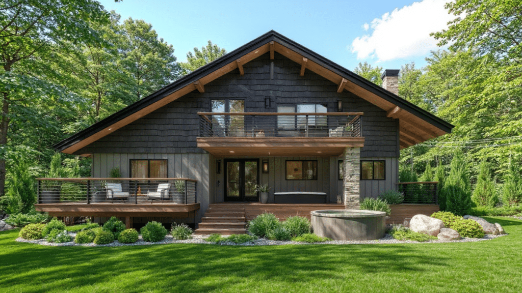
On the outside of your home, Rock Bottom works well on front doors, shutters, trim, or even full siding. It gives strong curb appeal without being too trendy or bright.
The deep green-gray tone looks beautiful next to white, beige, or stone finishes. It feels natural and solid, especially with warm wood porches or brickwork.
For a bold front door, pair it with brass or black hardware and a light welcome mat or planters to brighten the entry.
Lighting and Rock Bottom: What to Expect
Lighting changes how Rock Bottom looks. Here’s how it behaves in different conditions:
- Natural Light (Bright): The green undertones become more visible.
- Low Natural Light: The color looks cooler and more charcoal gray.
- Warm Bulbs: Makes the green feel softer and more earthy.
- Cool Bulbs: Brings out the gray, modern side.
Always try a sample in your own space before painting the whole wall. Look at it in morning and evening light to see how it shifts.
Which Finish Works Best for Rock Bottom?
Rock Bottom is available in multiple finishes. The best one depends on where you’ll use it.
| Finish | Best For |
|---|---|
| Flat/Matte | Ceilings or low-traffic walls |
| Satin | Bedrooms, living rooms, and hallways |
| Semi-Gloss | Cabinets, trim, and furniture |
| Gloss | Doors or high-traffic trim for durability |
Satin or eggshell is most common for walls. Semi-gloss works well for cabinets and doors.
Styling Tips for Rock Bottom
Want to get the most out of Rock Bottom SW 7062? These simple tips can help you style it in a way that feels balanced, bold, and easy to live with.
- Use contrast. Pair with light floors, bright trim, or white ceilings.
- Add texture. Use natural wood, soft fabrics, or stone to soften the bold tone.
- Try samples first. Paint two coats on the poster board and move it around the room.
- Keep lighting in mind. Add warm bulbs to balance the cool tone.
- Balance it out. Don’t paint the whole room unless you want a moody look. Use it on features.
To Conclude
Choosing the right dark paint can feel overwhelming, but Rock Bottom makes that decision easier. It brings a grounded style to any room without trying too hard.
Instead of following trends, this shade quietly fades into the background, letting your furniture, lighting, and personal style shine.
It’s a solid choice for anyone who wants color that feels strong but not cold. Take your time, test a sample, and see how it fits your space.
Paint should work for you, not the other way around. For more simple color guides and honest reviews, check out our full collection of paint blogs and tips.