")
Choosing the right white paint sounds easy, but it rarely is. Small changes in light, trim, and flooring can make one white feel warm, and another feel flat.
That is why many homeowners keep coming back to Sherwin-Williams’ Westhighland White when they want something clean but not harsh.
It works well in both modern spaces and classic homes, which explains its steady popularity.
In this review, I shared what makes this color stand out. You will learn about its overall look, undertones, and how it behaves in different lighting.
I also cover where it works best, how it compares to similar whites, and which colors pair well with it.
By the end, you will know if this shade fits your space and your style before you pick up a paintbrush. My guide will help you make the right paint choice.
Westhighland White Color Overview & Its Characteristics

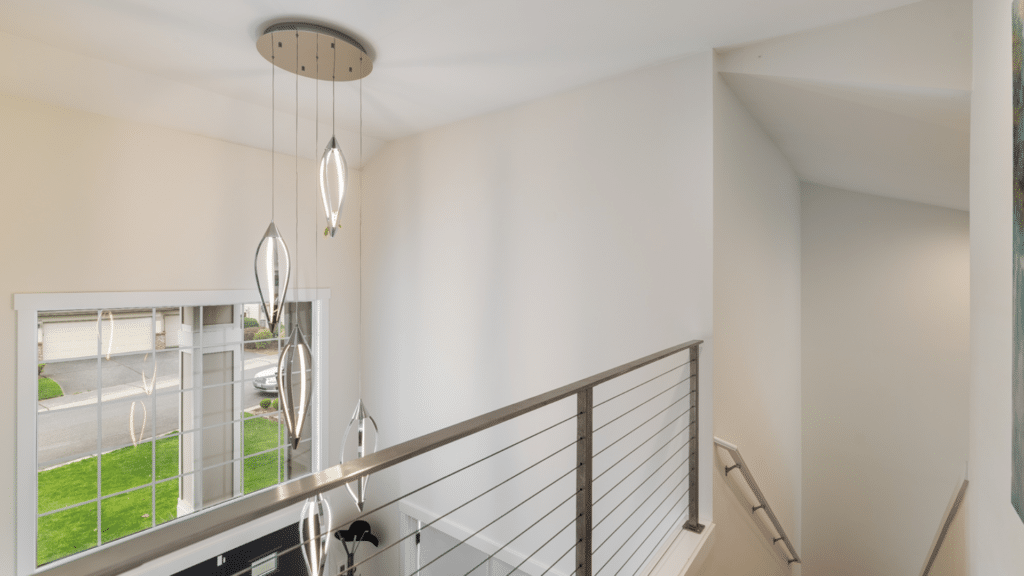
Sherwin-Williams’ Westhighland White (SW 7566) is a bright white with a soft, creamy touch. It feels clean without looking sharp, which makes it easy to use in many spaces.
This shade sits on the clearer end of the white range but avoids looking cold or stark.
It works well with both bold and muted colors. In natural light, it appears fresh and open.
Under artificial light, the slight creaminess becomes more noticeable, giving the room a warmer and more welcoming feel.
Key Specifications
- Light Reflectance Value (LRV): 86
- Interior and exterior availability: Yes
- Sample options: Color sample and paint sample available
- HEX code: #F3F0E9
- RGB values: 243, 240, 233
- Color family: White
Key Features of Sherwin-Williams’ Westhighland White
Westhighland White stands out because it balances brightness and warmth. These key features explain how it performs in real homes and why many homeowners trust it.
1. Subtle Undertones and Overall Warmth
Westhighland White has a soft, creamy undertone that keeps it from feeling cold. It does not lean yellow, but it also avoids looking gray or blue.
This balance makes it easy to use in many rooms without strong color shifts.
The warmth feels gentle rather than heavy, so walls stay light and open.
This undertone also helps the color work well with wood floors, stone surfaces, and warm metals, making it a steady choice for everyday living spaces.
2. High Light Reflectance Value and Brightness
With a high LRV, Westhighland White reflects a lot of light back into the room. This helps spaces feel brighter, even when natural light is limited.
It does not wash out details or trim, which is important in open layouts.
The brightness feels clean but not glaring, making it easier on the eyes.
This quality works well in both small rooms and larger areas where you want a clear, open look without going too stark.
3. Soft Appearance Compared to Stark Whites
Some whites feel sharp the moment they hit the wall. Sherwin-Williams’ Westhighland White avoids that issue.
Its slight creaminess softens edges and corners, which makes rooms feel more relaxed. This softness helps reduce harsh contrast with trim, cabinets, or ceilings.
It also combines smoothly with both light and dark decor.
Because of this, the color feels calm and lived-in rather than overly crisp or sterile, especially in spaces meant for daily use.
4. What Sets It Apart from Basic White Shades
Westhighland White stands out because it feels flexible without being plain.
Basic whites can feel flat or one-note, but this shade adds depth without drawing attention to itself.
It supports other colors instead of competing with them. This makes it useful for walls, trim, and cabinetry in the same home.
Its ability to stay consistent across different rooms is what separates it from many standard white paint options.
How Does Westhighland White Compare to Similar Colors?
Sherwin-Williams’ Westhighland White often acts as a middle ground. It avoids strong warmth or coolness, which makes it easier to choose when other whites feel too extreme.
| Paint Color | Undertone | Brightness Level | Best Use Case | When Westhighland White Works Better |
| Westhighland White (SW 7566) | Soft creamy | Bright but gentle | Walls, trim, cabinetry | When you want brightness without a sharp or cold look |
| Pure White (SW 7005) | Neutral to cool | Very bright | Trim, ceilings, modern spaces | When Pure White feels too crisp or flat |
| Alabaster (SW 7008) | Warm creamy | Soft and muted | Living spaces, bedrooms | When Alabaster feels too warm or heavy |
| Extra White (SW 7006) | Cool blue | Very bright | Trim, doors | When Extra White feels too stark |
| Snowbound (SW 7004) | Gray-beige | Medium bright | Modern interiors | When Snowbound looks slightly gray or dull |
Best Trim Colors for Sherwin-Williams’ Westhighland White
The right supporting colors help this shade look clean and balanced. Small pairing choices can change how warm or bright the space feels overall.
- Pure White (SW 7005): A clean option for trim and ceilings that keeps edges crisp without overpowering the walls
- Extra White (SW 7006): Works well for doors and detailed trim when a sharper contrast is desired
- Soft Greige Accents: Light greige or beige tones add depth without pulling attention away
- Muted Blues and Greens: Sage, soft navy, and dusty blue tones pair well for accents and furniture
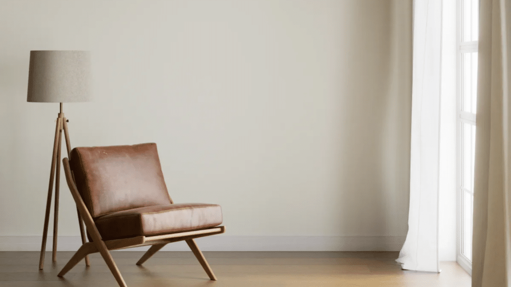
- Warm Wood Cabinets: Oak, maple, and light walnut keep the space feeling natural and grounded
- White or Cream Cabinets: Creates a layered look without a strong contrast
- Medium-Tone Wood Flooring: Balances brightness and warmth
- Light Stone or Neutral Tile Floors: Keep rooms open and cohesive
Westhighland White in Different Lighting Directions
Lighting direction can change how this color appears throughout the day. Understanding these shifts helps avoid surprises once the paint is on the wall.
1. North-Facing Rooms
North-facing rooms usually have cooler, softer light, which can mute some paint colors.
In these spaces, Sherwin-Williams’ Westhighland White keeps its balance without turning gray or dull.
The slight creaminess helps offset the cool light, so walls still feel warm enough. It will not look yellow, but it may feel calmer and less bright.
This makes it a good option for bedrooms, offices, or living rooms that receive limited direct sunlight during the day.
2. South-Facing Rooms
South-facing rooms receive strong, warm light for most of the day.
In this lighting, Westhighland White looks bright and clean while still holding onto its soft warmth.
The color reflects light well, making the room feel open and airy. Its creamy undertone stays subtle and does not overpower the space.
This balance works well in open layouts where you want a fresh look without harsh glare or overly warm walls.
3. East-Facing Rooms
East-facing rooms get bright morning light followed by softer light later in the day. In the morning, Westhighland White appears fresh and clear, with its brightness standing out nicely.
As the light fades, the warmth becomes more noticeable, helping the room feel comfortable.
This shift keeps the color from feeling flat throughout the day. It works well in kitchens and breakfast areas where light changes are noticeable.
4. West-Facing Rooms
West-facing rooms receive warmer light in the afternoon and evening.
During this time, Sherwin-Williams’ Westhighland White can appear slightly warmer and more inviting.
The creaminess becomes more visible, but it does not turn heavy or yellow. Earlier in the day, the color feels softer and more neutral.
This balance makes it a solid choice for family rooms or dining spaces where evening light plays a big role.
Pros and Cons of Using Sherwin-Williams’ Westhighland White
Westhighland White appeals to homeowners who want a dependable white. It offers flexibility across rooms without constant adjustments to decor or lighting.
| Aspect | Details |
| Pros | Bright without feeling sharp, easy to live with, works in many rooms, pairs well with warm and neutral tones, suitable for walls, trim, and cabinets |
| Cons | Can feel slightly warm in rooms with strong yellow lighting, may not suit ultra-modern spaces that need a crisp white, requires testing in low-light areas |
| Best Suited For | Homes with mixed lighting, modern and classic interiors, spaces with wood or neutral finishes, and homeowners wanting a soft white without gray tones |
Recommended Finishes for Westhighland White Paint
Choosing the right sheen affects how the color looks and holds up over time. Finish selection also impacts cleaning and light reflection.
- Flat or Matte: Works well on walls where you want a soft look and minimal surface flaws
- Eggshell: A popular wall choice that adds light reflection and is easier to clean
- Satin: Good for kitchens, bathrooms, and kids’ rooms due to better durability
- Semi-Gloss: Ideal for trim, doors, and cabinets where frequent cleaning is needed
- Gloss: Best for accent details or cabinetry when a smooth, reflective finish is desired
- Ceilings: Flat or matte finishes help reduce glare and hide imperfections
Where to Buy Sherwin-Williams’ Westhighland White Paint Samples?
You can buy Sherwin-Williams Westhighland White paint samples directly from Sherwin-Williams stores, where staff can help you choose the right sample size.
Most stores carry peel-and-stick color samples and small paint samples for testing.
If visiting a store is not easy, online ordering is also available through the Sherwin-Williams website.
Samples ship to your home and usually arrive within a few days. Testing a sample matters because paint can look different once it is on your walls.
Light, shadows, and nearby colors all affect how it shows up.
Always paint sample patches on more than one wall and check them at different times of day. This step helps avoid surprises and saves time and money before committing to gallons of paint.
Common Mistakes to Avoid when Using Westhighland White
Small choices can change how this Sherwin-Williams’ Westhighland White looks once it is on the wall. Paying attention to details helps avoid results that feel off.
- Skipping sample testing and choosing the color based only on online photos
- Using strong yellow or warm bulbs that make the color look heavier
- Pairing it with very cool grays that create an unbalanced contrast
- Ignoring how flooring and countertops affect the overall warmth
- Using the same finish everywhere without considering the room use
- Expecting it to behave like a pure white in low-light spaces
Conclusion
Sherwin-Williams’ Westhighland White works well because it keeps things simple without feeling plain. It offers brightness with a soft edge, which helps rooms feel clean, comfortable, and easy to live in.
The gentle warmth makes it flexible enough for both modern and classic homes.
It pairs easily with many trim colors, floors, and finishes, which makes decorating simpler. This color works well if you want a white that feels soft but still looks fresh.
It suits everyday spaces where lighting changes throughout the day. Before committing, always test it in your own home.
Paint a few sample areas and watch how it looks from morning to night.
If you have used Sherwin-Williams’ Westhighland White, share your experience in the comments below. Your input can help others decide.