
Choosing between Sherwin-Williams Agreeable Gray and Repose Gray can be tough, but you’re not alone.
These two popular grays are neutral and versatile, but their subtle differences can change the mood of your room entirely.
In this guide, I’ll break down the key differences between the two, focusing on their undertones, how they look in different lighting, and which spaces they work best in.
I understand how daunting it can be to pick the right color – nobody wants to repaint due to a wrong choice.
With real examples and honest feedback from home improvement specialists, this step-by-step comparison will help you make a confident decision, ensuring you pick the perfect gray for your home.
Overview of Agreeable Gray

Agreeable Gray (SW 7029) is what I call the “friendly neutral.” With its warm greige tone and beige undertones, it creates a cozy feel in any room.
The color has an LRV (Light Reflectance Value) of 60, making it bright enough to open up spaces without washing them out.
Agreeable Gray has soft, warm beige undertones. But there’s also a whisper of gray. It’s gentle. Cozy. Almost creamy in certain light.
In my north-facing hallway, it leaned a little cooler, but never cold. In rooms with warm lights? It looked more beige than gray. And in natural daylight? It was smooth and soft. Almost airy. I’d call it subtle but steady.
Overview of Repose Gray
Repose Gray (SW 7015) takes a different approach. It’s a cooler greige with subtle purple undertones that give spaces a fresh, clean look.
Its LRV of 58 makes it slightly darker than Agreeable Gray, but still light enough for most rooms.
Repose Gray is trickier. Cooler at first glance. But look again. There’s some gray, sure. But also a tiny bit of purple. And a hint of brown. That mix gives it personality.
In my south-facing bedroom, it felt crisp. Almost sleek. But in a shaded room, it surprised me. The purple undertone showed up a bit more. Not bold – just a soft tint in the shadows.
Best Rooms for Using Agreeable Gray
I’ve used Agreeable Gray in a lot of different spaces, and it never disappoints. It has a soft, warm feel that makes a room feel like home. This color doesn’t jump out at you – it just gently fills the space with comfort.
1. Family Rooms Feel More Relaxed
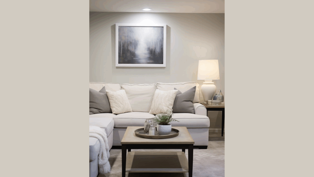
I love using Agreeable Gray in the family room. It gives the space a soft, warm feel – perfectly balanced, not too dark or light. It brings everything together without being overpowering.
You can mix colorful pillows, wood finishes, and different fabrics, and it all just works. It fits seamlessly with a comfy couch, a big rug, and throw blankets.
You don’t need to redesign the whole room; just changing the paint makes it feel cozier.
Even without sunlight, the room stays calm and inviting. It creates a relaxed, homey vibe, perfect for watching movies or hanging out. Agreeable Gray makes any family room feel welcoming and comfortable.
2. Hallways that Feel Less Empty
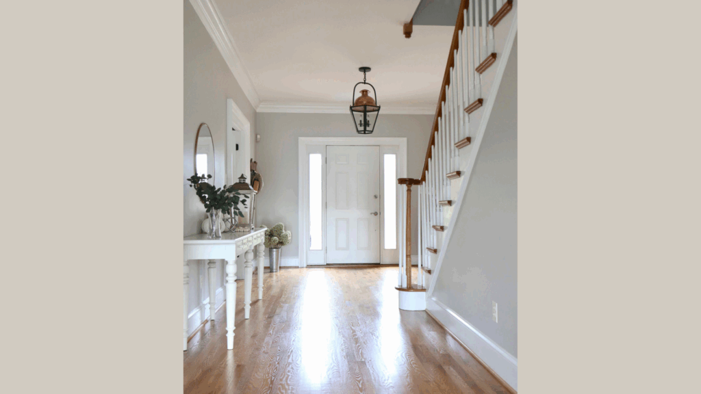
Let’s talk about the hallway. Often overlooked, it’s just a pass-through. But when I painted mine with Agreeable Gray, it transformed. Suddenly, it felt pulled together – inviting, not boring.
If your hallway feels cold or dull, this color is the fix. It adds warmth without making the space dark. And in hallways with low lighting or no windows, Agreeable Gray works wonders by softening shadows instead of making them gloomy.
Add a few photos or a runner rug, and just like that, the space feels styled and welcoming. It’s a small change with a big impact.
3. Bedrooms that Feel Cozy and Balanced
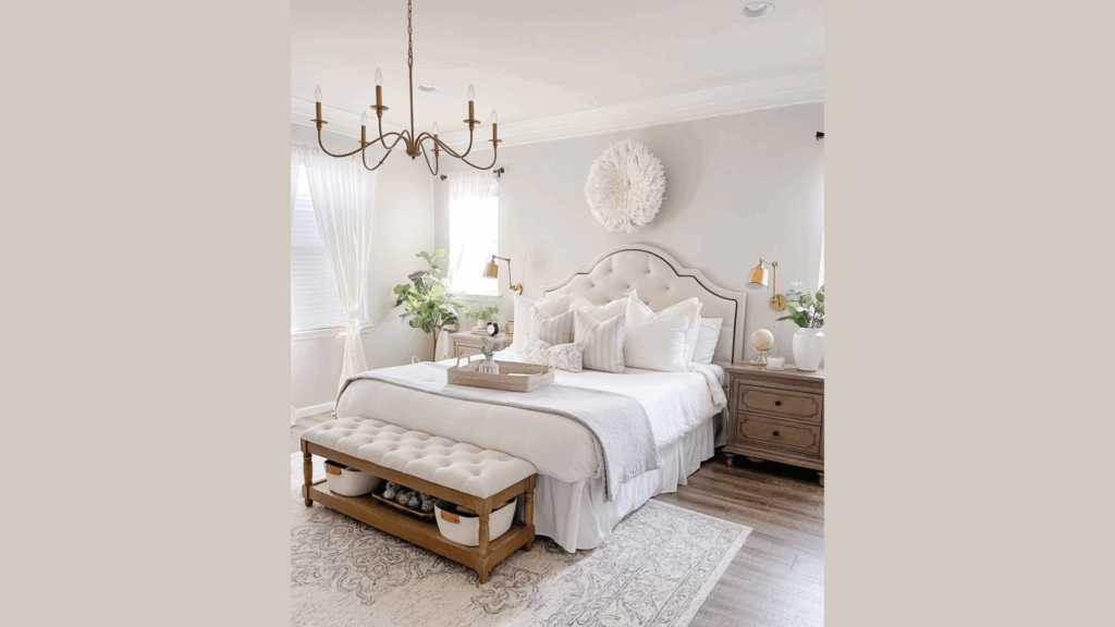
I’ve tried several paint colors in my bedroom – some too yellow, others too cold, and a few made the room feel smaller. Then I tried Agreeable Gray, and it just worked. The room felt cozy and quiet without being dark or distracting.
It’s like a soft blanket that wraps you up, creating a restful space. It pairs beautifully with wood tones, white trim, or soft bedding, and complements both cool and warm colors.
Agreeable Gray helps your mind settle, making it the perfect color for a restful bedroom.
Best Rooms for Repose Gray
I’ve found Repose Gray works beautifully in rooms that need a calm and balanced look. It has just the right mix of warmth and coolness, which makes it incredibly flexible.
1. Living Rooms that Look Fresh and Modern
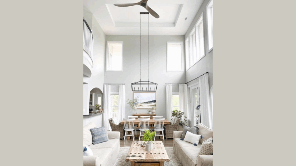
I first used Repose Gray in the living room, and I haven’t looked back. It gave the space a clean, polished feel, but in a soft, calm way – not harsh or concrete-like.
Repose Gray has a quiet warmth that pulls everything together without feeling forced. I paired it with white trim, a charcoal couch, and gold light fixtures, and everything blended beautifully.
What I noticed is how it glows in natural light. When the sun hits, it doesn’t wash out or look dull – it looks peaceful and inviting.
2. Kitchens that Feel Calm and Clean
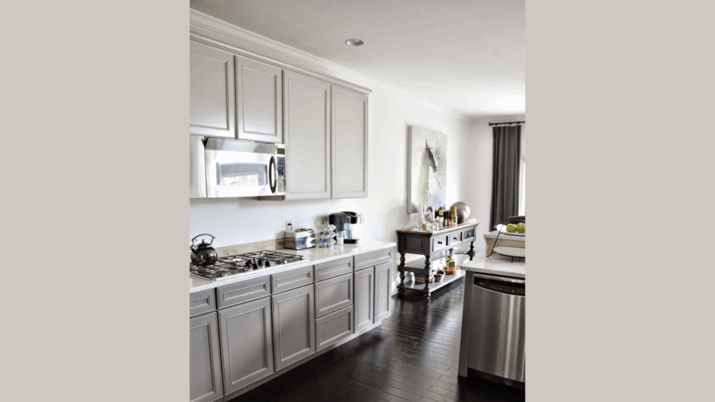
Kitchens are high-traffic spaces, so the color needs to stand out without overwhelming the room. I’ve used Repose Gray in several kitchens, and it makes the space feel fresh and light, without a sterile vibe – just clean and cozy.
It pairs beautifully with white or off-white cabinets, black hardware, wood shelves, and stainless steel appliances for a sharp contrast.
Plus, if your kitchen opens into other rooms, Repose Gray flows seamlessly across connected spaces, so you won’t need to change colors from room to room.
3. Open-Plan Homes that Need Flow
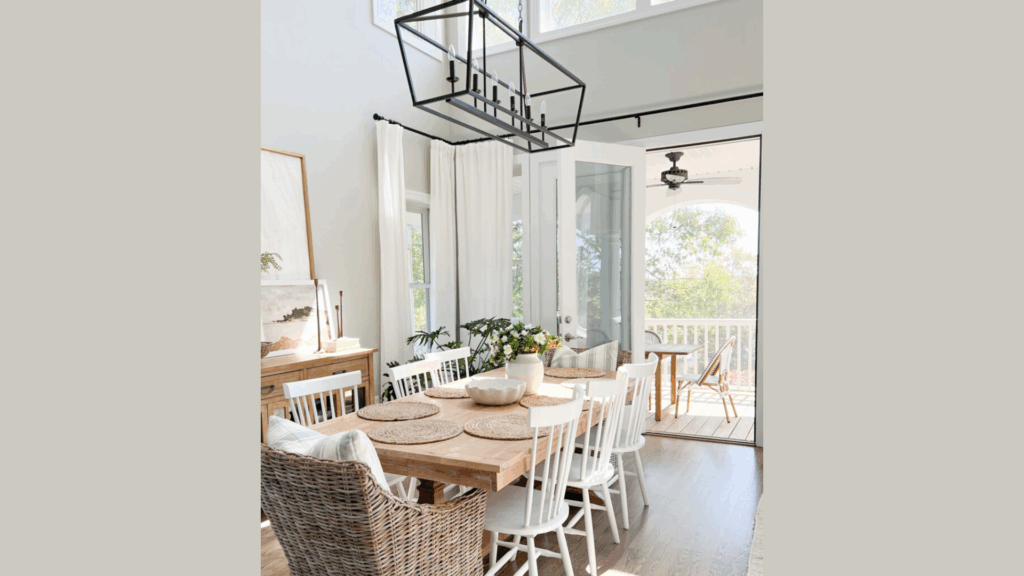
Open floor plans can be tricky to decorate, but Repose Gray is a great solution. It provides a neutral base that ties the rooms together without making them feel identical.
In spaces like the kitchen, dining area, and living room, it connects the zones while keeping each distinct. It’s soft enough not to overpower, but interesting enough to maintain depth.
What I love is how it shifts with lighting – cooler in the kitchen, softer in the living room. That flexibility makes it a perfect choice for open spaces.
Mood and Style: How Agreeable Gray and Repose Gray Differ
Each color brings something different to the table, so it’s really about choosing what fits your personality, lifestyle, and space.
| Color | Mood | Style It Matches | What It Feels Like | Lighting Compatibility | Best Room Types |
|---|---|---|---|---|---|
| Agreeable Gray | Warm, relaxed, and welcoming | Traditional or transitional homes | Like a familiar space that feels lived-in and gently comforting | Great for dim or moderate lighting | Family rooms, bedrooms, hallways |
| Repose Gray | Clean, airy, and slightly classy | Modern, minimalist, or open spaces | Like a tidy space with soft light and a peaceful energy | Best in bright or natural lighting | Living rooms, kitchens, and open-concept layouts |
If your home is traditional and you love that “homey” feeling, Agreeable Gray might be the better fit. But if you lean modern and love clean, uncluttered spaces, Repose Gray will likely suit you better.
Conclusion
If you’re leaning toward something that feels warm, soft, and easy to live with, Agreeable Gray is a safe and comfortable choice.
It brings a cozy energy into your home and makes spaces feel welcoming without needing much effort.
On the other hand, if you prefer a look that’s a little more crisp and clean, Repose Gray might be the better fit.
It has a cooler edge that works well in modern or open-plan homes and gives a space a light, airy feeling that many people love.
Still, I wouldn’t make the final call without testing them first.
Paint some samples on your walls and check them at different times of day. Natural light, shadows, and even nearby decor can shift the way each shade feels.
Take your time, trust what you see, and choose the one that feels right in your home. Because in the end, the best color is the one that makes you feel good in your space.