

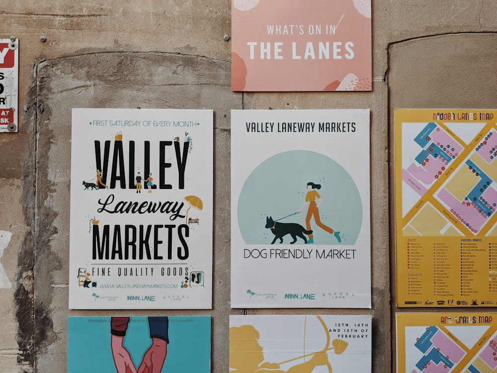
Colour is the first element people notice when they glance at a poster. It immediately impacts expectations and feelings in a space. A thoughtfully designed palette can get a space fired up, calm the mind, or prompt reflection. To make a poster, one must choose a colour that conveys messages instead of simply adorning.
How Colour Influences Mood and Energy
All the colours produce a particular feeling and cause a certain physiological response. Warm colours like red, orange, and yellow are more energetic and appealing to the eye. These tones suit dynamic environments like studios or group workspaces. Cool colours like blue and green relax arousal and promote normal breathing. They work in rooms intended for relaxation or focused reading. Scientific studies equate red with heightened heart rate and blue with reduced physiological arousal. That physiological state is responsible for deep blue prints feeling more calming and colourfully yellow banners feeling more arousing. A single tonal selection can change perceived room size, warmth, and rhythm.
Associating Colour with Personality and Space
Determine what emotional energy you would like the space to have. To create a vivid, active ambience, choose intensive reds or vivid corals. In case you like reflections and peace, use muted greens or relaxing neutrals. Colour is an emotional reflection, echoing personal style into daily life. Light levels change colour perception during the day, so always test samples in interior lighting. Material and finish also change appearance; a flat surface lowers values, yet gloss deepens perceived saturation. For pieces intended to bond multiple zones, employ harmonious tonal families rather than replicating the same precise colour.
Creating Harmony with Contrast
Solid designs balance between contrast and unity to steer attention. Colours that contrast, placed thoughtfully, generate energy without visual chaos. Teal and burnt orange generate lively movement, and navy and gold evoke contemplative refinement. Keep in mind temperature and visual weight when combining colours to ensure a strong accent doesn’t overpower soft backgrounds. Apply intense colours sparingly as a unifying point, not large areas. Blush against dark charcoal is an age-old combination that is more refined than harsh contrasts.
Designing a Palette with Purpose
Start with a striking colour that defines the preponderant mood. Add a secondary or two colours in order to enhance the mood and contrast. Use one colour of accent to get noticed (like a call to action or headline). Look at the way other furniture and fabrics used will coordinate with the colour scheme of the poster. If you’re creating more than one framed piece, repeat muted versions of an anchor colour to create cohesion on the wall. To guarantee personalized output, research features of solid print services that offer proofs and material samples. Buying samples prevents surprises and helps verify final colour pairings.
Translating Emotion Into Design
Identify the exact feeling that you would like your poster to feel before associating saturation, brightness, and temperature. Desaturated colour is associated with calmness, clear, bright colour is linked with optimism, and warm-neutral colour is linked with nostalgia. Weave individual taste with deliberate choices, as enjoying a colour can be an articulation of inner emotional needs. When choosing custom posters or printed artwork , think about scale, finish, and frame to ensure the colour is read accurately from the desired distances of sight.
Colour guides mood, perception, and everyday experience through measurable effects on body and mind. Skilled use of the colour palette matches emotional intention with material state and level of light. Employ a prime colour in multiple designs to unite a room without flatness. Experiment by printing a mini study sample first, since scale and finish reveal auras of alteration not evident on screens, and this process protects the mood that was intended.