 by BM Is the Perfect Earthy Color")
If you’re looking for a color that feels peaceful, grounded, and a little bit moody, Stonybrook (1566) by Benjamin Moore might be the perfect choice. This rich blend of green, blue, and gray gives any space a natural, calming feel. It’s bold enough to make a statement, but soft enough to feel relaxing.
Stonybrook works beautifully in both modern and classic homes. You can use it in bedrooms, living rooms, bathrooms, or even on kitchen cabinets. Whether you want to add a cozy touch to a big room or bring color to a small space, Stonybrook gives you that perfect mix of calm and character.
In this blog, we’ll take a closer look at why Stonybrook is such a favorite, where to use it, how it compares to similar shades, and what colors work well with it. If you’re considering using Stonybrook in your home, this guide will help you decide.
Why Benjamin Moore Stonybrook (1566) Is So Popular
Stonybrook is loved for its deep, earthy feel. It has a unique mix of green, blue, and gray that shifts slightly depending on the light. In bright rooms, the green and blue stand out. In darker spaces, the gray tones give it a quiet, classy feel.
People love Stonybrook because it feels connected to nature. It reminds many of a quiet forest, a foggy lake, or soft moss. It’s peaceful but not boring. It’s bold but still relaxing. That balance makes it a favorite for designers and homeowners who want something different from the usual gray or beige.
Stonybrook is also part of Benjamin Moore’s Classic Color Collection, which includes timeless, trusted shades that work in many types of homes. This color has been around for years and continues to be a go-to for creating calm, stylish spaces.
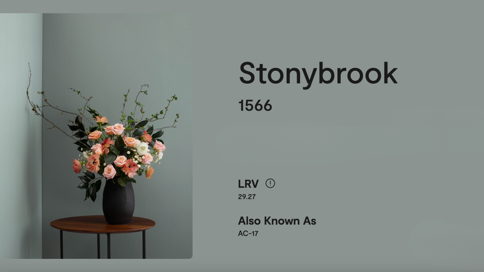
Specifications of Stonybrook (1566) by Benjamin Moore
Here are the key details you need to know about Stony Brook:
- Color Code: 1566
- Collection: Classic Color Collection
- Finish Options: Flat, eggshell, satin, semi-gloss, and more
- RGB: Red 147, Green 159, Blue 151
- HEX Code: #939F97
- Light Reflectance Value (LRV): 29.27
- Undertones: Green, blue, and gray
The LRV of 30.69 means it’s a darker color that absorbs more light. It won’t make a space feel super bright, but that’s part of its charm. It’s cozy, rich, and adds depth to a room.
The undertones of green and blue make it feel earthy and natural, while the gray keeps it from feeling too bright or bold.
Using Stonybrook (1566) by Benjamin Moore
Stonybrook is a flexible color that works in many spaces. Here are some ways you can use it in your home:
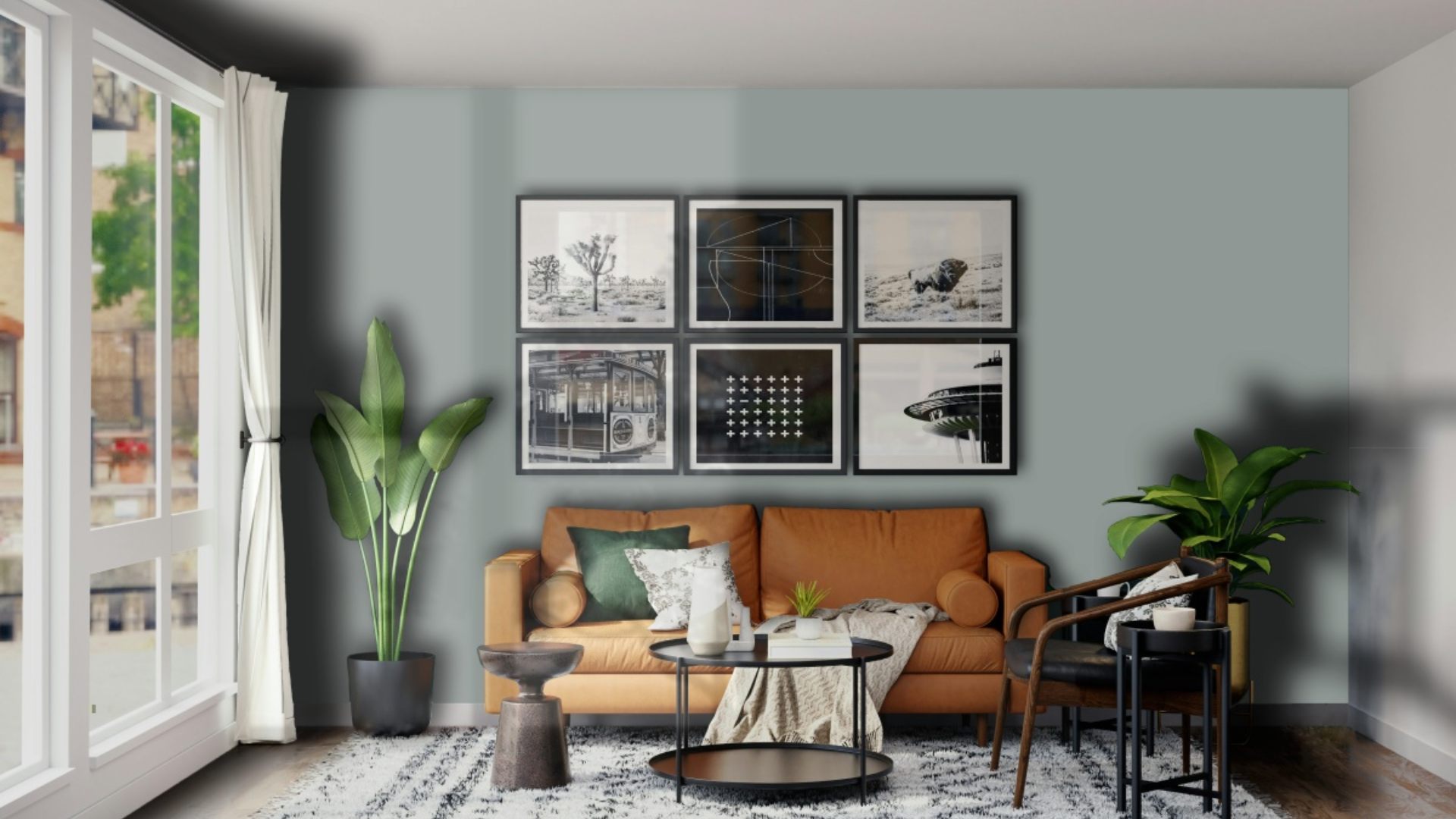
1. Living Rooms
Stonybrook adds a warm, grounded feel to living rooms. It’s a great choice if you want a cozy space that still feels grown-up and stylish. On the walls, it pairs well with neutral furniture and wood accents.
You can use Stonybrook on all four walls for a bold, cozy feel, or just as an accent wall behind your sofa or fireplace. It looks great with beige, white, or tan furniture, and you can add pillows or throws in deep blues, warm golds, or soft cream tones.
2. Bedrooms
In a bedroom, Stonybrook creates a peaceful and relaxing retreat. Its earthy tones are perfect for helping you unwind at the end of the day. You can use it on all the walls for a cocoon-like feel, or just behind the bed to create a calm backdrop.
Pair it with:
- White or ivory bedding
- Wood furniture in walnut or oak
- Soft lighting
- Natural materials like linen, rattan, or jute
The room will feel grounded and calm, like a quiet escape from the outside world.
3. Kitchens
Stonybrook can look beautiful in kitchens, especially if you’re going for a natural or coastal vibe. It works well on kitchen walls or cabinets, especially lower cabinets or islands.
Try pairing it with:
- White countertops
- Brass or black hardware
- Open wood shelving
- White or cream upper cabinets
Stonybrook adds just the right amount of color to make your kitchen feel warm and inviting, without being too bright or trendy.
4. Bathrooms
In a bathroom, Stonybrook brings a spa-like, peaceful feel. It works well with white tile, marble, and natural wood. You can use it on the walls, a vanity, or even the ceiling for a cozy, enveloping vibe.
Add in:
- Soft towels in cream or gray
- Wood accents
- A simple shower curtain
- Plants for a pop of green
This color makes even a small bathroom feel special.
5. Hallways and Entryways
Stonybrook also works well in entryways and hallways. It gives these often-forgotten areas a bit of style and personality. Since it’s a darker shade, pair it with light trim and good lighting to keep the space feeling open and welcoming. You can also use it with white wainscoting or a gallery wall to create contrast and depth.
6. Accent Walls
If you’re not ready to commit to painting an entire room in Stonybrook, use it for an accent wall. It looks amazing behind beds, fireplaces, or large pieces of art.
Accent walls in Stonybrook work well with:
- Light beige or white surrounding walls
- Natural wood floors
- Warm metallic accents
- Artwork in soft greens, blues, or golds
It adds color and character without overwhelming the space.
7. Furniture
Stonybrook is also a great choice for furniture makeovers. Try it on a dresser, nightstand, or even a painted bookshelf. It adds a custom look and brings a calming color into the room without needing to paint all the walls. Use a satin or semi-gloss finish for a smooth, stylish result.
Coordinating Colors with Stonybrook (1566)
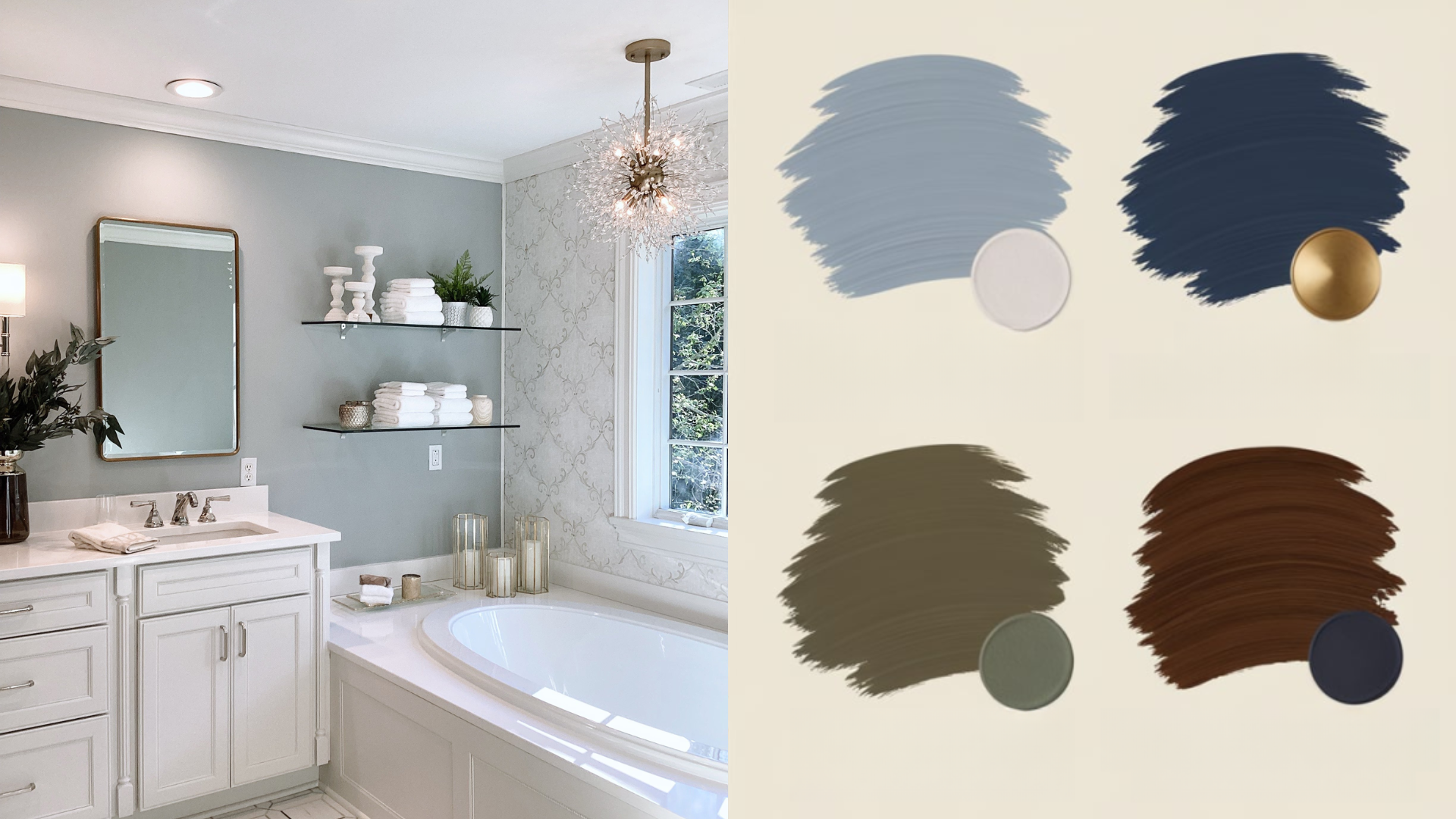
Stonybrook pairs well with a wide range of colors. Because it’s a mix of green, blue, and gray, it blends nicely with both warm and cool tones.
Here are some colors that look great with Stonybrook:
- White Dove (OC-17): A warm white for trim or ceilings
- Revere Pewter (HC-172): A soft greige that works well in connected rooms
- Manchester Tan (HC-81): A light, warm beige for a soft, natural feel
- Hale Navy (HC-154): For bold contrast and added depth
- Pale Smoke (1584): A light, dusty blue-green that complements Stonybrook
- Brass, gold, or matte black hardware: For a warm or modern finish
These combinations help highlight the richness of Stonybrook while keeping the room feeling balanced and stylish.
Stonybrook vs Similar Colors
Not sure if Stonybrook is the right green-blue for you?
| Color | Description | Key Differences |
|---|---|---|
| Stonybrook (1566) | A deep, earthy mix of green, blue, and gray | Balanced, moody, and natural |
| Stormy Monday (2112-50) | A cooler gray with purple-blue undertones | More gray and cooler than Stonybrook |
| Quiet Moments (1563) | A soft green-blue with more lightness | Lighter, airier, and more coastal |
| Sage Mountain (1488) | A warm, soft green | Less blue, more of a traditional sage color |
| Boothbay Gray (HC-165) | A bluish gray with subtle green tones | More blue-gray, with less earthy warmth |
If you like a grounded, medium-dark tone with a strong connection to nature, Stonybrook may be the one.
Reviews of Stonybrook (1566) by Benjamin Moore
Many homeowners and designers love how rich and peaceful Stonybrook feels. It’s often praised for its ability to bring color into a room without making it feel loud or overwhelming.
People who’ve used Stonybrook say things like:
- “It made our bedroom feel like a retreat.”
- “It changes depending on the light—sometimes green, sometimes gray, always beautiful.”
- “We used it on our kitchen island and love how it stands out without being too bold.”
- “It looks great with white trim and wood floors—very classic and calm.”
- “Feels cozy without being dark. So glad we chose it!”
Because it has a timeless, nature-inspired feel, it tends to age well and doesn’t go out of style.
Conclusion
Stonybrook (1566) by Benjamin Moore is a pretty and earthy color that brings peace and personality into your home. With its mix of green, blue, and gray, it creates a soft and grounded feel in any room.
Whether you use it on walls, cabinets, furniture, or just one accent wall, Stonybrook adds depth and calm. It pairs easily with whites, beiges, wood tones, and even bold colors like navy or charcoal.
If you’re looking for a paint color that feels natural, cozy, and stylish, Stonybrook is a great choice. Try a sample on your wall, look at it during different times of day, and see how it brings warmth and calm into your space.