
Choosing the perfect green paint can seem impossible. In this guide, I’ll show you Benjamin Moore greens that actually work in real homes. No more costly mistakes or disappointing results.
From soft sage to deep forest green, I’ll match each shade to specific rooms and lighting conditions. Green is tricky – what looks perfect on a paint chip can turn muddy, too bright, or completely wrong on your walls. I’ve made these mistakes so you don’t have to.
You’ll learn:
- Which greens work in north vs. south-facing rooms
- How to pick greens that complement your furniture
- The exact colors that create calm, energy, or coziness
- Simple rules for testing greens before committing
Let me help you find that perfect green you’ve been searching for.
Why Benjamin Moore Greens Can Be Tricky?
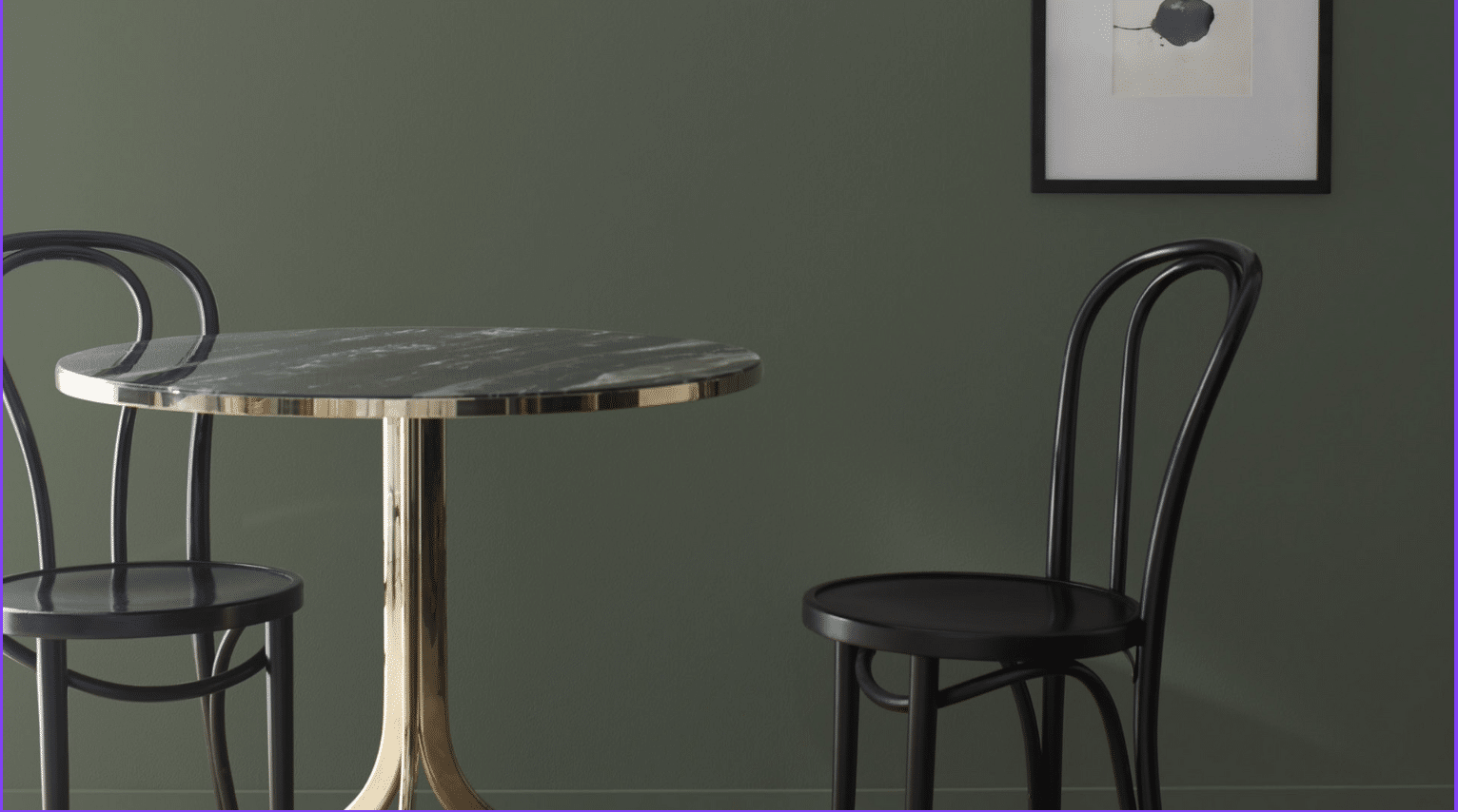
Green is one of the hardest colors to get right. Why? It changes dramatically with light. That soft sage can look like mint toothpaste in the morning sun, and that forest green might turn almost black by evening.
I’ve made my share of mistakes. Once, I painted an entire living room with a green that looked perfect on the sample card. When finished, it felt like sitting inside a lime—not what I wanted!
But when you get green right, it’s magic. It brings the outdoors in, works with most other colors, and creates a sense of calm that few different paint colors can match.
What to understand about LRV (Light Reflectance Value): The LRV number tells you how much light a color reflects. Higher numbers are lighter colors that reflect more light and make spaces feel bigger. Lower numbers absorb light, creating more intimate, cozy spaces.
Soft and Calming Greens for Relaxed Rooms
I love green rooms. They feel like a breath of fresh air. Green brings nature indoors and helps you unwind after a long day.
Not all greens work the same way, though. Some greens energize, while others calm. Let’s see some of Benjamin Moore’s best Green shades, which are soft and calming.
1. Saybrook Sage (HC-114)
This is my go-to for rooms where I want calm without being boring. It has just enough yellow to feel warm, not cold. It pairs well with cream, tan, and wood tones. I’ve used it in north-facing rooms where it stays true without turning blue.
This color has a timeless quality that never feels trendy or dated. It creates a soft backdrop for artwork and furnishings without competing for attention. In artificial light, it maintains its character instead of shifting dramatically like some greens do.
- Best for: Bedrooms and living spaces
- LRV: 45.46
2. October Mist (1495)
This color feels like morning fog in a garden. It’s so soft that it almost acts as a neutral but still gives you that connection to nature. I’ve used it in spaces where it creates a clean, fresh feel without any harsh tones.
It has a silvery quality in certain lights that adds depth to small spaces. The gray undertones help it work well with cool whites and marble. I find it looks especially good with houseplants, as it enhances their natural greens without competing.
- Best for: Bathrooms and hallways
- LRV: 46.54
3. Tea Light (471)
This is what I call a “happy green” – it has more brightness than the others in this group but still stays calm. It pairs well with white cabinets and marble countertops.
The subtle yellow undertone makes this color feel sunny, even on cloudy days. It doesn’t turn minty or blue under fluorescent lighting like many lighter greens can. When paired with natural elements like wood and plants, it creates a refreshing indoor-outdoor connection.
- Best for: Kitchens and breakfast nooks
- LRV: 60.09
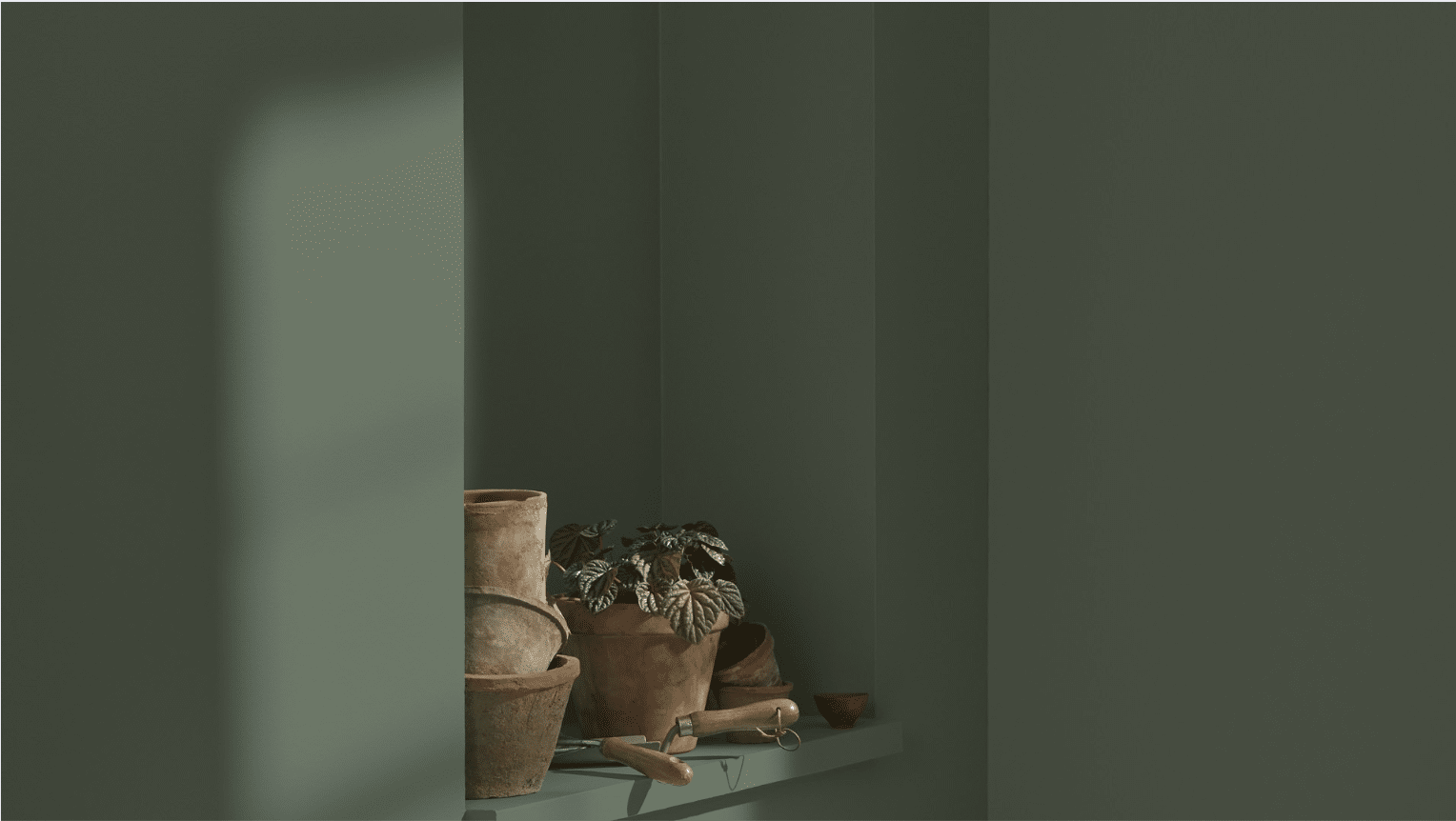
Earthy Greens That Feel Natural But Not Boring
I find earthy greens fascinating. They connect us to nature without feeling dull. These shades remind me of forest walks and garden paths. They bring life indoors but in a controlled way. These are some best earthy greens by Benjamin Moore:
4. Camouflage (2143-40)
This is my secret weapon color. Most people won’t even call it “green” when they see it on your walls. I use it when clients say, “No green,” but I know a touch of it would be perfect. It works in any room and with any style, from modern to traditional.
The magic of this color is how it changes throughout the day. In morning light, it reads more green; by evening, it shifts toward a warm tan. It makes connecting spaces flow beautifully without the stark contrast of white walls. I’ve yet to find a color scheme it doesn’t complement.
- Best for: Whole-house color and transitional spaces
- LRV: 55.46
5. Thyme (2148-20)
This green has a richness that makes rooms feel established and thoughtful. It has enough brown undertones to feel grounded but still reads clearly as green.
It creates an excellent backdrop for wood furniture, making the grain patterns stand out. The color has a slight moodiness that encourages lingering conversations at the dinner table. It looks classy in rooms with lots of books or vintage accessories.
- Best for: Dining rooms and studies
- LRV: 25.45
6. High Park (467)
When I want a green that feels grown-up and serious, this is my choice. The gray undertones help it pair beautifully with both cool and warm colors.
This green has a professional quality that encourages focus and concentration. It doesn’t fight with computer screens the way brighter colors can. In evening light, it deepens dramatically to create a cozy, den-like atmosphere perfect for unwinding.
- Best for: Home offices and formal living spaces
- LRV: 30.43
Moody Greens for Drama or Cozy Corners
I adore dark, moody greens. They create an instant atmosphere in any room. Deep forest and emerald tones transform ordinary spaces into something special. These are some of Benjamin Moore’s best green shades—perfect for adding a touch of drama or creating a cozy corner.
7. Backwoods (469)
This color creates instant coziness. I’ve even used it on ceilings in dining rooms. It has depth without feeling heavy and pairs amazingly well with brass fixtures and tan leather.
The brown base gives this green a richness that feels both natural and luxurious. It hides fingerprints and marks better than lighter colors, making it practical for busy areas. Under cabinet lighting makes this color glow with unexpected warmth in kitchens.
- Best for: Kitchen cabinets and library walls
- LRV: 12.68
8. Hunter Green (2041-10)
This is old-school green at its best. When I want a room to feel like it’s been there forever (in a good way), I reach for Hunter Green. It’s fantastic for accent walls in bedrooms, too.
This color has incredible staying power—it never feels dated, despite being around for decades. When used on trim or millwork, it makes architectural details pop. The deep tone creates a contrast that defines spaces without the harshness of black.
- Best for: Built-ins and interior doors
- LRV: 6.39
9. Vintage Vogue (462)
This green feels both modern and timeless. It is perfect for areas where you want drama without darkness. It pairs beautifully with cream, gold, and natural wood.
The gray undertones give this color an unexpected depth that photographs extremely well. It creates a flattering backdrop for skin tones in small entertaining spaces. In artificial light, it develops a rich, velvety quality that feels distinctly high-end.
- Best for: Powder rooms and dining spaces
- LRV: 11.85
Fresh and Adaptable Greens for Open Spaces
I love how greenery transforms open areas. They breathe life into empty spaces without overwhelming them. Let’s see some of Benjamin Moore’s best Green shades, which are fresh and adaptable:
10. Soft Fern (2144-40)

When walls flow from one space to another, this green maintains its character while playing nicely with changing light conditions. It’s my top recommendation for homes where color needs to work from multiple angles.
This green has a chameleon-like quality that makes it appear different but harmonious throughout the day. It recedes into the background in bright daylight but develops more personality in evening hours. The color creates a sense of continuity while still defining separate areas in open layouts.
- Best for: Open concept spaces and family rooms
- LRV: 56.67
11. Cushing Green (HC-125)
This green has stood the test of time in my projects. It’s not too yellow, not too blue – just right. It complements multiple spaces without competing with other elements.
The color has a depth that makes rooms feel finished without overwhelming other design elements. It provides an excellent contrast with both white and cream trim options. Even on cloudy days, this green maintains its clarity rather than turning muddy like some midtone greens can.
- Best for: Living rooms that open to kitchens
- LRV: 17.98
What Pairs Well with Benjamin Moore Greens?
- Woods: Medium to dark woods bring out the warmth in green
- Metals: Brass and gold look amazing with most greens
- Neutrals: Creams and tans complement, while crisp whites create contrast
- Other colors: Blues, terracottas, and burgundies all work well with the right green
The key is matching undertones. Look at the base of your green – is it yellow-green, blue-green, or gray-green? Match that undertone in your other elements.
Things to Avoid When Choosing a Green Paint
- Skipping the sample test: Green changes more than any other color with lighting
- Ignoring the room’s exposure: North light brings out blue tones in green; south light enhances yellow tones
- Choosing a green that fights with your floors: They’re a major color element in the room
- Going too bright: Toned-down greens tend to age better than vivid ones
Conclusion
Green is a color that brings life to homes, but it’s also one of the hardest to get right. Based on years of real-world testing, I’ve shared my favorite Benjamin Moore greens.
The key to success? Always test your color in your actual space. What looks perfect in a store can change completely in your home’s lighting.
Remember that greens with yellow undertones work best in north-facing rooms, while greens with blue or gray undertones shine in south-facing spaces. Don’t rush the process. Live with large sample patches for a few days and watch how they change from morning to evening.
When you find the right green, you’ll know it. The room will feel exactly how you want it to feel—calm, energetic, cozy, or fresh.
Which Benjamin Moore green will you try first?
Frequently Asked Questions
How Does Green Paint Change with Different Light Bulbs?
LED bulbs tend to enhance blue undertones in greens, while incandescent bulbs bring out yellow tones. Always test your green paint with the exact lighting you’ll use in the room.
Can I Use the Same Green Throughout My Entire Home?
Yes, but choose a versatile green like Camouflage or Cushing Green. These have balanced undertones that adapt well to different exposures and room functions.
What’s the Biggest Mistake People Make with Green Paint?
Going too saturated too fast. Start with a more muted green than you think you want—you can always go bolder if it feels too subtle after living with it.
How Do I Make My Green Room Look Modern, Not Dated?
Pair your green with a clean white trim rather than cream. Add black accents and minimal furnishings to keep the look current and fresh.
Will Green Walls Make My Artwork Look Strange?
Not if you choose art with colors that complement your green. Artwork with reds and oranges pops beautifully against green walls because they’re opposite on the color wheel.