
Keeping tenants happy and cutting down turnover can feel like a never-ending battle. The colors, textures, and finishes you pick aren’t just about making the place look Instagram-worthy; they can actually influence how much tenants enjoy living there, whether they stick around, and ultimately the difference between an average property and luxury one.
This guide explains: why color psychology isn’t just for interior design nerds, how investing in durable, high-quality finishes saves you from repainting every year, and painting hacks that’ll make your tenants happier. Whether you’re managing a single apartment, a flashy office space, or an entire complex, these tips will help you create spaces tenants won’t want to leave (and maybe even brag about to their friends).
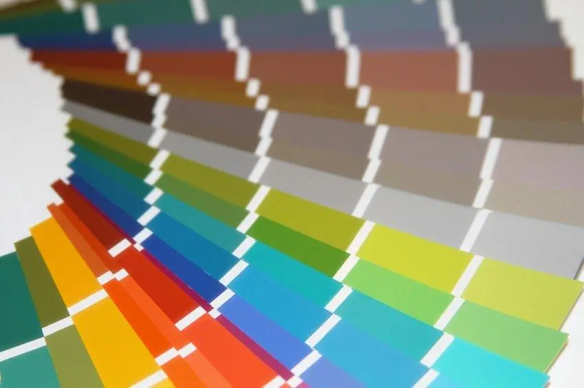
The Psychology of Color in Rental Properties
Colors do more than brighten up a space; they influence how people feel and behave. Understanding the psychology of color can help you select hues that resonate positively with tenants.
The Impact of Color on Mood and Behavior
- Warm Tones like yellows and oranges exude energy and optimism, perfect for communal spaces or kid-friendly areas.
- Cool Tones like blues and greens evoke calm and relaxation, making them ideal for bedrooms or quiet areas.
- Neutral Shades like grays, whites, and beiges are timeless and versatile, appealing to a broader range of tenants.
Pairing Color Schemes
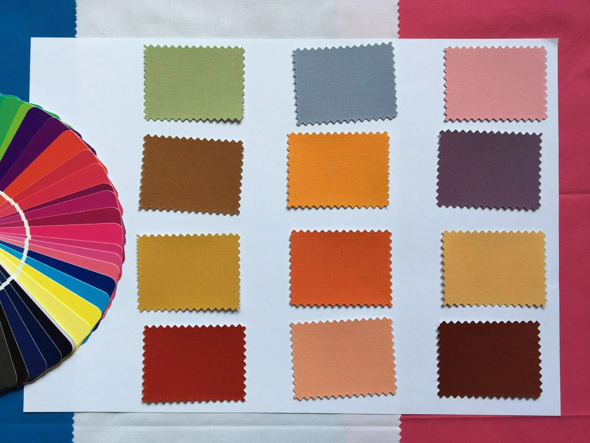
When it comes to pairing colors with your base shade, it’s all about balance and creating the right mood for the space. Complementary colors—those that sit opposite on the color wheel—can add contrast and energy to a room, while analogous colors—those next to each other—offer a more harmonious and cohesive feel.
For example, if your base color is a soft yellow, pairing it with cool shades like light blue or soft green can create a soothing environment, perfect for living spaces. On the other hand, pairing it with complementary purples can bring a bold, dynamic touch. Remember to consider the natural light in the space, as shades can look different in various lighting conditions. The goal is to ensure the colors work together to create the desired atmosphere while aligning with the psychology of the tenants you’re targeting.
- Soft Blue and Warm Beige: This combination evokes a sense of calm and stability. The soothing nature of blue paired with the grounding warmth of beige makes it perfect for bedrooms or relaxation spaces.
- Light Gray and Lemon Yellow: This pairing strikes a balance between neutrality and energy. The gray offers a modern, clean feel, while the yellow adds a cheerful and inviting touch, making it ideal for living rooms or shared spaces.
- Earthy Green and Off-White: Green connects us to nature, bringing freshness and tranquility, while off-white keeps the palette airy and open. This duo works well in kitchens or home offices.
- Dusty Pink and Charcoal Gray: Blending a muted pink with a deep gray creates a modern yet cozy atmosphere. This pairing adds sophistication to areas such as dining rooms or study nooks.
- Lavender and Pale Cream: The soft lavender brings a sense of relaxation and creativity, while the pale cream keeps the space light and welcoming. It’s a popular choice for bathrooms or quiet spaces.
Colors to Avoid
When it comes to choosing colors, it’s just as important to know which ones to steer clear of as it is to pick the right ones. Some colors might seem like a good idea, but they can end up clashing with your décor or even affecting the mood of a room in ways you didn’t want. Don’t worry, though—this isn’t about strict rules, he’s some best practice color selection “don’ts” from commercial interior design pros;
- Overly bold choices like bright reds or neon greens can overwhelm tenants and clash with their décor. Instead, keep the base colors neutral, allowing tenants to introduce their own personality through furniture and accents.
- Dark, moody shades like deep black or navy blue might make spaces feel smaller and less inviting.
- Highly saturated yellows can be too intense and create a sense of unease or discomfort.
- Patterns or stripes in bold colors can distract from the overall aesthetic and be difficult to match with personal décor styles.
- Metallic paints or overly glossy finishes can make walls feel overpowering and reflect too much light in certain settings.
Popular Color Choices
For rental properties, stick with universally pleasing palettes:
- Living rooms: Soft grays or greige (gray-beige)
- Bedrooms: Pastel blues or muted greens
- Bathrooms: Crisp whites or soothing seafoam tones
Choosing the Right Textures and Finishes
Textures and finishes play an equally important role in creating an inviting, functional space.
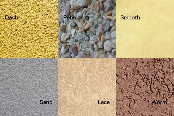
Textures Add Depth
- Subtle textures, like eggshell finishes, can add visual interest without being distracting.
- Smooth, glossy finishes, like polished marble or high-shine tiles, add a sleek and luxurious look.
- Avoid high-textured walls that might feel out of place in a contemporary apartment – they can also be challenging to keep clean or repaint.
- Soft, plush fabrics like velvet or yarn based fabrics like chenille, bring a sense of comfort and quality.
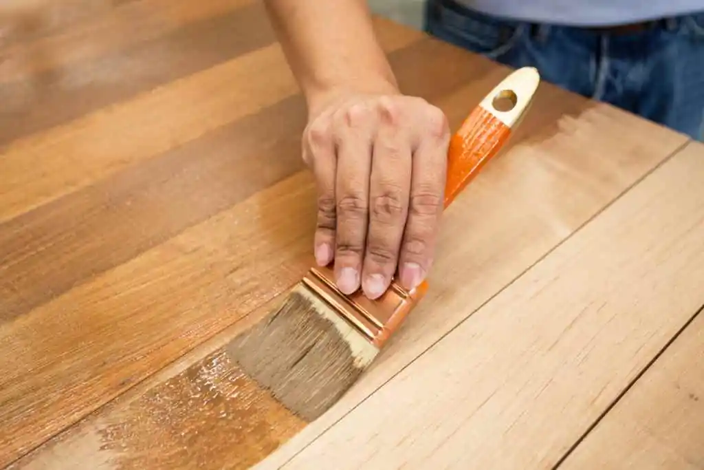
- Exposed wood grains, whether in flooring or furniture, add warmth and a natural, organic element.
- Brushed metals, like brass or stainless steel, offer a modern touch and bold contrast.
- Textured wallpapers, like as grasscloth or embossed designs, can add branding personality and sophistication to a space.
- Woven materials like rattan or cane introduce an earthy, laid-back vibe while maintaining elegance.
- Concrete finishes, either smooth or textured, give a contemporary, industrial edge.
Types of Finishes
When it comes to rental properties, finishes play a huge role in setting the tone and appeal of the space. Finished surfaces, whether they’re on walls, floors, or fixtures, define how a property looks, feels, and even functions. They can elevate the overall aesthetic, increase durability, and help attract tenants who prioritize style and quality in their living spaces. From sleek modern designs to warm and rustic vibes, the right finishes can speak volumes about the character of a rental, making it stand out in a competitive market.
Here are the most popular finishes to consider for your property;
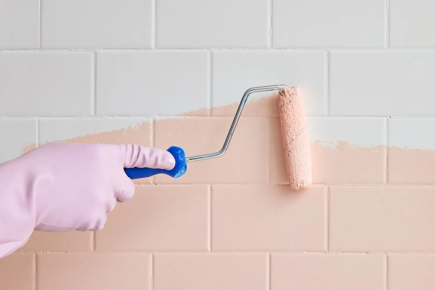
- Matte Finishes: Great for low-traffic areas since they conceal imperfections but are harder to clean.
- Satin Finishes: The all-around best choice for apartments; it balances durability, aesthetics, and cleanliness.
- Glossy Finishes: Perfect for trim and accents but too shiny for entire walls.
High-traffic areas like hallways or common spaces require durable finishes that withstand dings, scrapes, and frequent cleaning. Satin and semi-gloss are practical, tenant-friendly options.
Painting for Long-Lasting Results
Cutting corners on quality might save you money upfront, but a poorly painted space will cost you more in the long run.
For high-traffic areas like rental properties, it’s important to consider all the things we’ve touched on; paints, finishes, and textures. Even with the perfect color scheme for your property, overlooking its long-term impact can leave you right back at square one.
For tenant spaces, you’ll want to focus on durability and ease of maintenance. Paints with a satin or semi-gloss finish are often ideal because they strike a good balance between being resistant to scuffs and stains and being easy to wipe clean.
Textured finishes, while appealing in some cases, can accumulate dirt and may not be as straightforward to clean, so smooth finishes are usually the better choice for rentals. Look for paints designed with advanced durability features such as UV-resistance to prevent fading in sunlit areas or moisture resistance for bathrooms and kitchens. If you live in a region known for rain or treating living spaces like bathroom, consider mold-resistant paint for damp spaces.
Last, always see if you’re able to find paints or finishes known to be “scrubbable” and stain-resistant. This will make a big difference on how your property looks five years down the road.
Proper Prep Work is Key
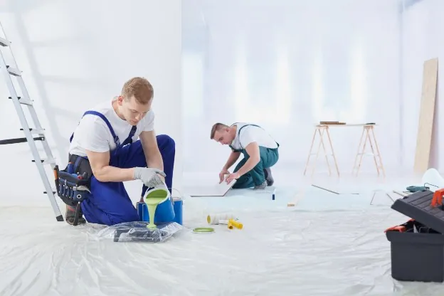
You can’t just slap paint over a surface that’s dirty, damaged, or uneven and expect it to look good or last long. Proper preparation ensures that the paint adheres better and helps avoid peeling, bubbling, or cracking down the road. Start by cleaning the walls thoroughly to remove dust, grease, or any grime that might interfere with the paint sticking. If there are cracks, holes, or imperfections, take the time to fill and sand them down until the surface is smooth. Don’t forget to check for any old, chipping paint and scrape it off—painting over it will only spell trouble later.
Once the surface is full prepped, do skimp on a applying a quality primer. It creates a uniform base for the paint and helps it stick like glue. Trust me, a little extra effort in prep work goes a long way in ensuring a lasting and professional-looking finish.
- Patch up any dents, chips, or holes before painting.
- Clean surfaces thoroughly to ensure paint adheres properly.
- Use primer to create a uniform base and extend the life of the paint.
- Keep a labeled container of spare paint for touch-ups to quickly repair scuffs.
- Use washable paint markers for easy spot fixes on walls.
Tailoring Spaces to Tenant Preferences
Understanding your tenant demographics can help personalize paint choices and create a sense of belonging.
Colors By Demographic
- Young Professionals: Sleek, modern colors like cool greys paired with bold accent walls.
- Families: Soft, inviting tones like light beige or pastel shades.
- Students or Shared Housing: Bright, cheerful shades in common areas to raise energy levels.
Colors by Industry Type
If you’re managing diverse properties, think functional but still with your audience in mind. Here’s some good examples of pairing your industry with their commonly associated schemes.
- Retail spaces might need sophisticated dark tones for contrast.
- Office spaces may benefit from energizing whites that maximize light.
- Restaurants often thrive with warm, earthy tones like terracotta or deep reds to create a cozy, inviting atmosphere.
- Healthcare facilities benefit from calming colors such as soft blues or greens to promote relaxation and comfort.
- Spas and wellness centers typically use neutral palettes or muted tones like lavender and sage for a soothing environment.
- Gyms and fitness studios can use vibrant colors like oranges or yellows to inspire energy and motivation.
- Schools and educational institutions may prefer cheerful yet calming colors like light yellow or pale green to foster focus and creativity.
Tip: The design of common areas sets the tone for the entire building. For these spaces its best to use warm, neutral colors to create a cozy, inviting atmosphere.
Case Studies and Success Stories
Need proof that painting impacts tenant retention? Here are two real-world examples from a property manager and specialty company who get it right.
Case Study 1: The Coastal Retreat Apartments
- Problem: High tenant turnover due to outdated interiors.
- Solution: Updated walls with soft greens and whites to mimic a beachy, tranquil vibe.
- Result: Tenant retention increased by 30%.
Case Study 2: Commercial Valley Paint Co.
- Featured Projects: A showcase of standout projects, each emphasizing quality, innovation, and client satisfaction.
- Key Challenges: Demonstrates how specific issues were identified and addressed with various solutions.
- Solutions Delivered: Highlights the strategies and efforts implemented to achieve desired outcomes.
- Impact and Results: Provides measurable improvements, like improved aesthetics and adding lasting functionality for lasting customer satisfaction.
Investing in thoughtful design with fresh, professional paint jobs isn’t just about aesthetics; it’s about fostering a sense of community, satisfaction, and loyalty. By harnessing the power of colors, textures, and durable finishes, you can create spaces that tenants will love to call home.