")
Are you looking for the perfect blue-gray paint color for your home? Water’s Edge (LRV-31.46) by Benjamin Moore could be the answer.
It’s a soft and balanced shade that sits between blue and gray. This mix gives it a calm and classic look that works in many different rooms.
In this article, I’ll explain everything you should know about Water’s Edge. You’ll learn where it works best, how to match it with other colors, and why many designers love using it.
I’ve worked with hundreds of homeowners to help them choose the right paint colors. Water’s Edge is one I often suggest. It has just the right amount of color to stand out, but still feels easy to live with.
If you’re painting one room or many, this shade is a great choice. By the end, you’ll know if Water’s Edge is the right fit for your space.
Why Water’s Edge (1635) Is the Perfect Choice for Your Space?

Water’s Edge by Benjamin Moore is a soft blue-gray that feels calm and balanced. It’s not too light or too dark, which makes it easy to use in many rooms.
The color works well with different lighting and styles, adding just enough interest without being too bold.
One reason I often recommend Water’s Edge is its ability to shift with the light. In north-facing rooms, it leans more blue.
The gray tones become stronger in sunny, south-facing spaces, making it flexible and useful throughout the home.
Water’s Edge pairs nicely with white trim and natural wood. It offers a clean, classic backdrop that doesn’t fight with your furniture or décor.
Unlike trendy colors that fade over time, this shade keeps its timeless beauty. It’s a favorite among designers for a reason.
Where Is Water’s Edge (1635) Best Used in an Interior?
Water’s Edge is remarkably versatile and can work in many areas of your home. These are the top spaces where this beautiful blue-gray really shines:
1. Living Room
Water’s Edge brings a calm yet stylish feel to living rooms. It’s dark enough to add interest but still light enough to keep the space feeling open.
The soft blue-gray tone works well with art, wood furniture, and cozy fabrics. As the light shifts during the day, the color gently changes, keeping things visually fresh without being distracting.
It pairs beautifully with cream sofas, ivory accents, and natural wood tones.
The result is a timeless space that feels both welcoming and put together.
It’s a great option if you want color without going too bold.
2. Bedroom
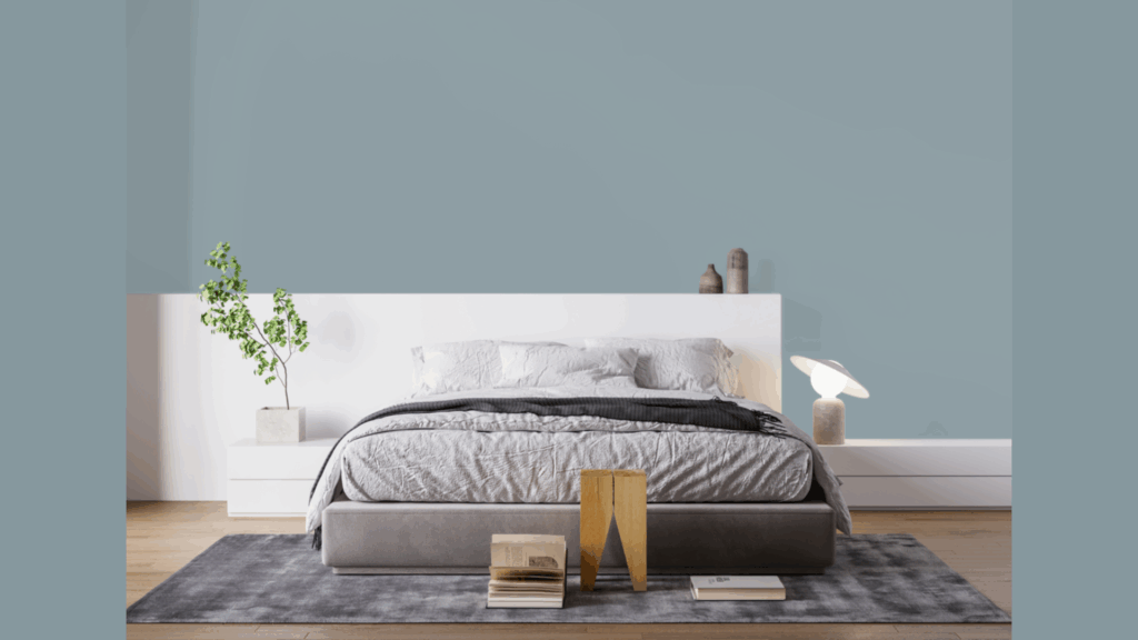
Water’s Edge is perfect for bedrooms because it creates a relaxing and peaceful mood.
The blue in the color helps calm the space, while the gray keeps it from feeling too cool or plain.
It looks great with crisp white bedding and works well with most wood furniture, from light oak to darker walnut.
For a more luxurious feel, add soft lighting and brushed gold or brass touches.
If your bedroom style is classic or modern, this color fits right in. It brings just enough personality to feel thoughtful, but still feels restful and easy to live with.
3. Bathroom Walls
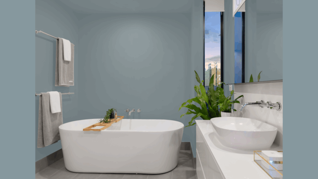
Water’s Edge is a natural fit for bathrooms. The color reminds people of water, helping create a peaceful, spa-like feel.
It pairs nicely with white sinks, tubs, and light stone or wood accents. In bathrooms without much sunlight, it helps brighten the space without feeling too harsh, like plain white sometimes can.
This soft blue-gray also hides small watermarks and spots better than lighter colors, which makes it a smart and stylish choice.
It works for both small powder rooms and larger master baths, bringing a clean and relaxing mood to either space.
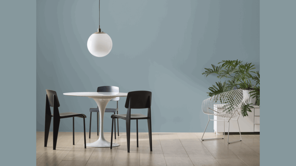
4. Dining Room
In dining rooms, Water’s Edge adds a rich but not overpowering feel. The color makes the space feel a little more dressed up, perfect for dinners with family or guests.
It works well with both wood and metal furniture.
Lighter chairs or warm-toned wood tables stand out nicely against the cool wall color. You can paint all the walls or use it on one wall for a simple accent.
Either way, it helps the room feel more inviting without being too dark. It’s a great color for creating a space that feels both modern and classic.
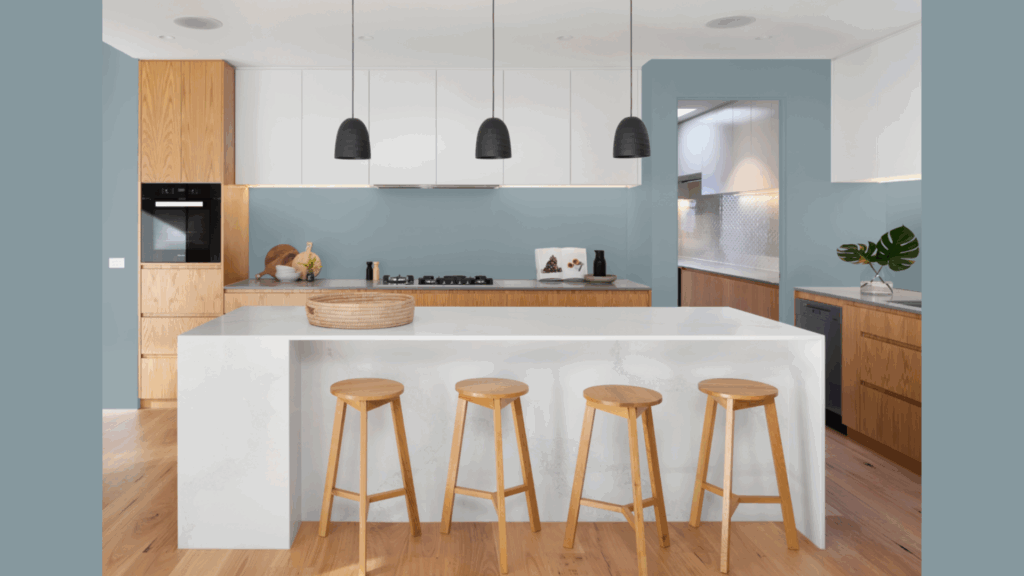
5. Cabinets

Water’s Edge looks beautiful on cabinets and gives kitchens or bathrooms a fresh update. It’s more interesting than plain white or gray, but still soft and easy to work with.
Use it on bathroom vanities or kitchen islands to create a strong focal point. The color pairs well with stone, quartz, or butcher block countertops.
It also hides scuffs and everyday marks better than lighter shades, making it a smart option for busy areas.
If your style is farmhouse or modern, Water’s Edge adds just the right amount of color without making the space feel too bold.
How to Incorporate Water’s Edge (1635) Into Your Home Decor?
Water’s Edge is a flexible color that works well in both classic and modern homes.
It pairs nicely with crisp whites like Chantilly Lace or White Dove for a clean look and also blends well with soft blues or deeper navy tones.
Natural materials like wood, stone, and plants help warm up the cool tone. Adding accents in blush, gold, or terracotta creates a cozy contrast.
Lighting affects how Water’s Edge looks. It appears more blue in cool, north-facing rooms and more gray in warmer light.
Always test a sample at different times of day to see how it shifts. Warm LED bulbs can help soften the tone in the evening.
This shade suits many furniture styles, from rich, traditional woods to light, modern designs. Soft throws, cream or blush pillows, and simple artwork complete the look.
To connect rooms, try using lighter or darker shades nearby. This creates flow while still giving each space its own feel.
Conclusion
Benjamin Moore’s Water’s Edge is a timeless blue-gray that brings both calm and style to any space. It feels soft and stylish, making it easy to use in many areas of the home.
This color works well on walls, cabinets, and even furniture. It changes slightly with the light, which makes it feel fresh and flexible. No matter your style, modern or traditional, Water’s Edge fits right in.
I’ve seen this shade transform simple rooms into beautiful spaces. It creates a calm background that is suitable for everyday life and special moments, too.
If you’re painting one room or your whole home, Water’s Edge is worth a look. Just remember to test it in your own space first.
Light changes how the color looks, and it’s important to see how it feels in your home. With the right mix of blue and gray, this shade could be the classic color you’ve been looking for.
Frequently Asked Questions
What Colors Go Well with Water’s Edge?
Water’s Edge looks great with crisp white trim, warm wood tones, and metal accents like gold or brass. For added contrast, pair it with soft blush, terracotta, or muted gold.
These warmer colors balance the cool tone, creating a cozy and stylish color mix that feels well put together.
Is Water’s Edge More Blue or Gray?
Water’s Edge is a true mix of blue and gray. It leans more blue in cool, north-facing light, while the gray stands out more in warmer, sunlit spaces.
This balance makes it very flexible. It shifts just enough to stay interesting without feeling too bold or too soft.
How Does Lighting Affect Water’s Edge?
Lighting has a big impact on how Water’s Edge looks. In bright natural light, it appears lighter and more blue.
It seems a bit darker and grayer in rooms with less light. Always test a sample on your wall at different times of day to see how it changes.
Is Water’s Edge Considered Neutral?
Yes, Water’s Edge works as a stylish neutral. It has more personality than beige or plain gray, but it still blends well with many styles. Its soft tone gives a room calm energy.
It fits both traditional and modern decor without standing out too much or fading into the background.
Can Water’s Edge Work in Small Spaces?
Water’s Edge works well in smaller rooms. Even though it’s a medium tone, it reflects enough light to keep the space feeling open.
It adds depth and color without making the walls feel too close. Just pair it with good lighting to keep the room bright and balanced.