")
After having Benjamin Moore’s Antique Pewter in my home for over a year, I want to share what I’ve learned about this complex, rich gray color. This beautiful shade has transformed my living spaces in surprising ways.
In this blog, you’ll find:
- How Antique Pewter actually looks in real homes
- The best rooms for this color
- Ideal color combinations
- How to properly test before purchasing
I’ve used this paint across several rooms with varying light conditions and observed its changes throughout different times of day. I’ve made mistakes that you can now avoid. Let’s see if this deep, layered gray is right for your home.
What Kind of Color Is Antique Pewter?
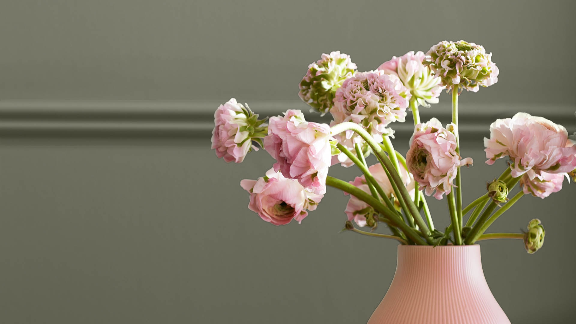
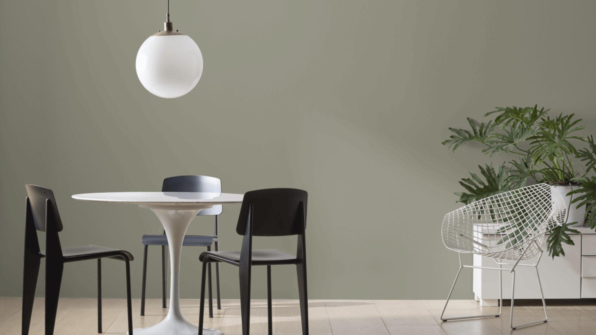
Antique Pewter (Benjamin Moore 1560) is a rich, medium-depth gray with slight green undertones. It forms a neutral backdrop and brings a cool, solid feeling to any room. To me, it appears to be aged metal with a natural finish—quiet, even, and full of depth.
I’ve noticed how it shifts throughout the day. Morning light reveals its soft, gray side. By afternoon, the green notes become more visible, and evening light brings out a deeper, more layered quality.
The color has an LRV (Light Reflectance Value) of 25.4, putting it in the medium-to-dark range. This means it strikes a good balance between absorbing and reflecting light, giving character to a room without making it too dark. This balanced quality makes Antique Pewter great for spaces that need to feel both airy and refined.
What makes Antique Pewter special is how it creates a feeling of peace and ties into classic design. In most spaces, it adds calmness and richness with a depth that complements a wide range of settings and home styles.
What Rooms Work Best with Antique Pewter?
I’ve found that Antique Pewter works wonderfully in spaces where you want a rich, timeless look that will last for years to come. Based on my experience, here are the spaces where Antique Pewter performs best:
Living Rooms
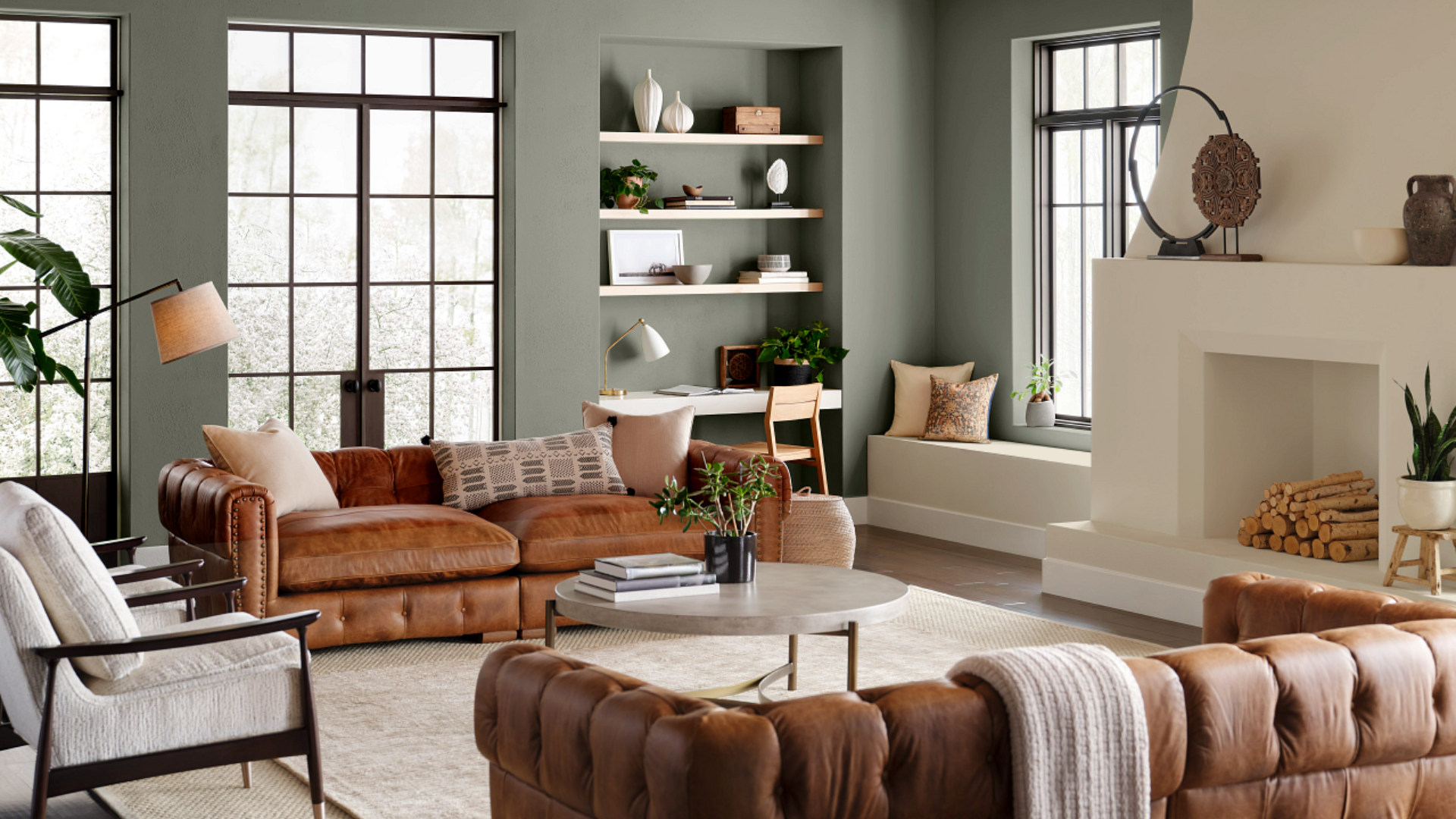
This shade transforms living areas into luxurious yet welcoming spaces. It creates a cozy background that makes furniture and art stand out. In my living room, Antique Pewter walls provide a solid foundation while showcasing my cream sofa and brass accents.
The color works well in areas that need warmth without being too dark. With proper lighting, it creates a space that feels both refined and comfortable.
Dining Rooms
Antique Pewter can transform dining spaces into rich, deep areas perfect for gatherings. After painting my dining room, I found that it created an intimate setting for meals and conversation. The gray tones help establish a pleasant atmosphere while offering more visual interest than basic neutrals.
What surprised me was how well it works with various wood finishes. My oak dining table stands out clearly against the Antique Pewter background, while crystal lighting adds brightness that balances the depth of the walls. The space feels both special and relaxed.
Home Offices and Studies
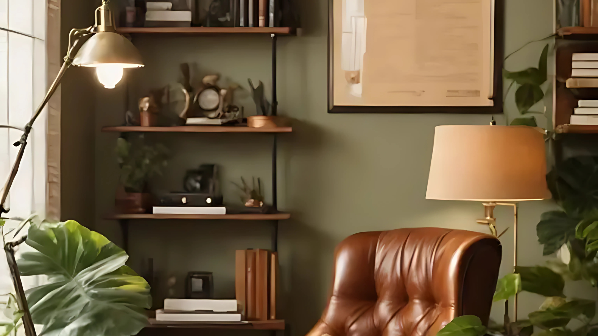
Antique Pewter brings focus and dimension to workspaces. The well-balanced gray feels timeless yet relaxing during extended work sessions. I coated my compact home office with this color and find it makes an ideal backdrop for my desk while keeping me calm and attentive.
Antique Pewter works especially well in areas that need a classic yet cozy feel. The color appears to add layers while aiding mental focus. I’ve noticed I’m more comfortable working in my Antique Pewter office compared to my old, basic white work area.
Bedrooms
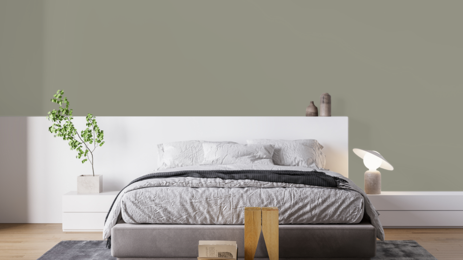
This balanced gray can comfort these personal areas. I painted my guest bedroom Antique Pewter, and it feels both full and snug. It works well for a space that needs to be warm without being too much.
The color looks great with white bedding and gold or brass items. It adds just enough color without overwhelming the room, making it a good choice for a space designed for rest and comfort.
Kitchen Cabinets
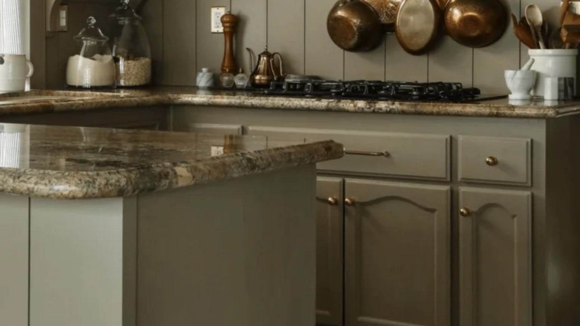
Antique Pewter adds a deep yet refined look to kitchen areas. I painted my kitchen island with it, making a central feature that grounds the space without being too heavy. The gray shade feels natural and clean, ideal for a cooking zone.
What I really like is how Antique Pewter works with both light and dark counter surfaces. Against my white marble tops, the gray makes a sharp, clean contrast.
What Colors Complement Antique Pewter?
- Sharp whites: They make a clean contrast that looks fresh and classic
- Gentle creams: Give a mild contrast that feels unified and peaceful
- Mid to dark wood finishes: Bring natural texture and matching warmth
- Deep blue details: Create a richer shade that brings out the subtle base tones
- Gold and brass touches: Add warm highlights that balance the cool base colors
For my dining room, I combined Antique Pewter walls with white trim and brass lighting fixtures. The combination feels both rich and balanced.
What Style Works Well with This Color?
Antique Pewter fits many design approaches. In older-style homes, it adds a timeless touch that feels classic without being dull. For newer spaces, it forms an ideal backdrop for simple, straight-edged items. In mixed settings, it provides a rich quality that feels right and stable.
Most notably, Antique Pewter works well in homes that blend different styles by adding a quiet presence to areas that mix various elements.
My home combines new items with more traditional pieces, and this color creates the ideal background for both. This adaptability makes it a wise pick if you enjoy changing your home items or mixing elements from different design styles.
Is It a Warm or Cool Color?

Antique Pewter is a cool shade with layered tones beneath. The gray base lends it a smart, rich appearance, while the subtle green notes add more character.
I think of it as “gently cool” – the type that helps a room feel solid rather than chilly or plain. Its neutral side keeps it from seeming too stark. This mix is useful all year round in most homes.
When used correctly, it doesn’t feel too cold despite its cool foundation. The richness keeps it comfortable for daily spaces. In areas with ample natural light, this balance helps reveal its true nature throughout the day.
If you think a space might be too cool, I’ve learned that adding warmer elements, such as wood finishes, soft fabrics, or brass hardware, creates just the right mix. In my dining room, the Antique Pewter walls look great with my oak table and brass light fixture.
Color Characteristics Table
| Characteristic | Antique Pewter | What This Means For Your Space |
|---|---|---|
| Temperature | Cool | Creates a classy, grounded atmosphere |
| Undertones | Gray with slight green notes | Adds depth and beauty |
| Light Reflectance Value | 25.4 | Absorbs more light than it reflects, creating a rich, cozy atmosphere |
| Seasonal Feel | Year-round | Works well in both summer and winter settings |
| North vs. South Rooms | Adaptable | Appears richer in south-facing rooms, deeper in north-facing rooms |
How to Test This Color in Your Space?
- Buy a sample: Get a small container of Antique Pewter
- Paint a board: Use a 2×2-foot piece of white poster board
- Move it around: See how it looks in different locations at different times of day
- Live with it for 3 days: Your initial impression might change
When I tested Antique Pewter, I was amazed by the significant changes it underwent from morning to evening. In my north-facing bedroom, it appeared deeper and more mysterious. In my south-facing dining room, it displayed more of its gray aspects throughout the day.
What Paint Finish Should You Choose?
- Flat: Good for ceilings and walls with texture issues
- Matte: My top choice for most walls – the color looks soft without glare
- Eggshell: This works in kitchens and bathrooms, where you need to clean walls
- Satin: Adds a slight sheen, could make the color look slightly brighter
- Semi-gloss: Too shiny for Antique Pewter walls, but works for trim and doors
I used a matte finish in my bedroom and an eggshell finish on my kitchen island. The eggshell finish makes cleaning easier without adding too much shine that would alter the color’s appearance.
Real Home Ideas Using Antique Pewter
- Main wall: Antique Pewter on a single wall makes a focus point that helps a room feel more stable
- With white edges: Used with white trim for a clean contrast
- Storage units: Kitchen island or bathroom counter in this color creates a custom look
- Home pieces: A shelf unit or chest painted this shade adds a rich touch
- Outside use: Works well as a highlight color for doors or window covers
My friend painted just one wall in her office, Antique Pewter with white trim, creating a balanced look that feels both sophisticated and grounded. It looks amazing and has inspired me to think about using it in more areas of my home.
Mistakes to Avoid
- Using it in poorly lit spaces – Without adequate lighting, Antique Pewter can look too dark and lose its nuanced character. Ensure that you have sufficient lighting to highlight its complexity effectively.
- Pairing it with conflicting undertones – Colors with strong warm undertones can clash with Antique Pewter’s cool, green-gray nature; test combinations carefully before committing.
- Overlooking natural light direction – East and west-facing rooms will show dramatic changes in this color throughout the day. Be prepared for significant shifts in how the color appears.
- Using too many dark elements – Since Antique Pewter has a medium-dark LRV, using too many other dark elements can make a space feel heavy. Balance with lighter elements.
- Not considering room function – This color might be too serious for playrooms or too sophisticated for casual family spaces. Consider how you use each room before applying.
Why Do People Like Antique Pewter?
Antique Pewter has gained popularity among many homeowners, and I understand why. Its balanced quality creates spaces with depth while remaining very livable. People appreciate it because it’s not a basic gray—it has character without being difficult to use.
The color creates rich spaces that still feel cozy and inviting. Unlike trendier colors, it works with many decorating styles and doesn’t date quickly. Whether in natural or artificial light, it shifts throughout the day, keeping spaces interesting.
Conclusion
Antique Pewter creates spaces that feel sophisticated and cozy. After using this color in multiple rooms over several months, I remain pleased with my choice. What makes it stand out is how it adds character while remaining very adaptable to different furniture and decor styles.
It’s not a color for those wanting very light, airy walls. Instead, it creates a foundation that supports your furniture and accessories while making a subtle statement of its own. This balanced presence explains why it remains a favorite choice year after year.
In a world of stark whites and basic grays, Antique Pewter is the ideal choice for those looking to incorporate color with purpose. It works with traditional, modern, classic, and many other styles.
It’s a truly versatile color that creates beautiful, livable spaces that feel sophisticated and personal, and that’s what truly matters in a home.
Frequently Asked Questions
How Does Antique Pewter Change in Different Light Conditions?
In morning light, it appears as a true gray. During midday, especially in south-facing rooms, the green undertones become more apparent. In the evening, artificial light takes on a deeper, richer quality. This changing nature keeps the color interesting throughout the day.
Can Antique Pewter Work in a Home with Many Natural Wood Elements?
Yes, it pairs beautifully with natural wood. The cool gray creates a pleasing contrast with warm wood tones, whether light oak or dark walnut. This combination feels grounded and organic, perfect for creating a balanced space.
Is Antique Pewter Suitable for Exterior Use?
While primarily used indoors, it can work as an exterior accent color for doors, shutters, or trim. Keep in mind that colors often appear lighter outdoors, so it might read as a lighter gray in natural sunlight. Always test exterior colors in your actual outdoor lighting before committing.
How Does Antique Pewter Compare to Revere Pewter?
Though they share “pewter” in their names, they’re quite different. Revere Pewter is a much lighter greige (gray-beige) with warm undertones and an LRV of 55.51, while Antique Pewter is a deeper, cooler gray with green undertones and an LRV of 25.4. Revere Pewter creates light, airy spaces, while Antique Pewter creates deeper, more dramatic ones.
Will Antique Pewter Make My Small Room Feel Smaller?
Not necessarily. While conventional wisdom suggests dark colors make spaces feel smaller, Antique Pewter’s depth can actually blur wall boundaries in smaller spaces, creating a cozy environment that feels intentional rather than cramped. The key is proper lighting and balancing with lighter furnishings.