")
After having Benjamin Moore’s Herbal Escape on my walls for over a year now, I’m eager to share what I’ve learned about this refreshing, peaceful color. This gentle green shade has changed my home in ways I didn’t expect.
In this blog, you’ll learn:
- What Herbal Escape really looks like in actual homes
- Which spaces work best with this color
- Colors that match perfectly with it
- How to properly test it before purchasing
I’ve applied this paint in various rooms with different lighting conditions and observed how it changes over the course of the day. I’ve made the mistakes, so you don’t have to.
Let’s determine if this soft, natural green is the ideal choice for your home.
What Kind of Color Is Herbal Escape?
Herbal Escape (Benjamin Moore 1487) is a medium green with subtle gray notes. It creates a natural backdrop and adds a refreshing, calming feeling to any space. To me, it looks like fresh herbs growing in a garden—quiet, balanced, and full of vitality.
I’ve watched it transform as the day progresses. In morning light, it shows more of its green character. By afternoon, the gray aspects become more noticeable, and in evening light, it takes on a richer, more layered quality.
The color has an LRV (Light Reflectance Value) of 39.97, putting it in the medium range. This means it balances light absorption and reflection, adding character to a space without making it too dark.
The balanced nature of Herbal Escape makes it perfect for creating rooms that feel both fresh and cozy.
What makes Herbal Escape special is its ability to create a sense of calm and a link to nature. In most areas, it adds a feeling of peace and freshness with a depth that fits many settings and home styles.
What Rooms Work Best with Herbal Escape?
I’ve found that Herbal Escape works wonderfully in spaces where you want a fresh, timeless look that will last for years to come. Based on my experience, these are the spaces where Herbal Escape performs best:
Living Rooms
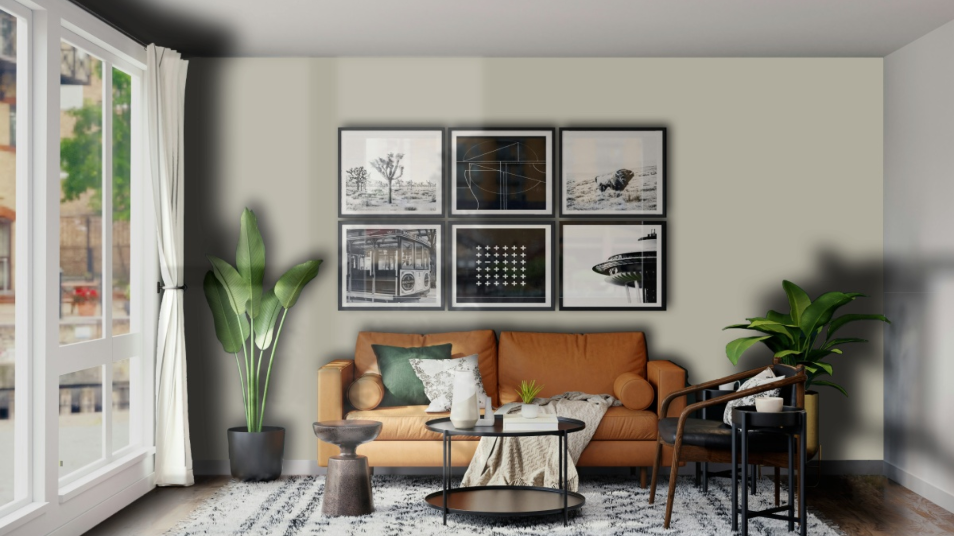
This color makes living areas feel fresh and inviting. It creates a calming backdrop that lets furniture and art stand out nicely. In my living room, Herbal Escape walls create a sense of connection to nature, making my wooden furniture and brass accent pieces look great.
The color works especially well in spaces that need to feel bright without being too plain. With good lighting, it creates a room that feels both fresh and comforting.
Bedrooms
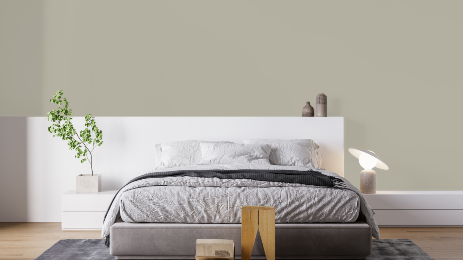
This balanced green can add a touch of nature to these personal areas. I painted my main bedroom Herbal Escape, and it feels both fresh and cozy. It’s perfect for a space that needs to feel calm but not boring.
The color works beautifully with white bedding and natural wood fixtures. It adds just enough color without being overpowering, making it a smart choice for a room designed for rest and comfort.
Dining Rooms
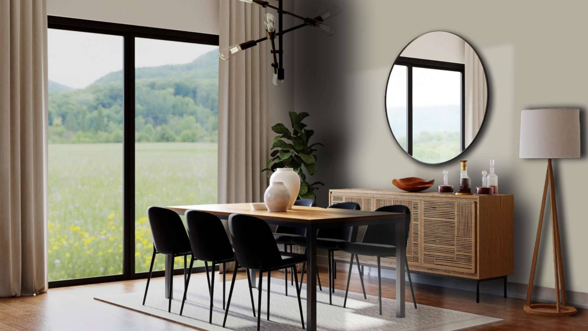
Herbal Escape can change dining rooms into warm, welcoming spaces perfect for gatherings. I used it in my friend’s dining room, where it created a natural setting for meals and conversations. The green tones help create a pleasant feeling while still being more appealing than basic neutrals.
What surprised me is how well it works with different wood tones. Her walnut dining table looks rich against the Herbal Escape walls, while glass light fixtures bring brightness that balances the depth of the walls. The room feels special yet comfortable.
Bathrooms
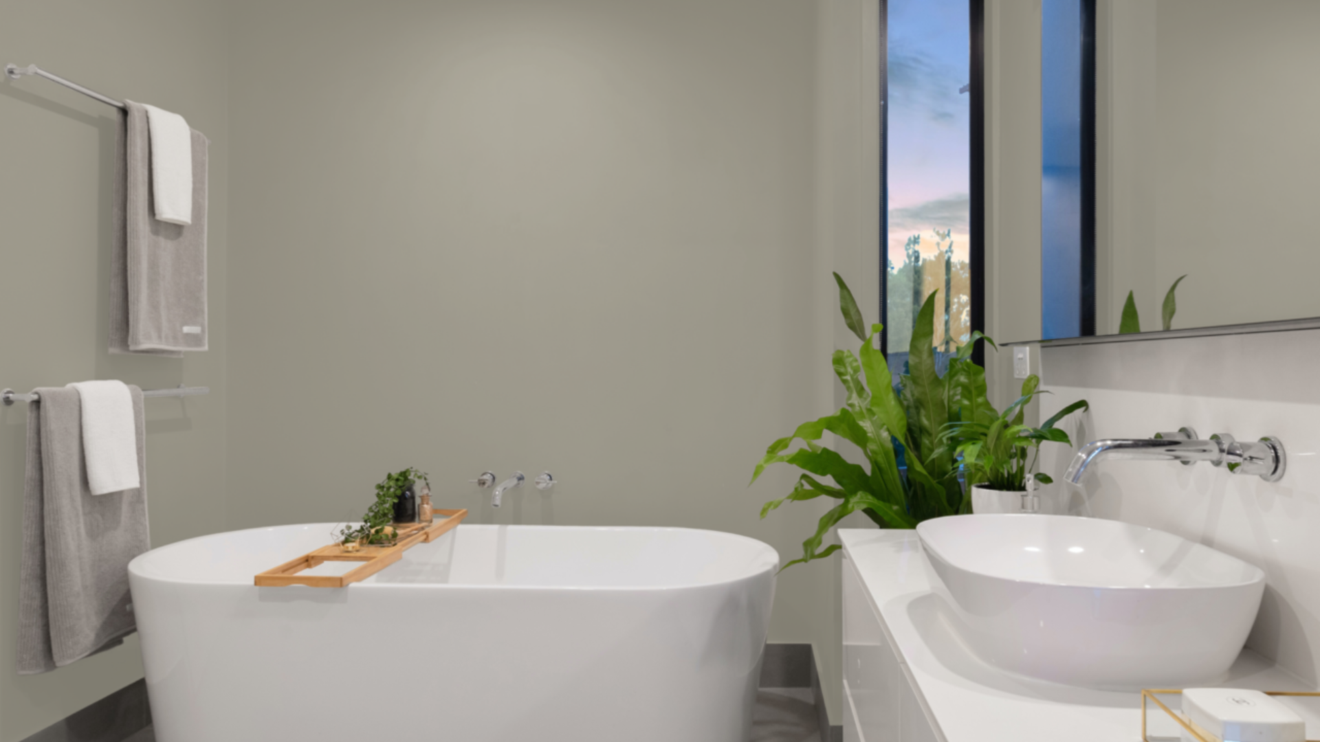
This medium green can transform bathrooms into spa-like spaces. I used it in my guest bathroom, where it created a clean, fresh atmosphere. The green tone feels natural and peaceful, making it an ideal choice for a space designed for relaxation.
What surprised me is how well it works with different tile colors. My white subway tiles look crisp against the Herbal Escape walls, while plants bring an extra touch of life that enhances the natural quality of the walls. The room feels special yet comfortable.
Sunrooms and Enclosed Porches
The natural quality of Herbal Escape makes it perfect for sunrooms and enclosed porches where you want to highlight a connection to the outdoors. I used it in my small sunroom, where it enhances the garden views and creates a smooth transition between inside and outside.
The color’s balanced notes mean it doesn’t compete with the greenery outside but rather complements it.
I’ve found it looks particularly beautiful in changing light throughout the day, adding depth and interest to a space that might otherwise feel too plain.
What Colors Complement Herbal Escape?
- Crisp whites: They create a fresh contrast that feels clean and natural
- Soft creams: Offer a subtle contrast that feels cohesive and calming
- Medium to dark wood tones: Add organic texture and complementary warmth
- Terracotta accents: Create an earthy combination that enhances the natural undertones
- Gold and brass accents: Add a touch of warmth that balances the cool undertones
For my dining room, I combined Herbal Escape walls with white trim and brass lighting fixtures. The combination feels both fresh and balanced.
What Style Works Well with This Color?
Herbal Escape fits various design styles. In farmhouse homes, it brings a natural element that feels lasting without being boring.
For modern spaces, it creates the perfect backdrop for clean-lined pieces. In coastal settings, it offers a fresh quality that feels appropriate and grounded.
Most impressively, Herbal Escape complements homes that mix different styles by adding a calm presence to spaces that combine various elements.
My own home combines contemporary items with more traditional ones, and this color creates the perfect backdrop for both. This flexibility makes it a smart choice if you like to change your decor or mix elements from different styles.
Is It a Warm or Cool Color?

Herbal Escape is a coolcolor with complex notes. The green base gives it a fresh, natural feel, while the slight gray elements add sophistication.
I’d describe it as “softly cool” – the kind that makes a room feel refreshed rather than cold or stark. The natural aspects keep it from feeling too clinical. This balance makes it work well year-round in most homes.
When used well, it doesn’t feel too cold despite its cool base. The depth keeps it livable for everyday spaces. In rooms with ample natural light, the balance allows it to showcase its true character throughout the day.
If you’re concerned that a space feels too cool, adding warmer elements, such as wood tones, fabric textures, or brass fixtures, creates the perfect balance.
In my bathroom, the Herbal Escape walls complement my natural wood vanity and brass fixtures beautifully.
Color Characteristics Table
| Characteristic | Herbal Escape | What This Means For Your Space |
|---|---|---|
| Temperature | Cool | Creates a fresh, calming atmosphere |
| Undertones | Green with slight gray notes | Adds depth and sophistication |
| Light Reflectance Value | 39.97 | Balances light absorption and reflection, creating a rich, natural atmosphere |
| Seasonal Feel | Year-round | Works well in both summer and winter settings |
| North vs. South Rooms | Adaptable | Appears fresher in south-facing rooms, more muted in north-facing rooms |
How to Test This Color in Your Space?
- Buy a sample: Get a small container of Herbal Escape
- Paint a board: Use a 2×2-foot piece of white poster board
- Move it around: See how it looks in different locations at different times of day
- Live with it for 3 days: Your first impression might change
When I tested Herbal Escape, I was surprised by the significant changes it underwent from morning to evening.
In my north-facing bedroom, it seemed more muted and calming. In my south-facing kitchen, it showed more of its green aspects throughout the day.
What Paint Finish Should You Choose?
- Flat: Good for ceilings and walls with texture issues
- Matte: My top choice for most walls – the color looks soft without glare
- Eggshell: This works in kitchens and bathrooms, where you need to clean walls
- Satin: Adds a slight sheen, could make the color look slightly brighter
- Semi-gloss: Too shiny for Herbal Escape walls, but works for trim and doors
I used a matte finish in my bedroom and an eggshell finish in my kitchen and bathroom. The eggshell finish makes cleaning easier without adding too much shine that would alter the color’s appearance.
Real Home Ideas Using Herbal Escape
- Accent wall: Herbal Escape on one wall creates a focal point that makes a room feel more connected to nature
- With white trim: Used with white trim colors for a crisp contrast
- Cabinets: Kitchen island or bathroom vanity in this shade creates a custom look
- Furniture: A bookcase or dresser painted this shade adds a fresh touch
- Exterior: Works beautifully as an accent color for doors or shutters
My friend painted just one wall in her living room, Herbal Escape with white trim, creating a balanced look that feels both fresh and grounded. It looks amazing and has inspired me to think about using it in more areas of my home.
Mistakes to Avoid
- Using it in rooms with very yellow lighting – This can cause Herbal Escape to look muddy or dull. Use balanced white bulbs (3000-4000K) to show their true beauty.
- Not considering the room’s layout – In very small spaces without much natural light, it can feel closed in. Ensure a balanced look with proper lighting and subtle accents.
- Rushing the paint job – This color shows roller marks more than some others. Take the time for proper application using high-quality tools for optimal results.
- Pairing with too many blue accents – This can make the color feel too cool. Balance with warm woods or touches of cream to maintain its fresh but inviting character.
- Forgetting about ceiling color – A stark white ceiling can create too much contrast. Consider a softer white or a very light tint of the wall color for balanced rooms.
Why Do People Like Herbal Escape?
Herbal Escape has gained popularity among many homeowners, and I understand why. Its balanced quality creates spaces that are fresh while still feeling very livable.
People like it because it’s not a basic green—it has personality without being hard to use.
The color creates fresh spaces that still feel cozy and inviting. It works with many decorating styles and doesn’t date quickly, unlike trendier colors.
Whether in natural or artificial light, it shifts throughout the day, keeping spaces interesting.
Conclusion
Herbal Escape creates spaces that feel both fresh and cozy at the same time. After using this color in multiple rooms over several months, I remain satisfied with my choice.
What makes it stand out is how it adds character while remaining very flexible with different furniture and decor styles.
It’s not a color for those who want very stark, white walls. Instead, it creates a foundation that supports your furniture and accessories while making a subtle statement of its own. This balanced presence explains why it remains a favorite choice year after year.
In a world of stark whites and plain grays, Herbal Escape is the ideal choice for those seeking to add color with purpose. It works with farmhouse, modern, coastal, and many other styles.
It’s a truly versatile color that creates beautiful, livable spaces that feel fresh and personal, and that’s what truly matters in a home.
Frequently Asked Questions
Does Herbal Escape Make a Room Look Smaller?
No, with its medium depth, Herbal Escape doesn’t usually make rooms look smaller. When paired with appropriate lighting and lighter furnishings, it can actually create a sense of depth that makes spaces feel well-defined rather than cramped.
How Does Herbal Escape Look Under LED Lighting?
LED lighting generally brings out the green tones in Herbal Escape. Choose LEDs with a color temperature between 3000K and 4000K for the most natural appearance. Very cool LEDs (5000K+) can make the image appear too blue-green.
Can I Use Herbal Escape in A Basement?
Yes, but with considerations. In basements with limited natural light, incorporate plenty of artificial lighting and pair it with lighter furnishings. It can actually work well to create a cozy, welcoming basement space when balanced properly.
Does Herbal Escape Work Well in Office Spaces?
Absolutely. Its calm, balanced nature creates an excellent backdrop for productive work. The green tones promote focus and a connection to nature, making it ideal for home offices or professional spaces where a fresh but professional feel is desired.
Is Herbal Escape Considered a Neutral Color?
While not a traditional neutral like beige or gray, Herbal Escape serves as a “new neutral” due to its versatility. Its balanced green-gray tones allow it to work with many color schemes and design styles while still adding more character than basic neutrals.