")
When our living room needed a fresh coat of paint last spring, I spent weeks looking at color samples.
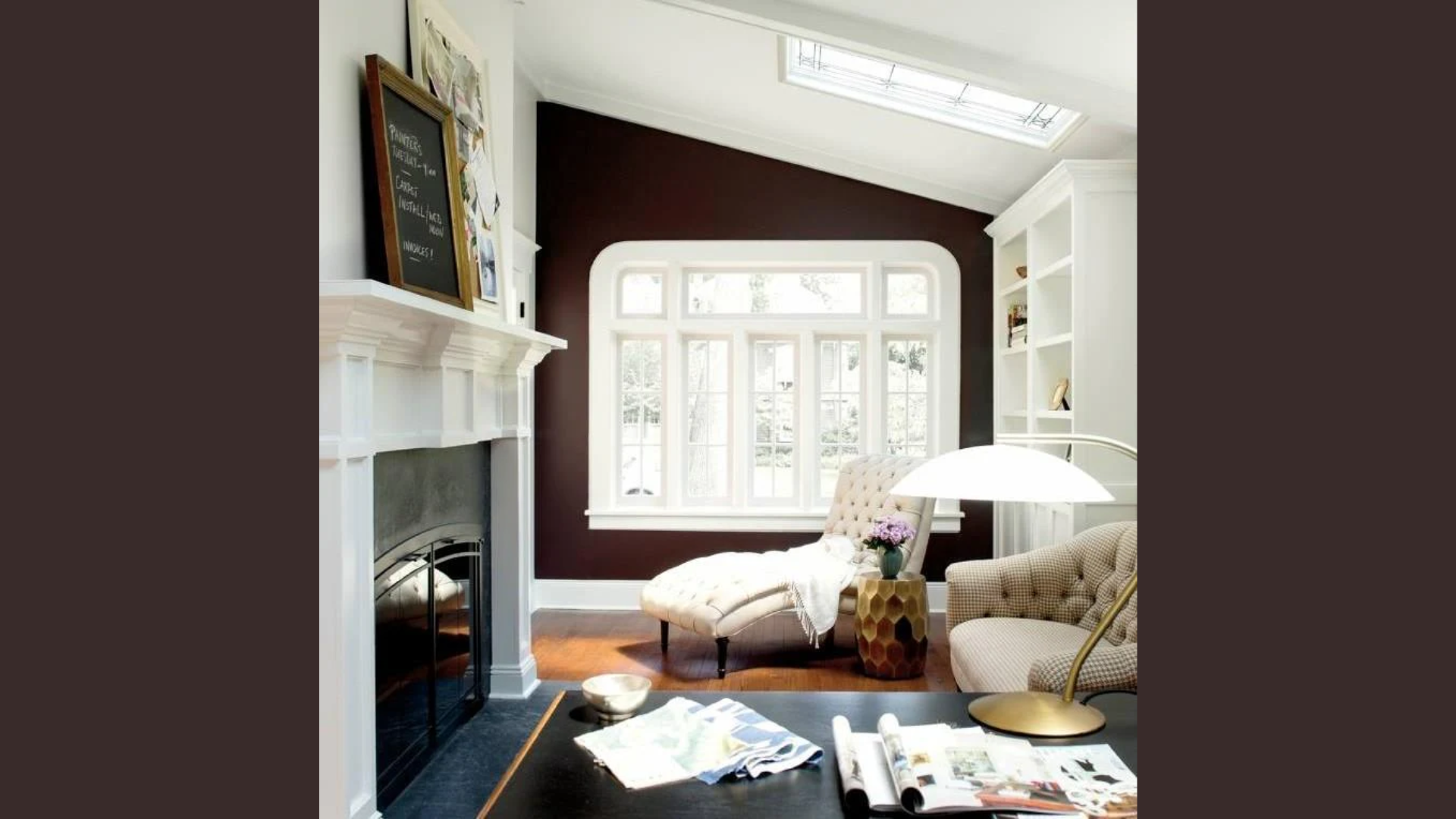
Nothing felt right until I spotted Wenge (AF-180) on a small corner card. The rich brown-purple mix caught my eye immediately – so warm and able to work with many styles.
I’m not just sharing facts from a color chart here. This review comes from actually living with Wenge on my walls for six months, through different lighting and seasons.
In this blog, I’ll tell you how this color looks in real homes, how it changes throughout the day, and what furniture and decor pairs well with it.
If you’re stuck choosing a deep neutral that isn’t boring, I’ll help you decide if Wenge is your answer.
I’ve tried it, tested it, and can honestly tell you if it’s worth your time and money.
The Rich Undertones of Wenge by Benjamin Moore

The first thing I noticed about Wenge is its depth. This isn’t just a plain dark brown. When I painted my first wall, I was struck by how much was happening in this seemingly simple color.
Wenge has a brown-black base that carries subtle hints of plum. When the light hits it just right, you might also catch glimpses of what look like espresso tones.
Sometimes, in warm afternoon sun, I even spot a touch of mahogany warmth coming through.
With an LRV (Light Reflectance Value) of only 4.79, Wenge is definitely on the darker side. This low number means it absorbs most light rather than bouncing it back.
The lighting shifts are fascinating.
In morning light, the color leans more toward its purple-brown side. By evening, under lamp light, it warms up considerably and feels cozier.
I’ve found that north-facing rooms bring out the cooler tones in Wenge, while south-facing spaces highlight its warmer qualities.
Before you commit, I suggest testing this color in your own space.
The way Wenge looks on my walls might differ slightly from how it appears in your home due to your specific lighting conditions.
What makes this color special is its ability to look both traditional and modern at the same time. It’s not flashy, but it’s far from boring.
The Psychology of Wenge by Benjamin Moore
When I first painted my study with Wenge, I noticed an immediate change in how the room felt.
Deep colors like this one change more than just walls – they change how we feel in a space. Wenge creates a sense of security that lighter colors simply can’t match.
I’ve found myself spending more time in my Wenge-painted rooms when I need to feel safe and settled.
The color brings a natural coziness to spaces. My living room, once bright and somewhat stark, now feels like it’s giving me a warm hug when I enter.
But there’s more to it than just comfort. I’ve noticed that Wenge adds a feeling of closeness to rooms.
Friends who visit comment on how my dining area now feels perfect for long, intimate conversations. What surprised me most was how grounded I feel in these spaces.
The color isn’t harsh or heavy – it’s stable and solid in a comforting way. Has it lifted my mood?
Yes, but not in the way bright yellows or blues might. Instead, Wenge brings a steady, calm feeling that lasts. The beauty of the color comes through without trying too hard.
My hallway, once forgettable, now has a quiet drama that makes even a simple walk to the kitchen feel more special.
You might find, as I did, that rooms painted in Wenge have a way of drawing people in.
There’s something about this depth of color that makes spaces feel both important and welcoming at the same time.
Why Wenge Is an Ideal Paint Color for Any Room?
I’ve used Wenge in several areas of my home, and what stands out is how well it fits different spaces.
This color has a rare ability to change its feel based on the room size and purpose. In my large, open living room, Wenge helped create a sense of boundaries and structure.
The room felt too vast before, but now it feels well-defined and put-together. For small spaces, you might think dark colors are a mistake.
I thought so, too, until I painted my tiny home office. Instead of making it feel smaller, Wenge turned it into a cozy nook that helps me focus.
The right color can completely change how you use a space. My bedroom walls, now in Wenge, have turned what was once just a place to sleep into a true retreat.
The deep tones block out the mental noise and help my mind wind down at night.
The dining room tells a different story. Here, Wenge adds a touch of class to our family meals.
\What was once a plain box with a table is now a space that makes even takeout pizza feel like a special event. Accent wall or full coverage? I’ve tried both.
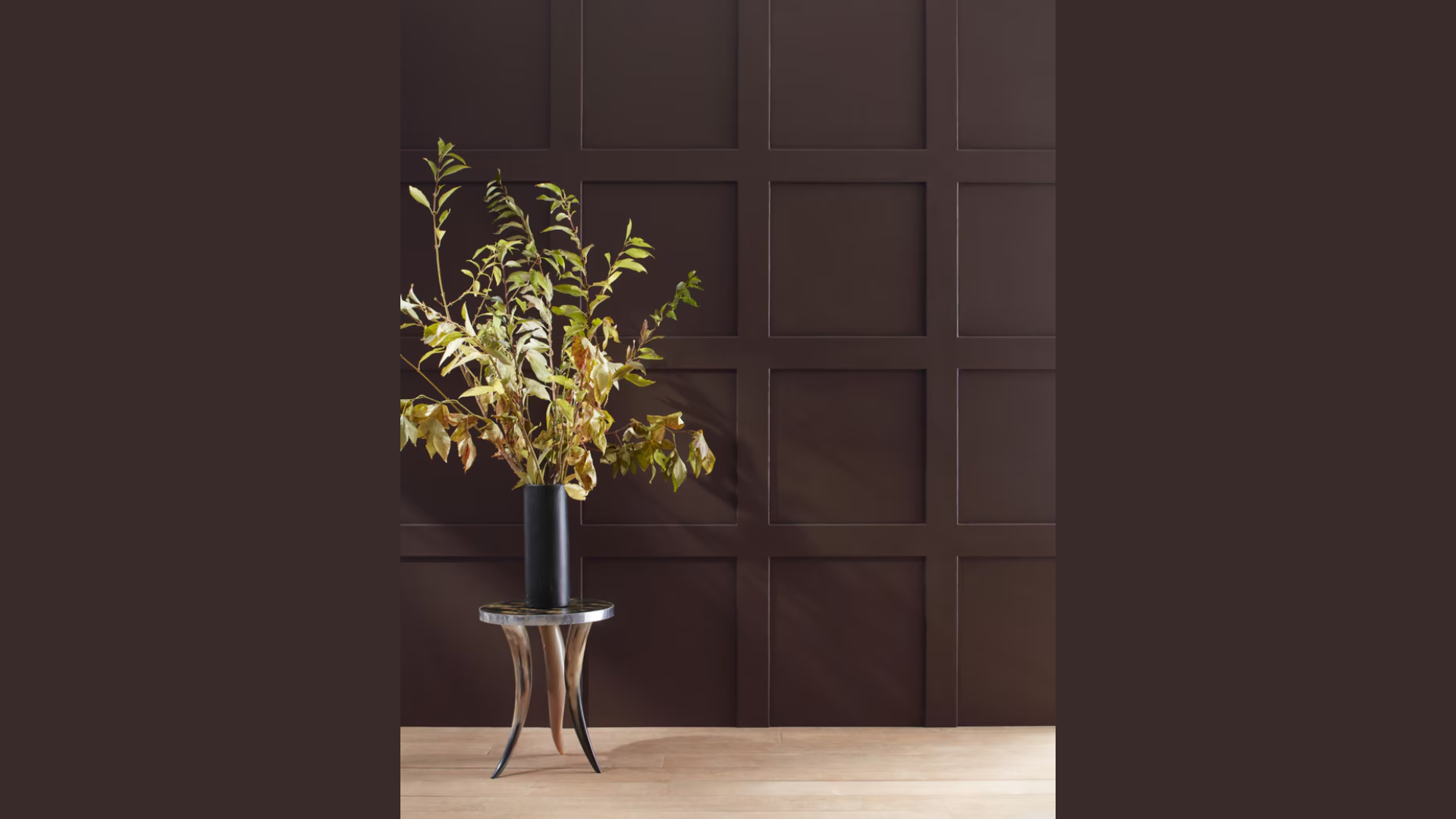
As an accent in my entryway, Wenge makes a strong first statement without being too much. The single dark wall balances perfectly with the lighter tones around it.
For full coverage, my study proves Wenge can wrap a room in warmth without feeling like a cave. With the right lighting, the full Wenge treatment creates a complete mood shift.
Best Places to Use Wenge in Your Home
After trying Wenge in various rooms of my house, I’ve found some spots where it truly shines.
These are my favorite places to use this rich color, along with some tips I’ve learned along the way.
1. Master Bedrooms
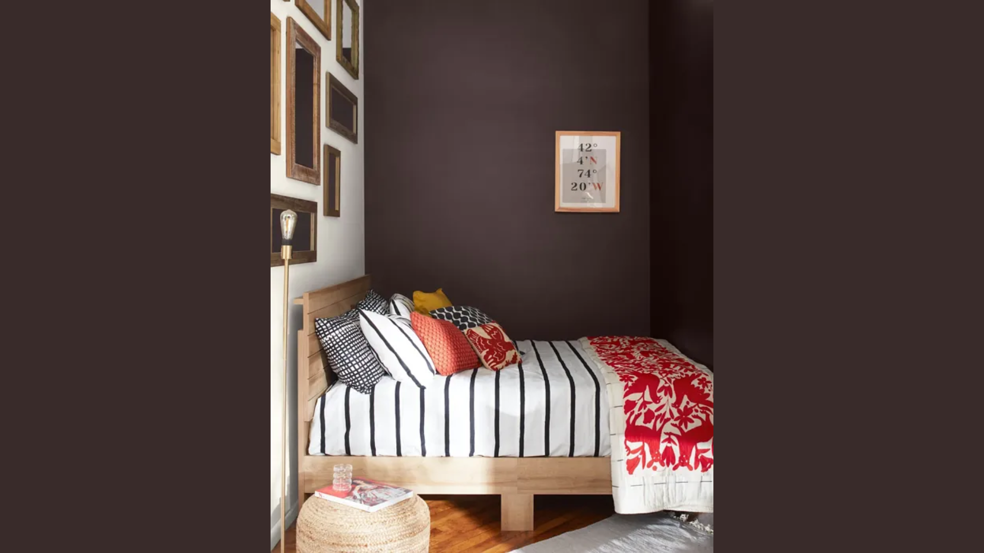
My master bedroom was the first place I tried Wenge, and it remains my favorite application. The deep tones create a sleep-friendly environment that feels like a cocoon at night.
I’ve found that the color makes bedtime feel special, like checking into a high-end hotel. Even with minimal decor, the walls do most of the work in creating a peaceful mood.
If you’re worried about the room feeling too dark, I suggest painting just the wall behind your headboard. This gives you the impact without committing to the full room.
2. Bathrooms
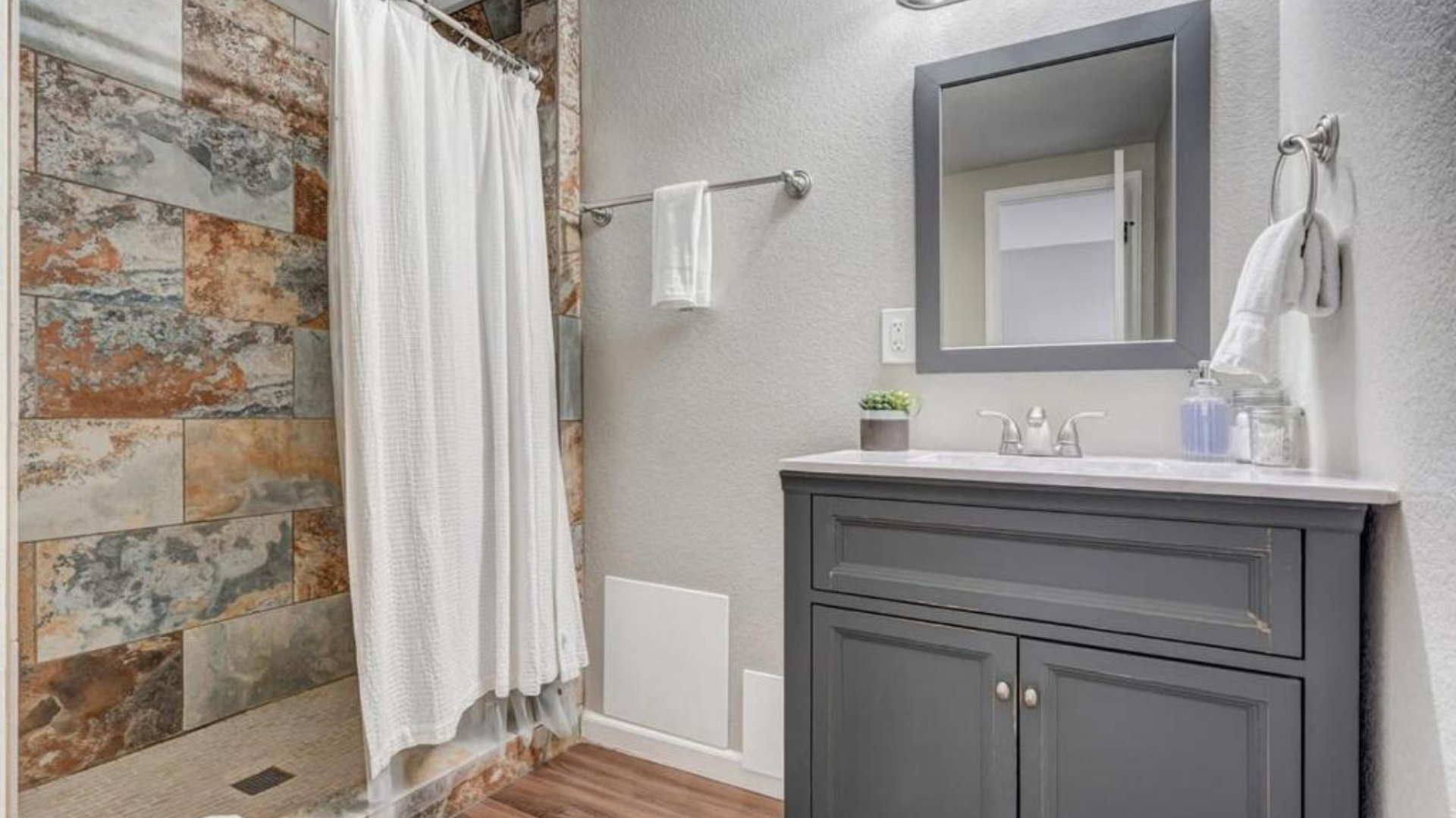
Surprisingly, small bathrooms can handle Wenge beautifully. I painted our powder room and found that the small space became much more interesting.
The deep color makes white fixtures pop and creates a sense of luxury in even the most basic bathroom. My guests often comment on how fancy our simple half bath feels now.
Water-based paints in a satin finish have held up well against humidity in my experience. Looking for contrast? Try this trick.
I kept my ceiling bright white, which creates a nice break from the dark walls and prevents the small room from feeling closed in.
3. Kitchen Areas
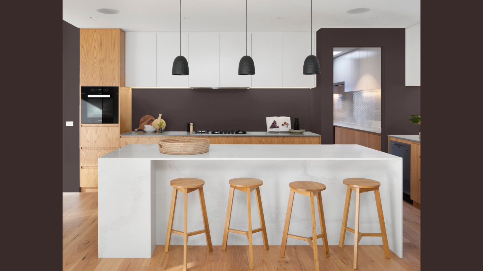
While I didn’t paint my entire kitchen in Wenge, I did use it for my kitchen island base, and the results were beautiful.
The dark color hides marks and scuffs that show up almost instantly on lighter cabinets. With kids and pets in the house, this has been a practical choice as much as a style one.
If you love the look but aren’t ready for dark cabinets, try painting a single wall in your eating area. I did this in our breakfast nook, and it made morning coffee feel much more special.
4. Home Libraries or Studies
Books look amazing against Wenge walls. This was an unexpected benefit when I painted my small home office.
The color creates the perfect background for bookshelves and makes titles on the spines easier to read. It also helps me focus when working from home.
I’ve noticed I can work longer hours without eye strain in my Wenge office compared to when the walls were bright white.
If you’re nervous about dark colors, a study or home office is actually a good place to start. These are often smaller rooms where you want focus rather than brightness.
When using Wenge in any room, I always pair it with lighter trim and ceilings. This prevents that “boxed in” feeling and creates clean lines that show off the rich color even better.
Flooring Options that Pair Beautifully with Wenge
Finding the right floor to go with Wenge walls makes a big difference in how the whole room comes together.
Through some trial and error in my own home, I’ve found certain flooring choices that work especially well with this rich color.
1. Warm-Toned Hardwood
My living room has oak floors with a honey-colored finish, and they pair perfectly with the Wenge walls. The warmth in the wood balances the depth of the wall color.
What I love most about this combo is how the floors seem to glow against the dark walls.
Medium-toned woods like cherry, walnut, or maple work wonderfully too. I tried samples of each before making my final choice.
If I could go back in time, I might have chosen slightly lighter wood for my hallway to create even more contrast with the walls.
2. Light Neutral Carpets
In my bedroom, I kept the existing soft beige carpet when I painted the walls Wenge. This turned out to be one of my best design decisions.
The light carpet prevents the room from feeling too dark or heavy. It creates a nice balance where your eyes have somewhere “light” to rest.
I’ve found that cream, taupe, or pale gray carpets all work nicely with Wenge. These neutral tones don’t fight with the walls but complement them instead.
Carpet texture matters too. A plush, soft carpet adds another layer of comfort to a room that already feels cozy thanks to the Wenge walls.
3. Natural Stone And Tile
My bathroom renovation coincided with painting the walls Wenge, which gave me the chance to choose the perfect flooring match.
I went with large-format cream marble-look tiles that have subtle veining. The light floor brightens the space while the natural pattern adds interest.
If you’re considering natural stone, travertine or limestone with their warm undertones work beautifully alongside Wenge walls.
I’ve seen this combo in friends’ homes and always admire how well it works.
4. Large Area Rugs As An Option
For my dining room with its existing dark floors, I needed to break up all the dark colors after painting the walls Wenge.
A large area rug with a light background and simple pattern solved this problem.
A generously-sized rug can create that needed visual break between dark walls and dark floors.
I recommend choosing rugs with some texture or a subtle pattern rather than solid colors. This adds depth to the room without making it feel busy.
When pairing floors with Wenge, I’ve found that contrast is key.
The deep color of the walls can handle, and often looks best with, lighter floors that keep the space feeling open and balanced.
Wenge Compared to Other Paints of Benjamin Moore
Before settling on Wenge for my home, I tested several other dark Benjamin Moore colors. Let’s see how they stack up against each other from my personal experience:
| Color | Undertones | Room Feel | Best For |
|---|---|---|---|
| Wenge | Purple-brown with plum hints | Rich and cozy without feeling heavy | Bedrooms, studies, accent walls |
| Espresso Bean | Red-brown, slightly warmer | Very dark and grounding | Libraries, dining rooms |
| French Press | Golden brown with slight red | Warm and inviting | Living rooms, kitchens |
| Kona | True brown, minimal undertones | Neutral and straightforward | Offices, kitchens |
| Bitter Chocolate | Cool brown with slight gray | Modern and clean | Modern spaces, accent walls |
Conclusion
After living with Wenge for over a year, I can honestly say it’s been a joy to come home to these walls each day.
The color has held up well, both in terms of durability and style.
Who will love Wenge? If you want a room to feel cozy, grown-up, and somewhat formal without being stuffy, this color might be perfect for you.
Who should think twice? If your space lacks good lighting or if you tend to feel down in darker rooms, you might want to test a small area first.
What makes Wenge special is how it creates a mood rather than just covering a wall. It turns ordinary rooms into spaces that feel thought-out and finished.
Have you tried Wenge in your home? I’d love to hear about your experience in the comments.
Or if you’re still on the fence, let me know what questions you have—I’m happy to share more about my time with this beautiful color.