
Purple sits on the color wheel, bold and rich. But what lies directly across from it?
Understanding opposite colors matters more than most people think. Designers use them to create contrast. Artists rely on them for balance. Even home decorators need to know how colors interact.
The answer isn’t always obvious at first glance. Color theory has specific rules about what makes two colors true opposites. These rules come from science, not guesswork.
Finding purple’s opposite means looking at the color wheel with fresh eyes. This blog breaks down exactly what purple’s opposite color is and why it matters.
Why is Yellow the Complementary Color of Purple?
Yellow stands directly opposite purple on the color wheel, making them perfect complements.
This relationship comes from how colors mix. Purple combines red and blue. Yellow is what remains when those two colors are removed from the light spectrum.
When placed side by side, yellow and purple create maximum visual contrast. The eye notices this pairing immediately because the colors intensify each other.
Artists and designers use this principle constantly. The contrast makes both colors appear more vibrant without changing their actual hue.
This complementary relationship follows basic color theory rules. Any primary color will always sit opposite the mix of the other two primaries.
Understanding the Color Wheel: How Opposite Colors Work
The color wheel organizes hues in a circular format, showing how colors relate to each other.
Opposite colors sit directly across from one another on this wheel. These pairs are called complementary colors because they complete each other visually.
The wheel starts with three primary colors: red, blue, and yellow. Mix any two primaries together, and secondary colors appear. Orange comes from red and yellow. Green results from blue and yellow. Purple forms when red and blue combine.
Each secondary color sits opposite its missing primary. Since purple contains red and blue, yellow must be its complement.
This system isn’t random. It’s based on how human eyes perceive light and color. When complementary colors meet, they create the strongest possible contrast without clashing.
Are There Different Opposite Colors for Different Shades of Purple?
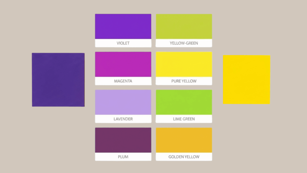
Different purple shades have slightly different complementary colors. The specific yellow or green shifts depending on purple’s red-blue balance.
- Violet (blue-heavy purple) – Opposite: Yellow-green or chartreuse
- True Purple (equal red and blue) – Opposite: Pure yellow
- Magenta (red-heavy purple) – Opposite: Green or lime green
- Lavender (light, cool purple) – Opposite: Pale yellow or soft butter
- Plum (dark, reddish purple) – Opposite: Golden yellow or mustard
- Indigo (deep blue-purple) – Opposite: Yellow-orange or amber
- Lilac (pinkish purple) – Opposite: Mint green or pale lime
- Grape (medium, cool purple) – Opposite: Lemon yellow
- Aubergine (very dark purple) – Opposite: Deep gold or bronze
- Orchid (bright pinkish purple) – Opposite: Spring green
Purple vs Yellow: Why This Color Combination Works So Well
Purple and yellow create one of the most striking color combinations in design. This pairing works because of how the human eye processes contrasting hues.
When complementary colors sit next to each other, they make each other pop. Purple appears richer and deeper. Yellow looks brighter and more energetic. Neither color competes for attention, yet both stand out.
This combination also balances warm and cool tones perfectly. Yellow brings warmth and sunshine. Purple adds coolness and depth. Together, they create visual harmony despite their contrast.
Brands often use purple and yellow for exactly this reason. The Lakers, Los Angeles’ basketball team, built their identity around these colors. Crown Royal whiskey does the same.
The pairing feels both bold and balanced, which explains its popularity across design fields.
Best Color Pairings With Purple Besides Yellow
Purple pairs beautifully with many colors beyond yellow. Each combination creates a different mood and serves various design purposes.
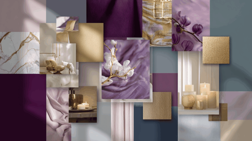
1. Gold: Gold and purple create a luxurious, regal combination. This pairing has royal associations dating back centuries. The metallic warmth of gold balances purple’s cool richness perfectly. It works well for elegant designs, wedding themes, and upscale branding.
2. White: White provides clean contrast against purple without overwhelming it. This pairing feels fresh and modern. Lighter purples like lavender look soft against white. Deeper purples gain drama and sophistication. It’s ideal for minimalist designs and contemporary spaces.
3. Gray: Gray tones down purple’s intensity while maintaining sophistication. Charcoal gray adds depth to lighter purples. Soft gray complements deeper purple shades. This neutral pairing works for professional settings and balanced interior design.
4. Pink: Pink and purple create an analogous color scheme that feels harmonious. These neighboring colors blend naturally together. The combination reads as feminine and playful. It’s popular for beauty brands, children’s designs, and creative projects.
5. Teal: Teal offers contrast without the intensity of yellow. This blue-green hue complements purple while staying cool-toned. The pairing feels modern and sophisticated. It works particularly well in graphic design and contemporary decor.
Common Mistakes When Using Purple and Its Opposite Color
Using purple and yellow together seems simple, but several common errors can ruin the visual impact and create unpleasant color clashes.
- Using equal amounts of both colors: This creates visual chaos instead of balance and makes the eye struggle to focus.
- Choosing the wrong shade intensity: Pairing bright neon yellow with soft lavender creates a jarring mismatch and poor harmony.
- Ignoring neutral space: Placing purple and yellow directly against each other without breathing room overwhelms the composition.
- Forgetting about lighting conditions: Colors shift dramatically under different lights, changing how complementary pairs interact and appear.
- Overlooking color psychology: Purple and yellow together can feel childish or cheap if not balanced with sophistication.
- Neglecting accessibility: Some purple-yellow combinations create poor readability for text, especially for colorblind viewers.
Final Thoughts
Purple’s opposite color is yellow, and this isn’t just trivia. It’s practical knowledge for anyone working with design, art, or decoration.
The color wheel explains why these two hues complement each other so perfectly. They create contrast, balance, and visual interest when used correctly.
This pairing appears everywhere, from sports teams to brand logos to interior design.
Understanding complementary colors opens up better design choices. The next time purple appears in a project, yellow might be exactly what it needs.