
I often find that choosing colors is the hardest part of starting a design project. Too many bright shades can feel busy, while very dark tones may look heavy.
That is why I often turn to a neutral color palette when I want something simple and balanced.
In this guide, I will share neutral color palette ideas that can work for many types of design. You can use them for graphic work, interior styling, fashion projects, or even website layouts.
Neutral tones are flexible, easy to mix, and help other design elements stand out.
I will walk you through palettes that mix soft beige, warm brown, gentle gray, and calm off-white shades. Each one offers a clean and modern feel without looking dull.
If you are looking for fresh color inspiration, these palette ideas can help you choose shades that feel calm, modern, and easy to use in many projects.
What Is a Neutral Color Palette?
A neutral color palette is a group of colors that feel calm, balanced, and easy on the eyes. These colors are not very bright or bold, which makes them simple to work with in many types of design.
Neutral shades often include white, beige, gray, taupe, brown, and soft black. Some palettes may also use cream, sand, or warm gray tones.
In design, neutral colors create a clean and stable base. They help other design elements stand out without making the overall look feel busy or overwhelming.
This is why many designers use neutral tones when they want a modern and simple style.
Neutral palettes are common in many design areas. You will often see them used in graphic design, branding, interior spaces, fashion, and website layouts.
Because these colors are flexible and easy to combine, they work well in both minimal and detailed designs.
Neutral Color Palette Ideas for Modern Design
Below are neutral palettes that work well across graphic design, interior projects, branding, and fashion. Each palette keeps the look simple while still adding depth and contrast.
1. Warm Sand and Soft Ivory
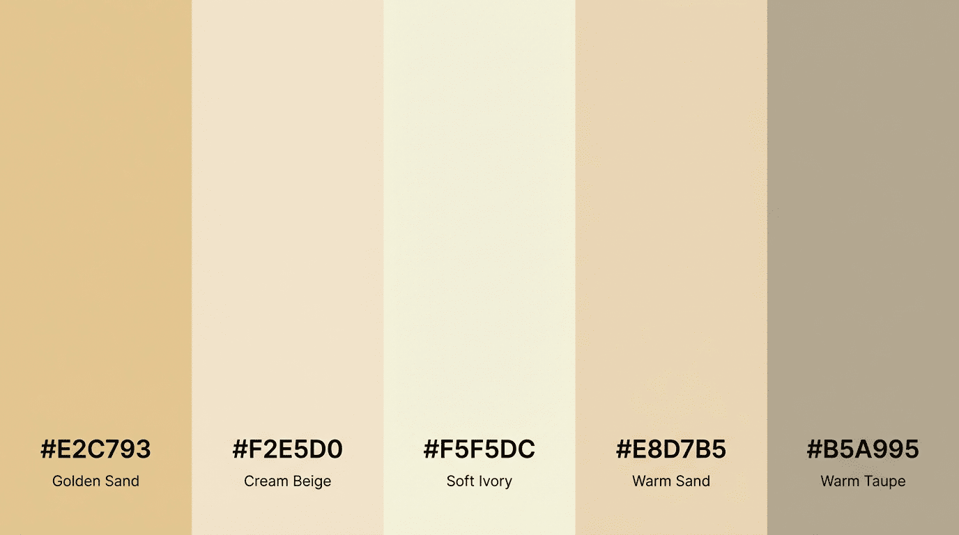
Warm sand paired with soft ivory creates a light and welcoming palette. These shades feel natural and relaxed, which makes them useful for many types of design.
Sand tones add gentle warmth, while ivory keeps the palette bright and open. Together, they create a soft visual balance.
This palette works well for websites, branding projects, and minimalist layouts. Designers often choose it when they want a calm and clean look that still feels warm instead of cold or plain.
2. Beige and Warm Gray
Beige and warm gray form a balanced neutral palette that feels both modern and comfortable. Beige adds a soft warmth, while warm gray brings a steady and grounded tone to the design.
When used together, they create a look that feels simple but still polished.
Designers often use this palette in website layouts, packaging, and brand visuals. The contrast between the two colors helps create depth without adding strong or distracting tones.
3. Cream and Soft Brown
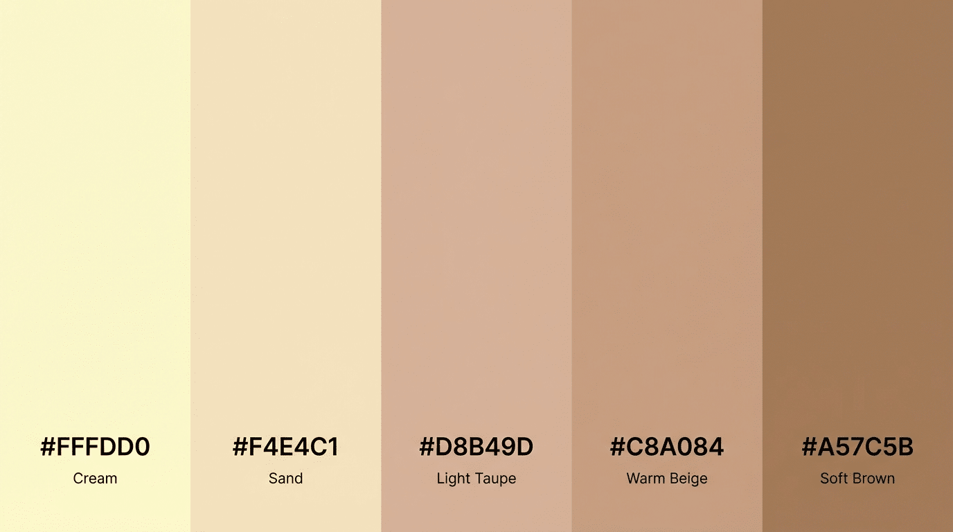
Cream and soft brown create a warm and relaxed palette that feels natural and inviting. Cream keeps the overall design light, while brown adds depth and structure.
This mix works well when designers want a neutral look that still has warmth.
This palette is often used in lifestyle branding, packaging design, and visual themes that aim to feel calm and welcoming.
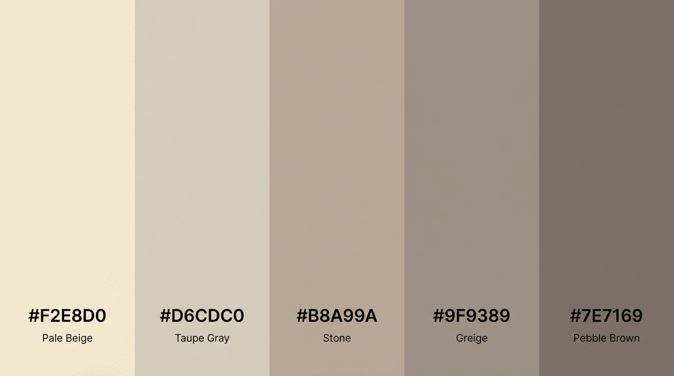
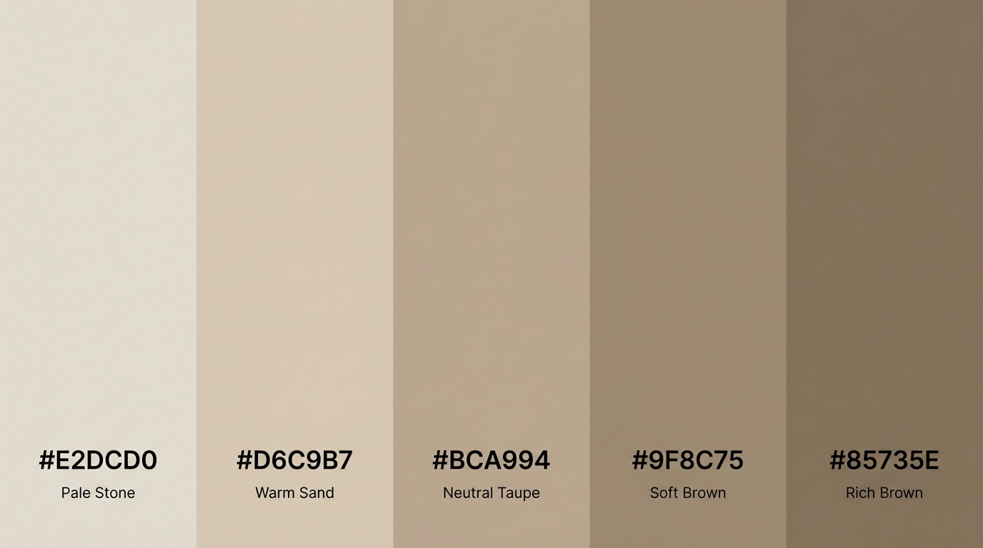
4. Taupe and Stone Gray
Taupe and stone gray create a refined neutral palette that sits between warm and cool tones. Taupe adds subtle warmth, while stone gray introduces a cool and stable base.
Together they form a balanced palette that feels modern and layered.
Designers often choose this palette when they want a neutral look that feels rich without adding bold colors. It works well in modern layouts, branding, and digital interfaces.
5. Soft Gray and Off White
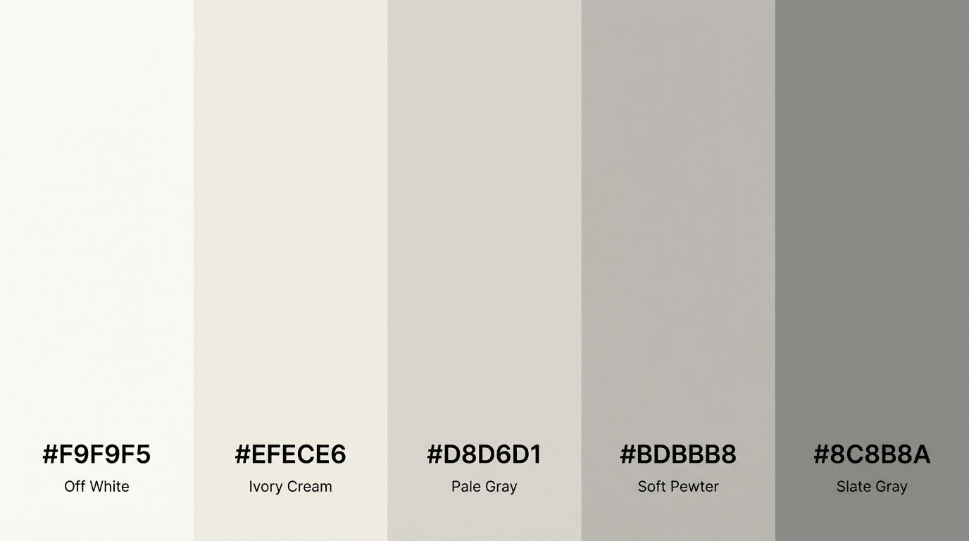
Soft gray paired with off-white creates a clean and minimal palette. Off-white brightens the design, while gray adds gentle contrast. This combination helps keep layouts simple and easy to read.
This palette is commonly used in website design, digital interfaces, and modern visual systems where clarity and simplicity are important.
6. Light Oak and Warm Beige
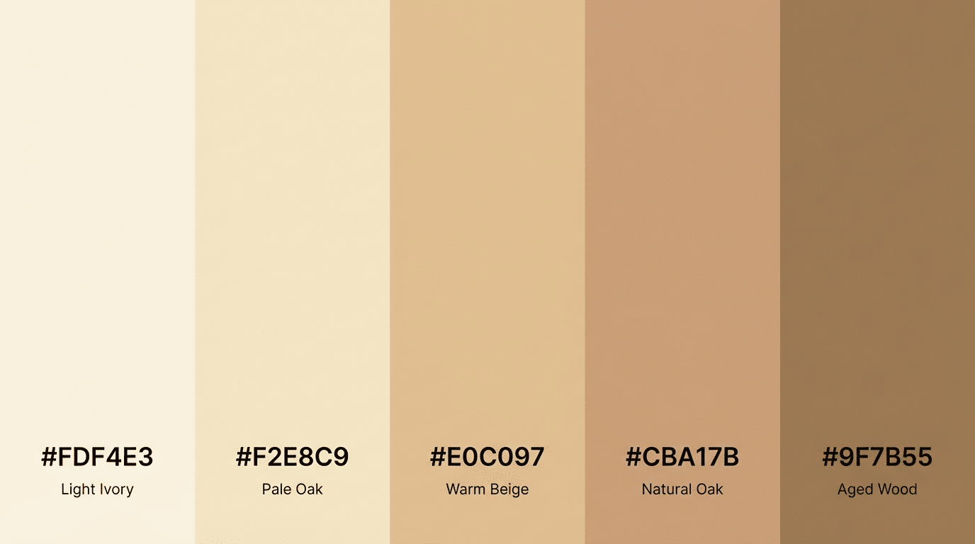
Light oak tones combined with warm beige create a grounded and natural palette. These colors feel earthy and calm while still keeping the design bright and open.
The subtle warmth in both shades helps maintain a comfortable visual balance. Designers often use this palette in lifestyle branding, packaging, and projects that aim to feel natural and relaxed.
7. Dusty Brown and Cream
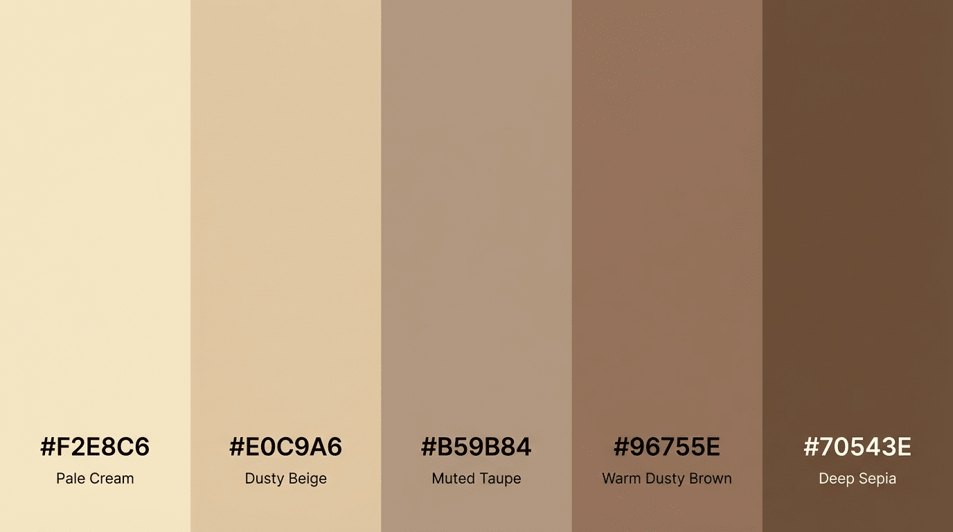
Dusty brown paired with cream creates a soft neutral palette that feels warm and balanced. Cream keeps the design light, while dusty brown introduces gentle depth and contrast. This mix prevents the palette from looking flat.
This palette works well in branding, editorial layouts, and design themes where a calm and natural tone is preferred.
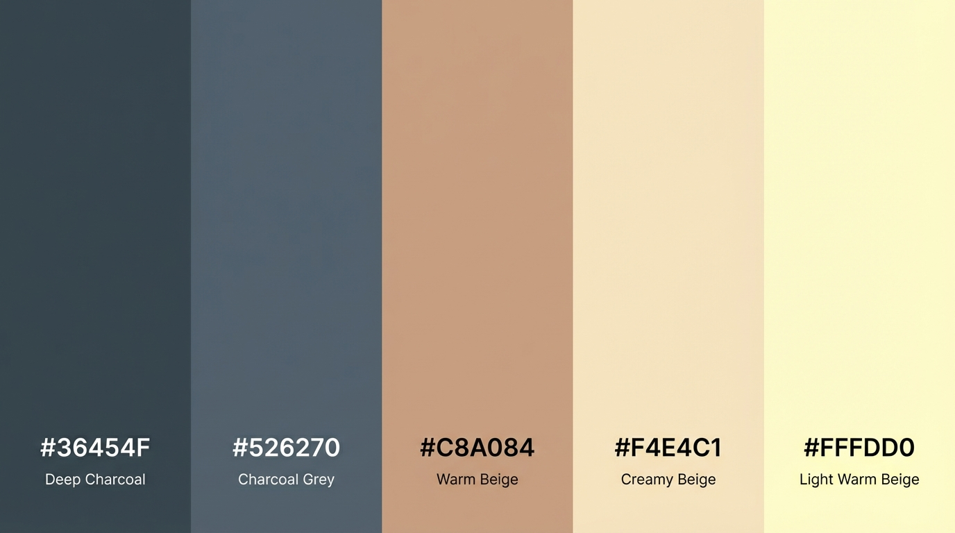
8. Cool Gray and Charcoal
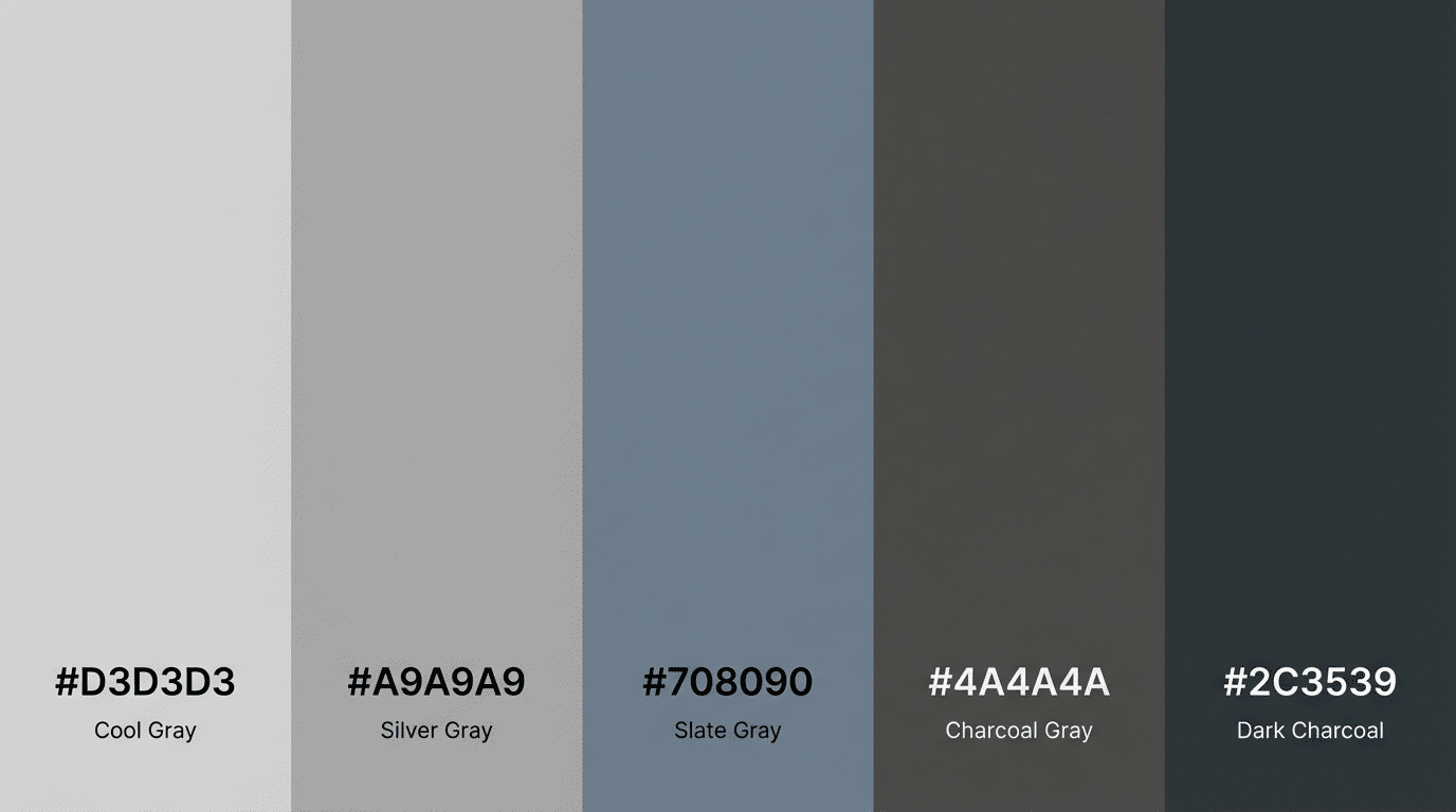
Cool gray and charcoal create a stronger neutral palette with deeper contrast. Gray provides a steady base, while charcoal adds bold depth. Even with the darker tone, the palette still feels modern and neutral.
Designers often use this palette in tech branding, product design, and website interfaces where clarity and strong contrast are important.
9. Soft Taupe and Ivory
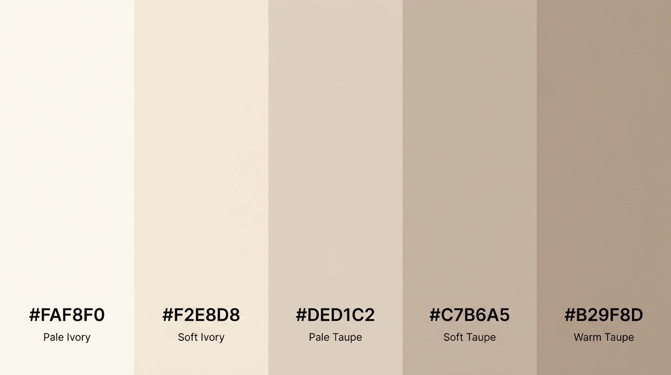
Soft taupe and ivory create a gentle and balanced palette that feels clean and refined. Ivory keeps the design light, while taupe introduces a soft warmth that adds dimension.
This palette works well for modern layouts, editorial design, and branding projects where a calm and polished appearance is important.
10. Warm Clay and Sand
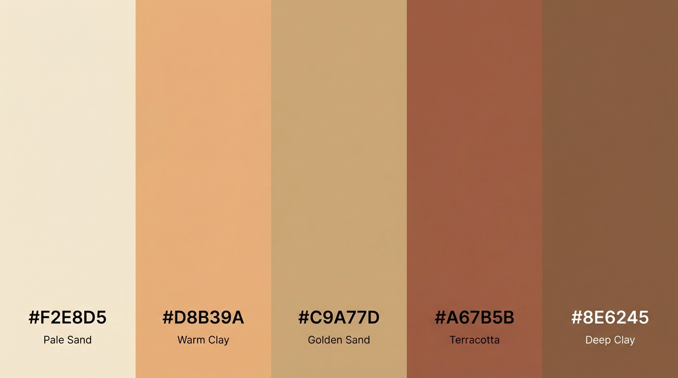
Warm clay mixed with sand tones creates a soft, earthy palette that feels natural and grounded. Sand tones keep the palette light, while clay introduces warmth and depth.
Designers often use this combination when they want a neutral palette that still feels warm and connected to natural tones.
11. Light Gray and Beige
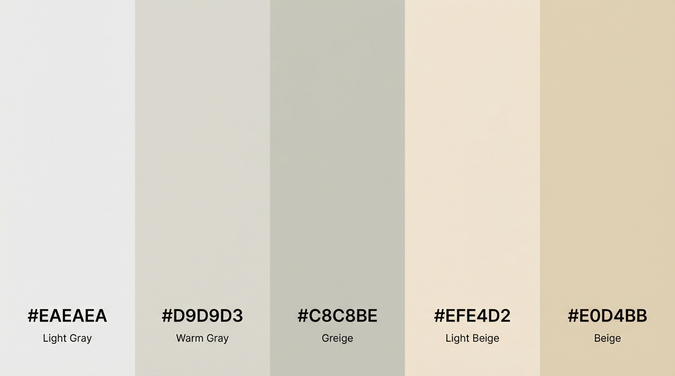
Light gray and beige create a balanced palette that mixes cool and warm neutrals. Gray adds a fresh and modern feel, while beige softens the palette and adds warmth.
This combination works well in many design areas because it feels flexible, calm, and easy to combine with other colors.
12. Mushroom and Warm White
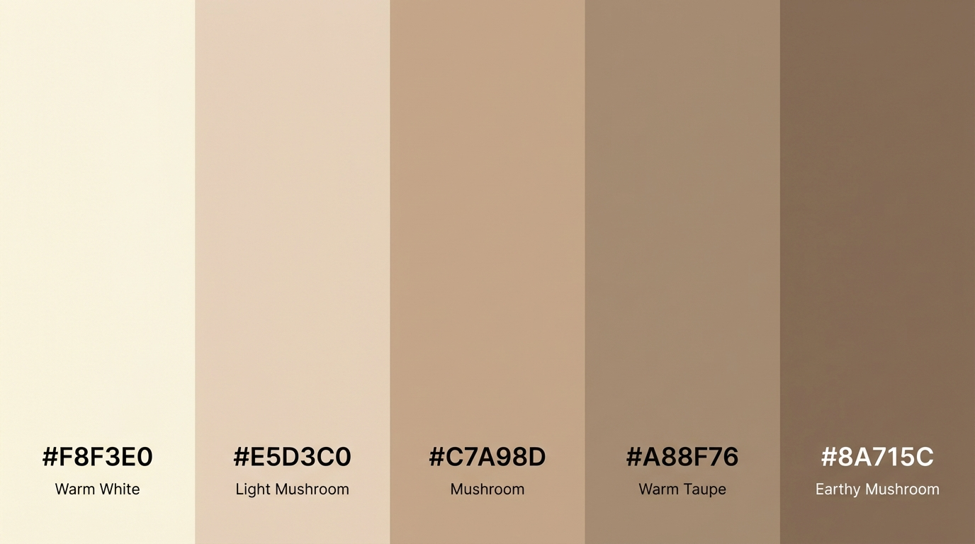
Mushroom tones paired with warm white create a soft and subtle palette. Mushroom shades add a muted depth, while warm white brightens the overall design.
This palette is often used in minimal layouts, branding, and modern design projects where gentle contrast is needed without strong color shifts.
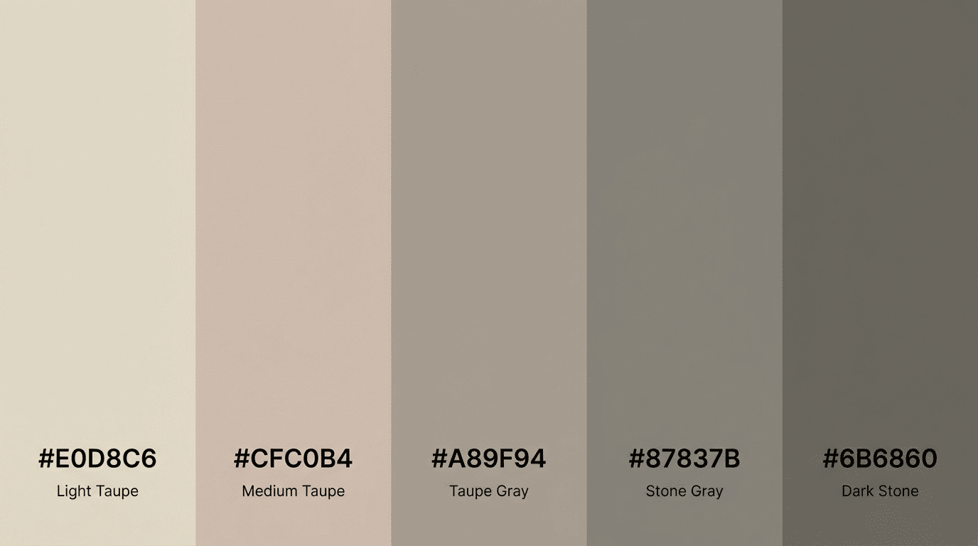
13. Stone and Soft Brown

Stone gray combined with soft brown creates a natural palette with balanced depth. The gray tone keeps the palette neutral, while brown introduces warmth and structure.
This mix works well in both digital and physical design projects because it feels stable, grounded, and easy to combine with other elements.
14. Pale Sand and Taupe
Pale sand and taupe create a calm and balanced palette that feels light and refined. Sand tones brighten the design, while taupe adds subtle depth.
Designers often use this palette in modern layouts where soft colors help maintain a simple and clean visual style.
15. Charcoal and Warm Beige
Charcoal paired with warm beige creates a strong yet balanced neutral palette. Charcoal adds bold contrast, while beige softens the overall look and keeps the design approachable.
This palette works well in modern branding, website layouts, and editorial design where designers want both contrast and warmth without using bright colors.
At the End
Neutral color palettes make design easier and more flexible. They help create a clean base while allowing other elements to stand out.
From warm sand and beige tones to deeper charcoal and gray shades, each palette offers a different mood.
The key is choosing colors that match the purpose of your project and the feeling you want the design to convey. The palettes in this guide can give you a starting point when you need calm, balanced colors for your work.
You can use them in graphic design, branding, digital layouts, or other creative projects. Try testing a few combinations to see what works best for your style and ideas.
Now I would love to hear from you. Which neutral color palette did you like the most? Share your thoughts or experiences in the comments below and join the conversation.