
Picking the right paint colors can feel harder than it should. I have faced this myself many times. You find one color you love, but you are not sure what to pair it with, and that can quickly become frustrating.
That is why I often recommend SW Alabaster. It is a soft, warm white that pairs well with so many colors, making decorating much easier.
It does not feel too bright or too cold, and that balance helps it fit into almost any space without much effort.
In this blog, I will walk you through the best colors that go with SW Alabaster, along with simple ways to use them in different rooms.
I will also share easy rules for building a color palette and point out common mistakes to avoid so you can feel more confident when choosing colors.
Why SW Alabaster Works With So Many Colors
SW Alabaster is not plain white. It has a warm undertone that leans slightly toward cream. That warmth is what makes it so easy to pair with other colors.
Cool whites can clash with warm tones, but Alabaster tends to blend easily. It is also not a stark or bright white. Softer whites like Alabaster sit comfortably next to both light and dark shades.
That gives more flexibility when choosing accent colors, furniture, or decor. One more thing worth knowing is how Alabaster responds to light. In bright natural light, it reads as a clean, soft white.
In lower light or in the evening, it can show off its warm, creamy tone. That shift actually works in its favor. It feels consistent without looking flat in any setting.
Best SW Alabaster Coordinating Colors
Here are seven colors that pair beautifully with SW Alabaster and work well in many areas of your home. These shades help you create contrast, warmth, or a soft blend without making the space feel too busy.
| Color Name | Color Family | Best Used For | Effect |
| SW Tricorn Black | Black | Doors, fixtures, trim | Bold, high-contrast look |
| SW Accessible Beige | Warm Beige | Walls, cabinets | Soft, seamless blend |
| SW Naval | Deep Blue | Accent walls, cabinets | Rich, dramatic depth |
| SW Repose Gray | Cool Gray | Bedrooms, living rooms | Calm, subtle contrast |
| SW Evergreen Fog | Earthy Green | Home office, shelves | Fresh, grounded feel |
| SW Iron Ore | Dark Neutral | Modern accents, doors | Strong, refined contrast |
| SW Urbane Bronze | Warm Brown | Cabinetry, accents | Warm, modern statement |
How to Use SW Alabaster Coordinating Colors at Home
Using SW Alabaster coordinating colors the right way can transform any room in your home. Here are seven practical ideas to help you pair colors with SW Alabaster in different spaces.
1. Create a Navy Accent Wall in the Living Room
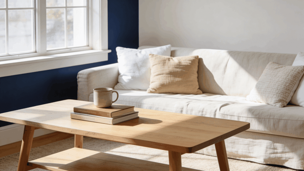
A navy accent wall is one of the most popular ways to use SW Alabaster coordinating colors in a living room. Paint one wall in SW Naval and keep the remaining walls in Alabaster.
The deep blue and soft white contrast creates a bold but balanced look. Add neutral furniture and natural wood pieces to complete the space.
This combination is easy to pull off and works well in both small and large living rooms without requiring major changes to existing decor.
2. Pair Beige Cabinets With Alabaster Walls in Kitchen
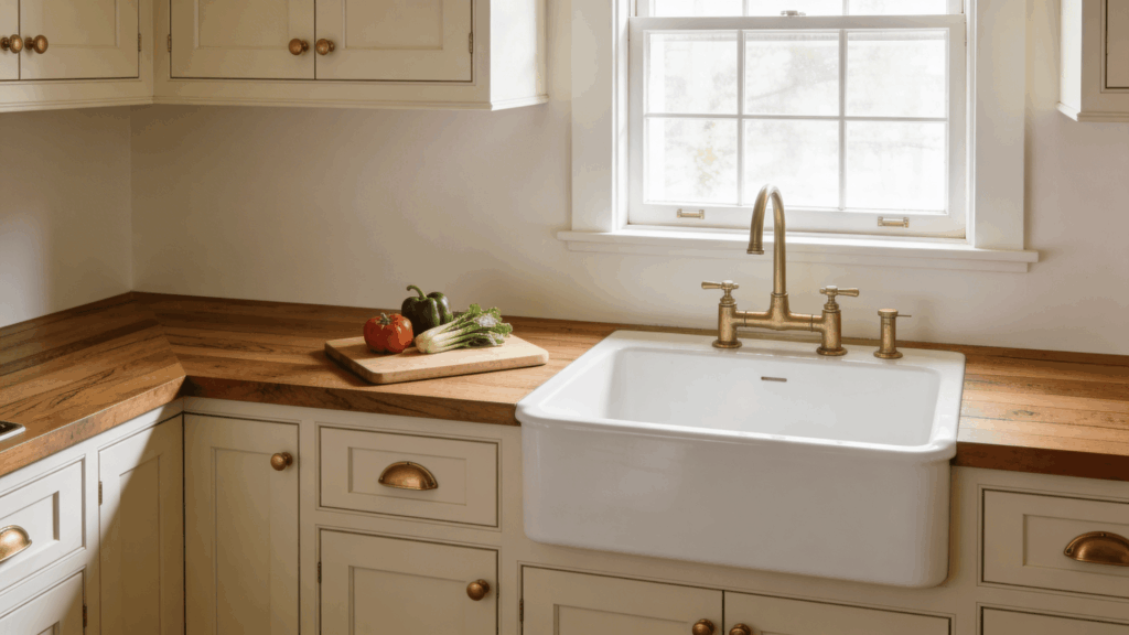
SW Alabaster walls with beige cabinets is a top kitchen color combination for homeowners who want a warm, cohesive look.
SW Accessible Beige on the cabinets shares the same warm undertones as Alabaster, making the two colors blend naturally. This pairing works well in kitchens with natural light and keeps the space feeling open and inviting.
Finish the look with wood countertops or warm-toned hardware to bring the SW Alabaster coordinating color scheme together in a simple, effective way.
3. Add a Gray Accent Wall in the Bedroom
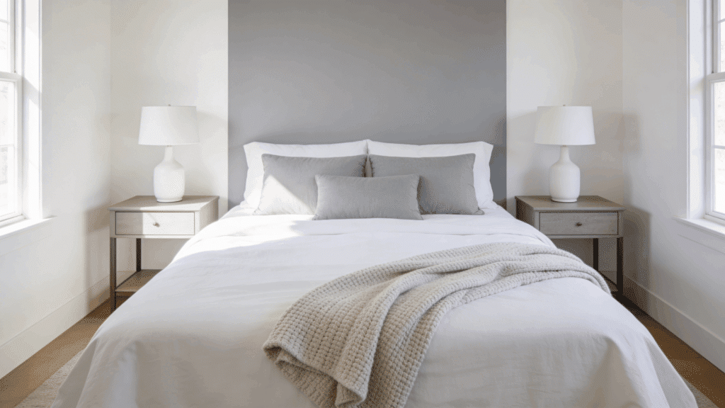
A gray accent wall is a simple and effective way to use SW Alabaster coordinating colors in a bedroom. SW Repose Gray works especially well because it is soft enough to keep the room feeling calm.
Place it on the wall behind the bed to create a natural focal point. This SW Alabaster and gray color combination is popular in master bedrooms and guest rooms alike.
Keep bedding and furniture in neutral shades to let the wall colors do the work without making the space feel too busy.
4. Use Black Fixtures in the Bathroom
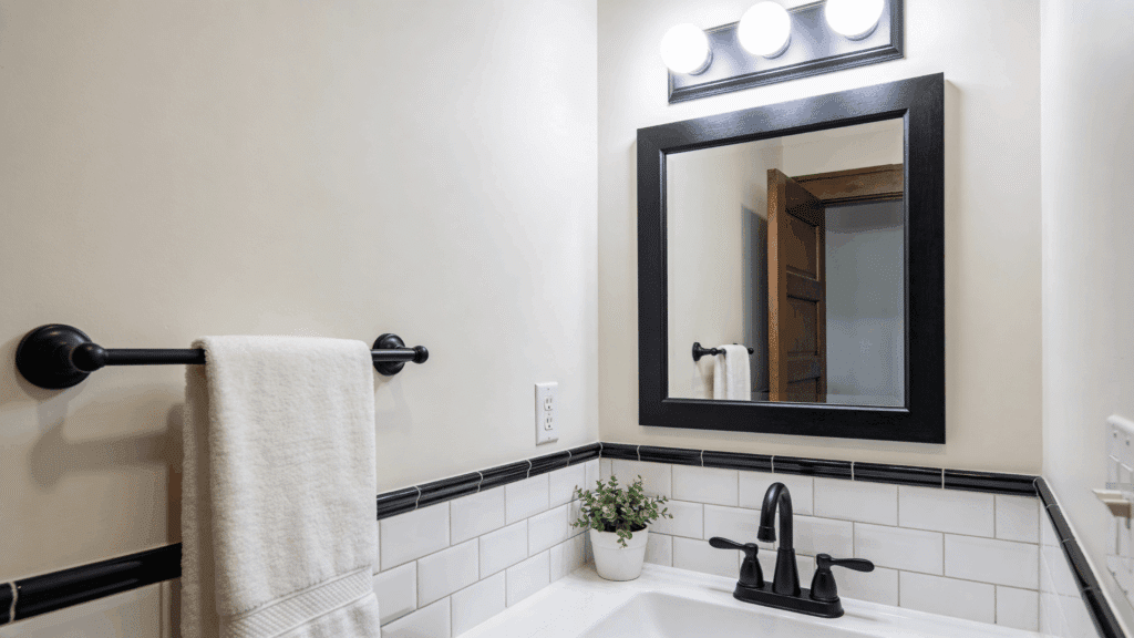
Black fixtures are a smart way to coordinate with SW Alabaster in a bathroom. Matte black faucets, towel bars, and light fixtures stand out cleanly against the warm white walls.
This SW Alabaster coordinating color pairing suits modern, farmhouse, and transitional bathroom styles. The contrast feels sharp and intentional without being overpowering.
Keep tiles and surfaces light to let the fixtures draw attention. This is a budget-friendly update that gives any Alabaster bathroom a more finished and polished overall appearance.
5. Paint Shelves Green in Home Office
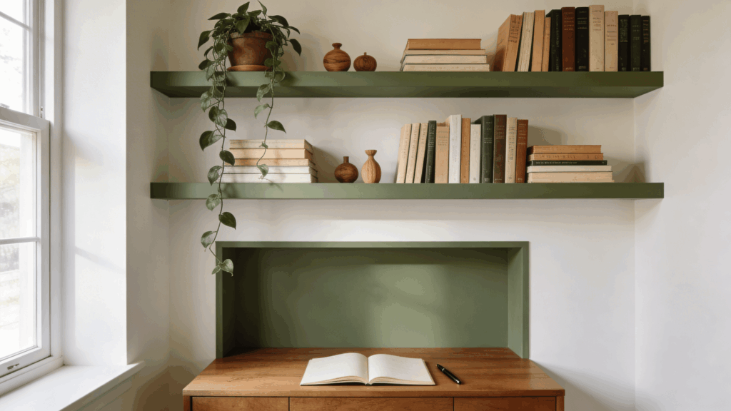
SW Evergreen Fog on shelves is a practical and appealing way to bring SW Alabaster coordinating colors into a home office.
The earthy green tone pairs naturally with the warm white walls and creates a calm, focused atmosphere. Painting only the shelves keeps the change subtle while still adding visual interest to the room.
This approach works well for people who want to add color without committing to a full accent wall. Add wood desk accessories or small plants to reinforce the natural, grounded feel of this color pairing.
6. Try Two-Tone Walls in Dining Room
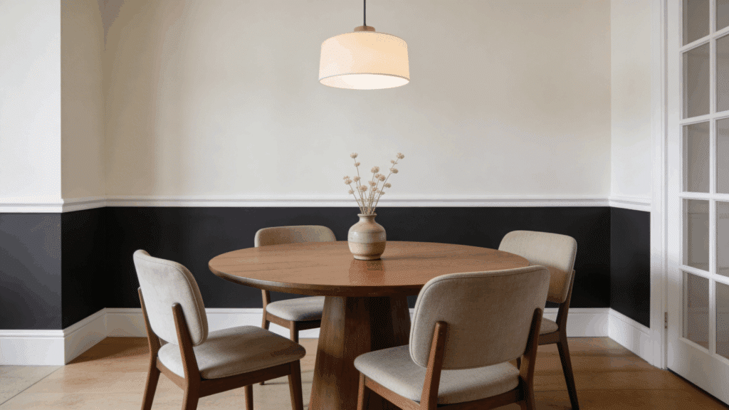
Two-tone walls are a strong design choice for anyone looking to use SW Alabaster coordinating colors in a dining room. Paint the lower half of the wall in SW Iron Ore or SW Naval, and keep the upper half in Alabaster.
Add a chair rail or trim line between the two sections for a clean finish. This SW Alabaster color combination adds character and depth to the dining room without the need for extra wall decor.
It is a straightforward technique that makes the space feel more intentional and well-designed.
7. Add Soft Pink Accents for a Cozy Space
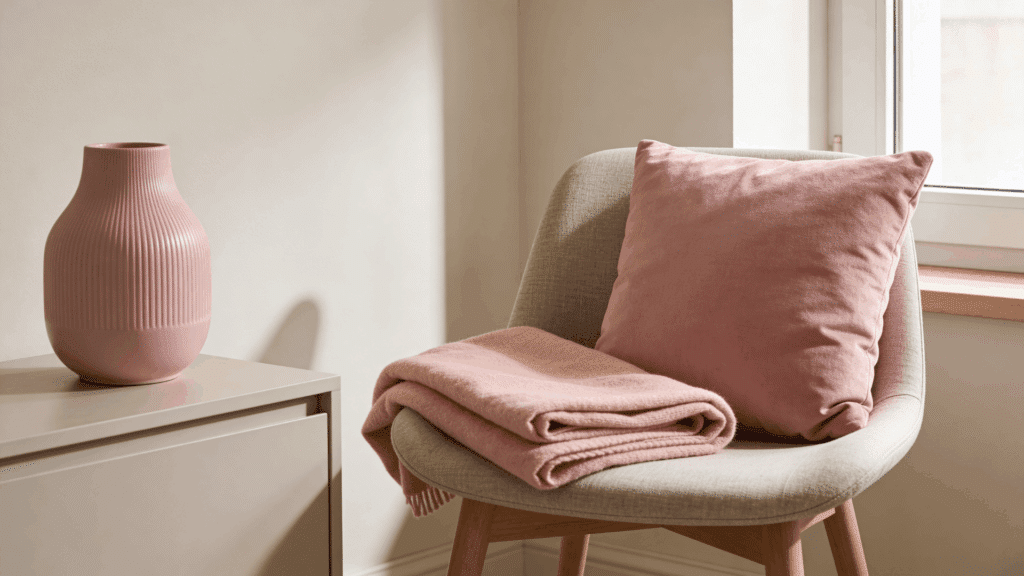
Soft pink is one of the most underrated SW Alabaster coordinating colors for creating a warm, cozy feel. This pairing works well in nurseries, reading corners, and bedrooms.
Use pink through pillows, throws, or a small accent chair instead of committing to a full wall color. The soft pink sits naturally against the creamy warmth of Alabaster without clashing.
Keep the rest of the room in neutral tones so the pink functions as a true accent. This is an easy, low-cost way to add warmth to any Alabaster space.
Simple Rules for Choosing the Right Coordinating Color
Picking a color to go with SW Alabaster does not have to be complicated. These five rules make the process much easier.
- Match Undertones First: Alabaster has warm undertones, so pairing it with other warm or neutral tones works best. Cool colors can sometimes clash if not chosen carefully.
- Use Contrast Wisely: A darker color next to Alabaster creates a strong visual break. Keep contrast balanced so one color does not overpower the other.
- Follow the 60-30-10 Rule: Use Alabaster as the dominant color across 60% of the space, a secondary color for 30%, and an accent for the remaining 10%.
- Test Colors in Real Lighting: Paint a small swatch and check it at different times of day before committing.
- Start Small with Bold Shades: Try a bold color on one wall or through accessories before using it across a full room.
Common Mistakes to Avoid
Even a great base color like SW Alabaster can fall flat if a few key things are overlooked. Knowing what to watch out for saves time, money, and a lot of repainting.
- Ignoring Undertones: Pairing a cool-toned color with Alabaster’s warm base can make the combination feel mismatched.
- Skipping Paint Testing: A color looks different on a wall than it does on a chip or screen, so always test before committing.
- Overusing Dark Shades: Too much dark color in one space can feel heavy, so keep it limited to accents or a single wall.
- Not Considering Lighting: Natural and artificial light both affect how a color reads, so check the pairing at different times of day.
Final Thoughts
SW Alabaster is one of those rare paint colors that I think makes decorating feel less stressful. It works with so many colors that there is no single wrong way to style it.
I think the key is to keep things simple and not overthink the process.
I suggest starting with just one color from this list. Pick the one that feels right for the room you are working on and see how it looks before adding anything else.
Most of the time, a simple two-color pairing is all a space needs to feel complete.
The best results I have seen always come from keeping it straightforward. Trust the process, test before committing, and let the colors do the work.
Have you tried pairing SW Alabaster with any of these colors? Share your experience in the comments below. I would love to hear what worked for you.