

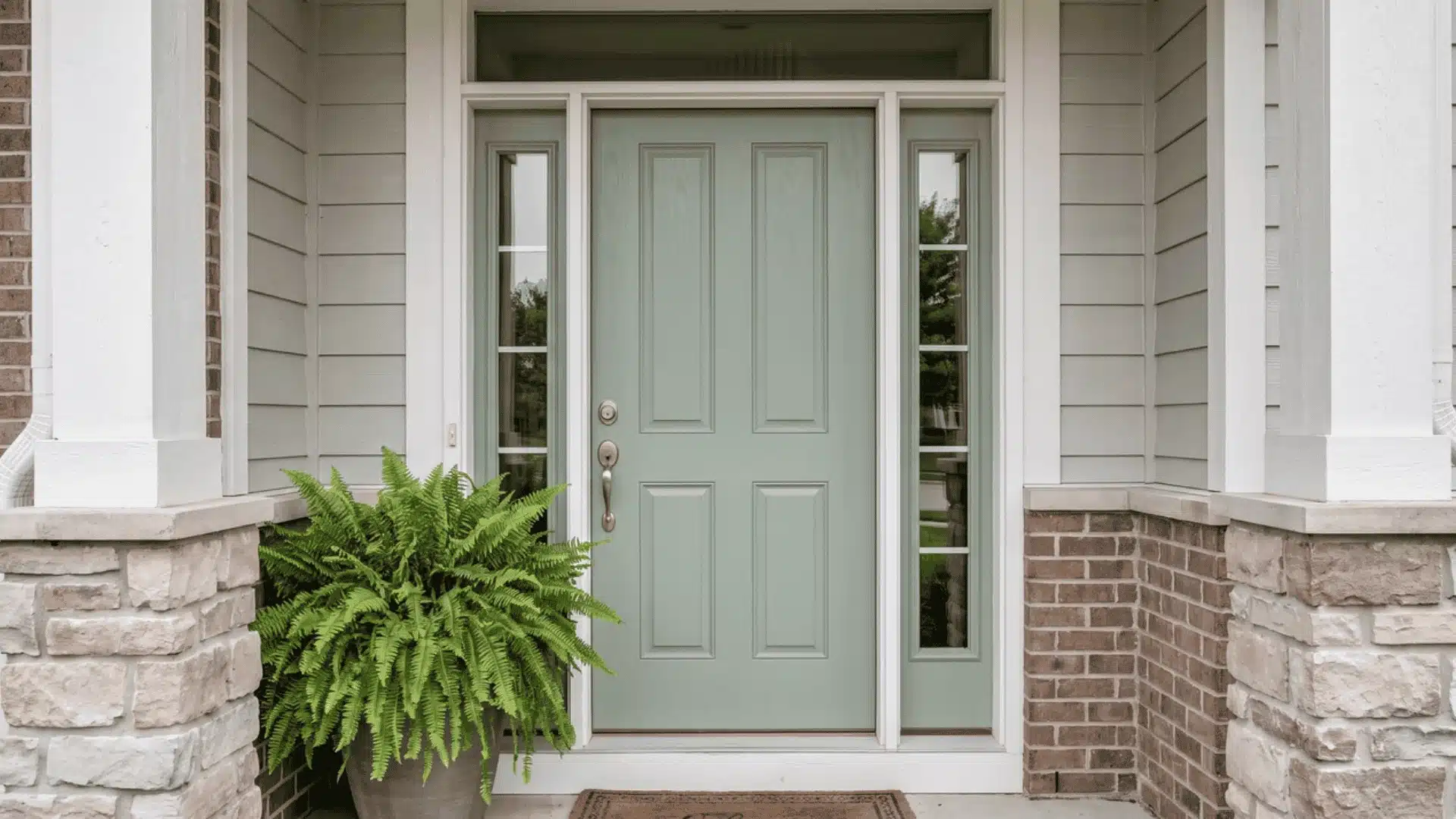
The wrong front door color can make an otherwise attractive exterior feel disconnected. With so many paint shades available, I understand why choosing one can become frustrating.
Learning how to pick a front door color starts with the parts of your home that are already fixed. You need to consider siding, brick, stone, roofing, trim, undertones, and natural light before reaching for a paintbrush. Personal taste still matters, but the shade must work with its surroundings.
Here, I help you compare contrast levels, match colors to common exteriors, account for climate and architecture, and test samples correctly. By the end, you can narrow your options and choose a color that feels balanced and practical.
How to Pick a Front Door Color
Choosing a front door color requires more than selecting a favorite shade. Learning how to pick a front door color means considering your home’s materials, style, lighting, and exterior conditions before making a final decision.
1. Identify the home’s fixed exterior colors: Review siding, brick, stone, roofing, trim, and other permanent features before selecting a shade.
2. Determine whether the palette is warm or cool: Understanding the exterior’s undertones helps avoid colors that clash with existing materials.
3. Decide whether the door should stand out or blend in: Choose between a bold focal point or a softer, coordinated appearance.
4. Choose a suitable color family: Narrow options based on your home’s style, materials, and desired mood.
5. Consider architecture, lighting, climate, and maintenance: These factors affect how the color looks and performs over time.
6. Test two to four shades outdoors: Check samples in real lighting conditions before committing to paint.
A well-chosen front door color connects your home’s materials, architecture, and surroundings. Testing samples outdoors helps create a balanced entrance that lasts.
Analyze the Colors Already Around Your Home
The front door should work with the complete exterior palette rather than matching one surface. Start by reviewing the siding, brick, stone, roofing, window frames, trim, and permanent hardscaping. Homes with mixed materials benefit from studying siding and brick pairings before choosing an accent shade.
Separate these colors into three groups:
- Dominant color: The main siding, brick, or exterior finish.
- Secondary color: Roofing, stonework, shutters, or large architectural details.
- Accent color: Trim, hardware, railings, and smaller decorative features.
Next, identify the undertones. Cream, tan, brown, rust, and some greens usually feel warm. Blue-gray, charcoal, crisp white, and certain stone shades often feel cool.
Small colors within brick or stone can also provide inspiration. Pulling out a subtle secondary tone usually creates a better connection than matching the material’s most dominant shade.
Decide Whether the Door Should Contrast or Coordinate
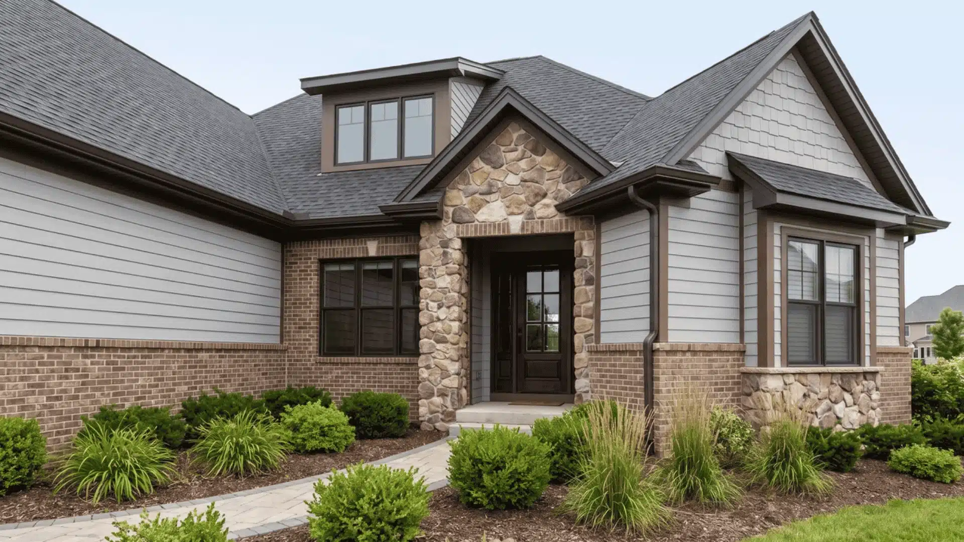
Your front door color affects how the entire entrance feels. Before selecting a shade, decide whether you want the door to become a focal point or blend naturally with your home’s exterior.
1. Create a Strong Focal Point
A contrasting color makes the entrance easier to see and adds personality to a simple exterior. It can be especially effective when the home has neutral siding or the doorway sits far from the street. Similar contrast principles appear across many farmhouse entrance designs.
Deep blue against beige, burgundy against muted green, or black against white can provide clear definition. The contrasting shade should still share a compatible undertone with the surrounding materials.
2. Create a Unified Exterior
A coordinated door uses colors already present in the siding, brick, stone, or trim. This approach works well for detailed exteriors where another bold feature could create visual competition.
Try a lighter or darker version of an existing exterior shade. Closely related colors can create a smooth transition without making the entrance disappear.
3. Use Subtle Contrast
The door does not need to be bright to stand out. Muted colors, rich neutrals, and slightly deeper shades can create separation while keeping the exterior balanced.
A dusty blue, olive green, warm charcoal, or muted burgundy can add character without overpowering surrounding architectural details.
Match the Front Door Color to Your Home’s Exterior
Knowing how to pick a front door color helps you compare materials, undertones, and architecture. Choose a shade that complements your exterior while creating balanced contrast. Reviewing broader house siding palettes can also clarify which accent families suit the dominant surface.
1. White or Cream Homes
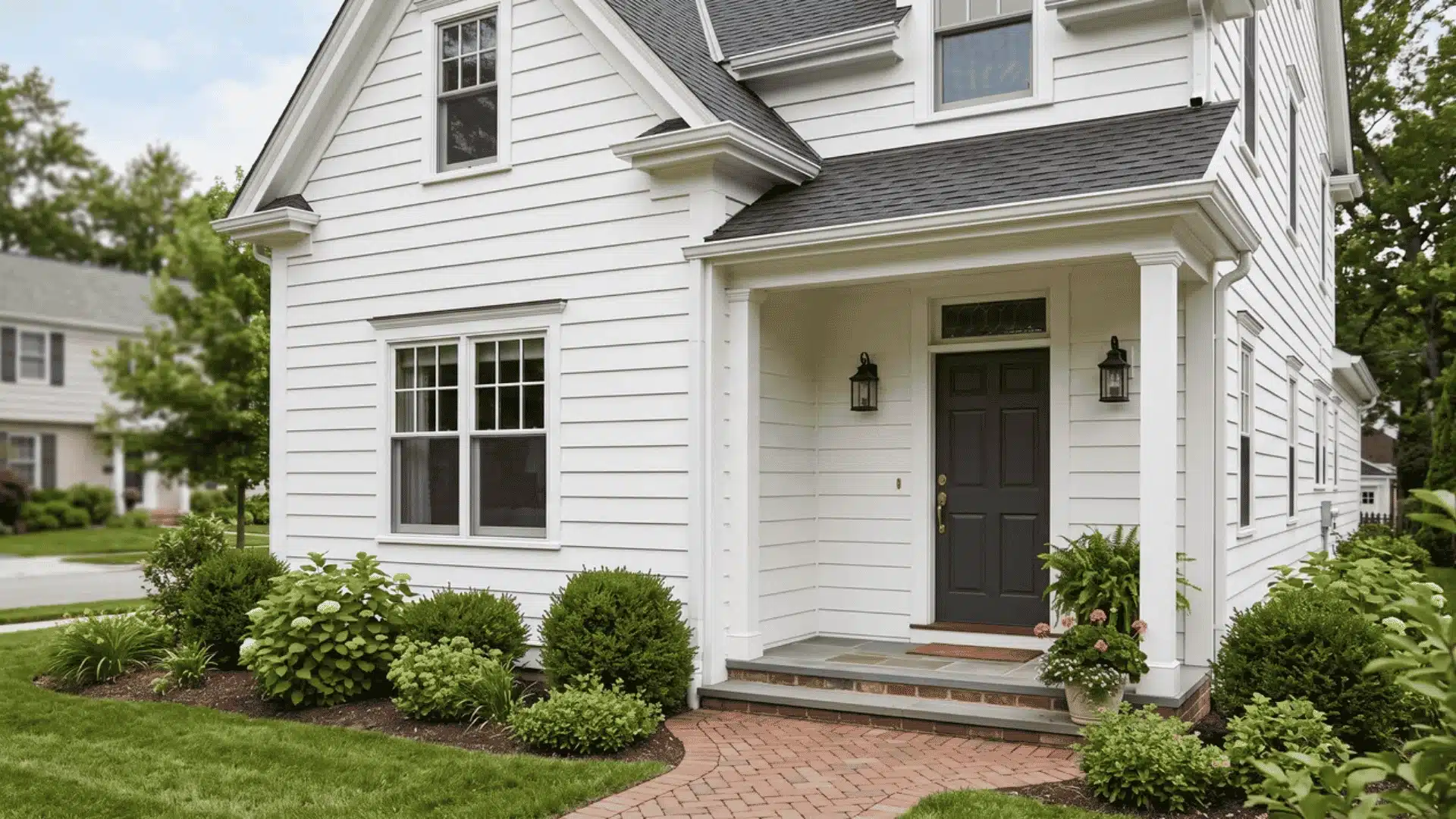
White and cream homes create a flexible background, allowing both classic and expressive front door colors. The right shade depends on the contrast level and warmth you want.
- Black, navy, forest green, burgundy, and charcoal: Create a timeless entrance while adding definition without overpowering the clean exterior.
- Yellow, teal, coral, and red: Add personality and create a stronger focal point when you want the door to stand out.
- Crisp white exteriors: Usually support sharper contrast because darker or brighter shades create a clear visual difference.
- Cream exteriors: Often pair better with warmer colors that complement their softer undertones.
The best front door color for white or cream homes balances contrast and connection. Choose a shade that enhances the exterior while reflecting your preferred style.
2. Gray Homes

Gray homes require careful color selection because the base tone can change how other shades appear. Checking the undertone helps create a more connected and balanced entrance.
- Navy and black: Create a classic contrast and add definition, especially against lighter gray exteriors.
- Deep green and burgundy: Add warmth and depth while creating a richer entrance.
- White and muted yellow: Brighten gray exteriors and add a softer focal point.
- Check the gray undertone: Cool grays often pair better with cooler shades, while warmer grays support earthy and warmer colors.
The right front door color should complement the gray’s underlying tone. Choosing a shade that works with the undertone prevents the entrance from feeling disconnected.
3. Beige or Tan Homes
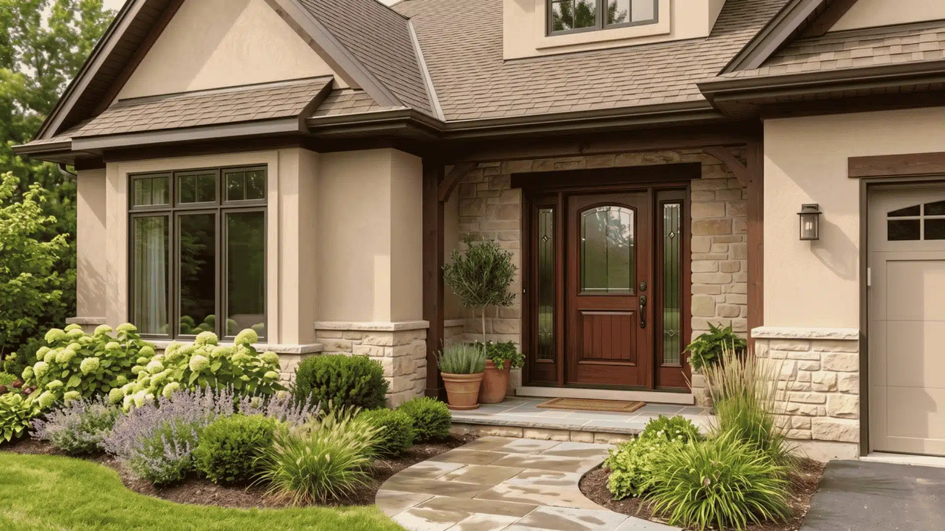
Beige and tan homes work well with colors that add depth while maintaining a warm, balanced appearance. The right shade should complement the natural warmth of the exterior.
- Olive and dark green: Add an earthy feel and connect well with warm exterior materials.
- Brown: Creates a natural, grounded look that works well with wood, stone, and traditional designs.
- Navy: Adds contrast while maintaining a classic and refined appearance.
- Muted red and warm teal: Introduce personality without overpowering the soft exterior palette.
- Avoid overly cool shades: Colors with strong blue or icy undertones may feel disconnected from golden or warm beige siding.
A well-chosen front door color enhances beige and tan homes by adding contrast while keeping the overall exterior feeling connected and inviting.
4. Brick and Stone Homes
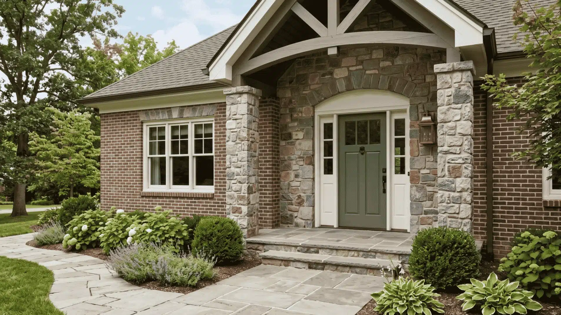
Brick and stone homes need careful color selection because natural materials contain multiple shades and textures. Look for subtle undertones that connect with the exterior instead of matching the strongest color.
- Navy, black, and forest green: Create a classic contrast with red brick while adding depth and definition.
- Warm gray, cream, and muted blue: Soften red brick exteriors and create a balanced appearance.
- Dark brown and charcoal: Complement brown brick and stone with a rich, grounded look.
- Olive, cream, deep blue, and rust: Work well with earthy stone tones and create a natural connection.
The best front door color should highlight the character of brick and stone while creating a cohesive entrance that feels connected to the home.
5. Dark Exteriors
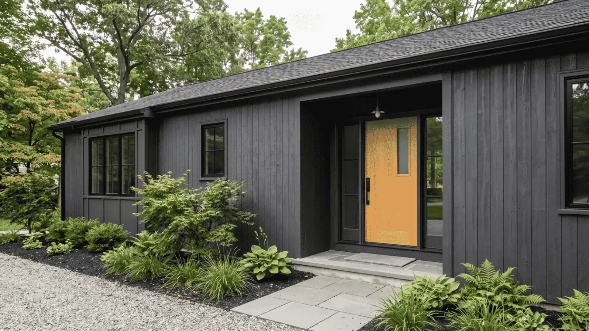
Dark exteriors often need a front door color that creates separation and improves visibility. Lighter or warmer shades can brighten the entrance while adding balance.
- Warm white and soft gray: Create a clean contrast and help the doorway feel more open.
- Pale blue and blush: Add a softer touch while creating distinction against darker surfaces.
- Yellow: Brings energy and creates a noticeable focal point on deep exterior colors.
- Natural wood: Adds warmth and texture while connecting with earthy materials.
- Dark doors: Can still work, but they need contrast from trim, hardware, or surrounding details to avoid blending in.
The right front door color can bring balance to dark exteriors by adding definition while keeping the overall design connected.
Choosing a front door color becomes easier when you consider your home’s materials, undertones, and architectural style. The right shade should enhance the exterior while creating a balanced and welcoming entrance.
Additional Factors That Shape Your Front Door Color Choice
Your front door color is influenced by more than personal preference and exterior tone — sunlight, climate, landscaping, home size, and finishing details like trim and hardware all play a role in how the shade looks and performs over time.
Light Exposure: Outdoor light affects color perception throughout the day. Direct sunlight can brighten shades, while deep shade may make darker colors appear heavier or less visible.
Climate and Weather: UV rays, humidity, rain, salt, snow, and heat exposure all affect fading and maintenance, and can determine whether a darker color stays practical long-term.
Landscape and Home Size: Your surroundings and home scale matter too. Use landscaping for inspiration, but prioritize permanent materials, and factor in street distance and entrance size when deciding how much contrast to use.
Trim Coordination: Contrasting trim creates definition, while matching trim offers unity. Sidelights can either increase visual impact or provide useful separation.
Hardware Finish: Brass, bronze, black, chrome, and nickel hardware all influence the entrance’s style, repeating just one or two finishes creates a more connected, intentional look.
Paint Sheen: Sheen affects both durability and appearance. Satin hides flaws well, semi-gloss cleans up easily, and interior versus exterior formulations may suit each space differently.
Test Front Door Colors Before Making the Final Choice
Testing front door colors before painting helps prevent costly mistakes. A shade that looks good on a small chip or screen may appear different beside exterior materials and outdoor lighting.
Before buying physical samples, you can narrow options using free online visualizers from brands like Behr’s Color Visualizer, Sherwin-Williams’ Color Visualizer, or Benjamin Moore’s Personal Color Viewer. These tools help shortlist two to four possible shades.
Digital previews are useful for planning, but they cannot replace real outdoor testing. Screen colors and lighting conditions may differ from your actual entrance and surrounding materials.
Apply physical samples to large boards near trim, siding, brick, or stone. Check them in the morning, afternoon, evening, sun, and shade, then compare from different distances before choosing. Confirm hardware, décor, and HOA rules before painting.
Common Front Door Color Mistakes
Avoiding common mistakes helps you choose a front door color that fits your home’s exterior, style, and long-term needs.
- Ignoring undertones: A color that looks good alone may clash with brick, siding, trim, or other exterior materials.
- Matching only the siding: Roofing, stone, brick, and hardscaping also influence how the final door color appears.
- Trusting small paint chips: Indoor samples can be misleading because outdoor light changes how colors look.
- Using too many competing accents: The door should work with trim, shutters, hardware, and décor without creating visual clutter.
- Choosing poor contrast: A door with too little contrast may disappear, while excessive contrast can feel disconnected.
- Ignoring climate and entrance details: Sun exposure, maintenance needs, sidelights, and hardware can affect the final appearance.
A successful front door color should support your home’s materials, style, and surroundings. Avoiding these mistakes helps create a balanced and lasting entrance.
Create an Entrance That Feels Connected
A front door color works because it belongs with the exterior, not because it looks attractive on a paint card. I recommend beginning with fixed materials, identifying their undertones, and deciding how much contrast you want.
Knowing how to pick a front door color means considering architecture, sunlight, climate, landscaping, trim, hardware, and paint sheen. These details influence how the shade appears and performs over time.
Digital visualizers can help you create a shortlist, but large outdoor samples provide the reliable comparison.
Take photographs, test two to four colors throughout the day, and view them from the street. Once you find the best match, share your choice or read my related exterior color articles.
Frequently Asked Questions
Should a Front Door Be Lighter or Darker Than the House?
A front door can be lighter or darker than the house as long as the contrast feels intentional. A darker door creates stronger definition against light exteriors, while a lighter door can brighten darker homes. The most important factor is making sure the color’s undertones work with the siding, trim, brick, stone, and other exterior materials.
What Is the Most Welcoming Front Door Color?
There is no single welcoming color for every home, but some shades naturally create an inviting appearance. Blue often feels calm, green connects with outdoor surroundings, warm yellow adds energy, muted red creates warmth, and rich neutrals provide a classic look. The best choice depends on the home’s style and exterior palette.
What Front Door Color Has the Best Curb Appeal?
Navy, black, deep green, red, and natural wood are popular choices because they work with many home styles. However, curb appeal depends on more than the color itself. A shade that suits the materials, lighting, and architecture will usually create a stronger result than choosing a color simply because it is popular.
Should the Front Door Match the Shutters?
The front door does not need to match the shutters. Matching creates a traditional appearance, but different colors can add more personality. The two elements can still feel connected through similar undertones, color depth, or the same overall color family.