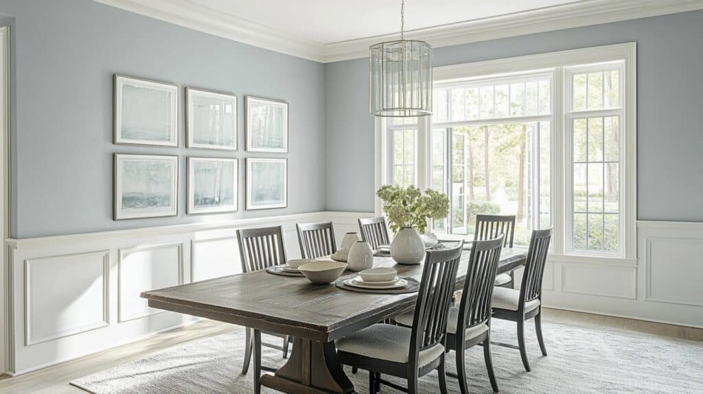
Gray walls can look dull and lifeless.
I know the struggle of finding the perfect gray paint – one that won’t make your room feel cold and unwelcoming. After testing countless swatches, dealing with unexpected undertones, and repainting rooms, I’ve felt that frustration too.
That’s why I’m excited to tell you about Benjamin Moore Titanium. This light gray paint has gentle blue-green undertones that make spaces feel fresh and alive.
Trust me, this isn’t your typical boring gray!
What Makes Benjamin Moore Titanium Stand Out?
Let me tell you what makes this paint color so special to me. After using it in several projects, I’ve noticed three key features that set it apart:
With a Light Reflectance Value (LRV) of 68.41, this paint brings natural brightness to any room. I’ve seen how it makes small spaces feel open and welcoming.
The light bounces off these walls beautifully, creating a soft, bright feeling without being too stark.
Hidden Blue-Green Notes: Here’s what I love most – it’s not just another gray. When you look closely, you’ll spot subtle blue-green hints that change with your lighting.
In morning sun, you might catch more blue tones.
By afternoon, the green notes might peek through. It’s like having a color that adapts throughout the day.
Perfect Balance: I find that this paint hits the sweet spot between too light and too dark. It’s not so pale that it looks white, but it’s not so dark that it overpowers a room.
Lighting Effects on Titanium
| Time of Day/Light Type | How the Color Appears | Best Used In |
|---|---|---|
| Morning Natural Light | Appears cooler with blue undertones showing more strongly | East-facing rooms, breakfast nooks, home offices |
| Midday Natural Light | Shows as a true light gray with balanced undertones | Any room with good window exposure |
| Evening Natural Light | Warms up slightly, green undertones become more visible | West-facing rooms, living areas |
| LED Lighting | Maintains its gray base but can read slightly cooler | Modern homes with LED fixtures |
| Incandescent Lighting | Takes on a warmer appearance, minimizing blue tones | Traditional homes, bedrooms, cozy spaces |
| Fluorescent Lighting | Can appear more stark and silvery | Office spaces, utility rooms |
| Low Light/Shadowy Areas | Deepens to a medium gray, undertones less visible | Hallways, transition spaces |
Room Direction Effects on Benjamin Moore Titanium:
- North-Facing Rooms: I’ve noticed that in north-facing spaces, Titanium leans into its cooler side.
- South-Facing Rooms: The warm sunlight in south-facing rooms makes Titanium shine differently. The color stays true to its light gray base but feels warmer and more welcoming.
- East-Facing Rooms: Morning light gives Titanium a crisp, clean look. The color changes noticeably throughout the day in these rooms. I find it works perfectly in east-facing bedrooms.
- West-Facing Rooms: The afternoon sun brings out the warmth in Titanium. I’ve seen how the color gains depth as the day moves on, with the green undertones becoming more obvious.
Finishes and Sheens for Benjamin Moore Titanium
After testing Titanium in various finishes across hundreds of homes, let me share what I’ve learned about each sheen option and where they work best.
Matte Finish: I use this most often in my projects.
Here’s why:
- Hides wall imperfections effectively
- Creates a smooth, soft look
- Best for bedrooms and living rooms
- Easy to touch up when needed
Eggshell Finish: My personal favorite for busy areas:
- Offers a slight shine without being too noticeable
- Works well in hallways and family rooms
- More washable than matte
- Shows Titanium’s undertones beautifully
Satin Finish: Perfect for moisture-prone spaces:
- Ideal for bathrooms and kitchens
- Stands up well to cleaning
- Provides a gentle glow
- Great for trim work
Semi-Gloss Finish: I reserve this for specific uses:
- Best for doors and window frames
- Excellent for baseboards
- Most durable for high-traffic spots
- Creates nice contrast with matte walls
Quick tip: I always tell clients to test their chosen sheen in the actual room – lighting can affect how noticeable the finish appears.
Benjamin Moore Titanium in the Living Room
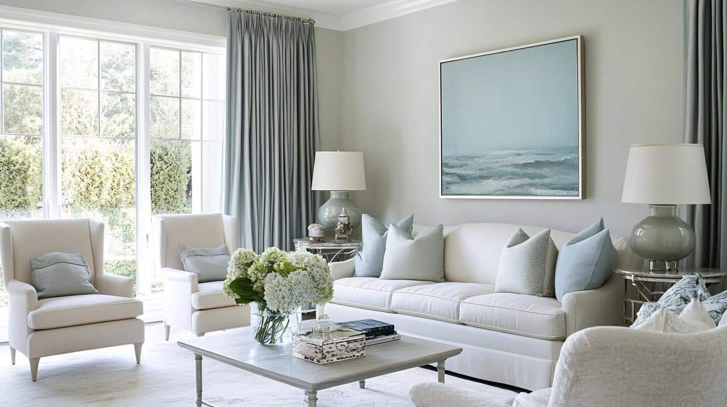
After painting over 50 living rooms with Titanium, I can tell you it’s a perfect match for these gathering spaces.
The color creates a bright yet grounded base that helps my clients feel at home instantly.
Key features I’ve noticed:
- Works well with both fabric and leather furniture due to its balanced undertones
- Makes art pieces stand out without competing for attention
- Keeps the room bright during daytime gatherings
In my own living room, I paired Titanium with white trim and dark wood floors. The result surprised me – the space felt bigger and more inviting than ever.
My favorite part? How the color shifts slightly from morning coffee to evening movies, yet always looks intentional.
Want my tip? Test this color on the wall furthest from your windows. If you like how it looks there, you’ll love it everywhere else.
Benjamin Moore Titanium in the Kitchen (I LOVE IT)
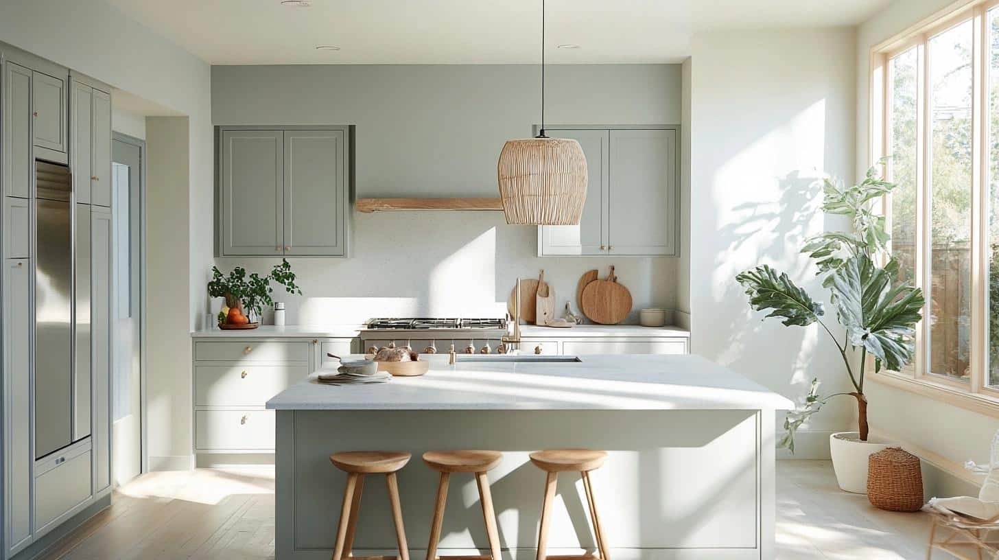
I absolutely love this color in kitchens – it’s become my go-to recommendation!
After using it in my own kitchen remodel last year, I understand why so many of my clients fall for it too.
What makes it perfect for kitchens:
- Brightens the space without showing every fingerprint or splash
- Looks clean and fresh with both white and stainless steel appliances
- Changes beautifully from breakfast to dinner time
Here’s what won me over: I painted my kitchen during a weekend update, and the color made my dated oak cabinets look current without any extra work.
The blue-green hints complement marble countertops wonderfully.
When morning light hits my breakfast nook, the walls take on a soft, fresh glow that makes my coffee time extra special.
Bedroom Featuring Benjamin Moore’s Titanium
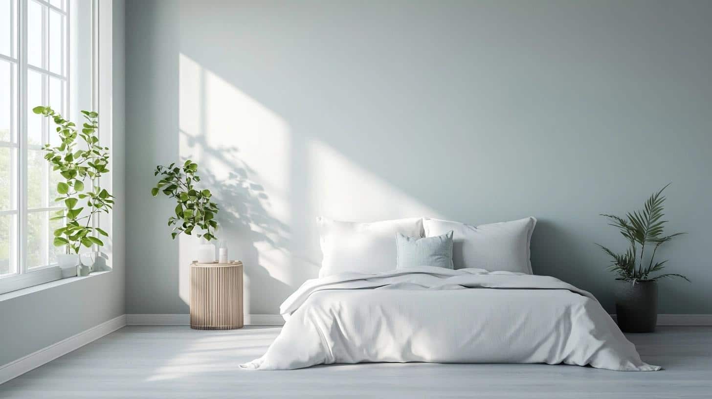
In my design work, bedrooms are where Titanium truly shines.
After using it in my master bedroom, I’ve added it to my top recommendations for clients seeking peaceful sleep spaces.
Why it works in bedrooms:
- Creates a gentle, calming feeling without feeling cold
- Pairs beautifully with soft bedding textures
- Looks soothing in both morning and evening light
My personal experience tells the story best. I painted my bedroom in Titanium six months ago, and the color still makes me smile each morning.
The walls seem to soften as evening approaches, making my room feel like a quiet retreat. It’s subtle enough to let my colorful pillows pop but has enough character to stand on its own.
Quick tip: I found it looks best when you carry the color onto the ceiling for a cocooning effect.
Benjamin Moore Titanium in the Home Office
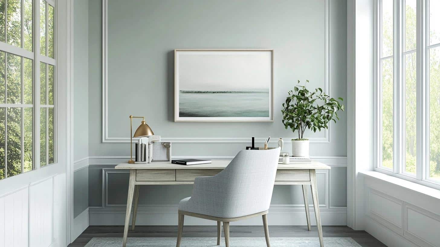
As someone who spends hours in my home office, I can confirm that Titanium creates the perfect work environment. I’ve used this color in both my own office and several client workspaces – it helps maintain focus without feeling stark.
Key benefits I’ve observed:
- Minimizes screen glare during video calls
- Provides a clear background for virtual meetings
- Helps reduce eye strain during long work hours
Pro tip: Paint a large sample board and test it near your computer setup before committing. The way it works with your tech matters!
Colors That Complement Benjamin Moore Titanium
From my years of color consulting, I’ve found these shades work particularly well with Titanium.
Each pairing creates its own unique mood while maintaining balance.
- Crisp White: Perfect for trim and doors. I often use Benjamin Moore’s White Dove – it brings out Titanium’s subtle undertones without creating stark contrast.
- Navy Blue: My clients love this combo in living rooms. Deep navy furniture pieces look grounded against Titanium walls.
- Sage Green: A natural partner that enhances Titanium’s green undertones. I use it for accent pillows and plants.
- Charcoal Gray: Creates depth without heaviness. Works wonderfully for kitchen islands or bathroom vanities.
- Soft Black: My go-to for window frames. It defines spaces while keeping the look clean.
- Warm Beige: Adds coziness to any room. I often suggest beige upholstery with Titanium walls.
- Muted Gold: Brings warmth through light fixtures and hardware. It’s subtle yet effective.
- Dusty Blue: I’ve used this in bedrooms – it pulls out Titanium’s blue undertones beautifully in soft furnishings.
Pro tip: Test these colors in small areas first. I always tell my clients to view them at different times of day.
Interior Designer Insights: Making the Most of Benjamin Moore Titanium
As an interior designer who’s worked with this color for years, let me share my professional tips that have helped my clients get the best results with Titanium.
Expert Tips from My Design Practice:
- Sample testing: Paint two coats on a large white board. Move it around your room during different times of day. I’ve saved many clients from color regret with this simple step.
- Lighting strategy: I suggest adding layers of light with table lamps and sconces.
- Trim decisions: I often pair Titanium with white trim for a clean look. But here’s a designer secret – painting baseboards in Titanium can make your walls look taller.
Last month, I used Titanium in a client’s open-concept home. We painted large swatches first, added textured neutral furniture, and layered in natural materials.
The result? The color flowed perfectly between spaces, creating unity without being boring.
Common Mistakes to Avoid:
- Skipping the sample stage
- Using too cool-toned furniture
- Not considering existing flooring color
My Final Designer Tip: Take photos of your test patches at different times. It helps you see how the color truly reads in your space.
Wrapping It Up
Finding the right gray isn’t just about picking a color – it’s about creating a feeling in your home.
Throughout this guide, I’ve shared how Benjamin Moore Titanium brings spaces to life with its subtle blue-green hints and versatile nature.
Remember, this paint does more than just cover your walls. It creates bright, welcoming spaces that adapt to your day.
Want to explore more paint options? Check out my other color guides:
- Benjamin Moore Britannia Blue: For those seeking bold, coastal vibes
- Benjamin Moore Gray Mist: A softer, airier alternative
- Benjamin Moore Iron Mountain: When you need deeper, dramatic contrast
Ready to start your painting project? Test your samples, consider your lighting, and trust your instincts. Your perfect gray awaits!

