
Contrast is one of the easiest ways I’ve found to make a room feel more interesting and balanced.
In interior design, contrast means using differences – like light and dark, rough and smooth, or big and small – to create a space that feels alive and full of character.
Whenever I’ve skipped contrast in a room, it ends up looking flat or a little boring. But when I mix things up just right, my home feels stylish, welcoming, and full of energy.
I don’t need to be a professional designer to see how contrast works; it’s really about noticing what stands out and using that to create visual interest.
In this guide, I’ll explain what contrast in interior design really means, why it’s important, and how I use it in my own spaces.
If you’re working with colors, shapes, or textures, adding contrast is a simple trick that can make a big difference. Let’s look at how you can use it in your home, too.
Understanding Contrast in Interior Design
Contrast is what makes a room stand out. It’s about using differences, like light and dark colors, smooth and rough textures, or big and small items, to create a space that feels balanced and interesting.
When done right, contrast helps your eyes move around the room and gives the space a sense of energy and depth.
Think of a black couch with white pillows, or a rough wooden table on a soft rug. These are simple examples of contrast that make things pop.
If everything in a room looks the same, it can feel dull. But mixing different elements brings the space to life.
Contrast is not just about looks; it also helps highlight your favorite pieces, like a bold painting or a cozy chair. It’s an easy way to show off your style and make your space feel complete.
Types of Contrast in Interior Design
Using contrast is one of the easiest ways I’ve found to make a room look polished, balanced, and full of life.
It really helps guide the eye across the space and adds just the right amount of “pop” without making things feel too busy.
I like using contrast to bring energy into a room while still keeping it calm and inviting.
I’ve tried several ways to add contrast, and each one has helped my spaces feel fresh, complete, and more thoughtfully designed.
1. Color Contrast
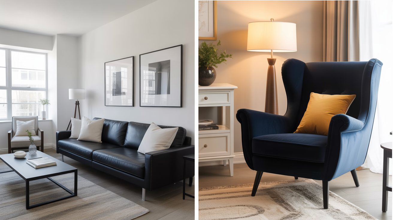
Color contrast is when you use two or more colors that are different enough to stand out from one another.
This could mean pairing dark with light, warm with cool, or even bold with neutral. It’s one of the fastest and most noticeable ways to add interest to a room.
Tips for using color contrast:
- Try classic black and white for a timeless look. This works great in bathrooms, kitchens, or modern living rooms. The bold difference between the two colors keeps things crisp and clean.
- Pair soft neutrals with rich, bold tones. For example, you could have a beige sofa with deep navy pillows or light gray walls with a dark green accent chair. This kind of mix adds personality without being overwhelming.
- Use contrast to highlight features. A brightly colored door on a neutral wall or a dark island in a white kitchen draws the eye and makes the design more exciting.
2. Texture Contrast
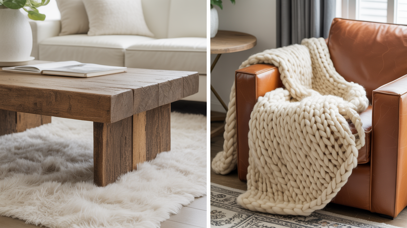
Texture contrast is about how things feel, not just how they look.
Even if everything in the room is the same color, using a mix of textures keeps the space from looking flat or boring.
Tips for using texture contrast:
- Mix hard and soft surfaces for balance. For example, place a rough jute rug under a smooth leather sofa. The difference in feel makes the setup more inviting and layered.
- Use natural elements for warmth. Combine raw wood with shiny metal or soft cotton with cool marble. This blend works well in rustic or industrial styles.
- Layer textures to add depth. Toss a chunky knit blanket over a sleek chair or use velvet throw pillows on a linen couch. These small touches help a room feel cozy and complete.
3. Shape and Form Contrast
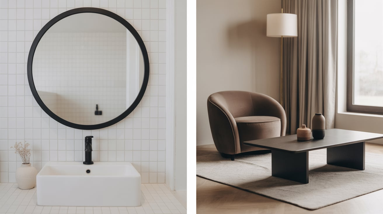
Not everything in your home should be square or round. Mixing different shapes helps keep things balanced and interesting.
This type of contrast works especially well when mixing furniture and decor pieces.
Tips for using shape and form contrast:
- Pair curved furniture with straight-lined accents. For instance, a round coffee table looks great next to a boxy sofa. It keeps the eye moving and adds softness to sharp corners.
- Use different forms in decor. Try adding a round mirror above a square fireplace or using an arched floor lamp over a rectangular dining table. This keeps the layout from feeling too stiff.
- Balance bulky and slim shapes. If your furniture is big and chunky, add a few delicate items like thin-legged side tables or lightweight curtains to create visual balance.
4. Size and Scale Contrast
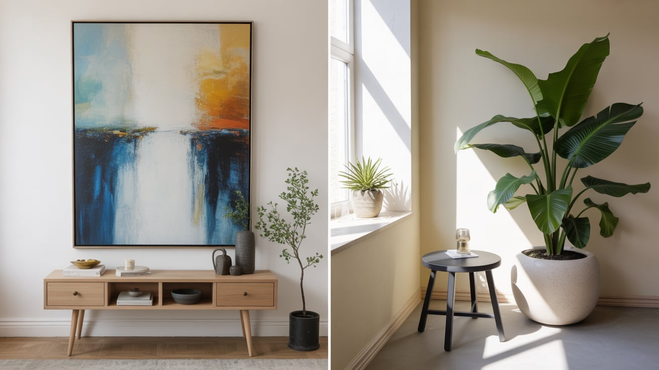
This type of contrast is all about mixing large and small items to add movement and focus.
If everything in the room is the same size, it can look flat and uninviting. Playing with scale helps create a layered and well-designed look.
Tips for using size and scale contrast:
- Mix oversized items with small accents. Try a giant piece of wall art over a simple console table, or a large plant beside a tiny reading lamp. These contrasts help anchor the room and create visual rhythm.
- Stack different-sized decor pieces together. Place tall candles next to short vases or large books underneath small bowls. This will give shelves and tables more interest.
- Use scale to highlight focal points. A large light fixture over a dining table or a tall headboard in the bedroom instantly draws attention to the main part of the room.
5. Material Contrast
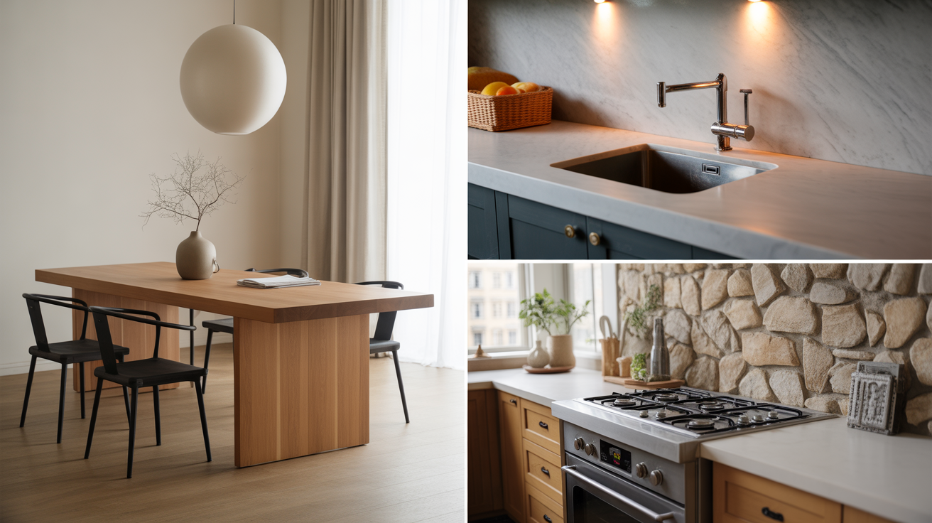
Material contrast is about combining different materials like wood, metal, glass, fabric, or stone.
These pairings help bring out each piece’s unique qualities and keep the room from feeling too “matchy.”
Tips for using material contrast:
- Mix warm and cool materials for balance. Wood adds warmth, while metal and glass have a cooler feel. Putting them together, like a wooden dining table with metal chairs, keeps the space from leaning too far in one direction.
- Add softness to hard surfaces. A soft upholstered bench beside a concrete wall or a woven rug on a tile floor adds comfort and balance.
- Layer rough and smooth materials. Use shiny countertops with textured tile backsplashes, or combine a slick marble tabletop with rough-hewn wooden legs.
6. Light and Shadow Contrast
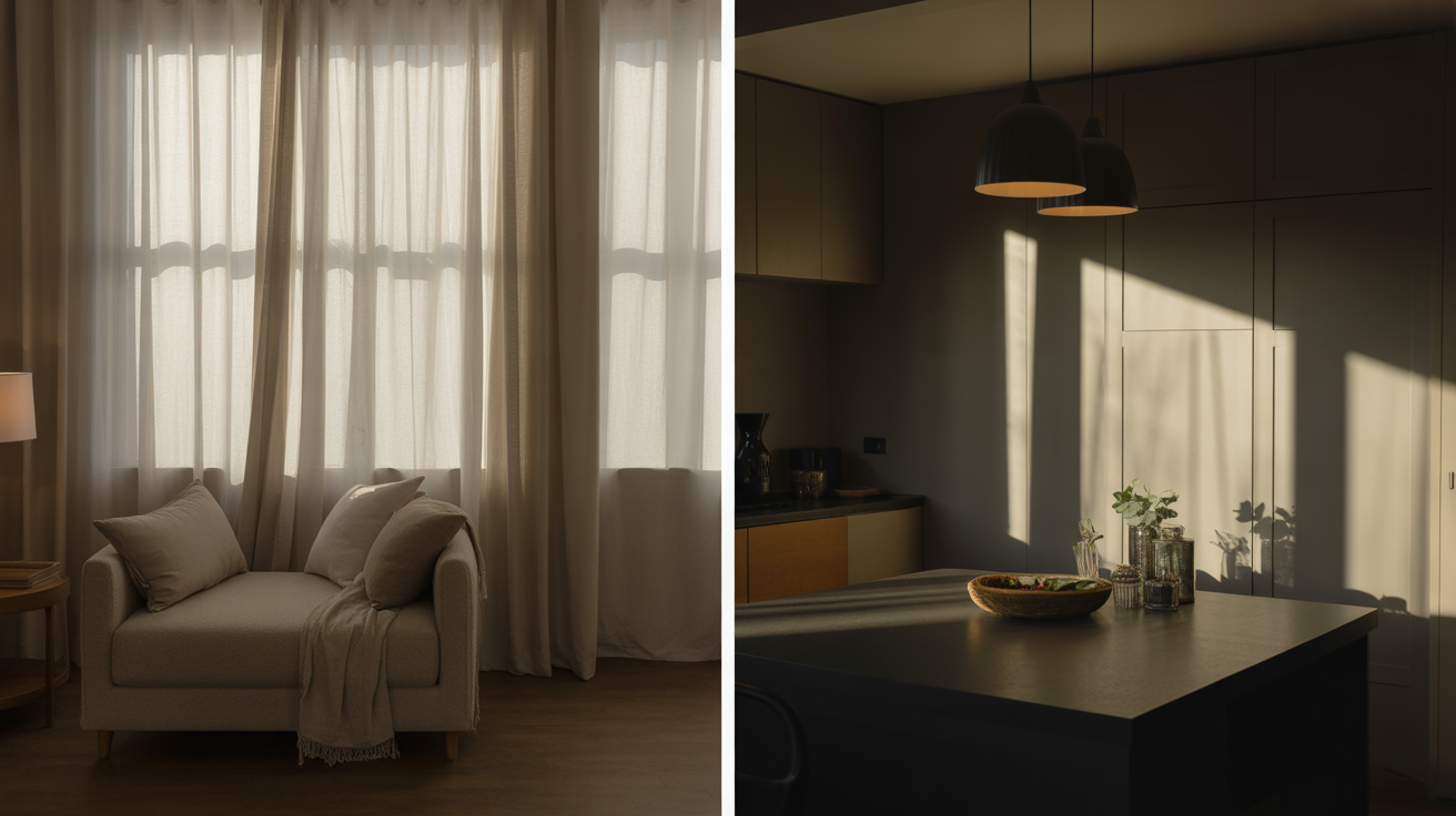
Lighting is often overlooked, but it plays a huge role in how a room feels.
Light and shadow work together to create mood, add contrast, and highlight the textures and shapes in your space.
Tips for using light and shadow contrast:
- Use layered lighting. Combine natural light with ceiling lights, floor lamps, and table lamps to create shadow and depth throughout the room.
- Highlight special areas. Shine a spotlight on a piece of art or use pendant lighting to draw attention to a kitchen island. The contrast helps focus the eye.
- Control the light for mood. Sheer curtains, dimmers, or lampshades can soften harsh light and create gentle shadows that add warmth to your space.
7. Pattern Contrast
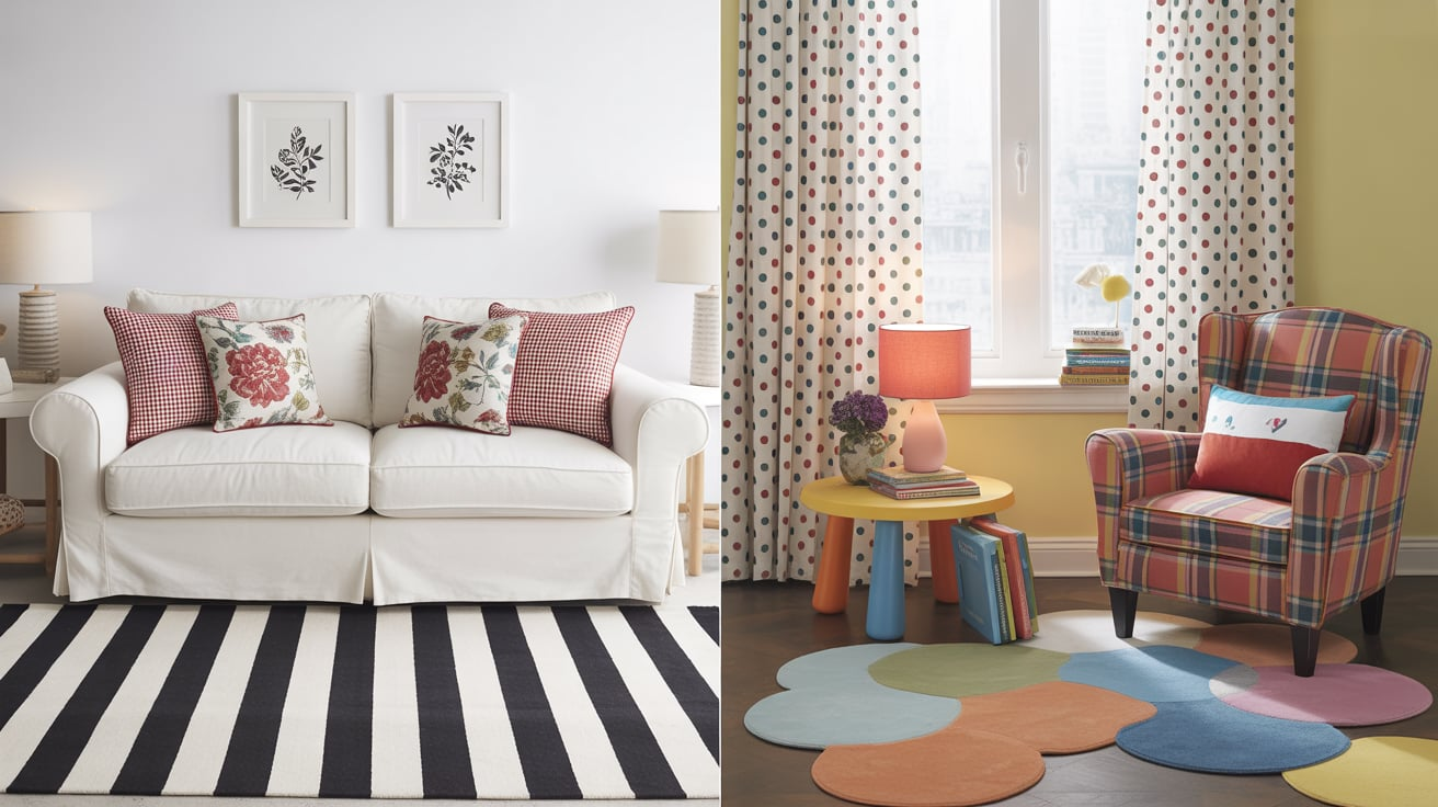
Pattern contrast keeps things lively.
Whether you’re mixing stripes, florals, plaids, or polka dots, patterns add character and personality to any space.
Tips for using pattern contrast:
- Mix large and small patterns. Pair a bold striped rug with small floral pillows or use wide-check curtains with thin-lined wallpaper. The key is to vary scale, not just the pattern type.
- Keep colors in the same family. This helps different patterns work well together without clashing. If you’re unsure, start with black-and-white prints or tone-on-tone looks.
- Use pattern sparingly in small spaces. A patterned accent wall, throw pillows, or a chair can be enough to add contrast without overwhelming the room.
8. Style Contrast
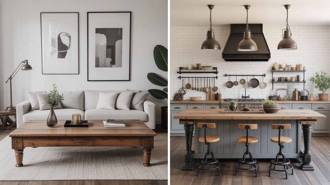
Style contrast is about mixing different design looks, like modern and vintage or farmhouse and industrial.
This creates a space that feels more personal and less like a catalog.
Tips for using style contrast:
- Pair old and new. A sleek sofa with a rustic wooden coffee table can look fresh and interesting. Together, they tell a story and feel lived-in.
- Use one main style and add touches of another. For example, if you love minimalism, add one or two vintage pieces for warmth and personality.
- Mix finishes and eras thoughtfully. A mid-century modern chair can pair beautifully with a traditional area rug if the color palette ties them together.
By understanding and using these types of contrast, you can create a home that feels complete, comfortable, and full of life.
Contrast is the secret ingredient that takes your space from ordinary to eye-catching, without needing a big budget or a full remodel.
Simple Ways to Add Contrast to Any Space
Adding contrast to your space doesn’t have to be complicated or expensive. Sometimes, the smallest changes make the biggest difference.
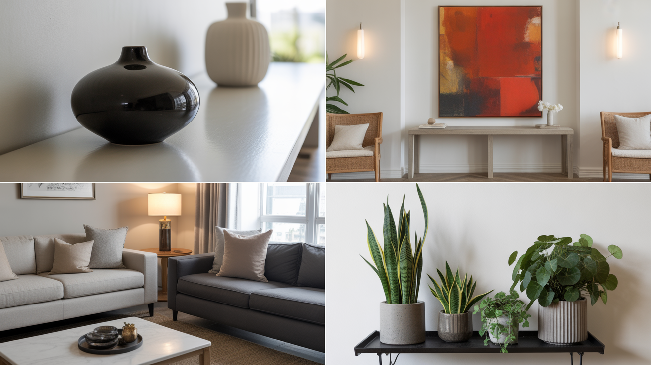
An easy way is to mix matte and glossy finishes. For example, place a shiny ceramic vase on a matte wood shelf to create a subtle but eye-catching contrast.
Another trick is to layer tones within the same color family, for example, pair light gray walls with charcoal accents for a soft, modern look.
You can also introduce contrast by using unexpected decor. Try placing bold, colorful artwork in a mostly neutral room or mixing clean, modern lines with playful, quirky accessories.
Even your choice of greenery can help, combining tall spiky plants with short leafy ones adds shape contrast without extra clutter.
These little touches keep your space interesting without needing a full redesign.
Common Mistakes to Avoid when Using Contrast
Using contrast in interior design can make your space feel exciting and balanced, but if it’s not done right, it can also feel messy or confusing. The goal is to create interest, not chaos.
- Using too many contrasting elements at once: Mixing too many bold colors, patterns, or textures can overwhelm the space.
- Not balancing contrast with unity: Without a common theme or color tying things together, the room may feel disjointed.
- Overdoing dark and light contrasts: High contrast is great, but too much can make a space feel cold or harsh instead of cozy.
- Ignoring scale and proportion: Using only oversized or tiny items without mixing sizes can throw the room off balance.
By avoiding these common mistakes, you can use contrast in a way that feels natural, stylish, and welcoming. A little planning goes a long way!
Conclusion
Contrast is one of the easiest and most effective ways to bring life and style into any room. It helps guide the eye, adds interest, and creates balance without needing a full makeover.
Whether you use color, texture, shape, or even light, a little contrast can go a long way. It’s all about mixing things smartly and thoughtfully, like pairing soft with hard, dark with light, or old with new.
The best part is, you don’t need a big budget to make it work. Small changes like new throw pillows, mixed materials, or a bold accent can make your space feel fresh and complete.
Just remember to keep things balanced so the room doesn’t feel too busy.
When used well, contrast can make your home look more polished, personal, and inviting. It’s a simple trick with big results.