: A Bold Sherwin Williams Review")
Are you looking for the perfect color for your home?
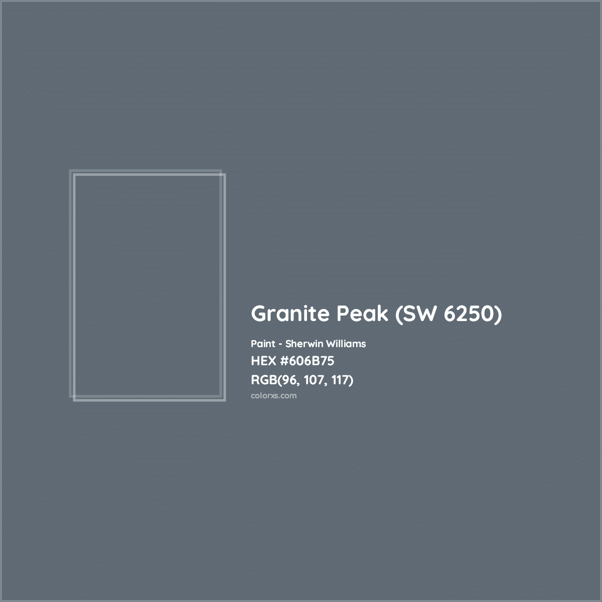
Granite Peak SW6250 by Sherwin Williams is the best option for your luxurious appearance. This deep blue shade has slate-gray undertones that work well in many spaces.
I’ve used it in different rooms and lighting, and it looks great at any time of day. It works beautifully in both bright and dimly lit spaces.
In this guide, You’ll learn everything about this paint
- Shade & Tone
- Direction & Lighting
- The right place to use
- Bedroom style with it
- Colour Combination
So, if you’re unsure whether a certain color is right for your home, this blog will help you make the best decisions.
What Makes Granite Peak SW6250 So Popular?
- This paint color has won over so many people, including myself. The deep blue shade creates peace in any room.
- Slate gray undertones add a touch of polish to modern and traditional spaces.
- Granite Peak looks good in both natural and artificial light. During the day, its blue tones are beautifully displayed. Gray undertones become more visible in the evening, making the room cozy.
- Granite Peak works perfectly with various design styles. It looks equally good with silver hardware and brass fixtures. The color also offers good coverage.
These are some points that make it more popular than others.
Understanding Tones and Shades of Granite Peak SW6250
Granite Peak is cool-toned. This color shows its true blue nature with a clear slate-gray underton. It reminds me of the color you might see on a cloudy ocean day. During morning hours, the blue appears softer and more muted. By afternoon, it takes on a deeper, richer look.
The gray undertones become more noticeable, making the color feel warmer and more grounded. Because of these changes, I often tell my clients to test the paint at different times of day.
Light Reflectance Value (LRV) of Granite Peak
Granite Peak has an LRV of 13, which means it’s on the darker side of the scale. Since LRV runs from 0 (pure black) to 100 (pure white), this tells us something important about how this color works in homes.
What this LRV means for your space:
- It absorbs more light than it reflects
- Works well in bright, sunny rooms
- It needs good lighting in darker spaces
- Creates a cozy feeling in large rooms
Best Design Ideas for Your Home by USing Sw Granite Peak
1. Exterior
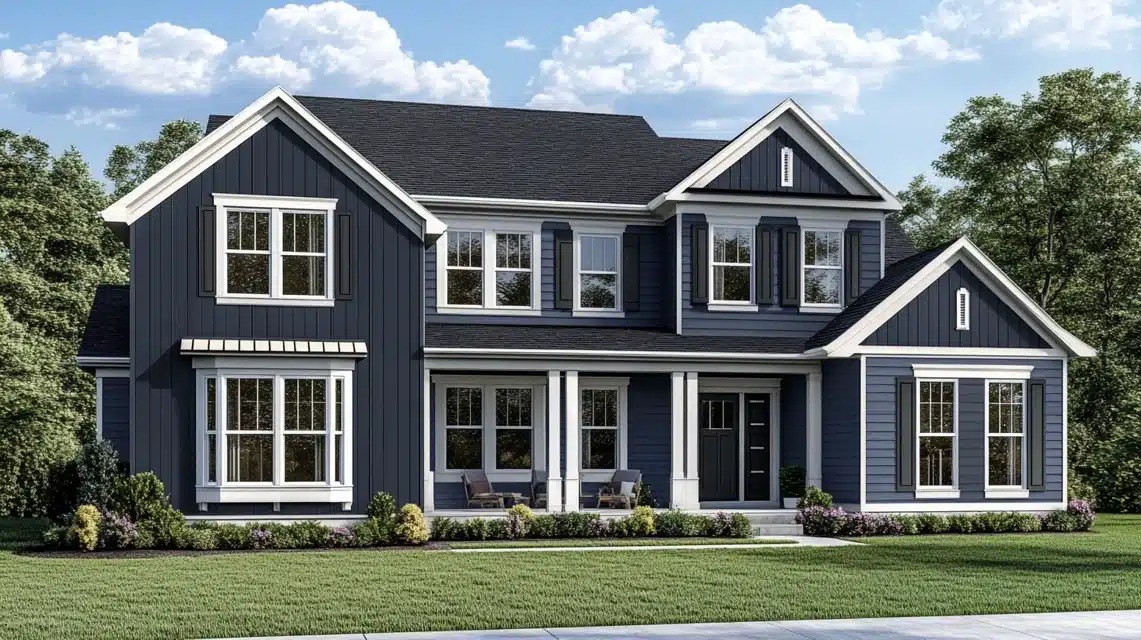
SW Granite Peak is an amazing color for your exterior. This color shines on home exteriors. Although it looks dark inside, the exterior gives a darker mid-toned blue.
The deep blue-gray looks amazing on the siding and trim. When sunlight hits it, the color stays true without fading badly. I often pair it with white trim and black shutters. It works well in both sunny and shaded areas of your house.
The color changes throughout the day, but it always looks fresh and stunning. It pairs nicely with white baseboards and crown molding.
2. Walls and Entry Door
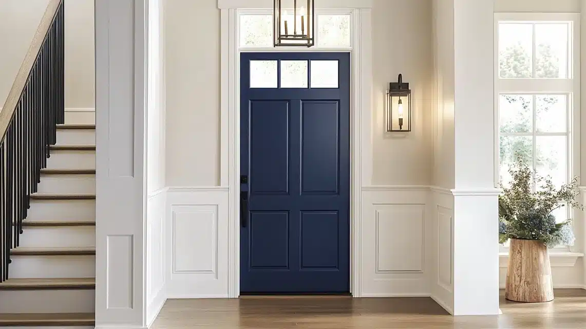
I’ve painted many front doors with this color, and it makes a great first impression. On walls near entryways, it creates a warm welcome.
Remember to use good lighting or a bright white shade with your side walls. I suggest adding a wall candle holder to brighten the space.
3. Dining Rooms
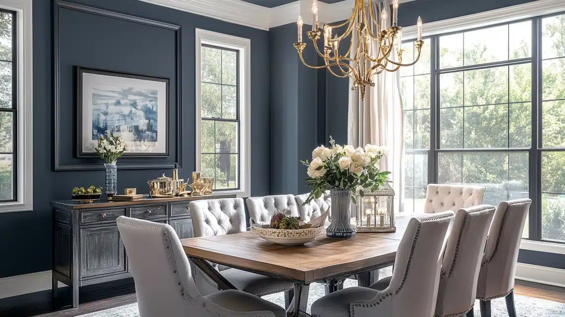
This color brings something special to dining rooms. I’ve used it in both formal and casual dining spaces. It makes a perfect backdrop for family meals.
The color looks rich under chandelier light and helps create a welcoming mood for dinner parties.
4. Kitchen Cabinets
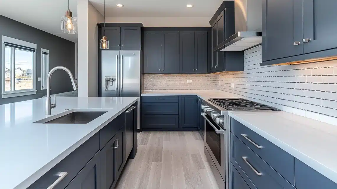
Granite Peak works wonderfully on kitchen cabinets. It pairs beautifully with various colors and shades, giving your kitchen a subtle look.
- White countertops
- Light backsplashes
- Stainless steel appliances
- Bronze or brass handles
5. Bedroom
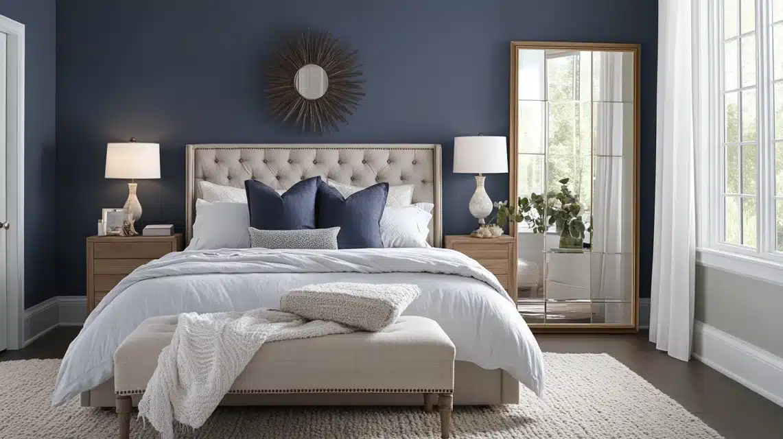
You can paint all four walls for a cozy space or just one wall behind your bed to keep things bright. This deep blue paint creates a perfect sleeping space, and you have many options for making it work.
If you have a small bedroom, add some mirrors, lighten your window coverings, and use white trim.
Other Places
You can also use Granite Peak in these spots
- Home offices for a focused environment
- Powder rooms for added style
- Laundry rooms to brighten daily tasks
- Media rooms for a theater feel
- Closets for a touch of class
What Goes Well with SW GranitePeak
Some of these colors create beautiful spaces with Granite Peak.
White Shades That Work
- Pure White SW7005 for clean trim
- Alabaster SW7008 for softer contrast
- White Duck SW7010 for a warmer look
Light Neutrals
- Repose Gray SW7015 for balance
- Agreeable Gray SW7029 for warmth
- Light French Gray SW0055 for flow
Warm Colors
- Accessible Beige SW7036 for comfort
- Natural Tan SW7567 for coziness
- Creamy SW7012 for softness
Cool Colors
- Sea Salt SW6204 for freshness
- Morning Fog SW6255 for harmony
- Silver Strand SW7057 for calm
Bold Accents
- Naval SW6244 for depth
- Iron Ore SW7069 for strength
- Tricorn Black SW6258 for contrast
Tips For Using These Combinations
- Test colors side by side
- Look at them in your room’s light
- Try different combinations for trim and walls
- Consider your furniture colors
Comparison of SW GranitePeak with Other Brands
| Brand | Color Name | Color Code | Similarities to SW Granite Peak | Key Differences |
|---|---|---|---|---|
| Benjamin Moore | Steel Wool | 2121-20 | Closest to Granite Peak’s tone with a blue-gray depth | Slightly lighter, bluer in some lighting |
| Flint | AF-560 | Similar blue-gray depth | Shows more gray tones | |
| Blue Note | 2129-30 | It has a similar depth but is a bit darker | More intense blue tones | |
| Behr | Dark Denim | PPU14-19 | Rich, deep color like Granite Peak | Slightly bluer, not as deep |
| Planetarium | PPU14-20 | Similar depth and richness | Slightly warmer tones | |
| Midnight Show | PPU15-20 | A similar deep, rich blue-gray tone | More vibrant blue undertones | |
| Valspar | Night View | 4007-4C | A very close blend of blue and gray | Very similar but slightly darker |
| Blue Coal | 4007-4B | Matches Granite Peak in blue-gray depth | Slightly more grayish | |
| Winter Fog | 4007-2B | A similar balance of blue and gray | Shows more cool tones |
Shopping Tip: Always test samples on your walls before deciding, as colors can appear differently depending on lighting and room size.
Top Suggested Directions to Use Granite Peak SW6250
Let me share my practical experience about the best directions for using Granite Peak SW6250.
- North-Facing Rooms: Natural light in north-facing rooms brings out the more gray undertones. If you’re considering using it in a north-facing room, test it first or add extra lighting to keep the space warm and welcoming.
- South-Facing Rooms: South-facing rooms receive warm sunlight, which makes the blue tones pop beautifully. The color stays balanced throughout the day, and the gray undertones help prevent it from feeling too intense.
- East-Facing Rooms: Morning light in east-facing rooms makes Granite Peak look bright and fresh. It works well in breakfast dining and kitchens that get morning sun. By afternoon, the color becomes more muted but still keeps its rich tone.
- West-Facing Rooms: In west-facing spaces, this color changes the most throughout the day. It looks dim in the morning, but the blue tones come alive when the afternoon sun hits. I often use it in living rooms that get evening light. This paint creates a perfect setting for relaxing.
Lighting Condition for SW Granite Peak
| Lighting Condition | Effect on Color | Additional Notes |
|---|---|---|
| Morning Light | • Fresh and clear appearance • Blue tones come forward • Gray undertones stay soft and subtle |
Best for highlighting the blue tones |
| Midday Sun | • Truest version of the color • Balanced and rich • Perfect time to assess the color |
It is ideal for seeing the full depth of the color |
| Evening Light | • Softer appearance • Gray undertones become more visible • Cozy feeling |
Creates a warm and inviting atmosphere |
| LED Lights | • Keeps the color clean and true • Highlights both blue and gray tones |
Works well with warm white LEDs for the best result |
| Halogen Bulbs | • Brings out warmth in the color • Makes gray undertones more visible • Cozy mood |
Great for creating a comfortable, warm ambiance |
| Fluorescent Lights | • Can make the color look cooler • May bring out more blue tones |
It is not ideal for this color as it can alter its appearance |
How to Sampalize SW GranitePeak
These easy steps will help you make the right choice.
Step 1: Get Your Samples Ready
- Buy a sample pot of Granite Peak SW6250
- Get a few white poster boards (at least 12×12 inches)
- Paint two thick coats on each board
- Let each coat dry completely
Step 2: Place Your Samples
- Put one board against the wall you plan to paint
- Move it around to different spots
- Keep it up for at least 24 hours
- Leave space between samples if testing multiple colors
Step 3: Check Throughout the Day
- Morning: How does it look with breakfast light?
- Noon: Check the color at its brightest
- Evening: See how it works with sunset
- Night: Test with your regular room lights
Step 4: Test With Your Room Items
- Your furniture
- Window treatments
- Floor color
- Trim color
Extra Tips from My Experience
- Paint bigger samples for better results
- Look at the color in every corner
- Test near windows and far from them
- Check how it looks with your room’s shadows
Conclusion
I hope my guide to Granite Peak SW6250 helped you better understand this beautiful paint color. As someone who wants to use it, I can say it’s a reliable choice that brings character to any room.
Remember to test the color in your space before making the final decision. Watch how it changes throughout the day and looks with your lighting.
If you are unsure, grab some samples and compare them with your furniture and decor.
Do you have questions about using Granite Peak in your home?
Leave a comment below—I’d love to help you create the perfect space.
Frequently Asked Questions
What Color is Sandbar by Sherwin Williams?
Sandbar (SW 7547) is a warm, neutral beige with subtle gray undertones. I find it creates a cozy feel that works well in living spaces and bedrooms.
Can Granite Peak Be Used for Kitchen Cabinets?
Yes, Granite Peak paint works well on kitchen cabinets. From my experience testing paints, it’s durable enough for daily kitchen use and resist moisture and frequent cleaning.