")
Are you trying to choose the perfect neutral color for your home and wondering if Sherwin-Williams Neutral Ground (SW 7568) is the right choice?
I totally get it, picking the right shade can be tough with so many options out there.
In this blog, I’ll walk you through the key details and specifications of this popular color, helping you understand exactly how it can work for your space.
I’ve worked with a variety of paints over the years, and I’m here to share my insights so you can make a confident, informed decision.
As someone who has used this paint for various projects, I know just how versatile and appealing Neutral Ground can be.
From creating a warm, inviting atmosphere to pairing it with different decor styles, I’ll guide you on how to make it work.
Overview: Sherwin-Williams Neutral Ground

Sherwin-Williams Neutral Ground is a warm, light beige with subtle taupe and khaki undertones.
It strikes a balance between creamy beige and soft tan, creating a welcoming and stylish backdrop.
Neutral Ground is ideal for living rooms, bedrooms, and kitchens, thanks to its understated warmth and light-reflective value (LRV 70), which helps to brighten and visually expand rooms.
Its neutral tone fits both traditional and contemporary designs, offering a modern yet cozy atmosphere that homeowners and designers appreciate.
The color also pairs easily with whites, natural wood tones, and bold accent colors, allowing you to create a harmonious color palette.
Neutral Ground’s soft refinement and its ability to complement various styles make it a favorite choice for creating a comfortable and stylish space.
Color Insights of Sherwin-Williams Neutral Ground
Sherwin-Williams Neutral Ground is a warm, medium-light beige paint with noticeable taupe and soft yellow undertones.
Its tone gently balances between creamy beige and light tan, feeling inviting yet understated.
You might also spot faint hints of gray or even a whisper of pale purple under certain conditions, which adds depth without being obvious.
In natural light, Neutral Ground’s warmth becomes more apparent, giving rooms a soft, cozy glow.
Under artificial lighting, especially cooler bulbs, the taupe and grayish notes can come forward, creating a more subdued vibe.
This subtle shift makes it an easy, authentic choice for spaces that need a calm, adaptable backdrop with just enough character.
Sherwin-Williams Neutral Ground: Product Specifications
Let’s have a quick reference for the key details of Sherwin-Williams Neutral Ground paint. This chart covers everything to help you plan your painting project with ease.
| Specification | Details |
|---|---|
| Paint Type | Available in finishes like matte, satin, eggshell, and semi-gloss |
| Sheen Options & Suitability | Matte/Eggshell: Great for living rooms, bedrooms, and ceilings. Satin/Semi-gloss: Better for kitchens, bathrooms, trim, or high-traffic spaces |
| Coverage per Gallon | About 350–400 sq. ft. per gallon on smooth, properly prepared surfaces |
| Drying Time |
Dry to touch: ~1 hour Recoat: 2–4 hours. Cure time: About 30 days |
| VOC Content | Standard Sherwin-Williams paints are generally low-VOC; check for specific formulas. |
| Available Sizes | Offered in quarts, gallons, and five-gallon pails |
Best Uses for Neutral Ground
Neutral Ground is a versatile color that works well in living rooms, bedrooms, and kitchens. Its warm undertones complement various decor styles and pair with different accent colors and furniture.
Living Rooms
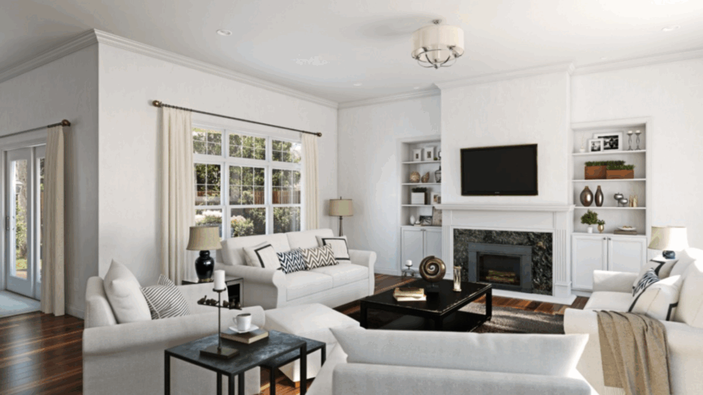
Neutral Ground is perfect for living rooms. Its warm, light beige tone creates an inviting atmosphere without overwhelming the space.
It pairs well with both light and dark furniture, making it versatile. I recommend using it with natural wood accents or soft whites to enhance its cozy feel.
This color helps brighten the room, making it feel more spacious and welcoming.
Bedrooms
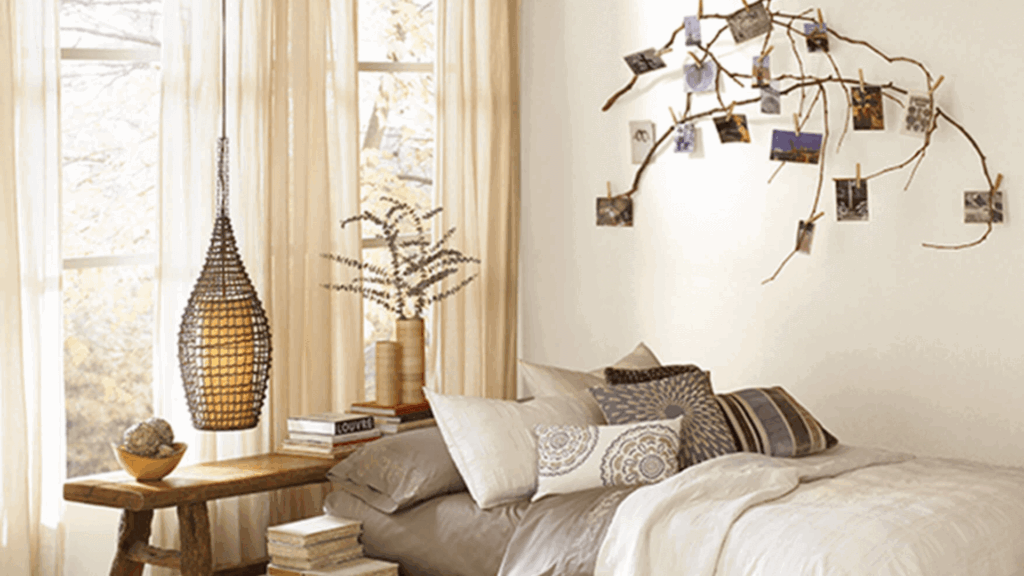
In bedrooms, Neutral Ground adds a calming vibe, making it ideal for restful spaces. The soft, warm undertones work beautifully with light bedding and white trim.
I’ve paired it with accent pillows in navy or mustard, and it complements them perfectly.
It’s a great choice for both modern and traditional designs, offering a neutral, serene backdrop that doesn’t compete with other elements.
Kitchens
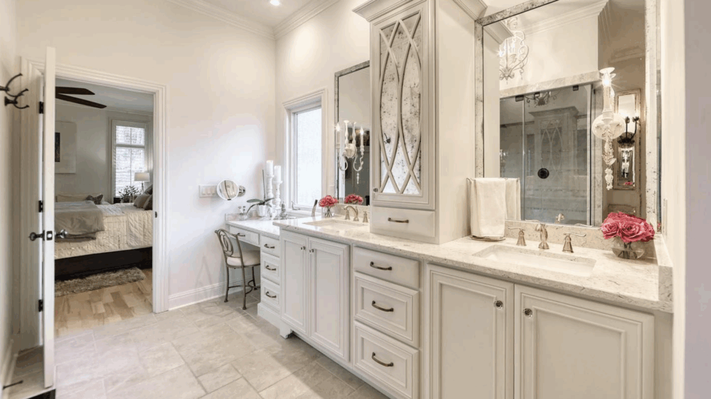
Neutral Ground is a great option for kitchens, providing warmth while keeping the space feeling fresh and clean.
It pairs beautifully with white or light wood cabinetry and works well with natural stone countertops. The color complements both modern and rustic styles.
For added contrast, I recommend pairing it with darker accent colors like navy or deep green, bringing richness to the space while keeping it cozy.
What Is Its Durability and Maintenance?
Neutral Ground is a durable and low-maintenance paint that performs well in everyday spaces. With proper care, it maintains its appearance for years, even in high-traffic areas.
- High-Traffic Areas: It holds up well to normal wear and tear, making it suitable for living rooms, hallways, and other commonly used spaces. The paint maintains its appearance, even with frequent cleaning and activity.
- Cleaning Tips: Use a soft cloth with mild soap and water to clean the surface. For tougher stains, a non-abrasive cleaner works best. Avoid harsh chemicals to preserve the paint’s finish over time.
- Moisture Exposure: While ideal for most areas, it’s best suited for dry to moderately humid spaces. In bathrooms or kitchens, choose a satin or semi-gloss finish for better durability against moisture. These finishes help protect the surface from water-related wear.
When Neutral Ground Might Not Be the Right Fit
While Sherwin-Williams Neutral Ground is a versatile color, it may not suit every home. Let’s discuss some situations where it might not be the best choice:
- Modern spaces with cool undertones: Neutral Ground’s warm tan can clash with gray floors, cool marble, or crisp white cabinetry, appearing mismatched or yellow.
- North-facing rooms: In spaces with limited natural light, it can feel dull or lose its warmth, turning a bit dingy instead of bright and fresh.
- Bold jewel tones and dark colors: If your decor includes navy, emerald, or deep charcoal, Neutral Ground’s soft warmth may seem out of place or washed out.
- Dark wood furniture or rich textiles: It may lack contrast and feel too subdued against dark furniture or saturated textiles.
- Ultra-minimalist or stark interiors: Neutral Ground may not suit spaces with clean lines or the cooler tones often found in minimalist or dramatic modern styles.
Neutral Ground vs. Alabaster
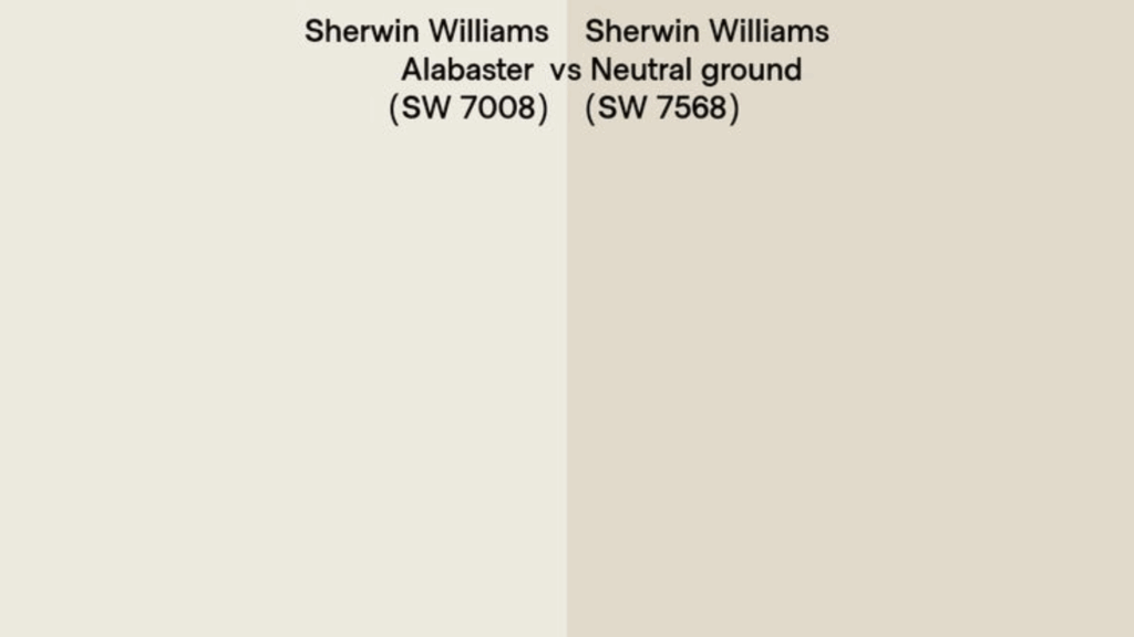
This comparison highlights the subtle yet distinct differences between Neutral Ground and Alabaster. Both are versatile, but each brings a unique feel to your space.
| Feature | Neutral Ground | Alabaster |
|---|---|---|
| Type | Warm, muted tan | Warm, creamy off-white |
| LRV (Light Reflectance Value) | 70 | 82 |
| Undertones | Tan, khaki; muted, subtle warmth | Soft yellow, creamy, distinctly warm |
| Appearance in Light | Light, but not “off-white”; keeps warmth in different lighting, less likely to appear stark or washed out. | Bright and airy; can look very creamy in low light and next to cool elements. |
| Best Use | Versatile neutral for walls in varied areas; won’t look heavy or drab, good for low light. | Ideal for interiors seeking a luminous, soft warmth; popular for trim, walls, and cabinets |
| Popularity | Popular for subtle tan warmth without going beige | One of Sherwin-Williams’ most popular whites, known for its versatility |
| Side-by-Side Difference | More muted and tan, less creamy and brighter than Alabaster | Brighter and visibly more creamy than Neutral Ground, especially next to true whites |
Conclusion
I hope this blog has provided the clarity needed regarding Sherwin-Williams Neutral Ground.
From its versatility and durability to how it complements furniture, I’ve covered all the important details to help you make an informed decision.
Choosing the right paint can be overwhelming, especially when looking for a color that fits into your home.
Neutral Ground offers warmth, adaptability, and ease of use in various spaces, making it a great choice.
If finding the perfect neutral tone has been a challenge, this guide should give you the confidence to move forward with your project.
Take the next step and enjoy creating a space that feels just right.