")
Are you searching for a paint color that brings sophistication without being overwhelming? This article covers everything about Benjamin Moore’s Vintage Vogue, from its unique qualities to the best ways to use it in your home.
I’ll solve your color dilemma by showing you exactly how Vintage Vogue works with different floor types, furnishings, and lighting conditions.
If you’re looking for a color that brings character without dominating your space, keep reading. I’ll share:
- How Vintage Vogue transforms throughout the day
- Which rooms does it perform best in
- What colors pair perfectly with it
- By the end, you’ll know if Vintage Vogue is the answer to your decorating questions.
Why Vintage Vogue Works So Well in Many Rooms?
Vintage Vogue (462) with LRV-11.85works in so many settings because it’s remarkably balanced and versatile. It sits comfortably in the medium-depth range – not too light that it disappears, not too dark that it overwhelms.
What makes it special is its chameleon-like quality to adapt to its surroundings while maintaining its core identity. When placed alongside other colors, it doesn’t shift dramatically or lose its character.
I’ve used Vintage Vogue in formal dining rooms and casual living spaces. It transitions beautifully between traditional homes and modern renovations.
This adaptability is why it’s a staple recommendation for clients seeking a color with presence and flexibility.
The Subtle Colors in Vintage Vogue
Vintage Vogue isn’t a simple, one-dimensional color – it has depth and complexity. Looking closely, you’ll discover:
- A muted purple-gray base that grounds the color
- Soft taupe undertones that add sophistication
- Subtle mauve hints that create warmth
These elements blend seamlessly to create a color that defies simple categorization. It’s not purely purple, gray, or taupe – it’s a masterful combination of all three.
This nuanced mix is why Vintage Vogue feels so natural. It echoes the complex color variations found in nature, creating rooms that feel curated yet effortlessly livable.
The Mood of Vintage Vogue
Vintage Vogue creates an atmosphere of refined comfort in any space. It’s not flashy or trendy – instead, it establishes a sophisticated backdrop that feels timeless.
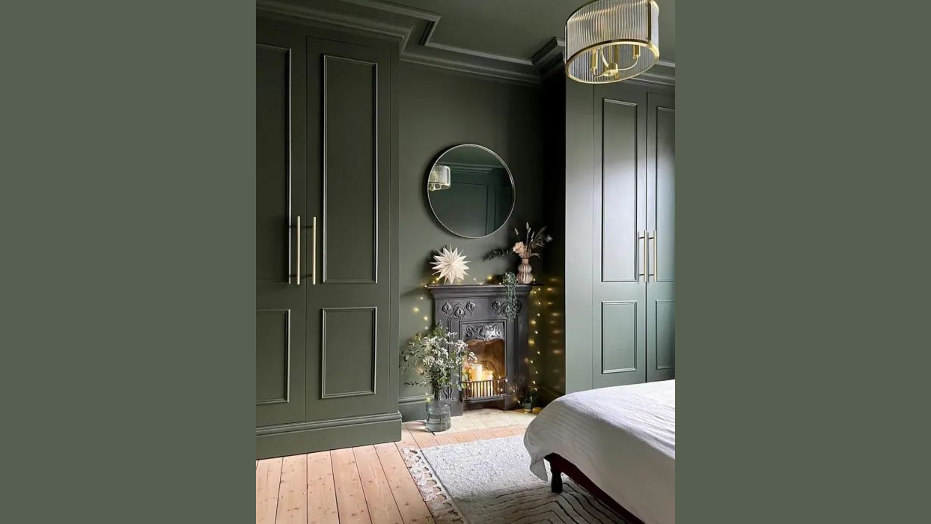
When I painted a client’s master bedroom with Vintage Vogue, they immediately noticed how the space felt more cohesive and serene. The color doesn’t compete for attention – it enhances everything around it.
This color has presence without being overwhelming. It provides visual interest while still allowing your mind to rest. If you’re seeking a color that brings elegance without sacrificing comfort, Vintage Vogue delivers exactly that balance.
Best Rooms to Use Vintage Vogue
I’ve found that Vintage Vogue excels in these areas:
- Dining rooms: Create an atmosphere of sophistication
- Bedrooms: Promotes relaxation with its soothing depth
- Living rooms: Establish a refined yet comfortable backdrop
- Home libraries: Complement wood tones and add gravitas
- Powder rooms: Add unexpected character to small spaces
It’s particularly effective in rooms that receive balanced light throughout the day. However, I wouldn’t recommend it for spaces where you want maximum brightness—its medium depth absorbs some light rather than reflecting it.
What Floors Go Best with Vintage Vogue?
The right flooring can enhance Vintage Vogue’s unique character. From my experience:
Dark walnut hardwood creates a dramatic contrast that feels luxurious
Medium oak flooring brings out the taupe undertones beautifully
Gray stone tile enhances the sophisticated aspects of Vintage Vogue
Marble with purple-gray veining creates stunning harmony
Dark slate creates a grounding effect that balances perfectly
I recommend avoiding very yellow-toned woods like pine or honey oak, as they can clash with Vintage Vogue’s cooler purple-gray elements.
Colors that Match with Vintage Vogue
After countless projects, these are my top 10 shades that pair effortlessly with Vintage Vogue:
1. Silver Satin (OC-26)

This luminous off-white has the faintest purple undertone, which beautifully complements Vintage Vogue. With an LRV of 76.34, Silver Satin provides bright contrast while maintaining harmony.
I often use this for trim, ceilings, and adjacent walls to create a sophisticated, cohesive look that feels intentional rather than stark.
2. Stonington Gray (HC-170)

This classic gray creates an elegant contrast when paired with Vintage Vogue. Its LRV of 59.36 provides similar depth but shifts toward true gray rather than purple.
The colors share complementary undertones, creating a natural flow between spaces while offering visual distinction.
3. Hale Navy (HC-154)

For dramatic pairings, Hale Navy adds richness and depth. With an LRV of 8.35, it provides substantial contrast, while its cool undertones resonate with Vintage Vogue’s purple notes.
This combination feels particularly elegant in formal dining rooms or as an accent wall behind a bed.
4. Ashwood (OC-47)

This gentle beige offers a warmer alternative that still harmonizes with Vintage Vogue. Its LRV of 65.98 makes it slightly lighter, while its warm undertones balance Vintage Vogue’s cooler elements.
I’ve paired these in open floor plans to create a subtle distinction between spaces.
5. Mount Saint Anne (1565)

A soft blue-green with gray undertones that complements Vintage Vogue beautifully. With an LRV of 56.72, it maintains similar depth while offering a contrasting hue.
This combination creates a sophisticated palette that feels curated without being trendy.
6. Edgecomb Gray (HC-173)

This warm, light gray creates a beautiful transitional color when moving from a Vintage Vogue room to adjacent spaces. Its LRV of 63.88 is slightly lighter with warmer undertones.
The subtle contrast creates interest while maintaining flow throughout the home.
7. Revere Pewter (HC-172)

A classic beige that adds warmth to a Vintage Vogue scheme. Its LRV of 55.05 provides similar depth while leaning more toward beige than purple.
This pairing works especially well in traditional homes where you want elegance without formality.
8. White Dove (OC-17)

For a clean, bright contrast, White Dove delivers with its soft, warm white presence. The LRV of 83.16 makes it dramatically lighter than Vintage Vogue.
I use this combination frequently for trim and wall pairings in rooms where I want Vintage Vogue to make a statement.
9. Chelsea Gray (HC-168)

A deep, rich gray that creates beautiful harmony with Vintage Vogue. Its LRV of 22.73 makes it noticeably darker, perfect for creating depth in a space.
This pairing works wonderfully for cabinetry, furniture pieces, or accent walls when Vintage Vogue is the primary color.
10. Pale Oak (OC-20)

A soft, warm neutral that lightens a Vintage Vogue palette. With an LRV of 69.89, it brings brightness while its subtle pink undertones connect with Vintage Vogue’s mauve elements.
I use these in adjacent rooms or as accent colors to create flow throughout a home.
Easy Ways to Use Vintage Vogue in Your Home
If you’re considering using a bold or deep color, start with a powder room or dining room to see how it transforms the space.
Try it on a single accent wall behind a headboard or fireplace to create a striking focal point. You can also use it on built-ins or cabinetry for a custom touch.
For a softer look, pair it with cream trim instead of bright white. In smaller or more intimate rooms, painting all the walls and trim the same shade can create a cozy, cocoon-like effect.
I always advise clients to test paint in their actual space – buy a sample and paint a 2×2-foot square on different walls.
Watch how it looks in the morning, afternoon, and evening light before making your final choice. This simple step can make all the difference in how the color feels in your home.
Vintage Vogue Compared to Other Medium-Depth Neutrals
| Paint Color | Undertones | LRV | Best For |
|---|---|---|---|
| Vintage Vogue | Purple-gray-taupe | 11.85 | Sophisticated spaces |
| Weimaraner | Warm taupe | 30.99 | Traditional rooms |
| Metropolis | Cool gray | 24.46 | Modern spaces |
| Smoke Embers | Green-gray | 51.44 | Transitional homes |
| Thunder | Brown-gray | 47.58 | Earthy interiors |
Vintage Vogue stands out with its unique purple undertones, giving it more character than straightforward grays while remaining sophisticated and not overtly purple.
Vintage Vogue in a Different Light
Light dramatically affects how this color presents itself. Here’s what I’ve observed:
- North-facing rooms: The purple undertones become more pronounced
- South-facing rooms: The taupe elements emerge more strongly
- East-facing rooms: Appears more gray in the mornings, warmer in the afternoons
- West-facing rooms: These show as cooler gray until late afternoon, when it warms dramatically
- Artificial light: Incandescent bulbs enhance the mauve notes; cool LEDs bring out the gray
The seasonal changes matter, too. Vintage Vogue feels richer and deeper in winter light, while summer sunshine brings out its lighter qualities.
Conclusion
Vintage Vogue distinguishes itself among countless medium-depth neutrals because it delivers true sophistication without becoming too trendy or theme-specific.
After using it in dozens of projects over the years, I can confirm that it performs beautifully in most lighting conditions and with diverse decor styles.
Its unique balance of purple, gray, and taupe creates a color that feels intentional and thoughtful.
Is it worth trying? Absolutely. While it won’t create the bright, airy feel of lighter colors, it provides something more valuable – a sophisticated backdrop that makes your furnishings, artwork, and architectural details look refined and intentional.
Before committing, test samples on different walls in your space and observe how they change throughout the day. If you’re seeking a color that brings character, depth, and timeless elegance, Vintage Vogue might be exactly what your space needs.
Frequently Asked Questions
Does Vintage Vogue Work with Wood Trim?
Yes! Vintage Vogue pairs beautifully with wood trim, especially medium—to dark-stained woods. The color’s sophisticated undertones complement the natural warmth of wood trim without clashing.
Will Vintage Vogue Make My Room Feel Smaller?
As a medium-depth color, Vintage Vogue will absorb some light rather than reflect it. In very small rooms with limited natural light, it may create a more intimate feeling.
How Does Vintage Vogue Compare to Benjamin Moore’s Weimaraner?
Vintage Vogue has more purple undertones than Weimaraner, which leans more toward warm taupe. They have similar LRV ratings (Vintage Vogue at 44.8, Weimaraner at 43.56).