
Picking the right neutral paint color can be tricky. There are so many shades that look similar, but once they’re on the wall, they can feel totally different.
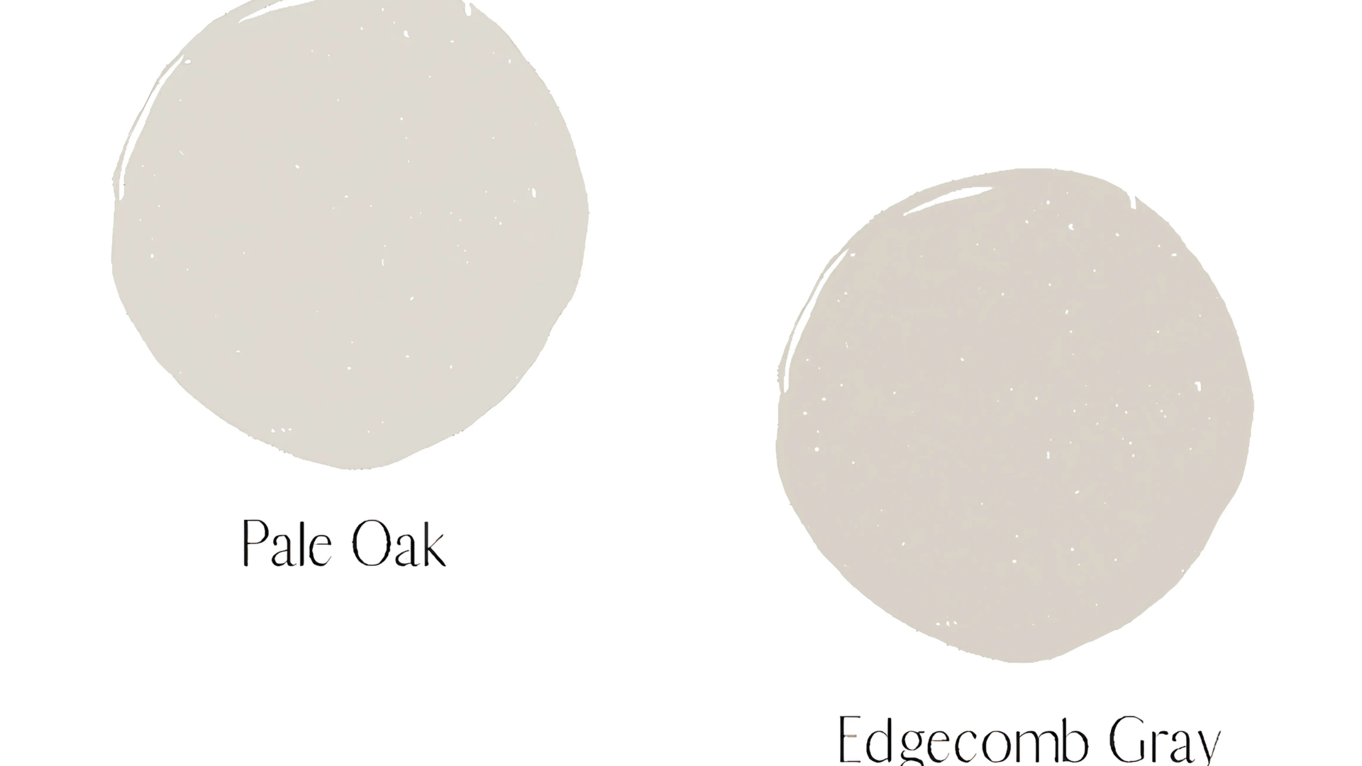
Two popular choices from Benjamin Moore are Pale Oak and Edgecomb Gray. Both are soft, light neutrals that work well in many rooms, but they each have their look and feel.
In this post, I’ll compare Pale Oak and Edgecomb Gray to help you see what sets them apart. I’ll talk about their undertones, how they react to light, and where they work best.
If you’re painting a cozy bedroom, a bright living room, or a hallway that needs a little love, this guide will help you pick the color that fits your home and your style.
By the end, you’ll feel confident choosing the one that works best for your space.
Understanding Pale Oak (#DDD7CE)
Pale Oak is a soft, light gray paint color from Benjamin Moore. Greige is a mix of gray and beige, so it gives you a warm, gentle look that still feels clean and neutral.
It’s not too dark, not too light – just a nice in-between shade that works in almost any room.
One reason people like Pale Oak is that it changes slightly depending on the lighting. In a bright room, it can look more beige or creamy.
In lower light, it may show a soft gray or even a slight pink or purple. That’s what makes it so flexible and easy to use.
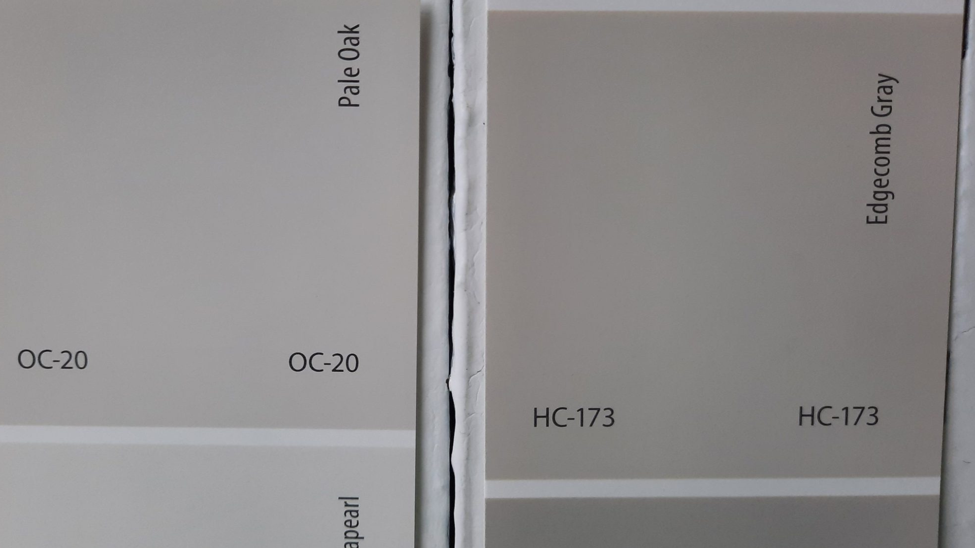
The color code for Pale Oak is OC-20. Ifyou’ree buying paint or looking at swatches, this is the code to remember.
Pale Oak works well in bedrooms, living rooms, hallways, and other spaces. It’s cozy, calm, and easy to live with.
Understanding Edgecomb Gray (#DAD2C8)
Edgecomb Gray is a light, soft gray paint color from Benjamin Moore. It is a mix of gray and beige, but it leans just a little warmer than cool. It’s a great choice if you want a neutral that feels calm, cozy, and not too bold.
One thing people love about Edgecomb Gray is how well it works in almost any space. In rooms with a lot of natural light, it can look more beige and warm. In lower light, it may show a bit more gray, but it still feels soft and welcoming.
The color code for Edgecomb Gray is HC-173. Look for that number when checking samples or buying paint.
Edgecomb Gray works well in living rooms, kitchens, bedrooms, and even hallways. It’s simple, classic, and easy to match with other colors and styles.
Pale Oak vs Edgecomb Gray: Side-by-Side Comparisons
Pale Oak and Edgecomb Gray are both light greige paint colors from Benjamin Moore. They’re great choices if you want a soft, neutral look.
But even though they seem similar, they have a few key differences. Let’s break them down to help you pick the right one for your home.
Color, Tone, and Feel
- Pale Oak has a soft gray-beige tone that leans slightly warm. It feels light, calm, and a little more airy. It’s a great choice if you want your room to feel soft and fresh without being too beige.
- Edgecomb Gray is also beige, but it leans more toward beige than gray. It feels warmer and a bit more grounded, which can make a room feel cozyIt’sss perfect if you want a color that adds warmth without being dark.
Undertones
- Pale Oak has subtle pink or purple undertones, especially in low light. In bright light, it can look more creamy or gray. These undertones give it a gentle, elegant look, especially in softly lit rooms.
- Edgecomb Gray has warm green or beige undertones. It usually stays pretty neutral and soft, without any strong color showing through. It’s a safer choice if you want a color that remains calm and doesn’t shift too much.
Light Reflectance Value (LRV)
- Pale Oak has an LRV of about 70, which means it reflects more light and can feel a little brighter in a room. It’s a good option for smaller rooms or spaces that don’t get much natural light.
- Edgecomb Gray has an LRV of about 63, so it’s slightly darker and gives a bit more contrast, especially against white trim. It works well in sunny rooms where the light helps balance the warmth.
Best Rooms for Each Color
- Pale Oak works great in bedrooms, living rooms, and hallways where you want a light and peaceful look. It pairs well with warm wood, soft whites, and natural textures. It’s also nice in spaces where you want just a hint of color without going full gray or beige.
- Edgecomb Gray is perfect for kitchens, entryways, and open spaces. It looks great with white cabinets, wood floors, and both modern and classic styles. It gives rooms a cozy, welcoming feel that works in any season.
Both are beautiful and easy to live with – it really just depends on the look you’re going for and how much light your room gets!
Take your time, test a sample on your wall, and trust your eye—your perfect color is the one that feels right to you.
How These Colors Look in Different Rooms
Pale Oak and Edgecomb Gray are both flexible paint colors that work in lots of spaces. But depending on the room and lighting, they can look a little different.
Living Room
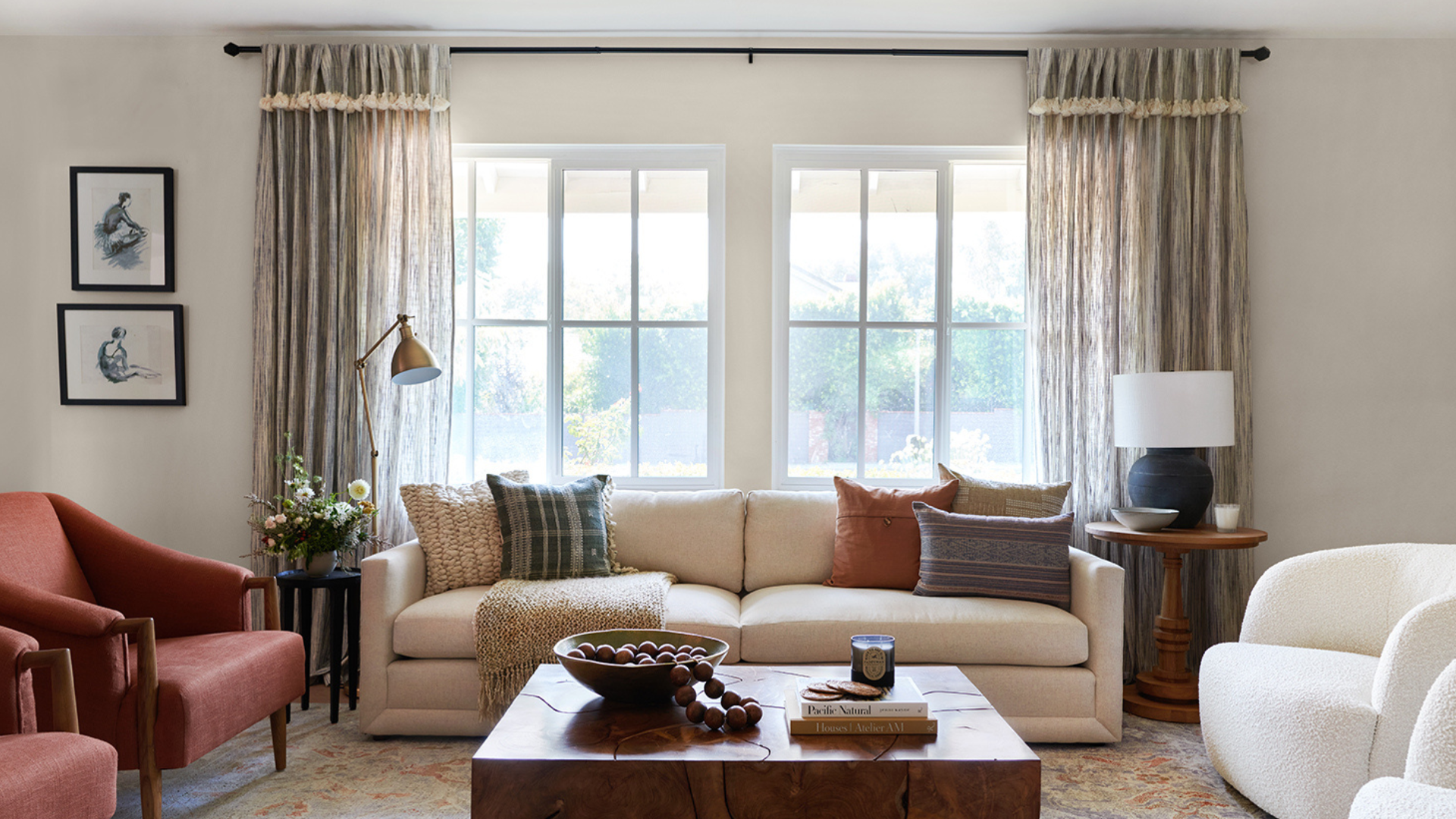
- I love how Pale Oak gives the living room a light, soft feel. It works beautifully with natural light and makes the whole space feel calm and cozy. I think it’s perfect for open areas where I want just a subtle touch of color.
- Edgecomb Gray adds a bit more warmth and feels a little richer. It pairs nicely with both light and dark furniture. I t’ss a solid pick if you want something neutral but not too pale.
Bedroom
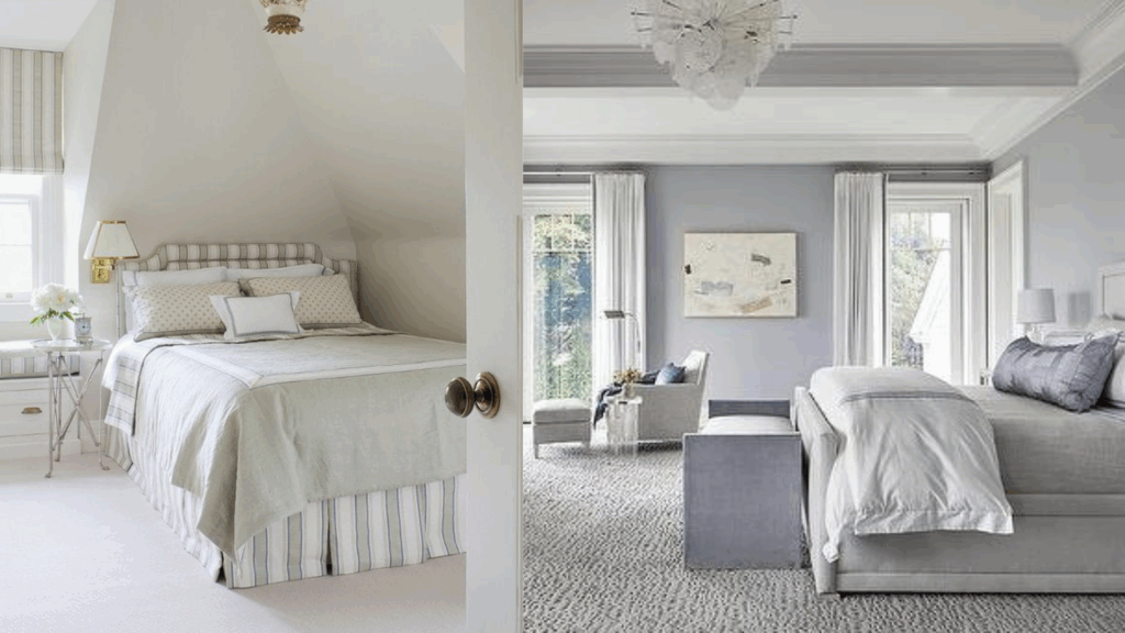
- Pale Oak is perfect for bedrooms if you want a peaceful, relaxing vibe. It looks great with light bedding and warm wood furniture. It creates a clean and calm space that’s easy to decorate.
- I find that Edgecomb Gray makes the room feel cozy and comfortable without being too dark. I really like it when I’m going for a warm, restful space. It also pairs nicely with soft textures and neutral tones.
Kitchen
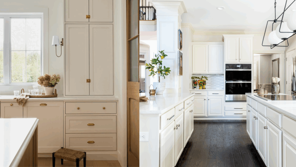
- Pale Oak looks fresh and clean in kitchens, especially with white or cream cabinets. It brings a soft brightness without being too stark.
- Edgecomb Gray works well and adds a little more contrast if your cabinets and counters are bright. It gives the kitchen a bit more depth while still feeling light.
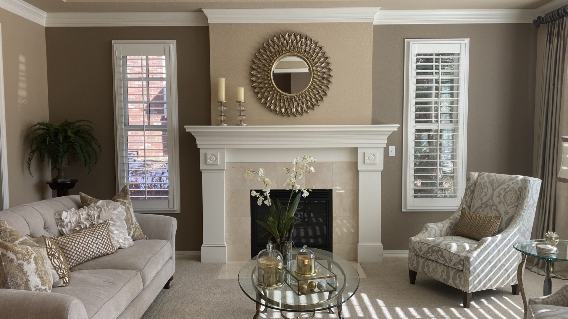
Bathroom
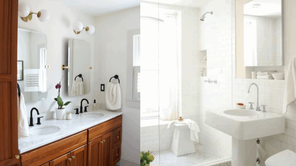
- Pale Oak gives bathrooms a soft, spa-like lookIt’sss great if you want something simple and light.
It pairs nicely with marble, tile, and brushed gold or nickel finishes. - Edgecomb Gray feels a bit warmer and makes the room feel calm and cozy, especially if you have warm lighting. It adds a touch of elegance without overpowering the space.
Things to Consider Before Choosing Between Edgecomp Gray and Pale Oak
Both Pale Oak and Edgecomb Gray are great neutral colors, but one might work better in your space, depending on a few key things.
Lighting in Your Room
Lighting can really change how a paint color looks. Pale Oak reflects more light and can help brighten up darker rooms. It may look more gray in cooler light and more creamy in sunlight.
Edgecomb Gray is a little darker, so it works well in rooms with plenty of natural light. It tends to stay warm, even in lower light. If your room gets little to no sunlight, Pale Oak may feel a bit more open and bright.
Room Size and the Feeling You Want
I like to think about the size of my room and how I want it to feel. I choose Pale Oak when I’m going for a light, airy vibe. It really helps my smaller rooms feel more open and spacious.
I like how Edgecomb Gray brings a bit more warmth and depth – it’s perfect for making a large room feel cozy. When my space feels too open or cold, I use Edgecomb Gray to help make it feel more grounded and inviting.
Your Furniture and Decor
Look around at what you already have. The Pale oak pairs well with light woods, soft whites, and natural textures like linen and jute.
Edgecomb Gray looks great with cream, brown, navy, and warm wood tones.
Make sure to compare the paint samples next to your floors and large furniture pieces.
Style of Your Home
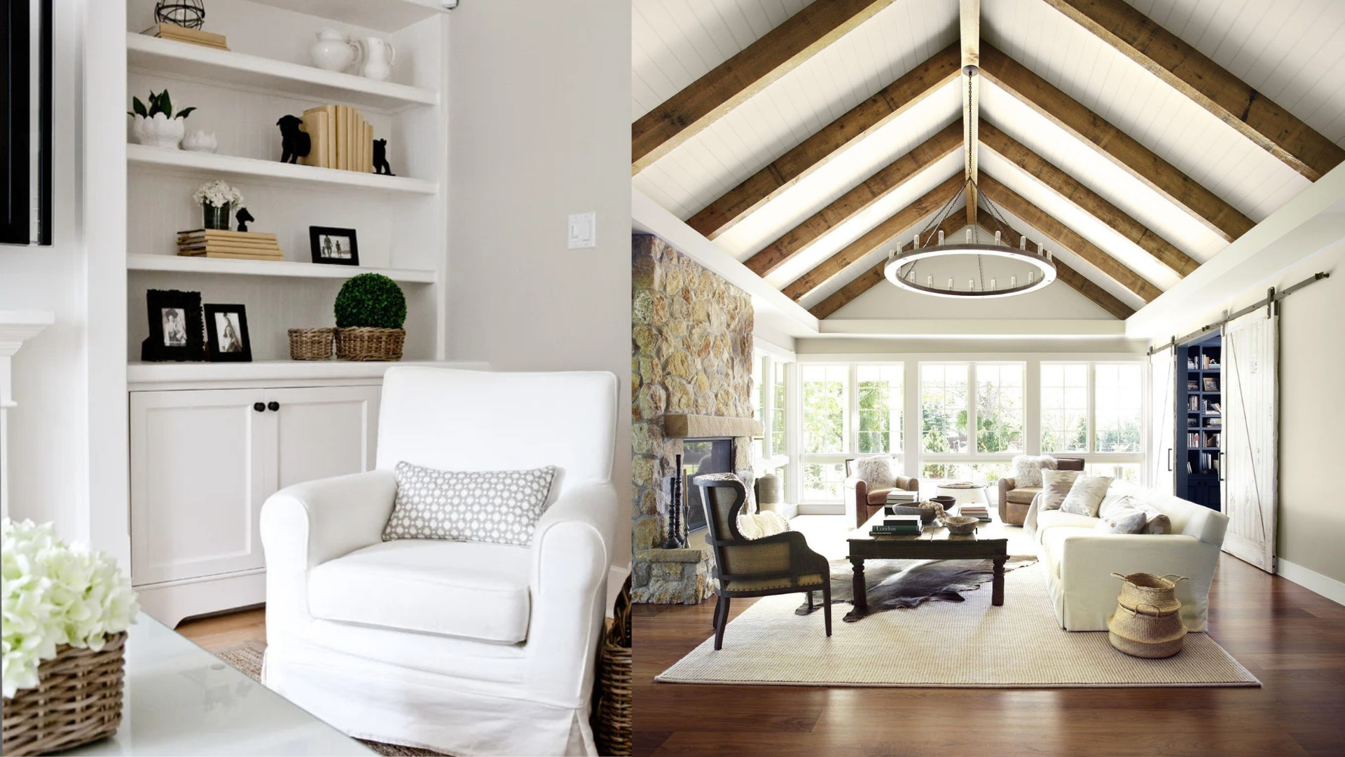
Your home’s style can help guide your choice. Pale Oak is perfect for farmhouse, coastal, or modern minimal spaces—it feels soft and fresh.
Edgecomb Gray works well in classic, transitional, or rustic homes because it adds a warm, timeless feel.
If you like a cleaner, more modern look, Pale Oak might be the better fit.
These small things can make a big difference in how your paint color turns out. Take your time, test first, and go with the one that feels right to you.
Edgecomb Gray vs Pale Oak: Quick Tips
Choosing between two timeless neutral paints can be tricky, but understanding how each one behaves in different lighting, affects mood, and works with decor can make all the difference.
| Category | Edgecomb Gray | Pale Oak |
|---|---|---|
| Undertone | Warm greige with soft beige and taupe undertones | Light greige with a hint of soft pink or lavender undertones |
| Best Uses | Ideal for family rooms, dining rooms, and spaces that need extra warmth | Works well in bedrooms, hallways, and offices for a clean but soft backdrop |
| Style Match | Complements traditional, farmhouse, and transitional interiors | Blends easily with coastal, Scandinavian, and modern minimalist styles |
| Trim Pairing | Looks great with creamy whites and off-whites | Pairs beautifully with crisp white or cool gray trims |
| Feel Over Time | Creates a grounded, welcoming look that deepens with age | Maintains a fresh and airy vibe, even as furnishings change |
Both Edgecomb Gray and Pale Oak are versatile, well-loved neutral colors that bring comfort and style to any space.
Conclusion
Both Pale Oak and Edgecomb Gray are beautiful, versatile neutral colors from Benjamin Moore.
Each has its own unique qualities – Pale Oak is light and airy with subtle pink undertones, while Edgecomb Gray offers warmth and coziness with a touch of beige.
The right choice depends on the lighting, size of your room, and the feeling you want to create. Pale Oak works well in smaller, brighter spaces, while Edgecomb Gray is perfect for larger rooms that need a bit of warmth.
Both colors are easy to live with and pair nicely with a variety of décor styles. I always suggest taking the time to test the samples on your walls, and go with the one that feels best for your space.
Whatever you choose, both colors will create a calm and inviting atmosphere in your home.