

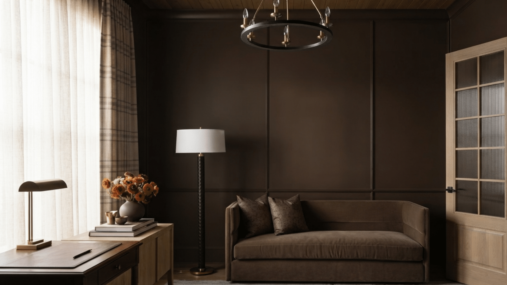
Some paint colors are easy to recognize, while others can look slightly different depending on where you see them. Sable is one of those shades.
It usually falls somewhere between warm brown and earthy neutral, but the exact color can change from one paint brand to another.
Some versions lean toward chocolate brown, while others include subtle gray, taupe, or olive undertones.
That variety can make picking the right shade a little challenging.
In this blog, I’ll explain what Sable looks like, compare popular paint brands, share colors that pair well with it, and help you decide if it’s the right fit for your home.
Quick Answer: What Color Is Sable?
Sable is a popular neutral paint color that blends the richness of brown with soft, earthy undertones.
While the name stays the same, the exact shade changes from one paint brand to another. Knowing the basic characteristics of sable makes it easier to compare different paint collections.
Sable is usually a medium-to-dark brown with subtle undertones of gray, taupe, olive, or black.
Its name comes from the luxurious fur of the sable animal, which naturally shows rich brown tones with slight color variation.
Paint manufacturers interpret this color differently, so there isn’t one standard sable shade. That’s why two paints labeled “sable” can look quite different once they’re on the wall.
What Does Sable Look Like?
Sable can look surprisingly different depending on the paint brand, room lighting, and surrounding colors. Even though every version shares a similar brown base, the undertones give each one its own personality.
Sable usually falls between medium and dark brown, making it a rich neutral that works in both traditional and modern homes.
Many shades have a warm appearance with hints of chocolate or coffee, while others pick up gray or taupe undertones for a softer look. In bright natural light, Sable often appears lighter, bringing out its warm side.
Under cool LED lighting, gray undertones may become more noticeable.
Because of these subtle shifts, it’s always a good idea to view a paint sample at different times of the day before making your final choice.
Sable Paint Colors from Top Paint Brands
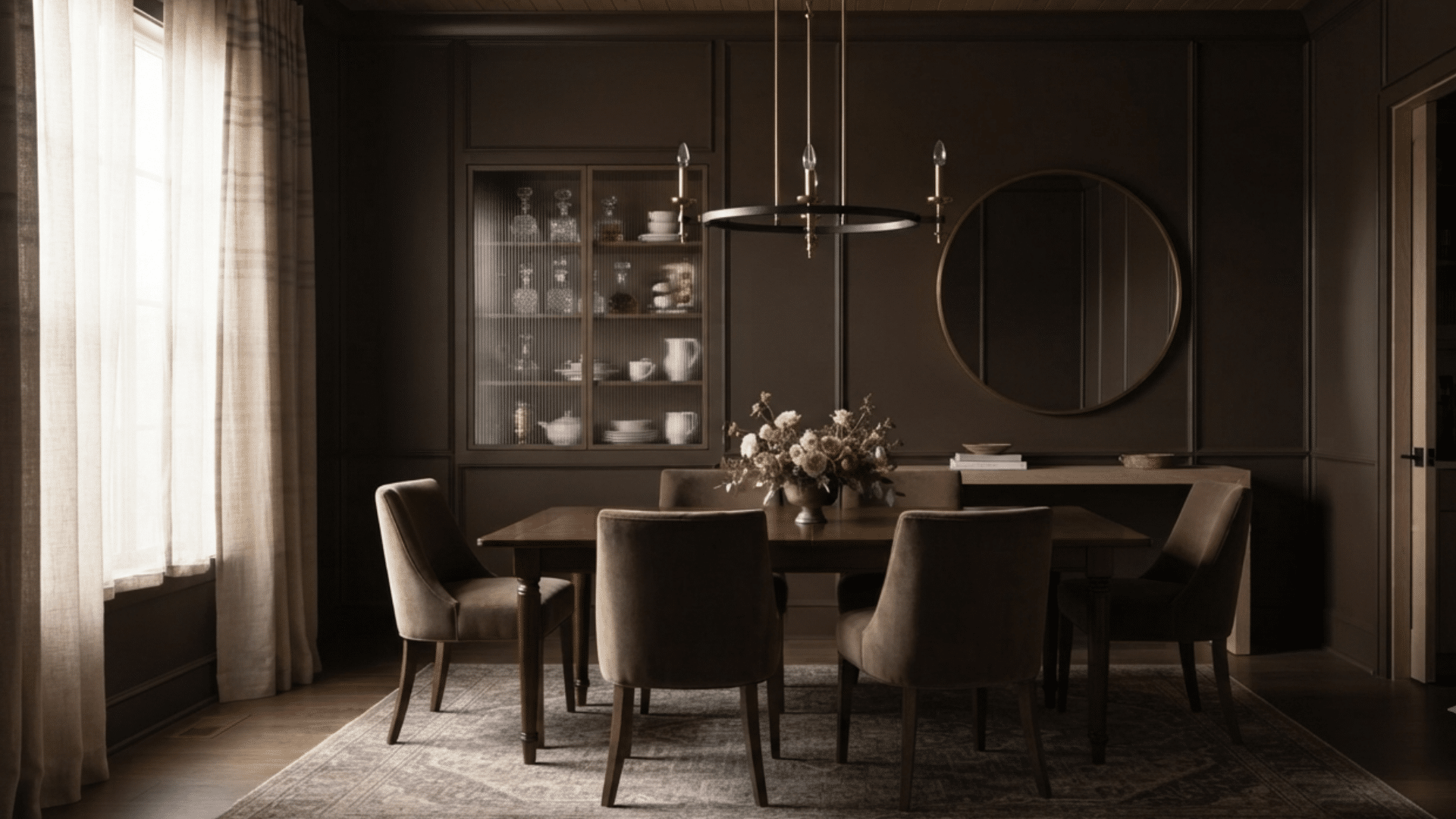
Different paint brands offer unique sable-inspired shades with varying undertones and finishes. Comparing these options can help you find a warm brown color that matches your space, lighting, and style.
1. Sherwin-Williams Sable SW 6083
Sherwin-Williams has one paint officially named “Sable,” but several of its brown neutrals create a very similar appearance.
These shades usually combine warm brown with soft gray or taupe undertones, giving them a balanced look that suits many decorating styles.
They work well in living rooms, bedrooms, dining rooms, and home offices where a rich neutral is preferred.
Since lighting can noticeably affect the appearance, it’s a good idea to compare a few swatches before choosing the shade that best suits your space.
- Hex code: #8B6A5C
- LRV: 22
- RGB: 139, 106, 92
- Available in: Sherwin-Williams paint collection
2. Behr Sable Brown 240F-6
Behr’s sable-style paint colors are known for their warm brown appearance with soft earthy undertones. Depending on the shade you choose, you may notice hints of caramel, mocha, or gray that add depth and character.
These paints work especially well on kitchen cabinets, accent walls, dining rooms, and family spaces where warmth is desired.
Pairing them with cream-colored walls, natural wood finishes, or brushed brass hardware creates a comfortable, timeless look that fits both modern and traditional interiors.
- Hex code: #80604B
- LRV: 17
- RGB: 128, 96, 75
- Available in: Behr paint collection
3. PPG Sablewood PPG1068-2
PPG offers several brown paint colors that closely resemble the classic sable look. Many of these shades include muted gray or olive undertones, creating a refined appearance that fits modern, rustic, and transitional homes alike.
They pair beautifully with black fixtures, natural stone surfaces, medium-toned wood furniture, and textured fabrics.
Whether you’re painting a single accent wall or an entire room, sampling a few similar shades first will help you choose the sable-inspired color that looks best in your home’s lighting.
- Hex code: #B18A70
- LRV: 28
- RGB: 177, 138, 112
- Available in: PPG paint collection
4. Glidden Sablewood PPG1068-2
Glidden’s sable-inspired colors generally fall between warm brown and soft taupe, making them a flexible choice for many interior styles.
Their appearance can shift throughout the day, looking lighter in natural sunlight and deeper under warm indoor lighting.
These shades work well in bedrooms, family rooms, hallways, and reading spaces for a welcoming feel.
Pair them with cream trim, beige furnishings, and natural wood accents for a balanced and timeless design that feels comfortable year-round.
- Hex code: #B18A70
- LRV: 28
- RGB: 177, 138, 112
- Available in: Glidden paint collection
5. Valspar Sable Calm 5002-2C
Valspar includes several warm brown paint colors that fit within the sable color family. These shades often feature soft taupe or gray undertones that help balance their richness without making them appear too dark.
They work well in living rooms, bedrooms, home offices, and dining areas, and pair beautifully with cream walls and natural wood flooring.
Viewing large paint samples under both daylight and evening lighting helps you choose the shade that best matches your home’s overall style.
- Hex code: #8A6958
- LRV: 23
- RGB: 138, 105, 88
- Available in: Valspar paint collection
6. ECOS Paints Sable
ECOS Paints offers environmentally conscious paint products, including several earthy brown shades that resemble sable.
These colors provide a warm, natural appearance with soft undertones that work well in bedrooms, living rooms, nurseries, and home offices.
They pair nicely with light trim, natural wood flooring, and simple neutral furnishings.
Homeowners looking for low-odor paint products can also appreciate having sable-inspired options that fit a wide range of interior styles.
Paint Brands with Colors of Similar Shades to Sable
Not every brand offers an official paint color called Sable, but many provide warm brown, taupe, and earthy neutral shades that create a similar appearance.
1. Benjamin Moore Sable-Inspired Paint Colors
Benjamin Moore offers several sable-inspired paint colors, ranging from rich chocolate browns to softer taupe-brown shades.
These colors add warmth without making a room feel too dark, making them suitable for both large and small spaces.
They pair beautifully with crisp white trim, natural oak flooring, brass fixtures, and neutral furnishings.
If you’re decorating a farmhouse, traditional, or transitional home, Benjamin Moore’s earthy brown tones create a welcoming atmosphere while remaining easy to coordinate with surrounding finishes and décor.
2. Farrow & Ball Sable-Inspired Paint Colors
Farrow & Ball doesn’t offer a paint officially named “Sable,” but several of its deep brown shades provide a similar effect.
Known for their rich pigments, these colors develop subtle variations as daylight changes throughout the day. They work particularly well in dining rooms, libraries, bedrooms, and cozy sitting areas where deeper neutrals feel inviting.
Pair them with warm white trim, oak furniture, linen fabrics, and soft lighting to create an elegant yet comfortable living space.
3. Dunn-Edwards Sable-Inspired Paint Colors
Dunn-Edwards features several earthy brown neutrals that closely resemble traditional sable. Most combine rich brown with gentle gray or taupe undertones, creating a classic finish that suits many decorating styles.
These colors pair nicely with warm white walls, sage green accents, brushed brass hardware, and natural wood furniture.
They’re suitable for interior walls, accent features, cabinetry, and even exterior trim, making them a practical option if you want one neutral color throughout different parts of your home.
4. Magnolia Home Sable-Inspired Paint Colors
Magnolia Home by Joanna Gaines offers several earthy brown neutrals that resemble sable and suit relaxed, comfortable interiors.
These shades blend beautifully with white shiplap, exposed wood beams, woven textures, and vintage-inspired décor.
Their warm undertones make them especially popular in farmhouse and cottage-style homes, although they also fit modern spaces with natural finishes.
Whether used on walls or cabinetry, these colors provide warmth while remaining easy to coordinate with other neutral paint colors.
5. Dutch Boy Sable-Inspired Paint Colors
Dutch Boy offers several medium-to-dark brown paint colors that closely resemble sable in both warmth and depth.
Many of these shades include subtle taupe or gray undertones, allowing them to blend easily with existing furniture and flooring.
They’re well suited for family rooms, dining rooms, entryways, and accent walls where a welcoming neutral is preferred. Pair them with soft white trim, warm lighting, and natural textures to create a space that feels inviting throughout the year.
Sable vs Similar Paint Colors
Many brown paint colors look alike at first glance, but small differences in undertones can change the overall feel of a room. Comparing sable with similar shades makes it easier to choose the one that best matches your style.
| Color 1 | Color 2 | Key Difference |
|---|---|---|
| Sable | Taupe | Sable has a richer brown base, while taupe contains more gray, giving it a softer and cooler appearance. |
| Sable | Mocha | Mocha usually appears warmer with stronger coffee-inspired brown tones, while sable often includes subtle gray or earthy undertones. |
| Sable | Chocolate Brown | Chocolate brown is darker and more saturated. Sable feels lighter and works better as a versatile neutral for everyday living spaces. |
| Sable | Espresso | Espresso is a very deep brown that can appear almost black. Sable offers similar warmth while keeping the room brighter and less dramatic. |
| Sable | Walnut | Walnut often has reddish or golden undertones, while Sable tends to be more neutral, with brown, gray, or taupe undertones. |
| Sable | Mink | Mink blends brown with noticeable gray or purple undertones. Sable generally looks warmer and more natural in different lighting conditions. |
Tips for Choosing the Right Sable Paint
A sable paint sample can look very different on your wall than it does on a paint chip. Taking a little extra time before painting helps you choose a shade you’ll be happy with for years.
- Test large paint samples: Paint a section of the wall instead of relying on a small color card. Larger samples give you a much better idea of the finished look.
- Check the color throughout the day: View the sample in morning, afternoon, and evening light. Natural and artificial lighting can bring out different undertones.
- Compare it with existing finishes: Hold the sample next to your flooring, cabinets, countertops, and furniture to make sure the colors work well together.
- Pay attention to undertones: Some sable paints lean warm, while others have gray or taupe influences. Choose one that complements the rest of your room.
- Choose the right paint sheen: Matte finishes create a soft appearance, while eggshell and satin are easier to clean in busy areas like hallways and family rooms.
- Buy a sample before committing: I’ve found that testing a small sample first often prevents expensive mistakes. Seeing the paint on your own walls is the easiest way to choose the right shade of sable.
How Does Sable Paint Vary Between Brands?
Even when two paint brands use the word “sable,” the finished color can look quite different. Small changes in undertones, depth, and light reflectance affect how the paint appears once it’s on your walls.
| Paint Brand | Overall Tone | Common Undertones | Best For |
|---|---|---|---|
| Sherwin-Williams | Warm medium-to-dark brown | Gray, taupe | Living rooms, bedrooms, home offices |
| Benjamin Moore | Rich earthy brown | Chocolate, taupe | Traditional and farmhouse interiors |
| Behr | Warm brown | Mocha, caramel, soft gray | Accent walls, kitchens, dining rooms |
| PPG | Balanced brown | Gray, olive | Modern and transitional spaces |
| Glidden | Brown-taupe | Gray, beige | Family rooms, hallways, bedrooms |
| Dunn-Edwards | Deep neutral brown | Taupe, gray | Interior walls, exterior trim, accent walls |
Best Colors that Go with Sable
Sable pairs well with both light neutrals and deeper accent colors. Choosing the right combination helps create a balanced room that feels warm, comfortable, and easy to decorate.
- Warm White: Warm white creates a soft contrast that keeps sable from feeling too heavy. It’s a great choice for walls, trim, ceilings, and cabinetry.
- Cream and Beige: These warm neutrals blend naturally with sable to create a layered look. They’re perfect for living rooms, bedrooms, and open-concept spaces.
- Sage or Olive Green: Earthy greens bring out Sable’s natural warmth and pair beautifully with wood furniture. This combination suits both modern and rustic interiors.
- Navy Blue: Navy adds depth without overpowering Sable. It works well for accent walls, upholstered furniture, and decorative accessories.
- Charcoal Gray: Charcoal gives Sable a clean, contemporary feel while maintaining a neutral palette. It’s ideal for modern homes with black fixtures or stone finishes.
- Brass or Gold Accents: Warm metallic finishes complement Sable’s rich brown tones. Use them on lighting, cabinet hardware, mirrors, or décor to complete the space.
Where to Use Sable Paint in Your Home?
Sable works well in several rooms because it adds warmth without feeling too bold. Use this table to decide where the color fits best in your home.
| Area | How Sable Works | Best Pairings |
|---|---|---|
| Living Rooms | Sable gives living rooms a warm, welcoming feel. Use it on all walls in bright rooms or as a feature wall in smaller spaces. | Cream sofas, wood furniture, woven rugs, soft white trim |
| Bedrooms | Sable creates a calm and comfortable bedroom setting. Lighter rugs and simple décor help keep the room open. | White bedding, beige curtains, warm wood, linen fabrics |
| Kitchens | Sable works well on cabinets, islands, and pantry doors. It also hides everyday marks better than many lighter colors. | Quartz counters, marble, brass hardware, warm wood floors |
| Bathrooms | Sable adds warmth to bathrooms and works well on vanities or accent walls, especially in smaller spaces. | White subway tile, stone counters, brass fixtures, matte black hardware |
| Home Offices | Sable gives a home office a finished, professional look while staying neutral enough for daily work. | Light wood desks, floating shelves, white trim, layered lighting |
| Accent Walls | Sable is a good choice when painting a full room feels too dark. It works behind beds, fireplaces, shelves, or TV units. | Warm white walls, cream accents, neutral furniture, wood décor |
Conclusion
Sable is a classic paint color that brings warmth, depth, and versatility to almost any room. Even though every brand has its own version, most sable shades combine rich brown tones with subtle undertones that work well in a wide range of interior styles.
Comparing samples and checking lighting and undertones helps you choose the right shade confidently.
If you’re updating a living room, refreshing kitchen cabinets, or adding a cozy accent wall, Sable offers a balanced neutral that’s easy to decorate around.
Use this guide to compare your options and pick the Sable paint that best suits your home.
Frequently Asked Questions
What Color Is Sable Closest To?
Sable is closest to a rich brown or deep taupe. Depending on the paint brand, it may also have gray, olive, or mocha undertones.
Does Sable Paint Look Brown or Gray?
Sable is primarily brown, but many shades contain subtle gray undertones. The balance depends on the paint brand and the lighting in the room.
Is Sable a Good Neutral Wall Color?
Yes. Sable works well as a neutral because it pairs with many colors and adds warmth without feeling too dark in well-lit spaces.
What Colors Complement Sable Paint?
Warm white, cream, beige, sage green, navy blue, charcoal gray, and brass finishes all pair beautifully with Sable paint.