
Gray paints with blue undertones stand out in interior design for their unique ability to bring calm and character to a room. These shades offer more depth than standard grays while maintaining a clean, fresh appearance in any space.
Many homeowners choose these colors to create serene, modern, and put-together environments.
Gray-blue tints adapt beautifully to different spaces and styles, from bright, airy living rooms to cozy bedrooms. They work equally well in traditional homes and contemporary settings.
This guide will cover everything you need to know about selecting and using gray paint with blue undertones.
We’ll explore how these colors behave in different lighting conditions, examine top paint options, and share practical tips for testing and styling. You’ll feel confident choosing the perfect shade for your home by the end.
Understanding Gray Paint and Blue Undertones
What Are Paint Undertones?
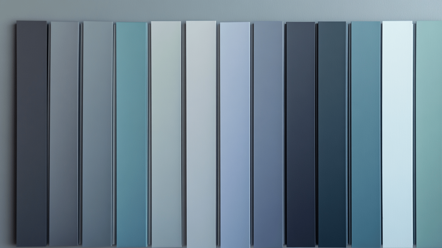
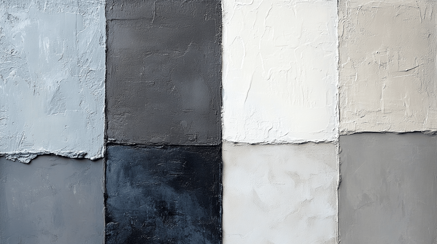
Paint undertones form the subtle color notes that emerge beneath the main color you see. These hidden hues become visible in different lighting conditions throughout the day. Most grays contain blue, green, or purple undertones, significantly influencing how the color appears in your space.
Understanding undertones helps prevent unexpected color shifts after painting. If you haven’t considered the underlying color makeup of a gray that looks perfect on a paint chip, it might show strong blue tints on your walls. Paint undertones interact with your room’s lighting and existing colors to create the final effect you’ll see daily.
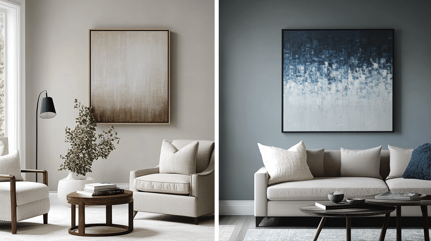
Why Choose Gray with Blue Undertones?
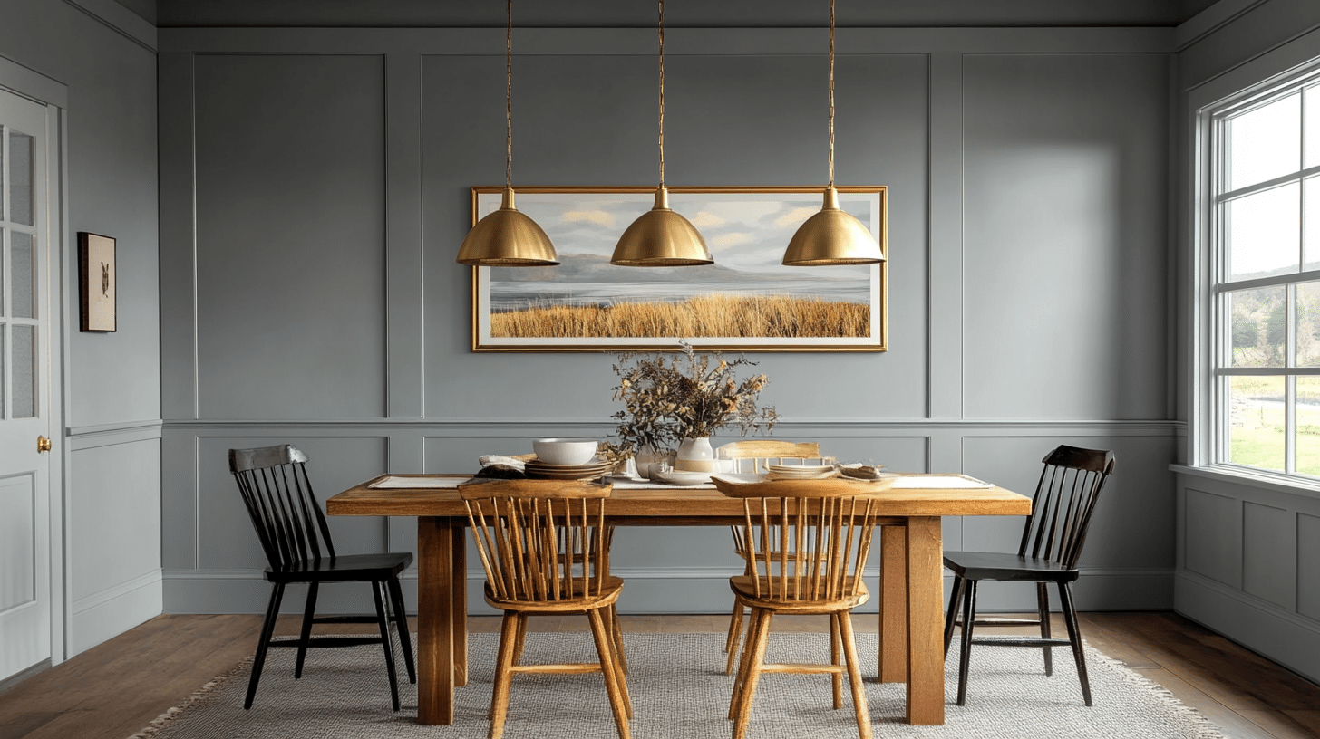
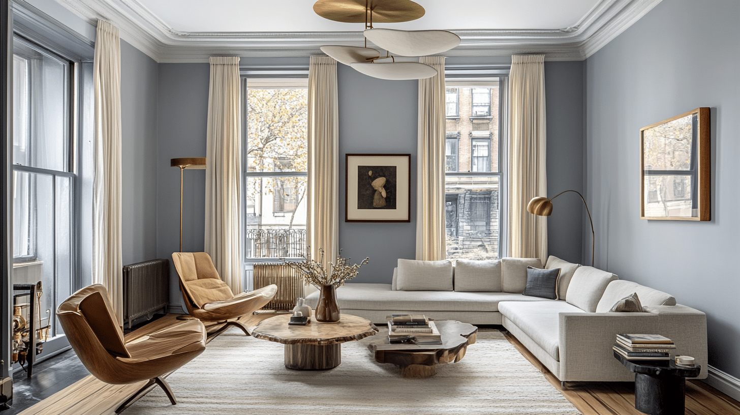
Blue-tinted grays bring a sense of calm and stability to interior spaces. These versatile shades work well in modern and traditional homes, offering more depth than plain gray while maintaining a fresh look.
These colors shine in spaces where you want to create a peaceful atmosphere. Many homeowners choose these tints for bedrooms and living areas because they promote relaxation without feeling cold. The subtle blue hints add sophistication while keeping the overall look understated and timeless.
Warm vs. Cool Gray Paints
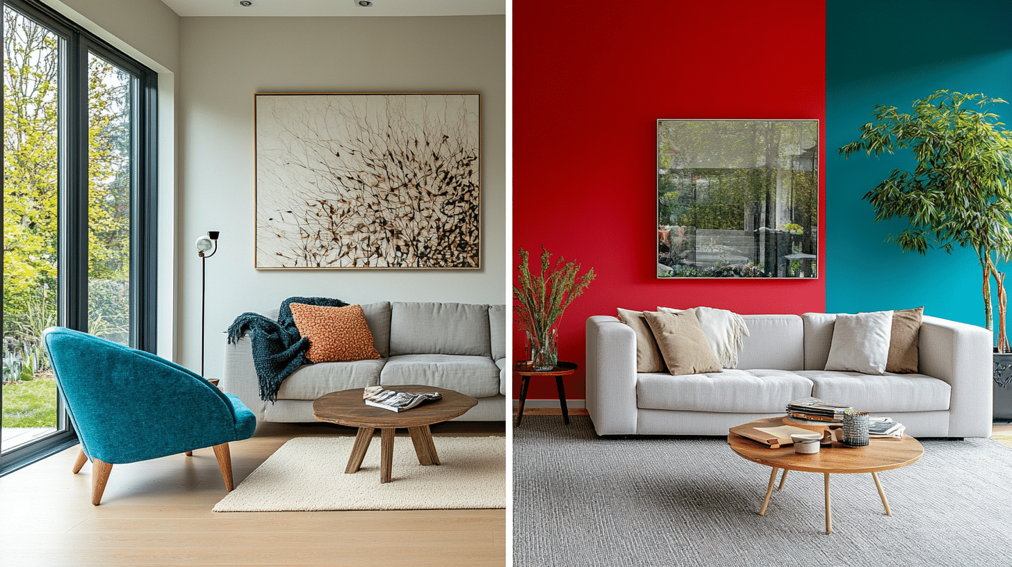
Cool grays featuring blue undertones create crisp, clean environments that feel fresh and modern. These shades pair beautifully with white trim and contemporary furnishings. They tend to work especially well in rooms with plenty of natural light.
Warm grays lean toward brown or beige, creating cozier spaces that feel more traditional. The choice between warm and cool depends largely on your room’s purpose and existing decor.
South-facing rooms can handle cooler tones, while north-facing spaces might benefit from warmer options to balance the natural light.
The temperature of your gray paint affects the entire mood of your space. Cool blue-tinted grays excel in creating bright, open atmospheres. They’re particularly effective in smaller rooms where you want to maximize the sense of space—warmer grays suit spaces where you want to foster comfort and intimacy.
Factors to Consider When Selecting a Gray-Blue Paint
1. Lighting Conditions
Natural light is vital in how gray-blue paint colors appear in your space. Morning sunlight brings out different tones compared to afternoon or evening light.
South-facing rooms receive a strong, warm glow throughout the day, which can soften the cool blue undertones.
North-facing rooms receive cooler, indirect light that might intensify blue undertones. Therefore, it is essential to test your chosen color at different times.
Artificial lighting also affects the paint’s appearance, with LED bulbs showing colors differently than incandescent or fluorescent options.
2. Room Size and Purpose
The size of your room influences how intensely the blue undertones will show. Smaller spaces might benefit from lighter gray-blue shades to maintain an open feel, while larger rooms can handle deeper tones without feeling closed in.
Bedrooms often work well with mid-tone gray-blue paints that create a peaceful sleeping environment.
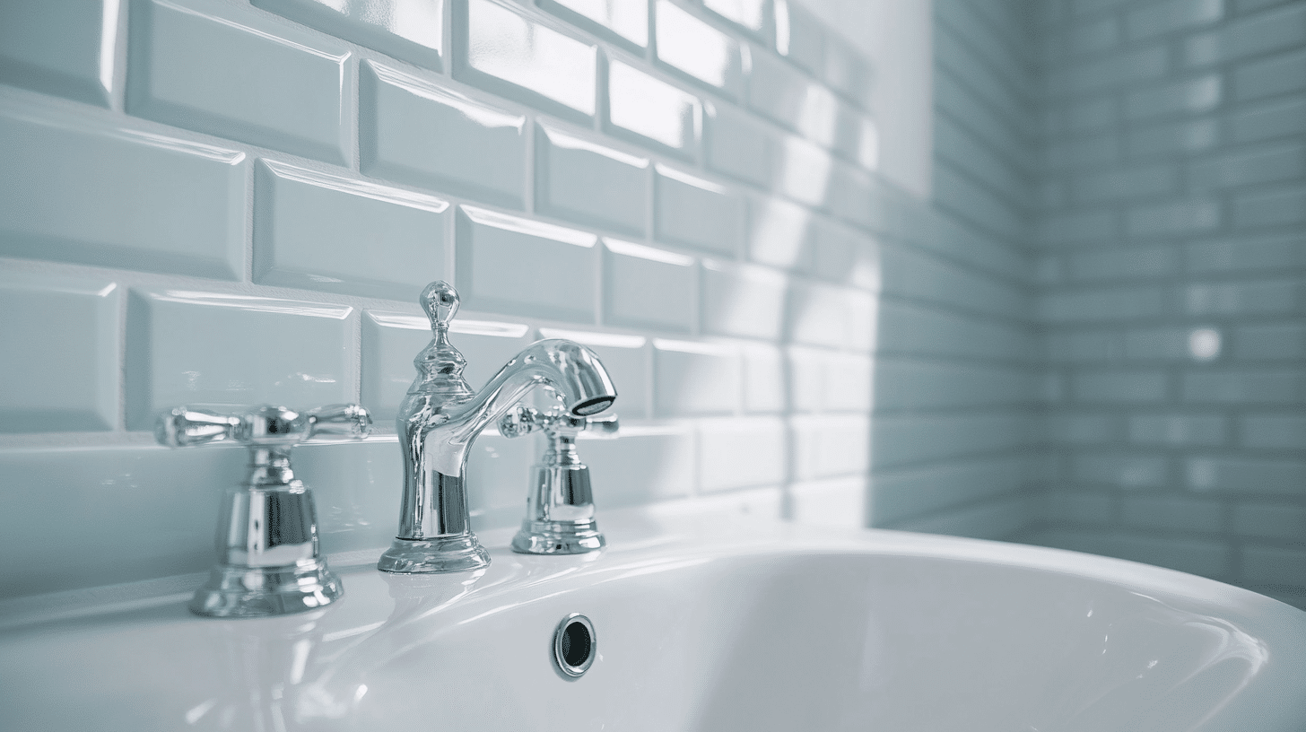
Bathrooms benefit from lighter shades that maintain brightness while adding subtle color. The kitchen and living areas might need different intensities based on their natural light and traffic patterns.
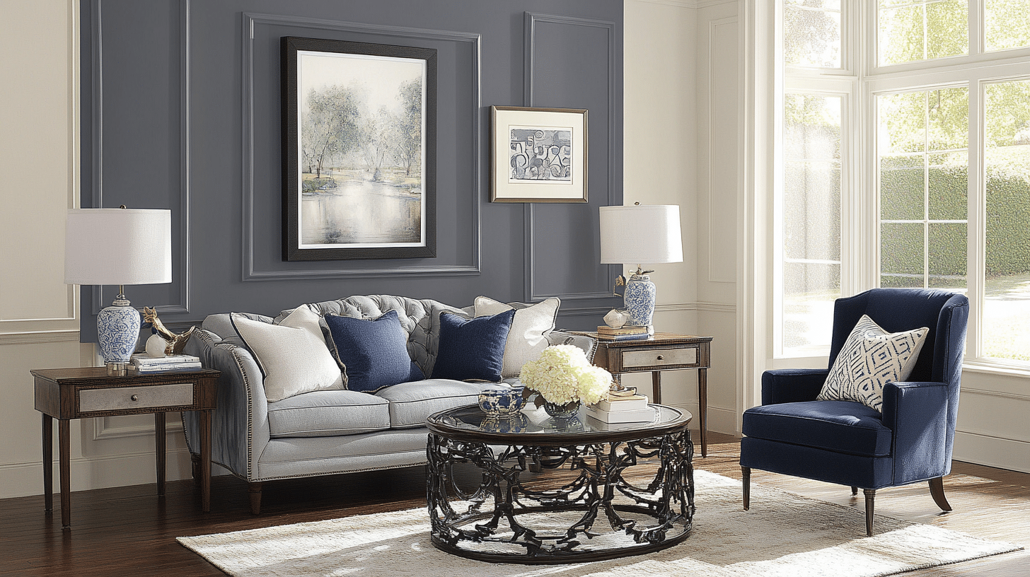
3. Existing Decor and Elements
Your current furniture and fixtures should guide your paint color selection. Wood tones, metal finishes, and fabric colors interact differently with gray-blue paint.
Natural wood adds warmth to balance cool undertones, while chrome or nickel fixtures enhance the crisp, clean feel.
Consider your flooring type and color as a starting point. Dark floors might require lighter walls to maintain balance, while light floors offer more flexibility with the intensity of wall color.
Your trim color also matters—white trim creates a sharp contrast with deeper gray-blue walls.
4. Finish Selection
Paint finish affects both the appearance and function of your chosen color. Flat or matte finishes hide wall imperfections but can be harder to clean. Eggshell provides a subtle sheen that works well in most living spaces.
Satin finishes offer good durability for high-traffic areas and resist moisture better than flatter options.
Semi-gloss works best on trim and doors, creating a pleasant contrast with wall colors. The higher the sheen, the more visible the blue undertones become in certain lights.
Top Gray Paint Colors with Blue Undertones
Detailed Reviews of Recommended Paints
Benjamin Moore Nimbus Gray offers a balanced mix of gray with gentle blue notes. With an LRV of 60.23, this shade brightens spaces while maintaining depth and interest.
In bedrooms, it creates a peaceful retreat that feels sophisticated yet welcoming. Morning light brings out its blue hints, while evening light shows its true gray base.
Sherwin Williams Network Gray presents a medium-toned option that works beautifully in modern spaces. Its blue undertones become more visible in natural daylight, creating a rich, layered look.
The color pairs exceptionally well with bright white trim and natural stone surfaces. Evening light softens its appearance, making it ideal for daytime spaces.
Sherwin Williams Silver Strand brings a lighter touch to the gray-blue family. This shade shows different personalities throughout the day, shifting from a soft gray in dim light to a subtle blue in bright spaces.
It works particularly well in bathrooms and kitchens where subtle color variations add interest without overwhelming the space.
Additional Noteworthy Colors
Sherwin Williams Gray Screen offers a lighter alternative that consistently maintains its blue undertones. This shade creates bright, open-feeling spaces, adding more interest than plain white walls. It performs especially well in rooms with limited natural light.
Benjamin Moore Boothbay Gray provides a rich, saturated option for accent walls or bold statements. The color maintains its depth without feeling heavy, making it suitable for larger spaces. It pairs beautifully with warm wood tones and brass fixtures.
Comparative Analysis
Let me share a clear breakdown of these colors to help you make an informed choice:
| Paint Name | Brand | Light Reflectance Value | Best Room Types | Best Lighting |
|---|---|---|---|---|
| Nimbus Gray | Benjamin Moore | 60.23 | Bedrooms, Living Rooms | Natural daylight |
| Network Gray | Sherwin Williams | 53.45 | Living Areas, Offices | Mixed lighting |
| Silver Strand | Sherwin Williams | 59.00 | Bathrooms, Kitchens | Bright spaces |
| Gray Screen | Sherwin Williams | 62.00 | Small spaces, Hallways | Limited light |
| Boothbay Gray | Benjamin Moore | 43.26 | Accent walls, Large rooms | Natural light |
How to Test and Choose the Right Color
1. Importance of Sampling
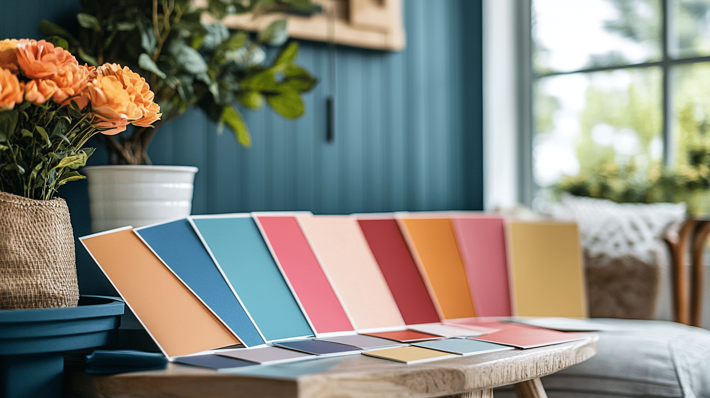
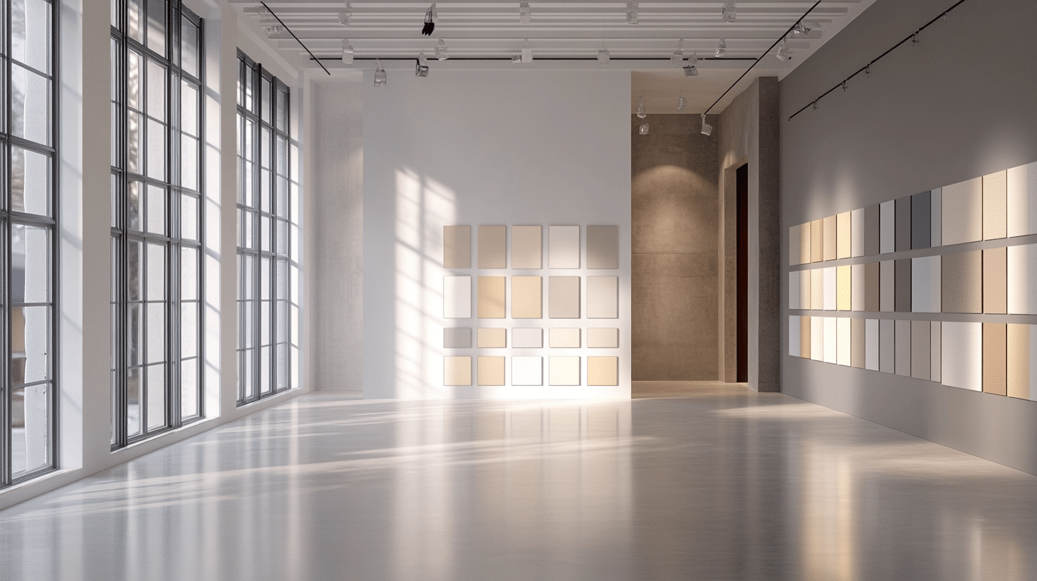
Testing paint colors in your space prevents costly mistakes and disappointment. Small paint samples let you see how colors look in your lighting conditions.
Due to lighting and surrounding elements, the same paint color can appear vastly different in two similar rooms.
Paint stores now offer large peel-and-stick samples that make testing easier than ever. These samples provide a better view of the color’s appearance than small paint chips.
You can also move the sample around the room to test different areas and lighting conditions.
2. Testing Tips
Start by placing samples on every wall of your room. Even in the same space, north—and south-facing walls often contrast colors. Watch how the color changes from morning to evening, noting when you like it best.
Consider the lighting you use most often in the space. If you mainly use the room in the evening, evening lighting should guide your decision more than morning light.
Test your samples against trim colors, flooring, and major furniture pieces to ensure everything works together.
3. Assessing Undertones in Your Space
To spot true undertones, compare similar colors side by side. Place a pure gray next to your chosen color to see how blue undertones emerge. Natural daylight shows undertones most clearly, so test during bright hours first.
The white paper helps reveal undertones by providing contrast. Hold white paper next to your sample and notice which colors become more visible.
This method helps identify whether blue undertones will complement your space.
4. Avoiding Common Mistakes
Paint colors on screens rarely match real life exactly. Computer monitors and phone screens can’t accurately display how paint colors look in physical spaces. Always test actual paint samples before making final decisions.
Consider how different finishes affect color appearance. Higher-gloss finishes reflect more light, making colors appear brighter or darker than expected.
Test your chosen finish along with the color to avoid surprises after painting.
Styling Ideas for Gray with Blue Undertones
1. Creating a Balanced Palette
Gray walls with blue undertones create an excellent foundation for various design styles. Natural wood furniture adds warmth and helps balance the cool tones in the paint.
Brass or copper light fixtures bring a golden glow contrasting beautifully with blue-tinted walls.
Textiles play a key role in completing the look of these spaces. Cream or ivory fabrics soften the coolness while maintaining a clean appearance.
Adding textured throws and pillows in warm neutrals creates depth without competing with the wall color.
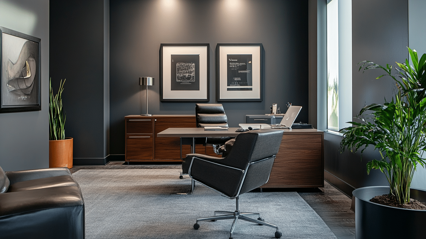
2. Using Gray-Blue as a Neutral Base
These versatile wall colors support many decorating choices. White trim and doors create clear boundaries and highlight architectural details. Steel or chrome hardware maintains the cool undertones while adding a subtle shine.
Consider layering different materials to add interest. Glass and mirror accents reflect light and make spaces feel larger. Stone surfaces like marble or slate complement the blue undertones, adding natural patterns and texture.
3. Accents and Decor Ideas
Depending on your goals, window treatments can enhance or soften blue undertones. Sheer white curtains maintain brightness while filtering harsh light.
Natural fiber blinds or woven shades add texture and warmth to balance cool walls.
Light fixtures deserve special attention in gray-blue spaces. Clear glass pendants keep rooms feeling open and airy. Table lamps with white or cream shades provide soft, flattering light that works well with cool wall colors.
Art selections can effectively unite your color scheme. Black-and-white photographs look striking against gray-blue walls. Abstract pieces incorporating similar tones create harmony while adding visual interest.
Area rugs help define spaces and add comfort. Choose patterns incorporating warm and cool tones to bridge the gap between wall color and furniture. Natural fiber rugs in neutral tones provide texture without competing with wall color.
Conclusion
Gray paint with blue undertones offers a perfect blend of style and serenity for today’s homes.
These shades create fresh and timeless spaces, working well in any room where you want to combine sophistication with calm.
Remember to test your chosen colors thoroughly in your specific space. Watch how they change throughout the day and interact with your lighting and furnishings. Observe how different finishes and decor items complement your selected shade.
The right gray-blue paint can transform an ordinary room into a peaceful retreat that maintains its style.
Whether updating a single room or planning a whole-house color scheme, these versatile shades provide an excellent foundation for creating spaces you’ll love for years.
If you’re unsure, start with a small space—you might want to bring these soothing tones into every room.