: Benjamin Moore Color Review")
Are you stuck trying to pick the perfect paint color? I was, too, until I found Woodlawn Blue. In this blog, I’ll show you exactly what this Benjamin Moore color looks like, where it works best, and how to use it in your home.
As a homeowner who’s tested dozens of paint colors, I can help you avoid the costly mistakes I made. I’ve painted four rooms with Woodlawn Blue and used it in different lighting conditions.
Whether you’re looking for a bedroom color that helps you sleep better, a bathroom shade that feels like a spa, or a living room tone that everyone compliments, this guide has your answers.
I’ll break it down:
- What makes this color special
- Which rooms it works best in
- Colors that match perfectly with it
- How to test it before committing
Let’s find out if Woodlawn Blue is right for you.
What Kind of Color Is Woodlawn Blue?
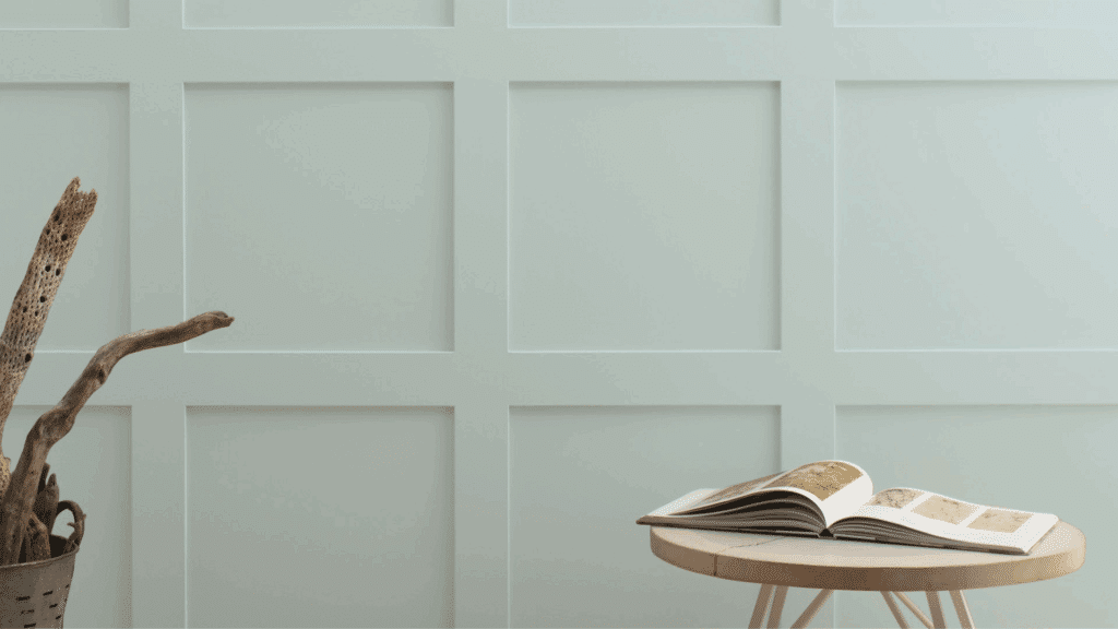
Woodlawn Blue (HC-147) is a soft blue-gray with green hints. It sits in the “Historical Collection” of Benjamin Moore paints. Not too bright or dark, it has just enough color to make a statement without being loud. Think of it as the color of a misty morning sky.
I find that it changes throughout the day. In morning light, the blue tones come out more. By evening, the gray takes over, creating a different feel.
The color has an LRV (Light Reflectance Value) of 60.65, which puts it in the medium-light range. This means it reflects a good amount of light while still having enough depth to show up well on walls.
What makes Woodlawn Blue special is its chameleon-like quality. In some spaces, it leans more toward blue, while in others, the gray or green undertones become more visible. This subtle shift helps it work in many different settings and with various decor styles.
What Rooms Work Best with Woodlawn Blue?
Woodlawn Blue (HC-147) by Benjamin Moore is a versatile light blue-gray shade that creates a calm, airy feeling in various spaces.
Bedrooms
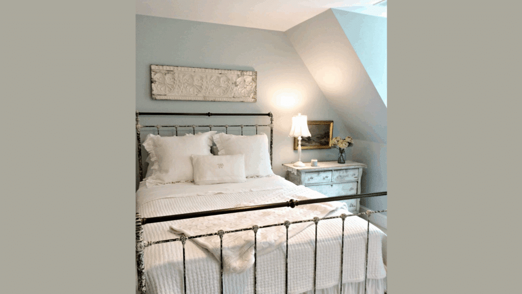
The soft blue-gray tones create a peaceful sleep environment. This color lowers heart rate and blood pressure, making it perfect for bedrooms.
I painted my master bedroom with Woodlawn Blue and paired it with crisp white bedding and natural wood nightstands. The combination feels both relaxing and pulled together.
Bathrooms
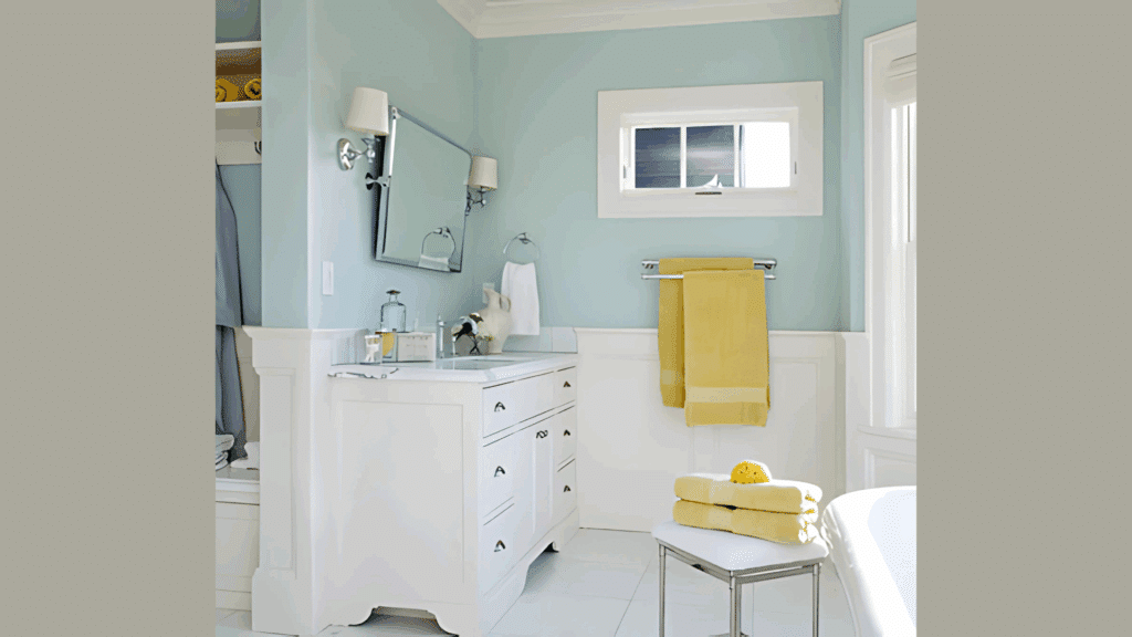
Woodlawn Blue gives bathrooms a clean, spa-like feel. The subtle blue hints remind us of water without being too obvious.
In my guest bathroom, I used Woodlawn Blue with white subway tile and chrome fixtures. Visitors always ask about the paint color and how it makes the small space feel bigger and more luxurious.
Living Rooms
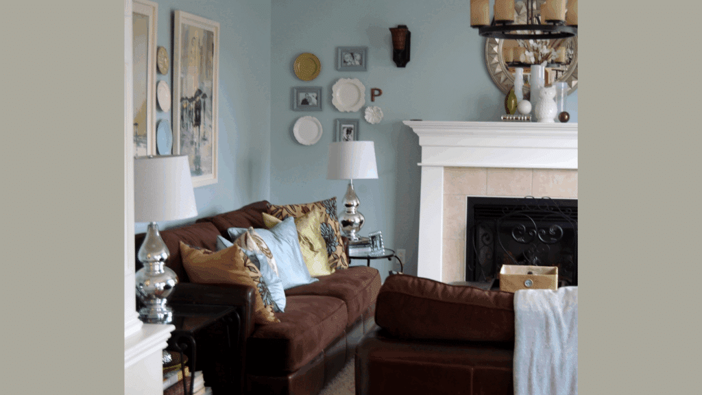
This color makes living spaces feel welcoming but sophisticated. It provides a neutral backdrop that doesn’t compete with furniture or art.
My friend painted her living room with Woodlawn Blue, and it beautifully highlights her collection of black and white photographs while making the room feel open and airy.
Home Offices
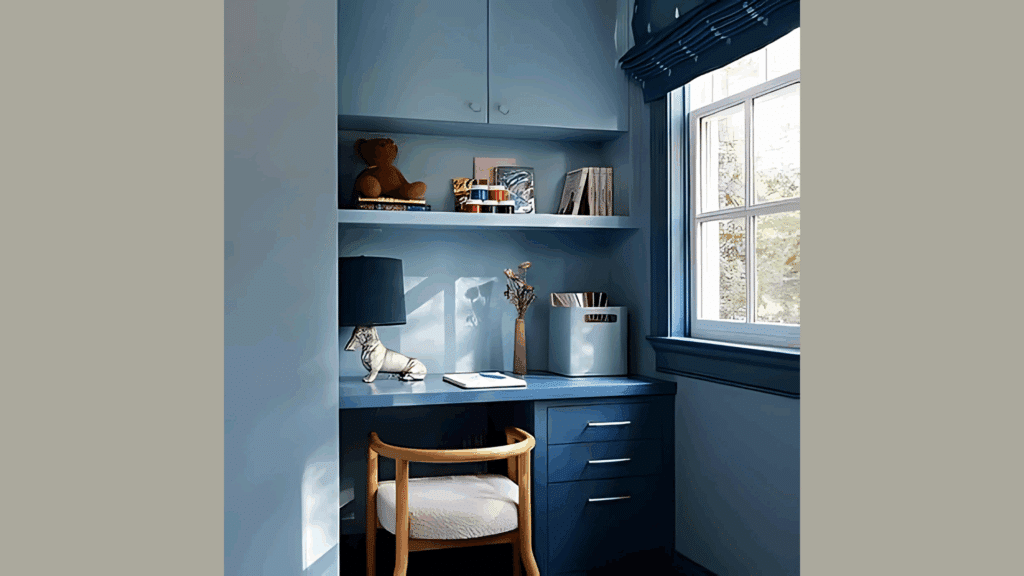
The color helps with focus without being boring. Blue tones promote productivity, while the gray aspects keep it professional.
I created an accent wall in Woodlawn Blue behind my desk, and it’s just enough color to make the space feel intentional without being distracting during video calls.
Kitchens
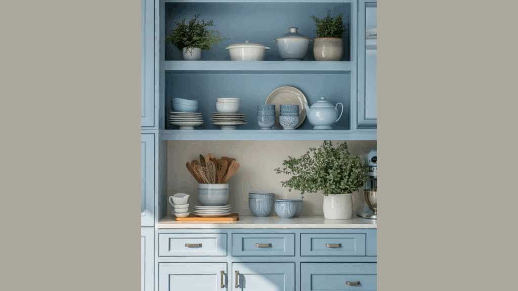
Woodlawn Blue adds subtle color that doesn’t overwhelm in food preparation spaces. It pairs beautifully with both white and stainless steel appliances.
My sister painted her kitchen cabinets in this shade, keeping the upper cabinets white, and the two-tone effect feels modern yet timeless.
What Colors Go Well with Woodlawn Blue?
Woodlawn Blue plays nicely with many colors. Here are my top matches:
- White: Crisp whites like Benjamin Moore’s White Dove make Woodlawn Blue pop
- Navy: For a deeper blue contrast that feels cohesive
- Soft greens: Sage or mint greens bring out the green undertones
- Warm woods: Oak, maple, or cherry wood tones add warmth
- Gray: Light grays create a soft, blended look
For my guest bedroom, I paired Woodlawn Blue walls with white trim and navy accents. The combo feels both fresh and timeless.
What Style Works Well with This Color?
Woodlawn Blue adapts beautifully to many design styles, which explains its lasting popularity. In coastal homes, it creates that perfect beachy feel without being too obvious – like sea glass or the ocean on a misty day.
For farmhouse-style interiors, it adds a modern touch while respecting the rustic elements that define the look. When used in traditional settings, the color complements classic furniture pieces and architectural details, providing a fresh update to timeless design.
Modern spaces benefit from its calm presence as a backdrop for clean lines and minimal furnishings. Perhaps most impressively, Woodlawn Blue shines in transitional homes by seamlessly connecting traditional elements with contemporary pieces.
My own home leans toward transitional style, and I’ve found this color creates the perfect bridge between my antique wooden chest and my more modern sofa.
This versatility makes it a safe choice if you’re not committed to just one decorating style or if you like to mix elements from different eras.
Is It a Warm or Cool Color?

Woodlawn Blue is definitely a cool color. The blue and gray elements give it that cool feeling, but it’s not icy or harsh. I’d call it a “friendly cool” – not the kind that makes a room feel cold.
The hint of green adds depth and keeps it from being too cool. This balance makes it work year-round in most homes.
| Characteristic | Woodlawn Blue | What This Means For Your Space |
|---|---|---|
| Temperature | Cool | Creates a calm, refreshing atmosphere |
| Undertones | Green-gray | Adds sophistication and prevents it from looking too “baby blue” |
| Light Reflectance Value | 60.65 | Bright enough to reflect light but not so light that it looks washed out |
| Seasonal Feel | Year-round | Works well in both summer and winter settings |
| North vs. South Rooms | Adaptable | Appears more gray in north-facing rooms, more blue in south-facing rooms |
How to Test This Color in Your Space?
Please don’t skip this step! Here’s how I test any paint color:
- Buy a sample: Get a small container of Woodlawn Blue
- Paint a board: Use a 2×2 foot piece of poster board
- Move it around: Check how it looks in different spots at different times of day
- Look at it for 3 days: Your first impression might change
When I tested Woodlawn Blue, I was surprised at how different it looked from morning to night. In my north-facing room, it appeared more gray. In my south-facing room, the blue and green came out more.
What Paint Finish Should You Choose?
The finish changes how Woodlawn Blue looks on your walls. Here’s what I recommend:
- Flat: Good for ceilings and low-traffic areas
- Matte: My favorite for most walls – hides flaws well
- Eggshell: This works in kitchens and bathrooms where you need to clean walls
- Satin: Adds a slight shine, good for trim with this color
- Semi-gloss: Too shiny for Woodlawn Blue walls, but works for trim
I used matte in my bedroom and eggshell in my bathroom. The eggshell finish makes cleaning easier without adding too much shine.
Real Home Ideas Using Woodlawn Blue
I’ve collected these ideas from my own home and friends’ houses:
- Kitchen cabinets: Lower cabinets in Woodlawn Blue with white uppers
- Accent wall: Just one wall behind a bed or sofa
- Whole-room color: All walls in a bathroom or bedroom
- Furniture: A dresser or bookcase painted this shade
- Exterior: Front door or shutters for a subtle pop
My neighbor painted her built-in bookshelves Woodlawn Blue against white walls. It looks amazing and has inspired me to try it on furniture.
Common Mistakes to Avoid
- Using yellow lighting with Woodlawn Blue. Incandescent bulbs or warm LEDs make this color look too green and muddy. To show its true beauty, stick with cool or neutral white bulbs (3000-4000K).
- Pairing it with cream instead of white. Cream or ivory makes Woodlawn Blue look dingy. For trim and ceilings, the color shines best with crisp whites like Benjamin Moore’s White Dove or Simply White.
- Not testing in your actual space. This color changes dramatically with lighting. I was shocked at how different it looked in my north-facing living room versus my south-facing bedroom. Always test a large sample board.
- Using only blue accents. This creates a room that feels flat and one-dimensional. Mix in other colors like greens, grays, and even pops of coral or gold for depth and interest.
- Expecting it to look exactly like the online photos. Every screen shows colors differently, and professional images are often edited. The only way to know how it will look in your home is to test it on your walls.
Why Do People Like Woodlawn Blue?
Woodlawn Blue has become a favorite color for many homeowners, and for good reason. Its unique balance of blue, gray, and green creates a versatile shade that feels both classic and current. People love it because it’s not a typical blue – it has depth and complexity without being hard to use.
The color creates peaceful spaces that still feel alive and interesting. It works with many decorating styles and doesn’t date quickly like trendier colors might.
Whether in bright or dim lighting, it maintains its character while shifting subtly throughout the day, keeping spaces fresh and engaging. This adaptability makes it a safe choice for those who want color without the risk of getting tired of it.
Conclusion
After living with Woodlawn Blue for years, I can honestly say it’s worth trying in your home. This color strikes the perfect balance – enough color to be interesting, but subtle enough to live with daily.
What makes it special is its ability to work in almost any room and with most decor styles. It’s the rare paint color that looks good in both morning and evening light.
Before you buy gallons, though, remember these three things:
- Test a sample in your actual space
- Look at it during different times of day
- Consider how it works with your existing furniture
I still smile when I walk into my Woodlawn Blue rooms. That lasting satisfaction is the true test of a great paint color choice.
Frequently Asked Questions
Is Woodlawn Blue Too Blue for A Living Room?
No, it’s actually a subtle blue-gray with green undertones. Most people find it calming in living spaces without being overly colorful or childish.
Does Woodlawn Blue Work with Oak Cabinets?
Yes! The cool tones of Woodlawn Blue beautifully balance the warmth of oak, creating a modern update without requiring new cabinets.
Will Woodlawn Blue Make a Small Room Look Larger?
It can! Its light-to-medium tone reflects enough light to open up small spaces, especially when paired with white trim and ceilings.
Can I Use Woodlawn Blue in North-Facing Rooms?
Yes, but expect it to look more gray than blue. In north-facing rooms, it creates a soft, cozy atmosphere rather than a bright blue feel.
How Does Woodlawn Blue Compare to Sea Salt?
Woodlawn Blue has more blue tones, while Sea Salt leans greener. It is slightly deeper, making it more versatile in different lighting conditions.