")
Benjamin Moore Philadelphia Cream (HC-30) is a warm, creamy paint color with soft yellow undertones.
It brings light and comfort into any space without feeling too bright or bold. This shade works great as a wall color when you want something more cheerful than beige but softer than true yellow.
Philadelphia Cream is a great choice for homes that need a little extra warmth. It can make any room feel cozy and full of light.
It’s perfect for traditional spaces, sunny kitchens, or any room where you want to add a soft glow.
In this blog, I’ll share everything you need to know about Benjamin Moore Philadelphia Cream.
You’ll learn what kind of color it is, how it looks in different rooms, what it pairs well with, and why it might be the warm neutral your home is missing.
What Kind of Color Is Benjamin Moore Philadelphia Cream (HC-30)?
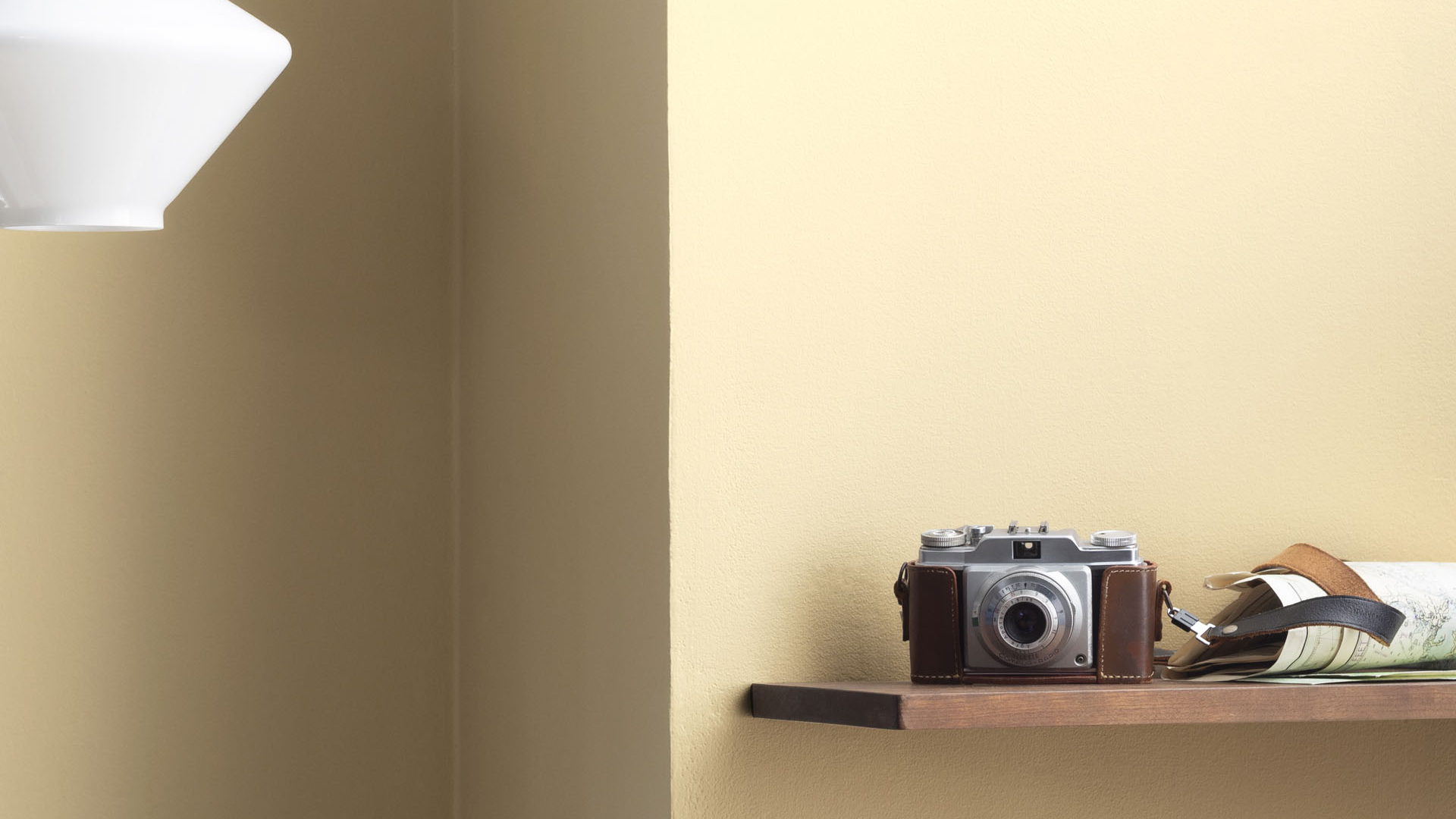
Philadelphia Cream is a warm neutral with yellow and beige undertones. It’s soft and sunny but not too bright.
This paint color gives off a welcoming glow that feels timeless and comforting. It’s great for anyone who wants a traditional, homey look without going too dark or too bold.
The Light Reflectance Value (LRV) is 69.12%, which means it reflects a moderate amount of light.
It doesn’t feel too light or too heavy, just enough to bring brightness while still adding color and depth. The hex code is #E4D3B2, showing its creamy, soft, golden base.
This color looks especially good in rooms with natural light, but it also holds up well in artificial light. It’s warm and gentle, not overpowering, and adds life to a room without taking over.
Philadelphia Cream: A Warm, Cozy Color for Every Room
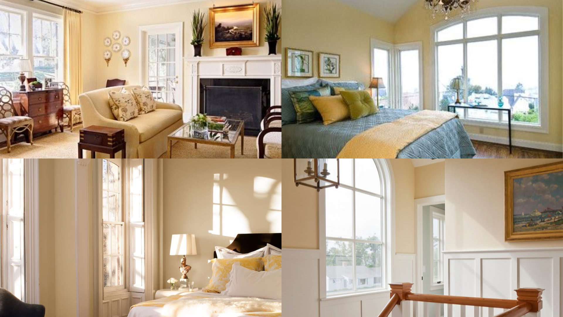
Philadelphia Cream works well in almost any room. It adds charm and comfort without being too bold or dark. It feels fresh in the daytime and cozy at night. Its soft glow helps spaces feel lived-in and loved.
Living Room
In the living room, Philadelphia Cream makes the space feel warm and relaxed. I love how it works with wood furniture, soft throw blankets, and warm metals like bronze or brass.
Add creamy trim, neutral rugs, and cozy lighting to create a welcoming feel that suits family time or quiet nights.
Bedroom
Philadelphia Cream gives bedrooms a peaceful and restful feel. I like pairing it with off-white bedding, light wood furniture, and soft textures like cotton and linen.
Add warm lighting and simple decor to make the room feel calm and cozy. This color helps create a serene retreat perfect for unwinding after a long day.
Kitchen
I’ve found that this color is a great choice for kitchens because it adds warmth without being too bold. It looks great with wood cabinets, stone counters, or white trim.
It also works well with both vintage and modern styles, depending on how you decorate. The creamy tone brightens the space while keeping it inviting and homey.
Bathroom
Philadelphia Cream brings a soft glow to bathrooms, making them feel clean and comforting.
I love how it pairs with white tile, brass or bronze hardware, and fluffy towels in cream, beige, or even soft peach.
The gentle hue enhances natural light and adds a soothing touch to the space. It’s perfect for creating a spa-like feel at home.
How to Use Philadelphia Cream in Small or Low-Light Spaces
Thanks to its warm tone and mid-range LRV, Philadelphia Cream can make small or darker rooms feel cozy and inviting.
While it doesn’t reflect as much light as a bright white, it still helps brighten a room without feeling too sharp.
1. Accent Walls: Use Philadelphia Cream as an accent wall in a small room to add color without closing it in. Pair it with soft white on the other walls to keep the space feeling open.
2. Hallways and Entryways: In entryways or narrow halls, this warm color can create a soft and friendly welcome. Add mirrors, warm lighting, and natural decor like baskets or light wood shelves to complete the look.
How to Pair Philadelphia Cream with Other Paint Colors and Accents
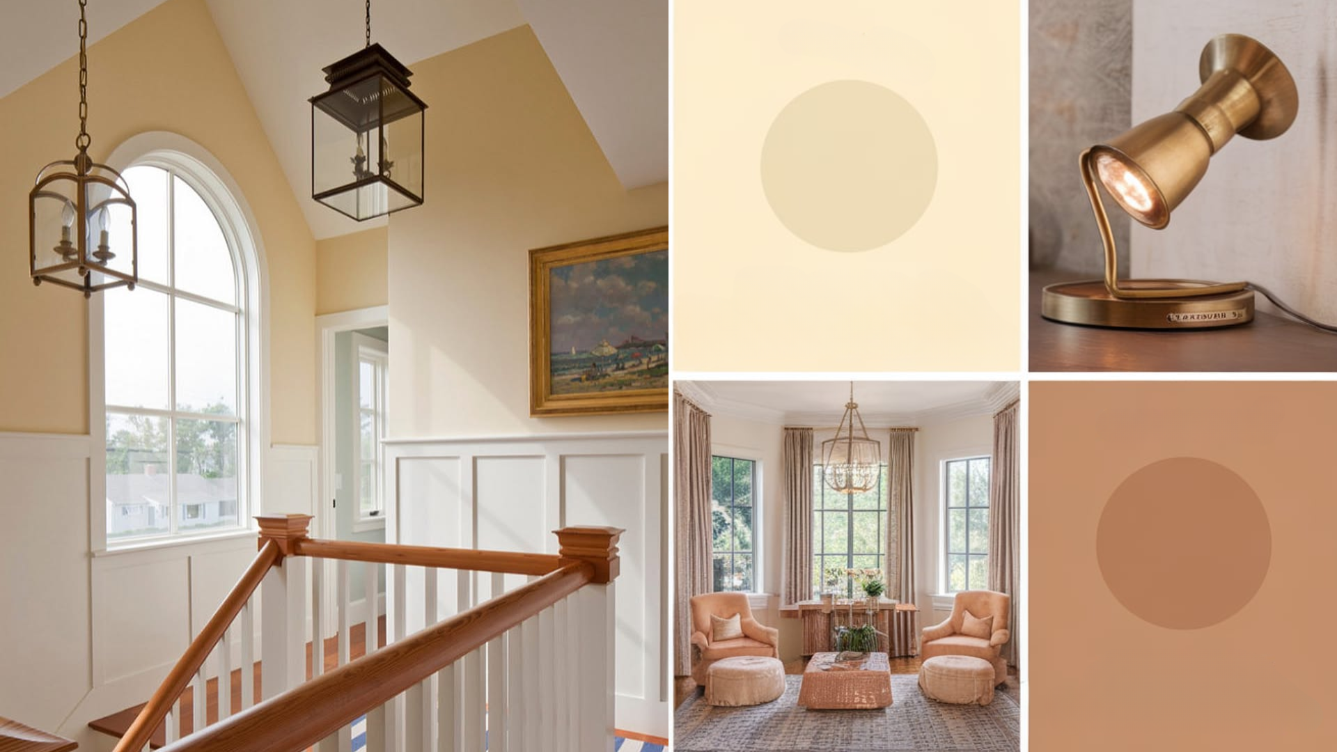
Philadelphia Cream has warm, soft undertones that work well with many other colors. You can create different looks depending on what you pair it with—cozy, classic, bright, or calm.
Neutral Colors: This color pairs beautifully with warm whites, cream, tan, and soft browns. These shades create a cozy and calming palette. Use white for trim or ceiling, and layer beige or taupe textiles for balance.
Warm Accents: Add wood tones, gold or bronze metals, terracotta, or earthy reds to warm up the room even more. These colors enhance the soft yellow in Philadelphia Cream and help the room feel even cozier.
Bold Colors: If you want a little contrast, try navy, deep green, or charcoal gray. These bold accents stand out nicely without clashing. Add them in small pieces like throw pillows, art, or a dark piece of furniture.
What Style Works Best with Benjamin Moore Philadelphia Cream?
Philadelphia Cream is a classic and traditional color, but it can work with many styles. It blends well into both casual and formal spaces, depending on how you decorate.
In traditional homes, this color pairs perfectly with crown molding, antique furniture, and warm wood floors. It brings a timeless charm that feels welcoming and homey.
In farmhouse spaces, it adds warmth to clean lines, white trim, and rustic wood. Add open shelving, simple decor, and cozy textures to complete the look.
In cottage or country-style homes, Philadelphia Cream feels just right. It pairs well with floral fabrics, natural wood, and vintage details.
In transitional styles, it balances well with both old and new furniture. It helps mix classic pieces with modern shapes in a soft and easy way.
Is Benjamin Moore Philadelphia Cream a Warm or Cool Color?

Philadelphia Cream is a warm color. It has yellow and beige undertones that give it a soft, golden feel. This warmth helps create a cozy and friendly atmosphere in any room.
Unlike cool grays or stark whites, warm colors like Philadelphia Cream add comfort and life to a space.
It’s especially good in rooms that feel cold or need a little soft glow. It works well with warm woods, soft lighting, and cozy textures.
This warm base makes it ideal for homes that want to feel welcoming, soft, and easy to live in.
Color Characteristics Table
| Color Name | Philadelphia Cream |
|---|---|
| Color Code | HC-30 |
| Hex Code | #E4D3B2 |
| RGB | 228, 211, 178 |
| Undertones | Yellow, Beige |
| Mood/Effect | Warm, Classic, Cozy |
| Best Rooms | Living Rooms, Bedrooms, Kitchens, Bathrooms |
| Style Compatibility | Traditional, Farmhouse, Cottage, Transitional |
| Light Reflectance Value (LRV) | 69.12% |
Like any paint color, Philadelphia Cream may look different in your home depending on the lighting and nearby colors. Always test before painting an entire room.
What Paint Finish Works Best for Philadelphia Cream?
Choose the right paint finish based on where you’re using the color and how the space is used:
1. Matte or Flat Finish: Best for bedrooms or ceilings. It gives a soft look and hides wall flaws.
2. Eggshell or Satin Finish: Great for living rooms, kitchens, and bathrooms. It’s easy to clean and gives a gentle glow.
3. Semi-Gloss or Gloss Finish: Perfect for trim, doors, and cabinets. It’s shiny and durable.
Select the finish that best suits your space and cleaning needs.
Common Mistakes to Avoid with Philadelphia Cream
A few things to watch out for when using this color:
1. Skipping the Sample Test: Lighting changes how it looks. Always test before painting.
2. Pairing with Cool Grays: Cool tones can clash with Philadelphia Cream’s warm undertones. Stick with warm neutrals.
3. Overusing Bright White Trim: Bright whites can make the creamy warmth feel too yellow. Use a soft or warm white instead.
Why People Love Benjamin Moore Philadelphia Cream
People love this color because it feels:
- Warm and welcoming
- Soft but not plain
- Classic and timeless
- Easy to match with other colors and styles
It’s a go-to shade for homes that want comfort and light in one paint color.
Is Philadelphia Cream the Right Paint Color for Your Home?
Benjamin Moore Philadelphia Cream (HC-30) is a warm, soft paint color that brings comfort and charm into any space.
It has just enough yellow to feel cozy, but not so much that it feels bright or bold. This makes it easy to live with and pair with furniture, decor, and finishes.
You can use it with warm woods, soft fabrics, and brass or bronze finishes.
It also pairs well with light neutrals or deeper accent colors, such as navy or olive green. Regardless of the room, it helps create a calm and welcoming atmosphere.
Philadelphia Cream has a timeless look. It doesn’t go out of style. It feels fresh in the day and cozy at night.
If you’re looking for a paint color that adds warmth and beauty without being too strong, this one is worth trying. It’s simple, classic, and always looks good.