")
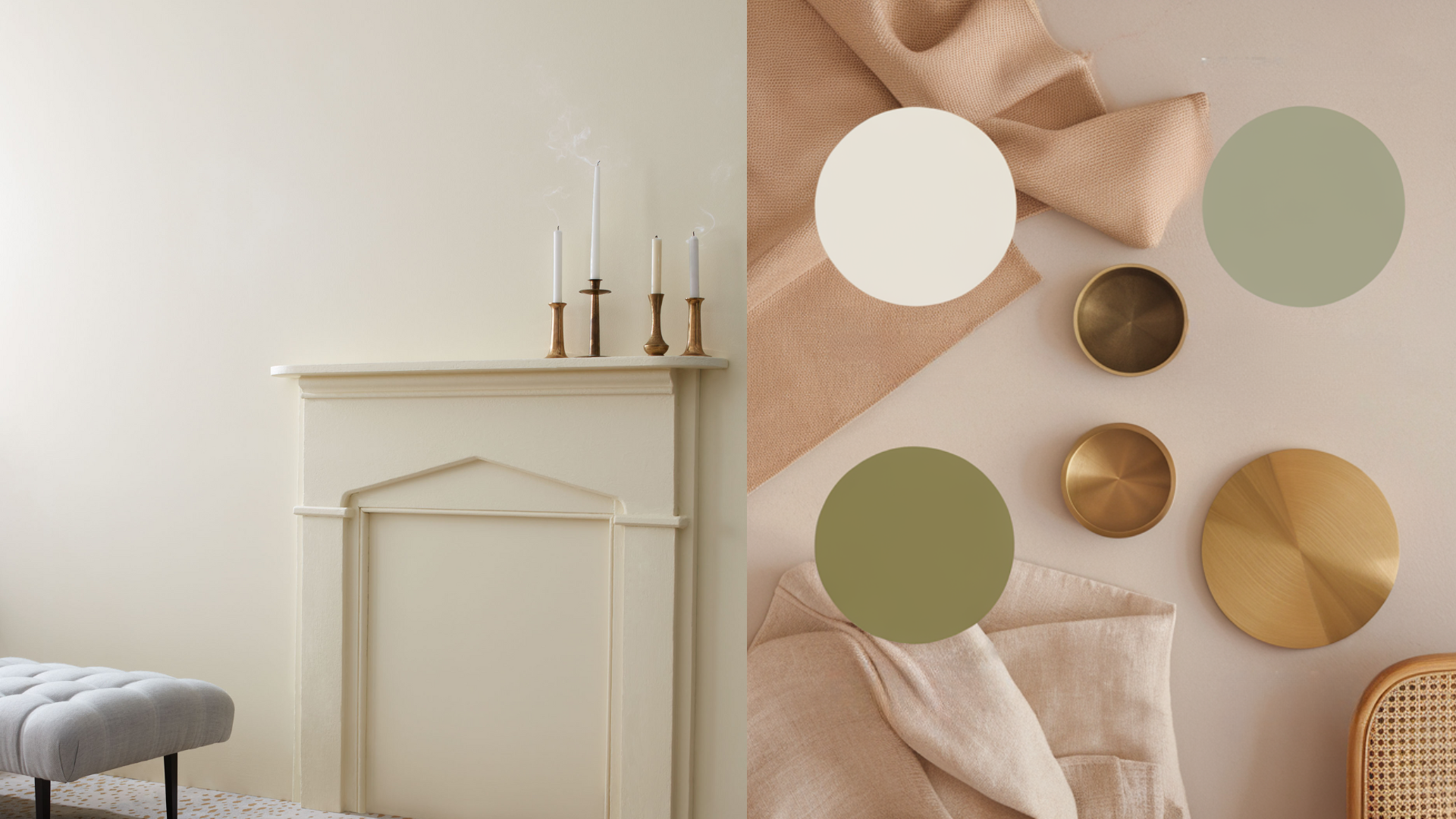
Benjamin Moore Bruton White (CW-710) is a soft, creamy white that brings warmth and charm to any room. It’s a subtle off-white with just enough warmth to feel cozy, but not so much that it feels yellow.
If you’re looking for a white that’s classic, calm, and never harsh, Bruton White might be just right.
This color works well in both old and new homes. It’s part of the Williamsburg Collection, which gives it a timeless, historical feel.
I love how Bruton White creates a peaceful background while still adding a hint of character. It’s a great choice for walls, trim, and even cabinetry.
In this blog, I’ll explain why Bruton White by Benjamin Moore is such a great pick for any space. From its soft undertone to its flexibility with different styles, you’ll see why this white paint is a quiet favorite.
Let’s look at what makes Bruton White so special.
What Kind of Color Is Benjamin Moore Bruton White (CW-710)?
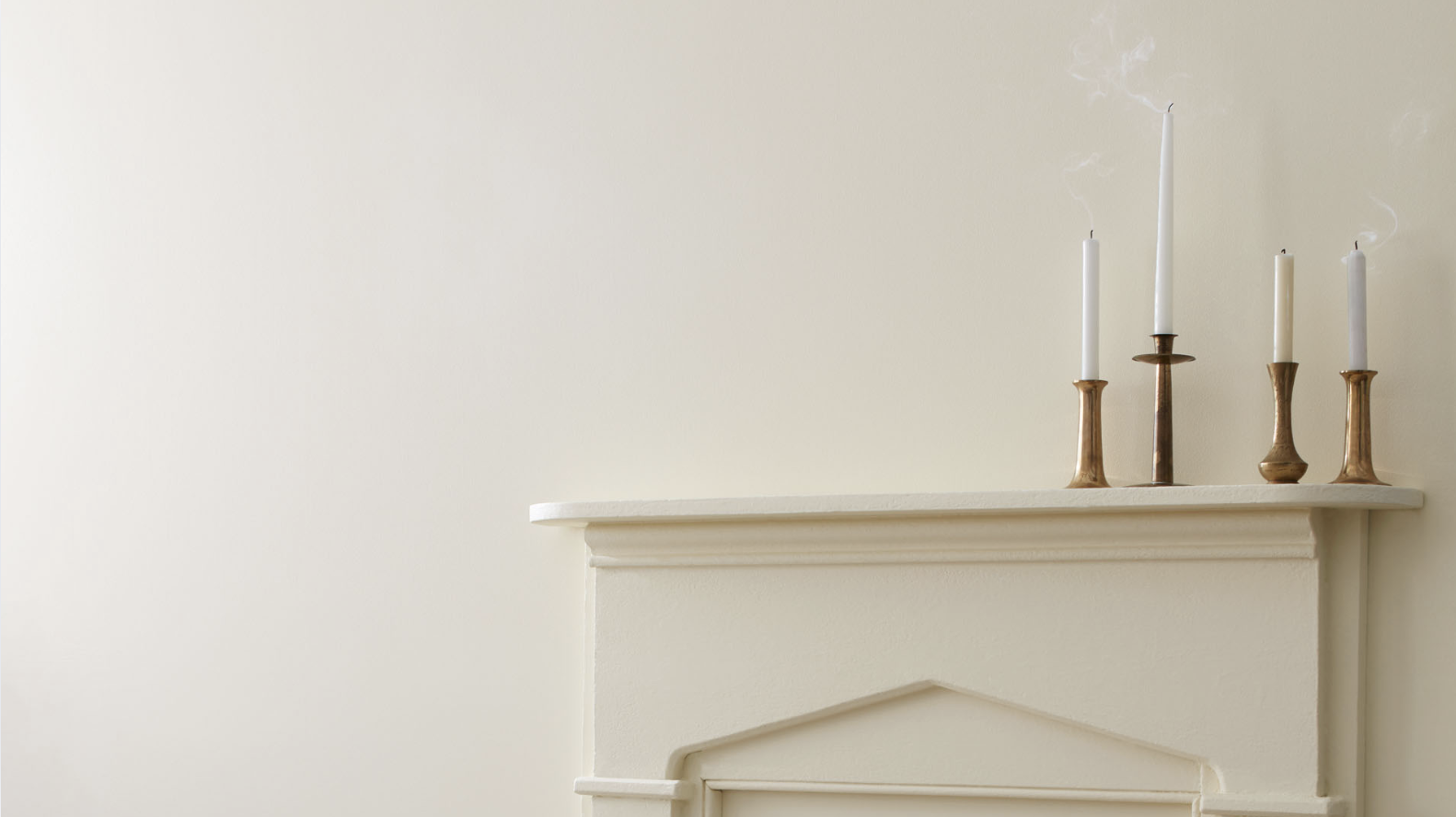
Benjamin Moore Bruton White is a warm off-white with a creamy undertone. It’s soft and subtle, making it a great option if you want a color that’s more inviting than a stark white. It doesn’t feel cold or clinical—it feels gentle and natural.
Bruton White has a Light Reflectance Value (LRV) of 63.26%, so it reflects a good amount of light without being too bright. That means it can help open up a room and still bring in warmth. It’s a nice balance between a bright white and beige.
This is a great paint color for anyone who wants a clean, light look that still feels lived-in. The warmth in Bruton White adds personality without taking over. It blends easily with other shades and doesn’t fight for attention.
If you’re painting walls, trim, or ceilings, Bruton White gives a timeless, welcoming touch to your space.
Bruton White: A Versatile Soft White for Every Room
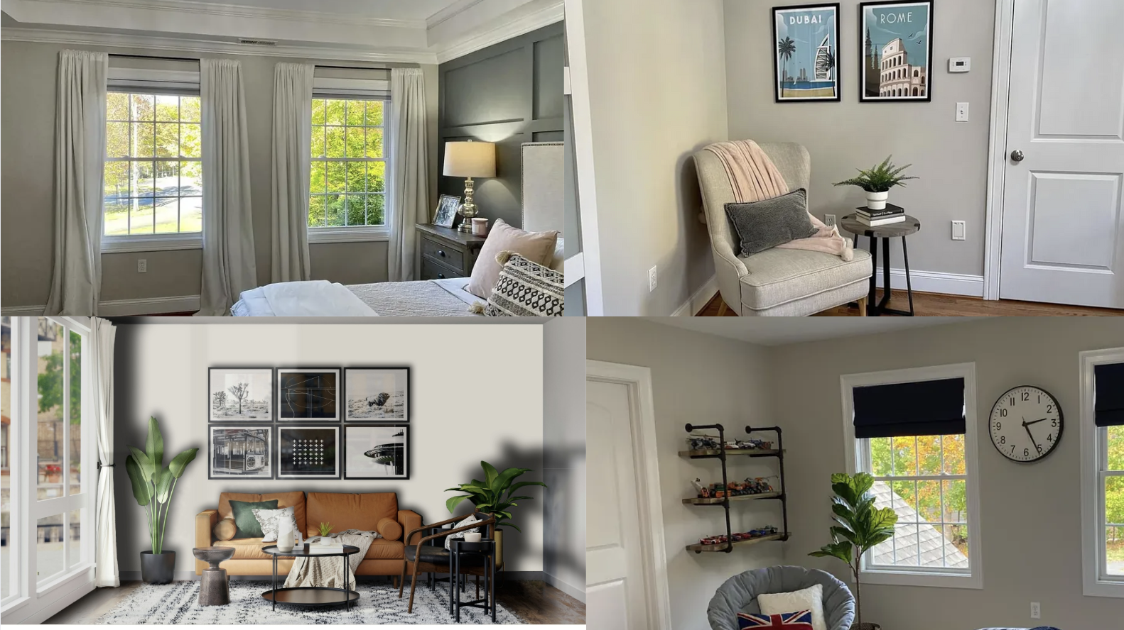
One of the best things about Bruton White is how well it works in every room. It’s soft enough to use anywhere and light enough to keep rooms feeling open.
This warm white looks beautiful with many design styles, from vintage charm to modern clean lines. Here’s how it fits into each space in your home.
Living Room
In the living room, I find that Bruton White adds a cozy, calm feel that makes the space easy to relax in. It creates a beautiful backdrop for both bright and neutral furniture, giving me a lot of flexibility when decorating.
I like pairing it with warm wood tones, soft grays, or even dark navy for contrast. It brings a clean and inviting look without being too bright or stark. This shade really helps tie the whole room together in a subtle, elegant way.
Bedroom
Bruton White is a top pick for bedrooms because it helps create a restful, quiet space. Its creamy tone works well with soft bedding, natural wood, and woven textures.
The color adds warmth without being too yellow, making your room feel peaceful and cozy.
Kitchen
For kitchens, I think Bruton White is a solid choice for both walls and cabinets. It brings a nice mix of warmth and light into the space, making it feel welcoming without being too bright.
I love how it works with white tile, marble countertops, or natural wood accents – it all comes together beautifully. This soft white gives my kitchen a fresh, updated look that still feels classic and comfortable. It’s the kind of color that makes the space feel timeless but still personal.
Bathroom
In the bathroom, Bruton White offers a clean look without feeling cold. It works well with chrome or brass fixtures and pairs nicely with white or beige tile.
It helps create a spa-like space that feels bright and calm at the same time. The soft warmth of this shade brings just enough color to add interest without overwhelming the room.
How to Use Bruton White in Small Spaces or Low-Light Rooms
Bruton White is perfect for small rooms or areas without much natural light. It’s light enough to brighten up the space, and its warm tone keeps it from feeling stark. Even in tighter spaces, Bruton White feels soft and welcoming.
While Bruton White is soft and subtle, it can still stand out as an accent wall, especially in rooms that already have a lot of color or texture. It adds a calm spot to the room and helps other features shine. Use it with patterned rugs or bold art to keep things interesting.
This color is also great in hallways and entryways. These spots often don’t get a lot of light, and Bruton White helps open them up. It gives the space a fresh, bright feeling while still staying warm and cozy.
How to Pair Bruton White with Other Paint Colors and Accents
Bruton White is easy to pair with other colors. It works well with both warm and cool shades, which makes decorating around it simple.
- Neutral Colors: Bruton White looks great with other neutrals. Try it with soft taupe, light gray, or beige for a layered and peaceful look. It also works beautifully with wood tones, woven textures, and natural materials.
- Warm Accents: To bring out the creamy warmth in Bruton White, pair it with brass, gold, or warm brown accents. These tones highlight the cozy side of the color and make the room feel extra inviting.
- Bold Colors: Bruton White also pairs nicely with bold shades. Deep navy, olive green, and charcoal gray stand out against the soft white, adding contrast and style. Just use bold colors in small amounts, like pillows, rugs, or accent furniture, to keep the room feeling balanced.
What Style Works Best with Bruton White?
Bruton White is a flexible color that fits many home styles. Its soft, creamy tone helps it blend into both classic and modern spaces with ease.
In traditional homes, Bruton White adds warmth and depth without stealing the show. It works great with vintage pieces, warm wood, and antique finishes, helping keep the room looking clean and put-together.
In modern or minimalist spaces, Bruton White offers a warm take on clean white walls. It pairs nicely with sleek furniture, black accents, and smooth surfaces. It adds a touch of softness to sharp lines and simple decor.
It’s also a perfect fit for farmhouse, cottage, or transitional styles. The warmth of Bruton White brings out the charm of these designs and makes the space feel cozy and lived-in.
Is Benjamin Moore Bruton White a Warm or Cool Color?

Bruton White is a warm color. Its soft, creamy undertones give it a gentle and cozy feel, making it a great pick for spaces where you want to feel calm and relaxed.
Even though it’s a warm white, it’s not overly yellow. It has just enough color to feel soft but still stays neutral. This balance makes it easy to match with other tones in your home.
Warm whites like Bruton White help brighten up dark rooms without feeling cold. They also add comfort to open spaces, making everything feel more connected and welcoming.
This warmth is what makes Bruton White stand out from other stark or cool whites.
Color Characteristics Table
| Color Name | Bruton White |
|---|---|
| Hex Code | #F1E9DC |
| RGB | 241, 233, 220 |
| Undertones | Creamy, Soft Beige |
| Mood/Effect | Warm, Cozy, Classic |
| Best Rooms | Living Rooms, Bedrooms, Kitchens, Bathrooms |
| Style Compatibility | Traditional, Modern, Farmhouse, Cottage |
| Light Reflectance Value (LRV) | 63.26% |
How to Test This Color in Your Home Before Painting
It’s always smart to test paint colors before doing a full room. Even soft whites can look different depending on the lighting and other features in the space.
- Buy a Sample: Get a sample of Bruton White from a Benjamin Moore store or online.
- Paint Large Swatches: Paint big test areas on more than one wall to see how the color reacts to light throughout the day.
- Check Lighting: Look at the swatches during the morning, afternoon, and evening. Light changes color more than you might expect.
- Match with Decor: Hold up furniture, fabric, or flooring samples near the paint to see how well they go together.
What Finish Works Best for Bruton White?
Choosing the right finish helps bring out the best in Bruton White. Here’s a quick guide to picking the right sheen:
1. Matte or Flat Finish: Perfect for bedrooms or ceilings. It gives a smooth, soft look with no shine.
2. Eggshell or Satin Finish: Great for living rooms, kitchens, or bathrooms. These finishes are easy to clean and offer a soft glow.
3. Semi-Gloss or Gloss Finish: Ideal for trim, cabinets, or doors. These finishes reflect more light and are easier to wipe clean.
Pick the finish based on where you’re painting and how much wear the surface will get.
Common Mistakes to Avoid When Using Bruton White
Even with a soft color like Bruton White, there are a few things to watch out for.
- Skipping a Sample Test: Lighting affects how Bruton White looks. Always test it first to make sure it works in your space.
- Using in the Wrong Spot Without Contrast: Bruton White may blend in too much if everything else is the same tone. Add contrast with trim, floors, or accents.
- Pairing with Too Many Cool Tones: Since it’s a warm white, pairing it with lots of cool grays or icy blues can make it look out of place. Try balancing it with warmer elements.
Why People Love Benjamin Moore Bruton White
People love Bruton White for many reasons:
Soft and Calm Feel: It adds warmth and comfort without being too strong.
Flexible Use: It looks great in almost every room, from kitchens to bedrooms.
Timeless Style: It never goes out of fashion and works with both old and new homes.
Bright but Cozy: It reflects light well, but still feels grounded and warm.
Is Bruton White the Right Choice for Your Home?
Benjamin Moore Bruton White (CW-710) is a soft, warm white that works well in many rooms. Its calm, creamy tone adds comfort without feeling too dark or yellow.
This paint color is a great choice if you want something classic, light, and easy to live with. It fits into bedrooms, kitchens, bathrooms, and living rooms without any trouble.
It pairs nicely with both warm and cool colors, so you can match it with many styles and materials. Use it with wood, metal, soft fabrics, or bold accents and it works every time.
This color has a timeless look that makes a space feel clean but still welcoming. It’s simple, soft, and flexible. Try a sample on your wall and see how it feels in your space.
Bruton White could be the perfect soft white to bring warmth and charm into your home.