")
Some paint colors feel just right the moment you see them. Benjamin Moore’s Puritan Gray is one of those shades. It blends soft gray with a touch of warmth, creating a calm and steady look that suits many home styles.
In this blog, we’ll take a close look at what makes Puritan Gray stand out. You’ll learn how it behaves in different lighting, how it affects a room’s feel, and what tones pair well with it.
I’ll also share tips on using it in bedrooms, living rooms, kitchens, and more.
If you’re thinking about a soft gray that doesn’t feel cold or dull, Puritan Gray may be a color to try. It brings a grounded and clean look to walls, no matter the size or style of the room.
Keep reading to learn how to use it with confidence in your home.
Why Puritan Gray Is the Perfect Choice for Your Space?
Puritan Gray stands out because it looks soft and steady. It has a clean feel that doesn’t take over a space, and it works well in homes with both light and dark features.
This is why many people are picking this color for their walls:
- It has a calm gray tone with just a hint of warmth.
- It helps rooms feel fresh without looking too bright.
- It pairs well with many types of wood and trim colors.
- It fits homes with classic or modern styles.
- It works in small rooms or open spaces.
- It looks nice with both bold and soft colors around it.
Puritan Gray gives you a solid base that doesn’t pull too much attention but still makes the space feel finished.
The Rich Undertones of Puritan Gray
Puritan Gray is not a flat gray. It has slight green and blue undertones that add depth. These soft hints help the color feel more natural and less cold.
This paint can change based on the time of day. In the morning, it may look a little cooler. As the light shifts, the warm undertones may come forward, especially in the afternoon or under soft indoor lighting.
To see how it works in your space, try a sample on more than one wall. Check how it looks in both daylight and evening light. This will help you avoid surprises after painting the whole room.
The Light Reflectance Value (LRV) of Puritan Gray
Puritan Gray has a Light Reflectance Value (LRV) of 34.29. This number shows how much light the paint reflects. Since it’s on the lower side, the color will not bounce much light around the room.
With this LRV, Puritan Gray will look a bit darker, especially in rooms with limited sunlight. It works best in spaces that have some natural or overhead light to keep things balanced.
If you want to use it in a dimly lit room, add lighter trim, flooring, or furniture. This will help the space feel open while still showing off the depth of the paint.
The Psychology of Puritan Gray: How It Affects Your Mood
Gray is often linked to calm and quiet. Puritan Gray adds to that by including soft hints of green and blue. These small touches bring a cooler, more peaceful feeling to the space.
This color works well in rooms where you want to rest or think clearly. It helps the mind slow down and stay focused without feeling dull or flat, so it fits well in bedrooms, living rooms, and home offices.
The steady tone of Puritan Gray supports both relaxing and productive settings. It brings comfort without pulling too much attention, which is helpful in both small and large rooms.
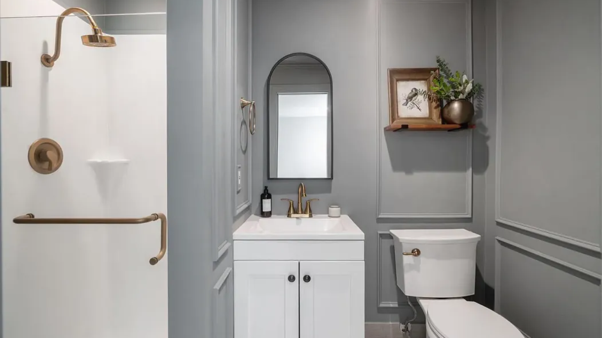
Where Is Puritan Gray Best Used in An Interior?
Puritan Gray is one of those colors that fits easily into many parts of the home. It offers a soft, steady look that isn’t too dark or too light, which makes it incredibly versatile.
Whether you’re going for something modern, classic, or in between, this color can adapt to your style.
Here are some great places to use Puritan Gray:
Bedroom: It brings a calm, peaceful feeling that makes it easier to relax at the end of the day.
Living Room: It pairs nicely with a wide range of couch and rug colors, from soft neutrals to deep blues.
Kitchen: Looks fresh and clean next to white or natural wood cabinets.
Home Office: Creates a balanced, focused mood without feeling cold or dull.
You can decide how much color you want, too. Use it on just one accent wall for a soft touch, or go with all four walls for a full, smooth look. It works beautifully in rooms with a lot of sunlight and even those with only a little.
I’ve found that no matter where it’s used, Puritan Gray makes a space feel pulled together and easy to live in.
Best Flooring Options for Puritan Gray Walls
| Flooring Type | Effect on the Room |
|---|---|
| Light oak or pine | Keeps the space feeling open, bright, and airy |
| Medium brown wood | Adds warmth and depth without overpowering the wall color |
| Dark wood tones | Creates bold contrast and makes Puritan Gray stand out |
| Cream or gray tile | Matches the soft tones of the wall and adds a clean look |
| Neutral carpet (beige/gray) | Brings softness and comfort while blending with the wall color |
Tip: Keep furniture and rugs in shades that link the wall and floor colors—this creates a more connected, balanced feel across the whole room.
How to Incorporate Puritan Gray Into Your Home Decor?
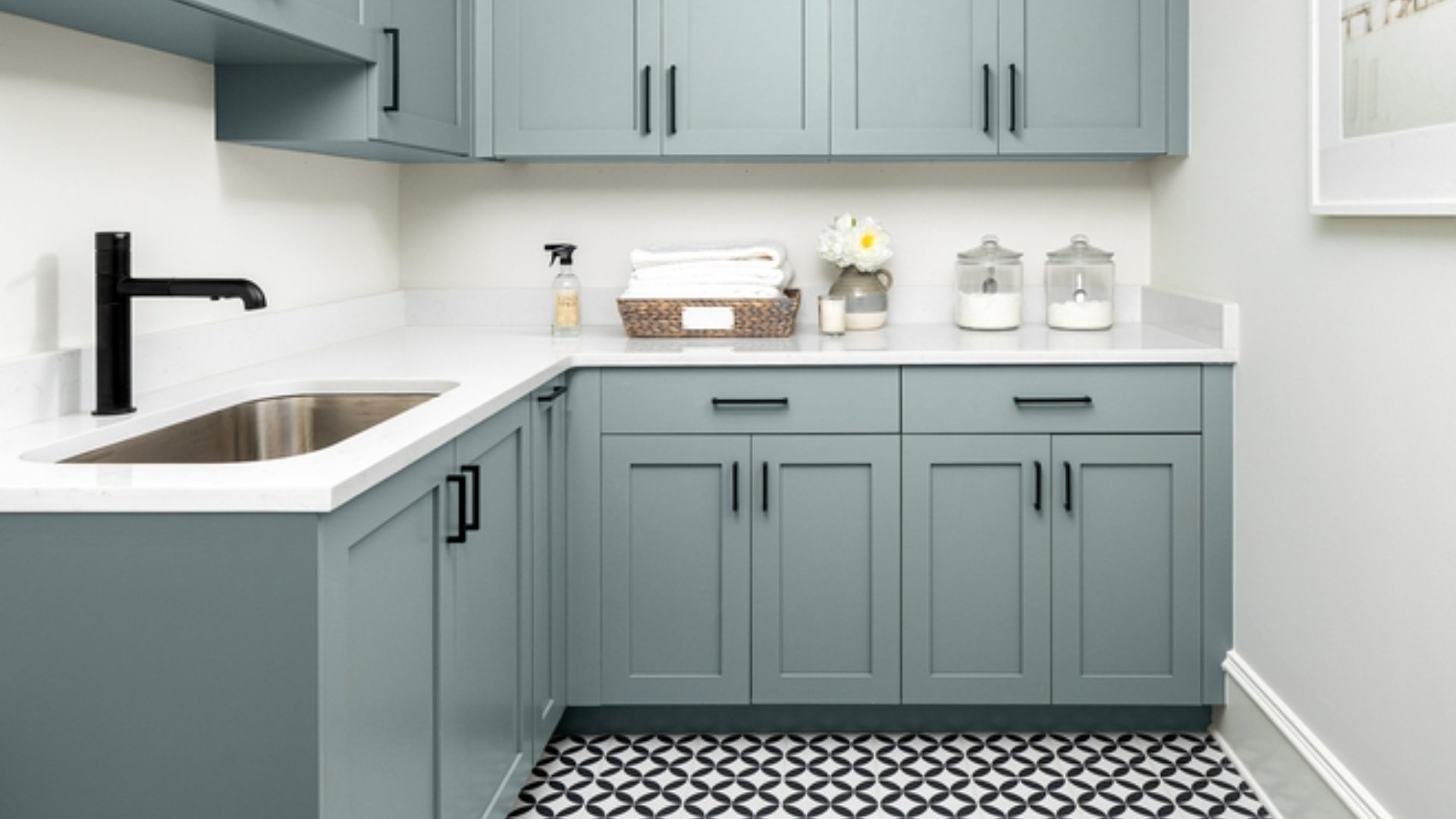
Once you’ve painted with Puritan Gray, the next step is to bring in decor that fits the tone. This color works as a soft base so that you can build a room around it without much effort. The key is to keep things simple and balanced.
In the living room, pair it with light sofas, natural wood tables, and warm throw blankets. In the bedroom, it looks nice with white bedding, soft rugs, and brushed metal lamps.
For the kitchen, try using it on walls or cabinets and add gold or brass handles for contrast. In a home office, mix it with dark wood and soft lighting for a focused and calm feel.
For metal finishes, brushed nickel, matte black, and brass all work well with this shade. These add just enough contrast without feeling too sharp.
Layering textures also helps. Use items like linen curtains, wooden shelves, or leather chairs to bring in warmth and variety. These touches give the space a complete and cozy look.
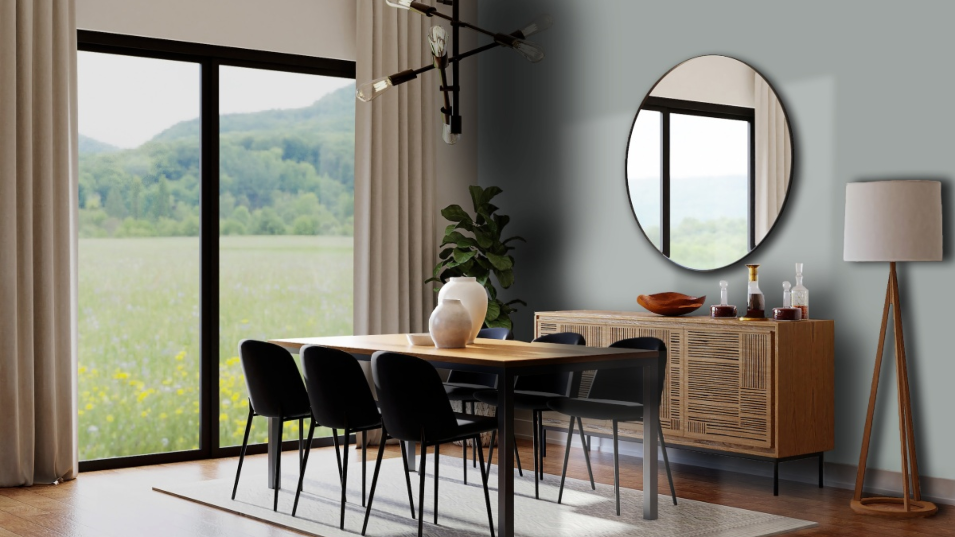
Puritan Gray vs. Other Cool-Toned Neutrals
Puritan Gray is a cool-toned gray in the middle range. It brings a gentle touch of warmth while still feeling soft and calm. To help you choose the right shade for your space, let’s compare it to Gray Owl, Stonington Gray, and Revere Pewter.
| Paint Color | Tone & Look | Light Behavior | Best For |
|---|---|---|---|
| Puritan Gray | Cool gray with green-blue undertones | Feels soft in light, slightly deeper in shade | Bedrooms, living rooms, and home offices |
| Gray Owl | Light cool gray with slight blue hints | Brightens rooms with lots of light | Small or low-light spaces |
| Stonington Gray | Crisp, cool gray, more blue than green | Can feel cold in low light | Modern kitchens, bathrooms |
| Revere Pewter | Warm gray with beige undertones | Warmer and softer in most lighting | Open-concept rooms, transitional spaces |
Each of these shades has its own use. Puritan Gray works best when you want something grounded but not too dark. It’s a good fit if you want a quiet color that works with both warm and cool decor.
Conclusion
Puritan Gray is a reliable color that brings peace and balance to any space. Its soft tone works well in both bright and low-light rooms. With a slight touch of warmth, it avoids feeling flat or cold.
Throughout this blog, we looked at where to use it, what to pair it with, and how it looks with different floors and finishes. You also saw how the right lighting brings out its full depth.
If you’re thinking about repainting, I definitely suggest trying a sample of Puritan Gray. Check it at different times of day, especially morning and evening – light really does change how it looks.
To finish the room, use soft textures and natural materials that match the tone of the paint. These touches can help the space feel calm and complete without much effort.
Frequently Asked Questions
Can I Use Puritan Gray on Kitchen Cabinets?
Yes, Puritan Gray can work well on kitchen cabinets. It brings a soft, clean look without feeling too dark. It pairs nicely with both warm and cool countertop materials.
What’s the Best Trim Color for Puritan Gray?
A crisp white trim is a safe and clean choice. It helps the gray stand out while keeping the space light and balanced. Soft creams can also work if you want a warmer touch.
Is Puritan Gray a Good Color for Hallways?
Yes, it’s a great hallway color. It brings a calm tone that connects well with nearby rooms. Use light flooring or bright lighting to keep narrow spaces from feeling closed in.